
4 Step CRO Blueprint for Increasing your Revenue in 2018.
The SEO world is changing rapidly.
In 2012, SEO was so consistent you could run the same system and get the same results over and over. At the start of 2018 it has completely changed, and no longer as straight-forward as it once was.
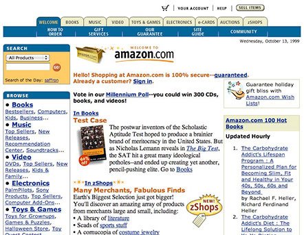
Times have changed. Amazon.com in the 90’s. Got CRO? Photo cred
To stay in the game, you need to constantly evolve your skills with the times or you’ll be drowned by competitors. If you’re neglecting CRO (conversion rate optimization) entirely, or failing to pay attention to the key areas I’ll discuss below, then you are making a huge mistake.
In this article, I am going to go through the key focus areas for 2018, with detailed guidance on how-to. I’ll emphasise on the things that are constantly neglected time and time again, that is losing clients (and probably you) money.
Let’s get right to it.
What you should be focusing on in 2018 for those quick CRO wins:
Most of the websites we optimized for conversions through the first half of 2017 were niche affiliate sites (not just Amazon affiliate). — eCommerce Conversion Rate Optimization
One thing we saw time and time again was that these websites were being built on scale by SEO’s, and apart from new content and links, weren’t improved upon after the initial build.
It was clear most were following the same blogs on how to build these sites which didn’t have any focus on conversions at all. Well, there are certain ways to increase your chances for a higher customer conversion rate.
Tip #1: Really optimize your websites for mobile
This usually gets the same response:
“My site is responsive.”
A website being responsive and a website being optimized for mobile conversions are two very different things.
In our testing, our data has repeatedly shown that the highest rated comparison table plug-ins tend to convert the worst on mobile. With most sites having over 50% of their traffic coming from mobile, often the gains from desktop visitors were completely negated by the low conversion on mobile.
Let me show you why:
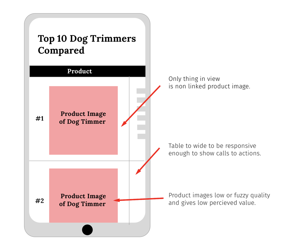
Here is a very common layout we saw on sites using Tablepress.
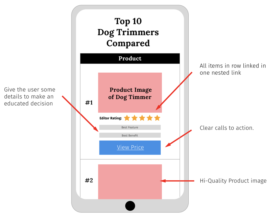
Here is what works much better on mobile. You can see why. Be careful with star ratings for amazon affiliate websites.
The issue with a lot of the “premium” table plugins for wordpress is that they are not at all optimized for mobile. There are ways to make them optimized for mobile with a few work arounds, but out of the box they are no good.
When optimizing your site for mobile you need to consider:
- Are the call to actions visible on mobile?
Quite often, the call to actions, the links that were used to get users over to affiliate partners, weren’t even visible on mobile. You would have to scroll sideways on your phone to see them (This isn’t Tinder, people rarely swipe sideways unless told to).
- Is everything aligned and uniform on mobile to be in alignment with your branding?
- Are you using buttons for your call to action?
Most people’s fingers make it very had to click a text link on mobile. Make it easy for users to click your affiliate links. Buttons tend to work better for mobile users, while sometimes text links work better on desktop.
- Are you trying to show too much info in your comparison tables on mobile?
With CSS it is very simple to show and hide elements that show up in your tables. Make it easy for your clients to quickly compare the rows in your comparison tables. It is called a comparison table for a reason. If they want to read more info about the product, make more detailed summaries down below in the page.
Most people just want to get a quick summary and are already sitting there with their credit card ready.
- Do you actually use call to actions at all?
In the review sections below the comparison tables, people would often have an image that would link to their affiliate or just link from the product name itself. They wouldn’t actually tell the user what to do. I am always all about designing sites suitable for a 5 year old. Not content wise, but if you want the user to do something, tell them to “check price” or “click here for latest pricing”. Hold their hand and nudge them in the direction you want them to go.
- Link your product images to your affiliate links. ‘Nuff said.
These are just some things we tested with consistent gains on mobile.
For clients’ sites, we always test every change. We never make a change to a website without running a split-test that proves better conversion rates first. We use data to make decisions, not intuition.
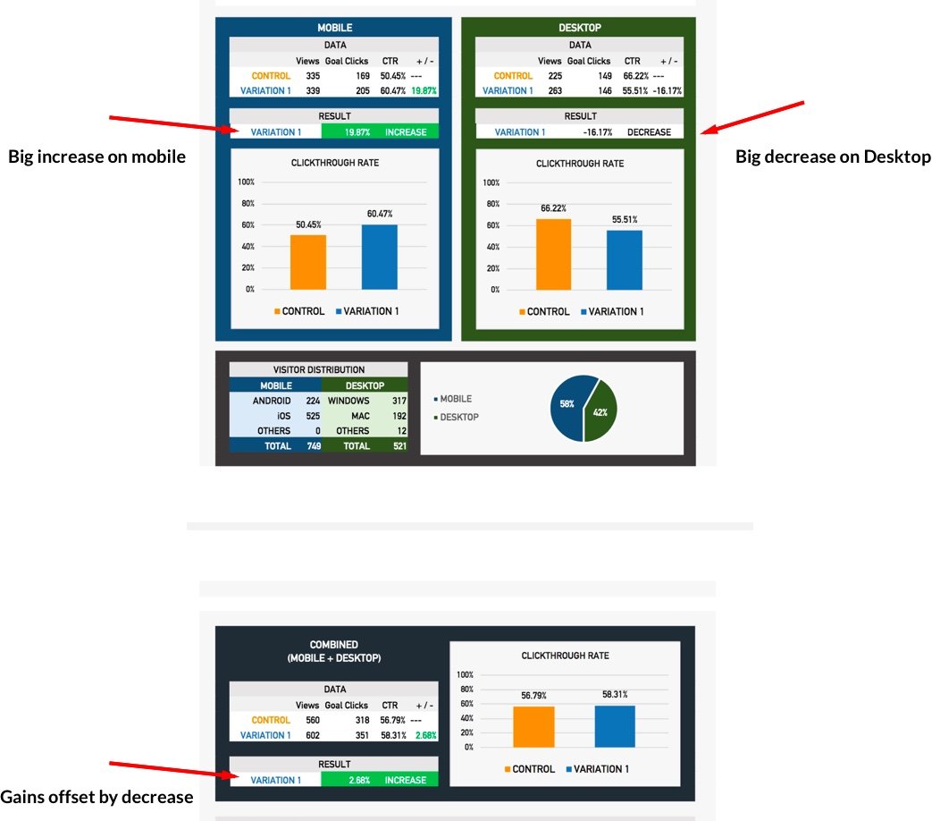
Our reporting at CROguy/Convertica always uses raw data from split-tests to allow us to see what the conversion rates were right down to the device level. Here is a conversion rate optimization diagram example:
Tip #2: Pull the raw data from split-tests.
You get A LOT of insights from this export. Here is how to do it on VWO:
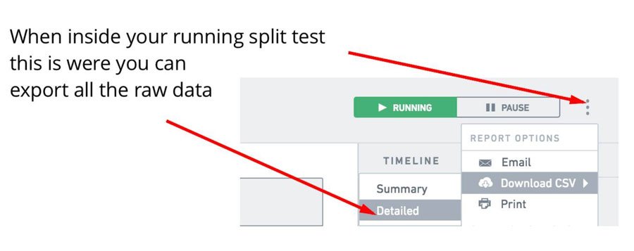
These detailed reports have all the data, specific to device type, location, screen size and much more. The report shows how even though we had an increase on mobile as in this example, we had a near-equal decrease on desktop which completely offset the mobile gains. We have to go ahead and create some pretty reports with some tricky calculations to get it look appealing but out of the box, the data is all there.
The great thing about having this data is that you can then make an educated decision about test results.
From there you can then choose to display one variation for desktop and another for mobile, allowing us to still get that increase on mobile while just displaying the original variation on desktop, and then going ahead and running another test, just to desktop.
Displaying different styles and layouts can be done with some simple CSS or even done by outputting different HTML to desktop or mobile visitors with PHP.
Here is a cool tutorial on how to do that with CSS.
Tip #3: Test every page.
Websites that generate most of their traffic from organic search, often have different pages ranking for different keywords. Because of this, the psychology of the visitors to each page can be very different. We see regularly that the exact same split test run on 10 different pages of a site will return very different results.
Sometimes a change will show a 30-50% increase in conversions on one page, while another page on the same site shows a -10% in conversions.
Be responsive to the data and be open to getting micro-specific about changes you make to your site.
I’ve had conversations with a lot of SEOs that have tried split testing and haven’t been able to get any increase in revenue.
This is probably why;
They would have tested one page, got a nice big increase in conversions then just rolled the changes out site wide. Our data shows it’s very possible for 4 of the highest traffic pages to see an increase, for 3 to see no real change at all, and for 3 to see a decrease, completely offsetting all the increases from the tested page.
The lesson here is to always test every page. Always test every change on every page.
Don’t know where to start? You can see my tutorials on setting up heat maps here.
Don’t know how to set up a split test? You can see my tutorial on setting up your first split test here.
Tip #4: Test mobile and desktop separately.
Let’s just say you have run a split test to all traffic and worked out that desktop had a 40%+ increase in conversions, awesome.
Mobile however had the complete opposite results and returned a -37% decrease.
We’ll assume that you have gone ahead and rolled out the desktop version live on the site but kept the mobile the same as the original variant.
So now you’ll need to test something new on mobile that might work, right? Let me show you how to deliver a test to mobile visitors only.
How to set up a Mobile visitors only test in VWO.
This tutorial is done in VWO.
VWO is our preferred software here at Convertica. If you use another AB testing service the strategies will be the same but implementation will be slightly different.
I have shown how to set up a standard split test here. You can catch up on that if you missed it.
Setting up a mobile-only split test is not difficult at all. Before you start the campaign, you just have to change one setting:
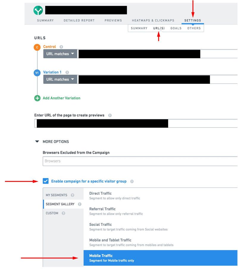
I kept the tutorial basic so you get the concept and implement it.
If you have any questions about more advanced strategies, join the CRO Academy Facebook group and ask me a question.
You should probably join the group anyway, if you have any interest in learning more CRO, which everyone does, right?
Times have drastically changed since SEO in the late 90s.

The first website I ranked #1 on google for was “pokemon rom downloads”.
It was 1998.
You might not even know what a “pokemon rom” is.
It’s a version of the original pokemen from Gameboy, ripped from the cartridge for PC and run through an emulator so you can play it on your PC, for free.
It was 1999, I was 14, the internet was starting to take off, and Pokemon on Gameboy was huge.
I had a 33.6kb/s modem which allowed 2kB per second download. I had to leave my PC on overnight to let internet explorer update.
That was less than 20 years ago and the online marketing scene is unrecognizable compared to now.
Over the years, I have changed with the times, learning new key skills as they became relevant: My small Freelance SEO business evolved to a client SEO company, to a 90% affiliate business, then to a CRO specialist (CROGuy), and now to Convertica.
 Introducing Convertica.
CROGuy has now re-branded under a new name: Convertica.
2017 was an amazing year: We had a huge list of successful happy CRO clients, and we have a rapidly growing team of talented people. We gained CRO expertise in a number of industries and niches allowing us to get better results as the year went on by growing our team of talent and building better processes.
The chart below illustrates the increases in conversions we got over the year for all our 2017 completed client campaigns. (This does not include clients with active campaigns still running.)
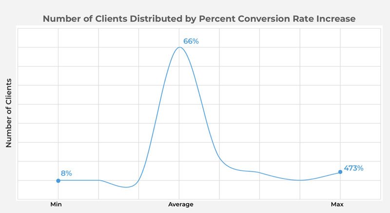
We had to move on from CROguy, because Convertica is not a one-man show. We’ve been able to achieve this success only due to our talented and hard-working team members, through which we were able to culminate 20 years of experience in online marketing to get astounding results for our clients.
Where to next with Convertica.
We went from servicing micro niche SEO websites and a few authority niche sites to now partnering with almost all exclusively authority sites and industry leaders.
The more sites we process, the more data we have, and the more industry-specific CRO expertise we develop:
The results just keep getting better and better for our clients.
My hope is to demystify the CRO industry and give information back to the community that we gain from our campaigns, to enable more people to make more money from the same traffic visitors and rankings.
If you have a website with pages over 1000 views per month, you should be split testing (or getting someone to do CRO for you). If you aren’t, you are leaving money on the table.
Jump over to the CRO Academy and let me know what tutorial you would like to see next.
Until next time,
Kurt Philip.
Head of CRO at Convertica.





 To get started, please enter your details below
Good read! Here’s a question for you: How long would you suggest as the ideal split testing window for accurate results to kick in?
There are a few different variables on how long. If the original page and the variation B are close in terms of conversion rates the test will take much longer than if there is a 30%+ increase. Generally we start to look for test conclusions after 1000 page views on both variants.
Thank you for the insight!
Kurt would you say then it’s better to do your setup and design of your website in mobile view rather than desktop?
Convertica is a great name, good luck with your new ventures!
Thank you for the tutorials they are great!
It’s best to design it for both. Unless 100% of your traffic is for mobile. We just noticed, from a lot of sample data, that mobile was being neglected. Thanks for the great feedback!
Hey Kurt, Great post . I think the comments about converting on mobile are super important . We got our best results from your program when we did the device split test. It was really a surprise that what worked on desktop was not as effective on mobile .
Bigger gains happening now on mobile. Definitely worth the exercise.
Awesome, glad to hear Grant.
Great post for 2018 on tables Kurt. And love the new logo, fuckit. Makes me want to redesgn mine. Who did it for you?
I always use 99designs. Love the service.
Look forward to seeing where you take this business, Kurt. Support ya all the way!
Thanks Jesse!
Hey Kurt, that’s one hell of a sick post. Loving it. (y)
I’ve always been a TablePress fan, but definitely see the problems it can have for mobile.
– Have you been able to recreate that second illustration you show in Tablepress?
– Have your data shown you that there’s a table plugin that by far beats TablePress. If yes, is there one you can highly recommend? Or is TablePress still king if properly optimized and configured?
Looking forward to your reply 🙂
– Yeah we just custom coded it. Pretty simple to do with a bit of css.
– We don’t like using any table plugins. Straight up HTML and CSS is best.
Thanks for the feedback, glad you enjoyed the article.
Hey again Kurt,
Quick question. Is Hotjar a lot better than VWO heatmaps, or what’s your reason for using it? A lot cheaper?
Was just planning on using VWO as my all in one tool, but #FOMO :p
Much appreciated.
I think that Hotjar is great for newbies. We use VWO for an all-in-one solution now.
Nice post Kurt! You seriously took me down memory lane with your Pokemon rom story lol. Oh, the good old days when keyword stuffing was a thing and less we forget the white text on white background.