Guide to Conversion Focused Web Design: Examples and Best Practices
Current day web design goes way beyond just “looking good.”
You’ll want your website to convert people visiting from cold traffic, and overall, have a smooth and intuitive user experience.
With the end goal being, of course, to drive sales and revenue.
But sometimes, what looks good to you – may not look good for your target audience.
You might be surprised to see what converts and what doesn’t, in terms of web design.
In other words, a website that may look ugly and confusing to you, may be exactly what the target audience is looking for.
Consider what’s important for the ideal audience, what pain points they’re struggling with, and what they’re already used to.
By using psychological triggers, minimizing distractions, and optimizing for user experience, you too can drive conversions and sales from your website.
Below, we’ll be going over conversion-focused web design and CRO principles to convert more people visiting your website.
Here’s what we’ll cover:
- A Word on Website Engagement and Other CRO Concepts
- 5 Essential Principles of Conversion-Focused Web Design
Ready?
Here’s what you need to know about using website conversion design.
A Word on Website Engagement and Other CRO Concepts
Before we look at conversion web design examples and best practices, let’s take a step back to discuss general CRO.
Conversion Rate Optimization (CRO) makes the most out of traffic coming into your site. It helps you work out why users are not continuing through the final sale or desired action.
Effective CRO will cause a rise in the overall percentage of incoming visitors that convert.
Nowadays, marketers are often hung up on the “essential” numbers like conversions, sales, etc.
They’re important, yes.
But we need to take into consideration the sub-numbers that help drive those “essential” numbers.
Here’s what I mean:
Website engagement, for example, helps people stay on your website longer.
And the longer they stay, the more likely they become to convert. For example, a website visitor might read your “about us” page fully, fill in a survey, opt-in for a lead magnet, and then do business with you.
The whole is greater than the sum of its parts, right?
Other CRO concepts you need to keep in mind which can help boost your overall website conversions and boost the effectiveness of your web design include:
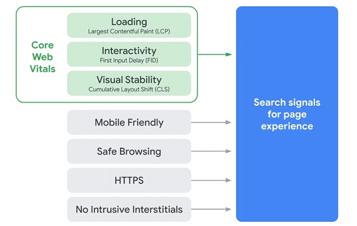
- Website load speed – According to Google, how fast your website loads is a direct ranking factor. Not only that, but if your website takes more than 3-5 seconds to load, most of your users will click off.
- Bounce rate – Another important, but misunderstood metric. Don’t think of this as a number to “fix”. There are pages where a high bounce rate can be good. It means that you satisfied user intent and the person didn’t need to interact with your site any further. Figure out what the number is telling you about your site’s page and the people you’re attracting and work from there.
- User experience – Another misunderstood metric. UX is actually a mix of things: Accessibility, size, color, and contrast of your text, use of images, simplification, and web design elements that affect usability.
Developing trust signals, and other CRO elements that remove objections – At the end of the day, a lot of your visitors will be on the fence about buying from you. They’re not sure if they can trust you, especially if they’re coming from cold traffic. Check out our conversion rate optimization strategies for some more practical marketing tactics to boost your conversions.
Source: SEMRush
So, why does this matter?
The point here is that you shouldn’t look at your website conversion rate in a vacuum.
Yes, your web design plays a big part in your conversions.
But web design also consists of a number of conversion-driven principles that can indirectly help your visitors convert.
Now, with that said, let’s take a look at some web design elements and examples below that can boost your conversion rate.
5 Essential Principles of Conversion-Focused Web Design
A conversion is an action your website visitors take in response to your CTA (call-to-action).
And the CTA could be to make a purchase, sign up for a demo, subscribe, or any other action you want them to take.
When adopting a conversion-based web design, your CTA becomes the core principle. While the rest of your web design will focus on getting the user to respond to the CTA (think: layout, text color, images, interactivity, etc.).
So, you can’t just focus on your CTA or copywriting in a vacuum to try and boost your conversions.
You need to consider what every element of your website is designed to do.
Once you adopt a conversion-first approach, you’ll start seeing these principles everywhere.
With the right design, your website will promote itself, and naturally get you better conversion rates and sales.
PS – Not a designer and still want to improve your website conversion rate? Claim our free CRO audit now and let us go over your web design. In the end, you’ll receive personalized advice on what to improve.
Now, let’s take a look at some web design tips you can use to boost your conversion rate.
1. Define one goal – stick to it
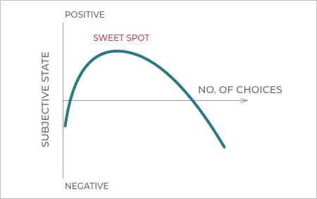
Your landing page should have one clear goal.
It’s easy for people to get overwhelmed by many choices and options.
So, the best way to put this conversion-driven principle is this: define a goal, stick to it.
This is pretty common in the SaaS industry, with multiple CTAs or options for subscribing.
If you want a website visitor to take action and convert into a lead, then stick to one goal for every lead generation page you create.
Give your visitors only one thing to do per page.
Which may sound like an oversimplification of things, but it works.
Users often leave web pages in 10-20 seconds. That’s the time frame you have to capture their attention and drive them to a specific goal (CTA).
So, you can’t afford to waste their time with multiple confusing CTAs, or a mix of all the different services you offer squished together in one page.
Introduce only one product or service for each page, and limit options by giving your users only one thing to focus on.
Direct your visitors’ attention towards one action and you’ll see an increase in your conversion rate.
For example, your main landing page should focus on your main benefits. If you offer multiple services, consider creating different pages for each service. The same goes if you’re in eCommerce – different product pages, categories, and so on.
Once you’ve got your goal in mind, you can start implementing the next landing page conversion principles.
2. Consider your “F-Layout” and heatmaps
The “F-Layout” (or F-Pattern) is a simple layout designed to guide a user’s eye to the information you want them to see, based on engrained human behavior.
A website heatmap is a visual representation of the collective behavior of your website visitors.
It’s presented in an easy-to-interpret image that shows how your visitors explore your landing page.
At a glance, you’ll know which parts of your site need to start work on right away. You’ll also know:
- How far down the page visitors scroll.
- Which parts of the page do they pay attention to the most.
- Which elements they click and engage with (if any).
Check out our article on heat map tools if you need more info on getting started with using heatmaps to boost your conversion rate.
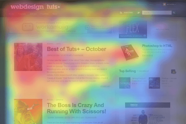
Source: Envatotuts
Hot spots (red, orange, yellow) represent where users’ attention lingers the longest.
Now, turn this into a barebones wireframe and you’ll get a better idea of how to structure your web design.
A closer look into heatmaps often reveal that:
- Brand marks and navigation capture the visitor’s attention first.
- Images often receive the greatest level of attention (so, visuals matter).
- Headline comes next, and text is only scanned.
3. Follow a conversion-driven layout template and include these essential sections
Most landing pages can be split up into 2 parts:
- Above the fold – what’s visible.
- Below the fold – what the users scroll to.
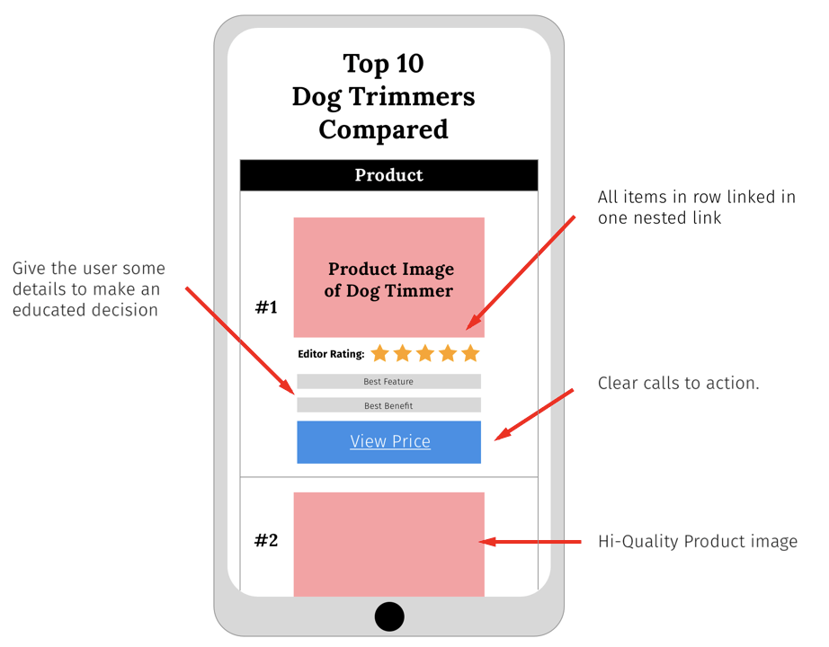
If you’re not sure where to begin, consider following this landing page template for pages that convert, according to MarketingExamples:
- Explain the value you provide (heading).
- Explain how you create it (subheading).
- Let the users visualize it (visuals).
- Make it believable and eliminate objections (social proof).
- Make taking the next step easy (CTA).
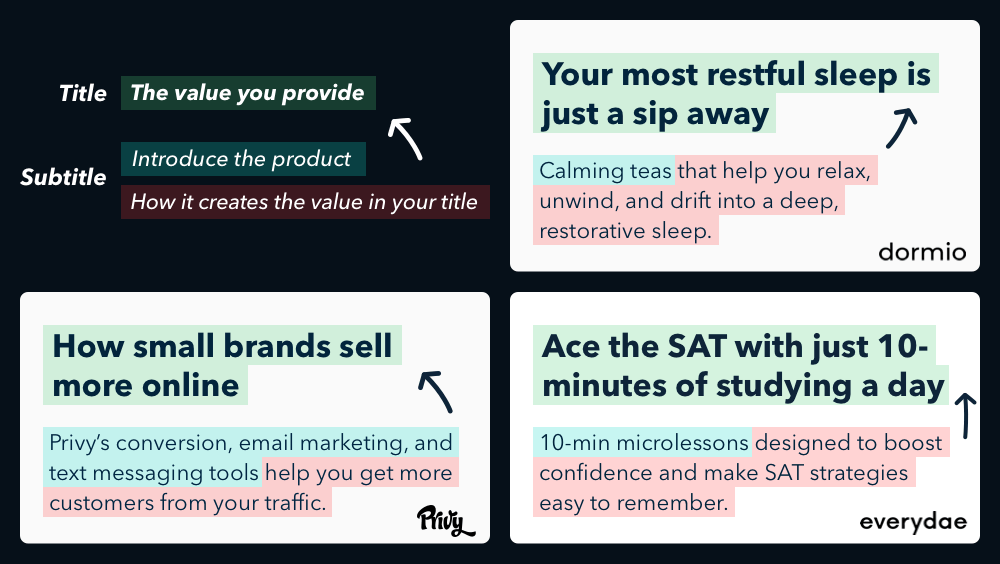
You see this web conversion structure usually in the SaaS industry – where benefits and how you design your website is more important than ever.
Obviously, there are a million and one details you could be optimizing for, depending on the checklist you follow.
But for the most part, regardless of your industry, your landing page is your sales pitch.
So, you should keep that in mind with your web design and make sure it’s communicating the right message.
4. Using web design contrast and color to your advantage
Obviously, color plays a huge part in your web design. It reflects the mood and the impact of the message that you want to convey to visitors.
You might already be familiar with general color theory and how each color conveys a different mood.
But did you know those same colors can have an effect on your web conversion rate?
Well, indirectly.
They help your users navigate through your website.
You have to take into consideration:
- Accessibility.
- Readability.
- Memorability.
- Direction cues.
- Urgency and scarcity.
- And more.
But you also need to take into consideration other web design concepts that can affect your conversion rate, such as:
White space – Also referred to as negative space. Parts of your web design left blank intentionally to increase the focus on certain web page elements such as CTAs or headlines.
According to Printwand, there are 4 main types of white space web design:
- Micro white space – Negative space between smaller elements like image, caption, words, letters.
- Macro white space – Blank space between main elements (e.g. headline and copy).
- Active white space – Space added consciously to the page to make it more structured. Mostly asymmetrical and makes the page look dynamic.
- Passive white space – Natural occurring white space, as it’s not added deliberately. It’s the space between words on a line or around a graphic.
Once you start seeing these concepts in landing pages, you’ll never be able to un-see them.
Even though white space is often referred to as “empty space”, it’s anything but wasted space.
It’s the space deliberately left blank so that the remaining areas could draw more attention and reduce cognitive load for your site visitors.
Color and usability can also help you establish trust. Since users might be used to certain elements to be a certain color (e.g.CTA buttons are usually always green).
Speaking of…
5. Building trust through conversion-driven web design elements
Your website shouldn’t be “just” beautiful, it should be building trust through clever web design elements you’re about to read below.
This is another case of your web design helping you boost your conversion rate through indirect conversion principles.
Here’s how:
A beautiful and professional-looking website triggers the halo effect cognitive bias.
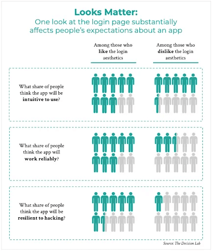
Source: TheDecisionLab
This is the idea that “if it’s beautiful, it’s probably good and safe.”
In other words, when we find something attractive and good from a user-experience standpoint, chances are, we’re more likely to pass other positive judgments.
In this case, it’s a matter of – if your landing page looks good (which is the first thing your visitors make a subconscious guess on), it’s more likely to have a higher conversion rate.
Though, one thing that’s important to take into consideration here is – does your website look good to your target audience? (they call the shots here.)
So, on a more practical level, here’s what this means for your web design:
Let’s assume you already have a good-looking landing page.
Following the conversion-driven principles mentioned in this article, it should also:
- Make good use of white space.
- Have a strong visual hierarchy.
- Have direction cues that guide your visitors to the goal of the page.
- Be easy to find other pages on the site.
- Be understandable at a glance what the site is about and what the user can do on it.
Conclusion
So, to recap, you don’t have to be a designer or a CRO expert to start thinking like one.
Hopefully, you’ve learned a thing or two and you’re well on your way to changing some of your design to boost your conversion rate.
Now, let’s go over some of the frequently asked questions with website conversion design:
- What is a high converting website design?
A high converting website design tells your prospect what the webpage is about, and what services or products you offer in the clearest way possible. Then, your web design helps communicate that your offer through accessibility, readability, direction cues, memorability, and other conversion-driven principles.
- How do I create a conversion website?
Consider what’s important for the ideal target audience and focus on that. By using psychological triggers, minimizing distractions, and optimizing for user experience, you’re more likely to come out with a conversion-driven website.
Be sure to also follow the above mentioned conversion-focused checklist:
- Define one goal per webpage and stick to it.
- Use a heat map tool and analyze your F-layout.
- Follow a conversion-driven layout web template and include all the essential sections in your industry.
- Use web design and color to your advantage to make it easy for your users to read through your web page to the CTA.
- Build trust through conversion-driven web design elements like the halo effect cognitive bias, white space, visual hierarchy, directional cues, and more.
- How do you design for conversions?
When designing your layout, consider including the following essential sections to maximize your conversions:
- Heading – The main value and benefits you provide.
- Subheading – The main features and how you create that value.
- Visuals – Let the users visualize it through practical screenshots or images.
- Social proof – Make it believable and eliminate objections from happy customers or past clients.
- CTA – Make taking the next step easy.
Successful CRO is a journey of many small steps in the right direction.
Claim your free CRO audit and get started with your journey now.

Hi, I’m Kurt Philip, the founder & CEO of Convertica. I live and breathe conversion rate optimization. I hope you enjoy our findings.
We’ve worked with over 1000 businesses in the last 6 years.
Let’s jump on a quick call to see how we can help yours.
Client Case Studies


