
Conversion Optimization Round-up – October 2022
Only 22% of businesses are happy with their conversion rate, which leaves much room for improvement. Where do you sit when it comes to conversions?
Continue reading as we break down this month’s list of articles showing you different techniques to improve conversions.
See how one company improved sales by 20%, another used a 100-year-old marketing strategy to improve conversions, and why too many options can be bad.
How Apple brilliantly used a 100-year-old persuasion strategy
https://conversion-rate-experts.com/100-year-old-persuasion-strategy/
You don’t want to miss this cool article from Conversion-Rate-Experts. We get to see how an advertising ad from 100 years ago is still one of the best advertising techniques today- and it’s a beer ad!
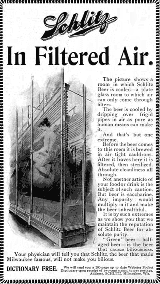
Image source: Conversion Rate Experts
Apple describes how they use the tried and tested technique of persuasion to improve sales.
As consumers, we like to know the about the process, what’s unique about the product, and we also love a story. Below are a few reasons why the art of persuasion method in advertising works.
- It adds a level of credibility
- It tells a story
- It allows trust to be built
Did you know storytelling can boost conversion rates by 30%? Continue reading this article for more great ideas.
With More or Fewer Content Cards?
https://guessthetest.com/test/with-more-or-fewer-content-cards/
This test is brought to you by Optimizely, a digital experimentation platform. Optimizely uses personalization to suggest “content cards” for related resources. Looking to add leads, the testing team wanted to know what layout works best. Two or three content cards?
The breakdown:
- Version A- 31,801 users saw the three smaller content cards.
- Version B- 32,141 users saw two larger content cards.
- The test ran for three weeks.
Version B is the clear winner with fewer and larger content cards. This single test led to an increase of 26.01% in click-through rate (CTR).
What did we learn from this article? Too much choice can crush your conversions. As consumers, when presented with too many choices, we become overwhelmed and lose sight of what we need or want. However, if we have too few options, we begin to feel like we have less power over the choice. There is a fine line between the two; A/B testing will help set you on the right path.
Take a look at your site- is it overwhelming, or does it leave too much to question?
Have you ever heard about the famous jam study? Check it out in this great article from Guess the Test.
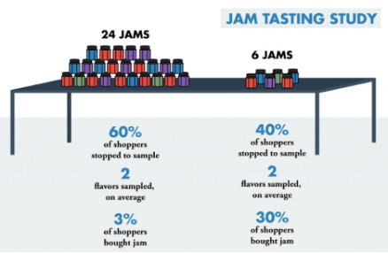
Image Source: Guess The Test
Delivering an 18x return on investment for Gousto by kick-starting their CRO program
https://conversion.com/case-study/gousto/
In this article, we find out how Conversion helped Gousto, a subscription-based meal service in the UK, increase ancillary sales by 20%.
Gousto had a problem. They were growing too fast- not a bad problem to have, but still a problem. They had growth targets to meet but couldn’t increase their customer base. What could they do?
They needed to increase the average order value. Through testing, they discovered many users were missing all the additional marketplace items.
So, they repositioned the marketplace as a step rather than an option.
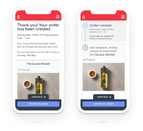
Image Source: Conversion.com
Here are the results:
- Improved sales by 20%
- 18x return on investment (ROI) in 18 months.
Once again, proof testing is a MUST for any company.
Publishers: A/B testing your paywall — Benchmark examples
https://whatsnewinpublishing.com/publishers-a-b-testing-your-paywall-benchmark-examples/
This article from What’s New in Publishing is one not to miss. Six great A/B tests are presented, showing you ideas on where you could be testing.
One of their goals was to get users to click through to the paywall. Below is the outline of the test run by ELLE Magazine.
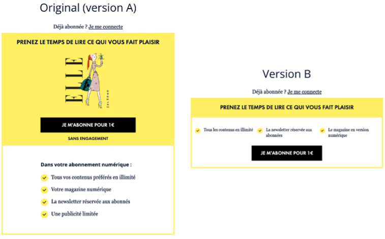
Image Source: What’s New In Publishing
- Goal: Increase click-through and conversion rate
- Version A: The standard upright rectangle
- Version B: A banner ribbon
Results:
The upright rectangle worked better amongst less engaged users, whereas the banner worked better for occasional users.
With many examples in this article, you will surely find one that relates to your content.
Summary
Conversion rate optimization is a must for every site. What are you going to do this month to improve your conversion rate?
Let’s close with a quote from Quicksprouf.com “If you double your conversion rates, then you cut your cost per acquisition in half.”
See you next month!
If you are interested in a free conversion optimization audit, submit your site, and we will send you a list of customized optimizations just for you!
Claim Your Free Audit Here.

Hi, I’m Kurt Philip, the founder & CEO of Convertica. I live and breathe conversion rate optimization. I hope you enjoy our findings.
We’ve worked with over 1000 businesses in the last 6 years.
Let’s jump on a quick call to see how we can help yours.
Client Case Studies


0 Comments