eCommerce Navigation Best Practices
Imagine going into a store for the first time. You enter a big building where you see dozens of aisles full of products from all over the world.
Here’s your dilemma. You’re in a hurry and you only want almond flour. What do you do? Do you frantically walk up and down the aisles to look for the most likely place where it might be displayed? Is it in the baking goods section? Or the healthy food aisle, perhaps?

Your website visitors go through the same dilemma. They want something but they have to figure out where it is on your site. The only difference is that they can’t walk up and down the aisles to find that bloody almond flour.
This is when your website navigation becomes the hero. It’s the online assistant that guides shoppers to the page they’re looking for in the quickest way possible.
When your site has a navigational structure that’s optimized for user experience, you get happy customers: customers who stay on your site, who discover the items in your store and who buy your products with a broad range of categories.
It’s that simple.
The bottomline is this. If you want to increase conversions, one of the things to test is your website navigation. That’s what we’re going to do today. Let’s have a look at some top eCommerce navigation examples and see where your website stands.
We’ve got a lot to cover, so let’s get this going.
Important considerations when designing site navigation
A wise woodsman once said that if you want to cut down a tree in five minutes, you must spend the first three sharpening your ax. In the same vein, if you want a navigation menu that does its job well, you’ll need to spend time carefully designing it.
So before we dive into the specifics, let’s first talk about the basic foundation of a user-friendly navigation menu.
Get the categories right
It should never take a long time for a customer to figure out whether you sell a product or not. Your products on your product pages must be accessible and easy to find.
But what do you do when there are hundreds or thousands of items in your catalog? How do you make it easy for customers to find the needle in the haystack, so to speak?
Luckily for you, people’s brains love broad categories. We love to put everything in groups for easy comprehension. Figure out the category that people correlate items to. And you’ve got yourself the backbone for your website’s navigation menu.
You probably already have an idea of which categories the items in your store belong to. But first, like any good conversion optimizer, have a look at your site’s analytics to see the navigation path people take so you have a better idea of the best category to peg a product in.
Another thing you can do is to spy on your competitors.
See. People’s perceptions depend a lot on past experiences. And like it or not, your customers will have visited a lot of other sites before finding yours. Capitalize on this by studying the navigation structure of your top competitors.
You’re not doing this to copy exactly what they do. You’re researching to have an idea of their navigation styles, how they name categories, and where their products are grouped. Find the similarities and let this guide you when you design your site navigation.
Limit the number of levels in your site hierarchy
Go only three to four levels deep in your site category hierarchy. This makes all pages easy to access and lessens buyer confusion when navigating your site.
Make labels intuitive
Labels affect usability too.
The consensus is this:
Use short labels. If you can use only one word so much the better.
Have clear descriptive labels.
The best way to optimize the main navigation bar
For many sites, the main navigation bar is on the header of each page. It’s the compass shoppers use to find what they want to purchase.
There’s only one problem. There’s very limited real estate in this area. There are only so many category links you can put on the top bar.
This is easy for small eCommerce sites. But stores with thousands of products will have to decide which categories to include.
If you have this problem, below are two guidelines to keep in mind for improved user experience.
1. Limit the numbers of links on the menu bar
If you spend any amount of time reading expert recommendations for the ideal number of links on the menu bar, you’ll find seven to be the lucky number. This means using seven parent categories in the top bar navigation.
I don’t know who first recommended this number. But it is something you’ll have to test on your site. The important thing to know is the reason why you limit the links. This is because too many buttons confuse shoppers. Which leads to frustration. Then abandonment. So by limiting the number of buttons, you make it easier for them to find an item.
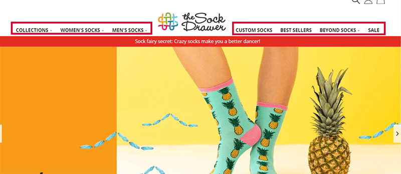
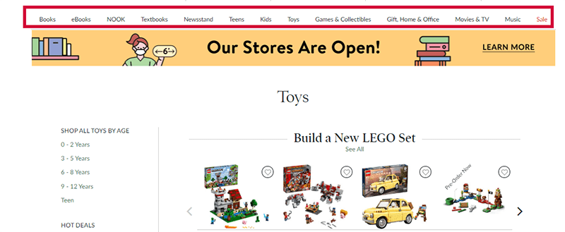
The number of navigation links that’s ideal for your audience is one that needs testing. Let’s look at how a couple of sites do this.
The Sock Drawer follows this religiously with seven categories on the top bar.
But Barnes and Noble, which carries a lot of products, has 13 on theirs.
So what’s best for your site? No one knows. You’ll have to test it.
2. Use drop-down menus the right way
You’ve chosen the parent categories for the top navigation bar. What do you do with the subcategories?
Big eCommerce sites solve this problem by using mega menus. These are a type of dropdowns that display all the subcategories visible at once. This means that when a user hovers, clicks or taps a parent category, all the subcategories are displayed on the drop-down. No scrolling, extra taps or clicks needed.
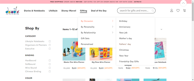
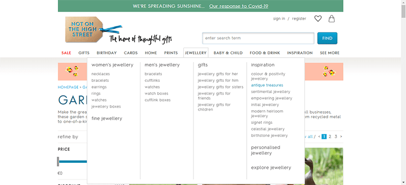
Below are two images showing the difference between a regular drop-down menu and a mega menu.
Here’s an example of a regular drop-down menu from the Doodle Collection. Not all subcategories are displayed.
And here’s an example of a mega-drop down menu from Not On The High Street. A mouse hover on the parent category drops down a window that shows all the subcategories at once.
Using the homepage for site navigation: best practices
Apart from the top bar navigation, shoppers also use the homepage to find their bearings. So consider your homepage a navigational tool, too.
The good thing is that you’ve got a bit more real estate to work with. But this doesn’t mean you can display just anything and everything on it. Too much information can be overwhelming. And overwhelm is the enemy of eCommerce sites.
So what do you do instead? Display only the categories or products that the majority of your shoppers are interested in.
For example, you can display
- Ongoing sales
- The most popular products
- A list of the main categories
- Recently viewed items
Also, include a diverse selection of products on the page. This gives shoppers a bird’s eye view of the breadth of your store.
See these principles in action. Have a look at the three examples below.
Wayfair
Wayfair features a lot of products on its homepage. Perhaps this is for SEO purposes. Nonetheless, you’ll notice that the top of the fold features the July 4th clearance with navigation links to popular categories: Furniture, Decor and Outdoor. But they don’t stop there. Just below that are links to all the parent categories. Pretty clever.
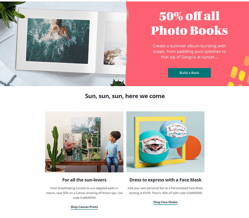
Photobox
Photobox sells a lot of different products you can customize. But they feature their main product, photo books, on top of the homepage. Scroll a little lower and you’ll notice that they’ve also got quick navigation links to customized masks. So that must be a popular product this month considering the current state of things. The rest of the page also features some popular multiple parent categories.
Asos
Asos goes for minimalism by pointing to two top categories: men or women. I like this. And a lot of fashion stores should probably follow this, too. It makes that first decision very easy for the visitor. If you go to the Asos homepage with the intent of buying, you’re bound to click one of these links. Once you click it, you then arrive at another page where most of the products are more tailored to your needs. Like going to a specific floor in a store that sells the products you came there for.
Designing the Category page for easy navigation to subcategories
Treat the category page as a mini-homepage. The same principles apply here. Except this time, you display the subcategories.
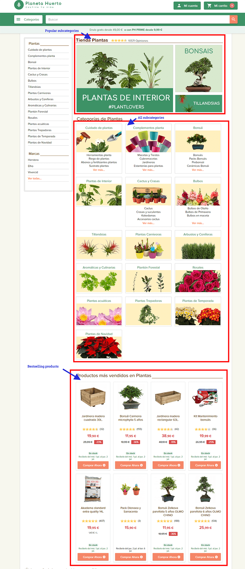
Here’s a Spanish site that does this well. Even if you don’t speak the language, this particular category page gives you a clear idea of the types of products they have for this category. On the top of the fold are the three top selling plant categories: Interior plants, Bonsais and Airplants.
If you scroll down, you’ll also see all 16 subcategories of the plants they sell. That’s a lot of links but they’ve designed it so well, that you don’t get overwhelmed. If you go to this site to buy a plant, it’s easy to find your way around and get the plant you want to buy.
As an eCommerce store, that’s exactly what you want your shoppers to experience.
How to use the product page for site navigation
You may not think of the product page as a place for navigation optimization. But it is.
Your focus, however, is different. This time, the main purpose of the navigation is to increase average order value or to get the visitor to keep looking for a product to buy. You see, the visitor is very close to buying something. So it’s best to limit his/her choices.
Here’s how you can do this.
- Add links to product alternatives. This could include the same product from a different brand, a cheaper version, or the bestselling item of its type
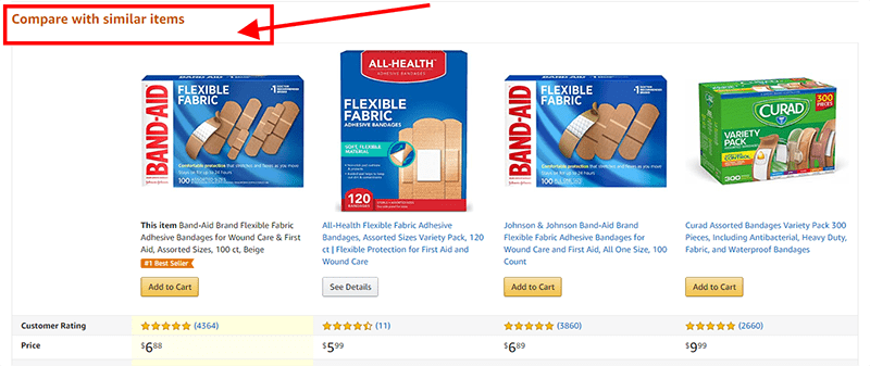
- Include a comparison table to similar products
- Give recommendations for product accessories.
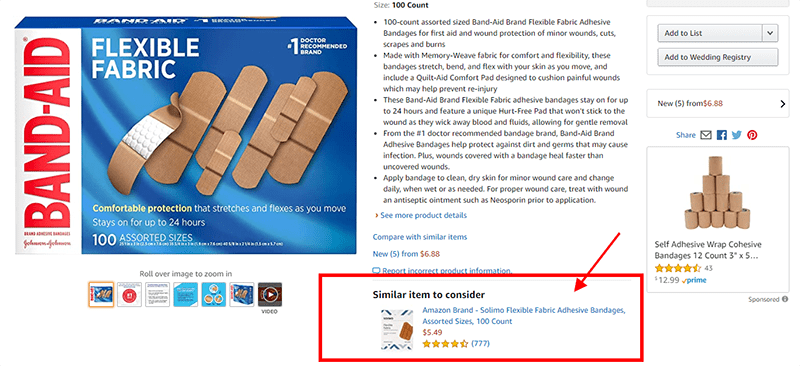
I suggest having a look at Amazon as it does this so well. For example, this product page for adhesive bandages has links to:
Similar item to consider
Frequently bought together items
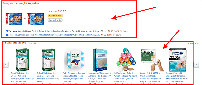
A comparison table
How to optimize the search bar for easy website navigation
If you’re still wondering whether internal search boxes are useful or not, stop. The verdict is out. We use both the search bar and navigation links when searching for a product in an eCommerce store. And if you cater to a younger demographic, 50% of them will go straight to your search bar to find their way around your site.
Here’s the thing. We’re a little spoiled when it comes to search bars. We’re used to internet giants like Google or Amazon who do a good job of assisting us with our searches. So we expect nothing less from other e-commerce sites we visit.
What does this mean for you?
It means that you should treat your eCommerce store’s search function with the same reverence. This means making your site’s internal search bar more intuitive and helpful with what customers are looking for.
Here are some things you can start doing now:
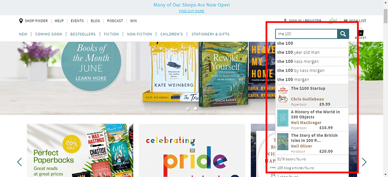
Use the autocomplete feature the way Waterstones does it.
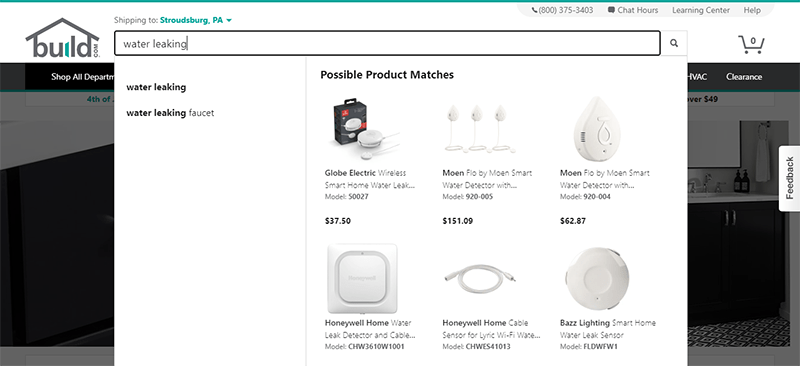
Make it possible to search not only for product names but also for things like the product’s theme (spring jacket), product ‘s type (multi-function jacket) or a problem (drafty window). See how Build.com does this.
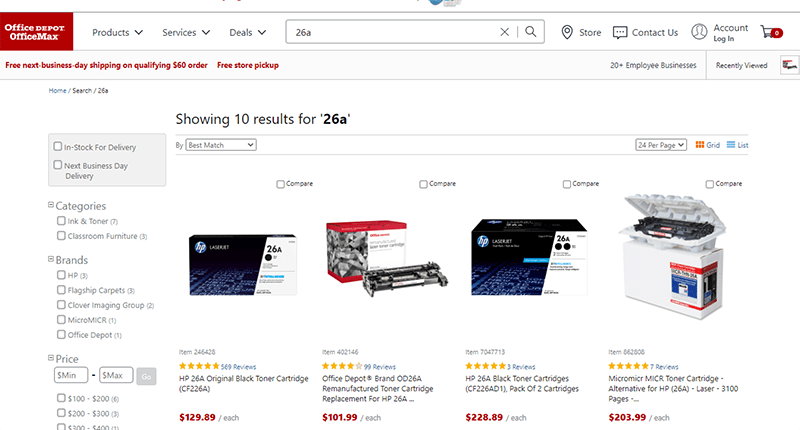
Know which different ways people refer to a product and offer the same results whatever search words they use. Notice how Office Depot shows the same results whether you search for hp 26a toner or just 26a.
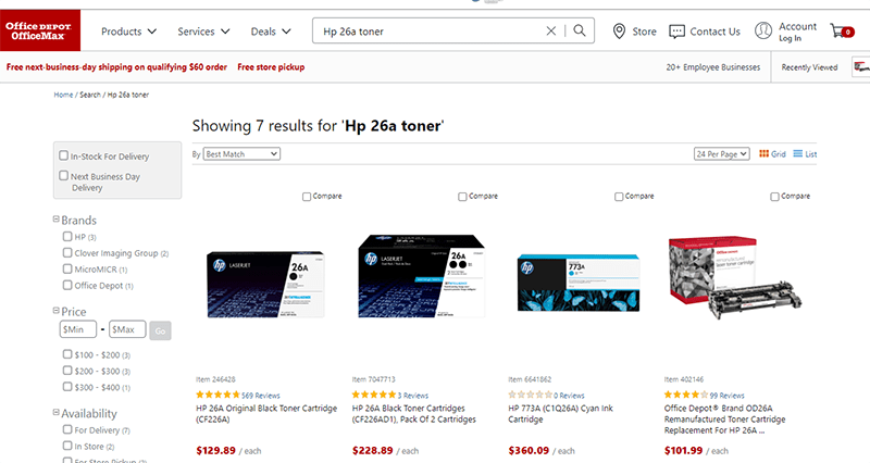
search term: hp 26a toner
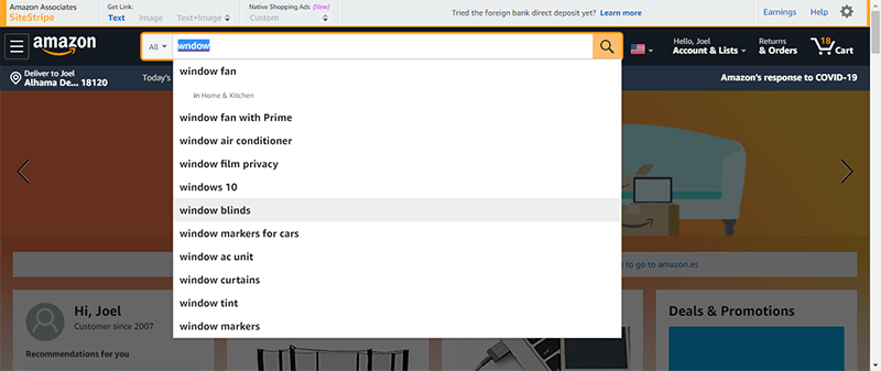
Lastly, autocorrect spellings whenever possible as Amazon does:
Building mobile-friendly navigation menus
As soon as a person searches the internet using a mobile phone, his psychology changes. He becomes a bit more demanding. He has less tolerance for sites that aren’t user-friendly. And he doesn’t want to waste his time on an e-commerce website searching for a product. It is critical in supporting explorative product browsing.
What this means is that your navigation carries an even bigger responsibility in making sure your customer finds the product that you sell. This also means that site navigation should be simpler and easier to access than on desktop.
You know where I’m going with this, right?
You’ve got an itty-bitty space on mobile. This makes designing navigation menus for big eCommerce stores a challenge. I admit it’s not straightforward . But there are ways around it. Here are some best practices for building mobile-friendly navigation menus.
- Use a hamburger icon to indicate navigation. Even better, use the word Menu with it
- Test different places to put the navigation menu such as the top bar, the bottom of the window, or as a sticky.
- Make it easy to tap, click and scan links.
- Add a search box that’s always visible.
- Put the most popular product categories at the top and within easy access.
Recap
As you can see, an optimized website navigation structure leads to a good buying experience. It encourages customers to stay on your site, increases the average order value and improves conversions.
It takes careful planning to make a user-friendly navigational structure. But it’s a task that’s well worth it.
Here are the quick links to the sections of the article if you want to read it again.
- Important considerations when designing site navigation
- The best way to optimize the main navigation bar
- Using the homepage for site navigation
- Designing the category page for easy navigation to subcategories
- How to use the product page for site navigation
- How to optimize the search bar
- Building mobile-friendly navigation menus

Hi, I’m Kurt Philip, the founder & CEO of Convertica. I live and breathe conversion rate optimization. I hope you enjoy our findings.
We’ve worked with over 1000 businesses in the last 6 years.
Let’s jump on a quick call to see how we can help yours.
Client Case Studies


 To get started, please enter your details below
0 Comments