Case study
dScryb case study: 49.4% more paid membership sign-ups in a 17-day A/B test
This dScryb case study shows how redesigning the calls to action in a membership eCommerce store's search results raised paid sign-ups. The results had no clear next step and answered locked content with an error message. Convertica A/B tested clear, access-aware calls to action in the results against the original.
dScryb case study at a glance
| Client | dScryb, a membership eCommerce store selling written "scenes" for role playing games |
|---|---|
| Vertical | Membership eCommerce |
| Goal | More paid membership sign-ups |
| Page tested | Search results |
| Change tested | Access-aware call-to-action buttons on every result, and no error message for locked content |
| Test | A/B test in VWO, desktop and mobile, 17 days, 98% confidence |
+49.4%
Paid membership sign-ups, 17-day A/B test
Source: dScryb, paid membership sign-ups, 17-day A/B test, 98% confidence
What is dScryb?
dScryb is a membership eCommerce store that sells boxed text called "scenes": short written descriptions of characters, places, spells and other moments in the fantasy worlds of role playing games. Players use them to bring a game scene to life. Scenes are organized into collections of similar elements.
dScryb offers some scenes free to everyone. Visitors can also buy and subscribe to particular collections, or become a Hero subscriber with access to everything. So the store earns money when a visitor moves from free browsing to a paid membership.
What was wrong with dScryb's search results?
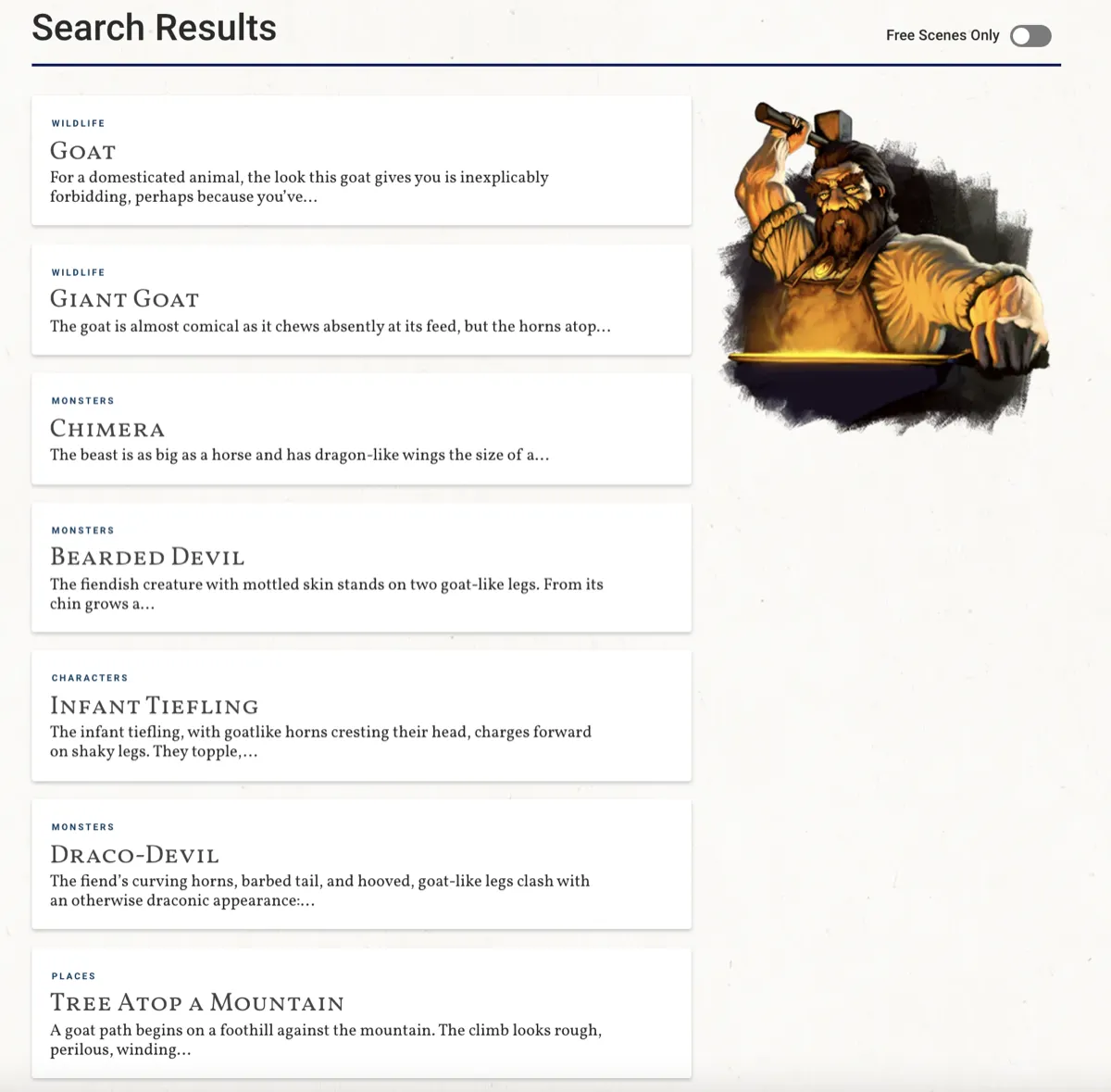
dScryb's search results page gave visitors no clear next step and no sign of what they could access. Search is a widely used feature on dScryb: a visitor enters a subject and sees matching scene listings. But a visitor who clicked a scene they could not open met an error message instead of a way to join.
In the original version, the control, three things stood between a search and a sign-up:
- No clear call to action. The only next step was to click the listing title.
- No sign of access. The listings did not say whether a result was free, or available at the visitor's membership level.
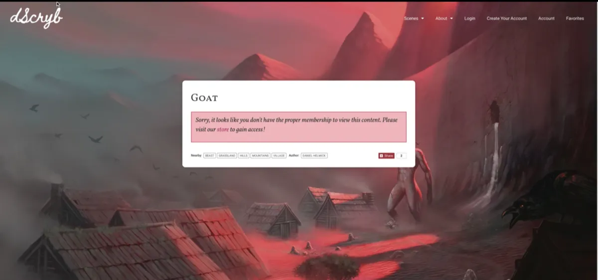
- An error at the worst moment. Clicking a result the visitor could not access (because they had no account yet, or needed a higher tier) showed an error notification asking them to go to the store page to sign up or upgrade.
What was the hypothesis?
The hypothesis behind the dScryb test was that adding call-to-action buttons to the search results would raise the rate of paid membership sign-ups. If every result showed what the visitor could do with it, and a locked result led to the store page instead of an error, more of the people who searched would go on to pay.
The reasoning is simple. A visitor who searches already wants something specific. The control made them guess whether they could have it, and punished a wrong guess with an error. Removing the guess, and the error, should keep more of that intent moving toward a sign-up.
What changed in the variant?
The dScryb test variant made three changes to the search results:
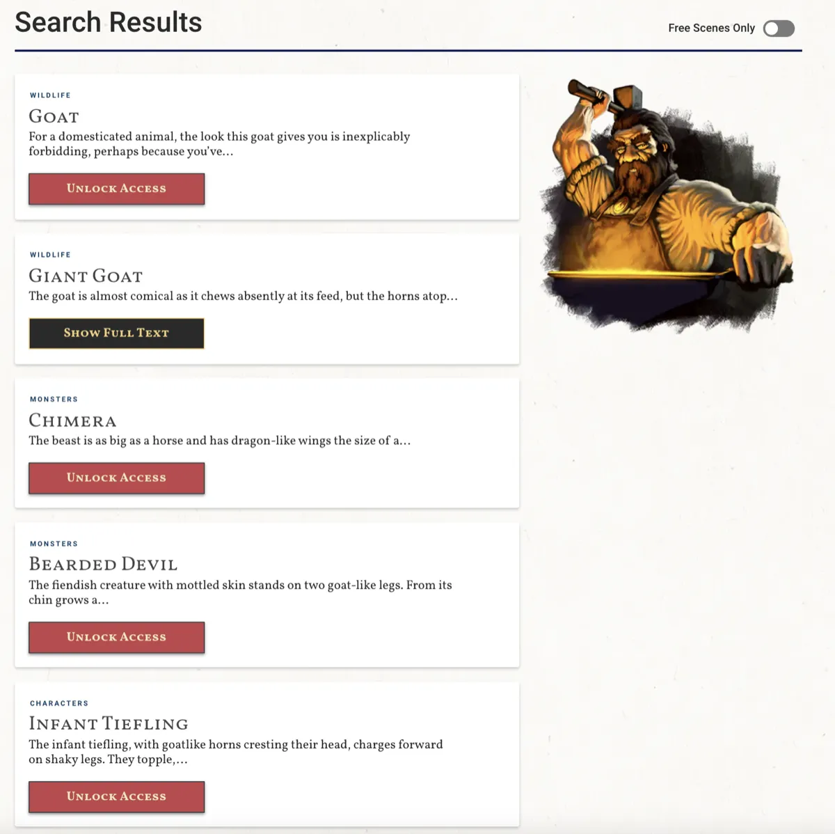
- A button on every result. Each search result got a clear call-to-action button.
- A label for the visitor's access level. The button said what the visitor could do at their account level, for example read the full text, or get access.
- No error message. Because the result already said what was available, the error message was no longer needed. It was removed, and visitors who needed access went straight to the store page.
| Element | Control (original) | Variant |
|---|---|---|
| Next step from a result | Click the listing title | A clear call-to-action button |
| Access level | Not shown | Shown on the button, by the visitor's account level |
| Clicking locked content | Error notification, then a trip to the store page | Straight to the store page |
How was the dScryb A/B test run?
The dScryb A/B test ran in VWO, Convertica's preferred testing software, on desktop and mobile, with traffic split equally between the control and the variant. It ran for 17 days, during which the website had 20,000 visitors, and it reached a 98% confidence level.
| Testing tool | VWO |
|---|---|
| Devices | Desktop and mobile |
| Traffic split | Equal, control and variant |
| Visitors to the website during the test | 20,000 |
| Duration | 17 days |
| Confidence level reached | 98% |
| Goal metric | Paid membership sign-ups |
Seventeen days covers more than two full weeks, so both weekday and weekend visitors appear in each version, a basic rule for A/B test duration. The result was read on the metric that pays, paid sign-ups, with clicks and revenue per visitor as supporting measures.
What were the results?
The dScryb variant beat the control at every step from search to revenue, desktop and mobile combined: more visitors clicked a call to action in the search results, more of them became paying members, and revenue per visitor rose with them.
+24%
Call-to-action clicks from the search results page, 17-day A/B test
Source: dScryb, VWO A/B test, desktop and mobile combined, 98% confidence
+49.4%
Paid membership sign-ups, 17-day A/B test
Source: dScryb, VWO A/B test, desktop and mobile combined, 98% confidence
+23.8%
Revenue per visitor, 17-day A/B test
Source: dScryb, VWO A/B test, desktop and mobile combined, 98% confidence
Why did it work?
The dScryb variant most likely worked because it answered the visitor's question before they had to ask it. The control asked visitors to guess whether they could read a result, and when they guessed wrong, the site answered with an error. The variant said what each visitor could do and offered the button to do it. A dead end became a route to the store.
It also removed a step. In the control, a visitor who wanted locked content had to click, read an error, then find the store page. In the variant, one click took them there.
What can you apply to your own site?
You can apply the dScryb approach to any site that gates content or products by membership, plan or paywall: find the places where a visitor meets something they cannot have yet, and turn each one into a clear, labeled route to getting it, then test that against what you have now.
- Treat search results as a high-intent page. A visitor who searches knows what they want. Give every result a clear next step.
- Show access before the click. Label each item as free, included in the visitor's plan, or available with an upgrade.
- Make the button say what happens. Read it, get access, upgrade: the label should match what the visitor can do at their level.
- Replace error messages with routes. An error on the way to a purchase is a conversion problem. Send the visitor to the place where they can buy.
- Measure the outcome that pays. Clicks are a signal; paid sign-ups and revenue per visitor are the result.
- Test on desktop and mobile, for full weeks, to a clear confidence level. The dScryb test ran 17 days on both and reached 98%.
Gated content raises a newer question too: can an AI agent tell what a visitor gets at each level, and what it costs? If plans and access rules live only in buttons and pop-ups, an agent may not be able to read them. Agent readiness is one of the eight checks in Convertica's free CRO audit.
To plan a test like this, the A/B test sample size calculator shows how much traffic you need, and the statistical significance calculator checks your result. For two sequential tests on a product page, read the JustThrive case study.
dScryb case study FAQ
What did the dScryb case study test?
It tested calls to action in dScryb's search results. The variant gave every result a clear button, showed what the visitor could do at their membership level, and removed the error message for locked content, sending visitors straight to the store page instead. The original search results page was the control.
How much did paid membership sign-ups increase?
Paid membership sign-ups rose 49.4% in a 17-day A/B test in VWO that reached a 98% confidence level, desktop and mobile combined. Call-to-action clicks from the search results page rose 24%, and revenue per visitor rose 23.8%.
How long did the dScryb A/B test run, and on how much traffic?
The test ran for 17 days, with traffic split equally between the control and the variant on desktop and mobile. The website had 20,000 visitors during the test period, and the test reached a 98% confidence level.
Why did revenue per visitor rise less than sign-ups?
The original case study does not break this down. Revenue per visitor is averaged over every visitor in the test, including people who never searched or bought, and new members can join at different levels, so it would not be expected to move in step with sign-ups. Both figures rose.
Should search results have call-to-action buttons?
On a site where search is a main route to products, it is worth testing. In the dScryb test, a clear button on every result, labeled for the visitor's access level, raised clicks from the search results 24% and paid membership sign-ups 49.4%. Results vary by site, so test it on yours.
What testing tool was used for the dScryb test?
VWO, which Convertica described as its preferred testing software at the time. The test ran on desktop and mobile with an equal traffic split between the control and the variant.
Can Convertica run this kind of test on my site?
Convertica starts with the free CRO audit, an app that checks your page for people and for AI agents while you watch. After it, CRO advisory, led personally by founder Kurt Philip with Convertica's CRO team, then gives you ongoing direction on what to fix and what to test while your team builds the changes. Or, with full implementation, Convertica's team builds the fixes from your audit. Both are priced after your audit.