Case study
Exit popup case study: an exit popup and sticky footer on an affiliate review site
This exit popup case study covers one test on an affiliate site that reviews products sold by online stores. Convertica added an exit popup and a sticky footer, both pointing visitors to the page's top product. Over three weeks, clicks across the ten tested pages rose 29.6%, and the original write-up reports sales per visitor at over 10x the original.
Exit popup case study at a glance
| Client | An affiliate site in the adult niche that reviews products sold by online stores (name kept private) |
|---|---|
| Vertical | Affiliate |
| What changed | An exit popup and a sticky footer, each with a call to action to the page's top product |
| Pages tested | 10 review pages |
| Test length | 3 weeks, to a 99% confidence level |
| Pages that won | 7 of 10 gained clicks; 6 of 10 gained orders and revenue |
+29.6%
Clicks, all 10 pages combined, 3-week test
Source: Affiliate review site, 10 pages, 3-week test, 99% confidence level
Over 10x
Sales per visitor, vs the original pages, 3-week test
Source: Affiliate review site, as stated in the original case study (raw numbers not published)
Which site was tested?
The site in this exit popup case study is an affiliate review site in the adult niche. It reviews products that are sold on several online stores, and it earns when a reader clicks through to a store and buys. Its name is kept private. The original write-up, published in March 2022, called it part 2 of an affiliate case study series.
What was the problem?
The problem was distance between the moment a reader decides and the next button. The review pages carried long sales copy with calls to action spaced far apart. On a phone in particular, a reader who thinks "yes, this one is for me" halfway down a review then has to scroll around to find a link, and some never do.
What was the hypothesis?
The hypothesis was that keeping a call to action for the page's top product in view at all times, and offering it once more as the visitor leaves, would send more readers to the store and lead to more sales. Both additions point to the same place: the top product's page on the store.
What changed?
Convertica added two elements to each tested review page, designed in house:
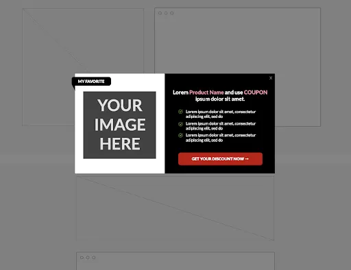
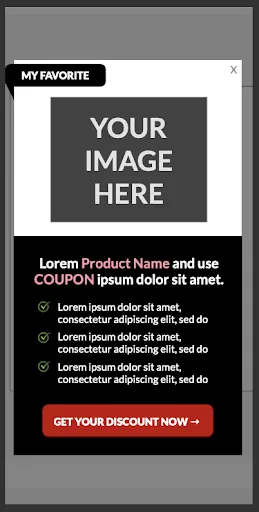
- An exit popup. A box shown to visitors who were about to leave, with a "My favorite" label, the top product's image, three short benefit lines and a call-to-action button.
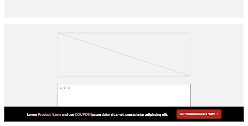
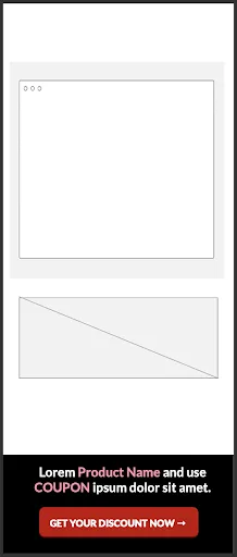
- A sticky footer. A slim bar fixed to the bottom of the screen with a line of copy and a button, always in view as the visitor scrolls.
Clicking either button took the visitor to the top product on the store's product page. The mockups below use placeholder text; they show the layout, not the final copy.
How was it tested?
The exit popup and sticky footer were split tested against the original pages on ten review pages at once. The test ran for three weeks, until it reached a 99% confidence level. Results were measured in clicks to the stores, then in orders and revenue, per page and for the ten pages combined.
What were the results?
Seven of the ten pages gained clicks, and across all ten pages clicks rose 29.6%. Six of the ten pages gained orders and revenue. The original write-up reports that sales per visitor rose to over 10x the original and revenue per visitor to over 50x.
Read the multiples with care. The case study does not publish the raw sales numbers, so they cannot be checked from the page. Multiples this large usually mean the pages started with very few sales, where a handful of extra orders changes the ratio a lot. Four of the ten pages did not gain orders at all. The 29.6% rise in clicks across all ten pages is the steadier measure of what the change did.
Why did it work?
The exit popup and sticky footer most likely worked because they put a call to action in front of readers at the moment they were ready, instead of making them hunt for one. On mobile especially, a long review with few buttons asks the reader to scroll back or search for a link. A button fixed just above the thumb removes that step.
Because both elements were added in one test, the case study cannot say which one did more. It also covers one site in one niche. The original write-up notes that simple tactics like these are among the best performers for many of Convertica's clients. On your site they are still a hypothesis until a test says otherwise.
What can you apply to your own affiliate site?
You can apply this exit popup case study to any review page with long copy: make sure a call to action for your top pick is always within reach, give leaving visitors one clear reason to click, and test the two separately so you know which earns its place.
- Find your long pages with few buttons. Scroll your top review pages on a phone and count how far a reader has to go to reach a link.
- Add a sticky call to action on mobile. One button for your top pick, fixed at the bottom of the screen, small enough not to cover the content.
- Make any popup easy to close and not intrusive. Google's guidance on intrusive interstitials and dialogs recommends small banners over overlays that block the page.
- Test one element at a time. This test changed two things at once; testing them in sequence tells you which one to keep.
- Judge the test on orders and revenue per visitor, not only clicks. Clicks can rise without sales following.
One more check for 2026: a popup that loads with JavaScript after a visitor moves to leave is invisible to an AI agent reading the page. Make sure your top pick and its link are also in the page's own HTML, so an agent or an AI search answer can find them. AI agent readiness is one of the eight checks in Convertica's free CRO audit.
For another test on a review site in the same niche, read the comparison table case study. For a sticky element on an Amazon affiliate site, read the product rating case study. To check a result of your own, use the statistical significance calculator.
Exit popup case study FAQ
What did this exit popup case study test?
It tested two additions on the review pages of an affiliate site: an exit popup, designed in house, and a sticky footer, a bar fixed to the bottom of the screen. Both showed a call-to-action button that took visitors to the page's top product on the store's product page. The original pages were the control.
What were the results of the exit popup test?
Across the ten tested pages, clicks rose 29.6% in a test that ran for three weeks and reached a 99% confidence level. Seven of the ten pages gained clicks, and six of the ten gained orders and revenue. The original write-up reports sales per visitor at over 10x the original and revenue per visitor at over 50x.
Why are the 10x and 50x figures so large?
The original case study does not publish the raw sales numbers, so the multiples cannot be checked. Multiples this large usually mean the pages started with very few sales, so a small number of extra orders moves the ratio a lot. Read them as a sign of how much the pages were missing, not as a forecast for another site.
Does a sticky footer help on mobile?
It can, especially on pages with long copy. On a phone, a reader who decides to buy halfway down a long review may have to scroll to find a button. A sticky footer keeps the call to action at the bottom of the screen, within thumb reach, the moment they are ready. In this test the sticky footer ran alongside an exit popup.
Do exit popups hurt SEO?
Google's guidance on intrusive interstitials warns against overlays that block content and recommends banners that take up a small part of the screen instead. An exit popup that appears when a visitor is leaving, and is easy to close, is less intrusive than one that covers the page on arrival, but check the current guidance before you launch one.
Which change worked, the exit popup or the sticky footer?
The case study cannot say. Both were added in the same test, so the results belong to the combination. If you want to know which element earns its place, test them separately, one after the other, against your current page.