
Form Design Best Practices For the Best Sign-up Forms that Convert
It’s a scenario we’ve all had to deal with far too many times.
You stand in a long queue for a long time in front of an office window. Then when your turn comes, the person in charge hands you a piece of paper. And with a dull and monotonous voice says, “Fill out this form. Next!”
As you look at it, you see all the blank lines you have to fill. And all the joy gets sucked out of you. No wonder many of us have an aversion to filling out forms.

I’ll tell you what though. Forms are indispensable in online commerce. From generating leads to selling to getting newsletter subscriptions, you will have to show your target visitors a form at some point.
The reality is it’s a delicate situation. You know that people inherently hate forms. And yet the person who’s about to answer it is on the edge of converting. This person has already made up his mind to engage with you. You’d think that because the motivation is there, the form is the least of his worries.
But that’s not the case. The form’s appearance intimidates your customers. And even though they’re motivated to interact with your site, it still gives them the same visceral response that standing in a queue in front of an office window induces.
That’s why testing sign-up forms on your website is one of the first tests to do especially during the early stages of your conversion rate optimization campaigns. From our many tests in Convertica, optimizing forms are one of the easiest things you can change that offer big returns. (Click here to see how we increased Empire Flippers’ conversion rates by 51.6% just by working on their valuation form)
And yet not many businesses spend that much time optimizing it.
But not you. Today, let’s talk about form design best practices. Let’s discuss all the little tweaks you can do to build the best sign up forms that convert
Form Design Best Practices For the Best Web Forms
1. Make forms short and easy to fill out
As soon as a customer sees a form, a lot of questions arise. “What personal information do I have to give up? What will I get in return? What’s in it for me? Is it worth filling out this form? How long will this take?”
They’ll then scan the form to find the answers to these questions. If the pros outweigh the cons, they proceed to start and fill it in. Because of this quick evaluation that people often do, first impressions matter.
So what do you do to give your online form a fighting chance?
Make the forms short and easy to answer. Long forms generally overwhelm people. A study by Marketing Experiments showed that every field you take away from a form increases conversions. In this study, they tested three different form variations with five, seven and nine form fields. The results of the study showed that the shorter the form, the higher the conversion. The one with 5 fields converted at 13.4% while the long-form converted at 10%.
So let this be one of the first things to consider when you design a form. This leads us to the next form design best practice…
2. Include only the things you need
Which data do you really need to reach the form’s one goal? And I mean only the absolutely necessary information you need. Be ruthless. Got that? Then only ask for that information.
Your goal once a target customer is already eyeing up the form is to get him to click the call to action button as quickly as possible. More form fields will only delay his journey. So be frugal with the information you ask from him. Other information can wait another day.
When deciding which fields to include, be aware that people tend to guard some information more than others. Giving up certain personal details triggers more anxiety. We’re only willing to give them up when we feel that the value we get is proportionate to the information we give.
Here’s an illustration from Marketing Experiments showing a few of the forms fields we often use. And the level at which each piece of requested information triggers people’s anxiety.
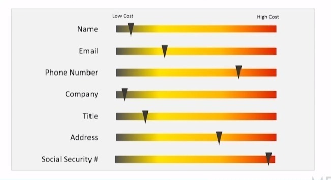
Study the image. You can see for example, that asking for someone’s phone number makes people more uneasy than asking for their email address. With this insight, you can do one of two things.
You can either
- Not ask for phone numbers
- If you really need it, let them know why
3. Arrange form fields in one column
One of the surefire ways to increase conversions is to ensure that you’re in control of the path your visitors take. Having multi-column layouts takes away that control from you.
How so?
A study by Baymard.com shows that users interpret multi-column forms in different ways. Edward Scott says,
“…some users may look at a multi-column form and think they only have to fill out one column. Some may view the columns and think there is a sequence they must follow, while others may assume there’s a different sequence entirely.”
This poses a problem for you. When different users interpret it in different ways, you are no longer in control of the conversion path. Stick to a single-column form so your customers better understand what you want them to do.
However, here’s another thing that the Baymard study found:
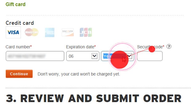
There are form fields that you can put together in multiple-column forms but will not confuse the user such as
- credit card details
- Name fields and
- City, state and zip code fields.
Just like what you see in the form below.
4. Make use of white space
Perception plays a big role in form design. You know your customers already have a pre-existing repulsion to forms. Without even realizing it, their brain’s immediate response when they see a form is, “Do I have to do this?”
And just as quickly, they make a mental calculation of the form’s ease of use. Their brains also decide how to quickly and easily finish the form.
That’s why from the onset, give your customer no reason to conclude that the form is going to be a pain. And how do you help him arrive at this conclusion? One of the easiest things you have in your design toolbox is the use of white space.
This may seem so trivial.
But this small visual change affects what a person feels about your form.
When elements in a form have very little white space, it looks too busy and overwhelming. It makes a person feel like there’s so much that needs to be done. It also makes the brain’s job of scanning the form a difficult one.
As Jan Tschichold said, “White space is to be regarded as an active element, not a passive background.”
5. Handle errors with grace for the best sign up forms
Imagine that at the end of every day, you’re not allowed to sleep unless you’ve correctly done everything you were supposed to do that day. Now imagine that you will only know if you’ve made any mistakes just when you’re about to sleep.
Ding. Ding.Ding. An alarm bell rings as you’re getting ready to go to bed. “You’ve made five errors today. Go back and do them again.” It won’t even tell you which one you got wrong. Imagine the frustration! The anger! The tantrum that will follow.
But that’s exactly what you do to customers when they answer a whole form and a message in red pops up when they click the submit button.
“We can’t process the form. You’ve made 5 errors, stupid!”
Okay. Maybe you don’t write the stupid bit. But that’s how the user feels. He feels like after all the work, he’s not getting close to finishing it. Or he’ll feel you’re the stupid one. And he will raise his hands in frustration and forego finishing the form.
Now imagine a different situation. Imagine that as you go about your daily activity, someone gently taps you on the shoulder whenever you make a mistake. And then, he tells you exactly how to fix it.
Isn’t that better? You wouldn’t be as irked by it and you’d be a much happier person at the end of the day.
When it comes to online forms, this is called inline validation. That is, you immediately show the error message right after it is carried out. This allows the person to correct it right away. And displaying validation errors is a user-friendly way to show your customers any errors they make.
But let’s not stop there. The timing of when you put an error also plays a big part in your users’ frustration level.
Alistapart did a study to see how validation errors affect form completion. In the study, the control showed the error/s only after the user had answered all the questions. For the variations, there were five. Each variation showed a different method of inline validation. Watch the YouTube video below to see the placements of the error messages in each variation.
The study concluded that when the errors were validated inline after answering each question, they saw a 22% increase in success rates. But that’s not all. Doing it this way, errors lessened, completion time decreased and customer satisfaction went up.
6. Clearly state required fields
My gut reaction to an optional active input field prominent is to exclude them. We know that a shorter form structure generally convert more than longer ones. So why bother asking for information that’s optional at this time? If you really don’t need it now, then get rid of it.
However, if you must include optional information, then clearly label the required fields. And how do you do this to maximize user experience? Use an asterisk before the label, preferably in red. ch
7. Make the CTA button stand out
I guess it’s safe to say that when it comes to optimizing form designs, the call to action button gets all the attention. Many CRO case studies have been devoted to optimizing it. That’s because the customer who gets to this part of the form is very close to converting. All it takes is a click.
And yet this small action — the click, comes with a lot of burdens. It triggers a lot of doubts and questions to the user. “What happens when I click this button?” “Where will this button lead me?” “Do I have to do more things after I click this?”
That’s a lot for the CTA button to be responsible for. That’s why CRO specialists devote a lot of time to it. It’s got a big responsibility at a crucial point in the transaction.
The good news is that because of the many CTA button case studies, there’s a lot of data that you can base conversion experiments on.
But for this article, here are some of the most important things to bear in mind.
- Make it stand out from the background.
- Work on the call to action text. Don’t just write submit. Make the words on the button match what’s going to happen after the person clicks it. Words like Add to Cart, Download my PDF, Audit my site, Subscribe are all descriptive words that signal to a person what’s going to happen when he clicks the button. For more on CTA buttons, see our post on this topic
8. Spend time on the copy
Imagine you’re in an office filling out a form. Then by sheer luck, the person at the desk offers to help. He nicely asks you how you’re doing and if there’s anything he could help you with.
When this happens, the experience of filling out the form is no longer as painful as it usually is.
Online, you don’t get this type of interaction. Forms are often cold elements on a screen, leaving you to work it all out yourself.
But they don’t have to be. You can make a web form warmer, more responsive and more conversational by using the power of words.
The copy acts like that friendly person in the office. It reminds the user of the value of what he’s getting. It helps lighten his mental load. It helps him understand the form. It gently nudges him when he’s made a mistake.
From the headline to the text in the CTA button, the words you use and how you say them play a pivotal part in convincing the customer to finish the form. You want him to think, “After I do this, I’m going to get something that will benefit me. So I’m going to finish this form.”
This was what MECLABS did in their study on web form design.
They made two variations against the control. Variation A had 14 fields while variation B had 9. When they did the test, variation A (the longer form) converted at 115% more than the control while variation B (the shorter one) converted at 89%. When they further studied why the longer form performed better, they concluded that it was the copy that made the difference.
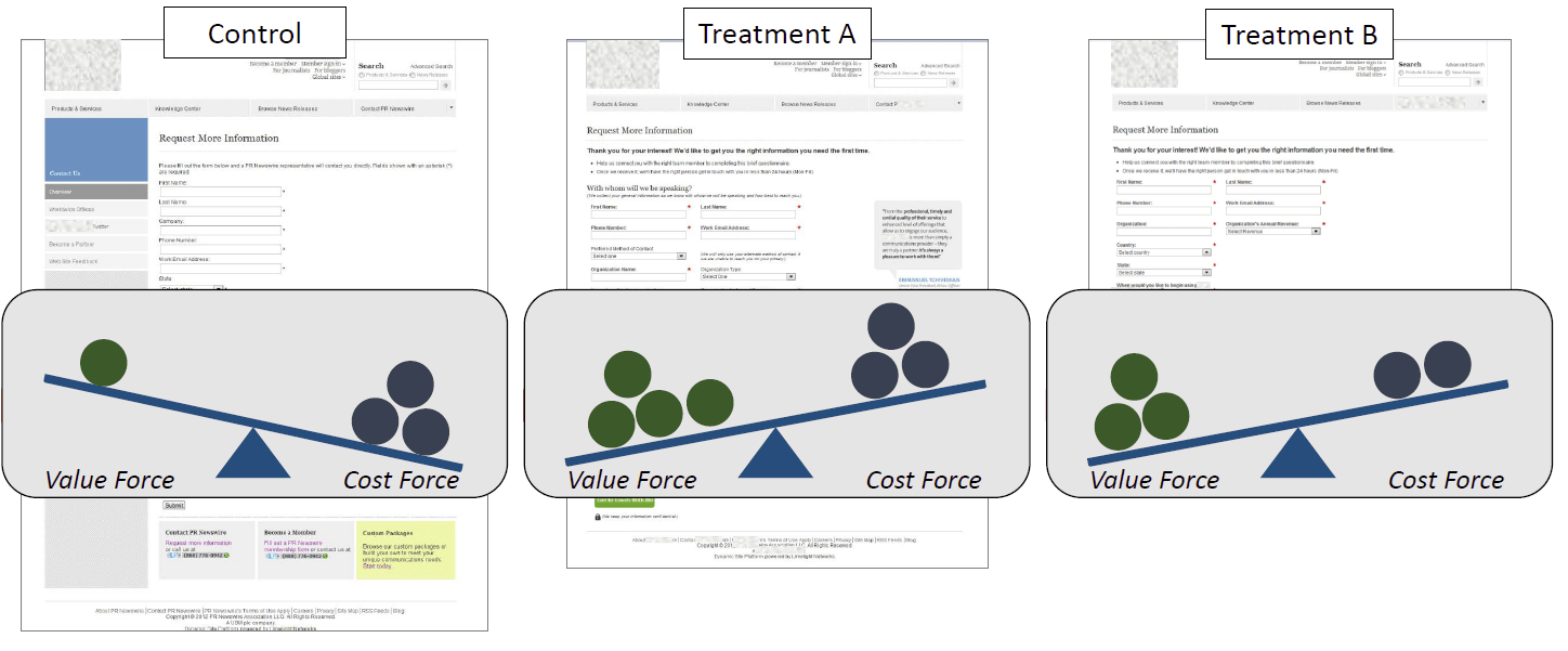
That’s because it was like a conversation between the company and the person filling out the form. The copy made it clear why the questions were important for the user’s future interactions with the business. In short, they made the value of each field clear to the user. He knew that they were not asking for information that only benefits the company. But it’s information that benefits the user as well.
And you know what’s even more impressive about this test? Every single person who answered the form filled out all the optional form fields. Every. Single. One. That’s because they knew that even though the input fields were optional, it would make their interaction with the company easier later on. This change in knowledge amplified by the copy made all the difference.
9. Add social proof
Third-party proof can go a long way in making a person see the value of what he’s signing up for. If someone else vouches for you, then the person who’s filling out the form gets a boost in confidence that he’s doing the right thing. If other people are happy with your offers, products or services, then he’s likely going to be pleased with them, too.
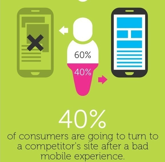
10. Design a separate form for mobile devices
Ideally, web forms should have a mobile-first design. However, I know that many websites don’t do this. But if most of your visitors visit the site using a small screen, then it’s in your best interest that web forms render well in mobile devices.
Why?
Mobile users have different psychology to people who access the internet using desktop devices. They have smaller screens, less freedom for keyboard controls and are usually on the move. Because using the keyboard on mobile can be challenging, then users have a lot less patience in finishing the forms. If desktop users want easy-to-use forms, mobile users require it even more.
11. Consider using “gamification” on web forms
We use this on Convertica’s site and it works wonders. We also applied the same concept on Empire Flippers’ valuation tool and increased conversions by 51.67%.
The rationale is simple. “Gamification” makes it easy for a user to answer forms online. Most of the time, he doesn’t have to use a keyboard. All he needs is a click of his mouse to answer most of the questions. Designing forms this way keeps typing on a keyboard to a minimum. All they have to do is click.
Click. Next step. Click. Next step. Click. Next step.

Do it like the above and you make your visitors’ lives easier. And this almost always increases form conversion rates.
Another important element of this type of form is that it puts you in control of what the person does next. And as I’ve said many times before, when you limit the activities of your users to the path you want them to take, conversions increase.
Lastly, look at how mobile-friendly it is. I have yet to see a form that does not benefit from being designed this way.
Give it a try. You’ll never look back.
12. Consider using form builders
Here’s the good news. If you aren’t a web developer or you want to build forms quicker, then a form builder software will make your job a breeze.
Many of them have a very short learning curve, so you could have a well-optimized form that follows best practices by tomorrow without learning how to code.
Some of the best form builders we’ve seen are:
13. Test the forms
And last but not the least. Test your checkout form. At the end of the day, all that I’ve listed here are best practices and you will never know how your new form design performs until you’ve tested it.
A form analytics software will tell you things like
- Which fields people always make errors on
- Which fields take a user a long time to answer
- Which parts customers decide to abandon the at
These insights give a wealth of knowledge to help you improve your form design for better conversions. Check out Zuko or Clicktale for this. Only feedback can prove that your forms are effective.
Conclusion
It all boils down to this. Your website visitors hate filling out forms. It’s your job to enlighten them so they see the value of answering them and clicking the add to cart button. Follow the form conversion best practices I’ve laid out above, and you’ll see that the form completion on your site increases. I challenge you to make it happen. Then tell me all about it in the comments section.
3 Comments
Submit a Comment

Hi, I’m Kurt Philip, the founder & CEO of Convertica. I live and breathe conversion rate optimization. I hope you enjoy our findings.
We’ve worked with over 1000 businesses in the last 6 years.
Let’s jump on a quick call to see how we can help yours.
Client Case Studies


Your work is greatly appreciated. It’s well written, well researched, not too fluffy, and insightful. Just wanted to say thank you.
Excellent post really love that. You pointed out MECLABS & Marketing experiments.
It’s all about that inline validation. It’s shocking to me. How many forms still don’t have it.
Most of the time it’s just set and forget the out-of-the-box forms. This will change as the market matures.