Plan a test
A/B test sample size calculator
How many visitors each variant needs before a test starts.
A/B testing
These A/B testing examples are real tests with published results: what each one changed, why, how it was tested and what happened. Most come from Convertica's own case studies, with the metric, timeframe and source for every number. After them you will find test ideas by page element and example hypotheses you can adapt.
An A/B test, also called a split test, shows two versions of the same page to different visitors at the same time and compares which one gets more people to take an action, such as buying or signing up. Version A is the current page, the control. Version B is the change. Traffic is split at random, so the only systematic difference is the change.
A simple example: an online store believes shoppers hesitate because they cannot see the delivery cost. Half its visitors see the current product page; the other half see the same page with the delivery cost under the price. After a planned number of visitors, the store compares orders from each group and checks the gap is bigger than chance.
These three A/B testing examples come from Convertica's published case studies, each written up by founder Kurt Philip. Every figure is quoted from the original write-up with its metric and timeframe. Each example shows the problem, the change, how it was tested and the result.
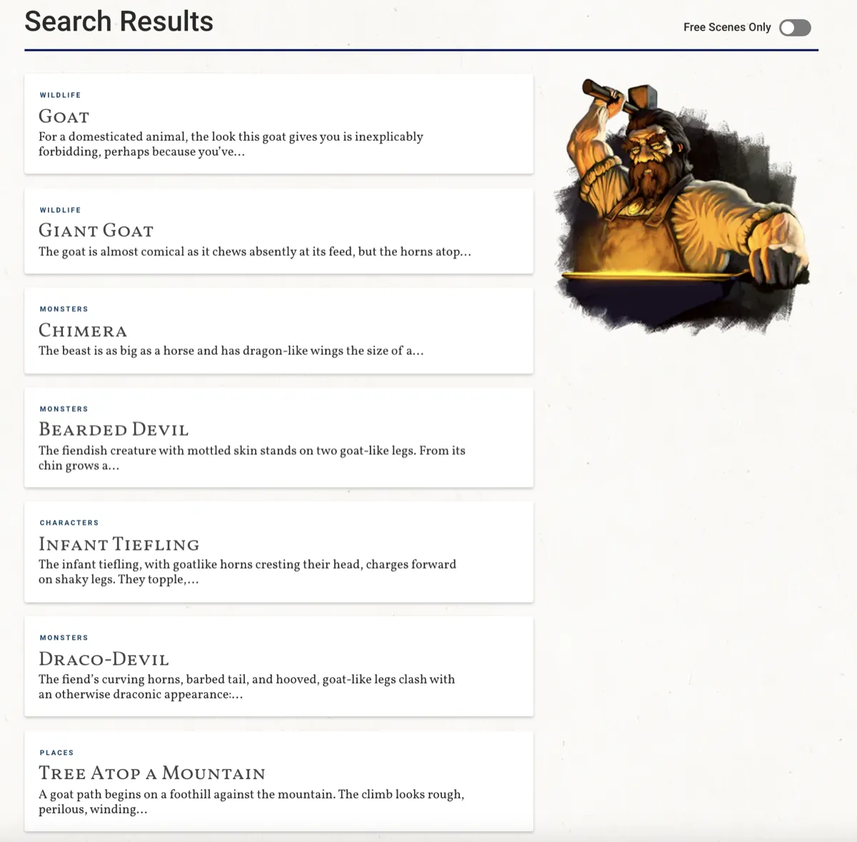
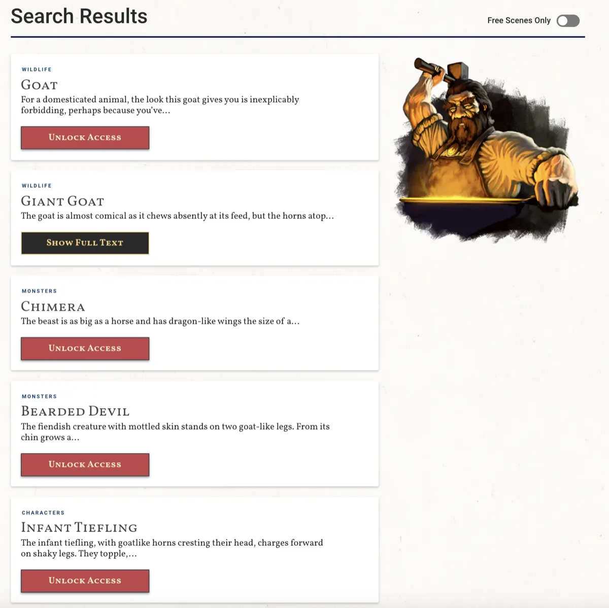
The problem. dScryb, a membership store selling boxed text called scenes for role playing games, showed locked content in its search results with no clear next step. Visitors who clicked a scene their account could not open hit an error message instead of a way to upgrade.
The change. Each search result got a call to action button that showed the action available for the visitor's access level, and the error was replaced by a link straight to the store page.
How it was tested. An A/B test in VWO on desktop and mobile, with traffic split equally between the control and the variant. It ran for 17 days, saw 20,000 visitors and reached a 98% confidence level.
+49.4%
Paid membership sign-ups, 17-day A/B test
Source: dScryb, paid membership sign-ups, 17-day A/B test, 98% confidence
+23.8%
Revenue per visitor, 17-day A/B test
The lesson. Search results are a page too. When a visitor is looking for something specific, show them the next step right where they found it. Call-to-action clicks from the search results page also rose 24%. Read the dScryb case study.
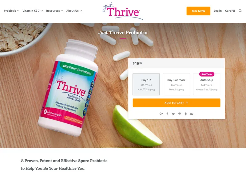
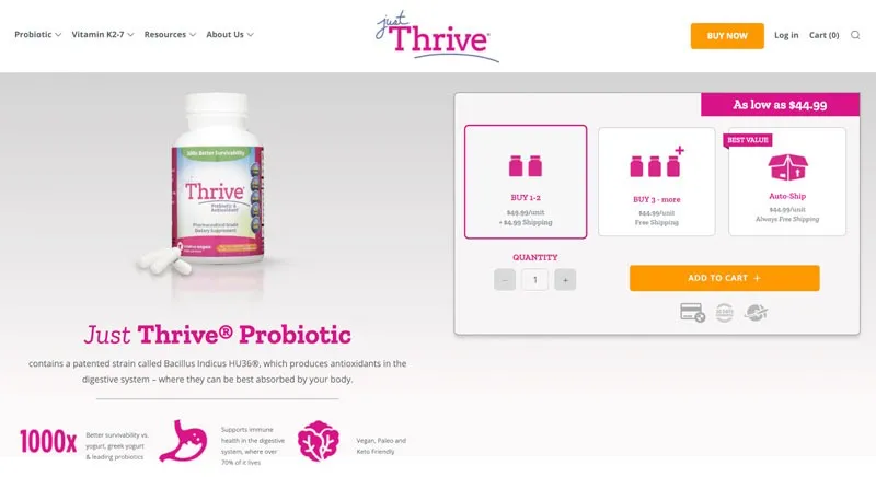
The problem. JustThrive, a supplement store, wanted more auto-ship subscriptions and a better return on its ad spend from the same product page traffic.
The change. The first variation added trust signals by the add to cart button and made the auto-ship offer more prominent, labeled best value. The second variation, tested against the first winner, made auto-ship the default option and changed several other elements.
How it was tested. Two sequential split tests on the live product page. Test 1 ran from 7 December to 15 January and reached 98% significance. Test 2 ran from 15 February to 24 March, measured against the test 1 winner rather than the original page.
+101.82%
Revenue, cumulative across two sequential split tests, 7 December to 24 March
Source: JustThrive, revenue, two sequential split tests, Dec to Mar
+85.19%
Auto-ship subscriptions, test 2 against the test 1 winner, 15 February to 24 March
Source: JustThrive, second split test
The lesson. A winning test is a new starting point, not the end. Testing the next idea against the winner, not the original, compounds the gains: the cumulative revenue figure is the two lifts multiplied together. Read the JustThrive case study.
The problem. The valuation tool on Empire Flippers, a marketplace for buying and selling online businesses, asked for a page of typed financial details right after the first click.
The change. The form became a step-by-step flow with one multiple-choice question per screen and a progress bar, so visitors were well into the process before typing any data. A later fix moved key buttons within easy reach of a thumb on mobile.
How it was tested. A split-URL test with a 50/50 traffic split. The new flow converted 40% better than the original within two weeks, but desktop visitors converted well ahead of mobile visitors. Form analytics in Formisimo, split by device, showed phone users struggling to reach controls near the top of the screen, which led to the mobile fix. The new process was then rolled out and measured.
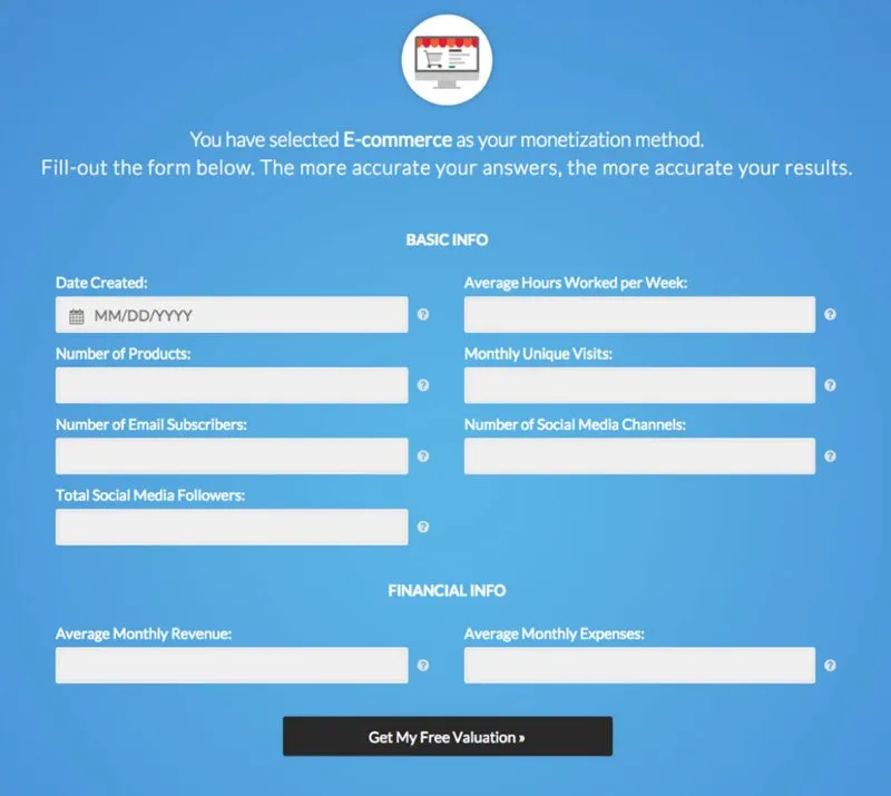
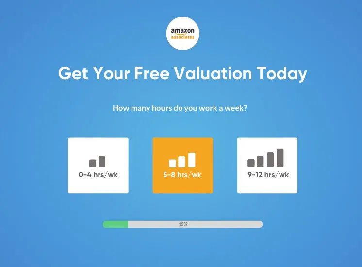
+51.6%
Conversions (valuation tool submissions), 47 days
Source: Empire Flippers, valuation tool submissions, 47 days, split-URL test then rollout
The lesson. Long forms lose people at the first hard question. Start with easy choices and save typing for later, then check each device separately: the device split in the first test pointed straight to the next improvement. Read the Empire Flippers case study.
Lead generation A/B tests usually change where and how the form appears, because the form is the conversion. These three Convertica case studies did not publish how long the tests ran, so treat the results as examples of what was tested rather than as benchmarks.
Two of the best-known A/B testing examples were written up by the people who ran them, which is why they are worth retelling. Both show the same thing: the version the team expected to win was not always the one that did.
In December 2007, the Obama presidential campaign tested its sign-up splash page: four button labels and six media items (three images and three videos), 24 combinations in all, as a multivariate test. According to Dan Siroker, the campaign's director of analytics, the winning combination of a "Learn More" button and a family photo converted 11.6% of visitors against 8.26% for the original page.
The surprise was the media. The team's favorite video lost, and Siroker writes that every video did worse than every image. Source: Dan Siroker, How Obama raised $60 million by running a simple experiment, Optimizely blog, 2010.
At Microsoft's Bing, an employee suggested a small change to how ad headlines were displayed. The idea sat in the backlog for more than six months because it was not seen as a priority. When an engineer finally ran it as an A/B test, it increased revenue by 12%, which the authors put at more than $100 million a year in the United States alone, without hurting user experience metrics.
Source: Ron Kohavi and Stefan Thomke, The Surprising Power of Online Experiments, Harvard Business Review, September to October 2017. The lesson is that small ideas are cheap to test and opinions about their value are often wrong.
The best A/B test ideas come from evidence on your own site, but most tests fall into a few families: the headline and offer, the call to action, forms, trust and proof, product information, pricing, checkout and navigation. The table pairs each with an example test and what it can teach you.
| Element | Example test | What it can tell you |
|---|---|---|
| Headline and offer | A headline that names the outcome against one that names the product | Which promise your visitors care about |
| Call to action | One primary button instead of three of equal weight | Whether choice is slowing people down |
| Forms | A step-by-step form against a single long form, as in the Empire Flippers example | Where people give up and which questions can wait |
| Trust and proof | Reviews and returns information beside the buy button instead of in the footer | Whether doubt at the point of decision is costing you |
| Product information | Delivery date and total cost shown under the price | Whether surprises later in checkout drive people away |
| Pricing | A subscription option set as the default, as in the JustThrive example | How defaults change what people choose |
| Checkout | Guest checkout offered before account creation | How much forced sign-up costs you |
| Search and navigation | Calls to action inside search results, as in the dScryb example | Whether visitors who know what they want can act on it |
Landing page A/B testing compares versions of a page built for one campaign and one action, so it is often the easiest place to start: the traffic source is known and there is a single goal. Common landing page tests change the headline to match the ad, the length of the page, the form and the proof shown beside it.
An A/B test hypothesis states what you saw, what you will change, for whom, and what you expect to happen to which metric. A clear hypothesis makes a losing test useful, because it tells you which belief was wrong. Use this format: because we saw [evidence], we believe [change] for [audience] will [result], measured by [metric].
Each one names its evidence. A test idea without evidence is a guess, and guesses are the tests most likely to waste your traffic.
To run an A/B test, find a page that is losing visitors, write a hypothesis from evidence, calculate the sample you need, build the variant, split traffic at random, run to the planned sample in whole weeks, then check significance and roll out or learn. The steps below are the same ones the examples above followed. For the full method, read the complete A/B testing guide.
Use analytics to find a busy page or step where many visitors leave. That is where a test can matter.
Use heatmaps, recordings, polls and support questions to explain why people leave, then write the change you expect to help.
Enter your baseline and the smallest lift worth detecting in the A/B test sample size calculator, then work out how long to run the test.
Change as few things as you can, so you know what made the difference. Check it on every device and browser before launch.
Use an A/B testing tool to split visitors at random and keep each visitor in the same version.
Do not stop early because one version is ahead. Leave the page, the offer and the tracking alone until the test ends.
Check the result with a statistical significance calculator, look at desktop and mobile separately, and write down what you learned, win or lose.
Successful A/B testing examples share a handful of habits: they start from evidence, they measure a result that matters to the business, they run to a planned sample, they check devices separately, and they treat each winner as the next control. None of them came from copying another site's test.
That last point matters. Copying a winning test from another site rarely works, because your visitors, offer and traffic are different. Use these A/B testing examples for ideas, then test them on your own evidence.
Plan and read your own tests with Convertica's free calculators. Each shows its formula and a worked example.
Plan a test
How many visitors each variant needs before a test starts.
Check a result
Whether a finished A/B test result is statistically significant.
Measure
Conversion rate from visitors and conversions, with the formula.
A/B testing examples show what happens when two versions of a page are shown to different visitors at the same time and compared on one action. The best ones change one meaningful thing and measure a business result: dScryb added calls to action to its membership search results and raised paid sign-ups 49.4% in a 17-day test.
Good A/B testing examples change one meaningful thing and measure a business result. Convertica's dScryb test added calls to action to membership search results and raised paid sign-ups 49.4% in a 17-day test. A JustThrive product page test was followed by a second test against the winner, and revenue rose 101.82% across the two.
An A/B test shows two versions of a page to different visitors at the same time and compares how many of each group convert. For example, half your visitors see a product page with reviews beside the add to cart button and half see the current page, and you compare orders from each group.
To do A/B testing, pick one page and one goal, write a hypothesis, build a variant that changes one thing, and split traffic at random between the original and the variant. Run the test until it reaches the sample size you calculated in advance, then compare conversion rates with a significance test before you ship the winner.
Large online companies run A/B tests at scale: in a 2017 Harvard Business Review article, Ron Kohavi and Stefan Thomke wrote that Microsoft, Amazon, Booking.com, Facebook and Google each conduct more than 10,000 online controlled experiments a year. Smaller sites use the same method on fewer, bigger changes, because they have less traffic to split.
A/B test first on your busiest page that loses the most visitors, and test a change backed by evidence such as analytics, session recordings or visitor feedback. Headlines, calls to action, forms and the information near the buy button are common starting points because they sit at the point of decision.
A good A/B test hypothesis names the evidence, the change, the audience and the metric. For example: because recordings show mobile visitors scrolling past the price, moving the price and delivery date above the image will raise mobile add to cart rate. It is testable and tells you what you learned either way.
An A/B test should run until each variant reaches the sample size you planned before launch, rounded up to whole weeks, and at least one full week. The dScryb example ran for 17 days and reached a 98% confidence level. The free sample size calculator shows how long your own test needs.
No. Many A/B tests end with no clear winner or a loss, and that still has value, because it stops you shipping a change that would not have helped. In the Obama 2008 campaign test described by Dan Siroker, every video variation did worse than every image.
An A/B test compares whole versions of a page, usually the control against one variant. A multivariate test changes several elements at once and tests every combination, like the Obama campaign's 24 combinations of buttons and media. Multivariate tests need far more traffic, because the visitors are split across many more versions.
You can, but test bigger changes on your busiest pages and measure a goal close to the change, so the test finishes in a reasonable time. Where traffic is too low for any test, fix clear problems directly. Convertica's free CRO audit ranks what to fix and what to test.

Ask Convertica
Convertica
Hi, I'm Convertica's AI assistant. Ask me anything about the free CRO audit, the one page and full site rebuilds, or any of the free tools.