What do these CRO examples teach?
These CRO examples teach a method more than a tactic. In each one, the team found the exact step where visitors hesitated, changed that step to remove effort or doubt, and tested the change against the original before calling it a win. The pages and the numbers differ; the sequence is the same. The three most detailed write-ups, one each from lead generation, eCommerce and membership, show it best.
Empire Flippers: make a form feel like an app
The goal. Increase submissions from the Empire Flippers valuation tool by 50%, a target set before any work started.
What was found. The first step was a single click. The next screen was a static form that asked for a lot of typed input straight away. Kurt Philip had bought and sold sites on the marketplace himself, and this was the point where he had felt the friction as a user.
What changed. Multiple-choice and yes or no questions replaced open fields, sliders replaced typed income and expense figures, progress was made visible, and the Next button was dropped. A visitor was 40% of the way through before typing any data.
How it was tested. A split-URL test sent half of the traffic to each version. The new flow showed +40% conversions in the first two weeks of the test, so it was rolled out to all traffic.
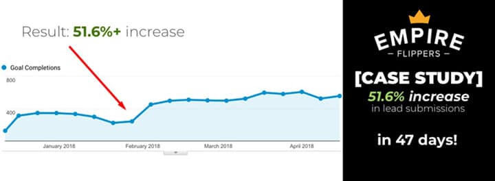
The result. +51.6% conversions (valuation tool submissions) in 47 days, according to the original case study.
The lesson. Ask for easy answers first and specific numbers last. Then split the results by device: on the new flow, desktop visitors converted well ahead of mobile visitors (36% vs 26% conversions in the first split-URL test), and that gap led to a mobile layout with the important controls within thumb reach. Read the Empire Flippers case study.
JustThrive: remove doubt at the moment of purchase, then test again
The goal. More auto-ship subscriptions and a better return on ad spend for a supplement store whose traffic came mostly from search and paid ads.
What was found. A review of Google Analytics and heatmaps, plus two observations about the market: buyers of supplements tend to arrive wary, and a choice between several variations of one product at the moment of purchase creates friction.
What changed, test 1. Less visual clutter around the product images, trust signals beside the Add to Cart button (a 30-day guarantee, secure payment and shipping icons in place of social media icons), and a more prominent auto-ship option with its free shipping emphasized. Run from 7 December to 15 January at 98% significance: +25.4% conversion rate, +41.5% auto-ship subscriptions and +30.4% revenue against the control.
What changed, test 2. Run against the test 1 winner, with several elements changed at once; the main one made auto-ship the default option. From 15 February to 24 March: +85.19% auto-ship subscriptions, +53.73% orders and +54.77% revenue against the test 1 winner.
The result. +101.82% revenue, cumulative across the two split tests (1.304 x 1.5477 = 2.0182), 7 December to 24 March.
The lesson. Run the next test against the last winner, not the original, so gains compound. Be clear about what a test with several changes tells you: the team changed several elements in test 2 to get a faster answer, against its usual rule of changing as few as possible, so the result shows the package worked, not which element did the work. Read the JustThrive case study.
dScryb: put the next step where the visitor already is
The goal. More paid membership sign-ups for dScryb, a membership store that sells boxed text, called scenes, for role-playing games.
What was found. Search is a widely used feature on the site, but the results had no call-to-action buttons, did not say whether a result was free or open to the visitor's membership level, and a click on restricted content showed an error asking the visitor to go to the store page.
What changed. A clear call-to-action button on every result, with wording based on what the visitor's account level allows. The error message was removed: visitors who needed access went straight to the store page.
How it was tested. An A/B test in VWO on desktop and mobile, with traffic split equally between control and variant. It ran for 17 days, saw 20,000 visitors and reached a 98% confidence level.
The result. Desktop and mobile combined: +24% call-to-action clicks from the search results page, +49.4% paid membership sign-ups and +23.8% revenue per visitor.
The lesson. Replace dead ends with a next step. And measure past the click: clicks are an early signal, so the test also tracked paid sign-ups and revenue per visitor, the numbers the business actually runs on. Read the dScryb case study.