Case study
Product page redesign case study: desktop order completion rate up 56%
This product page redesign case study follows an online retailer that wanted cleaner, more modern product pages and an easier route to checkout. The redesign added a sticky Add to Cart and Buy Now bar. Convertica tested the new pages against the old ones on desktop and mobile.
Product page redesign case study at a glance
| Client | An online retailer (name not published) |
|---|---|
| Vertical | eCommerce |
| Goals | A cleaner, more modern product page and a quicker route to checkout |
| Page tested | Product pages |
| Change tested | A redesigned layout and interface, plus a sticky Add to Cart and Buy Now bar |
| Test | New design vs the original, desktop and mobile, 98% confidence on desktop |
| Test length | Not published in the original case study |
| Desktop order completion rate | +56% |
|---|---|
| Desktop revenue per visitor | +33.3% |
| Desktop confidence | 98% |
| Mobile | No significant change |
| Test length | Not published |
What did the retailer want from the redesign?
The online retailer set two objectives for its product pages. The first was to modernize the layout and user interface, for a cleaner and more modern design. The second was to make buying easier and quicker, by adding a sticky bar with Add to Cart and Buy Now buttons that stays on screen as the shopper scrolls.
Both goals aim at the same moment: the point where a shopper who likes the product decides to buy it. A cluttered page makes that decision harder to reach, and a long page can scroll the buy button out of sight just when the shopper is ready.
What changed in the redesign?
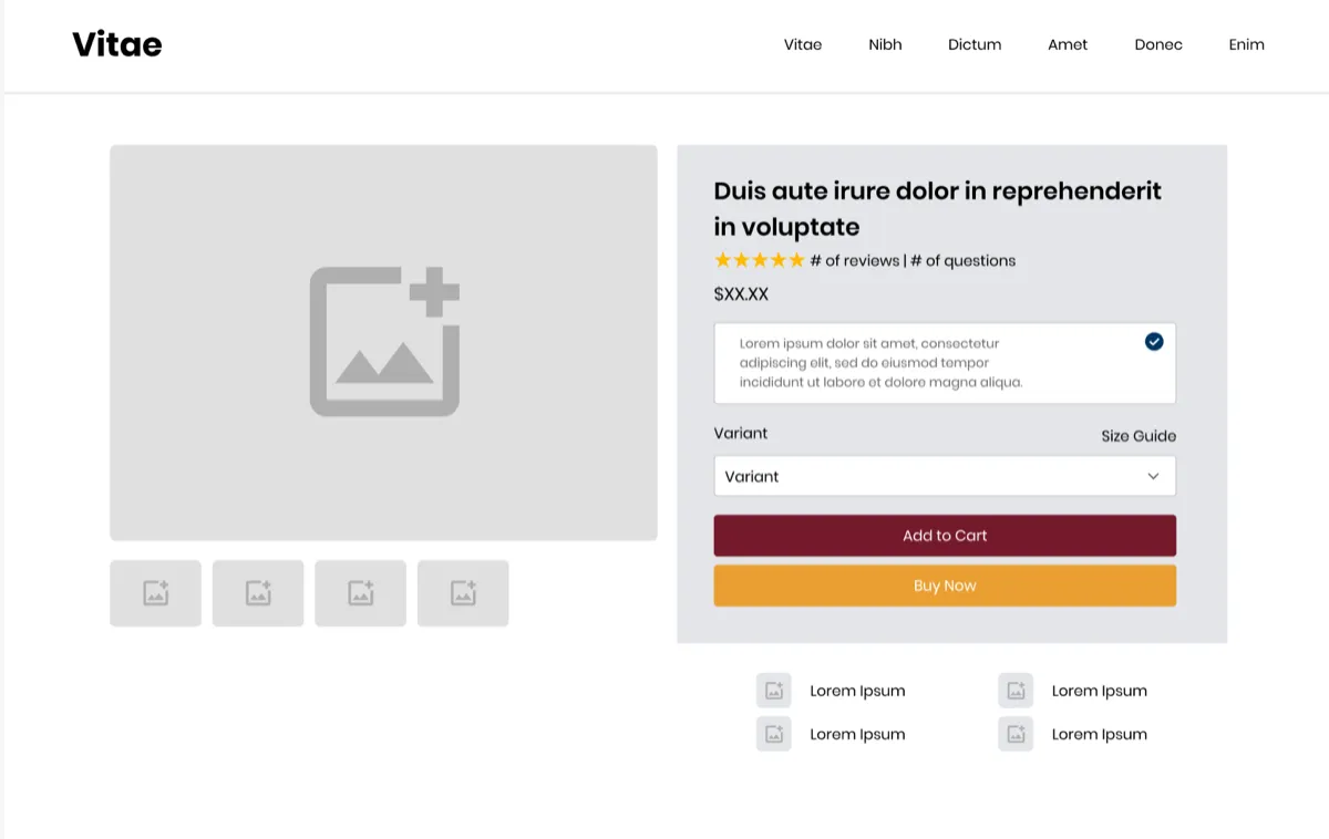
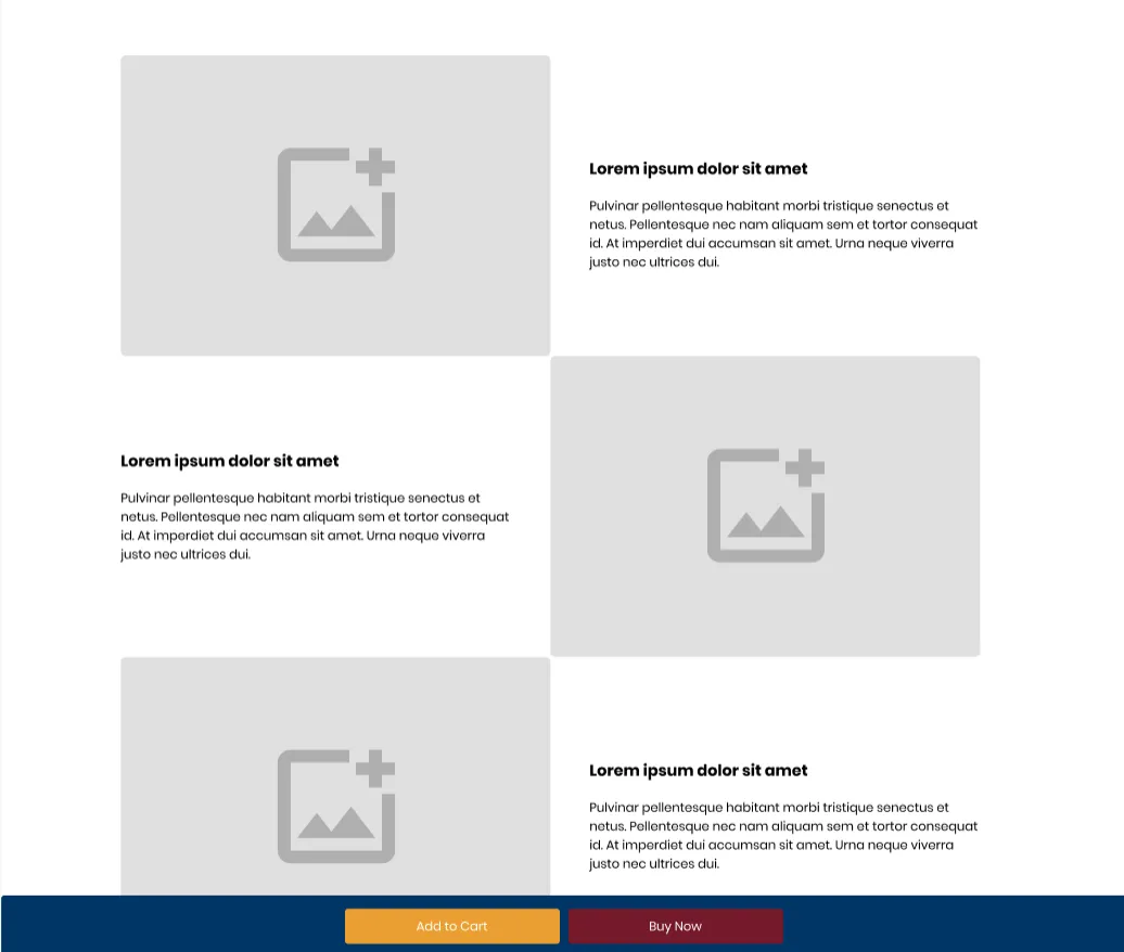
The redesign changed the product page in two ways. Convertica's mockups of the new design show:
- A cleaner buying area. The product title, star rating with review and question counts, and the price sit together at the top of a shaded panel beside a large product image and thumbnails. Below them come a selectable product option, a variant menu with a size guide link, then Add to Cart and Buy Now buttons in contrasting colors, and a row of four short feature points under the panel.
- A sticky Add to Cart and Buy Now bar. As the shopper scrolls down through the product details, a bar fixed to the bottom of the screen keeps both buttons in reach.
What was the hypothesis?
The hypothesis was that a cleaner product page, with the buy buttons always in reach, would help more shoppers complete an order. A modern, uncluttered layout makes the product and its price easier to take in, and the sticky bar removes the need to scroll back up to buy, which shortens the journey to checkout.
How was the product page redesign tested?
The product page redesign ran in two phases. First, design and development: the new product page layouts and the sticky bar were designed and built. Second, testing and data collection: the new design was deployed on a test basis against the original pages, with results measured on desktop and mobile separately.
| Phase 1 | Design and development of new product page layouts and the sticky bar |
|---|---|
| Phase 2 | New design deployed on a test basis against the original; data collected |
| Devices | Desktop and mobile, reported separately |
| Measures | Order completion rate, revenue per visitor, funnel steps |
| Confidence reached | 98% on desktop |
| Test length, traffic split and sample size | Not published in the original case study |
What were the results?
On desktop, the product page redesign raised the rate of order completion by 56% and revenue per visitor by 33.3%. Improvements were consistent across every step of the sales funnel, and the result reached a 98% confidence level. On mobile, the redesign did not significantly affect the rate of order completion or revenue per visitor.
Two notes on reading these figures. The original case study does not say how long the test ran, so they are shown without a duration. And the 56% is a rise in the order completion rate, the share of desktop visitors who completed an order, not a count of orders, even though the original page title speaks of orders.
Why did the redesign not help on mobile?
The redesign was neutral on mobile: it did no harm, and it did no good. The original case study suggests that mobile shoppers may have different preferences or behavior that the redesign did not address. That is a fair reading, but the test did not examine it directly.
A design built and judged mainly on a large screen often reaches mobile as a squeezed version of itself. Mobile product pages already stack every element in one column, and some mobile themes already keep a buy button close at hand, so a sticky bar may add less there than on desktop. These are possibilities, not findings.
What did Convertica recommend?
- Roll out on desktop. Given the significant desktop result, Convertica recommended implementing the redesign across all desktop product pages.
- Rethink mobile. Further analysis, and possibly a separate redesign strategy for mobile product pages, built around how mobile shoppers behave.
Why did the redesign work on desktop?
The product page redesign most likely worked on desktop because it made buying easier at the moment of decision. A cleaner buying area put the price, the reviews, the options and the buttons in one place, and the sticky bar kept Add to Cart and Buy Now in reach as shoppers read further down the page.
Because the redesign changed several things at once, the test cannot say which change did the most work. The result belongs to the whole package. That is the trade-off of a redesign test: a bigger, faster answer, but a less specific one.
How do you test a product page redesign?
You can test a product page redesign in six steps: decide what the redesign must achieve, build it around the buying decision, test it against your current page, read desktop and mobile separately, roll out where it wins, and then test the parts to learn what mattered.
- Set one or two clear goals. Here: a cleaner page and a quicker route to checkout.
- Design around the buying area. Title, rating, price, options and buttons together, with nothing competing for attention.
- Keep the buy buttons in reach. On a long page, a sticky bar is one way to do it. Test it rather than assume it.
- Test the new page against the old one. A redesign that looks better can still sell less.
- Read each device on its own. Here desktop won and mobile was flat. Design mobile for mobile.
- Break the winner down. Follow-up tests on single elements show which parts of the redesign earned the gain.
A redesign is also a chance to check how AI shopping agents read your product page. Price, options, availability and reviews should be in the page's HTML as plain text, not only in images or script-driven widgets. Agent readiness is one of the eight checks in Convertica's free CRO audit.
For another test that won on desktop only, read the ecommerce search bar case study. For a sticky buy button tested on its own, read the sticky CTA case study. For two sequential product page tests, read the JustThrive case study. To plan your own test, the A/B test sample size calculator shows how much traffic you need.
Product page redesign case study FAQ
What did the product page redesign case study test?
It tested a redesigned product page against the original on an online retailer's store. The redesign modernized the layout and interface and added a sticky Add to Cart and Buy Now bar that stays on screen as the shopper scrolls. Results were measured on desktop and mobile separately.
How much did the product page redesign increase orders?
On desktop, the rate of order completion rose 56% and revenue per visitor rose 33.3%, with improvements at every step of the funnel and a 98% confidence level. On mobile, the redesign had no significant effect on either measure. The original case study does not state how long the test ran.
Is the 56% an increase in orders or in the order completion rate?
In the order completion rate. The original page title speaks of a 56% increase in desktop orders, but its results section reports a 56% increase in the rate of order completion on desktop. This page uses the measure from the results section, which is the share of desktop visitors who completed an order.
Which part of the redesign caused the increase?
The test cannot say. The redesign changed the layout, the interface and the purchase controls at once, so the result belongs to the whole package. The original case study credits the cleaner design and the sticky Add to Cart and Buy Now bar together. Isolating one change would need its own test.
Why did the redesign not help on mobile?
The original case study does not know for certain. It suggests mobile shoppers may have different preferences or behavior that the redesign did not address. Convertica recommended rethinking the mobile strategy, possibly with a separate mobile redesign, rather than assuming the desktop design would work everywhere.
Should I redesign my product page or test one change at a time?
Both have a place. A redesign can deliver a large gain at once, as it did on desktop here, but it hides which change worked. One change per test is slower but tells you exactly what helped. A common path is to test a redesign, then test its parts one by one.
Can Convertica run this kind of test on my store?
Convertica starts with the free CRO audit, an app that checks your page for people and for AI agents while you watch. After it, CRO advisory, led personally by founder Kurt Philip with Convertica's CRO team, then gives you ongoing direction on what to fix and what to test while your team builds the changes. Or, with full implementation, Convertica's team builds the fixes from your audit. Both are priced after your audit.