
eCommerce Case Study – See How We Got a 42.38% Conversion Rate Increase
In our latest eCommerce case study, we’ll show you how we repositioned the reviews section on two sites for increased conversions.
The Websites:
The first website is a niche bedding store based in the USA. They sell premium bedding designed in the states.
The second website is a jewellery store, specialising in beaded bracelets. They are based in the USA but ship their products worldwide.
Test Details & Background:
We repositioned the reviews section on the product pages so that it appeared earlier on the page and was more readily visible to customers. Beforehand, the customer reviews were at the very bottom of the page.
We placed the reviews before the recommended/suggested products, and by doing so we hoped to increase trust with shoppers.
We tested the changes on mobile and desktop on both sites.
We ran the tests for 2 weeks to reach a 98% confidence level.
Traffic allocation was set to 50/50.
Test Set-up:
The version with the review section higher up the page looked like this on Desktop:
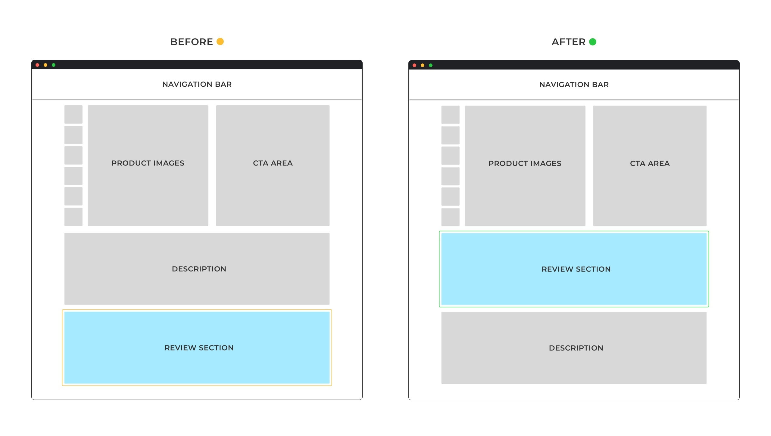
Mobile:
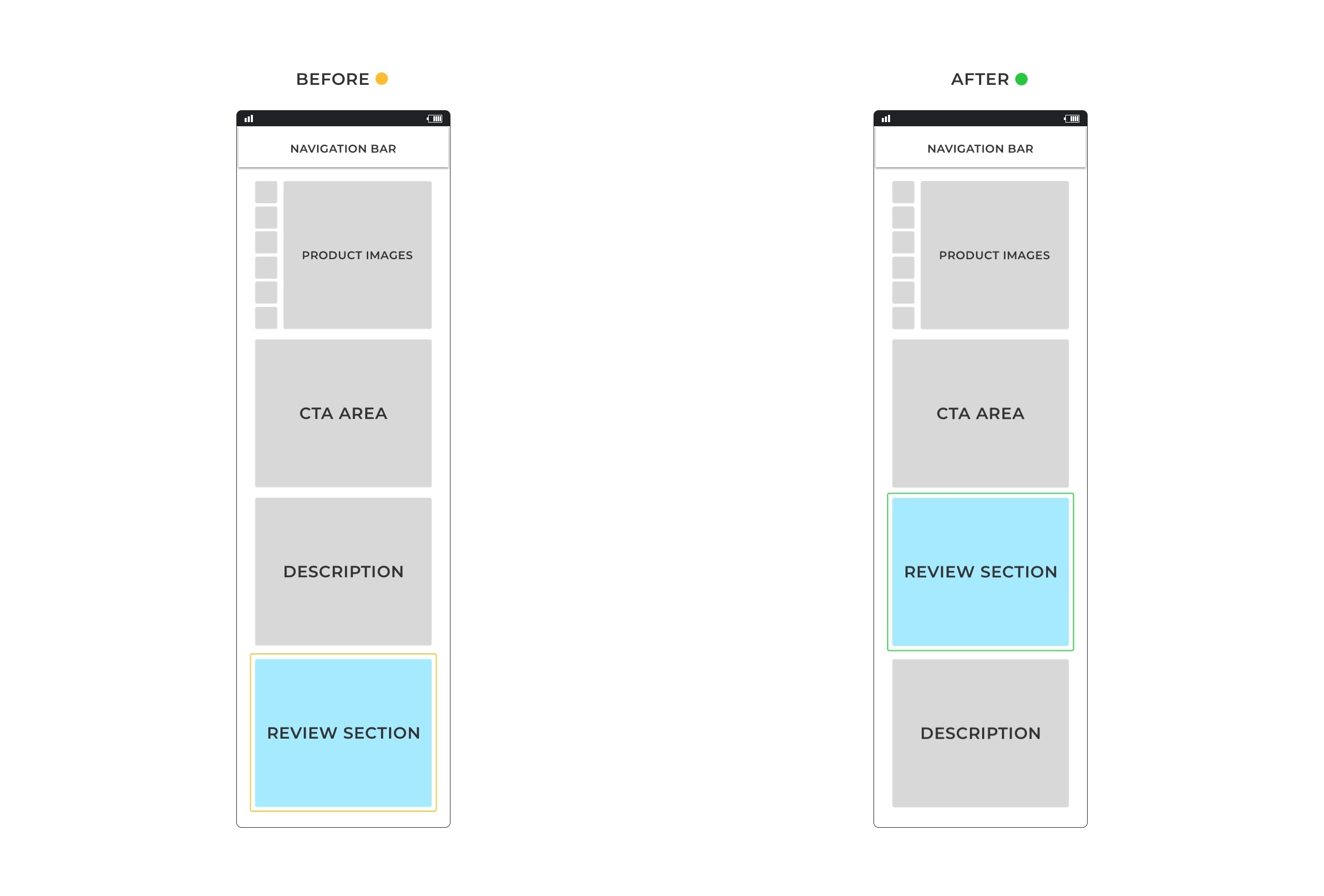
We placed the reviews just under the product, just below the fold and above the product comparison and detailed description/features.
The Results:
The repositioned reviews section won on both sites, but only on mobile on one, and only on desktop on the other.
The bedding store saw increases in conversions (order per visitor) on mobile only, with an overall 42.38% increase in orders.
We saw conversion increases in all the different steps of the funnel (users proceed to the cart page, users proceed to the checkout page, and users complete their purchase).
The revenue results (revenue per visitor) were consistent with our funnel results where we saw increases in all steps of the funnel on mobile.
For the jewellery store, interestingly they only saw increases in conversions (order per visitor) on desktop, with a 20.34% increase in completed orders.
We also saw increased conversions in all steps of the funnel on desktop (users add to cart, users checkout, users are redirected to thank you page).
The revenue results (revenue per visitor) were consistent with our funnel results where we saw increases in all steps of the funnel on desktop.
By rolling out the winner only on desktop, the total impact would be a 2.9% increase in the rate of order completion and 2.2% increase in revenue per visitor.
Key Takeaways:
- For this test to work for your website, you will need to have good reviews first.
- A/B testing this change first is important, as we have shown, one saw increases on mobile and the other on desktop.

Hi, I’m Kurt Philip, the founder & CEO of Convertica. I live and breathe conversion rate optimization. I hope you enjoy our findings.
We’ve worked with over 1000 businesses in the last 6 years.
Let’s jump on a quick call to see how we can help yours.
Client Case Studies


0 Comments