Case study
Variant selector case study: a redesign that lifted conversion rate 144.8% in three weeks
This variant selector case study shows how an eCommerce store selling configurable bathroom furniture redesigned the way shoppers choose product options. Seven plain option rows, most reading "No Selection", became labeled panels with visual swatches. In a three-week test, conversion rate rose 144.8% at 98% confidence and revenue per visitor rose 83.9%.
Variant selector case study at a glance
| Client | An eCommerce store selling configurable bathroom furniture with many options (not named in the original case study) |
|---|---|
| Vertical | eCommerce |
| Page tested | The product page's variant selectors |
| Change tested | Labeled option panels, image swatches grouped by finish, a clear "Not Required" choice and a dropdown for size |
| Test | A/B test, three weeks; mockups for desktop and mobile; results reported for the test as a whole |
| Metrics | Conversion rate, revenue per visitor and click-through rate at each funnel step |
+144.8%
Conversion rate, Three-week test
Source: Variant selector redesign, A/B test, three weeks, 98% confidence on conversion rate
+83.9%
Revenue per visitor, Three-week test
Source: Variant selector redesign, A/B test, three weeks (confidence level not stated for this metric)
What is a variant selector?
A variant selector is the part of a product page where shoppers choose which version of a product they want, such as a size, color, material or optional extra, before adding it to the cart. Simple products need one selector. Configurable products, like the bathroom furniture in this case study, can need half a dozen or more.
When there are many options, the variant selector stops being a detail and becomes the main task on the page. If shoppers cannot see their choices or tell which ones they still need to make, many give up before the Add to Cart button.
What was wrong with the original variant selectors?
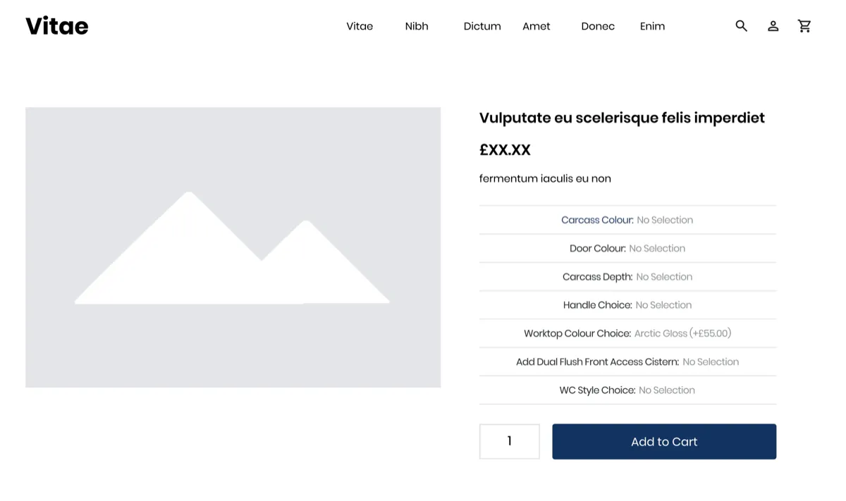
The original product page listed seven options as plain text rows: carcass color, door color, carcass depth, handle, worktop color, an optional cistern and a WC style. Six of the rows read "No Selection" (the worktop showed a default finish), and the rows themselves did not show what the choices were. A shopper could not see the finishes, could not tell which options were optional and had no sense of how much was left to do.
The original write-up describes the work as a thorough analysis of the existing layout to find areas to improve and the bottlenecks that could get in the way of the shopper.
What was the hypothesis?
The hypothesis was that a more intuitive variant selector, one that makes it easy to see and choose each product option, would lead more visitors to buy and raise revenue. The redesign aimed to make the options easier to navigate and the shopping experience smoother from the first choice to the order.
What changed in the variant selector redesign?
The redesign kept the same options, in the same order, and changed how they were presented:
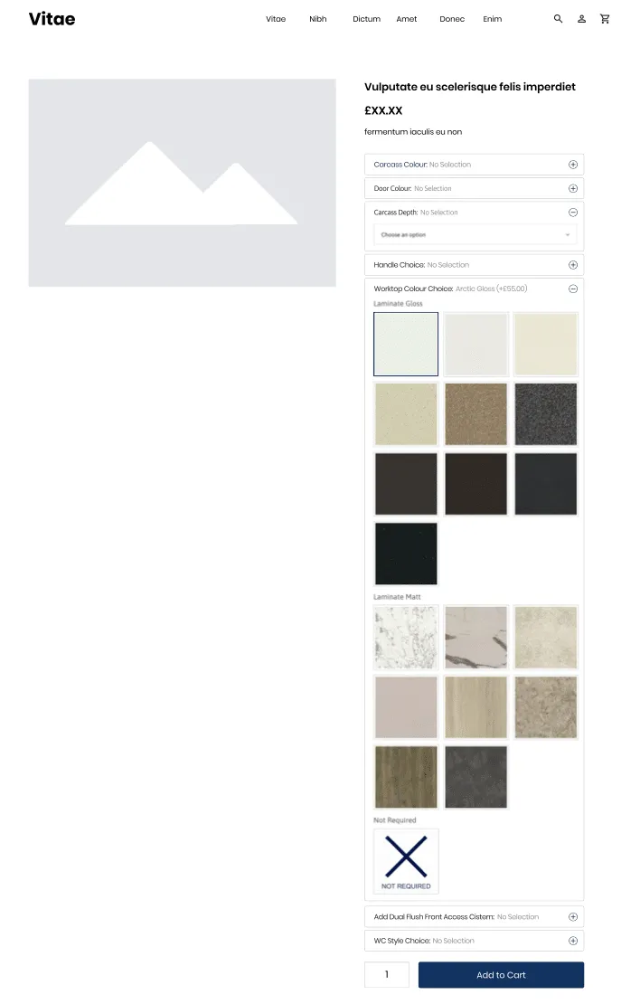
- Labeled panels. Each option became a bordered panel with its name, the current selection and an open and close icon, so shoppers could see at a glance what each row was and open the ones they needed.
- Visual swatches. Worktop colors were shown as image tiles instead of names, grouped by finish (gloss and matt), with the selected tile outlined.
- A clear opt-out. Optional extras got an explicit "Not Required" tile, so skipping an option became a choice rather than a guess.
- A dropdown where it fits. Carcass depth, a plain list of sizes, used a simple "Choose an option" dropdown.
How was the redesign tested?
The redesigned variant selectors were tested against the original for three weeks. The team measured conversion rate, revenue per visitor and the click-through rate at each step of the sales funnel: adding a product to the cart, proceeding to checkout and receiving the order. The redesign was mocked up for desktop and mobile, and the results are reported for the test as a whole.
| Metric | Change vs the original | Confidence reported |
|---|---|---|
| Conversion rate | +144.8% | 98% |
| Revenue per visitor | +83.9% | Not stated |
| Click-through rate at each funnel step (add to cart, checkout, order) | Increased at every step (figures not published) | Not stated |
What were the variant selector results?
After three weeks, the redesigned variant selectors raised conversion rate by 144.8% at a 98% confidence level and revenue per visitor by 83.9%. The click-through rate also rose at every step of the funnel, from adding to the cart through to the completed order, which suggests the change helped shoppers all the way through, not only at the product page.
Why did revenue per visitor rise less than conversion rate?
Revenue per visitor is the conversion rate multiplied by the average revenue per order. With conversion rate up 144.8% and revenue per visitor up 83.9%, the arithmetic implies that the average order in the variation was smaller (1.839 divided by 2.448 is about 0.75). A plausible reason is that the clearer selectors helped more shoppers finish simpler or lower-priced configurations, and the "Not Required" option made it easy to skip extras. The original case study does not report order value, so treat this as an inference. Revenue per visitor still rose substantially, and that is the number that pays.
Why did the redesign work?
The redesign most likely worked because it turned a hidden task into a visible one. Shoppers could see every option, see the actual finishes, tell what was optional and see their progress, so fewer of them stalled on the way to the cart. The funnel data supports this: more shoppers moved forward at each step, not only at the first one. Making the choices visible is one way of reducing cognitive load at the point of choice.
Because several presentation changes went into one variation, the test cannot say which of them mattered most. That is a fair trade when the goal is a large, fast improvement, and a reason to test refinements one at a time afterward.
How to design variant selectors that convert
You can apply this to any product with more than one or two options. Make every option visible, show visual choices as pictures, mark what is optional, and let shoppers see what they have picked so far. Then test the redesign against your current page and report each device separately.
- Count the decisions. List every option a shopper must choose before Add to Cart. The more there are, the more the selector design matters.
- Show visual options as images. Colors, materials and finishes are easier to choose from a swatch than from a name.
- Label every option and its current value. "Door color: Oak" tells the shopper more than a blank row.
- Make optional extras clearly optional. A "Not Required" choice removes doubt about whether a row can be skipped.
- Group long lists. Grouping swatches by finish, as here, makes a long list scannable.
- Use dropdowns only for plain values. Sizes and dimensions suit a dropdown; anything visual does not.
- Measure the whole funnel. Track add to cart, checkout and orders, plus revenue per visitor, as this test did.
To size and check a test like this, use the A/B test sample size calculator and the statistical significance calculator. For another test about choosing between product options, read the mobile package slider case study and the JustThrive case study, where too many choices at the point of purchase were one of the problems.
Can AI shopping agents read your product options?
Only if the options are in the page as text, not only as pictures or in a script that runs after a click. An AI agent buying for someone needs to know which options exist, which are required and what each one costs. Give every swatch a text name, keep option values in the HTML, and describe variants in your structured data (schema.org has a ProductGroup type with hasVariant and variesBy for this). Agent readiness is one of the eight checks in Convertica's free CRO audit.
Variant selector case study FAQ
What is a variant selector?
A variant selector is the part of a product page where a shopper chooses a version of the product, such as a size, color, material or add-on, before adding it to the cart. It can be a dropdown, a set of buttons, color or material swatches, or a group of expandable panels when there are many options.
How much did the variant selector redesign increase conversions?
Conversion rate rose 144.8% at a 98% confidence level in a three-week test. Revenue per visitor rose 83.9% over the same three weeks, and the click-through rate rose at each step of the funnel: adding to the cart, proceeding to checkout and completing the order.
What changed in the variant selector redesign?
The original page listed seven options as plain text rows, most reading "No Selection", and none of the choices visible in the rows. The redesign turned each option into a labeled panel with an open and close icon, showed finishes as image swatches grouped by type, offered a clear "Not Required" choice for optional extras, and used a simple dropdown for size.
Why did revenue per visitor rise less than conversion rate?
Revenue per visitor is the conversion rate multiplied by the average revenue per order. Conversion rate rose 144.8% and revenue per visitor 83.9%, so the arithmetic implies the average order was smaller in the variation. One possible reason is that more shoppers completed simpler or lower-priced configurations. The original case study does not report order value.
Are variant selector results the same on mobile and desktop?
The original case study does not split the results by device. The redesign was mocked up for both desktop and mobile, and the reported figures cover the test as a whole. If you test a variant selector redesign, report each device separately, because option panels take up far more of a phone screen.
Should I use swatches or dropdowns for product options?
Use swatches when the choice is visual, such as colors, materials and finishes, so shoppers can see what they are picking. A dropdown can still suit a long list of plain values, such as dimensions. This redesign used both: image swatches for worktop finishes and a dropdown for depth.
Can Convertica run this kind of test on my store?
Convertica starts with the free CRO audit, an app that checks your page for people and for AI agents while you watch. After it, CRO advisory, led personally by founder Kurt Philip with Convertica's CRO team, then gives you ongoing direction on what to fix and what to test while your team builds the changes. Or, with full implementation, Convertica's team builds the fixes from your audit. Both are priced after your audit.