Case study
Policy visibility case study: cart page policies lifted desktop order completion 21.8%
This policy visibility case study tested a small change at the last step before checkout: shipping and refund policy badges on the cart page, each opening a short pop-up. Convertica A/B tested the change against the original cart page on desktop and mobile.
Policy visibility case study at a glance
| Client | An online store (name not published) |
|---|---|
| Vertical | eCommerce |
| Goal | More completed orders from shoppers who reach the cart |
| Page tested | The cart page |
| Change tested | Shipping and refund policy badges, each opening a pop-up |
| Test | A/B test on desktop and mobile, 97% confidence |
| Test length | Not published in the original case study |
| Desktop order completion rate | +21.8% |
|---|---|
| Desktop revenue per visitor | +20% |
| Confidence | 97% |
| Mobile | No significant change |
| Test length | Not published |
What was the problem on the cart page?
The store's cart page asked shoppers to commit without answering the questions they have at that moment. How long will shipping take? What will it cost? What happens if the product is not right? In the original cart page, the control, those answers lived elsewhere on the site, so a shopper who wanted them had to leave the cart to look.
Leaving the cart is risky. A shopper who goes looking for a policy page may not come back, and a shopper who does not look may stay unsure and close the tab. Either way, an order that was nearly made is lost.
What is policy visibility?
Policy visibility means showing a store's shipping, returns and refund terms where shoppers make the decision to buy, instead of only in the footer. On a cart page, it usually takes the form of short policy badges or links near the checkout button that open a plain summary, so the shopper gets the answer without leaving the cart.
What was the hypothesis?
The hypothesis was that showing the refund and shipping policies on the cart page would raise the order completion rate and revenue per visitor. Every bit of assurance at the last step before checkout can make a difference. If shoppers could see, right beside the checkout button, that shipping and refunds were covered, fewer of them would stop to worry.
What changed on the cart page?
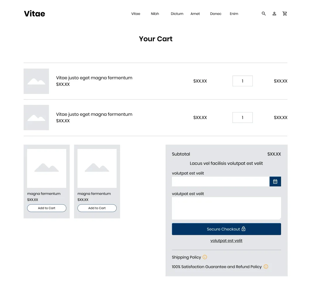
The test version kept the cart page as it was and made two additions, under the Secure Checkout button in the order summary:
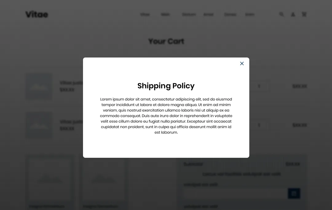
- A shipping policy badge. A "Shipping Policy" line with an information icon. Clicking it opened a pop-up with the shipping policy over the cart.
- A refund policy badge. A "100% Satisfaction Guarantee and Refund Policy" line with the same icon, opening the refund policy in the same way.
Because the policies opened in a pop-up, the shopper could read them and close the pop-up to find the cart exactly as they left it. The same design ran on desktop and mobile, with the two badges under the checkout button in the stacked mobile cart.
How was the policy visibility test run?
The policy visibility test was an A/B test with two versions: the control, with no changes, and the test version, with the policy badges and pop-ups on the cart page. Convertica collected the rate of order completion, revenue per visitor and funnel performance, on desktop and mobile, and the test reached statistical significance at a 97% confidence level.
| Test type | A/B test, control vs test version |
|---|---|
| Control | The original cart page, no changes |
| Test version | Shipping and refund policy badges with pop-ups on the cart page |
| Devices | Desktop and mobile, reported separately |
| Measures | Order completion rate, revenue per visitor, funnel steps |
| Confidence reached | 97% |
| Test length and sample size | Not published in the original case study |
What were the results?
On desktop, the test version raised the order completion rate by 21.8% and revenue per visitor by 20% compared with the control, at a 97% confidence level. On mobile, there was no significant change in either measure. The original case study does not say how long the test ran, so these figures are shown without a duration.
The desktop funnel report pointed the same way. The original case study reports more desktop users proceeding to the cart page, proceeding to checkout and completing their purchase. It does not publish the step figures, and it does not explain the rise at the step before the cart, which the change did not touch, so treat the funnel detail as direction rather than proof.
What happened after the test?
Convertica rolled the change out live on desktop and on mobile. Desktop had improved significantly. Mobile had not improved, but it had not suffered either, so one version of the cart page for everyone was the simpler choice with no measured cost. A neutral mobile result is still a prompt to test a different mobile treatment later.
Why did showing policies on the cart page work?
Showing policies on the cart page most likely worked for two reasons, the same two the original case study gives:
- More trust and transparency. Clear, easy-to-reach information about the purchase can build trust and ease concerns, so shoppers are more likely to complete the order.
- Less uncertainty. Shoppers often worry about shipping times, shipping fees and the hassle of returns. Making the policies prominent answered those worries at the moment they matter.
The pop-up design likely helped too. The shopper got the answer without leaving the cart, so checking a policy no longer meant risking the order.
How do you make your store's policies more visible?
You can apply policy visibility to your own cart page in five steps: find the policy questions your shoppers ask before buying, summarize each answer in plain words, show it beside the checkout button, open it without leaving the cart, and test the change on desktop and mobile.
- Find the questions. Support emails, chat logs and post-purchase surveys show what shoppers ask before they buy. Shipping times, fees and returns are the usual three.
- Write a short, plain summary. A few lines that answer the question. Link to the full terms for anyone who wants them.
- Place it at the decision. Under or beside the checkout button, where this test put it.
- Keep shoppers on the cart. A pop-up or an expanding panel answers the question without a page change.
- Test it, device by device. In this test only desktop improved. Read each device on its own.
Policies matter to AI shopping agents as well as people. An agent comparing stores needs to find your shipping costs, delivery times and return window, and it may not open a pop-up to do it. State your policies in plain text on a crawlable page, and consider marking them up: schema.org has properties for return policies and shipping details. Agent readiness is one of the eight checks in Convertica's free CRO audit.
For a trust test at the top of the funnel, read the homepage trust signals case study. For answers in pop-ups on the product page, read the Factory to Home case study, and for the rest of the cart page, the guide to shopping cart optimization. To plan your own test, the A/B test sample size calculator shows how much traffic you need, and the statistical significance calculator checks a result.
Policy visibility case study FAQ
What did the policy visibility case study test?
It tested showing an online store's shipping and refund policies on its cart page. The test version added two policy badges under the checkout button, one for shipping and one for the satisfaction guarantee and refund policy, each opening a pop-up with the policy text. The original cart page was the control.
How much did the order completion rate increase?
On desktop, the order completion rate rose 21.8% and revenue per visitor rose 20% compared with the control, and the test reached a 97% confidence level. On mobile there was no significant change in either measure. The original case study does not state how long the test ran.
Why does policy visibility on the cart page matter?
Because the cart page is where shoppers weigh the full cost and risk of an order. Questions about shipping times, shipping fees and returns come up there, just before checkout. Answering them on the page, without sending the shopper away to a policy page, removes a reason to hesitate or leave.
Should policy details open in a pop-up or a new page?
In this test they opened in a pop-up over the cart, so the shopper read the policy and closed it without leaving the page. That keeps the cart one tap away. A separate policy page still matters for full terms; the pop-up is a short, readable summary at the moment of decision.
Why was the change rolled out on mobile if mobile did not improve?
Because the mobile test showed no negative effect. Desktop improved significantly and mobile was neutral, so rolling out on both kept one version of the cart page to maintain, with no measured cost on mobile. A neutral result is not a win, so mobile remains a place to test further.
Can Convertica run this kind of test on my store?
Convertica starts with the free CRO audit, an app that checks your page for people and for AI agents while you watch. After it, CRO advisory, led personally by founder Kurt Philip with Convertica's CRO team, then gives you ongoing direction on what to fix and what to test while your team builds the changes. Or, with full implementation, Convertica's team builds the fixes from your audit. Both are priced after your audit.