Monthly CRO Roundup – May 2018

Monthly CRO Roundup – May 2018

If you’re anything like the team here at Convertica, you’re so absorbed in tinkering with, testing, and adjusting (and then testing again) everything on your site that you’ve missed some of the exciting things going on in the CRO world.

Don’t worry, I don’t work the team too hard.

We still found enough time to bring you a few of the more interesting happenings in the CRO world that we think to provide a lot of value.

No need to thank us!

Do you want a 20-100% conversion rate increase?

Are You Seeing a Pattern Here?

In CRO, you always have to test things individually. You can run a website funnel analysis to examine what would work for one site may not work for another.

However, if a test works for one site, and then another, and then yet another, there’s a good chance you’re onto something. At Convertica, we use experience gleaned from running 100s of tests to refine our testing processes. That’s why we found this study from Conversion XL (CXL) fascinating.

By identifying easily repeatable UI changes (headlines, photos, layout, forms, etc.) and scoring tests based on “repeatability” (a measure of how effective the test has been over multiple iterations), they ended up achieving a killer success rate.

The theory is simple: the more a change provides similar results over more iterations, the more likely it will provide similar results in the future (for example, gamifying a lead capture to increase submissions 😉 ).

So, do patterns work?

The results were pretty promising. CXL ran 51 pattern-driven tests and 36 returned positive results (71%). Positive results meaning anything with a better than 50/50 success rate.

But it goes beyond that—the higher the repeatability (basically, the more successful a test had been in the past) the better the results. “Highly repeatable” tests returned 80% positive results.

In their recap, CXL walks you through how to determine repeatability, and how to connect with your inner muse and dream up new and exciting tests for your sites and use them for future gain. Anyway, you can learn more about the theory behind it.

Key Takeaway: Exploit past wins for future gains. Track successful tests and group them together based on how frequently they return positive results. Use these as a rapid way to get easy wins on future projects.

CRO Home Runs in 8 Weeks

You and I both know how daunting CRO can be. The journey from just starting to hitting a few home runs can feel like it takes forever. Well, apparently it can be done in about 8 weeks.

You’ve probably heard of a little CRO company called Visual Web Optimizer.

If you’re struggling to figure out where to start or just need a path set out in front of you, VWO partnered with another little venture called Hubspot to put out a guide to in-house CRO for your business in just 8 weeks. Together, they used insights from over 5,000 clients to come up with a repeatable process that will provide reliable wins quickly.

There comes a time when you need real CRO pros to get the most out of your site, but this guide shows you how to get some DIY wins in just 60 days. It’s all laid out in a methodical manner (you know how much we love processes here). In it, they cover all of the basics and even a few more advanced concepts. It includes things like:

  • Basic CRO principles
  • How to conduct an audit
  • Identifying key areas for improvement
  • Researching user behavior
  • Creating hypotheses
  • Analyzing tests and learning from them

By the way, if you are looking to further refine the process, check out our 12-step checklist for perfecting your conversion process.

Dynamic Text Matching Works…A LOT

Ever wonder how powerful the words you choose are?

They’re very powerful.

Just ask Norwegian-based conversion company, ConversionLab.

They worked with a client, Campaign Monitor, to CRO their paid search landing pages and decided to test out some dynamic headlines. What they found was a revelation into landing-page psychology.

Matching landing pages to searches: One key tenet of CRO is to match a landing page (specifically the headline) to the user’s search. If you show up for results for query “Mexico Villa Rentals” and the user clicks through to your home page that says “Worldwide Vacation Rentals”, chances are they’re gonna bounce.

The hypothesis: ConversionLab theorized that if they met the user’s definition of what solved their problem, they could increase conversions. In English, this basically means that the closer the headline matched the search, the higher the conversions, specifically in regards to the most powerful parts of speech—the verb.

To set up the test they created a few variants for queries based on email creation (that’s what Campaign Monitor does, by the way). Based on the verb in the query, the user was shown 1 of 4 possibilities:

  • Build stunning emails
  • Create stunning emails
  • Design stunning emails
  • Make stunning emails

The results were pretty good if you ask us:

31.4% conversions with 100% statistical significance

Key Takeaway: When you mirror the initial search as closely as possible (particularly the verb), it increases landing page relevance and therefore conversions.

Are you using landing pages for paid search? If so, it’s time to start thinking dynamically.

Do you want a 20-100% conversion rate increase?

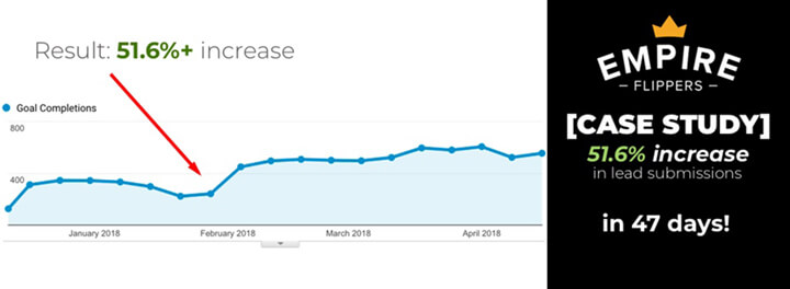
It’s All a Game Til’ Someone’s Website Gets 51.6% More Conversions in Just 47 Days

It might be a bit narcissistic to lead with our own case study, but give us a break here. This one is full of some serious value for lead-gen site owners.

There are literally dozens of reasons why users aren’t submitting a form on lead-gen sites. If you aren’t getting conversions, you’ve got to hypothesize, adjust, and test until you are. But what if you’re a successful site whose tool has already done more than $47,000,000 worth of evaluations? — Find out the best case study made site generate extra monthly revenue.

The Empire Flippers Valuation Tool gives business owners a fair estimate of their asset’s value based on dozens of proven metrics. Empire Flippers approached us hoping to improve the efficiency of their lead-submission tool and since I had been both a buyer and seller multiple times in a past life, I had some insider insight into what the biggest sticking point was:
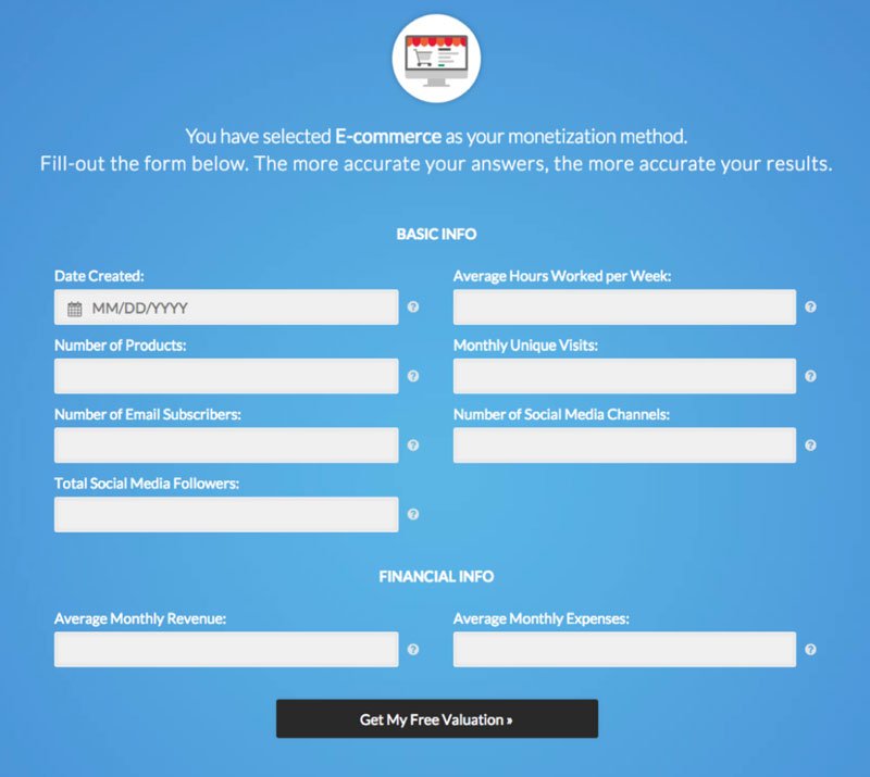
The form itself.

If your forms aren’t performing up to par, it could be because you’re making life too hard on the user. EF’s tool required a lot of user input and wasn’t very intuitive. Based on past wins for lead-gen sites, we knew if we could gamify the tool and make it more interactive, EF would see an uptick in submissions.

ENTER: Our team of UX wizards.

Instead of a static form that required user input, we gamified the lead capture and reduced the necessary submission steps to a bare minimum. We used:

  • Multiple choice questions
  • Sliders
  • Progress visualization

With the new tool, the user was 40% done with the process before they had to enter any info. The key takeaway here is “the more a user has to think, the lower conversions will be”.

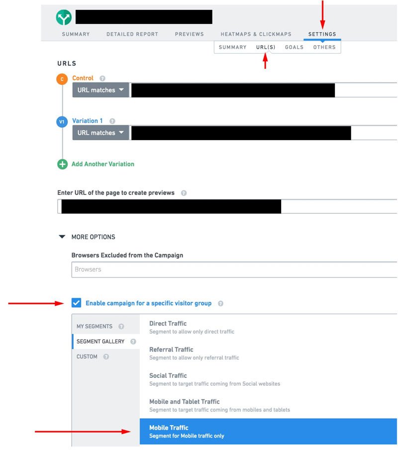
We didn’t stop there, though. We further refined the process using data collected down to device level by segmenting audiences into mobile and desktop. The result? + 51.6% more conversions in just 47 days,

Key Takeaway: The more a user has to think, the lower the conversions. Keep actions to a minimum, make forms more intuitive, and keep testing/refining. Check your forms now, are they too boring?

Click here to read the full 2,500+ word article.

May was a pretty exciting time for CRO. We hope you found these case studies and findings as interesting as we did. See you at next month’s CRO roundup.

Have you got marketing questions? We want to help. In our weekly Conversion Coaching calls, you can ask our top Leadpages mentor anything regarding how to grow your email list, send traffic to your site, use your blog to attract leads or use Leadpages to develop your specific business. Read more about our CRO Services.

Do you want a 20-100% conversion rate increase?

Author: Kurt Philip

Hi, I’m Kurt Philip, the founder & CEO of Convertica. I live and breathe conversion rate optimization. I hope you enjoy our findings.

We’ve worked with over 1000 businesses in the last 6 years.
Let’s jump on a quick call to see how we can help yours.

Book FREE CRO Call

Client Case Studies


Follow us on Youtube

Empire Flippers Lead Generation Conversion Rate Optimization Case study

Empire Flippers Lead Generation Conversion Rate Optimization Case study

Today, I’d like to share a case study with you.

Convertica’s experience working on the Empire Flippers valuation tool is the perfect example of the power of CRO done the right way.

Analytics & Conversion Rate Optimization doesn’t have to be complicated, it just requires a well managed process.

With a systematic approach, hard data, and experience gained from CRO’ing hundreds of sites (plus a bit of UX magic), we were able to increase an already successful website’s conversions by over 50% in just over 6 weeks.

I’ll detail the exact steps we took to CRO the tool plus the thought process behind it.

To see the full 2,500+ word conversion optimization case study on the Empire Flippers Blog, click here.

Synopsis

Empire Flippers is an Inc. 500 online marketplace with over 11,000 members. As website brokers, they facilitate the sale of established, profitable online businesses.

The Empire Flippers Valuation Tool lets business owners get a good idea of their site’s value based on dozens of proven and tested metrics.

Even though the tool had already successfully evaluated 45,000 businesses, Empire Flippers knew it could do better.

They turned to Convertica due to our past experience with lead-gen sites that we personally owned or managed for clients.

Fortunately, I had been both a buyer and a seller on the site multiple times before, so I had unique from a CRO perspective. This allowed me to put myself into the user’s shoes (which ended up playing a HUGE role in the campaign’s success).

The Challenge: The tool was already a major success by any measure: $47 million dollars worth of businesses sold and over 45,000 evaluation isn’t too shabby if you ask me.

However, there were a few sticking points that I myself had encountered that were holding the tool back from reaching its potential. Mainly, the fact that the valuation submission process wasn’t very intuitive and required A LOT of user input. Convertica had to find a way streamline everything, and it all had to be done on Empire Flipper’s Frankenstein mash-up of a WordPress site.

Our Hypothesis: Based on past wins for our lead-gen clients (62% average increase) and my perspective as a former user of the tool, we theorized a solution based on a simple hypotheses:

The more a user has to think, the lower conversions will be.

CRO doesn’t have to be complicated. This simple hypothesis had worked for plenty of clients in the past. We thought if we could simplify the process and make it more engaging(read more cases here), Empire Flippers would see a major boost to submissions.

Think about it—in 2018, we use apps for everything: dating, ordering lunch, finding a dog sitter, you name it. Most of them are so intuitive (a swipe here, a button press there) we don’t even notice we’re using them. Everything is done in the subconscious (like a game). This is a HUGE for CRO. We knew if we could keep users in that stream, we’d bump conversions significantly.

Even we didn’t expect 51.6% in just 47 days, but looking back on it, it makes a lot of sense. Here’s the exact process we used for achieving our goal.

Convertica’s CRO Process

We Set a Goal

Based on our past wins, we knew more than 50% gains were achievable.

We wanted to set a realistic but ambitious goal.

The point of setting a goal is framing your success.

You never want to settle for mediocre results — jump over to the study case in increasing monthly revenue within a short time!

Increasing leads by 20% is by all means a success, but when compared to our goal it would have been a failure, especially considering our past wins.


 Gamify the Lead Capture Process

One strategy that had worked for nearly all of our lead-gen clients in the past was “gamifying” their lead capture tools. By making the process more like the rest of the apps a user is glued to all day (more engaging, easier to use, simpler), we knew we could increase conversions. Our goal was to get the user to think as little as possible.

How we “gamified” the tool  

The first page of the lead capture was already very intuitive; no thinking, just clicking a button.

However, once you chose your monetization method, you were brought to this screen:

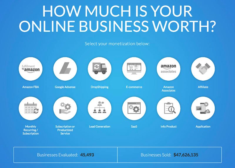
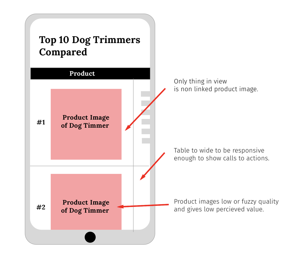
This type of static form is not intuitive. Now the user actually has to enter data (and exit their subconscious stream).

ENTER: our kick-ass in-house team armed with a year’s worth of lead-gen tool data.

All of those tests we ran on lead-gen sites taught us that if the initial 2 or 3 fields of a tool require no specific input, conversions increase in a big way.

Here’s what we did:

  • Multiple-Choice Questions: Multiple-choice or yes/no questions automatically generate the form without the user realizing. It also keeps them fully engaged.
  • Sliders: Instead of the user manually entering their monthly income and expenses, we had them use an interactive slider.
  • Progress Visualization: Never underestimate the power of visualizing progress. According to the lead impact case study, when the user can see how close they are to completing the process, it keeps them engaged.

Here’s what the new submission process looked like;

You can view the live version here.

Did you notice there isn’t a “Next” button? If it doesn’t have to be there, why put it? They’ve entered the data, now move to the next step.

TIP: Minimize your visitor’s actions. The less times the user actually has to make a decision, the better. Try and make some for them.

With our new submission process, the user is 40% done before they have to enter any data.

Test the New Tool vs. the Old

We don’t like to be too full of ourselves, but we knew the new tool was a winner. Still, as part of our standard operating procedure, we always test (and you should too).

We ran a split-URL test. This sends 50% of traffic to the new version of the lead capture and 50% to the original.

As we suspected, the test showed a pretty clear winner relatively quickly. The new gamified version killed it: + 40% in just two weeks.

Our custom reporting software provided valuable insight as to which type of user (segmented by device) converted by each version. Which brings me to my next point:

Always use data collected from tests to further refine your testing.

Data collected from this first test allowed us to create a more targeted second test. A 40% increase is great, but our goal was 50% so we weren’t satisfied.

Implement the New Lead Captures

Pretty straightforward here, right? The old version was clearly inferior, so we rolled out the new version and sent 100% of the traffic to it. We instantly saw a jump in conversions, which was just the validation we needed.

Use Live Data to Optimize Further

If there’s one takeaway from this case study, it’s to use data to further refine your results.

Good CRO is a constant process of refining based on the data (click here to know more).

We had already increased conversions by 40%, but our goal was 50%. Using our new data and some awesome CRO software, we could further identify some key friction points.

By using the data from the first test, we were able to double down and gain even more conversions for Empire Flippers. It was like the icing on the cake.

Optimizing for Mobile with Formisimo

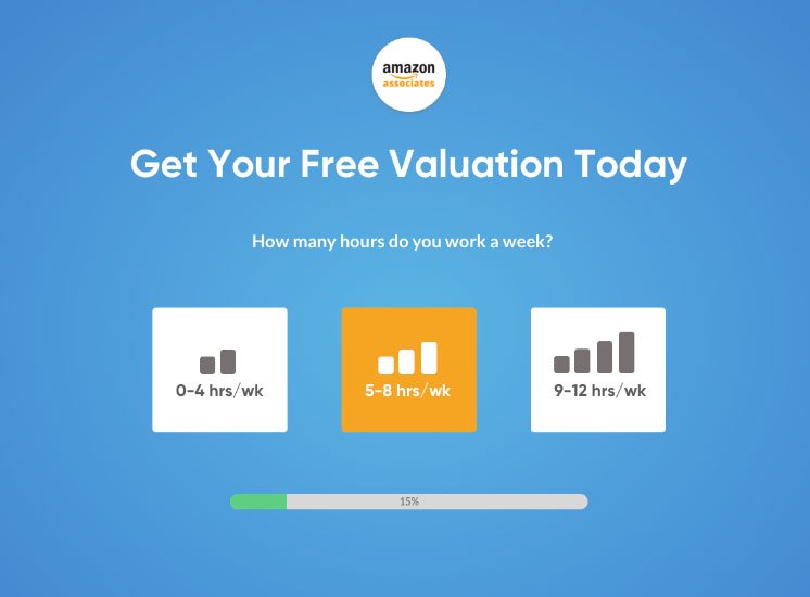
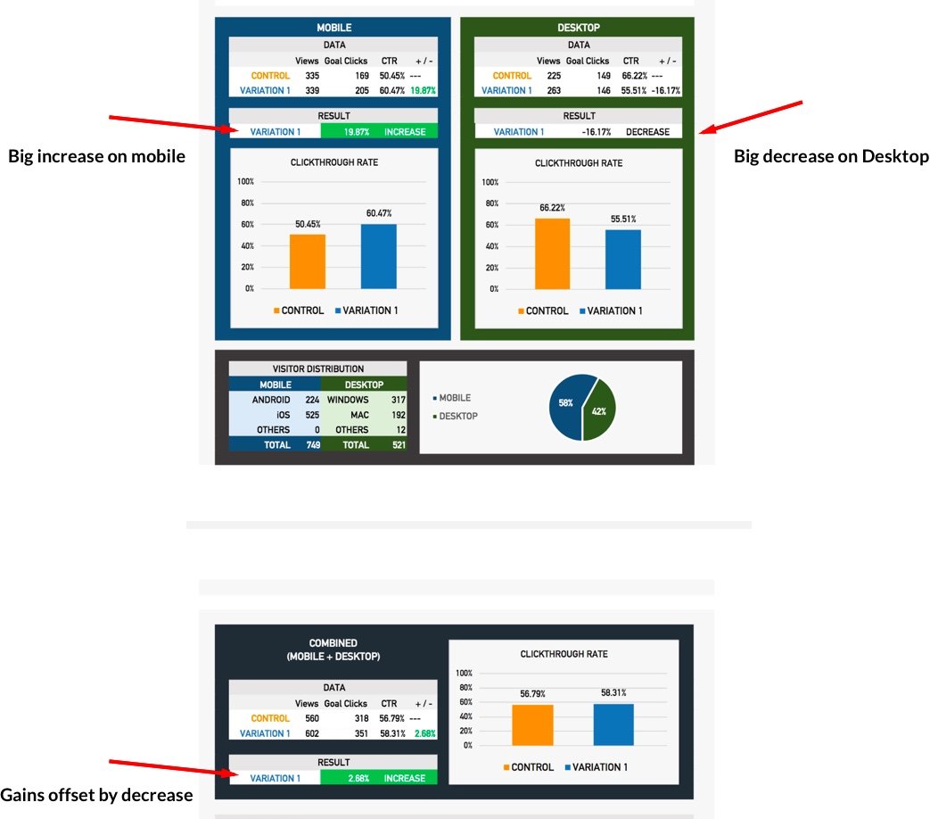
After running a split URL test, we gleaned an important piece of data: the desktop version of our variation outperformed the mobile version by a good margin (36% conversions vs 26%).

We used a killer piece of form-tracking software for lead-gen sites called Formisimo that let us see the top drop off points for users who need to fill out forms. Basically, it speeds up your CRO by allowing you to conduct more focused and effective tests through identifying bottlenecks. In simpler terms, it’s freakin’ awesome.

Using Formisimo, we segmented visitors by device and discovered a major sticking point for mobile users: their thumbs.

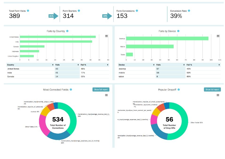
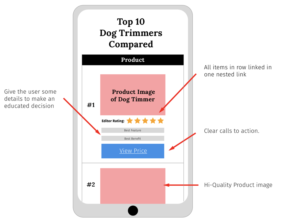
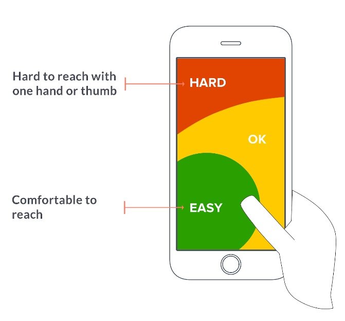
The mobile thumb problem: Most people use apps with just one hand. The layout of the new variation was such that reaching the important areas with just one thumb was difficult to say the least.

The solution: We had our UX magician work her magic. Anywhere toward the top of the screen was too hard to reach, so the layout had to keep most of the important stuff toward the bottom so it could be used with just a thumb. Now, instead of having to use both hands (or god forbid reach a bit further!), the entire page was in what we considered the “easy to reach” zone.

The result: Guess what? 10% more conversions! — not only that we also do coaching to maximize conversions.

Summary

Challenge: Increase Empire Flippers’ lead-gen tool’s submissions by 50% and make it appealing to hundreds of visitors using their phones with one hand.

Solution: Gamify the tool to make it more engaging and decrease user thinking by making it more intuitive.

Result: + 51.6% conversions in just 47 days which was significantly optimized even further over the following months.

Key Takeaways:

  • Set challenging goals
  • Keep the user in their subconscious by decreasing their workload. Remember, the more thinking the lower the conversions
  • Display their progress and delay specific input as long as possible
  • Test and track everything!
  • Use data learned from initial tests to further refine later tests
  • Segment down to device level to get even more easy wins
  • Never settle for mediocre results. Keep testing!

To see the full 2,500+ word case study on the Empire Flippers Blog, click here.

Author: Kurt Philip

Hi, I’m Kurt Philip, the founder & CEO of Convertica. I live and breathe conversion rate optimization. I hope you enjoy our findings.

We’ve worked with over 1000 businesses in the last 6 years.
Let’s jump on a quick call to see how we can help yours.

Book FREE CRO Call

Client Case Studies


Follow us on Youtube

4 A/B Split Testing Mistakes Newbies Should Avoid

4 A/B Split Testing Mistakes Newbies Should Avoid

What if I told you, you could find conversion rate increases with every single A/B split test by avoiding a few newbie mistakes.

It’s true. But that’s the tragic feast or famine reality of A/B testing. Get it right, and your affiliate site is now a CRO BEAST that literally forces customers to put money in your pocket. Get it wrong, and you could invest money in the wrong changes, miss out on major opportunities, or even doom your website to failure.

The ironic thing is the mistakes that hurt the most are sometimes the easiest to fix; a missed detail here, a wrong hunch there. Sometimes it’s just because you’re too eager to find the miracle fix that can double your sales overnight.

Remember: Conversion rate optimization checklist doesn’t need to be complicated.

Do you want a 20-100% conversion rate increase?

At Convertica, we have run over 1000 tests in the last 12 months. After working with 100s of clients, we have found the 4 most common mistakes people make that kill their earning potential and even ruin their chances of making more sales. By the end of this article, you’ll know exactly which changes I made to my strategy that helped take my success rate with clients to nearly 100% (hey, nobody is perfect. Not even me).


Mistake #1: Not Tracking Enough Sample Data

You’ve got to resist the urge to crown a champion too early. I know that feeling: you have a hypothesis, set up your test, click run, and BOOM, right out of the gate the data starts confirming what you knew all along. The variant is pummeling the control into the dust.

Chill.

There are a million and a half reasons why the variant can be outperforming the control, and most have nothing to do with the changes. Time of day, week, month, or year; a sudden mood change; random luck. This is where statistical significance comes into play. Statistical significance is the probability that your result is NOT due to random chance (variables outside of your control). Industry standard is 95% + statistical significance to be certain. This means if your test confirms a winner with a statistical significance of 95%, that there is only a 5% chance that this result is due to chance.

We don’t even start to draw conclusions until around a minimum of 1000 views. The more iterations of the process, the more you eliminate statistical anomalies, the closer to the truth you get.

Fix the Mistake: Don’t jump to conclusions. Keep the test going until you reach a high degree of statistical significance.

Even VWO can call a winner too early. Generally speaking though, the clearer the winner the earlier the test will be concluded with statistical significance.


Mistake #2: Not Refining Your Data Analysis

You’ve run your first test, anxiously waited a few long weeks, and now the results are in…..

-0.48% decrease overall.

What? Is that really possible?

It is, but the chances are it only appears that way, and you just need to take a closer look to find the gold. If you pull the data out of VWO (or your preferred AB testing tool) and do some digging, you will find the devil is in the details.

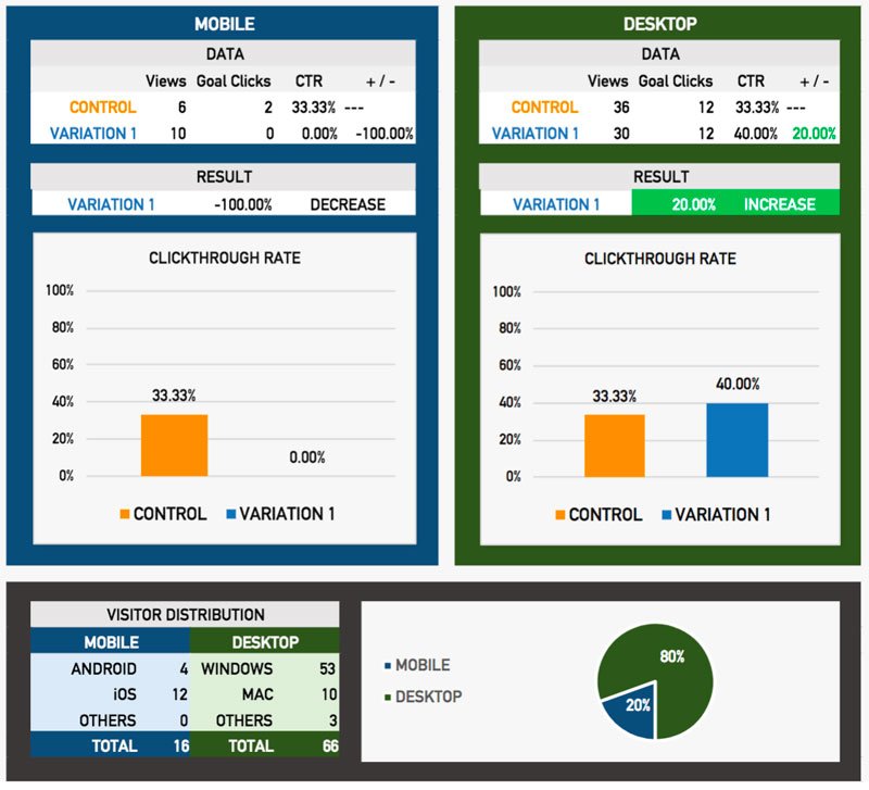
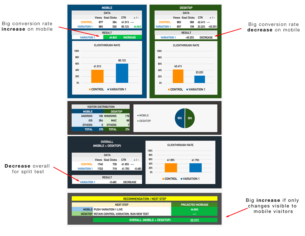
We see it often: mobile and desktop results often cancel each other out. That  -0.48% decrease overall is actually just -0.48% averaged across the total visitors and doesn’t account for the nature of those visitors (in this case, the device they are using).

A test that initially showed no change to visitors actually held valuable data. The changes caused a conversion increase for mobile device visitors and a decrease to desktop ones. That shouldn’t come as a surprise, though-what works on desktop doesn’t always work on mobile (fat fingers make life tough).

So now, we install a device-only plugin and show the changes only to mobile, and suddenly you get a 22.21% overall website conversion rate increase from a split test that you thought was no good.

This technique alone, will increase your chances of success with split testing to nearly 100%.

Do you want a 20-100% conversion rate increase?

Are you starting to see the power of CRO?

We see this ALL the time with tests we run, and it caused us to refine our process. Here’s how it works now:

1. Run split test for all visitors
2. Segment the concluded test data into mobile and desktop and analyze each separately
3. From the findings, run a test to mobile-only traffic and another to the desktop. Check our CRO blueprint here…

This has literally 10x’d our success for our clients. We have an almost 100% success rate on all our tests now by segmenting the data and running separate tests to each device. Refining the process like this reveals far more valuable data.

Fix the Mistake: Testing only for desktop will reveal what works best on desktop (remember, CRO doesn’t have to be difficult). Same for mobile. Refine your processes by segmenting audience so you don’t get results that cancel each other out.

I have gone through in detail how to do device level testing.


Mistake #3: Focusing on the Wrong Areas to Test

Opportunity costs for A/B testing are astronomical. Each test should be run for 500-1000 views on each variation. It all comes down the the difference in conversion rates for each variation.

If you own an affiliate site, this means that testing the wrong thing can screw up a whole month of sales. You should never test too many elements at the same time (I’ll cover this in detail next), so make sure you choose the most effective ones first.

I have discussed this before in detail. When you are testing, make sure you are testing the areas that have the highest impact on conversion rates on the page. These are some of the lowest hanging fruit for A/B tests on your affiliate site are:

● Headlines
● Calls to Action
● Images
● Product Descriptions
● Prices

OK Kurt, but how do I decide which area to test first?

Tip: The best way to figure out where to run the juiciest A/B tests? You don’t decide. Let your visitors decide. Run heatmaps (Hotjar or some other software) for a few weeks and see where the hotspots for testing are. Start with this article on the best heat map tools for websites.

Fix the Mistake: Be sure to test the elements that matter most to avoid high opportunity costs. Run heatmaps to hone in on the best places to start testing rather than wasting time on elements that don’t matter (looking at you, button color!).


Mistake #4: Split Testing Too Many Things at One Time

The same is true for testing too many areas on your website at the same time as well. Once you get that first taste of victory, it’s natural to want to test everything and go overboard.

Resist.

When you test multiple elements on the same page, you run a major risk of polluting the results, and this is a poor scientific process. The two tests can “cross pollinate” and leave you not knowing which change is responsible for the results. The best-case scenario if you do this is that you confuse the results. The worst case? All your tests become invalid.

EXAMPLE

You decide to run two A/B test at the same time.

Test 1: You change all of the text links in the comparison table to graphics buttons. Result: + 30%.
Test 2: You add images to the mini-reviews below the comparison tables. Result: -23%.

The results now give off a distorted view of how the campaign is performing. In fact, you can’t actually be certain that the results aren’t polluted (meaning the changes from the first test are affecting conversions in the second). Be patient and test one thing at a time. In case the worst happens you can click here and get a quote from our professionals.

Fix the Mistake: You might think running multiple tests will help you grow faster, but it’s a dangerous game if you don’t know what you’re doing. Don’t test too many elements at one time. Unless you’re a bad-ass pro at CRO (and even if you are) we suggest you stick to testing one single thing at a time.

The road to affiliate site CRO hell is paved with good split-testing intentions. I recommend keeping things as simple as possible. Don’t make CRO harder than it has to be.

Focus on the right elements, segment your audience, and don’t stop the test too soon. Lather, rinse and repeat. This is exactly how we increased our success rate 10x, one win at a time, and it isn’ hard at all. Fixing just one of these simple mistakes can lead to massive upticks in revenue.

What do you think are the most disastrous A/B testing mistakes? Also, check out our conversion rate optimization service, the end goal of our service is to turn qualified users into satisfied customers.

Do you want a 20-100% conversion rate increase?

Author: Kurt Philip

Hi, I’m Kurt Philip, the founder & CEO of Convertica. I live and breathe conversion rate optimization. I hope you enjoy our findings.

We’ve worked with over 1000 businesses in the last 6 years.
Let’s jump on a quick call to see how we can help yours.

Book FREE CRO Call

Client Case Studies


Follow us on Youtube

4 Step CRO Blueprint for Increasing your Revenue in 2018.

4 Step CRO Blueprint for Increasing your Revenue in 2018.

January 16, 2018

The SEO world is changing rapidly.

In 2012, SEO was so consistent you could run the same system and get the same results over and over. At the start of 2018 it has completely changed, and no longer as straight-forward as it once was.

Times have changed. Amazon.com in the 90’s. Got CRO? Photo cred

To stay in the game, you need to constantly evolve your skills with the times or you’ll be drowned by competitors. If you’re neglecting CRO (conversion rate optimization) entirely, or failing to pay attention to the key areas I’ll discuss below, then you are making a huge mistake.

In this article, I am going to go through the key focus areas for 2018, with detailed guidance on how-to. I’ll emphasise on the things that are constantly neglected time and time again, that is losing clients (and probably you) money.

Let’s get right to it.

What you should be focusing on in 2018 for those quick CRO wins:

Most of the websites we optimized for conversions through the first half of 2017 were niche affiliate sites (not just Amazon affiliate). — eCommerce Conversion Rate Optimization

One thing we saw time and time again was that these websites were being built on scale by SEO’s, and apart from new content and links, weren’t improved upon after the initial build.

It was clear most were following the same blogs on how to build these sites which didn’t have any focus on conversions at all. Well, there are certain ways to increase your chances for a higher customer conversion rate.

Tip #1: Really optimize your websites for mobile

This usually gets the same response:

“My site is responsive.” 

A website being responsive and a website being optimized for mobile conversions are two very different things.

In our testing, our data has repeatedly shown that the highest rated comparison table plug-ins tend to convert the worst on mobile.  With most sites having over 50% of their traffic coming from mobile, often the gains from desktop visitors were completely negated by the low conversion on mobile.

Let me show you why:

Here is a very common layout we saw on sites using Tablepress.

Here is what works much better on mobile. You can see why. Be careful with star ratings for amazon affiliate websites.

The issue with a lot of the “premium” table plugins for wordpress is that they are not at all optimized for mobile. There are ways to make them optimized for mobile with a few work arounds, but out of the box they are no good.

When optimizing your site for mobile you need to consider: 

  • Are the call to actions visible on mobile?

Quite often, the call to actions, the links that were used to get users over to affiliate partners, weren’t even visible on mobile. You would have to scroll sideways on your phone to see them (This isn’t Tinder, people rarely swipe sideways unless told to).

  • Is everything aligned and uniform on mobile to be in alignment with your branding?
  • Are you using buttons for your call to action?

Most people’s fingers make it very had to click a text link on mobile. Make it easy for users to click your affiliate links. Buttons tend to work better for mobile users, while sometimes text links work better on desktop.

  • Are you trying to show too much info in your comparison tables on mobile?

With CSS it is very simple to show and hide elements that show up in your tables. Make it easy for your clients to quickly compare the rows in your comparison tables. It is called a comparison table for a reason. If they want to read more info about the product, make more detailed summaries down below in the page.

Most people just want to get a quick summary and are already sitting there with their credit card ready.

  • Do you actually use call to actions at all?

In the review sections below the comparison tables, people would often have an image that would link to their affiliate or just link from the product name itself. They wouldn’t actually tell the user what to do. I am always all about designing sites suitable for a 5 year old. Not content wise, but if you want the user to do something, tell them to “check price” or “click here for latest pricing”. Hold their hand and nudge them in the direction you want them to go.

  • Link your product images to your affiliate links. ‘Nuff said.

These are just some things we tested with consistent gains on mobile.

For clients’ sites, we always test every change. We never make a change to a website without running a split-test that proves better conversion rates first. We use data to make decisions, not intuition.

Our reporting at CROguy/Convertica always uses raw data from split-tests to allow us to see what the conversion rates were right down to the device level. Here is a conversion rate optimization diagram example:


Tip #2: Pull the raw data from split-tests.

You get A LOT of insights from this export. Here is how to do it on VWO:

These detailed reports have all the data, specific to device type, location, screen size and much more. The report shows how even though we had an increase on mobile as in this example, we had a near-equal decrease on desktop which completely offset the mobile gains. We have to go ahead and create some pretty reports with some tricky calculations to get it look appealing but out of the box, the data is all there.

The great thing about having this data is that you can then make an educated decision about test results.

From there you can then choose to display one variation for desktop and another for mobile, allowing us to still get that increase on mobile while just displaying the original variation on desktop, and then going ahead and running another test, just to desktop.

Displaying different styles and layouts can be done with some simple CSS or even done by outputting different HTML to desktop or mobile visitors with PHP.

Here is a cool tutorial on how to do that with CSS.

Tip #3: Test every page.

Websites that generate most of their traffic from organic search, often have different pages ranking for different keywords. Because of this, the psychology of the visitors to each page can be very different. We see regularly that the exact same split test run on 10 different pages of a site will return very different results.

Sometimes a change will show a 30-50% increase in conversions on one page, while another page on the same site shows a -10% in conversions.

Be responsive to the data and be open to getting micro-specific about changes you make to your site.

I’ve had conversations with a lot of SEOs that have tried split testing and haven’t been able to get any increase in revenue.

This is probably why;

They would have tested one page, got a nice big increase in conversions then just rolled the changes out site wide. Our data shows it’s very possible for 4 of the highest traffic pages to see an increase, for 3 to see no real change at all, and for 3 to see a decrease, completely offsetting all the increases from the tested page.

The lesson here is to always test every page. Always test every change on every page.

Don’t know where to start? You can see my tutorials on setting up heat maps here.

Don’t know how to set up a split test? You can see my tutorial on setting up your first split test here.

Tip #4: Test mobile and desktop separately.

Let’s just say you have run a split test to all traffic and worked out that desktop had a 40%+ increase in conversions, awesome.

Mobile however had the complete opposite results and returned a -37% decrease.

We’ll assume that you have gone ahead and rolled out the desktop version live on the site but kept the mobile the same as the original variant.

So now you’ll need to test something new on mobile that might work, right? Let me show you how to deliver a test to mobile visitors only.

How to set up a Mobile visitors only test in VWO.

This tutorial is done in VWO.

VWO is our preferred software here at Convertica. If you use another AB testing service the strategies will be the same but implementation will be slightly different.

I have shown how to set up a standard split test here. You can catch up on that if you missed it.

Setting up a mobile-only split test is not difficult at all. Before you start the campaign, you just have to change one setting:

I kept the tutorial basic so you get the concept and implement it.

If you have any questions about more advanced strategies, join the CRO Academy Facebook group and ask me a question.

You should probably join the group anyway, if you have any interest in learning more CRO, which everyone does, right?

Times have drastically changed since SEO in the late 90s.

Photocred

The first website I ranked #1 on google for was “pokemon rom downloads”.

It was 1998.

You might not even know what a “pokemon rom” is.

It’s a version of the original pokemen from Gameboy, ripped from the cartridge for PC and run through an emulator so you can play it on your PC, for free.

It was 1999, I was 14, the internet was starting to take off, and Pokemon on Gameboy was huge.

I had a 33.6kb/s modem which allowed 2kB per second download. I had to leave my PC on overnight to let internet explorer update.

That was less than 20 years ago and the online marketing scene is unrecognizable compared to now.

Over the years, I have changed with the times, learning new key skills as they became relevant:  My small Freelance SEO business evolved to a client SEO company, to a 90% affiliate business, then to a CRO specialist (CROGuy), and now to Convertica.

Introducing Convertica.

CROGuy has now re-branded under a new name: Convertica.

2017 was an amazing year: We had a huge list of successful happy CRO clients, and we have a rapidly growing team of talented people. We gained CRO expertise in a number of industries and niches allowing us to get better results as the year went on by growing our team of talent and building better processes.

The chart below illustrates the increases in conversions we got over the year for all our 2017 completed client campaigns. (This does not include clients with active campaigns still running.)

We had to move on from CROguy, because Convertica is not a one-man show. We’ve been able to achieve this success only due to our talented and hard-working team members, through which we were able to culminate 20 years of experience in online marketing to get astounding results for our clients.

Where to next with Convertica.

We went from servicing micro niche SEO websites and a few authority niche sites to now partnering with almost all exclusively authority sites and industry leaders.

The more sites we process, the more data we have, and the more industry-specific CRO expertise we develop:

The results just keep getting better and better for our clients.

My hope is to demystify the CRO industry and give information back to the community that we gain from our campaigns, to enable more people to make more money from the same traffic visitors and rankings.

If you have a website with pages over 1000 views per month, you should be split testing (or getting someone to do CRO for you). If you aren’t, you are leaving money on the table.

Jump over to the CRO Academy and let me know what tutorial you would like to see next.

Until next time,

Kurt Philip.

Head of CRO at Convertica.

Author: Kurt Philip

Hi, I’m Kurt Philip, the founder & CEO of Convertica. I live and breathe conversion rate optimization. I hope you enjoy our findings.

We’ve worked with over 1000 businesses in the last 6 years.
Let’s jump on a quick call to see how we can help yours.

Book FREE CRO Call

Client Case Studies


Follow us on Youtube