Calls to action
Call to action buttons: how to write, design and place the button that gets clicked
Call to action buttons are where a visitor stops reading and starts doing. The best ones are not about a special color. They are the right ask, at the moment the visitor is ready, with a label that says what happens next. Here is how to write, design, place and test them, with phrases and examples you can use today.
Short answer
Call to action buttons are the clickable elements that ask a visitor to take the next step, such as buy, sign up, download or book. The best ones stand out through contrast rather than a particular color, use a short label that starts with a verb and names the result, and sit where the visitor is ready to decide.
- No button design rescues a page that has not answered the visitor's questions.
- Name what the visitor gets, such as "Get my quote", rather than the mechanism, such as "Submit".
- Make one action primary, and give secondary actions an outlined button or a text link.
- A short line of reassurance beside the button answers doubts where they arise.
- Real HTML buttons and links with text labels work for screen readers, keyboards and AI agents.
What is a call to action button?
A call to action button is the clickable element that asks a visitor to take the next step: buy, sign up, download, book or continue. CTA is short for call to action. The button's design makes it easy to find, and its label tells the visitor what will happen when they click. It is the point where a reader becomes a lead or a customer.
That makes it one of the most tested elements on any website, and one of the most misunderstood. Most advice about call to action buttons is about color. In Convertica's experience, color is rarely what decides whether people click. What decides it is whether the page has earned the click, whether the button asks for the right thing, and whether the visitor knows what is behind it.
Why a CTA button never works on its own
A call to action button only works if the rest of the page has prepared the visitor to click it. If the offer is unclear, the value is not obvious or there is no reason to trust the claims, the button has to do all the work, and it cannot. No button design rescues a page that has not answered the visitor's questions.
Think of the button as a closed door. The visitor cannot see what is behind it, so they fill the gap with their own worries: will I be charged straight away, will a salesperson call me, is this going to waste my time? The page around the button, and the label on it, are your chance to answer those worries before the click.
So before you change a button, check three things on the page around it:
- The offer is clear. A visitor can say what they get and why it matters to them.
- The ask fits the moment. You are not asking for a purchase from someone who has only just learned what you do.
- The doubts are answered. Price, commitment, privacy and what happens next are stated near the button.
When those are in place, the button's wording, design and placement start to matter. When they are not, fixing the page will do more than any button test. The guide to conversion focused website design covers the rest of the page.
What color should call to action buttons be?
No color converts best on every site. The question we are asked most often about call to action buttons is "what is the best button color?", and the honest answer is: the one that stands out on your page. A button's first job is to be noticed, and that comes from contrast, not from a particular hue.
Look at a row of houses where one door is painted differently. Your eye goes straight to it, whatever the color. Buttons work the same way. Red, green, orange and blue buttons have all won tests on some sites and lost on others, because what matters is how the button relates to everything around it.
- Use a color nothing else on the page uses. If your logo, headings and links are all the same color as the button, the button stops standing out.
- Contrast with the background. WCAG 2.2, the web accessibility standard, asks for a contrast ratio of at least 3:1 for the visual boundary of a control and 4.5:1 for normal-size text. A button that passes is easier for everyone to see, not only people with low vision.
- Keep it consistent. Use the same style for the primary action across the site, so visitors learn what "the main button" looks like.
- Fit the brand, not a trend. A luxury brand can use a dark, quiet button if it is still the clearest thing to click on the page.
If you want to test color, test it last. Wording, offer and placement usually have more room to move the result.
How to write call to action button text
Good call to action button text tells the visitor what they get or what happens next, in a few words that start with a verb. Color makes people see the button; the words make them click it. If the label speaks to what the visitor wants at that moment, the click feels like their decision, not your demand.
-
Start with a verb
Get, start, try, add, book, download, see, join. The verb tells the visitor what they are about to do.
-
Name the result, not the mechanism
"Submit", "Send" and "Click here" describe the mechanics of the web. "Get my quote" and "Download the checklist" describe what the visitor receives. Be specific: "Download 12 templates" says more than "Download".
-
Match the copy around it
If the headline promises a free trial, the button should say "Start my free trial", not "Sign up". A mismatch between the promise and the button creates doubt at the exact moment you need confidence.
-
Say what the click really does
If the next step is choosing a size, the button should say "Choose options", not "Add to cart". If the next step is a calendar, say "Pick a time". Visitors trust buttons that do what they say.
-
Try the first person
"Get my free audit" reads as the visitor's own words; "Get your free audit" reads as yours. Either can win. It is a cheap thing to test once the offer is right.
-
Keep it short, but not vague
Two to five words is typical. A longer label is fine if it is clearer and the button has room to breathe.
Call to action phrases and words that work better than "Submit"
Call to action phrases work when they fit the offer and the stage the visitor is at. Use these as starting points, then adapt them to your own words and test them. Each pairs an action verb with the thing the visitor gets.
| Goal | Phrases to start from | Use when |
|---|---|---|
| Buy | Add to cart, Buy now, Get yours, Complete my order | The visitor has chosen and the price is visible |
| Start a trial | Start my free trial, Try it free, Create my account | The product is easy to try and the terms are clear |
| Get a lead magnet | Download the checklist, Send me the guide, Get the template | The offer is a specific resource |
| Get a quote or audit | Get my quote, Get my free audit, See my price | The value depends on the visitor's own details |
| Book time | Book a call, Pick a time, Schedule my demo | A conversation is the real next step |
| Learn more | See how it works, Compare plans, Read the case study | The visitor is not ready to commit yet |
| Subscribe | Join the list, Send me new guides, Get weekly tips | You say what arrives and how often |
Avoid labels that make the visitor do work to understand them: Submit, Go, Click here, Continue (when it is unclear what continues), and Learn more as the only button on a page that wants a sale.
Where to place call to action buttons
Place a call to action button where the visitor is ready for it. Ask too early, before the value is clear, and people ignore it. Ask too late, after their interest fades, and you lose them. The right spot depends on how much the visitor needs to know before deciding.
- First screen. Put the primary button where it is visible without scrolling, on a phone as well as a laptop, for visitors who arrive ready. They should never have to hunt for it.
- After the argument. On long pages, repeat the button after the benefits and the proof, where the case has been made. Visitors who read that far are often the most engaged.
- At the end. Close with the same action, restated with the main benefit.
- Sticky on mobile. On long product pages, a button that stays on screen can help, as long as it does not cover content or other controls. The sticky CTA case study shows one tested on mobile.
- Next to the reason to act. Wherever you make a strong point, a nearby button lets the convinced visitor act on it.
Repeating the same action is different from adding new ones. A page can show "Get my free audit" four times and still have one goal. A page with four different buttons has four goals and usually achieves none of them well.
How to design a CTA button: size, shape and white space
Design a CTA button so it is the most obvious thing to click and easy to hit with a thumb. Size, shape and the space around it all help. A button that is too small gets missed; one that is enormous looks desperate. White space is often the simplest way to make a button stand out without making it louder.
| Property | What to aim for | Why |
|---|---|---|
| Size | At least 24 by 24 CSS pixels (WCAG 2.2 AA); 44 by 44 or larger is easier on touch screens (WCAG 2.2 AAA) | Small targets cause missed taps and frustration |
| Contrast | At least 3:1 for the button's edge and 4.5:1 for normal-size label text | Visible to everyone, in sunlight and on cheap screens |
| Shape | Looks clickable on your site: consistent with your other buttons | Visitors recognize a button by pattern, not by a specific shape |
| Space | Clear space on all sides, separated from other links | Separation draws the eye and prevents mis-taps |
| States | Distinct hover, focus, pressed and disabled styles | Shows the button responded; focus styles are needed for keyboard users |
| Icons | Optional arrow or cart icon, never instead of the text | An icon alone is easy to misread and hard for assistive tools |
Primary and secondary buttons
When a page needs two actions, such as "Start my trial" and "See pricing", make the hierarchy obvious. The primary action gets the filled, high-contrast button. The secondary action gets an outlined button or a text link. If both look the same, visitors have to think, and some will choose neither.
How to reduce anxiety around the button
The moment before a click is when doubt peaks. Fears, uncertainties and doubts all arrive at once: what will this cost, what am I committing to, what will you do with my details? A short line of reassurance right next to the button, sometimes called microcopy, answers them where they arise.
- Cost and commitment: "No card required", "Cancel anytime", "Free returns", but only if they are true.
- Privacy: "We never share your email" or a link to the privacy policy beside a form button.
- What happens next: "You will get the checklist by email", "Takes about two minutes".
- Proof: a short, named review or a client name close to the button.
- Delivery and returns: on product pages, delivery times and returns terms near "Add to cart".
Be careful with urgency. "Offer ends Friday" works when the offer really ends Friday. Fake countdown timers and false scarcity cost trust, and they can break consumer protection rules. Use urgency only when it is real, and say why it exists.
Case study: adding clear calls to action to search results
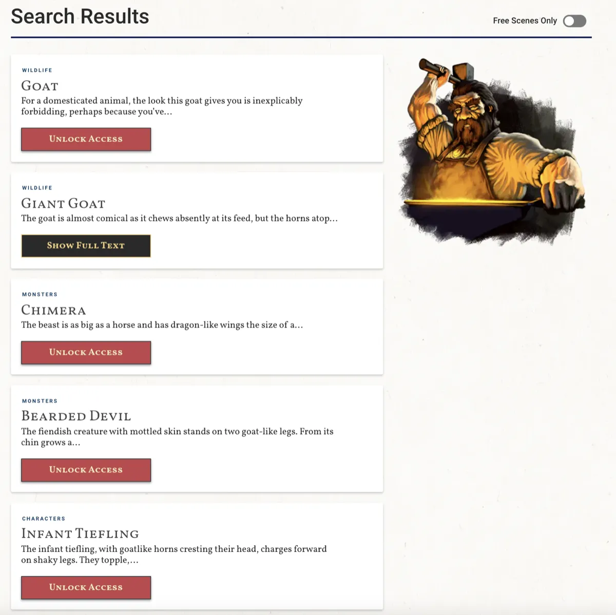
In Convertica's dScryb case study, a membership store's search results had no clear next step, and clicking locked content produced an error message. The variant added a button to every result, labeled with what the visitor could do at their access level, and sent locked results to the store page instead of an error.
The A/B test ran in VWO for 17 days on desktop and mobile, with traffic split equally, and reached a 98% confidence level. Call-to-action clicks from the search results page rose 24%, and paid membership sign-ups, the number that mattered, rose 49.4%. The lesson for your own buttons: a clear, honest label that tells people what they can do removes a guess, and removing guesses tends to move people forward. Results vary by site, so test it on yours.
+24%
Call-to-action clicks from the search results page, 17-day A/B test
Call to action button examples: weak and stronger
The best call to action button examples are the ones that fit their page. These examples show common weak labels and stronger versions for different kinds of site, with the reason each change helps. Use them as patterns, not as copy to paste.
| Site type | Weak | Stronger | Why it helps |
|---|---|---|---|
| Online store | Buy | Add to cart, then Free returns below it | Names the step and answers the main doubt |
| Store, product with options | Add to cart (before options are chosen) | Choose size and color | Says what the click really does |
| SaaS | Sign up | Start my free trial, with No card required below | States the offer and removes the commitment worry |
| Lead generation | Submit | Get my free quote | Names what the visitor receives |
| B2B service | Contact us | Book a 20-minute call, with Pick a time that suits you | Sets expectations for the next step |
| Content site | Subscribe | Send me the weekly guide | Says what arrives and how often |
| Affiliate site | Click here | Check today's price | Tells the reader where the link goes and why |
Accessible call to action buttons work for people and AI agents
An accessible call to action button is a real HTML button or link with a text label that says what it does. That same markup is what screen readers announce, what keyboard users can reach, and what AI agents acting for a person look for when they need to take the next step on a page.
- Use a
<button>for actions and an<a>for navigation, not a styled<div>with a click handler. - Make the visible label the accessible name. An icon-only button needs a text label that assistive tools can read.
- Keep the label specific. Ten buttons all called "Learn more" are hard to tell apart for anyone not looking at the design.
- Give the button a visible focus style, so keyboard users can see where they are.
- Do not hide the key action behind hover-only menus or gestures that need a mouse.
None of this changes how the button looks. It changes whether everyone, and everything, that reaches your page can use it.
How to A/B test call to action buttons
To A/B test call to action buttons well, test the change with the most room to move first, measure the outcome that pays the bills, and decide your sample size before you start. Button color tests are popular because they are easy, not because they usually matter most.
- Start with the offer and the wording. "Get my free quote" versus "Submit" changes what the visitor thinks they are getting. Color does not.
- Then test placement. A button on the first screen, after the proof, or sticky on mobile.
- Change one idea per variant, so you know what caused the result.
- Measure the final conversion, such as orders, sign-ups or qualified leads, not only clicks. A button that gets more clicks but sends less ready visitors forward has not helped.
- Set the sample size first with the A/B test sample size calculator, run for full weeks, and check the result with the statistical significance calculator.
Call to action button checklist
Run this call to action button checklist on your most important page, on a phone first. Every "no" is something to fix or to test.
- The page has one primary action, and it is obvious which button that is
- The primary button is visible on the first screen on a phone
- Its color is used by nothing else on the page and contrasts with the background
- The label starts with a verb and names what the visitor gets
- The label matches the promise in the headline and the copy around it
- The button does what its label says
- A line of reassurance sits next to it: cost, commitment, privacy or next step
- The button is repeated after the main argument and at the end on long pages
- Secondary actions look clearly secondary
- It is a real button or link with a text label and a visible focus style
- Tap targets are comfortably large, with space around them
- Tests measure orders or leads, not only clicks
Related guides
Call to action buttons FAQ
What is a call to action button?
A call to action button is the clickable element that asks a visitor to take the next step on a page, such as buy, sign up, download or book. It is usually styled to stand out, and its label tells the visitor what will happen when they click. CTA is short for call to action.
What color should call to action buttons be?
No single color converts best. Call to action buttons work when they contrast clearly with the background and with everything else on the page, and when the main button is the only element in its color. WCAG 2.2 asks for a 3:1 contrast ratio for a button's visible boundary and 4.5:1 for normal-size label text.
What should a call to action button say?
A call to action button should say what the visitor gets or what happens next, starting with a verb: Get my free audit, Start my trial, Add to cart, Book a call. Avoid labels like Submit or Click here, which describe the action rather than the result. Match the wording to the promise in the copy around it.
Where should I put call to action buttons on a page?
Put the primary call to action where the visitor is ready to act. On short pages, that is the first screen. On long pages, add the button again after the main argument and at the end. On mobile, a sticky button can help on long product pages. Test placement on your own traffic.
How big should a CTA button be?
Big enough to be the most obvious thing to click, and easy to tap. WCAG 2.2 sets 24 by 24 CSS pixels as the minimum target size at level AA and 44 by 44 at level AAA. Many sites use full-width buttons on mobile. Space around the button matters as much as its size.
Should a page have more than one call to action?
A page can repeat the same call to action several times, but it should have one primary action. Secondary actions, such as Learn more or See pricing, should look clearly secondary, for example as a text link or an outlined button, so they do not compete with the main button.
Is first person better than second person in CTA button text?
Sometimes. Get my free audit and Get your free audit can perform differently, and first person often reads as the visitor's own words. There is no rule that holds on every site, so treat the wording as something to A/B test once the offer and placement are right.
How do you A/B test call to action buttons?
Test the biggest uncertainty first, usually the offer or the wording rather than the color. Change one thing per variant, measure the final conversion such as orders or leads rather than clicks alone, set the sample size before you start, and run the test for full weeks until it reaches that sample.