Lead Generation Landing Page Best Practices
Let’s not beat around the bush.
If you’re having problems generating leads, your business is going nowhere. Without a system that continuously generates leads, your business shrivels like an orange left out in the sun.
You know what it’s like. You have an offer with awesome benefits for your target audience. And yet your visitors are not interested. Your site is getting traffic. But no one’s queuing up to sign up for your offers.
When no one signs up for your offers. You don’t get leads. When you don’t have leads, forget about increasing sales!
Here’s the deal:
Whenever a business comes to us with this problem, we always try and focus our attention on the lead generation landing page. Almost always, when we optimize the landing page, we increase the conversion rate.
Look at this way. The people on your lead gen landing page are looking for something. They took time out of their day to click a link and visit your page. It’s in their best interests to find what they went to the site for. When they take action and convert into leads, that’s not only beneficial for you. It’s good for them, too.
But if they land on your site, and decide against doing what they were there to do in the first place, then you’ve got yourself a landing page optimization problem.
You’re failing at convincing your target customers to avail of your offer. At convincing them to take the very offer they came looking for.
It’s as simple as that.
A bit disheartening, right?
But there’s good news!
You can turn it around.
You can increase conversions using UX design and consumer psychology principles. There’s a way to optimize your landing page in a way that generates leads for your business.
With these simple tweaks to the lead gen landing page, you could dramatically increase the number of visitors who sign on to become leads.
Lead Generation Landing Page Best Practices
So how do you optimize landing pages?
Let’s start with a warning.

These are simply guidelines to jumpstart conversion tests. The benefits can only go so far. Don’t treat them as the magic pill that will suddenly convert your traffic to leads.
Keep this in mind as you read these landing page best practices below.
==========
- Stick to one goal
- Make use of directional and visual cues
- Consistency is key
- Design for usability
- Convince with your copy
- Have a compelling call-to-action
- Reduce friction and solidify claims
- Make your value proposition clear
- Design for mobile devices
- Always A/B test
- Landing Page Examples
- Conclusion
=============
1. Stick to one goal
If there’s one key thing we know about buying behavior, it’s this:
It’s easy for people to make a decision when the choice is limited. Too many choices bog people down.
So if you want to convert a warm prospect. If you want a website visitor to take action and convert into a lead, then stick to one goal for every lead generation landing page that you create.
What I’m saying is this. Landing pages are unlike the office water cooler. It’s not the place for small talk. It’s the place where business gets done. And because of that, you’ll have to create a one-track process for your potential prospects.
You do this with a single offering for each page. Give your visitors only one thing to do. Introduce only one product or service for each page. Limit their options and give them one thing to focus on. Direct your visitors’ attention towards one action and you’ll see an increase in conversion rates.
Why is this so important in converting traffic? Here’s why.
You’re already competing for their attention, as it is. As they survey your landing page, they have other tabs open. There’s Netflix to watch, Social Media to poke their head into and YouTube videos to check out.
This means if you want them to take action, if you want to generate more leads, you need to have their focused attention.
Their focused attention on only one goal. When there’s a single thing to do, this helps the brain make a decision. And you want them to make that decision to take your offer, right?
So before you design your landing page. Before you pay for traffic. Before you write any additional content for prospects to read. Do this first.
Ensure that there’s a single action your prospects can take to engage with you.
So now it’s your turn.
What’s the one purpose of your landing page? What one action do you want your visitors to take?
Once you know this, design every element on the page to direct visitors towards taking that action.
Is it to:
- subscribe to your newsletter?
- request a quote?
- donate to charity?
- provide his contact number?
- start the trial of a new tool?
- answer survey questions?
- try the demo of new software?
- download the pdf of a case study or industry report?
- sign-up for a webinar?
Whatever it is, choose only one. That’s your page’s only purpose. Then every single element on your lead gen landing page should be designed to get your customers to take that one action.
This means you stick to that one message no matter what. In effect, visitors have only two choices. If the landing page is optimized, they accept your offer. If it’s not, they leave. Simple as that.
Here are some tips to help you with this
- Focus on only one call to action. If you want your visitors to try a demo, let that be the only measure of website engagement. No share buttons. No links to your about us page. Nothing.
- Don’t give your prospects the option to click links that don’t directly drive people to convert. Often, this includes getting rid of navigation links.
- If you must present different options, like different pricing structures, highlight the choice that you want them to take. This could be the product or service that converts the most. The one that provides the most value.
2. Make use of directional and visual cues
Once you know the action you want prospects to take, the next step is to create lead generation landing pages that are designed to guide target customers towards it. To do this, provide a specific and predetermined path for visitors to take.
But how do you do this on a virtual page? How do you start creating a path to convert visitors with only computer pixels to work with?
One of the effective ways to do it is by using directional and visual cues. These are design signals to guide your users towards important elements on the page. These design elements are like beacons on a screen that capture your prospects’ attention. They ensure that their minds don’t wander. That they notice the relevant steps they have to take as they read your content and decide whether or not to take your offer.
You’re not there to actually hold their hands. So in place of this, use the tools that you have at your disposal. What tools? The tools that all online marketers must learn to wield: colors, fonts and imagery. Use these web design elements when optimizing your pages and your prospects will stick to the path that leads to a conversion.
So how is this possible? How can simple design changes have an impact on successful lead generation?
Well, here’s the thing. Our brains like to keep things simple. And when there’s a signal on a page that tells us where to focus our attention, we gravitate towards it. That’s what changes in designs can do.
Here are some tips on how you can start doing this.
- use arrows that point to the ctas
- have an image of a person face the form you want the person to fill in
- have an image of a man or woman point to the offer
- use colors to emphasize parts of the page you want people to focus their attention to. For example, use bright colors for the CTA button and make it stand out from the rest of the elements on the page.
- Bold important keywords to attract the eyes to that part on the page
3. Aim for message match and consistency
A lead generation landing page is part and parcel of your conversion funnel. It does not exist by itself.
There are other moving parts in your marketing strategy that determine its success. To increase conversions, you can’t build it in isolation to other marketing campaigns.
Yet one of the big problems we see is that different teams within a company don’t talk to each other. The SEO’s do their magic. The PPC ads people do their thang. The web developers work away. They don’t share their campaigns and processes.
What ends up happening is a lack of message consistency from one part of the conversion funnel to the next. There’s no message match. The ad promises one thing. But the landing page promises something else.
When your optimization process runs this way, it doesn’t matter how perfect the landing page is. It doesn’t matter if you have a landing page with flawless UX, dozens of testimonials and a strong copy that hits right through the heart. If the traffic that lands on it are not the type of visitors who are looking for your offer, they will abandon the landing page as quickly as they arrived.
Here’s what I’m trying to drive at.
If you want effective landing pages, ensure there’s a message match between the source of traffic and the page on your blog. Make it a practice to have the same message between different sales and marketing channels: the PPC ads or the meta titles in Google search results must have continuity with the headline and the content on the landing page.
When you do this, you prime visitors for what they’re about to do. There are no surprises and their hearts and minds will be in it, too. Doing this alone will make a big difference in eliminating friction. And provide prospects a reason to stay and read what’s on the screen. It can have an impressive impact on your landing page conversions. It’s that powerful, it can lift conversions by as much as 212%.
Tbh, if you pay for PPC ads, then this is one of the first things you have to do. Or else, you’re just throwing money away. And yet many businesses continue to do this.
Here’s an example. I just did a quick Google search – “buy a house in Valencia Spain“.
Here’s the top Google AD.

And here’s the landing page.
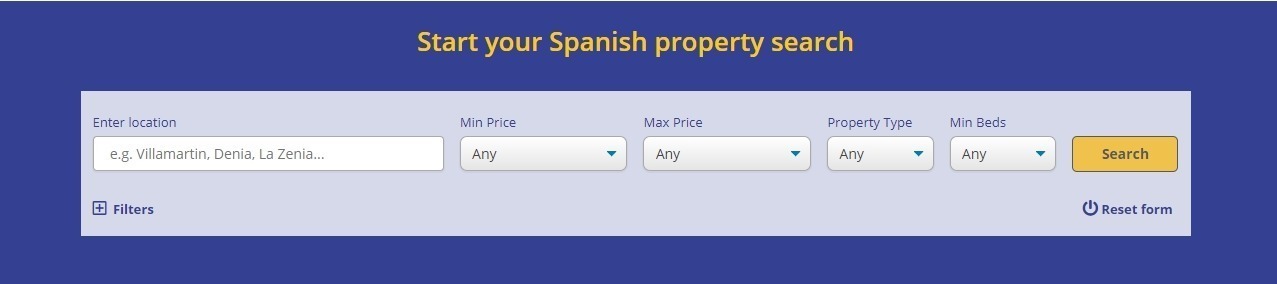
You see the mismatch?
When I look at that Google ad, my brain thinks, “Ok. I’m going to be looking at a list of properties in Valencia, Spain.“
But what greets me on the landing page?
A search form with the headline “Start your Spanish property search.”
I’m not looking for a “Spanish” property. I’ve already narrowed down my options to Valencia. And I expected to see a landing page with a list of houses for that area.
You might reason that it’s easy enough to just type Valencia under location. And you’re right. But that’s an extra thing for me to do. And at this point, you’ve just interrupted my line of thought. Your landing page is supposed to limit me to only one path. You’ve not only annoyed me by not giving me what I expected to see. You’ve also opened a new path for my brain to start wandering off to.
That very subtle change in my thought process. That extra action you want me to take will impact what I think about your business and how I’ll engage with you.
Sure. Big brands like Amazon and Apple can get away with it. But for most online businesses, it’s a mistake you can’t afford.
Still don’t believe me? Let me take you to the other side.
Let’s go back to the same example. If I were doing the same Google search. And I get to a landing page with a list of the hot properties for sale in Valencia this week — this is what I feel.

A completely different state of mind. And this is where you want your visitors to be when they are on your page. Happy visitors are more likely to take action and engage with you.
Capeesh?
But how do you do this? Here are some tips.
Go back to your one goal. That’s where it starts and ends.
- Use the same words in the ads and the landing page headline. This also holds true for any message you have on other marketing channels – from social media to Google search listings. This way, people know they’re on the right page. They’re not left wondering, “Did I click the right link?”
- Remember what I said about the one specific goal for your landing page? When writing the content, ensure your CTA is consistent with the promise on the headline. Joanna Wiebe recommends writing the call-to-action first. Then reverse engineer from there. This way, as you write the headline and the copy, it’s always in-line with the action in the CTA button.
4. Get rid of things that distract users from the goal
Remove any additional elements that take the visitor’s attention away from the page. A common reason visitors leave is that they get distracted by other things. Some distractions are outside your control but others are not.
So how can you ensure that people do not get distracted? Here are some examples of things you can do
- remove any links on the navigation menu that take people away from the page
- get straight to the point. Too much information can harm your optimization efforts
- limit videos and images. True. They can sometimes lift conversions but they can also distract people. Test it.
- don’t ask for unnecessary information
5. Design for usability
Just because a lead generation landing page looks pretty doesn’t mean it’s going to convert.
Many times, I’ve seen that bells and whistles often distract visitors from the objective.
I’m not suggesting that you build an ugly site. I’m saying that beauty should be a secondary consideration in landing pages. And if at any point it clashes with the goal of the site, always ditch beauty in favor of function.
Look at it this way.
When people first visit your landing page, they need some guidance. The ideal situation is for you to be there. To welcome them in. To answer their questions in real-time. To help them whenever they get stumped. But you can’t do that.
So what do you do instead?
You do everything in your power to optimize the user experience using the tools you have.
The people who land on your site know what a landing page does. They know they’re going to have to give something up if they engage with it.
They’ll have to give something that belongs to them – be it their time, phone number or email address.
Because of this, when they first get to the landing page, they have more reason to bounce off than to stay.
It’s your job to stop that from happening and tip the scale in your favor.
And the way to do this lies in what psychologists call cognitive load. In simple terms, this means making the brain do as little as possible. It’s
- making page navigation easy for the prospect
- having content easy to understand
- showing desired actions clear to act on
All these together form the foundation of designing the user experience.
There are many things you can do to improve your site’s UX. But for this article, let me share a few things you can do.
When it comes to landing pages, I find that there are three crucial points to optimize for UX.
- when a prospect first lands on the page
- as he scrolls the page content
- as he decides what to do next
Optimize these three critical points and you create a page that the brain prefers and prospects love. And why is that important? Because making the brain happy is one step closer to converting your target customer.
So with that said, here are some UX practices for effective page optimization campaigns.
- Optimize for the first impression. The first crucial seconds when visitors see your page has a strong effect on cognitive load. If the elements are squished too close to each other, if the imagery is not enticing, if the page looks unprofessional, then the brain will immediately feel like there’s a lot of work that needs to be done. So make it easy for the brain by making use of space and having a clean layout.
- Provide design elements that make reading the page easy to read. This includes using directional cues, imagery to support important points, and using colors not only for branding purposes but also to direct people to areas of the page you want them to focus on.
6. Convince with your copy
So you’ve designed a landing page that’s easy for users to use. You got rid of navigation buttons. The directional and visual cues are on-point. The hero image is perfect. You even have an awesome video on the page.
Now comes the substance of your lead generation landing page: the copy.
The copy is your “love letter” to the readers. This is where you convince them that engaging with you benefits their lives.
It makes potential clients see the value of your offer.
How do you achieve this?
You achieve it by meeting the customer where he is in the buyer’s journey and making him see that you understand his needs.
Only when he fully grasps this should you start talking about the product or service you offer.
Here are some ways to help you with landing page copy best practices to increase your site’s conversion rates.
- Before you write your copy, get up close and personal with your target audience. Research the voice of your customers. Hand out a survey and collect answers to relevant questions about your offers. Know the exact language they use to describe their problems. Gather customer testimonials and reviews. Find strong feelings that a lot of prospects use to describe your offers. All this information will give you the insights you need to write the content for the landing page. When you know your target customers well enough, effective copy that increases conversion rates will be very easy to write.
- Add an element of curiosity to your content. Don’t’ say “Download my eBook about social proof”. Say “Download this eBook and learn the technique we used to increase our sales by 50% last month!”
- Suck them in with the content above the fold. The visible part of the screen that prospects first see when they land on a page is prime real estate. It’s when people decide whether to give you the time of day or not. It’s an important part of your lead generation landing page. And if you’re an internet marketing strategist or copywriter, you should spend a lot of your time perfecting content above the fold. Ensure that important elements are visible above the fold including the headline, subheadlines, value proposition, and images (when applicable) and the main benefit. For short landing pages with a form asking for contact details, design it to show on the screen too.
- Clearly talk about the benefits of your product or service. People who’ve been running digital marketing campaigns for any length of time know to emphasize the benefits rather than the features of the product or service they’re selling. And yet, many lead generation landing pages still fail at this. You know why? It’s usually because they don’t know the pain points of their visitors that well. So when your copy isn’t converting potential prospects, go back to the first step and collect valuable customer data. Know your audience and writing sales copy that converts becomes a piece of cake.
7. Work on your headlines
Headlines and subheadlines may just be 1-3 sentences of your landing pages. But they play a big part in optimization. What exactly do headlines do? Well, an effective headline captures a visitor’s attention and entices them to stay on the page. It encourages a prospect to scroll the page and read your offer.
Here’s a secret. If you’re out of headline ideas, start with headline templates. These templates have been tested many times by many conversion copywriters and they make your job easier.
8. Have a clear and compelling call-to-action button
The call-to-action is a point of great tension for your customer.

He knows that he’s about to give up something that belongs to him.
Understandably, he wants to ensure that he’s not going to make a schmuck of himself and regret it later.
So your call-to-action button should help lessen this tension and anxiety.
Here are two things that can help you with this
- Make it clear what he’s going to get. Don’t just use the word Submit. Use more specific language like Start trial now. Add to Cart. Check Price. Try Demo Software. Or I want to sign up for the webinar
- Start with an action word. For extra points, use “My”. So instead of saying “Download the Ebook”, use “Download My Ebook”.
- Make it clear that it’s a call-to-action. Have it stand out from the rest of the elements on the page. Use bold colors. Contrast it from the background. Place it inside a box.
CTA buttons can be as detailed as Search Logistics’

Or as straight to the point as Moz

You’ll have to test which one works best for your audience.
Once you start testing the performance of your pages, you’ll find that ctas are great for quick wins. They’re one of the quickest things you can change in your pages. Marketers who don’t have a programming background can easily test them. In fact, many of the AB testing platforms have visual editors that allow you to easily test call-to-action button colors and text. And the good thing about all these is that testing call-to-action buttons can often have a big impact on your conversions.
That’s why one of the first things marketers do is fiddle with call-to-action buttons. It’s a small tweak that delivers major returns.
9. Reduce friction and solidify claims by adding quality social proof
Use social proof to get your target customers to act on your offer.
Social proof is a shortcut people use to make decisions. It helps reduce anxiety. When there’s third-party proof, prospects tend to believe their claims more than the brand tooting its own horn. It’s a shortcut to getting visitors to trust your company and the validity of your claims. It helps lessen customer anxiety which increases a page’s conversion rate.
For example,
If many people say your company is the real deal. The brain in shortcut mode will say, “Hmmm. It must be. If they trust this company, I can give it my trust too.”
If respected people in your industry give glowing testimonials on your brand and say your services have changed their lives for the better. A visitor thinks, “I want what he’s got, too”
If a security software badge indicates your site is trustworthy, a customer will believe it more than if you said it yourself.
So make a lot of space in your layout for social proof.
Examples of social proof include:
- user testimonials and reviews
- endorsements from celebrities or influencers
- business credentials
- logo of a credible brand you’ve worked with
10. Clearly state your value proposition
The value proposition is what makes your company stand out from other businesses selling the same thing as you.
Why should a user buy from you? What makes you different?
Your target audience needs a valid and compelling reason to accept your offer. What’s so unique about what you’re offering?
Finding your value proposition might take a lot of “soul-searching” but here’s a way to help you find your brand’s unique feature that separates you from other businesses.
Picture your target customer in research mode with 5 tabs open.
Four of the tabs belong to your competitors. They are all offering the same thing as you.
Now here are the important questions:
What makes you different from them? What do you have as a company that your competitors don’t? What will stop the visitor from clicking your tab’s X button?
That’s your value proposition.
11. Design for mobile devices
Design for mobile devices first before you build the landing page for desktop.
Why?
People are increasingly using their phones to go online.
And here’s the interesting thing:
Most people use their mobile devices while on the move. And then transfer to desktop when they’re ready to buy.
What this means for you is:
It’s on mobile devices that you should be doing the convincing. It’s where you build trust.
But you can’t do that with a lead generation landing page that is not optimized for mobile. So when you make your landing page, keep this at the top of your list of things to do.
Here are landing page best practices for small screens to get you started:
- Be clear with your value proposition above the fold. As soon as visitors land on the page, he should immediately know what the page is about and why he should stay. Do this with a compelling headline and a clear value proposition. If you’re using a hero image or a video, ensure it doesn’t use up all the space above the fold.
- Test making the copy short and crisp.
- Create a form that’s short and easy to fill out
- Make it speedy. Yep. That one. How’s your lead generation landing page load time? Impatient mobile users want yours to load in under 2 seconds. How do you fare?
- Add a sticky header or footer with your CTA button. Have a CTA button that’s always visible on the screen and make it easy for prospects in buying mode to convert.
- Make use of white space. It’s great for the user experience.
- Put CTA buttons on areas that the thumb can easily reach on mobile devices.
12. Build a form that lessens anxiety
On a lead capture landing page, the form is almost always the place where potential leads engage with the page.
It’s an important part of lead generation landing pages. And yet, it’s also the part that causes anxiety with your target users.
People hate to fill in a form.
So ease the mental pain that a form often triggers in people. You’re already making people work by filling the forms out — which is not something that people love to do, anyway — and the least you can do is to make that a no-fuss affair.
How do you do this?
There are two main things to consider when creating forms for landing page:
The length of the form and the visual appeal.
Optimizing these two things will make a big difference in converting visitors.
How do you do this?
On form length
A lot of marketing advice will tell you to limit form fields. And for the most part, that’s true. But like a lot of things on the internet, this has so much to do with your relationship with the buyer.
If they only just got to your funnel, make the form concise and direct. A simple email address form field is enough. If they’re further down the funnel and you have a more advanced relationship, they’ll be more inclined to answer more questions or fill out long forms.
At any rate, studies have shown that 7 form fields are the maximum number of fields after which the rate of abandonment escalates.
So reduce long forms and include only the necessary form fields. At the most basic, this could just be someone’s contact email. This is especially true when you’re asking for information from people at the top of the funnel. Bear in mind they’re not that invested in you yet, so they don’t have that much of a reason to give you their personal information.
When visitors are at the bottom of the funnel and you already have a deeper relationship with them, you can get away with a longer form. But even then, ask only for what’s absolutely important for your relationship at that stage.
On visual appeal
Embrace white space. There’s no easier way to immediately make visitors feel better about your form. It costs nothing yet it does wonders in the mental frame of mind of your user. It makes him think the task is less draining when there is a good use of white space between from one form field to the next.
And lastly, gamify your forms. Most people don’t use auto-fill. So they have to write all the information every time they fill out a form. This makes forms a real pain. There’s one way to remove that pain. Gamify the forms. Make them interactive. People tend to finish forms when it’s easy for them and there’s not a lot of brainpower involved. Try it. You’ll be surprised how much more willing people are to give you their contact info this way.
13. Always A/B test your lead generation landing pages
You never know what’s going to work. And often just a little change can spell the difference between success and failure.
So get into testing mode. As soon as you make changes to your lead generation landing pages, do it using a data-backed scientific process, and you’ll have valuable insights that will help you in converting visitors to leads.
Here are some ideas for page elements that you can test:
- headlines
- sub-headlines
- copy lengths
- CTAs
- copy
- images or videos
Best Lead Capture Landing Page Examples
SEMrush
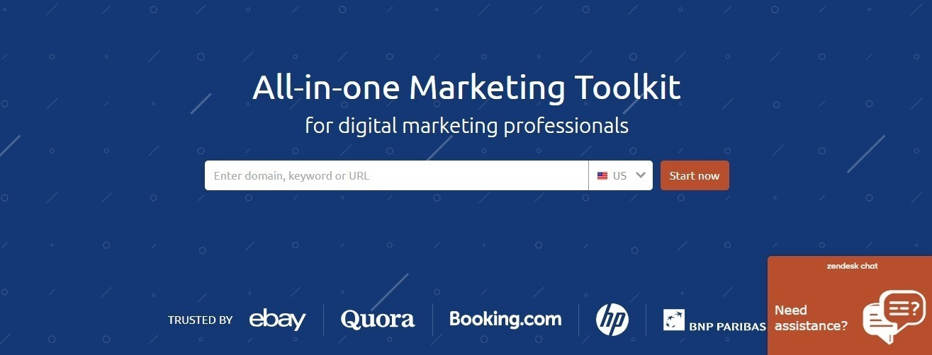
SEMrush’s one goal is clear. To get you to try the tool. They also show that they are a trusted service by showing social proof. The logos of big companies that use them are very prominent above the fold. This is prime real estate when it comes to website design. And there’s a reason why they’ve got all these logos plastered on it. Social proof, especially from a big brand or a trusted expert, can and do swing the needle in your favor.
That’s social proof that provides the visitors with some validation to know more about what they offer on the page. And click the cta button.
Mental Mastery
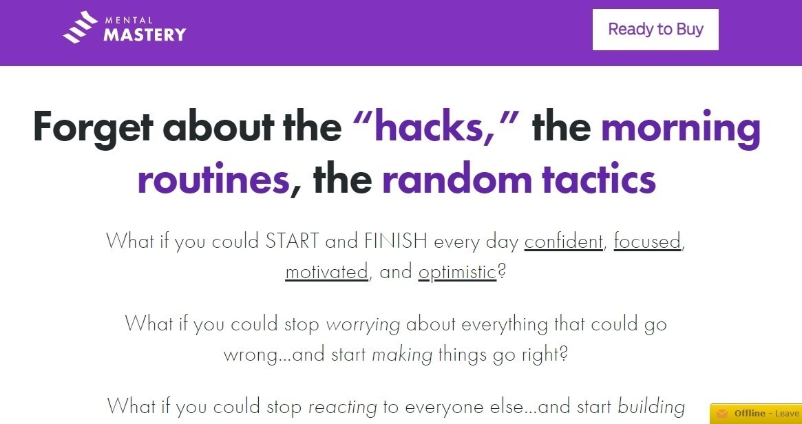
This is one of Ramit Sethi’s courses.
He doesn’t skimp on words. In fact, many of his sales pages start with very long stories to lure the reader in before he starts talking about his product.
Yes, it has a big cta button in the header for people who are already in the buying mode. But after that, it all starts with one long piece of educational content.
He does a lot of storytelling. He makes himself an example. Talks about his life. He shows the reader that he understands what they’re going through because he’s been through it too.
He talks about the reader’s problem for a very long time. As you scroll down the page, there are more than 2000 words to agitate the readers’ pains points That’s copy that really gets the reader to understand that he is on their side. And whatever it is the reader’s going to give up, it’s going to be worth it.
Cleanzy

Cleanzy has a very clear value proposition.
You don’t want to take more time than necessary to look for a cleaner. But it’s an important decision. You’re letting someone into your house. Can you trust them? What types of jobs can they do? Who are they? These are the potential customer’s deepest anxieties. And Cleanzy irons-out these worries with its clear and compelling value proposition.
“The Easiest Way To Book Trusted Professionals”
If you visit this landing page, you’ll also see how everything on that page puts the reader at ease. And check out that form. It asks only for the post code
The copy emphasizes a $150,000 coverage in the event of any damage. Anxiety squashed.
It shows how they only hire trusted cleaning professionals who go through a background check before they’re hired. Major client worries eliminated.
What to do next to generate more leads
So here’s what you do.
Assess your current lead generation landing page. Where are you at? What are the conversion rates?
If you have horrible conversion rates then changing just one element on a page won’t cut it. I suggest overhauling the whole page based on the landing page best practices outlined here.
After you create a new page, observe its performance and look at the sales data. See if that’s more effective at converting visitors to leads. If it converts better than your old page, then start testing. You then iterate and make this new page better.
On the other hand, if you’ve already got landing pages with ok conversion rates, then you need a different optimization process. I recommend doing a CRO audit first. Spend time analyzing data. Look at your analytics and notice what the data is telling you. Install a heatmap and notice where your visitors are stalling, what they focus their eyes on, or at what point they leave. All this research helps you make a strategic plan for improving the performance of a landing page. Have a good and honest look at all the elements on the page. Then from there, identify the element that you think affects conversions the most. Then make changes to that element. From there, you and your team can keep testing to improve the relevant page.
Conclusion
In conclusion, landing pages are essential to the success of any digital marketing effort. Businesses may develop highly effective landing pages that encourage conversions and yield quantifiable results by adhering to best practices and using conversion rate optimization ideas. Concentrating on producing a seamless user experience, writing catchy headlines and copy, and adding effective calls to action is crucial.
Testing and iterating the design while optimizing the website for mobile devices is essential to ensure that the design produces the most significant outcomes possible. In order to make sure that the right audience is being reached with the right message, organizations need also pay special attention to their targeting and segmentation initiatives.
1 Comment
Submit a Comment

Hi, I’m Kurt Philip, the founder & CEO of Convertica. I live and breathe conversion rate optimization. I hope you enjoy our findings.
We’ve worked with over 1000 businesses in the last 6 years.
Let’s jump on a quick call to see how we can help yours.
Client Case Studies


Great article Kurt. Thanks for taking the time to spell it all out.