We’ll increase conversions by
20-100+%
on your website.
Get a FREE Audit today
See how we can help your business increase conversion rates
How to do Mobile Conversion Optimization
Can I be totally honest with you?
You’ve been taught wrong about mobile conversion optimization.
You’ve been made to believe that you only have to make a responsive mobile site and conversion rates will match that of desktop.
But that could not be more wrong.
We know.
We’ve worked with around 400 online businesses. And we’ve seen how desktop and mobile conversions can go in opposite directions even when the site is responsive.
It’s time you stop being a victim to this widespread mentality.
So that you can have mobile conversion rates like this.
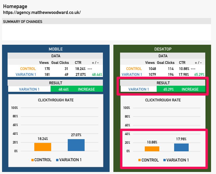
That’s only one of the results of the many mobile website optimizations we’ve done at Convertica. And we can do that for you, too.
Mobile Web Conversion Rates Benchmark
Latest research shows that mobile visitors have surpassed desktop users.
Yet the global average for mobile conversion rates is still at 1.79%. While it’s 4.44% for desktop.
Think about that for a minute.
Go back to this past year. If your mobile conversions were as high as desktop, how much more money would you have made this year?
How much money has been leaking out of your business only because your mobile site is not optimized?
To be honest, it’s not your fault.
It’s this common advice that trips many website owners. “Make your site responsive and you’re good to go,” is what a lot of articles say.
Except that it doesn’t work that way.
Why am I saying this? We know that many websites have already jumped on the bandwagon of responsive sites. But the average mobile conversion rates in various industries are still marginally lower than desktop conversions. Everybody’s losing on mobile across the board.
That sounds rather grim, right?
But let’s look at the bright side today. That’s good news for you!
Why?
Because it’s not just you. Your competition is very likely suffering from the same dismal mobile conversions. But you’re here now. And today it changes. Today you will master the art and science of mobile CRO.
Are you ready? Let’s get this show on the road.
So what’s the deal?
Why don’t people convert as well on mobile?
The mobile ecommerce ‘gap’ chart below shows us the top five reasons consumers don’t feel comfortable shopping on mobile.
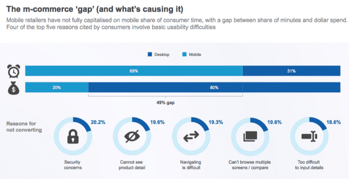
Here are the reasons again:
-
20.2% have security concerns
-
19.6% cannot see product details
-
19.3% say navigating is difficult
-
19.6% say they can’t browse or compare
-
18.6% say it’s too difficult to input details
Can you spot something interesting?
These are all things you can change! These are within your control. This means optimizing for mobile users is not a lost cause. There’s a wealth of opportunity that you can capitalize on if you do the work now. It is achievable. You just have to put things in place.
Before I show you how, let me first tell you why your responsive website is failing you.
It’s because of this:
It’s a squashed version of the desktop design. It took everything from the desktop site and dumped them all on to the mobile version.
Yes. All the elements stack one on top of the other. And it looks beautiful. But looking good and making sales are two different things.
When you dump all that information into the small screen of a mobile device, you disregard the non-negotiable part of successful conversions:
that a well-optimized page must respond to and interact with the psychology of the person using the site.
Think about it.
When do you use your smartphone?
On the go while on your commute to work. In the passenger seat of a car. Or in a queue. It’s usually at a time when you’re also doing something else. When distraction is lurking in the corner.
Compare this to using your desktop. Aren’t you more relaxed, less hurried and more focused when using a desktop device?
Now think about how these different situations affect your online experience. You have different levels of patience. Different expectations. Different goals.
But what do most online businesses do?
We disregard this shift in user expectations and treat the visitor equally. And that’s when converting the visitor becomes a struggle.
So what do you do?
The answer is no secret.
Know your mobile visitors. Know what separates them from your desktop customers. When you know them, it becomes easy to build a site that encourages them to stay and engage with you.
To do this, use your analytics or other CRO tools to understand the behavior of this subset of visitors. But before you get into the nitty gritty, consider these three factors that affect the experience of customers on mobile devices. And let’s see what these mean for your conversion rate optimization strategy.
1. He is usually on the go or doing something else
What does this mean for you? Get to the point. A desktop user scans a page. A mobile user scans even faster. Present information in a digestible manner that makes it easy for him to quickly see what the page is about. Don’t make him do any work. Make the user experience so flawless that he feels good being there and then becomes eager to engage with you.
2. He has less patience
What does this mean for you? Make it easy to find things. Make it easy to compare products. Make it easy for him to read the copy. You don’t want him to have to minimize and maximize the page every time something catches his attention. Know what the visitor wants from a page and then deliver it to him at the right time.
3. He doesn’t trust the mobile infrastructure as much as he does a desktop device
What does this mean for you? This is one of the main reasons people don’t buy online, so address this problem. If you want conversion rates to increase, be proactive in putting this sense of security in your buyers. People used to feel the same way with desktop. But unfortunately for mobile, the market is not quite there yet. So be more persistent with showing signals of trust and badges of security.
Mobile Conversion Optimization tips
The minute you start thinking about your user, your mobile conversion rate increases. It’s that simple.
This means getting up close and personal with your target customer. There are best practices to follow in designing a site for mobile devices. But if you want conversion rates that go above the industry average, then know everything about your user – what makes him tick, why he visits your site, what his goal is.
How do you do this? Here are some conversion optimization tips to get you to a good start.
Get the basics in place
When it comes to CRO, your customer is the star.
Let me be clear though. You can know the customer all you want. But if you don’t have the basic website optimization in place, it’s all for naught.
What am I driving at?
It’s this. Every mobile optimization strategy starts with a basic foundation that holds true for anyone with a website. I call this low-hanging fruit. They are simple changes in design and site architecture. If you’re not doing these yet, then making these changes will increase mobile conversion rates.
Increase page speed
You may think of page speed as an SEO matter. But it’s equally important in conversion rate optimization.
People tend to stay away from slow-loading mobile sites or any websites. And you can’t convert people who bounce off to another site. So get this in place first.
Make call-to-actions clear, bold and easily accessible
When someone clicks a link on your site, it means you’re doing something right. You’ve convinced the person on the other side of the screen to engage with you.
But let’s say he’s about to click a link. But it’s so small and too difficult for his thumb to click. This may seem like it’s only a little nuisance but this can quickly become frustrating for mobile users.
And if they’re not invested in your site or brand yet, it’s an easy decision to leave and click the exit button on their mobile screens. And online, people almost always choose the easier option.
So when designing CTA links:
-
Make it stand out from the page
-
Make it easily accessible.
-
Even better, for important call to actions, consider using a sticky banner. This way, the visitor doesn’t have to scroll up and down to find the link.
Put important information at the top of the page
So you’ve got the task to optimize a page.
Here’s the first thing to find out.
What’s the one thing the page is supposed to do? Just one thing.
Do you know what it is? Great.
Now put the important elements that lead towards that goal on top of the page
-
If it’s for lead generation, make the form visible on top.
-
If it’s a product page, get the buy button in that area.
-
If it’s a blog post, have a link to a lead magnet or related posts within easy access
Here’s how Barnes and Noble do it during the Christmas period. They make it clear when standard shipping ends for gifts to arrive in time before Christmas day. It’s important information the buyer needs before he starts browsing and searching for gift ideas. It eliminates a common worry Christmas shoppers have.

Now go do it and see what that does to your mobile website conversions
I can’t emphasize enough the importance of making the above changes to your site. If you’re at the beginning stages of mobile conversion rate optimization, put this basic foundation in place first.
This is what we usually do at Convertica. There are many other things we can do to increase conversions. But we also know that when we make these changes to a non-optimized mobile site, we see conversions increase right away.
So if your site doesn’t have these three things in place yet, go do it. That’s how you get an increase in revenue in the shortest time possible.
Would you rather have us do it for you?
Click here to chat with an expert
Improve Conversion Rates On Mobile
You’ve laid the groundwork for a solid mobile CRO strategy. You should have fairly good conversion rates by now. But if you want to join the big leagues, then you’ll need to think further ahead than the competition.
This isn’t just about changing layouts and designs. This is about truly understanding your customers. This is about crafting a shopping experience that is sensible to the mobile user’s frame of mind.
Ready to get down and dirty?
Great. Here are your next steps.
1. Know their one goal
Mobile users are like horses in a race track. They go into your site with one purpose and they want to get it as quickly as possible.
They hate any distractions that don’t take them to it. And will be quick to judge your site if it looks like it doesn’t keep in line with this goal.
What does this mean for you?
It means that every page on your site should take this one goal seriously and respect it with the same reverence as your mobile users do.
It means that you engineer every element on a web page to get your visitors to get closer to the very reason they’re on that page.
But how do you do this? How do you know what their one goal is?
Easy. Do a site audit.
A site audit will show you the mobile optimization gaps that stop your visitors from engaging with you. It also gives you ideas on making the shopping experience worthwhile for your customers.
Most importantly, you’ll find which goal to laser-focus on. Click here to read our mini-course on how to conduct a CRO audit.
2. Make important changes to gain conversion lifts
Once you know your user, it’s time to make some changes (you did do that site audit, right?).
Here’s a tip. Prioritize the pages that impact conversions the most.
Is there a page with lots of websites and mobile traffic but with conversions that are below your site average? Then start with that one. Get focused on those visitors.
Study that page and figure out what’s stopping them from scrolling, clicking or buying.
Fix the pages based on the main reasons why people on mobile don’t engage with an online store. Start by answering these questions:
-
Are there enough trust signals so that he feels that he’s buying from a secure website?
-
Is it clear what the product is from the images and the copy?
-
Is it easy to navigate from one page to another?
-
Is it easy to compare products?
-
Is the form (if any) easy to fill-in?
Having these questions in the back of your mind every time you optimize a page addresses the main concerns a visitor has when buying online.
3. Let the different pages do their own jobs
Let’s say you have a mansion with lots of rooms and hallways.
A plumber arrives to fix a pipe in one of the 10 bathrooms. You don’t just leave him at the door to find his way around the house. You lead him to it (or your butler, for that matter, sire!).
It’s the same for your website. Have some level of control on where you want the visitor to go next. Streamline the path to conversion by giving each page a job of its own.
The home page
The homepage is where you qualify visitors. It’s not the place to ask for too much too soon. Most of the people who arrive here are at the top of the funnel.
So use your homepage to lead them to where they want to go. It’s also your site’s North Star. When a person gets lost in the pages of your site, he goes back to the homepage to find his bearings.
Here’s Crate and Barrel’s homepage for non-US customers in December

This says a great deal about the site. It’s already personalized to me even at the homepage level. This makes me feel like they’re talking to me. Also, this means that every time I add an item in the shopping cart, I know that it can be shipped to my country. That’s one worry I don’t have to have in the back of my mind as I shop.
And that’s really the frame of mind you want your visitors to have – to have that sense of security that they’re doing the right thing. That they’re not wasting their time.
The category pages
Many eCommerce sites spend a lot of their resources on product pages. With good reason.
But when they disregard the category pages in the process, that’s when it goes wrong.
The category page may not be where the money is but it’s a vital stepping stone to getting there. So,
-
Make it easy to access.
-
Have clear category titles that even a first time visitor can understand.
The product pages
You’ll find yourself optimizing product pages a lot. It is, after all, the pages on your site that directly impact sales and revenue.
It’s also where people at the bottom of the marketing funnel congregate. They’re ready to buy. You just need to do a good job of convincing them to buy the item from you and not from a competitor.
It’s the job of the product page to reassure the buyer that he’s not going to regret his decision.
Here are some pointers for building high converting product pages for mobile.
-
Include the title, product image, price, availability, add to cart button and a short description at the top of the page
-
Lessen anxiety by adding security badges and trust signals
-
Include a detailed product description
-
Make it easy to compare products
-
Add shipping information
-
Include different ways to pay. The easier for the customer the better
4. Optimize the search bar
Mobile visitors use the search bar a lot on mobile. It’s the quickest way for mobile users to find a product.
So have a robust search engine that:
-
knows common misspellings
-
has auto-suggestions
-
puts out of stock products at the bottom of the list
Don’t underestimate the power of a highly optimized search engine. It encourages people to stay on your site. The longer they spend time engaging with you, the better it is for conversions and tempting for them to click that mobile checkout button.
5. Give users the option to finish on desktop
Buying on a desktop gives customers a sense of security that mobile phones and mobile apps don’t. Perhaps at some point, the market will mature and mobile purchases will become mainstream. But for now, a lot of people still hesitate to use their phones for online commerce.
But that doesn’t mean you can’t get your share of the pie.
Keep your mobile users in your ecosystem by giving them the option to finish on desktop. They can add their items to the cart through mobile but then pay in the comfort of their desktop devices.
And this is what it all boils down to
More people use mobile phones to go online than a desktop device. And yet conversion rates leave a lot to be desired. If you want to keep your business relevant in the next decade, you need much more than a responsive site. To take your mobile CRO to the next level, you need a different strategy. One that considers the difference in user psychology between these two devices.
If you want some help with optimizing your mobile website, schedule a chat with us. This is what we’re good at. Let this be the year your site’s mobile conversion rate finally catches up with desktop conversions.

Hi, I’m Kurt Philip, the founder & CEO of Convertica. I live and breathe conversion rate optimization. I hope you enjoy our findings.
We’ve worked with over 1000 businesses in the last 6 years.
Let’s jump on a quick call to see how we can help yours.
Client Case Studies


0 Comments