Case study
Empire Flippers case study: 51.6% more valuation tool submissions in 47 days
How Convertica turned the Empire Flippers valuation tool's static form into a step-by-step flow of taps and sliders, tested it against the original with a split-URL test, rolled it out, then reworked the mobile layout for people using a phone with one hand.
Empire Flippers case study summary
This Empire Flippers case study shows how Convertica raised submissions from the Empire Flippers valuation tool, a lead capture tool on a marketplace for buying and selling online businesses. A static form was rebuilt as a step-by-step flow, tested against the original with a split-URL test, rolled out, then refined for mobile.
+51.6%
Conversions (valuation tool submissions), 47 days
Source: Empire Flippers, valuation tool submissions, 47 days, split-URL test then rollout
| Client | Empire Flippers, an online marketplace for buying and selling established online businesses |
|---|---|
| Vertical | Lead generation |
| What was optimized | The submission process of the Empire Flippers Valuation Tool (lead capture) |
| Goal set beforehand | Increase submissions by 50% |
| What changed | A step-by-step flow: multiple-choice questions, sliders, visible progress, no Next button |
| How it was tested | Split-URL test, 50% of traffic to each version, then rollout of the winner to all traffic |
| Result | +51.6% conversions (valuation tool submissions) in 47 days |
| Tools named | Formisimo (form analytics) |
Who is Empire Flippers?
Empire Flippers is a website broker: it handles the sale of established, profitable online businesses. At the time of the case study, Empire Flippers described itself as an Inc. 500 online marketplace with over 11,000 members, and its free valuation tool had already evaluated 45,000 businesses. Those figures are the company's own, as stated in the original case study.
The valuation tool gives a business owner an estimate of what their site is worth. For Empire Flippers it is also lead capture: every completed valuation is a potential seller. The tool was already working well. The question was how much better it could do.
Empire Flippers chose Convertica because of its experience with lead generation sites, both sites the team owned and sites it managed for clients. Kurt Philip had also bought and sold sites on the marketplace himself, more than once, so he had used the tool as a customer before Convertica worked on it. That turned out to matter a great deal.
What was wrong with the valuation tool?
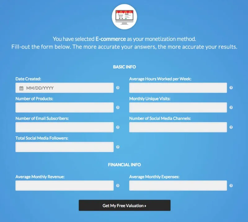
The Empire Flippers valuation tool asked for too much effort too early. The first step was easy: pick how the business makes money, with one click. The next screen was a static form that asked for a lot of typed input straight away, so a visitor who had been clicking without thinking now had to stop, find numbers and type them in.
That was the sticking point Kurt had hit himself as a user. The work also had to be done on Empire Flippers' existing WordPress site.
What was the hypothesis?
The hypothesis was one sentence: the more a user has to think, the lower conversions will be. It came from two places: Kurt's own experience of the tool, and Convertica's earlier tests on lead generation tools, which pointed to conversions rising when the first two or three fields of a tool need no specific input.
Before any work started, the team set a goal: increase submissions by 50%. Setting the target first frames what counts as success. A smaller gain would still have been a gain, but measured against the goal it would not have been enough, and that is what kept the work going after the first win.
What changed in the submission process?
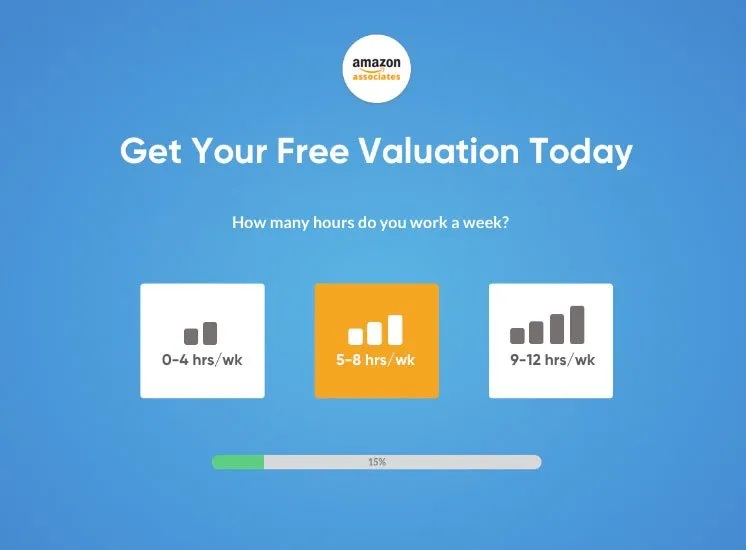
Convertica rebuilt the Empire Flippers submission process as a multi-step flow designed to feel like the apps people use all day: tap, slide, move on. Each change removed a piece of work or a decision from the visitor, and specific input was pushed as late in the process as possible.
| Change | What it does | What it removes |
|---|---|---|
| Multi-step questions | Multiple-choice and yes or no questions build the form's answers without the visitor feeling they are filling in a form | Typing and thinking on the early steps |
| Sliders | Monthly income and expenses are set by dragging a slider | Looking up exact figures and typing them |
| Visible progress | The visitor can see how close they are to the end | Doubt about how long the process will take |
| No Next button | Once a question is answered, the tool moves on by itself | One extra decision on every step |
| Specific input last | A visitor is 40% done before they have to enter any data | The early reason to quit |
The tip behind the missing Next button applies to almost any form: every decision a visitor does not have to make is one fewer chance to leave. If a step does not need the visitor to choose, make the choice for them.
How was the new form tested?
The new Empire Flippers form was tested with a split-URL test: 50% of visitors went to the new submission process and 50% to the original, over the same period. Testing both versions on live traffic at the same time means the difference in submissions comes from the change, not from a busy week or a different traffic mix.
The team was confident in the new version and tested it anyway, as it does with every change. Convertica's custom reporting also split the results by device, so it showed which kind of visitor converted on each version. That segmentation is what set up the second round of work.
What were the results?
The Empire Flippers case study reports +51.6% conversions (valuation tool submissions) in 47 days. The first split-URL test showed a clear winner quickly: the new flow converted 40% better than the original within two weeks. It also showed desktop visitors converting well ahead of mobile visitors on the new flow.
+40%
Conversions, new submission process vs the original, first two weeks of the split-URL test
Source: Empire Flippers, split-URL test, 50/50 traffic split
36% vs 26%
Conversions on the new variation, desktop vs mobile, first split-URL test
Source: Empire Flippers, split-URL test segmented by device
With a clear winner, the new version went live for all traffic, and submissions jumped straight away. But a 40% lift was short of the 50% goal, so the work continued on live data, using the first test's findings to look for the next point of friction. The original case study says the tool was optimized further over the following months. Those later figures were not published, so they are not shown here.
How did the mobile thumb-zone change help?
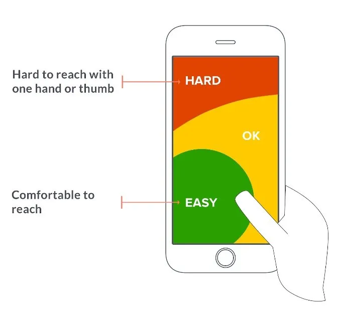
The mobile follow-up in the Empire Flippers case study moved the tool's important controls toward the bottom of the screen, so the whole flow could be completed with one thumb. It came from form analytics segmented by device, which showed that phone users were struggling to reach controls near the top of the screen.
Formisimo, a form analytics tool, shows where users drop out of a form. Segmented by device, it pointed to a problem specific to phones: thumbs. Most people use a phone with one hand, and on the new variation several important controls sat near the top of the screen, which is hard to reach that way. The fix kept the important controls inside the easy-to-reach zone, so nobody had to switch to two hands.
The original case study reports about 10% more conversions from this mobile layout change. It does not say over what period that was measured, so the figure is given here as the case study states it, not as a verified result.
Lessons from the Empire Flippers case study you can apply
The lessons from the Empire Flippers case study apply to any lead form, quote tool or calculator: set a target first, cut the thinking a visitor has to do, ask for specific input last, test against the original, and segment the results by device. Here is how to use each one.
- Set a challenging goal before you start. Write down the lift you are aiming for, so a partial win does not end the work too early.
- Use your own site as a customer. Kurt's experience as a buyer and seller on the marketplace showed him the sticking point before any data did. Fill in your own form on a phone and note where you hesitate.
- Reduce the thinking a visitor has to do. Replace open fields with choices and sliders where the answer allows it.
- Show progress, and ask for specific input as late as possible. Contact details and exact figures belong near the end, once the visitor has invested in the process.
- Test the new version against the old, even when you are confident. A split test on live traffic is the only way to know the change caused the lift.
- Use what one test teaches you to design the next one. The device split from the first test produced the brief for the mobile fix.
- Segment by device. Phones and desktops lose visitors in different places, and a layout that works with a mouse can fail under a thumb.
What this means for your site
If your site captures leads through a form, a quote tool or a calculator, the same two questions apply: how much does a visitor have to think, and where do they stop? A CRO audit is the place to start. Convertica's free CRO audit checks your page for people and for AI agents and ranks what it finds by likely impact: enter your website and email, and watch it run live.
Empire Flippers also published a longer version of this write-up, by Kurt Philip, on its own blog: How Convertica increased the Empire Flippers valuation tool conversions.
Empire Flippers case study FAQ
What did Convertica change in the Empire Flippers case study?
Convertica replaced the valuation tool's static form with a step-by-step flow: multiple-choice and yes or no questions, sliders for monthly income and expenses, visible progress and no Next button. Visitors were 40% of the way through before they had to type any data. A later change moved the important controls within thumb reach on mobile.
How much did the Empire Flippers valuation tool's conversions increase?
Conversions (valuation tool submissions) rose 51.6% in 47 days, according to the original case study. The first split-URL test showed a 40% lift for the new flow within two weeks; the new version was then rolled out to all traffic and refined on live data.
What is a split-URL test?
A split-URL test divides visitors between two versions of a page that live at different URLs, here half to the original valuation form and half to the new one, over the same period. Because both versions see the same kind of traffic at the same time, a difference in conversions can be put down to the change rather than to seasonality or the traffic mix.
Why did mobile visitors convert less than desktop visitors?
On the new flow, desktop visitors converted ahead of mobile visitors (36% vs 26% conversions in the first split-URL test). Form analytics in Formisimo, segmented by device, showed why: important controls sat near the top of the screen, out of easy reach for a thumb on a phone held in one hand.
Can I use the same approach on my own lead generation form?
Yes, the method carries over, although the result will not be the same on every site: ask easy questions first and specific numbers or contact details last, show progress, remove steps that need no decision, and test the new form against the old one. Convertica's free CRO audit app checks your page for people and for AI agents.
Does the Empire Flippers valuation tool still work this way?
This case study describes the tool at the time of the work, which was written up in 2018. The current Empire Flippers valuation tool may look and work differently.