We’ll increase conversions by
20-100+%
on your website.
Get a FREE Audit today
See how we can help your business increase conversion rates
Login Form Design: Best Practices & What to Avoid
As a business owner, website developer, or marketer, you’ve likely used — or at least encountered — login form more times than you’d care to admit. While “form filling” may not be most people’s idea of fun, making users go through this process shouldn’t be a terrible experience either. The best way to ensure that the user journey is as smooth and enjoyable as possible? Well, designing a good login form is key!
In this article, we will explore the fundamental principles behind creating a successful login form design – discussing what works well and what should unequivocally be avoided. We’ll give you all the tips and tricks from our in-house CRO campaign experts.

Unlocking the Secrets of Login Form Design
To ensure the best possible user experience, take a look at these expert login form design tips and tricks — they’ll have you signing in like an old pro in no time!

Keep It Simple & Straightforward
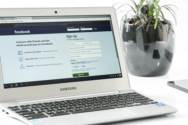
Avoid the login/sign-up page chaos and keep it simple! Less is more when designing a user-friendly experience; one field is for the mobile phone number, email or username, and another for a password.
This will help users sign in swiftly with fewer potential errors. You don’t need to feel overwhelmed by an intimidating number of input fields. Get on board – less confusion means more simplicity and better security.
Use The Autocomplete Feature
You don’t have to be a security expert or an accelerated typist – autocomplete is here to lend you a helping hand! Not only does this feature add that extra layer of much-needed protection, it also speeds up the login/sign-up process by automatically filling in your information on the registration form. And with fewer mistakes made along the way, what’s not to love?
Include Captchas
Captchas are an essential part of any login form design. They help differentiate between real users and bots or automated programs that may be trying to gain access without permission.
Captchas come in several different forms, such as image recognition tests or puzzles that require users to solve them before being allowed into their account. These are effective at keeping malicious bots out while still providing an enjoyable and secure user experience.
Tips In Making The Best Login Forms
Crafting a login form page that pleases both the user and you can be a tricky business. But don’t worry, with these tips & tricks at your disposal, it’ll be smooth sailing from here! Before long, those users will happily sign in to your site!
Make Your Instructions Clear
Make sure you provide clear instructions when creating your login form. Provide details on what type of information should be entered into each field and let users know what happens next after they submit their information (e.g., “Click Here To Login”). This will help ensure that users don’t get confused or frustrated while trying to login.
Design Matters
Pay attention to design! Use colors that stand out against the background image of your site but aren’t too overwhelming or distracting. Also, make sure you use large fonts so that all text is easy to read and understand at a glance.
Last but not least, include icons or visuals next to each field (e.g., an envelope icon next to the email address field) as this will help guide users through the process without having them read through all of the instructions again.
9 Best Practices to Simplify Logins
Selecting the Right Term — Differentiate them with contextual clues
Make sure that the language you use is easy to understand and clear. Terms such as ‘Login’, ‘Sign In’ or ‘Access My Account’ can be used in place of more complicated terms like ‘Log On’ or ‘Check-In’. Contextual clues will help users understand the type of action they are taking and make it easier to complete the task.
Allowing Easy Password Recovery
Include a ‘Forgot Password’ option on your login form. This will enable users to quickly recover their password if they have forgotten it. It is also important to provide clear instructions on how to do this, as well as explain the security measures in place for protecting user data.

Placing the ‘Sign up’ not near the top
We suggest you place the ‘Sign up’ or ‘Register’ button far apart from the login form. This will make it easier for users to distinguish between those who have already registered and those who don’t have an account yet.
Enabling One Click Registration — Sign up with Social Media
Make it easier for users to register with just one click. Offer them the option to sign up using their social media accounts and include a ‘Connect with Facebook’ or ‘Sign up with Google’ button on your login form.
This will significantly decrease users’ time spent filling out registration forms and make the process much less daunting.

Indicating the first input field with color and bold type
You may also want to consider using color, and/or bold typeface to indicate which input field should be filled out first. This will make it easier for users to quickly understand the form without having to read all of the instructions. web project
Show password requirements clearly — indicating when the password is invalid
Include a ‘Show Password Requirements’ button that will clearly indicate to users when their password does not meet the necessary requirements. For example, if a user enters a password that is less than 8 characters, the form can display an error message such as:
“Your password must be at least 8 characters long.” This will help prevent users from entering invalid passwords and ensure that their account is secure.

‘Log out me after’ instead of ‘Remember me’
Include a ‘Log Out Me After’ option in your login form. This will ensure that users are automatically logged out after a certain amount of time, no matter if they forgot to logout or not. This is especially helpful for shared computers as it will help protect user privacy and prevent unauthorized access to their accounts.
Allow switching from login to sign up form
In some cases, users may intend to log in but then realize that they don’t have an account yet. To make it easy for these users to switch from the login form to the registration form, include a ‘Sign up’ button on your login page.
Warn Users when ‘Caps Lock’ is On
To avoid potential security issues, let users know when their ‘Caps Lock’ is on. This can be done by displaying a warning message in the form of a small pop-up box or simply changing the text color to red when they attempt to enter their password.
What to Avoid When Designing Login Forms
If you’ve tried to login/ sign up to a website, then you know all too well how frustrating it can be when the login/sign-up process is either not intuitive or just plain broken. It’s amazing how something as seemingly simple and straightforward as a login form could end up being so frustratingly difficult. Unfortunately, this happens far more often than would be expected – even among experienced web developers.
Fortunately, there are some things that we can learn from these experiences (and mistakes) about what we should avoid when designing our own login form.
Using Weak Passwords
One of the most important parts of any login form is the password field, so it’s important to choose one that is strong and secure, as well as easy for your users to remember. A weak password like “123456” or “password” may be easy for someone to guess, so make sure that you use something more complex and unique.
You should also have a policy in place that requires users to create passwords with a certain number of characters or symbols, and regularly remind them to update their passwords if they haven’t done so in a while.
Forgetting About Security Questions
Security questions are an essential part of any login form because they provide an extra layer of protection against unauthorized access. Asking users to answer questions about their personal information such as birthdate or address will help make sure that only those who know this information have access to the website.
However, these questions should be phrased carefully in order to avoid giving away too much information about the user—questions like “What is your mother’s maiden name?” should be avoided as they could potentially give away too much information about the user.
Additionally, security questions should never be used alone; always combine them with other methods such as two-factor authentication for extra security. Especially on the forget password page, when resetting the user’s password securely, answering security questions must also be considered.

Ignoring Access Levels
When designing a login form, it’s important not to overlook access levels or permission settings for different types of users on your website. Different users may need different levels of access depending on their role within your organization, so it’s important to design your login form accordingly.
For example, you might want certain types of users (e.g., admins) to have more control over certain functions than others (e.g., regular users). This can help ensure that only those who need access get it, which can keep unauthorized personnel from accessing sensitive data or making changes without permission.
Don’t Let This Happen To You!
But what happens when those forms don’t work as intended, or are simply not optimized? It might sound like a minor issue, but it can have major consequences, especially for your bottom line. Here’s why you should always make sure your login form pages are functioning properly.
The Impact of Login Form Failures on User Experience
Login forms are often one of the first things a user sees when they visit your website or application. If it’s poorly designed and difficult to use, then you can expect a higher bounce rate and lower engagement from your users.
In addition, if users have difficulty logging in, they may forget their passwords or become frustrated with the process altogether. This can lead to fewer conversions and lost revenue for your business.

The Frustrated User Experience
When a login form fails or isn’t optimized, users will quickly grow frustrated with the process of trying to log in and may abandon the effort altogether. This means that you could be missing out on important business opportunities due to poor user experience.
Additionally, it can result in a decrease in customer loyalty. People remember when their experience is bad—and they often take that frustration out by leaving negative reviews or simply deciding not to come back again.
Security Concerns
When designing a login form, security is also an important factor to consider. Login forms should include measures such as two-factor authentication (2FA) and CAPTCHA tests for extra protection against hackers and other malicious actors.
Without these safety measures in place, companies open themselves up to potential security threats such as data breaches and identity theft.
It Affects SEO
Did you know that even search engine rankings can be impacted by poorly designed login forms? Google looks at how long people stay on certain pages, so if your pages are filled with errors or don’t load properly due to a broken login form, people will leave your page quickly which can affect your SERP rankings over time.
It’s important to keep track of these metrics so you don’t end up losing out on organic traffic due to the subpar performance of your website’s most crucial elements such as the login page!
Examples of Good & Bad Login Forms
But not all login forms are created equal; some are well-designed and user-friendly while others are downright ugly and hard to use. Let’s take a look at some of the best and worst examples of login form design out there. You can also check out our Convertica case studies for more examples.
The Good
When it comes to login form design, good design is all about simplicity and ease of use. Take Google’s sign-in page, for example. It’s clean, simple, and intuitive; everything you need to log in is right there on the page with no extra clutter or distractions. A good and simple login form should also be mobile-friendly; after all, more people access websites from their phones than ever before!
The Bad
On the flip side of that coin, we have bad login form design—forms that are overly complicated or cluttered with too many options and features. Take this example from a major airline website as an example (see image below): there’s too much going on here!
There are multiple unnecessary steps that just add confusion instead of helping users get where they need to go quickly and easily. This kind of design isn’t just unattractive—it can actually decrease user engagement by making it difficult for customers to access their accounts!
Login Form Example 1
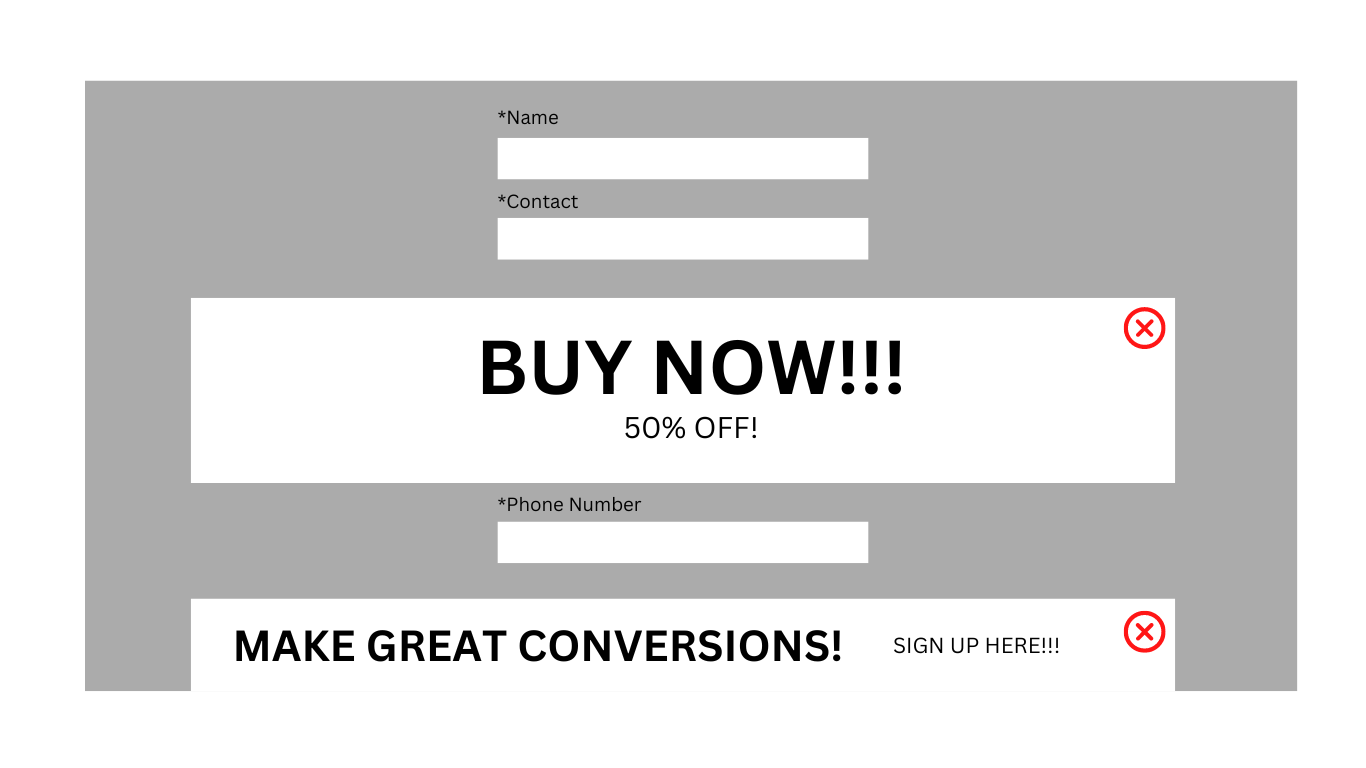
Image Credit: Airline Website
Image Description: This is an example of an overly cluttered login form from an airline website. There are multiple unnecessary fields that make it difficult for customers to log in quickly and easily.
The Ugly
Last but not least we have ugly login forms—forms that aren’t just confusing or unhelpful but downright unpleasant to look at!
These kinds of forms often feature outdated designs or graphics that don’t fit with modern web standards. They might also include elements like pop-ups or auto-playing videos that can be distracting (and annoying!). An example is shown below:
Login Form Example 2
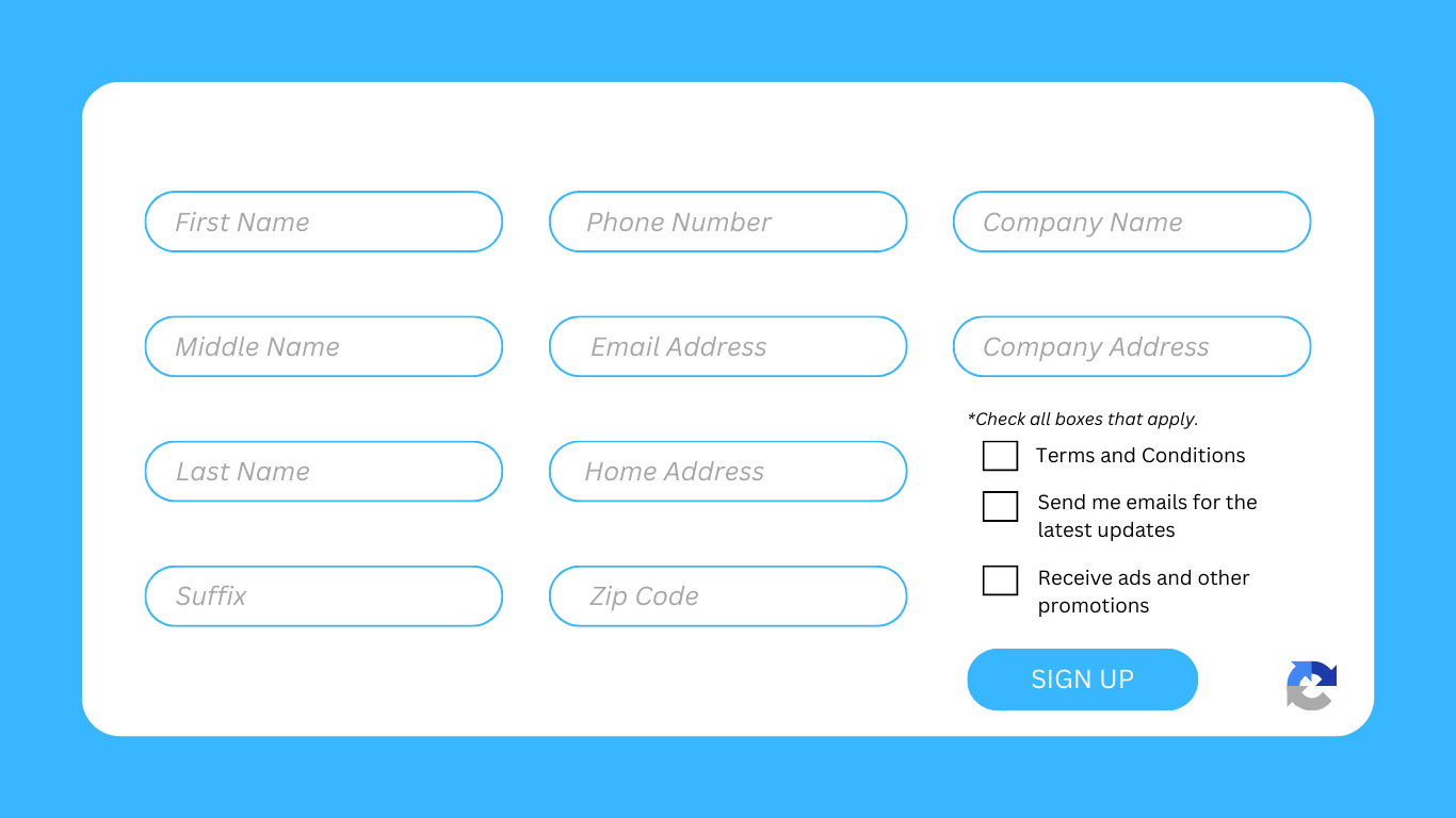
Image Credit: Banking Website Image
Description: This is an example of a poorly designed banking website login form. The outdated graphics and lack of whitespace make it unattractive and hard to use.
How to Make Your Login Form Shine From Others
You don’t have to be a web designer to know that a login form is essential for any website. After all, it’s the only way for your customers to access their accounts and start shopping!
But many websites have a boring, outdated login form that can feel like a chore to fill out just like the previous examples we made. So how do you make your login form stand out from the competition?
Use Colors To Your Advantage
Just as previously mentioned, one of the easiest ways to make your login page design stand out is by adding color to your designs. When used correctly, colors can help draw attention and create an inviting atmosphere.
For example, you can use bright colors like yellow and orange on buttons or links that lead people to the login or sign-up page. Or if you prefer a more subtle approach, try using shades of grey or muted pastels in the background of the form itself — a vibrant login form will give it a modern look without taking away from the user experience.

Make It Easy To Find
Another important factor when designing a login form is making sure it’s easy to find! This means having a prominent link or login button on your homepage that leads directly to the login page — no long detours necessary. Plus, if you want people to keep coming back and logging in again, make sure they know where they need to go each time they visit your site.

Focus On Visual Design
Finally, don’t forget about visual design! Well-designed login pages should be easy on the eyes and make users feel comfortable entering their information. Try adding elements like icons or illustrations (if appropriate) and playing around with different font styles until you find something that works best with your brand’s overall aesthetic. If possible, avoid using generic stock images — instead opt for photos or artwork that are specific to your business!

Pro Tip: Add Simple Animations!
To really make your login pop, consider adding some animation. An animated element such as a spinning cogwheel or a flashing lightbulb would work well here—just make sure it’s subtle enough not to distract from the actual login process itself! Long forms are intimidating; keep yours short, sweet, and concise!

Conclusion
It’s no surprise that your login form needs to be successful in order for your business to have success. By having the best practices and avoiding the not-so-great elements in a standard login form, you set yourself up to stand out from the competition.
Being tech-savvy and researching the best options are key to creating a great-looking, user-friendly, and secure HTML login form. With success like this, you put your business at an advantage that sets it apart from others in the same field.
If you’re ready to ramp up your business, Get In Touch with Convertica and see how they can help make sure your login page looks polished and is secure enough for customers to trust their information with you. Take advantage of all the tips we discussed here today, and see how much better your login form can become!
FAQs
What makes a good login screen?
A good login screen should be aesthetically pleasing, user-friendly, and secure. It should also have a prominent link or login button on the homepage that leads directly to it without any long detours necessary. Additionally, adding subtle animations can make your login page stand out from others.
What is the best practice for password validation?
The best practice for password validation is to have a minimum length requirement, passphrase length requirements, special character requirements, and automatic logout after a set amount of time. Additionally, having an email or text message verification as part of the login process is recommended.
What should I include on my login page?
When designing your login page, it’s important to make sure it’s easy to find and visually appealing. Include elements such as icons or illustrations (if appropriate) and play around with different font styles until you find something that works best with your brand’s overall aesthetic. Additionally, adding subtle animations can help make your login page stand out from the competition.


