How to Build Multi-Step Forms to Increase Conversion Rates
Are you unsure of what to test first to increase conversions?
Don’t be.
Start with a page that has the promise of big gains but only needs a few little tweaks.
This includes
- Optimizing the value proposition of the landing page
- Adding testimonials on product pages, or
- Displaying trust signals at the point of purchase
But one of my favorite places to start is optimizing a web form. Doing this almost always leads to an increase in conversions.
There are many things you can change on web forms that affect how people perceive them. But here’s what I suggest you do. Convert your one-page forms into a multi step form.
And you’ll most likely see an uptick in visitors completing the form.
We’ve done this so many times we know it works. For example, when we did this to Empire Flippers’ valuation form, their leads increased by 51.6% in only a few weeks (read the case study here).
Do you want to know exactly how to do this?
Buckle your seatbelts.
Today we’re going to talk about how to build a multi-step form.
The Benefits of Multi-Step forms
You’ve read a lot of tactics, hacks and strategies to increase conversions.
But if there’s one overarching theme in all these best practices, it is this: Make your pages easy for every person who lands on that page.

That is it.
Easy to Read
Make it easy for him to read the page. Make it easy for him to know what you offer. Make it easy for him to take the action you want him to take.
When something is easy to understand, people give it more attention. And when something is easy to do, people tend to agree more to do it.
That’s why multi-step forms are so effective. They make it easy for a person to understand and fill out the form. It minimizes the “hostility” attached to forms by making them pain-free.
So let’s have a look at what happens to your visitors’ psychology when you change one-page forms to multi-step forms.
It reduces friction
It’s about focus. Doing (or thinking of) too many things at the same time bears too much load on the brain. Our brain is a powerhouse. But it’s not too keen on spending too much of its resources at any given time. If there’s something less demanding, that’s where the brain likes to hang out.
And guess what? Filling out forms, especially during the form-filling process, is not easy for most people. Give a person a form with lots of details to fill out and the thought alone of doing it can be overwhelming. Too many questions, too much recall necessary, and the process itself can seem like too much work.
But when you split the questions into multiple pages, each page focusing on only one category, then the brain focuses on only one task at a time. It then gets the impression that it’s easy to finish the task. It may seem counterintuitive at first. Won’t many pages give the feeling that a lot of work is involved?
You’d think. But based on our tests, forcing a person to think of only one thing or category at a time, reduces friction and does wonders in getting him to finish the task.
Multi-step forms are mobile-friendly

Don’t you hate it when you’re on mobile and you get to a page with a long form that has a lot of fields to fill out, like your own multi-step form or a contact form? With that small device and the even smaller keyboard, the task can quickly get daunting.
But when you break the form into multiple steps, it becomes less overwhelming. And when you add in some multi-step UX principles as well, the task is easier, too.
Small asks lead to big gains for multi step forms
It’s easier for a person to agree to a small ask, particularly when it comes to form filling. By asking relevant questions, you can boost the conversation and make the task seem less overwhelming. A simple question can make sense, just like a small ask from a friend. This approach can lead to more leads and more visitors to your website. 😊

But here’s another situation.
What if a few days after the 1-hour babysitting, your friend asks you to look after the child again for a couple of hours? Then the next week the whole afternoon? When it plays out like this, you’ve had the chance to get used to the task. And also, you’ll start to think, “I’ve done a couple of hours before, a few more hours is not much of a chore. Besides, the child’s quite fun to be around!”
The same thing happens when you use multi step forms. Each page has a little ask, which is a small request for information or action. The little ask doesn’t cause too much anxiety to the brain. And each step slowly gets the person invested in the task. This can boost conversion and create an account by simply clicking the submit button or adding a credit card number. It’s not as much of a burden. And she becomes more likely to agree to it. That’s one of the reasons why multi-step forms have a higher completion rate and can boost conversion rates.
Best practices for building multi step forms
By now, I hope I’ve convinced you enough of the benefits of breaking one form into many pages. Now it’s time to do the work.
Let’s look at how you can design multiple step forms to maximize conversions.
1. Consider “gamifying” the multi step form
When I say gamifying, I mean eliminating as much as possible any use of the keyboard.
So if the visitor is on a desktop, he uses the mouse to click from a list of options. Or if he’s on mobile, he can just easily tap a button.
One great example is this.

There’s no need to use the keyboard with the above example. Just choose the best answer and click.
Gamifying may also involve using elements of game design, such as rewards, progress tracking, and competition, to make the form more interactive and enjoyable.
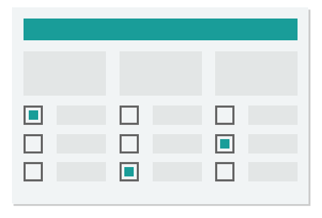
2. Make as many pages as possible to lessen distraction
The main purpose of multi step forms is to have the user focus on one task at a time. It doesn’t necessarily mean asking only one question on each page. You can include a few questions as long as they belong to one category.
Here are some of the many multi-step form examples that are used across various industries and websites: E-commerce Checkout Forms, Job Application Forms, Event Registration Forms, Survey Forms, and Lead Generation Forms.
Let’s say you’re an eCommerce store and you’re designing a multi-step form for the checkout page.
The first page could ask only for important contact details like name and email. Then the next page might be for the delivery address. Then another page for payment details. Each of these pages might have a few different fields, but since they all belong in one category, it’s no burden to the brain.
3. Use a progress bar on your multi step form
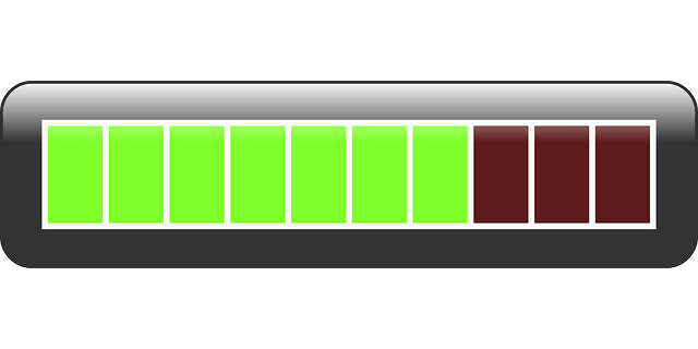
Have you ever tried doing an online quiz and the questions just kept on coming? And there’s no way to know how many questions are left? There’s a point when you start to wonder if you’ll ever finish the form. When you don’t know how many more steps you need to do, your mind wanders off and starts thinking of other things.
“I’ve wasted too much time on this already, maybe I should just stop now and ditch this, ” or
“I’ve spent quite a lot of time on this, maybe I should just keep going. I’ve already wasted a lot of time on it anyway” or
“How many more questions do I have to answer? I’m getting bored of this.”

You know what’s happening here? Your brain has left the task at hand and got lost in another task. That of worrying and wondering. And when your brain becomes too caught up in this, you will most like get frustrated and leave. This uncertainty fazes a lot of people and clicking the back button becomes the easier option.
But put a progress bar and all that mindless wandering disappears. You now know exactly how many steps there are left, so you can put your undivided attention into the form. A positive experience is crucial when it comes to form filling, a progress bar can help to make the process feel less time-consuming and increase the chances of user conversion. That’s the kind of attention you want while a customer is filling out a lead gen or a checkout form. A progress bar can also help to keep the user engaged and motivated to complete the form, which can lead to more leads and a higher conversion rate.
4. Follow all principles of the optimization of regular online forms
Just because you have a multi-step form doesn’t mean you ditch the best practices for building online forms.
I’ve written about form optimization here. So if you haven’t read that yet, go there after you finish this one. At any rate, here are the important points you need to know.
- Ask only for the things you really need. Only ask questions that are necessary for the task at hand. This will make the form seem less overwhelming and easier to complete.
- Make use of white space. This creates a sense of visual hierarchy and draws attention to specific elements.
- Clearly state which is the required fields. Use plain language to avoid confusion.
- Make the CTA button stand out for website visitors.
- Spend time on the copy.
- Add social proof.
- Test the forms.
5. Provide validation and proper error message on your multi step forms

Provide real-time validation, and error messages and help the user to correct their mistake, this will make the user feel more in control of the process.
6. Add a summary form in the form-filling process
For the last page of a multi-step form, it’s good practice to add a summary of all the answers.
A summary form can help to make the multi-step filling process less daunting, by providing a clear overview of the information that has been entered and helping the user to identify any mistakes or missing information before submitting the form. This gives the visitor one last chance to make sure he filled out all the forms correctly.

Ideally, also make it easy to edit any part of the form during this last step.
Build you Multi Step Forms with WordPress Plugins
There is a lot of software that makes building a multi-step form easy even for non-techy people. I won’t show you all of them. However, I know that a lot of you use WordPress, so I’ll show you three plugins that can help you build multiple-step forms.
Here are multi steps form examples.
All of these plugins have free versions with limited functions. For a more advanced form, that looks better and includes important optimization elements like a progress bar, check out their paid versions.
1. Multi Step From by Mondula GmbH
With its drag-and-drop form builder, Mondula GmbH’s builder is the best free option on this list. I also like that it’s already compatible with Gutenberg. The forms look beautiful out of the box but you can also customer it with a little bit of CSS.
2. Contact Form 7 Multi-step form
Contact form 7 (cf7) has a free multi-step form plugin. And if you just want to test how multi-forms work, it’s a good place to start. However, it’s not the most user-friendly plugin, and building the form can take a lot of time. If you have a web form with a lot of form fields, then you’ll have to use the pro version.
3. Formidable Forms
Formidable makes it very easy to build multiple-page forms. If you have a complicated form, Formidable is a good choice. Apart from its intuitive drag-and-drop builder, it’s also full of features not just for a contact form but also for other forms your website might need like surveys, quizzes, or checkout forms. This costs more than the other two plugins above.
Takeaways
There are a lot of things you can test on your website to boost conversion rate optimization. But web form optimization, specifically lead capture forms, is one of the things I’ve seen that almost always gives quick and high returns.
By making it easier to fill out, making it user-friendly, and dividing long forms into multiple pages, you can increase the chances of qualified leads.
Test this on your site today. Pick one form that gets a lot of traffic. Grab a WordPress plugin and change the form into multiple pages.
Then sit back and watch the conversions go up.
Want to reread the article? Here are the quick links:

Hi, I’m Kurt Philip, the founder & CEO of Convertica. I live and breathe conversion rate optimization. I hope you enjoy our findings.
We’ve worked with over 1000 businesses in the last 6 years.
Let’s jump on a quick call to see how we can help yours.
Client Case Studies


0 Comments