Case study
Product rating case study: a rating above each button and a sticky way back to the table
This product rating case study covers a test on an Amazon affiliate site in the home heating and cooling niche. Convertica added a rating above each call-to-action button in the comparison tables, and a sticky button that took readers back up to the table. The original write-up reports revenue per visitor up 43.1% at a 99% confidence level, without saying how long the test ran.
Product rating case study at a glance
| Client | An Amazon affiliate site in the home heating and cooling niche (name kept private) |
|---|---|
| Vertical | Affiliate |
| What changed | A product rating above each call to action in the comparison tables, plus a sticky button back to the table |
| Pages tested | Review pages with comparison tables (number not published) |
| Confidence | 99%, for all tested pages combined |
| Test length | Not published in the original case study |
| Revenue per visitor | +43.1% |
|---|---|
| Orders per visitor | +67.7% |
| Clicks per visitor | +6.5% |
Source: the original Convertica case study, published May 2022. It reports a 99% confidence level but no test dates or duration, so these figures are not shown as headline results.
Which site was tested?
The site in this product rating case study is an Amazon affiliate site in the home heating and cooling niche. Its review pages compare products in a table near the top, followed by full reviews further down. It earns a commission when a reader it sends to Amazon buys. Its name is kept private.
What was the problem?
The review pages left readers with two gaps. In the comparison table, nothing told a reader at a glance how the site rated each product, so the choice rested on the product names and a few bullet points. And a reader who scrolled down to read the full reviews, then decided, had to scroll all the way back up to the table to click through.
What was the hypothesis?
The hypothesis had two parts. A product rating next to each button would give readers one more piece of information to make an informed choice and encourage them to buy. A sticky button back to the table would let readers who had finished the reviews return and click through in one tap, once they had decided.
What changed?
1. A product rating above each call to action
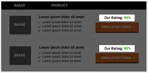
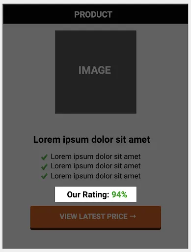
Each product row in the comparison table got a rating, such as "Our Rating: 94%", placed directly above its "View latest price" button. On mobile, the rating sits between the product's bullet points and the button.
2. A sticky anchor button back to the table
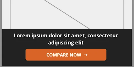
Once a reader scrolled past the comparison table, a bar appeared at the bottom of the screen with a short line of copy and a "Compare now" button. Tapping it jumped the reader back up to the table, ready to click through.

How was it tested?
Both changes were split tested together against the original review pages, on desktop and mobile. The results were measured per visitor, in clicks, orders and revenue, and the data for all tested pages combined reached a 99% confidence level. The original case study does not give the test dates, the duration or the number of pages, so this page reports the results without a timeframe.
What were the results?
The original product rating case study reports revenue per visitor up 43.1%, orders per visitor up 67.7% and clicks per visitor up 6.5%, at a 99% confidence level for all tested pages combined. The heatmaps also showed that the rating raised engagement with the comparison table.
Why did orders rise so much more than clicks?
The original case study does not explain the gap, so this is a reading, not a finding. The pattern matches other Convertica affiliate tests: when a table helps readers choose on the page, clicks move a little and orders move a lot, because the people who click through arrive at Amazon having already decided. The heatmaps, which showed more engagement with the table after the rating was added, fit that reading.
Two limits apply. Both changes ran in one test, so the case study cannot say how much came from the rating and how much from the sticky button. And without a test length or page count, there is no way to weigh the figures against the traffic behind them.
What can you apply to your own affiliate site?
You can apply this product rating case study to any affiliate page with a comparison table and long reviews: put a clear, honest rating next to each button, give readers who finish the reviews a quick way back to the table, and measure the test on orders and revenue per visitor.
- Put your verdict next to the button. A rating beside the call to action gives readers a last reason to choose at the moment they decide.
- Make the rating mean something. Explain how you score products somewhere on the page, and keep the scores consistent across your site.
- Give long pages a way back. A sticky button that appears after the table and jumps back to it helps readers who read the full reviews first.
- Measure per visitor. Orders and revenue per visitor show what clicks alone would hide.
- Test one change at a time when you can. And record the test dates and traffic, so the result can be judged later.
One check for AI search: a rating that lives only in an image, or loads after the page, is invisible to an AI assistant comparing products. Keep each rating as text next to the product name, so AI answers can read your verdict. AI agent readiness is one of the eight checks in Convertica's free CRO audit.
For a test that put a call to action in a sticky footer, read the exit popup case study. For a full comparison table campaign on an Amazon affiliate site, read the 10Beasts case study. To check a result of your own, use the statistical significance calculator.
Product rating case study FAQ
What did this product rating case study test?
It tested two changes on the review pages of an Amazon affiliate site. A product rating, such as "Our Rating: 94%", was added above each call-to-action button in the comparison tables. A sticky anchor button appeared at the bottom of the screen once a reader scrolled past the table and took them back up to it.
What were the results of the product rating test?
The original write-up reports revenue per visitor up 43.1%, orders per visitor up 67.7% and clicks per visitor up 6.5%, with a 99% confidence level for all tested pages combined. It does not say how long the test ran or how many pages it covered, so the figures cannot be tied to a timeframe.
Why did orders rise so much more than clicks?
The case study does not break this down. A likely reason is the same one seen in other affiliate tests: the rating helped readers choose on the page, so the people who clicked through to Amazon were more ready to buy. The heatmaps showed more engagement with the comparison table after the rating was added.
What is a sticky anchor button?
A sticky anchor button is a button fixed to the bottom of the screen that jumps the reader to a section of the same page, here the comparison table. It appeared only after the reader scrolled past the table, so someone who had read the full reviews further down could return and click through without scrolling back up.
Should I show my own ratings on an affiliate comparison table?
Test it, and make sure each rating reflects a real, consistent judgment you can explain on the page. A rating only helps if readers trust it. Show how you score products, and keep the number next to the button, where the decision happens.
Which change worked, the rating or the sticky button?
The case study cannot say. Both changes were tested together, so the results belong to the combination. The heatmaps point to the rating raising engagement with the table, but to know what each change is worth on your site, test them one at a time.