How to Design Pricing Pages that Convert
Pricing page.
Product page.
Landing page.
Whatever you call it doesn’t matter.
We all know one thing:
The person on this page is ready to buy. He just needs a little nudge to assure him that he’s making the right decision.
This is an important page on your site.
If this page falls flat on its face, you don’t have a business.
But when it does well, your Gringott’s vault overflows with golden galleons.
You may have the right product at the right price, but that’s not enough
Picture this:
Your ideal customer sits in front of his laptop to find the answer to a pressing problem.
Your product is the awesome solution that can make his problem disappear.
He lands on your pricing page. It looks like this:
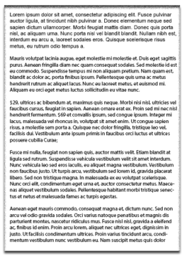
Chances are, he’ll give it a quick look. Get overwhelmed by the big wall of text. Get confused. Become unsure of what to do next.
You may be selling the best product but if your pricing page looks like this, most people will not bother reading it.
The problem?
Your page is too much work. It requires too much thinking. This would be his thought process when he lands on the page.
- “Hmmm… I wonder what this site sells.”
- “What does it do exactly? How can it solve my problem? I’ve already read a whole paragraph. I still don’t know what this thing does.”
- “How much is it? Oh, it’s only $29. But there’s another price over here that says it’s $69! I wonder what makes that different from the $29…”
Can you see all the thinking this person has to do?
Now, compare that to a page that looks like this:
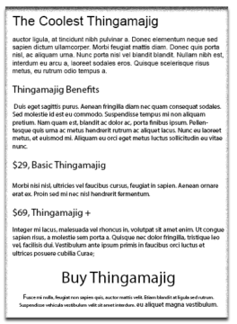
One look. One glance.
No. Thinking. Involve.
The person knows exactly where everything is. Even when a toddler is squealing in the background. Even when it’s his first time on this page.
It’s easy to see where to go to find the information he wants.
And this is your goal when you design a pricing page.
Make it is so simple. So easy to follow.
That even when you grandma lands on it, she’ll know where to find what.
So what’s my point?
That whenever you design a pricing page, making things easy should be your guiding force.
You make tweaks in your layout. You rewrite your copy…
Because you’re building a page that’s easy to follow for the average visitor to your page.
When you do this, steering your visitor to take the action you want him to take becomes easier.
The good news is:
Many other people have done this before you. There are dozens of studies that you can refer to to find ideas for your next A/B tests.
I’ve put together some of these studies in this article. Refer to them next time you build your pricing page to help boost conversions.
Cheap-to-expensive, expensive-to-cheap or piggy-in-the-middle?
Researchers North, Hargreaves and McKendrick played German and French music on alternate days in a supermarket.
They wanted to know if the music has any influence on the type of wine people buy. After a 2-week period, the results showed that on days when French music was played, French wines outsold German wines and vice-versa.
This is what you call anchoring bias.
It’s when you make your decisions based on the first piece of information that you get. The first piece of information becomes your anchor. And you make your next decision based on that.
You, my dear skeptic, might say, it’s B.S. Game of chance. Totally random!
But this experiment has been repeated in many different cases like this one on guessing the number of African countries in the United Nations to this classic Tversky and Kahneman study on guessing the height of the tallest Redwood.
But the question is: What has this got to do with your pricing page?
Let me answer with this:
If I ask you whether $150 is cheap or expensive,
Your answer will most likely be:
“It depends. What am I buying?”
If I say that it’s for a Nintendo Switch game
You’ll say that’s expensive.
But if I say that it’s for a Nintendo Switch console,
You’ll say it’s cheap.
That’s because there is already an anchor in your head on the expected price to pay for these things.
Now back to your pricing page:
It turns out that you can plant this anchor on your customer’s brain, too.
One effective way you can do this is by using the 3-tiered-pricing strategy.
This means you have three different prices for the same product but with different options.
Just like SiteGround’s:
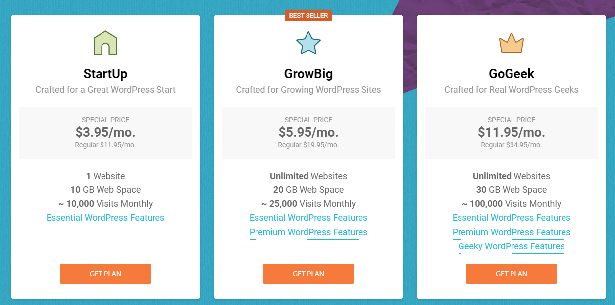
What exactly does this do?
It sets an anchor on the minimum and maximum price they can pay for this service.
The basic (StartUp) package is for those who don’t want a lot of features, are budget-conscious, or beginners.
The premium (GoGeek) is for the pros who want more customizations.
And then, there’s the standard package (GrowBig). The one SiteGround most likely wants you to buy (Bestseller).
Most people will gravitate toward this package. And my guess is that SiteGround did this on purpose.
Just for a couple more dollars, you get to buy a hosting package where you can host unlimited domains (a jump from 1 domain to unlimited is pretty big!). This makes you feel that you’ve bought the one with the better value. And that you’ve saved money in the process, too.
You’re happy.
They’re happy.
Now before you do your own test, here’s the thing:
There are a few different ways to do tiered-pricing.
For example, ConversionXL recommends arranging your products from the highest to the lowest because visitors tend to stay longer when it’s arranged in this manner.
This is how Unbounce does theirs.
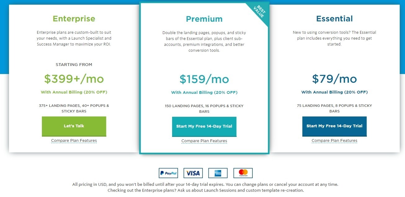
But it is not set in stone.
In fact, a lot of companies order their products the other way around like Zapier.
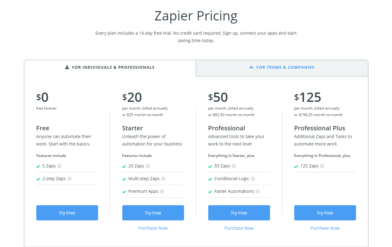
The truth of the matter is that this is something you have to test to see which works best for your customers.
2. Highlight a preferred option
Recent studies show that your brain has a capacity of at least 1 petabyte – that’s a quadrillion bytes or about the same as the content of the World Wide Web.
But guess what?
Your powerful brain would rather not use that power to decide whether the red socks are better than the blue.
Our human brains are wired to take shortcuts. Sure we would love to think that every single time we make a decision, we weigh the pros and cons and arrive at a rational decision.
But we don’t.
In fact, even firefighters in emergency situations pick the first solution that comes to mind and run with it.
Psychologist Barry Schwartz calls this the paradox of choice.
Having too many choices is overwhelming for the brain. And when this happens, it goes into analysis paralysis.
Basically, when it’s overwhelmed, it says, “Forget it. I can’t be bothered.”
And apathy is not what you want when you’re selling something.
So what do you do?
Help the brain make the choice.
One way you can do this is by highlighting the preferred action you want the customer to take.
This could be the best value, the most popular or the one with the most desirable features.
This makes it easy for the brain to categorize and decide which one to buy.
Learn from this old selling tactic
No one knows for sure when this pricing strategy started. But it’s one that is used both online and offline because it works.
What am I talking about?
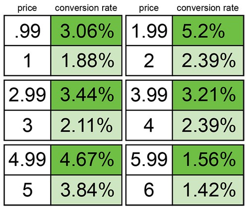
It’s charm pricing.
Notice:
$4.99 not $5.00.
$199 not $200.
$1999 not $2000.
There’s a reason why your local grocery store has prices that end in the number 9.
The difference is minuscule.
But here’s the interesting thing:
Our brain doesn’t process it that way.
Instead, our brain thinks it’s a better value than the whole number price after that.
So what’s happening here?
Researchers at MIT & the University of Chicago explains that this works in countries that read from left to right. Our brains generally, like to do shortcuts. and when we see the first number, we just round it off to that number instead of the number actually closest to it.
So $199 becomes 100+ rather than $200.
On a more recent study, Gumroad shows how this pricing technique made 50% more sales across the many stores on their site.
A word of warning:
This doesn’t always work across the board. So as I’ve always said, test it and see.
For example, a study by Anderson and Simester shows that charm pricing is not as effective for items that retailers have sold in previous years nor when they use “sales” cues.
Also, because consumers now equate prices ending in 9 as “value price”, products that end in whole numbers are considered “luxury”. You won’t find Tiffany & Co. selling this $12000 bracelet for $11,999 anytime soon.
Do these minor changes in the CTA button to make for higher conversions
The call-to-action (CTA) button is one of the easiest elements to change on your pricing page.
So, listen up!
Designing the CTA button is a science and an art.
It’s not just about changing colors from green to red.
For it to do its job well, it needs to do these two things:
- Act as a visual cue
- Diminish anxiety
The Call to Action Button as a visual cue
Every element on your pricing page has a level of importance. The more important an element is, the bigger and more prominent it should be on your page.
A call-to-action button is high on this list.
You need it to be prominent so that it captures the eyes and attracts attention.
You’re signaling to the brain, “Hey! Here’s something that’s important. Come hover over here, will yah?”
To do this, the call-to-action button should be in a color that contrasts from the background like the example below.
One of the most common colors for CTA buttons is red.
Performable did an A/B test on this by changing the color from green to red. It boosted conversions by 21%.
Some companies, on the other hand, like Widerfunnel, swears by the big orange button.
But don’t just go running to change your button color to red or orange right away. Orange can get beaten too, Here’s another study where blue beats orange.
And this is where I say, you gotta’ test it, bruh!
Kapeesh?
But you’re not done yet.
The button text is where it all gets exciting.
See, now you’ve got your visitor’s attention with a button that pops. Now he knows that button is important. And now, he’s looking and hovering on that button.
Well done, you.
But.
That freakin’ button induces anxiety.
Why?
Because it means if he clicks that button, he’s got to do something that changes him from being a passive reader to an active visitor.
Now he has to engage.
And if you want him to click that button, address that anxiety.
Do this with your button text.
Its job is to shut down that anxious voice and make him feel better.
That’s how important the CTA text is in your conversions.
When you use text that breaks that barrier.
Text that is easy to understand.
Text that assures him he’ll get something of value.
The click is going to happen.
Here’s a quick guideline on how to find the perfect text.
- Preferably start with an action word like Add, Get or Start.
- Then add words that imply some benefit or value.
So
- Download Now instead of Send
- Download for free instead of Download
- Start My trial Now instead of Download
- Click Here and try it for FREE instead of Click Here
- Add to Cart instead of Cart
Show me my money
A French SAAS company asked this on Hacker News:
I’m building a SAAS product targeting small companies (monthly subscription). Given we’re a French company but the product is not location-dependent, we’re going to launch internationally.
The easiest choice is to bill in €.
I have no idea if billing in € is a blocking point for most of you, hence this poll.
This is the result:
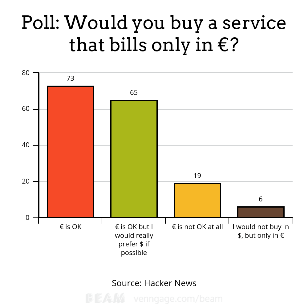
At first glance, you’ll see that most people say billing only in Euros is ok. However, 90 of the respondents say it’s not. And I bet, if you do this poll again and add I would also like it in my currency as an option, this choice would be preferred by many International customers.
As Sharon Hurley Hall says
For online shoppers, the world is their market, but that doesn’t mean they’re happy to spend in every currency. In fact, most online shoppers prefer to see prices displayed in their local currency, so they know exactly what they’re going to pay.
See that?
When there is the option to know how much it costs in their local currency, it’s now less work for the brain. They don’t have to do any mental calculations. They don’t have to go to Google, find a currency exchange site and figure things out.
You see the theme that’s going on here?
That’s right.
You’re making everything easy for them. Back to the very first thing I talked about.
A lot of companies do this already. I like the way MailChimp does this. It lists prices in dollars. But there’s a tiny drop down where you can choose your currency to see the equivalent in your local money
Definitely worth testing especially for companies with a global audience.
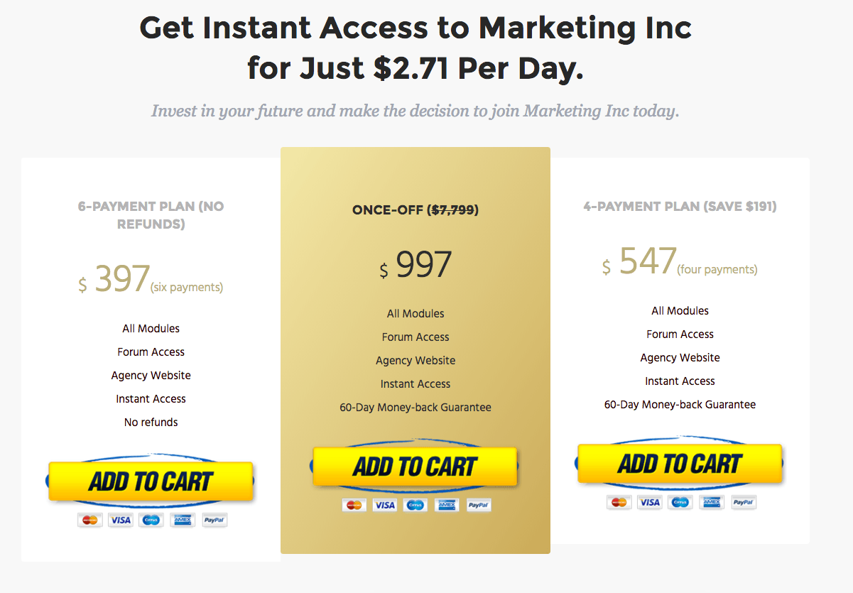
Make way for Pennies-a-Day (PAD)
Did you know that you can influence perception by changing the way you frame the price?
One of the most widespread ways to do this is by using the Pennies-a-Day strategy.
This is when you reduce a price to a small daily or ongoing expense solely for the sales pitch.
When you do this you’re helping the buyer compare the cost of the product against something that’s more affordable and usually, trivial.
Here’s an example from Marketing Inc.
Reduce anxiety and add trust signals
Buying online may be as commonplace as grabbing a drink from your local bar.
But the buying fear remains real.
Whenever a person lands on a new site, he comes with lots of questions:
- Can I trust this site?
- How much will I be charged for shipping?
- How long will it take for my package to arrive?
- Is my credit card secure?
- Can I talk to somebody if I don’t like this product?
- Can I return a product if I don’t like it? How easy will the process be?
There are all these fears and questions built into the psyche of online shoppers.
So the burden is on your pricing page to shut all these fears down.
Make it easy for your visitor to feel safe and secure while on your site.
How can you do this?
- Include testimonials with the name of the reviewers if possible
- Add badges and payment logos that attest to your site security like McAfee Secure, PayPal verified, or Verified by Visa
- Take away risk by adding a money-back guarantee.
- Add images or logos of your biggest clients
- Make it easy for the customer to contact you – if you have 24-hour support, so much the better.
Now go forth and conquer
At the risk of sounding like a broken record, I’ll say it again.
If you want to design a pricing page that boosts conversions, design it with your visitor in mind.
Make it intuitive and easy to understand.
When you do this, your visitor smoothly slides down from the headline to the call-to-action button without even thinking about it.
When this happens, the more he will respond to the action you want him to take.
And the higher your page conversions will be.

Hi, I’m Kurt Philip, the founder & CEO of Convertica. I live and breathe conversion rate optimization. I hope you enjoy our findings.
We’ve worked with over 1000 businesses in the last 6 years.
Let’s jump on a quick call to see how we can help yours.
Client Case Studies


0 Comments