Measure
Conversion rate calculator
Your cart or store conversion rate from carts, visitors and orders.
Ecommerce cart
Shopping cart optimization makes the step between adding a product and starting checkout as clear and reassuring as possible. This guide covers what a good cart page includes, 10 ways to raise your cart conversion rate, how to measure the cart, and how to win back shoppers who leave.
Shopping cart optimization is the process of improving an online store's cart so more shoppers who add a product go on to check out and buy. It focuses on the costs the cart shows, its controls, the checkout button, the reassurance near it and how it works on a phone, and it is judged on orders, not clicks.
Shopping cart optimization is the process of improving an online store's cart so more shoppers who add a product go on to check out and buy. It focuses on the cart page or drawer: the costs it shows, the controls it offers, the checkout button, the reassurance near it and how it works on a phone. It is judged on orders, not clicks.
The cart sits between choosing and paying. Shoppers use it to check what they picked, see what it will cost and decide whether to commit. Some use it as a wish list or a price check, which is normal. Cart optimization removes the reasons that stop people who did intend to buy. It is also called cart optimization or cart conversion optimization.
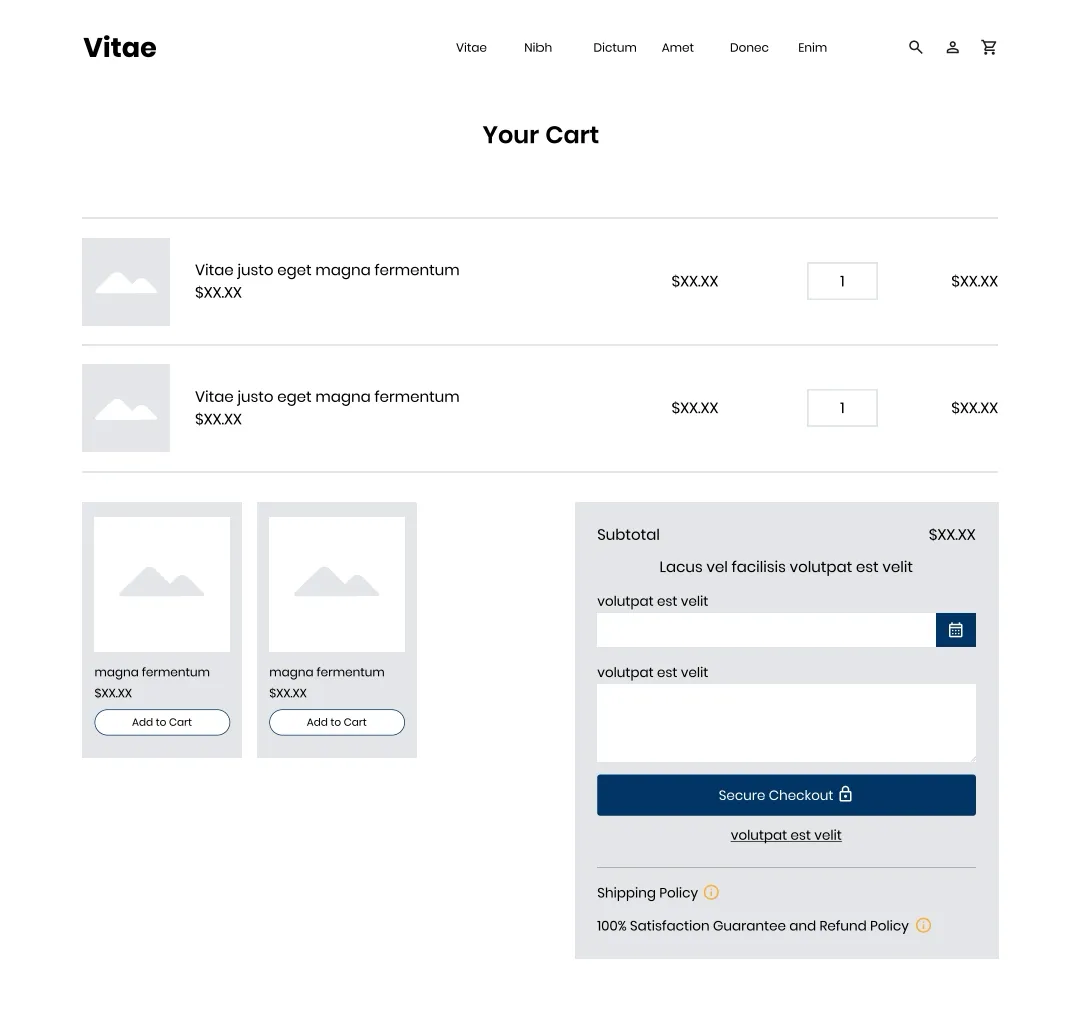
A shopping cart page should show each item clearly, let the shopper change the cart without friction, show the full or estimated cost, offer one obvious way forward to checkout and answer the questions people have just before they pay: delivery, returns and security. Everything else on the page should earn its place.
| Element | Why it matters |
|---|---|
| Item thumbnail, name, variant and price | Shoppers check they picked the right size, color and quantity before paying |
| Quantity and remove controls | Editing the cart should never mean starting again |
| Subtotal, shipping and taxes | Costs revealed later are a common reason to leave |
| Free shipping progress | Tells the shopper exactly how much more qualifies, if you have a threshold |
| One clear checkout button | The main action should be the most visible thing on the page |
| Accepted payment methods and express wallets | Answers "can I pay the way I want?" before checkout |
| Shipping and returns policies | Reassurance at the point of commitment |
| A way back to shopping | A small "continue shopping" link, without competing with checkout |
A full cart page, a slide-out cart drawer and a mini cart that drops down from the header can all convert well. The right choice depends on how many items people buy at once and how much reassurance they need before checkout. Whatever the format, the checkout button and the total must be easy to find.
| Format | Good for | Watch out for |
|---|---|---|
| Cart page | Room for costs, policies, reassurance and editing | An extra page load between product and checkout |
| Slide-out drawer | Stores where shoppers add several items and keep browsing | Cramped on phones; costs and policies often left out |
| Mini cart or toast | Confirming an item was added, without interrupting | Too small to reassure; easy to miss on mobile |
| Straight to checkout | Single-product stores and one-off purchases | No chance to review or change the order first |
To optimize your shopping cart, confirm every add to cart clearly, show the full cost early, make checkout the obvious next step, put shipping and returns information near the button, keep the cart easy to edit, show free shipping progress, offer express payment, keep cross-sells relevant, save carts for returning shoppers and design for the phone first.
When a shopper taps add to cart, show clearly that it worked: open the drawer, show a confirmation with the item and a checkout button, or update a visible cart count. A silent add leads to double adds or to shoppers thinking it failed.
Show shipping and taxes in the cart, or a reliable estimate from the shopper's location. A total that grows at checkout is one of the main reasons shoppers leave.
Use one high-contrast checkout button, near the total and visible without scrolling on a phone. Keep "continue shopping" as a quiet text link, and avoid two buttons of equal weight.
Short, plain statements of your shipping and returns terms near the checkout button answer the last questions before commitment. Link to the full policy, or show it in a small panel without leaving the cart.
Let shoppers change quantity, size or color and remove items in the cart, without a page reload that loses their place. Offer "save for later" if people often use the cart as a wish list.
If you have a free shipping threshold, show how far the cart is from it, in money, and suggest a relevant low-cost item that would close the gap.
Wallet buttons in the cart let shoppers who use them skip most of the checkout form. Show the payment methods you accept, so nobody has to start checkout to find out.
One or two genuinely related items, such as the accessory the product needs, can raise order value. A carousel of unrelated products pushes the checkout button down and adds choices. Base recommendations on what is in the cart.
Keep the cart's contents when the shopper leaves and comes back, and across devices for signed-in customers. Many shoppers add items on a phone and buy later on a computer.
On a phone, the total and the checkout button should be visible without scrolling past every item. A sticky checkout bar at the bottom of the screen can help on long carts. Test it on real devices. For a tested example on a store's landing page, see the sticky call to action case study.
Shipping and refund information near the checkout button can change what shoppers do in the cart. In a Convertica A/B test for an online store, the variant added shipping and refund policy badges under the checkout button, with a popup explaining the shipping terms. Everything else stayed the same.
The original case study reports a clear improvement on desktop in the rate of order completion and in revenue per visitor, at a 97% confidence level, and no significant change on mobile. The store rolled the change out on both, because mobile showed no harm. The lesson for your own cart: answer cost and risk questions before checkout, and read desktop and mobile results separately.
Cart conversion rate is the share of carts that become orders: orders divided by carts created, over the same period. Read it alongside the add to cart rate and the cart to checkout rate, split by device, so you can tell whether shoppers stop in the cart itself or later in checkout.
| Metric | Formula | What it tells you |
|---|---|---|
| Add to cart rate | Sessions with an add to cart / sessions | How well product pages turn interest into intent |
| Cart to checkout rate | Checkouts started / carts created | Whether the cart itself sends people on |
| Cart conversion rate | Orders / carts created | The share of carts that become orders |
| Cart abandonment rate | 1 minus (orders / carts created) | The share of carts left behind |
| Average order value | Revenue / orders | Whether cart changes such as cross-sells raise order size |
| Revenue per visitor | Revenue / visitors | The net effect of a change on orders and order value together |
In Google Analytics 4, the standard add_to_cart, view_cart, begin_checkout and purchase events give you these steps in a funnel exploration. The guide to cart abandonment rate covers that metric in depth, and the conversion rate calculator works out any of these rates. These cart steps sit alongside the other ecommerce success metrics a store should track.
Shoppers abandon carts because the total is higher than expected, they are not ready to buy yet, they are comparing prices, they do not trust the store, or the next step looks like hard work. Win them back by fixing those reasons first, then by saving the cart and sending relevant, consented reminders.
Personalize the shopping cart only where it answers the shopper's next question: recommendations based on what is already in the cart, delivery estimates for their location, and the payment methods available in their country. Personalization that adds noise or uses data the shopper does not expect you to have can cost more trust than it gains.
Test personalized elements like any other change, judged on revenue per visitor. The A/B testing guide explains how, and the free shipping case below shows why device matters.
In another Convertica test, telling shoppers whether their cart qualified for free shipping, or how much more it needed, improved results on desktop while mobile showed no significant change, so the change was recommended for desktop.
AI shopping agents that act for customers need to read your products, prices and costs and use your cart controls. Standard buttons and links, prices and stock in the page HTML, and shipping and returns terms in plain text make that possible. Carts that rely on custom widgets, or show costs only in images, may stop an agent before checkout.
This is a new field, and nobody, Convertica included, has years of data on it yet. Agent readiness is one of the eight checks in the free CRO audit, and the agent readiness checklist lists what to check.
Use this shopping cart optimization checklist on your own store. Add a product on a phone and on a computer, open the cart and answer each line yes or no. Each "no" is a fix to make or a change to test.
Measure your cart and plan tests with Convertica's free calculators.
Measure
Your cart or store conversion rate from carts, visitors and orders.
Plan a test
How many shoppers each cart version needs before a test starts.
Read a result
Whether a finished cart test is a real result.
Shopping cart optimization is the work of improving an online store's cart, the page or drawer that lists what a shopper has chosen, so that more shoppers move on to checkout and complete their order. It covers costs, cart controls, the checkout button, trust, cross-sells, mobile layout and recovering carts that are left behind.
The cart is where shoppers review what they chose: items, quantities, the running total and the costs to come. The checkout is where they give contact, delivery and payment details and place the order. Cart optimization gets shoppers into checkout; checkout optimization gets them through it.
A shopping cart page should include a thumbnail, name, variant and price for each item, controls to change quantity or remove items, the subtotal with shipping and taxes or an estimate, one clear checkout button, the payment methods you accept, and the returns and shipping policies close to the button.
Increase cart conversion rate by showing the full cost early, making the checkout button the clear main action, putting shipping and returns information near it, keeping the cart easy to edit, showing progress toward free shipping, offering express payment, and saving carts so returning shoppers find their items.
Both can work. A slide-out drawer keeps shoppers on the product page and suits stores where people often buy several items. A full cart page has more room for costs, policies and reassurance. Many stores use a drawer with a clear checkout button and a link to the full cart, and test which converts better.
They help when they are few, relevant and cheap relative to the order, such as the accessory that goes with the product. They hurt when they push the checkout button down, add choices the shopper did not ask for, or slow the page. Test them, and judge the test on revenue per visitor.
Recover abandoned carts by saving them so they are still there when the shopper returns, sending a short series of reminder emails to shoppers who gave their email and consented, and using retargeting ads where your privacy settings allow. Fixing the reason they left in the first place recovers more than any reminder.
They can if your product details, prices and stock are in the page HTML, cart controls are standard buttons and links, and shipping costs and policies are written in text. Agent readiness is a new area and one of the eight checks in Convertica's free CRO audit.

Ask Convertica
Convertica
Hi, I'm Convertica's AI assistant. Ask me anything about the free CRO audit, the full report, the one page and full site rebuilds, or any of the free tools.