eCommerce Conversion Rate Optimization Case Study

eCommerce Conversion Rate Optimization Case Study

We’ve all been there:

On the hamster wheel.

You spend many long days and sleepless nights fighting tooth and nail to get more people to your site.

  • You work on your SEO endlessly,
  • You spend a big chunk of your revenue on ads and
  • You hustle on social media as Gary V told you to.

It seems the only way to make more money is to keep on increasing your site’s traffic.

Same hustle, day in and day out.

But that isn’t the only way:

You can work on your ecommerce conversion rates and it will open the floodgates to more revenue. Let us show you how to increase your ecommerce revenue!

With the same traffic, you can make 30 to 100% or more compared to what you’re making now, using a little ecommerce conversion rate optimization (CRO).

With even just a single winning test, you’ll immediately see a boost to your income.

Sometimes possible with one simple tweak to your page. And all you need to do is apply some eCommerce store CRO techniques.

That’s not all.

This is a system that is scalable, repeatable, and most importantly, data-driven.

It’s one-time work that will continue to grow your revenue into the future, at no added cost or effort to you.

What could be better than that?

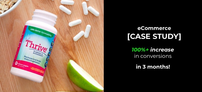
Take, for example, one of our clients, JustThrive.

JustThrive is a health company based in Illinois, USA.

They sell supplements that are non-GMO as well as gluten, dairy, and nut-free.

Most of their traffic comes from search and costly paid ads.

When they approached us, they wanted to increase ecommerce conversion rates on their auto-ship subscriptions and get a better return on their ad spend.

In less than 3 months, we not only achieved these targets for them but increased their revenue by over 100%.

Imagine what that would look like for your business.

You don’t have to get any more traffic. Yet you significantly increase your revenue.

Today, I’ll show you exactly what we did to increase JustThrive’s e commerce conversions.

I’ll also dish out some marketing truths that play a big part in how I approach conversion rate optimization experiments.

I hope this helps you go beyond quick fixes like changing button colors, to understanding why people will buy from you and not your competitors.

Because this knowledge helps you create an eCommerce conversion optimization strategy that works no matter what niche or site you work on.

But before we talk results, let’s look into the birth of every eCommerce conversion rate optimization test

Conversion rate optimization is all about data, and that is the only information you should rely on. No matter how many years of experience your web developer or UI designer might have, they can’t always know what’s going to work with your audience.” – Hubspot–

I couldn’t agree more.

And I also think that disregarding this in any optimization campaign is why many eCommerce businesses websites report low conversion rates.

Here’s what I’m getting at:

You can do apply all the conversion rate optimization tactics and best practices on your site.

But it still may not increase your ecommerce conversion.

You see. What works for one site or target audience is not guaranteed to work with another.

You have to do a data-driven test to see if your customers respond to any conversion rate optimization changes.

That’s right. It’s inevitable. You can’t wing this. If you want a strong conversion rate optimization foundation, then you’ve got to test and deal with statistical data.

But here’s something really interesting:

It’s true that data is the foundation of a good eCommerce conversion rate optimization strategy. But equally important is an analytical mind.

An analytical mind that can look at both site analytics and design. Then arrive at an informed decision as to what elements to test to increase conversions.

How do you develop this analytical mind?

Like all things, it comes with practice. But if you’re a beginner to conversion rate optimization, you can start by analyzing pages on your eCommerce site and answering the questions below:

  • What’s the one goal of the page?
  • Does the page answer the visitor’s intent and clearly show the path that leads to a conversion?
  • Do all the important elements from the image to the copy, to the layout, seamlessly work together to support the one goal?
  • Does the page build trust and lessen anxiety or confusion?

Be brutal and honest when answering these questions.

I know your site is your baby. But this is how you find the flaws that may be limiting ecommerce conversions.

Sometimes you’ve seen your site so many times you can no longer view it objectively. In these situations, it can be very valuable to have an eCommerce CRO agency audit your site.

At Convertica, we follow the same objective and data-driven process every time we do a site audit.

Which was what we did when we first started working on JustThrive. Then after a thorough analysis of the page, we concluded that there were two big things we needed to address moving forward:

1) The customers

This niche has buyers with high motivations to engage. They have problems they want to get rid of yesterday.

But many of them may have been burnt in the past by companies who underdeliver. Plus news of vitamin and supplement scams online don’t help.

So they’re a bit wary. This meant that they probably land on the site holding their trust tightly in their fists.

2) On Selling Multiple Variations of One Product

JustThrive’s product pages have a few product variations. This creates friction.

When a customer has to choose at the moment of purchase, it can lead to decision paralysis. It stops them from taking any action.

The good thing was that JustThrive wanted more auto-ship subscriptions. So the goal was to steer the visitor to choose that over the other two options on the page. This made our job easier.

With these things in consideration, the Convertica team got down to work.

We went over their Google analytics with a fine tooth comb.

We got a heatmap going to see where the users were clicking, or trying to click.

We referred to our long list of proven tests and hypotheses relevant to this niche that we’ve run before; and

We put together the first hypothesis.

Yes, a hypothesis.

We may have done thousands of tests, and we may sometimes think that we know exactly what to do to improve your ecommerce website conversion rate — but all that means nothing until the analytics show us the real data.

Just because something worked on one site, doesn’t mean it’s going to work on another – even in the same niche. There are too many things that could affect the results of your experiment.

Sure, the more expertise you have, the more often your hypotheses will be big winners from the get-go.

But that doesn’t mean ecommerce conversion rate experts do not go through the process of testing their hypotheses.

Any conversion rate optimization service that offers to implement changes on your site without explicitly testing and showing you the data, is simply cutting corners.

So, as I was saying,

Before testing, we start with a carefully formed hypothesis. And we wait for what the data tells us. We try, hard as it is, not to let our ego get in the way.

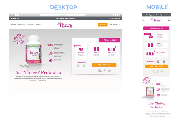
After our initial deliberations, our experienced development team got to work and built a new store design ready for a split-test.

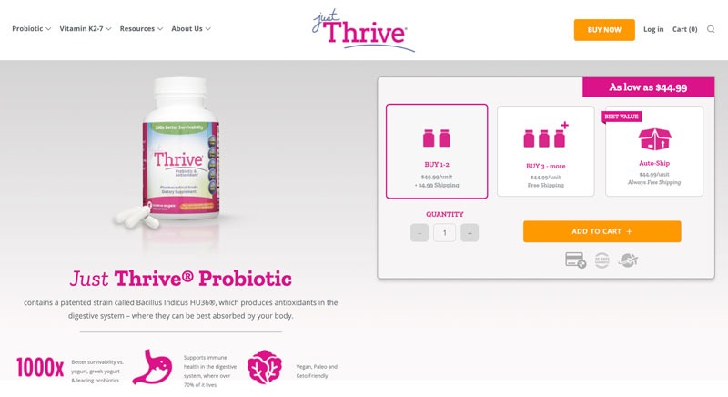
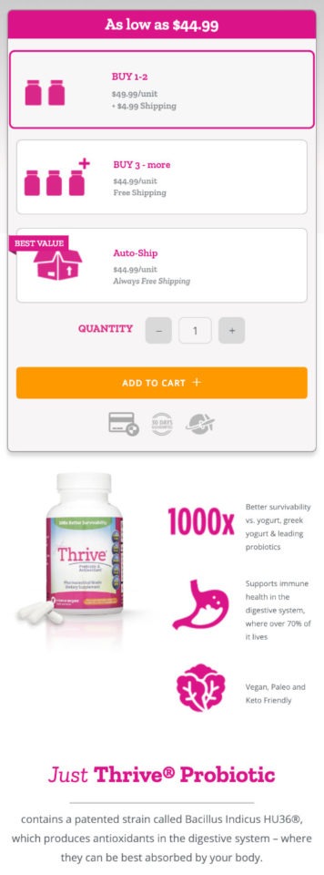
These are the things we changed:

  1. We minimized visual clutter by changing the product images and putting more white space around them.
  2. We made sure that elements near the Add to Cart CTA button had trust signals. This meant instead of social media icons, we added icons for a 30-day guarantee, secure payment options, and a shipping icon.
  3. Because we wanted to push the auto-ship subscription offer, we made this more prominent in the layout. We added an eye-catching button that says “Best Value” and emphasized the free shipping offer.

Do you want a 20-100% conversion rate increase?

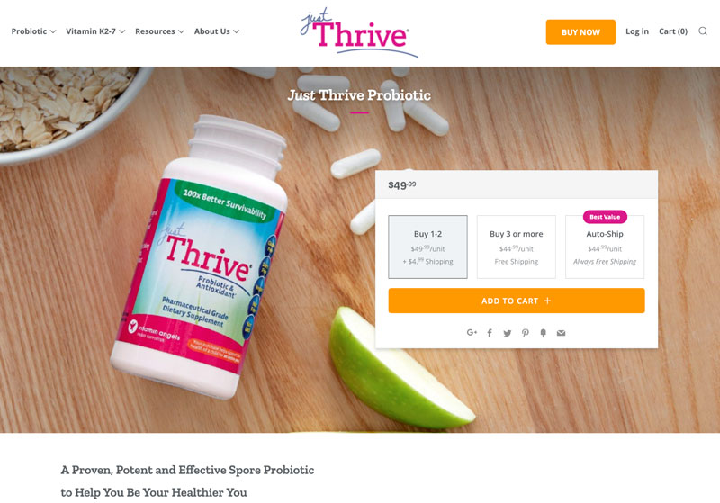
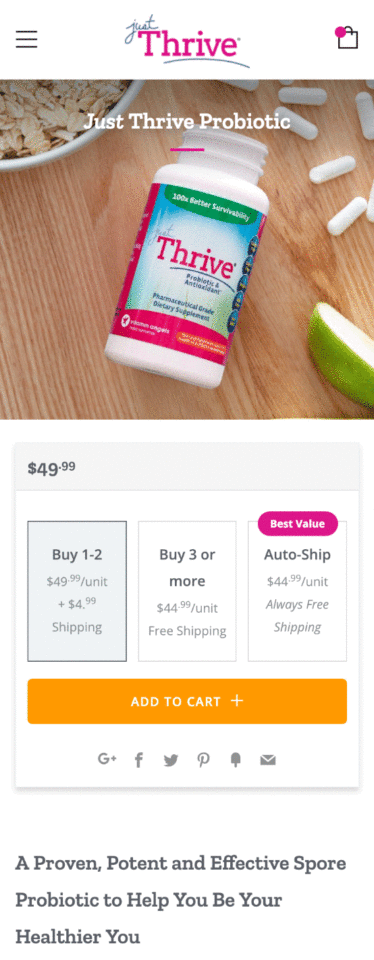
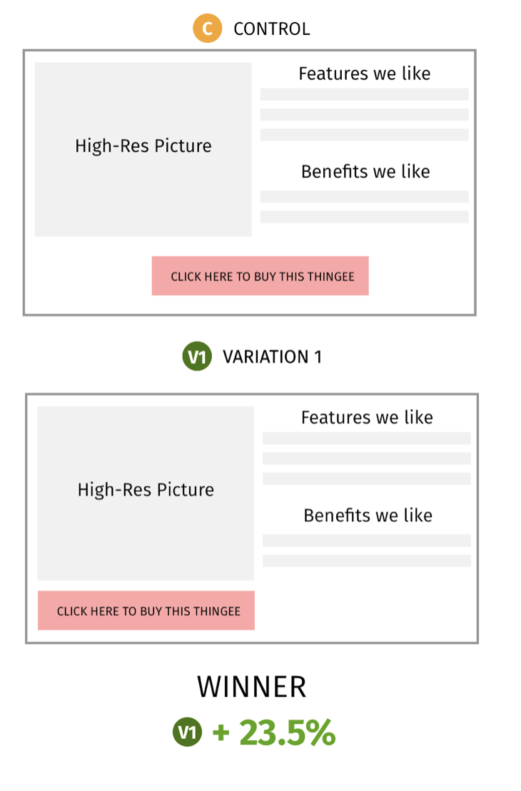
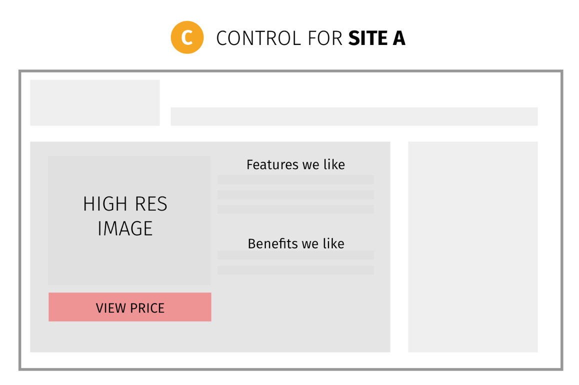
Here is what the original layout looked like.

Desktop version


Increase your ecommerce conversion CRO case study


Mobile version


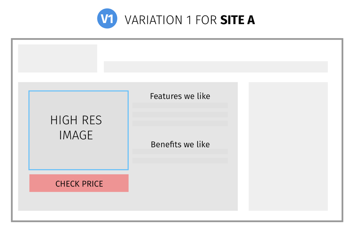
Here is what our first winning variation looked like


Desktop version


Mobile version


We deployed this campaign on the 7th of December. After a little over a month, on the 15th of January, our assumptions proved to be correct.

Here are the results of the first test with 98% significance.


JustThrive Variant 1 results


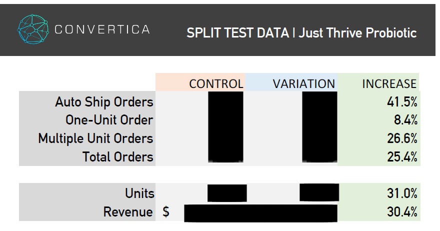
Our first winning variation increased conversion rates by 25.4% over the control.

Autoship subscriptions increased by 41.5 %.

……and the revenue went up by 30.4%.

We were quite pleased with the increase in auto-ship subscriptions, because that was, after all, our main goal.

Now here’s the thing…

That’s only the very first test. One test. Over a 6-month campaign, we can complete up to 12 tests with significant wins almost every time.

We were just getting warmed up.

In eCommerce conversion rate optimization, you should never stop after just one test.

You glean some insights from testing one element and then you try and push that further with another test.

And push we did.

We went back to the drawing board and formed a new hypothesis. With more specific data learned from the first test, it was time to take it to the next stage.

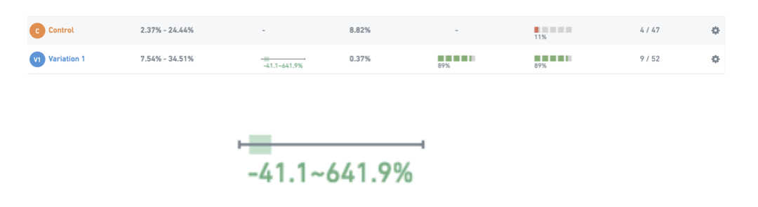
Here’s the second variation.


You may have noticed that we changed a few different elements here. The main thing to take note of was that we set the autoship product variation to default.

Most of the time, our rule is to change as few elements as possible.

However, we wanted quick results here so we opted to simultaneously test the optimizations based on what worked in the past from our thousands of tests. If this didn’t test well, we would have scaled back on the changes then tested again.

We released this new variation on the 15th of February against our first improved variation.

On the 24th of March, we had the results.


JustThrive Variant 1 results


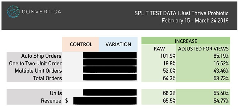
That’s an 85.19% increase in auto-ship subscriptions.

53.73% increase in the total number of orders.

And a 54.77% increase in revenue. Compared to the already improved second version.

How about that, huh?

This 54.77% increase was against our first test variant that already produced a 30.4% increase, meaning the cumulative revenue increase for these two split tests is 101.82%! (1.5477 x 1.304).

Not to mention the bigger win here being the cumulative increase of 162% in recurring revenue.

By now you’re probably wondering…

That’s all great, Kurt. But what do I have to do to increase my online store’s conversion rates?”

Well, keep reading.

I’m about to share some lessons I’ve learned running thousands of conversion tests so you can optimize your online store as we did with JustThrive.

eCommerce Conversion Optimization Mindset

First, a warning.

This isn’t about the best words for your call to action button or the perfect image to use. I’ve already got a post about that here.

Instead, this is about your mindset and the mental shift that needs to take place if you want to become a eCommerce conversion rate master.

We good?

You see, conversion rate optimization is not about changing single elements on the page and doing psychological hocus-pocus to lure visitors to buy your goods. It’s a scientific process.

At the very heart of it is understanding what influences your users to buy from you.

And to understand your customers, there are some realities to reconcile yourself to.

1. Your product page is not just a product page

Your product page is not just a showcase for your amazing gadget.

It’s the place where your customer’s dreams come true. So don’t ask questions like:

  • How can we make this page look cool?
  • How can we win the Webby Awards with this design?

Instead, when you build a product or landing page, ask these questions:

  • When my potential customers land on this page, do they know they’re at the right place within the first 2 seconds?
  • Are all the product images crisp and clear so that they know exactly what this page is about just by scanning it?
  • Is the product description specific and complete, so that shoppers have all the information they need to make the decision right there and then?
  • Is the content easy to understand? Does it answer every objection and question buyers may have?
  • Does it have all the elements needed to lessen buyers’ fear of online shopping, for example,
  • If you offer free shipping, is it clearly written on the page?
  • Do you make it clear that your site uses a secure payment system and that their credit card details are secure?
  • Is there a link for customer support such as live chat or email?

Always ask these questions when you build your product page or landing page, and you’ll have done a lot more than many eCommerce business websites.

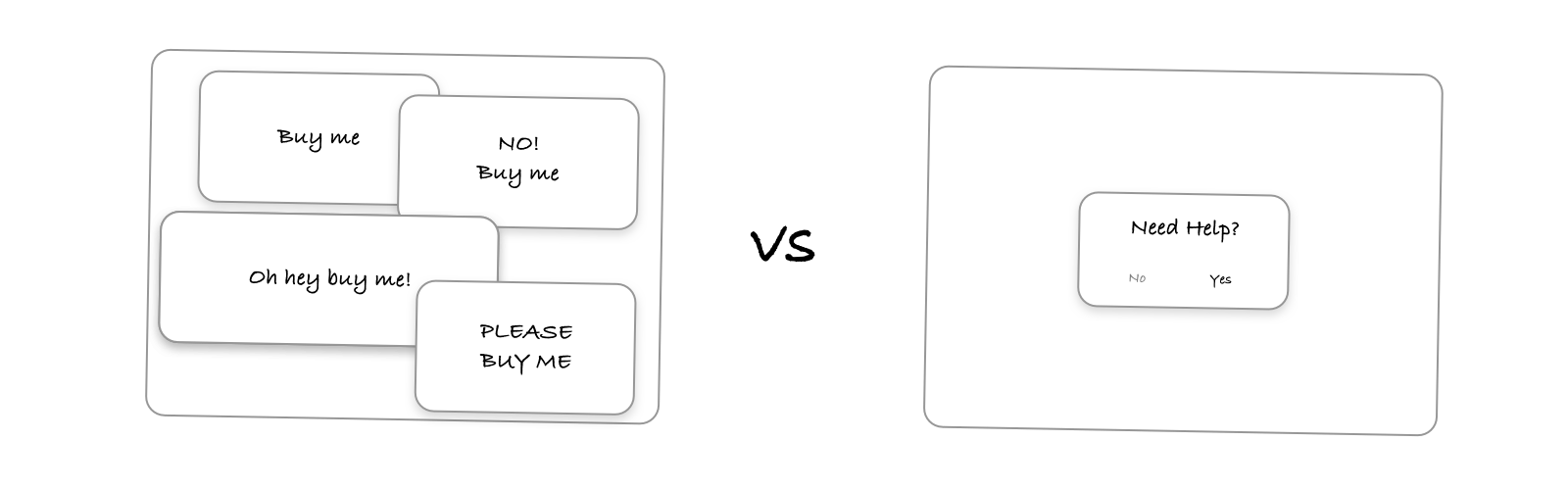
2. You’re guilty until proven innocent

People hate to let go of their hard-earned money.

They hate marketers even more.

Add to this the many stories of fraud, lies and scams that they hear about online. And you’ve got potential buyers who start a relationship with you with a very low level of trust.

And if you think that’s bad. It doesn’t stop there.

Online shoppers are bombarded with options.

Online shoppers fickle and know they can go to another store with the click of the back button or a quick google search.

When they look at your site, they have 3 other tabs open – all of them your competitors.

Guess what?

It’s the store that breaks that barrier and radiates trustworthiness that will get that person’s business.

This means that your page from the copy, to the tone, to the flow, to the design should overcome this initial prejudice if you want a visitor to take the desired action.

As Flint McGlaughlin from MarketingExperiments says,

..your copy needs to give me a sense of certainty not only that this is the right product but that you are the right guy.

He further adds that your page has to answer this question:

“Why should I stay here rather than consider another option? What makes you so special? If I am your ideal customer, why should I purchase from you instead of any of your other competitors? Help me as a visitor to understand this is the place to look for my solution”

3. Your visitors owe you nothing

Tbh, product pages are great fun to optimize.

Why?

Because most shoppers are already aware of what you’re selling.

But just because they’re ready to buy doesn’t mean they’ll buy it from you.

Just because they landed on your page doesn’t mean they’ll read every word on it.

Steve Krug in his book, “Don’t Make Me Think,” says,

“Most web users tend to act like sharks. They have to keep moving, or they’ll die. We just don’t have the time to read more than necessary.”

So what do you do?

Easy.

  1. Know your buyers. Know the motivations that got them to your page. Know their questions. Know their objections. Know the exact words they use to explain their pains and desires.
  2. Make it clear as soon as buyers land on the page that they’re in the right place.
  3. Make sure that your page answers the persistent question that hangs over every visitor’s head, “What’s in it for me?”

Keep these three things in mind when you build your product pages.

Make it clear when you write product descriptions that you understand your customers. It’s when you’re sensitive to what they feel, that they get motivated to stay on your page and check out your offers.

Tips to Increase your eCommerce Conversion Rate

Mystery boxes have their place. But most of the time, when a person visits an online store, he wants to know what he’s getting.

And it’s your job to tell him what it is.

Sounds simple enough, right?

But because there’s a technological barrier between you and the buyer, it’s more challenging than it sounds.

You may think that traffic is all you need to make money from your site. But it isn’t. This is why the average eCommerce theme conversion rate across all industries is staggeringly low compared to offline retail stores.

And yet, when a business gets it. Really gets the art and science of selling online, their conversion rates increase by leaps and bounds.

Don’t believe me? Then check out this eCommerce conversion rate average for different industries. Take note of the big difference between mean conversion rates to that of the conversion rates in the 90th percentile.

In computer software and video games, for example, the mean is 19.5%. And yet, the one in the 90th percentile is 61%.

These eCommerce businesses converting at 61% get it. And it’s what you can aspire to get to.

So. How do you get to this level?

By understanding your customers and doing lots of conversion rate optimization tests. There’s no way around it.

But I also know that you’re reading this to have some takeaways that you can apply to your site now.

So let me show you the top three things to focus your optimization efforts on to propel the growth of your eCommerce business.

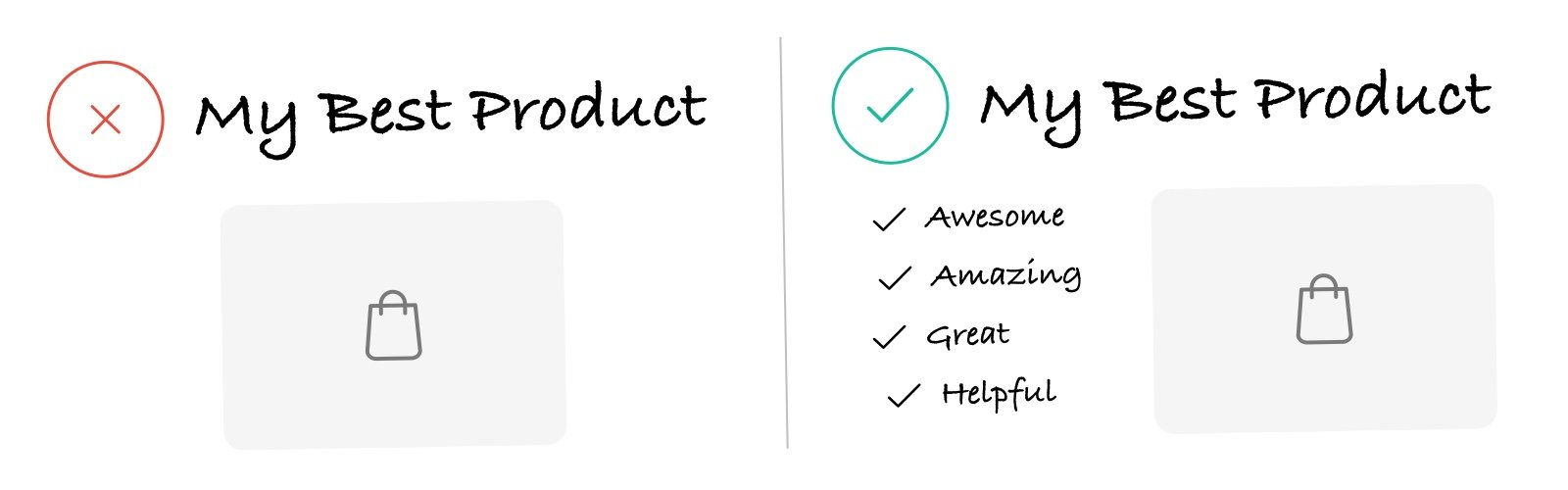
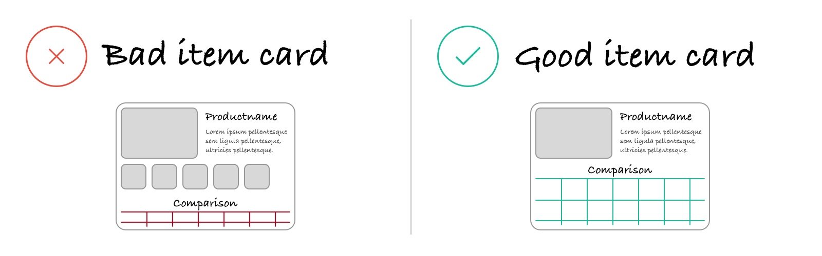
1. Make them understand what your eCommerce store is all about

A person has to know a few things before he’s even willing to read through your copy, much less click the Add to Cart button. First,

  • He needs to know he’s in the right place
  • That you’re selling the product he wants

Let’s say you’re in a gigantic mall with dozens of stores. You go in to buy a computer. You’ve never been to this place before. You’re not familiar with the shops. So the first thing you do is find a computer shop. Then once you’re there, you find out if they have what you want.

The same is true for every new visitor who lands on your site.

As soon as he lands on any of the pages on your site, he first has to know if he’s in the right place. And if you want to improve your conversion rate, you’ve got to make that clear to him.

Here’s the problem.

You’re not there. There’s no sales clerk either who can walk a person through a product, or show him the way if he gets lost.

That is your big challenge.

And it’s not always an easy one to deal with

See. This means you have to think about all these possible problems beforehand.

This is where optimizing user experience comes in. Anticipate their potential problems and then build a site that’s easy to use and brings on flawless user experience.

How do you do this? Here are some tips

Consider where the visitor is in the customer journey

Before a person buys anything, he goes through three different stages. This is called the buyers journey. The stages are

  • Awareness
  • Consideration and
  • Decision

His frame of mind depends on which stage of the journey he’s at.

The person at the awareness stage knows he’s got a problem or he needs something but he doesn’t know what it is. So he might search for something like “What computer should I buy for video editing?

The person at the consideration stage knows the different products available but is now looking for the best one among the different options. He’s most likely to search for “Difference between Apple iMac 4K and Microsoft Surface Studio 2.

And finally, the person at the decision stage knows exactly which product he’s buying and is now looking for the best place to buy it from. He might use the keywords “Buy Microsoft Surface Studio 2.

Think about these different stages. And bear in mind, that at each stage, the customer will be at a different frame of mind.

So if he’s still at the awareness stage, don’t bombard him with the price or the discount offer you have right now. He doesn’t care about that. Not at this stage.

Tell him only what matters to him now.

You’ll have to evaluate every page on your site and see at what stage of the buyer’s journey a person who lands on that page is at.

Study your site’s Google analytics report. And pay attention to the keywords visitors use to find you. These keywords will give you an idea of their awareness levels.

Here’s a table from Hubspot showing relevant terms for each stage of the journey. Use this as a guide to know more about your visitors and the pages they visit.


2. Reduce friction and anxiety

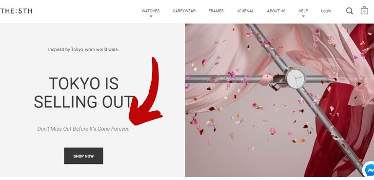
Shopping online comes with a lot of inherent fears and insecurities.

Why do people go to big known brands to buy online? Because there’s a lesser degree of risk involved.

And if you run an online store without the marketing budget of big brands like Amazon, Target or Walmart, you’re already in a losing battle.

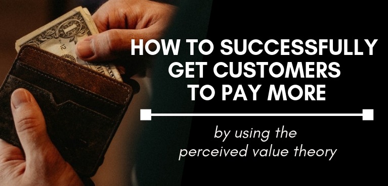
There are things you can do to fight and put the odds somewhat in your favor, such as improving your perceived value, but let’s assume you’ve done all that already.

What else can you do? How do you convince a person to buy from you instead of the competition?

I’d say that one of the important deciding factors on whether a person buys from your site or not is the level of trust he holds for your business.

Online, this doesn’t come easy. People tend to be wary of businesses they know nothing about. This is why as part of your marketing strategy, you put your brand in front of people even when they’re not in a buying mode. This gets them primed and familiar with your business.

But apart from this, there are also other things you can do to make potential buyers trust you and your brand.

This doesn’t happen by chance. You’ll have to engineer it and deliberately show that you’re trustworthy.

Here are some things you can do to initiate this.

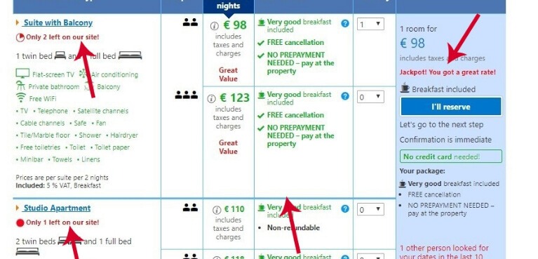
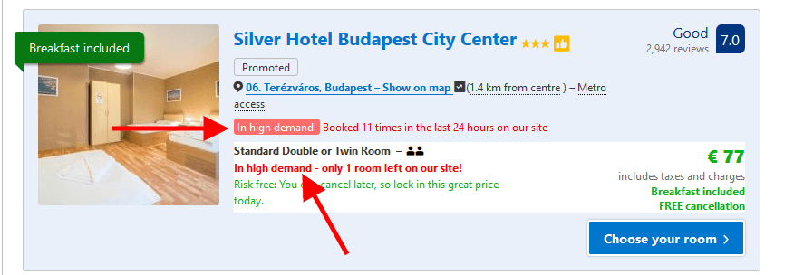
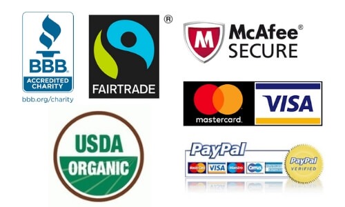
Use the power of third-party social proof

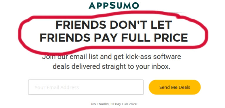
Be it reviews, testimonials, trust badges or certifications, third party social proof is a great way to improve your conversion rate. It changes a person’s frame of mind from “I’m not sure if I can trust this business” to “If others have bought from this store before and were happy with the purchase, then maybe I can trust them, too“.

  • If you have reviews that show the qualities of the product as well as the trustworthiness of your brand, don’t hide them. Show them off where the person can easily see them.
  • Use testimonials strategically. If a popular person has a testimonial, don’t be scared to flaunt it.
  • Show your guarantee. Guarantees may seem like a small thing but it takes a person who’s deciding whether to buy a product from you to the next step of the decision process. Let’s say she’s researching a product and she’s got another tab open – that of your competition. You’re both selling exactly the same product, but you have on your page clearly displayed your 30-day return guarantee. Who do you think they will buy it from? It’s little things like this that make a big difference in the conversion rate of eCommerce sites.

Prominently display customer support information

Make customer support prominent on every page of the site.

Your challenge online is the lack of a real person to show a shopper the ropes. Most shoppers have come to terms with that. But still, it’s your job to reassure them.

It’s your job to let them know that should they have any questions or problems, there’s the customer support that they can talk to.

How do you do this?

Have your contact information visible on every page. If you can put your phone number on the header and it doesn’t affect site design, then do it.

If you have a properly designed website, most people will not call. But psychologically, it means a lot. You display that phone number and their trust in you increases.

Additionally, have live chat and your email address within easy access.

If you don’t have the resources for live chat, then use a chatbot. This is now commonplace in many eCommerce stores and customers are getting used to it.

Know the importance of the Add To Cart Button

The Add to Cart button. Such a small part of the whole design of a product page. But it plays a major part in eCommerce conversions.

Why?

Because it’s usually the point he has to engage with you to get to the next step.

It’s the point where your buyer has taken action. It’s the point where he becomes a passive reader to an active consumer.

And though that may seem like a small thing, it isn’t.

This is why a lot of blog posts and case studies are spent just exploring CTA buttons to increase conversion on eCommerce websites.

3. Optimize the checkout process to increase eCommerce conversion rates

So at this stage, the visitor knows that he wants the product you’re selling and he trusts you enough to buy from you.

You think that’s enough? If only it were that easy.

Look. The first two tips above are very important in getting a potential customer to this ready-to-buy stage.

But here’s the thing. The checkout process can potentially be the most stressful part of the shopping experience.

Let me lay it out for you:

A visitor at this stage has done all the research. He’s read many websites. Compared a lot of products. And after hours of research, he has finally decided to buy from you.

What a relief. Here is the culmination of all that work.

Finally, all the hard work is done.

I repeat that. He expects all the hard work to be done.

It should now be smooth-sailing. All he has to do is pay. Then he can get back to watching football, playing with the kids or vegging out on the sofa.

Now imagine that psychology. That frame of mind. Itching to get it done and over with.

But then…

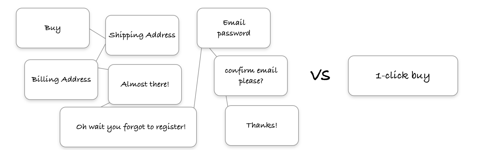
  • There’s a long form he has to fill in
  • He has to register first
  • He finds out you don’t accept the payment system he prefers using
  • Shipping’s going to take weeks
  • Shipping costs an arm and a leg

All these things he has to do. All these problems he has to deal with. It’s supposed to be easy and yet, you’re making his life hell.

Ok. Maybe hell is a bit of an overstatement. But all these sudden responsibilities he does not welcome at all. Some determined people will stay. But most of them will want to leave (and can you imagine how much more frustrating that is for users on mobile devices?)

Don’t believe me?

Do you know  the shopping cart abandonment rate for online retailers.

It’s 69.57%!

Imagine that! More than half of the people who are ready to buy, credit card in hand, just leave.

Isn’t that painfully disheartening?

So near yet so far.

It’s a real problem in eCommerce. But why? What exactly are the reasons why people leave? Baymard recently asked more than 4000 US adults for their reasons for cart abandonment. Here’s the result of that survey.

Shopping Cart Abandonment

Source 

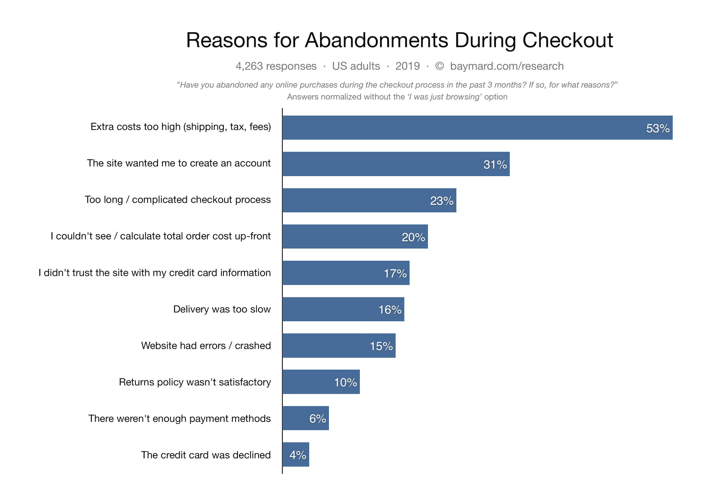
The top responses are:

  • The extra costs are too high
  • The site wanted me to create an account
  • The checkout process is too long or complicated
  • I couldn’t calculate total order cost upfront
  • I didn’t trust the site with my credit card information
  • Delivery was too slow
  • Website crashed
  • The returns policy wasn’t satisfactory
  • There weren’t enough payment methods

These are all things that you can do something about. These are problems you can solve. Solve these and you decrease shopping cart abandonment problems

So if you want to get serious with your eCommerce conversion rate efforts, then study the top reasons for abandonment. Get your conversion team together and see how you can enhance your customer’s shopping experience to improve your conversion rate.

The challenge here is to make the checkout process as seamless as possible,

  • Make it easy for them to get from clicking the Add to Cart button to the Pay Now button.
  • Offer different payment systems
  • Allow guest checkout
  • Have interactive forms that tell users why their payment has been denied

Also, find a way to communicate important information they need to know before they add an item to the cart. Basic information such as shipping, extra costs, or payment systems you accept should be clear to buyers before they add an item to the cart.

Are you still with me?

Now that you know

…that your product page is for meeting your buyers’ needs

…that your visitors come to your site full of distrust, and

…that your visitors feel no obligation to buy from your store.

You can start to optimize your page.

And when you do, here’s a good rule of thumb.

Assume you know nothing about your potential customers

Whaaat?

Yes, that’s right. Harvest all the research you need about your customers.

But.

Once you start the eCommerce conversion optimization campaign, shelve it in the corner.

Why?

Because all that research can’t tell you how your visitors will behave when they land on your test pages.

All that research will only help you meet them halfway when you formulate the hypothesis, write the product descriptions and design the layout.

But once they interact with your page, you never know what they will do.

You just have to test it in the field and test the validity of your assumptions.

Then and only then will you know if your visitors do what you thought they would do. Then and only then will you be able to glean insights to the types of changes your particular customers respond to.

TL;DR

“All men can see these tactics whereby I conquer, but what none can see is the strategy out of which victory is evolved.” – Sun Tzu

Quick fixes and best practices can get you so far.

But if you want to become successful at eCommerce conversion optimization, you need to operate beyond tactics.

More importantly, you need to understand the motivations and pains that led your customer to your page. You need to change your mindset about what conversion optimization is.

That it isn’t just about changing web designs and layouts but actually knowing your customers. And understanding what is most important for them when they land on your page.

And then once you know this, build a site that makes their experience while on your site a smooth and easy one. This means optimizing the different pages to match the different levels of buyer awareness.

Finally, set up a site that inspires trust.

And when you put all these together as you optimize your website, you’ll find that your visitors will engage with you more. The more they engage with you, the more they think of you next time they need something you sell. And that is how you increase eCommerce conversion rates and thrive as an online business.

Ready to boost your conversions? Contact our expert eCommerce CRO agency today to take your online business to the next level!

Author: Kurt Philip

Hi, I’m Kurt Philip, the founder & CEO of Convertica. I live and breathe conversion rate optimization. I hope you enjoy our findings.

We’ve worked with over 1000 businesses in the last 6 years.
Let’s jump on a quick call to see how we can help yours.

Book FREE CRO Call

Client Case Studies


Follow us on Youtube

Scarcity Marketing Tactics used by the World’s Biggest Brands

Scarcity Marketing Tactics used by the World’s Biggest Brands

16 seconds.

That’s how quickly the $1800 Supreme x Rimowa 82L luggage sold out.

It was an unlikely collaboration between a luxury brand and a streetwear company.

There were no fancy ads or elaborate marketing campaigns.

There was only a post on Instagram signaling to its fan base that the limited edition luggage was out.

16 seconds later, the luggage was all gone.

This is the power of scarcity marketing.

And if you run an eCommerce business, it’s one to keep close to your heart.

The Psychology behind the scarcity marketing principle

…….No!

Two letters.

But it’s more than enough to trigger your brain into panic mode.

Your right brain takes the driver’s seat and your emotions take control.

When someone tells you that resources are limited…

When someone tells you that you can’t have something…

When someone tells you that you’ll lose your chance to get the thing you really like if you don’t click the buy button in the next 2 hours…

Your brain shifts to a different level of thinking.

Now the game changes.

Utility drops in importance. And the desire to own it becomes the goal.

As psychologist Robert Cialdini in his book, Influence: The Psychology of Persuasion, says “a product becomes more attractive when its perceived availability is limited.”

Sure. Other concerns like price still float in the back of your mind, but their importance dims in comparison to your desire to own the product.

This is the modus operandi of the human psyche and it’s one to keep in mind when you run an online shop.

How can you make the best of Scarcity Marketing for your eCommerce store?

Scarcity is an effective marketing strategy. But it isn’t magic.

It doesn’t just happen when you slap countdown timers and write only one stock left on the page.

But it works like a charm when there’s a synergy between perceived value, good branding, and scarcity messages.

What does this mean?

This means that for it to work, you should have hungry buyers who are already sold on what you’re selling.

Scarcity is simply a little nudge to get them to click the buy button quicker.

But you’re probably wondering, “Why do I have to nudge them? If they like what I’m selling, they’re gonna buy it anyway!”

And my answer is this:

Just because they want to buy an item doesn’t mean they’ll buy it now or that they’ll buy it from you.

There are a million and one things competing against you for their attention.

It could be another site that sells the same things as you…

It could be Twitter…

It could be a cat video.

But show them a tantalizing offer and add a time limit to it —

Then you get their attention.

You stop them in their tracks.

And chances are they’ll buy from you and not your competition.

So how do you start to implement these scarcity marketing tactics?

Let’s start with words

Scarcity and urgency words

The exact words you use are crucial when you advertise scarcity online.

There are two types of words that come in handy here: words that show scarcity of time (there’s an end date to the offer) and words that show scarcity of the product (stocks are limited).

Words for time scarcity for online retailers

  • Deal ends today

  • Only 12 hours left

  • Prices go up in 1 day

  • Today only

  • Offer expires today


Words for stock scarcity for limited availability

  • First 50 people get a free coaching call

  • Nearly sold out

  • Limited edition

  • Only available to members

  • Get them while they last

For more words like these, check out Buffer’s, 189 powerful words that convert

Real-time countdown timers to create urgency

A countdown timer laser-focuses your train of thought.

See, we count down for a lot of momentous events.

We count down on New Year’s Eve…

We count down when launching a rocket…

We count down the days for the next John Wick.

You may not realize it but timers like these spark a visceral response that influences your mental functions.

It feeds your emotions and keeps you in that hyped state of mind.

When it’s on a website, it’s a visual representation of urgency that reminds the brain what it’s dealing with.

In short, it keeps the right brain on the driver’s seat.

The trick is to put it on pages where a person is already considering making a purchase like your product pages.

You can also use a countdown timer to boost sales:

  1. In the cart

  2. As a floating bar

  3. As a pop up especially during flash sales

  4. In Emails

  5. In social media posts

Where do scarcity marketing tactics and urgency make sense?

Think of it like this:

Scarcity guides your loyal customers to get to the buying decision quicker.

You’re not pushing them. You’re guiding the way.

You limit their choices and you keep them focused so they get to the buy button without any hiccups.

You get inside the conversation that’s going on in their heads. So they don’t wander and do other things like watch another cat video.

Here’s the deal.

Don’t limit scarcity and urgency messages during special days like Black Friday. On eCommerce sites, it’s good practice to have it as an ever-present part of your copy.

Now I’m not suggesting that you be that schmuck who insults his customers’ intelligence by using scarcity signals to trick them to buy.

I’m talking about using the scarcity principle as a beacon that guides your visitors as they shop on your site.

Let me give you some examples:

Amazon has lots of scarcity marketing urgency signals.

Here’s one that tells you the time you have left on a lightning deal that’s in your cart. Now that’s good information to know. If I were buying this item, I would like to know exactly how much time I have left before it gets taken out of my cart.

Countdown timer example via amazon.com

source

Here’s another scarcity marketing tactic by Etsy.

And whoa! If you really want this pillow cover, you better buy it right now because there’s only 1 left and 2 people have it in their carts. Now it’s a race to see which of you three can whip out your credit card faster!


Etsy urgency example

source


And lastly, here’s a scaricty marketing tactic by Secret Sales.

This is unique and one that I haven’t seen done on other sites. Imagine if you really wanted this jacket. It’s going to be the longest 12 minutes of your life.

Nail biting scarcity message - this is in another person's site. Come back in 12 minutes

source


Be warned:

There’s a fine line between guiding your visitors and annoying them so use this with a lot of thought and restraint. 

Looking for inspiration? Here are some scarcity marketing examples

1. Apple is the master of scarcity marketing campaigns

Remember what I said that scarcity works best when combined with other marketing strategies? There’s no company that does this better than Apple.

They hit the right emotions at the right time. So when they launch a new product, there’s no other thing on their customers’ minds but to buy the new tech gadget right now

As Robin Lewis says in his Forbes article, How Apple Neurologically Hooked its Customers:

The buzz begins building, first with dropped hints, then with escalating stagecraft, until the anticipation is palpable. As demand accelerates, Apple warns of scarcity, which further heightens demand and drives an enormous volume of preorders. All in all, before the product is even released, consumers’ minds are filled with Apple, leaving no space for thoughts about competitive brands.

2. Hermés Birkin Bags

If you want to see the combined powers of perceived value and scarcity fueling each other, look no further than Hermés.

They have taken scarcity to a point that Birkin bags may as well be unicorns.

You go to any one of their shops and you’re told there’s none available.

You ask when they’ll have it and they tell you they don’t know.

And oh! There’s a waiting list as long as your arm.

And when you do get on this list, you wait for months before you’re given the bag.

Now, do you think all these jumping through hoops stop people from buying a $10,000 bag?

No!

Quite the opposite. It fuels their desire for it.

3. Gmail’s invite-only origins

In 2004, Google made Gmail.

It was a venture into a new market, and the engineers were concerned they would not be able to cope with tremendous demand.

They had one solution: make Gmail invite-only.

So they invited a select group of people who could send invites if they liked the product.

And invite they did.

Before long, people were talking about this great email service that was only available to a chosen few.

You know what that is?

Scarcity and exclusivity. And when these two work together, they take the world by storm.

People wanted it so badly that Gmail accounts were selling for as much as a hundred dollars on eBay.

4. The Share-a-coke scarcity marketing campaign

It was 2011.

A study in Australia showed that 50% of teens and adults hadn’t tasted a coke.

In response to this, their marketing team cooked up a plan to get people to drink their first coke.

They printed the most common Australian names in coke bottles with the words: Share a coke with (person’s name).

What a rare sight to see one’s name on a soda bottle! It was innovative and unusual that it went viral.

And what a success it was!


Share a coke campaign case stuy

source


5. AppSumo Deals, limited supply scarcity tactics

Go to the appSumo website and this is the entry pop-up that greets you


appSumo pop-up : scarcity + exclusivity example

source

“Friends don’t let friends pay at full price.”

Boom! They already have you on a string.

You’ve just arrived in their world and they already call you a friend!

That’s exclusivity at first base.

But that’s not all.

Their business model relies on scarcity and urgency. It also doesn’t hurt that many deals are a steal!

I know because I’m their friend. And I may have taken out my credit card once or twice for them.

6. Siteground’s scarcity marketing Black Friday deals

Or any Black Friday deals for that matter.

Why do people sleep in tents outside department stores the night before the big day? Why do people wait for lightning deals with bated breath?

One reason: they don’t want to lose out on a deal. Once it’s gone, it’s gone.

7. Yeezy Turtledove Sneakers

Kanye West now says that “everybody who wants Yeezys will get a Yeezy.”

But when the Kanye-Adidas collaboration first started with the Turtledove sneakers, they used the power of scarcity with a lot of success.

What did they do?

They limited production to 9000. They could have made more considering the buzz around it. But they didn’t.

And if you’re one of those people who wanted one and you knew there were only 9000 pairs, you would be clamoring for it by the time it’s released. Which was exactly what happened.

8. Cabbage Patch Kids scarcity marketing

“It was the country’s first instance of total consumer anarchy.” Stephanie Buck writes

And all that was because of a doll people thought was ugly.

The secret? Each of the dolls was one of a kind. They also came with birth certificates and adoption papers. So that’s the rare aspect which was already a big selling point.

Now mix that with stores that couldn’t stock enough of it and you had a match made in heaven.

Parents became so desperate to get one that a store manager had to arm himself with a baseball bat against all the rioting parents!

9. The:5th

The:5th sells limited watch designs every month.

Check out their homepage. It’s got scarcity, urgency and exclusivity cleverly added into their copy without looking tacky or pushy.


Luxury watch with limited editions

source


10. Back-alley bacon and other secret restaurants

These aren’t eCommerce sites.

But secret restaurants use scarcity and curiosity in a very clever way that they deserve to be on this list.

Let’s take Back Alley Bacon for example.

No one knows a lot about this pop-up restaurant. No one knows the chef. No one knows who owns it. Even the man who hands out the meal wears a pig mask.

To know when a meal is available, you have to follow them on Facebook or Twitter.

Then every Wednesday, they post the information you need to buy a meal. This includes what it is, how much it costs, when it’s available and of course, a password.

That’s it.

And people love it.


Back Alley Bacon post on Facebook

source


11. De Beers and its diamonds scarcity marketing examples

We can’t write about scarcity without talking about diamonds.

Here’s the deal: diamonds are not rare. But in 1888, a group of major diamond investors called De Beers Consolidated Mines Ltd. put all their resources together and controlled the production of diamonds.

This created a sense of scarcity. Mix that with a well thought out marketing campaign and we still think of diamonds as rarer than other metals and precious stones.

12. McDonald’s

Even big establishments like McDonald’s use scarcity because it works.

McDonald’s regularly makes limited edition items like the McRibs.

Not too long ago, they even made a limited release of the McDonald’s Szechuan sauce after it was mentioned in a Rick & Morty episode. That campaign was so successful that Thrillist writer James Chrisman says, “The response was apocalyptic. Put simply, there wasn’t enough sauce. People freaked out.”

McDonald’s does this not so much to make money. But it’s used as a promotional and branding strategy. Every now and then when these limited-edition items come out, it keeps us talking about the brand. What a clever way to keep themselves relevant!

13. Booking.com uses high demand and limited availability scarcity marketing

When it comes to travel sites, booking.com leads the way in scarcity and urgency marketing with their high demand to encourage customers to book through their online store..

As soon as you start searching for a room, there’s a constant reminder that if you don’t act fast enough, you will lose the room. And no one wants to lose a room they really want, right?


Cart timers and other urgency signals on booking.com


14. Alibaba singles day.

For one day only, on the 11th of November, Alibaba holds the biggest eCommerce event in the world. If you want to save up to 50% on your purchases, you’ll be lining up to buy some products too!

One day site-wide sales are becoming very common in eCommerce websites. There’s Singles Day for Alibaba, Prime Day for Amazon, the 17th of every month for Burberry.

What’s yours?


Alibaba Singles Day

source 

15. Supreme

Supreme’s business model runs on scarcity with limited quantities.

They play hard to get.

They ask for your email but they hardly send any emails your way. A brilliant scarcity marketing tactic.

They only sell limited editions like the collaboration with Rimowa luggage.

They release items only once a week.

Their products have a very high perceived scarcity and a very loyal group of fans and existing customers wait with mouths watering for every item they release. And almost always, their products sell out in less than a day – many of them only in minutes.

Check out their website and see how it looks like they’re not even trying!


Supreme homepage- playing hard to get

source


16. Amazon Prime day scarcity marketing

Amazon doesn’t just want you to buy from them. They want you to be a Prime member.

So what do they do? They invented Prime day. Just one day when prime members get special discounts, deals, and free shipping.

And if you regularly buy from Amazon and you find a good offer on this day, it would be wise to get a Prime membership.


17. Kylie Cosmetics Limited Editions create scarcity


Say what you want about the Kardashians. But you can’t deny that they have business sense.

The way Kylie Jenner promotes her limited edition beauty products is an eCommerce story worth telling. She uses a combination of different scarcity marketing strategies that get people in a buying frenzy.

Let’s see.

She’s got a good brand. Even when she’s not selling anything, she engages with her fans. When she does have a product to promote, she builds up the tension weeks before the launch.

She talks about it.

Shows pictures and videos of it to stimulate increased demand,

Teases people with it. Scarcity marketing works.

When launch day finally comes, fans know that with the demand there isn’t going to be enough for everyone.

The fans are so hyped-up, the only thing that matters on launch day is to click that buy button.

You may not like her. But that is genius marketing.


Don’t go yet. Here’s something important

Scarcity is an effective strategy to convert website visitors to buyers.

It’s a powerful marketing tool.

But it’s also very fragile.

Consumers know about the scarcity strategy. And they often have their wary antennas on when it is presented in front of them.

So when your website says there are limited quantities of only 2 items left.

There should be only 2 left.

When your website says the offer will be gone in 3 hours. Stop the deal after 3 hours.

When your website says something is only for premium members, don’t offer it anywhere else.

Potential customers are not fooled easily anymore and they demand nothing but the truth.

Break their trust and your credibility will suffer. You’ll lose customers faster than you can say, “Bob’s your uncle”.

And as this study finds, people hold a grudge after bad customer experience. Once you’ve broken a customer’s trust, it’s very difficult to get it back.


A final word about scarcity tactics,

If you want this strategy to really work in your favor, work on your branding and perceived value.

Create that feeling of trust in your brand and desire for your products.

Then, add a sprinkling of social proof and exclusivity on your pages.

If you’ve got these in place, you’ll see scarcity working on your eCommerce store like a hot knife through butter.

Author: Kurt Philip

Hi, I’m Kurt Philip, the founder & CEO of Convertica. I live and breathe conversion rate optimization. I hope you enjoy our findings.

We’ve worked with over 1000 businesses in the last 6 years.
Let’s jump on a quick call to see how we can help yours.

Book FREE CRO Call

Client Case Studies


Follow us on Youtube

Perceived Value Theory 101

Perceived Value Theory 101

Imagine this:

You’re about to rescue a child stuck on the ledge of a cliff.

There are two bags in front of you. Each bag contains a rescue kit.

Here’s the kicker:

One was made in Germany. The other in China.

Which one would you pick?

The bag you choose shows that you attach more value to that country for life-saving gear.

This is what you call perceived value. And it drives every decision we make.


Why is perceived value important in marketing?

Short answer:

It could make or break your business.

“Perception is reality. If you are perceived to be something, you might as well be it because that’s the truth in people’s minds.” Steve Young

There are two elements to perceived value. These are the customer’s perception of your product and the price he is willing to pay for it.

MECLABS illustrate this with the value fulcrum:

https://images.airstory.co/v1/prod/i15548728322ce2b3f8-0408-40a3-bf58-6dd0ff110a62/Acceptance.jpg Source

Here’s how this works:

When your customer feels that your offer has more value than the material and mental cost, then you tip the fulcrum in your favor.

That’s easy to understand, right?

But here’s the deal.

Perceived value is very personal and highly subjective.

It has nothing to do with numbers, logic, or manufacturing cost.

It has everything to do with perception.

And you know what? That’s good news.

Why?

Because perception is malleable. If you have a stellar product to start with, you’re more than halfway there.


Emotion is the ruler of perceived value

People buy with their emotions.

Without it, the brain can’t make a decision as neuroscientist Antonio Damasio finds.

When a person decides to buy something, it may feel and look like a very logical data-driven behavior.

But the truth is that this decision is influenced by subconscious motivations.

And if you want them to give you a time of their day. If you want them to buy your stuff. You need to find a way to get inside the inner sanctum of their brains and do this one thing:

Make. Them. Feel. Good.

They may not know it or articulate it.

But when you position yourself as the answer to their primal needs, your perceived value goes up.


How the lobster increased its perceived value and why you should too

Lobsters were once a pest of the earth served only to the lowest people in society.

As David Foster Wallace eloquently says in Consider the Lobster:

Even in the harsh penal environment of early America, some colonies had laws against feeding lobsters to inmates more than once a week because it was thought to be cruel and unusual, like making people eat rats. –David Foster Wallace

But look how far the lobster has gone! From abhorrent prison food to exclusive and expensive delicacy.

Talk about a 180-degree turn-around in perceived value.

So what can you learn from this lobster story?

This:

Increase your perceived value and you’ll make more money.

Why?


1. You can charge more and your customers will not flinch

The more value your customer feels for your products and solutions, the lesser it is for money to be a concern. His question will no longer be, “Can I afford this?”

Instead, he’ll be asking, “Can I afford to live without it?”

And if you’ve communicated your value well enough, he’ll gladly take out his credit card knowing that it’s going to make his life better.


2. Your store’s conversion increases

Want to drive online sales and make more money from the people who visit your site?

Then increase your perceived value.

The good news with online stores is that it’s easy to tweak your site design and web copy to influence customer perception.


3. You have staunchly loyal customers who will walk on fire for you

Perceived value benefits many of the other facets of your business.

Nowhere is this more apparent than in customers that become your flag-bearers.

They’re the customers who stand in line for hours to wait for your newest products.

The customers who are full of praises for you and defend you when someone talks trash about your company

They’re your valuable unpaid employees. The company assets every business dreams of.


Your customers own their perception of you

Your customer is the hero, the star and the heartbeat that drives perceived value.

If there’s only one lesson you can learn today, let it be this.

Don’t be arrogant and impose values you think will be good for them.

Look at it from their point of view: their exact words, motivations and inclinations.

Just because you think something is good for them doesn’t mean they’ll care about it.

Think about it this way:

If they don’t care about it, they will not value it.

When they feel there’s no value in it for them…

There goes your business down the drain.

So when you brainstorm ways to increase your perceived value, make your customers the be all and end all.

If you focus on anything else, it’s a useless exercise.


How to influence perceived value

Let me tell you a powerful secret that businesses use to influence perceived value.

Ready?

Reframing.

This is when you alter the way you express something with the purpose of changing someone’s perception.

Think of the ugly duckling who turns into a beautiful swan.

She’s fundamentally the same. But the way she looks at herself has changed.

And this is your goal when you reframe: to make a person see something from a different point of view.

But exactly how do you do this?

Here are 10 popular reframing methods that will benefit your bottom line.


The power of luxury

The desire to collect upmarket goods is very strong for many people.

It’s so strong it fuels the luxury market.

Sure, people will find a logical reason why they buy a Hermes Birkin bag, a Bentley or this $47,000 crib.

But it boils down to one thing:

Significance.

As Tony Robbins puts it:

…people will pay disproportionately to feel significant. And this can be true even if the purchase is a gift for someone else. Because they subconsciously believe that giving someone a gift will get them attention, appreciation, or even love, which ultimately means one thing — significance.

Many marketing concepts do not apply to luxury brands. In fact, luxury brand strategy goes against the grain with its 24-anti laws of marketing.

So how do you convey luxury in online marketing campaigns?

Here are five rules from the 24 anti-marketing laws that you can apply in your marketing now.

  • Keep non-enthusiasts out
  • Make it difficult for clients to buy your product
  • Don’t respond to rising demand.
  • Raise your prices as time goes on, in order to increase demand.
  • Keep raising the average price of the product range.
  • Here’s the full list


FOMO is your friend

FOMO (fear of missing out) is real.

It’s not just a millennial’s dilemma.

And my, it’s a formidable ally in your arsenal when influencing perceived value.

It works so well that it’s one of the most common ways internet companies increase website conversions.

Here’s Amazon:

Amazon website example - Psychology of scarcity example

Here’s Bookings:

Scarcity Principle example from the Bookings website

The fear of losing something (“there’s not enough of this for everybody”) drives our brain haywire and compels us to want it more.

You see this when parents sacrifice limbs to get the must-have toy every Christmas,

As human beings, our fear of loss is very dominant, that we will risk so much when faced by such a situation.

So knowing this principle, what can you use on your site?

Here are effective tactics for your product pages that use the scarcity principle.

  • 20% off until the end of the month
  • Limited to only 2 items per buyer
  • Price good while supplies last
  • Price increases in 2 days
  • Lightning deals

A word of caution:

Be truthful when you use this method. Consumers are a smart bunch. And you don’t want to lose your credibility.

There’s nothing more devastating to perceived value that lost trust.


Behold the power of an influencer

When Kate Middleton wore this dress during her Asian tour, it sold out in less than an hour.

That’s the power of an influencer.

But you don’t have to wait for for the duchess to wear your products or pay a Kardashian for a brand deal.

Know your customers and find an influencer that’s closest to their heart.

Look for bloggers and social media influencers that get your target market.

Develop brand partnerships and start an influencer program.

When you’ve got this in place, you find that the more influencers talk about your brand, your sales increase as well – as Anita Elberse finds in this study on the economic value of celebrity endorsements.


Take them on a journey behind the scenes

People are nosy.

We know it’s frowned upon. But we secretly like knowing other people’s business.

It’s why vlogs of people doing nothing rack up millions of views on Youtube.

It’s why Instagram posts document everything from exotic places to childbirth.

It’s why we like watching movie bloopers.

We like the stories they tell. They make someone who’s not within our social circle feel closer and human like us.

Dr. Paul Zak, who studied the neuroscience behind storytelling says this:

“Stories are powerful because they transform us into other people’s worlds, but in doing that, they change the way our brains work and potentially change our brain’s chemistry. And that’s what it means to be a social creature: to connect to others, to care about others, even complete strangers.”

When a story is scripted well, it flicks a switch and sparks a fire in our brain and desires.

This is why stories inspire people to take action.

At a bigger level, they can start a revolution.

On a smaller scale, they can motivate people to buy your products.

Why? Telling stories creates an emotional bond between you and your customers.

And remember the basic law of perceived value? It’s how you make your consumers feel.

When you make them feel good, they attach good feelings to your brand.

And when this happens, your value increases.


Show credibility through social proof, testimonials, videos, etc.

You can toot your horn all you want.

But getting someone else to do the bragging for you is 100x more effective.

Start with customer reviews. This is a staple in any web business that consumers expect it. If you don’t have it on your site, fix it right now. It’s an easy way to show your value to every person who lands on your site.

Another thing that requires little effort is adding trust symbols.

These are third party organizations that consumers already trust. Put their logos on your site and by association, consumers transfer their trust on you.

So what are these symbols of trust?

These are logos or certifications that the people you want to reach care about such as Fairtrade, USDA certified product or the Better Business Bureau.

And don’t forget to add some trust signals that online buyers associate trustworthiness with like Visa-Mastercard, Paypal verified or Mcafee secure.

Increase perceived value by using third party trust symbols such as Paypal certified, USDA organic, Mcaffee security etc.


Experiment with the magic of pricing high

Let’s say that tonight, you have a date with the woman of your dreams. You’ve been looking forward to this date. You know she’s the one to marry.

Two hours before meeting her, you get a massive headache. You go to the pharmacy. There are two brands of painkillers. One is three times more expensive than the other.

Would you buy the cheaper or the expensive one?

If you choose the expensive one, you’re in the same boat as most people.

This is what Baba Shiv, Rebecca Waber, Ziv Carmon & Dan Ariely found out when they conducted a study to see the difference in perception when using painkillers with different prices.

In the study of painkillers, researchers applied electrical shocks to the wrists of study participants before and after they took a placebo they believed was a pain pill. When the results were compared, 85 percent of the patients who believed they were taking the expensive pill reported a reduction in pain from the shocks compared to 61 percent for those in the low-priced sample group.

People have a non-conscious bias for more expensive products, as this study shows.

So what’s a quick thing you can do to increase your value?

Sell your products at a higher price than the norm in your market.


End prices with this number for high conversion rates

This is a very easy tweak.

Change the ending of your prices to 99.

So, $2.50 becomes $2.99. $4 becomes $3.99 or $200 becomes $199.

If you have any doubts, just look at Gumroad’s conversion rate chart comparing different price points. 

https://images.airstory.co/v1/prod/i1554472985d6cf0fbb-2ce2-4e48-9dfc-8d8baa3326bc/tumblr_inline_mx8hjmf6GO1s8u3ed.jpg Source


Website design quick wins

Here’s the reality:

People don’t like to work when they land on a site.

As soon as your website feels like it’s going to take more work than most, they leave.

Page taking to long to load? Poof. They’re gone.

Forms have too many lines to fill in? That’s it. They’re not doing it.

Web navigation in places they’re not used to? Don’t even think about it.

This is also true with their feelings for your brand.

As soon as they land on your page, they immediately decide if they want to stay or not. Whether it’s a website that gives value or extra work to their busy lives.

This is why every single thing on your site needs to have a purpose. Every element, every design is there to attract your user to stay, to make his life easier, to make him feel good.

Do this and you’ll improve your perceived value.

There are a few things you can do to engineer this.


Choose color combinations that reflect your brand 

Spot the difference between these two sites. One’s Emmemobili. The other, Fortnite.

Emmemobili & Fortnite compared

Different markets. Different colors. Different feel.

Want to know more about colors for your web design projects? Read this massive guide on color Psychology


Make your homepage sticky

Many of your visitors may not land on your homepage. But if they like the first page they land on, they will click to the homepage to find their bearing.

So make your homepage clear and free of clutter.


Communicate your value accurately and leave no room for doubt

Body language and tone of voice play an important part in effective communication.

But you don’t have this luxury on your website.

You may have the best product in the world, but if the words on your sales page don’t jump into the hearts of your readers, you are no different from a business that doesn’t have an online presence.

As conversion-copywriter Joanna Wiebe says,

Effective site design and copy can work wonders to reduce friction for your visitors, but you need to know what to look for and how to eliminate it. – Joanna Wiebe

So what do you need to do? Joanna explains the 5 things you always need to keep in mind:

  1. Write copy that reflects motivation.
  2. Craft a value message that tells readers they’re in the absolute place they wanted to be.
  3. In cases when you have incentives like free shipping, discounts or special offers, then flaunt them front right and center.
  4. Find the parts on your site that create friction and eliminate them.
  5. Find what stresses your customers on your site and present them in a way that makes the worry disappear.


So…

I’ve given you a lot of things to implement.

Whatever you plan to do next, remember this one important thing:

Perceived value belongs to your customers.

Keep this in mind next time you write your website copy or execute your marketing campaign.

When you do, you trigger the happy centers in their brains and you leave them with no choice but to buy what you sell.

Author: Kurt Philip

Hi, I’m Kurt Philip, the founder & CEO of Convertica. I live and breathe conversion rate optimization. I hope you enjoy our findings.

We’ve worked with over 1000 businesses in the last 6 years.
Let’s jump on a quick call to see how we can help yours.

Book FREE CRO Call

Client Case Studies


Follow us on Youtube

Why Most Affiliate Site Split-Tests Fail (and how to fix it)

Why Most Affiliate Site Split-Tests Fail (and how to fix it)

I have discussed this topic in previous posts but there is still a lot of confusion about the triple set up for affiliate split tests.

In this post I will walk through in more detail and show you the solution to a major issue for affiliate SEOs:

How to run a split test on your affiliate site the right way.

There is a great trick to split-testing that, as far as we know, we are the ONLY ones doing.

It’s something that we are extremely proud of and psyched to share with everyone for the first time.

Occasionally your split tests may return wonky results and you think you have a winning variation. But then you roll out the winning variation and it doesn’t line up with your split test data.  Why?

Use this technique, and you’ll finally get accurate data and great results.

Do you want a 20-100% conversion rate increase?


Why Your Split Tests Aren’t Providing Clear Answers

When making major changes to your Amazon affiliate sites (eg. Changing your comparison table layout), you absolutely have to run split tests to make sure those changes will drive more revenue. Otherwise you’re just speculating.

Some pages will see increases and some will see decreases. We run split tests to work out which ones are the winners and which ones are the losers so we can use data to increase our revenue.

The problem is that running split tests on affiliate sites is pretty tricky. In fact, a lot of SEOs get discouraged when they try to run their own tests for the first time and don’t get any conclusive results.

Split testing your sites correctly is an extremely effective way to multiply your revenue with existing traffic. You’ve just got to do it the right way.

In a ‘normal’ test, we’d just set the control (original page), create a variant (style we want to split test), allocate the visitors 50/50 to each variation, and watch as they battle it out for supremacy.

If only life were that easy….

This textbook way just doesn’t work in real life. Actually, it’s the reason why the majority of all split tests fail to show conclusive data.

Here’s why…..

If you’re running split tests in any of the split testing tools that use javascript to load the variations, and you set the traffic to split 50/50 to original and variant, then your original page will still end up getting 1.5x-2x the number of views. You may have noticed this discrepancy in your own tests and wondered why traffic isn’t being split equally. This preference for the original will skew your results MASSIVELY and give you a distorted picture of sales.

The Amazon sales data you get back will be so skewed that you won’t be able to draw accurate conclusions on the effect on revenue.

There are 3 reasons for this:

  • The testing software doesn’t sort visitors who have disabled javascript
  • The testing software doesn’t sort visitors who’ve disabled cookies
  • The testing software doesn’t sort visitors with a slow internet connection

We’ll call this the “excluded” traffic. This excluded traffic adds up to a huge visitor base that isn’t being subjected to your test, and are simply shown the original page. 

These ‘unsorted’ visitors aren’t being included in the 50/50 traffic split, and end up as ‘extra’ traffic on the original page.

Therefore, the reason your split tests are failing, isn’t that split-testing doesn’t work for Amazon affiliate sites. It’s that your traffic isn’t properly allocated and causing you to get skewed results.

After running test after test, we’ve devised a really badass, MacGyver-like hack to get your test results and Amazon sales data to line up right again. I’m super pumped to be sharing this insight with you.

Here’s what you’ve got to do….

Introducing Convertica’s affiliate site split-test traffic hack:  The Triple-Setup

We decided to share a technique we developed which has revolutionalized our split testing process.

Split-testing Amazon affiliate sites isn’t all that common to begin with.

If you want accurate results, instead of splitting traffic 50/50 between 2 pages, you’ve got to run the Convertica Triple-Setup. We call it that because you need 3 pages instead of 2:

You get this by duplicating the original page TWICE (don’t worry, it’s 100% safe for SEO. We’ll explain below).

This extra duplicate (control page) is an EXACT copy of the original, and all changes are made ONLY to the third page (the Variant).

Then you send 45% of the traffic each to the duplicate control page and the variant page, with only 10% to the original.

Still with me?

Here’s what the 3 pages look like:

  • Original: 10% of Traffic
  • Control (exact duplicate of the original): 45% of Traffic
  • Variant (the changed page): 45% of Traffic

Here’s a visual representation:

NOTE: Duplicating the original should be easy. Just use your theme’s default post duplication function.

This way, all the visitors who don’t get picked up by the split-testing software (the excluded visitors with disabled javascript, disabled cookies, and slow connections) get shown the original page. The remaining visitors that get picked up by the split-testing software are sorted into exactly 45%-45%-10% as above.

Here’s What You Do Next….

From there, you give the Control and Variant pages unique URLs (for example, postname-2018) and set up unique Amazon tracking-IDs for each.

By segmenting the traffic 45/45/10, we achieve perfect segmentation and calibrate the data to align with Amazon. Pretty cool, aye?

Do you want a 20-100% conversion rate increase?


Understanding the Distinction Between Traffic Segmentation Settings and Reality

If you recall, we determined that setting traffic segmentation to 50% – 50% would result in more than half the true traffic seeing the original. (The 50% assigned to original + the excluded traffic.)

Likewise when we set the traffic segmentation to 45% – 45% – 10%, more than 10% of the true traffic will see the original page. (The 10% assigned to original + the excluded traffic.)

But in this case, that’s ok, because you’re not using any of the sample data going to the original page. You’re only interested in the equal traffic that’s gone to your Control and Variant pages, and their corresponding revenue data over on Amazon (through their unique tracking-IDs).

What’s the 10% for? Shouldn’t we just allocate everything to the duplicates and make it 50-50-0?

We don’t want Google to think we’re gaming the system or trying any type of trickery. So as a precautionary measure, we want to make sure the original variation still gets some traffic, at least 10%. After all, that is the page that is ranking in the SERPS. From Googles perspective, if they allowed 100% redirection of traffic away from the ranking page in the name of split-testing, that could easily be abused.

Quick Review

We know this is a bit confusing so let’s review it quickly. It’s actually not that hard at all once it clicks.


  1. Duplicate the original twice
  2. Add a canonical tag on both duplicates back to the original page (to make safe for SEO)
  3. Keep the first duplicate an exact copy of the original: this becomes the Control page
  4. Make all your changes (that you want to test) to the second duplicate: this becomes the Variant page
  5. Send 45% of traffic to each Control and Variant, and only 10% to the Original
  6. This will calibrate your results to make up for the traffic that VWO doesn’t track, and ensure Control and Variant receive equal traffic.

Phew.

Talk about life-hacks.

But hold on…

Duplicate Pages? Wait a Second. Is that Safe for SEO?

Telling an SEO to duplicate pages is like telling a vegan to eat beef. Don’t worry. This is 100% safe for SEO as long as you add a canonical tag to the original page. We’ve run well over 1,500 tests by now and never had any penalties as a result of duplication:

This tag tells Google to honor the original page ONLY and ignore the duplicates. The duplicates won’t affect your SEO at all.

Google has even confirmed this, and you won’t have any SEO problems.

OK, so now that you know how to run the test and make it safe for SEO, let’s run down how to set up the test in VWO.  The process will be similar across all split-testing platforms.

How to do the Triple-Setup Hack in VWO

As a default, VWO will only create a control and a variation, so you’ve got to do a bit of CRO mad-science to get the tri-setup configuration set up.

  • Go into your VWO dashboard
  • Click “Split URL” in the left-sided menu
  • Click “Create”

Click “Add Another Variation” to get your 3rd page, and give your duplicates a unique URL.

OK, almost there!

Next, Set up Your Goals

Goals are extremely important in CRO (and life too). There needs to be an identifier within the URL that shows us when a visitor clicks through to Amazon from that duplicate. This allows us to track revenue and match them to test data.

You must track Clicks on Link and Link Contains.

Add the Amazon ASIN number for each of the products in your comparison tables/mini review areas. You only need to add them once.

Finally – Allocate Your Traffic and Install the Header Code

Now that your test is set up, you just need to allocate the traffic according to our hack (45/45/10) and copy/paste the VWO Smart Code in just after the header.

Before you launch your test, be sure to preview it and make sure everything is in order. Once you’ve confirmed that it’s all good to go it’s time to launch your test and let the (accurate!) results roll in.

How to Analyse Your Test for Wins

As a rule of thumb, we don’t even think about calling a test until we’ve got at least 1,000 views to EACH Control and Variant, and above a 15% increase in conversions. The lower the conversion increase the more views you will need to ensure statistical significance. (In other words, the smaller the difference, the more sample data you need to be really sure.) If a test is suggesting under 5% increase in conversions, we scratch the test and start again.

In general, the higher the difference in conversions the fewer views required to draw statistical conclusions. For example, if a Variation is crushing the Original (actually, the duplicate of the original) by 30%, then we need fewer views to confirm the hypothesis than if it were leading by only 5%. Get what we mean?

VWO will show you the statistical significance of your test. (Statistical significance is the mathematical certainty that your test is NOT due to random chance. If statistical significance is at 80%, then you can be 80% certain that your test is actually showing correct results and not just a random fluke. In general, we look for 95% before calling a winner in a test.

TL,DR – Why Most Amazon Split Tests Fail

A lot of affiliate SEOs get discouraged when they run split tests on their Amazon affiliate sites and receive no insights.

The problem isn’t that split testing doesn’t work, it’s that tools like VWO by default don’t allocate traffic perfectly. This skews your results and leads to misinformed decisions. This is because:

  • VWO doesn’t track visitors who have disabled javascript
  • VWO doesn’t track visitors who’ve disabled cookies
  • VWO doesn’t track visitors with a slow internet connection

If you want more accurate results, you’ve got to run the “triple-setup” technique. Duplicate your original page twice and make all of your changes to one Variant page and keep the other copy as Control. Then, send 45% of your traffic to each, and only 10% to the original. Give each page a unique URL and tracking ID, and you are good to go!

This is 100% safe for SEO if you add a canonical tag to the original page.

REMEMBER: The Control page is an EXACT copy of the original. Make all of your changes ONLY to the Variant page.

There you have it! It might seem complicated at first, but using this awesome split testing hack will return accurate Amazon sales data and paint a clear picture of what is and is not working on your affiliate sites. Split-testing definitely works on affiliate sites, you’ve just got to do it right!

Do you want a 20-100% conversion rate increase?


Author: Kurt Philip

Hi, I’m Kurt Philip, the founder & CEO of Convertica. I live and breathe conversion rate optimization. I hope you enjoy our findings.

We’ve worked with over 1000 businesses in the last 6 years.
Let’s jump on a quick call to see how we can help yours.

Book FREE CRO Call

Client Case Studies


Follow us on Youtube

Empire Flippers Lead Generation Conversion Rate Optimization Case study

Empire Flippers Lead Generation Conversion Rate Optimization Case study

Today, I’d like to share a case study with you.

Convertica’s experience working on the Empire Flippers valuation tool is the perfect example of the power of CRO done the right way.

Analytics & Conversion Rate Optimization doesn’t have to be complicated, it just requires a well managed process.

With a systematic approach, hard data, and experience gained from CRO’ing hundreds of sites (plus a bit of UX magic), we were able to increase an already successful website’s conversions by over 50% in just over 6 weeks.

I’ll detail the exact steps we took to CRO the tool plus the thought process behind it.

To see the full 2,500+ word conversion optimization case study on the Empire Flippers Blog, click here.

Synopsis

Empire Flippers is an Inc. 500 online marketplace with over 11,000 members. As website brokers, they facilitate the sale of established, profitable online businesses.

The Empire Flippers Valuation Tool lets business owners get a good idea of their site’s value based on dozens of proven and tested metrics.

Even though the tool had already successfully evaluated 45,000 businesses, Empire Flippers knew it could do better.

They turned to Convertica due to our past experience with lead-gen sites that we personally owned or managed for clients.

Fortunately, I had been both a buyer and a seller on the site multiple times before, so I had unique from a CRO perspective. This allowed me to put myself into the user’s shoes (which ended up playing a HUGE role in the campaign’s success).

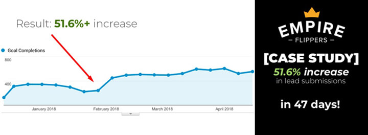
The Challenge: The tool was already a major success by any measure: $47 million dollars worth of businesses sold and over 45,000 evaluation isn’t too shabby if you ask me.

However, there were a few sticking points that I myself had encountered that were holding the tool back from reaching its potential. Mainly, the fact that the valuation submission process wasn’t very intuitive and required A LOT of user input. Convertica had to find a way streamline everything, and it all had to be done on Empire Flipper’s Frankenstein mash-up of a WordPress site.

Our Hypothesis: Based on past wins for our lead-gen clients (62% average increase) and my perspective as a former user of the tool, we theorized a solution based on a simple hypotheses:

The more a user has to think, the lower conversions will be.

CRO doesn’t have to be complicated. This simple hypothesis had worked for plenty of clients in the past. We thought if we could simplify the process and make it more engaging(read more cases here), Empire Flippers would see a major boost to submissions.

Think about it—in 2018, we use apps for everything: dating, ordering lunch, finding a dog sitter, you name it. Most of them are so intuitive (a swipe here, a button press there) we don’t even notice we’re using them. Everything is done in the subconscious (like a game). This is a HUGE for CRO. We knew if we could keep users in that stream, we’d bump conversions significantly.

Even we didn’t expect 51.6% in just 47 days, but looking back on it, it makes a lot of sense. Here’s the exact process we used for achieving our goal.

Convertica’s CRO Process

We Set a Goal

Based on our past wins, we knew more than 50% gains were achievable.

We wanted to set a realistic but ambitious goal.

The point of setting a goal is framing your success.

You never want to settle for mediocre results — jump over to the study case in increasing monthly revenue within a short time!

Increasing leads by 20% is by all means a success, but when compared to our goal it would have been a failure, especially considering our past wins.


 Gamify the Lead Capture Process

One strategy that had worked for nearly all of our lead-gen clients in the past was “gamifying” their lead capture tools. By making the process more like the rest of the apps a user is glued to all day (more engaging, easier to use, simpler), we knew we could increase conversions. Our goal was to get the user to think as little as possible.

How we “gamified” the tool  

The first page of the lead capture was already very intuitive; no thinking, just clicking a button.

However, once you chose your monetization method, you were brought to this screen:

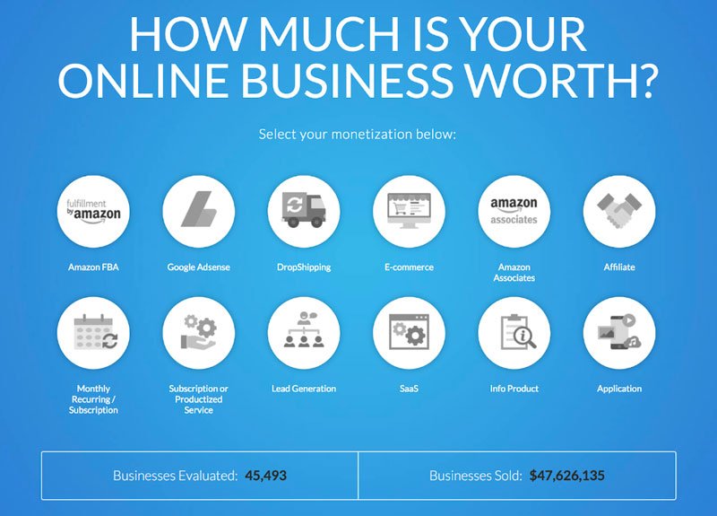
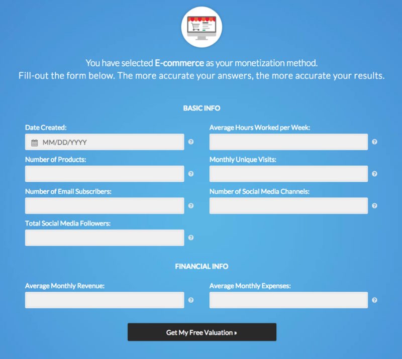
This type of static form is not intuitive. Now the user actually has to enter data (and exit their subconscious stream).

ENTER: our kick-ass in-house team armed with a year’s worth of lead-gen tool data.

All of those tests we ran on lead-gen sites taught us that if the initial 2 or 3 fields of a tool require no specific input, conversions increase in a big way.

Here’s what we did:

  • Multiple-Choice Questions: Multiple-choice or yes/no questions automatically generate the form without the user realizing. It also keeps them fully engaged.
  • Sliders: Instead of the user manually entering their monthly income and expenses, we had them use an interactive slider.
  • Progress Visualization: Never underestimate the power of visualizing progress. According to the lead impact case study, when the user can see how close they are to completing the process, it keeps them engaged.

Here’s what the new submission process looked like;

You can view the live version here.

Did you notice there isn’t a “Next” button? If it doesn’t have to be there, why put it? They’ve entered the data, now move to the next step.

TIP: Minimize your visitor’s actions. The less times the user actually has to make a decision, the better. Try and make some for them.

With our new submission process, the user is 40% done before they have to enter any data.

Test the New Tool vs. the Old

We don’t like to be too full of ourselves, but we knew the new tool was a winner. Still, as part of our standard operating procedure, we always test (and you should too).

We ran a split-URL test. This sends 50% of traffic to the new version of the lead capture and 50% to the original.

As we suspected, the test showed a pretty clear winner relatively quickly. The new gamified version killed it: + 40% in just two weeks.

Our custom reporting software provided valuable insight as to which type of user (segmented by device) converted by each version. Which brings me to my next point:

Always use data collected from tests to further refine your testing.

Data collected from this first test allowed us to create a more targeted second test. A 40% increase is great, but our goal was 50% so we weren’t satisfied.

Implement the New Lead Captures

Pretty straightforward here, right? The old version was clearly inferior, so we rolled out the new version and sent 100% of the traffic to it. We instantly saw a jump in conversions, which was just the validation we needed.

Use Live Data to Optimize Further

If there’s one takeaway from this case study, it’s to use data to further refine your results.

Good CRO is a constant process of refining based on the data (click here to know more).

We had already increased conversions by 40%, but our goal was 50%. Using our new data and some awesome CRO software, we could further identify some key friction points.

By using the data from the first test, we were able to double down and gain even more conversions for Empire Flippers. It was like the icing on the cake.

Optimizing for Mobile with Formisimo

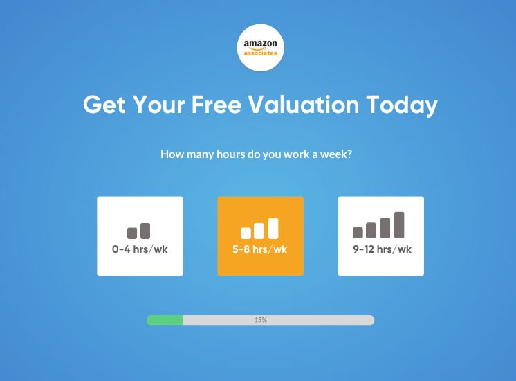
After running a split URL test, we gleaned an important piece of data: the desktop version of our variation outperformed the mobile version by a good margin (36% conversions vs 26%).

We used a killer piece of form-tracking software for lead-gen sites called Formisimo that let us see the top drop off points for users who need to fill out forms. Basically, it speeds up your CRO by allowing you to conduct more focused and effective tests through identifying bottlenecks. In simpler terms, it’s freakin’ awesome.

Using Formisimo, we segmented visitors by device and discovered a major sticking point for mobile users: their thumbs.

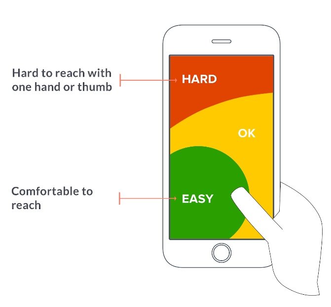
The mobile thumb problem: Most people use apps with just one hand. The layout of the new variation was such that reaching the important areas with just one thumb was difficult to say the least.

The solution: We had our UX magician work her magic. Anywhere toward the top of the screen was too hard to reach, so the layout had to keep most of the important stuff toward the bottom so it could be used with just a thumb. Now, instead of having to use both hands (or god forbid reach a bit further!), the entire page was in what we considered the “easy to reach” zone.

The result: Guess what? 10% more conversions! — not only that we also do coaching to maximize conversions.

Summary

Challenge: Increase Empire Flippers’ lead-gen tool’s submissions by 50% and make it appealing to hundreds of visitors using their phones with one hand.

Solution: Gamify the tool to make it more engaging and decrease user thinking by making it more intuitive.

Result: + 51.6% conversions in just 47 days which was significantly optimized even further over the following months.

Key Takeaways:

  • Set challenging goals
  • Keep the user in their subconscious by decreasing their workload. Remember, the more thinking the lower the conversions
  • Display their progress and delay specific input as long as possible
  • Test and track everything!
  • Use data learned from initial tests to further refine later tests
  • Segment down to device level to get even more easy wins
  • Never settle for mediocre results. Keep testing!

To see the full 2,500+ word case study on the Empire Flippers Blog, click here.

Author: Kurt Philip

Hi, I’m Kurt Philip, the founder & CEO of Convertica. I live and breathe conversion rate optimization. I hope you enjoy our findings.

We’ve worked with over 1000 businesses in the last 6 years.
Let’s jump on a quick call to see how we can help yours.

Book FREE CRO Call

Client Case Studies


Follow us on Youtube

High Traffic & Low Conversions: Our 12-Step Checklist for Perfecting Your CRO Process

High Traffic & Low Conversions: Our 12-Step Checklist for Perfecting Your CRO Process

When it comes to CRO, the hardest part can be deciding what to start optimizing.

I have already done a post showing where to start if you’re new to CRO.

The questions is, when you have the areas to focus on identified, what do you start testing?

Do you want a 20-100% conversion rate increase?

We all know the feeling; traffic is rolling in but you aren’t making a lot of conversions.

If you own an affiliate, Lead Gen or eCommerce store, chances are you’re either facing this problem right now or have had it in the past.

If this sounds familiar, then you are obviously hungry to make some changes and start making major sales or commissions. If you’re getting thousands of visitors a month, your site holds massive potential.

You just need to unlock it.

At Convertica, we have helped hundreds of clients increase their conversions by making small changes based on systematic testing.

We have brought in major returns for site owners by applying a proven testing process.

I asked my team of CRO magicians to uncover the secret and help me put together a list of the highest-value tests we run on a new site to increase conversions.

Each of these minor improvements could help increase your conversions big time.

Remember: In CRO, there is no “magic bullet”, or one-size-fits-all.

If there was, none of us would be in business.

You can never be sure what will work (or even what is working) unless you test, test, and test some more. However, with this systematic approach, you increase your chances of success exponentially.

Now we have listed the best conversion rate optimization guidelines.

1) Locate Easy Comparison Table Wins: Features and CTAs

Features: General wisdom states you need product features front-and-center so the buyer knows what they are getting.

At Convertica we are interested in what works, not in theories. We’ve actually found that sometimes, having no features increases conversions (you only know if you test it!).

A visitor searching for a fridge will almost certainly want to see specs, but if they’re just looking for a pair of socks, it’s not worth the bother.

CTAs: It’s not only what you put in your CTA, it’s where you put it.

What we’ve found effective are horizontal tables with CTAs aligned vertically (along the y-axis).

2) Do You Explain Why You Chose Your Number 1 Recommended Product?

If you’ve got a number 1 product (or top model or merchant’s choice), are you just displaying the product and saying it’s the best? If so, this could be a big reason why you aren’t making sales.

Testing has shown us that adding 3-4 reasons explaining why you chose it and then hitting your visitor with a CTA right there increases clicks in a big way.

Bonus: If you’re using a sticky widget, do the same thing. We see too many widgets with just the product name and an image. Don’t let clicks to your affiliate slip away.

3) Is Your Comparison Table too Congested?

A major mistake we see on affiliate sites is comparison tables with too many columns.

Buyers love comparison tables because they make it easier to digest a product’s important data. If you have too many columns, it makes it harder to consume that data and decreases conversions. We’ve found that one column called “features or details” with all of the info listed outperforms multiple columns by a good margin. It occupies less space and makes life way easier for your customer.

4) Are You Sure You’re Selling the Right Products?

You can have the best comparison table in the world, but it won’t do you any good if it doesn’t have the right products in it. Review your Amazon sales data regularly and see which products are actually being sold. You’d be surprised how many times a client comes to us asking for a solution only to find out that they had the wrong products in the table. When you find out what is selling, review it and put it in the comparison table.

Remember: CRO doesn’t have to be complicated. Sell products that people want and they’ll make it to checkout!

Bonus: Always make sure that the 1st product in the table is “Available” or “In stock” on your Affiliate partner site. The first product is the one which has the highest CTR compared to all other products reviewed on the page. If the product isn’t available, it might turn off the visitors, and you probably won’t get the sale. — For your query get a quote from our website optimization service for free.

5) Make Sure Your Table is in “the Best” Position

When people search for keywords with “best”, they are in buy-now mode. Don’t beat around the bush with this one. Make sure your comparison table is right at the top the page (within the first 2 paragraphs). We’ve increased clients’ CTR by over 10% just by moving the table closer to the top of the page.

6) Test Your Pop-Ups

Sometimes a pop-up can be a good thing. Sometimes it puts customers off and decreases conversions. The only way to know is to test (are you noticing a pattern here?). If you aren’t getting conversions, stop throwing offers at your customer’s face and see if that leads to an uptick.


Do you want a 20-100% conversion rate increase?

7) Try Out Pros and Cons Below the Review

Having cons clearly visible on products increases consumer trust. Reviews that list pros and cons often outperform their counterparts by a good margin. If you’re simply stating why a product is good, it doesn’t drive a customer to take an action. Pros and cons are straight to the point and allow a visitor to think, “Aha! That’s the benefit I’m looking for.” Put the pros vs. cons comparison below the product review and see if that helps out.

8) Are Your Images Hi Resolution Enough?

67% of consumers stated that product images are VERY IMPORTANT in purchasing a product. In fact, they might even be more important than your descriptions. Don’t skimp in this department. Larger, clearer images are one of the easiest wins you can get and will almost certainly lead to better conversions.

One thing that we noticed with a lot of affiliate sites is that the images in the comparison tables are too small. Just by doubling these image sizes in our variation tests we have seen an increase in CTR of about 10%.

9) Make the Checkout Process as Simple as Possible

The more your customer has to think, the loweryour conversion rate will be. Everything needs to be as seamless and intuitive as possible. Each link is an extra distraction. Each extra step is another chance for them to say, “You know what? Nah. I don’t want this anymore.” Whichever action you want them to take (buying something or signing up, for example), you need to simplify the process. There are two ways to do this:

  • Make it easier: Delete unnecessary steps. Combine multiple steps into one. Having a “product preview” and the payment gateway on the same page is one easy way to combine two pages into one.
  • Make it fun: Make the process engaging and fun by gamifying the process. Add slider bars, multiple choice questions, or even a questionnaire to help them find the right product.
  • Remove forced sign up: If they have an account already, add an “Already have an account” section to the top of the checkout form. If they don’t, create an account for them automatically when they fill out the form.

Lesson: The more barriers to the goal, the harder it is for your customer to complete that goal (simple, isn’t it?).

10) Test Every Page

There is no magic bullet to CRO (I’m thankful for that). What works on one page might not work on another. It depends on the nature of the product and the type of consumer. We’ve seen certain layouts bomb on certain pages and perform like champs on others. Run tests on every page to see what’s working and what isn’t. And remember, don’t assume anything. Let your customers decide which version is best, and always keep testing/refining.

11) Full-Width vs. Sidebar

We totally understand why you love your sidebar. It’s a great place to display some prominent information that you think the user needs and to run some ads (we’ll cover this next, but for now, I advise you to study about common split testing mistakes done by a newbie). It could very well increase your sales…but you never know!

Try a full-width page instead of a sidebar. The sidebar might be counterproductive if it’s a distraction to your visitor. Not having it keeps them focused on what’s in front of them: your products. It’ll help put more emphasis on the things you’re trying to sell.

12) Test Turning off Amazon Ads / Adsense

Ads are a great way to make some extra money, but they could distract users from the products and turn them off big time. Try removing ads from your page and see if that does the trick.

Final Tip: Never test blindly. Yes, these step by step conversions will increase your chances of CRO success immensely, but taking a shot in the dark has major opportunity costs (especially for eCommerce stores). If you make the wrong change, you could cost yourself a great deal of sales. Instead, run heat maps for a while to get live data. Test the highest volume areas first.

We’ve CRO’d sites for over a hundred clients, and these are the exact tests we run on each new site. So far, they’ve produced the best results. The important thing to remember is that this is a systematic process and EVERYTHING has to be tested. You never know what’s going to work, but if you follow this checklist, we’re sure you’ll find what does. Be part of our conversion rate optimization class and learn more particular conversion strategy.

Do you want a 20-100% conversion rate increase?

Author: Kurt Philip

Hi, I’m Kurt Philip, the founder & CEO of Convertica. I live and breathe conversion rate optimization. I hope you enjoy our findings.

We’ve worked with over 1000 businesses in the last 6 years.
Let’s jump on a quick call to see how we can help yours.

Book FREE CRO Call

Client Case Studies


Follow us on Youtube

[AFFILIATE CASE STUDY] Part II: Increasing Monthly Income by $32,532 in under a 90 days.

[AFFILIATE CASE STUDY] Part II: Increasing Monthly Income by $32,532 in under a 90 days.

It’s a Sunday afternoon and I’m packing my suitcase in preparation for my trip back to Chiang Mai for the Diggity Marketing annual SEO conference.

My phone starts ringing.

It’s Robert.

Me: Rob, what’s up.
Robert: We did it man! Check your skype.

Me: Wait, you hit it?
Robert: Damn rights.

3 years ago, Robert set a goal, and a pretty audacious one at that.

Goal: $100,000 a month in affiliate income.

Reward:

This is the actual photo Robert sent me on Skype: A 2015 Mercedes c400. His dream car he was able to buy, in cash.

The Proof (from just two of his accounts):

This case study is for 1 of Robert’s websites in his portfolio. 100k was for his total income across all his sources.
We were able to achieve these numbers by constantly running split tests. Over the 3 month period, we ran over 50 tests which allowed us to get incremental compounding gains over time. This process was made a lot easier by having a huge amount of traffic to work with.

The Truth about CRO

There are a lot of misconceptions around CRO and how split testing works. In the CRO Academy, I regularly post examples of wins and losses. One thing that I mention often is that in order to be successful at split testing, we have to disconnect from the urge to always be right. This is confirmation bias and it is dangerous.

This can be hard. Especially if there are no conversion rate optimization experts to give you inputs and ideas.

We are socially conditioned to always want to be right.

Don’t get me wrong, there are conversion rate optimization best practices that are a must on any site.

A few of them, in no particular order:

I won’t get into too much detail about that in this article. I have done that, here, and here.

Once you have what I call a CRO baseline in order, we need to work on getting a large targeted list of experiments ready.

When-ever I ask a potential client if they have ever done CRO and they say no, I get very excited – I’ll explain why.

Just this month, I ran a test using the two variants below:

A simple re-alignment of the calls to action from center to left increased clicks to the calls to action by +23.5%. Seems too easy right? Seems a bit like B.S right? Well, you can grab your phone and do we can do coaching call with CRO experts and see if this is true or not.

This is where it ties back into my story about Robert.

Now, let’s say Robert has finished baseline CRO after reading one of my posts. Clicks to his affiliate account jump 16%. Awesome.

As an example, and to keep the calculations simple. Let’s say Robert’s site was generating $20,000 per month before he did baseline CRO roundup. With a 16% increase that would mean that he would make $23,200 next month.

Same rankings, same traffic.

That would mean that he could take an extra trip somewhere next month, or he could get that new iMac next month that he wanted. No extra costs, just more profit.

Ok now it’s time to set up a split test, he has a goal to get to $30,000 a month from this site by the end of the year and god damn it, he will do it.

That means, he has to increase revenue by another 30% roughly.

Let’s say he tries the same layout as my example above.

He sets the split test up, this is his first one.

He sets his goals as a click on the calls to action button, makes sure the split testing software is installed and functioning correctly. 

Robert starts the test and runs it for 1 hour and because he has roughly 2500 visits a day, he checks again in 60 mins to see if everything is registering correctly.

He sees the initial data after an hour and a euphoric feeling washes over him.

Relative Improvement against original;

Because the algorithm inside VWO doesn’t have much data, it is showing the possible result of the test based on current data could be between -41.1 and +641.9%.

His mind only registers one thing: 600% increase!

That would mean that his possible increase in revenue could push him above $100,000 per month.

Robert can’t sleep that night. His mind is going crazy with ideas on what he could spend all this cash money on, he goes to sleep with a big smile on his face.

How does this Tie into Split Testing and CRO?

Robert wakes up at 6am, and he opens his laptop instantly to check the numbers:

It’s not looking good.

Robert’s mood is instantly crashed, quite the opposite of last night.

The split test is now showing a likely gain of 10 to +32%

Not 600%+ like it looked like last night.

More data has come in and it has evened out the gap between the two variations with the actual test concluding at around 30%+ increases in CTR%.

This is where statistical significance comes in.

You can read about that in more detail here.

Due to us being conditioned to always wanting to be right. When the data tells us otherwise, it creates an uneasy emotional response.

Getting into the right Psychological Frame.

We have to just rely on the data for split testing.

Us wanting to always be right doesn’t have a place here and we need to recognize this early to have any success at this. We have to take a purely rational viewpoint when it comes to split testing. This is where our CRO consulting services can you help you, a lot.

For rationals this may seem quite easy, for the more emotionally reactive, this may take some practice.

When we take on a new client, we don’t have any emotional connection to the website, we didn’t build it, we don’t have any history attached to it.

This allows us to be in the best position to be able to purely rely on data to make decisions.

This is how we view split testing, objectively.

The power of compounding conversion rate increases.

Let’s use our original baseline of 100 clicks for an easy number:

In split test 1, we increased click rates to our calls to action by 23.6%.

New Control Baseline: 124 clicks roughly.

In split test 2, we increased click rates to our calls to action by 6.5%.

That now takes our baseline click rate to 132 clicks.

We are now up 32.6% on our original click-through rate. From just 2 split tests.

This is why we have to disconnect emotionally from the outcome and keep running the campaigns systematically.

Our Emotions Around Money

We have these two emotions that are connected to money:

Greed and Fear.

These two emotions make us perceive data differently at different points in time without us realising it.

The hardest thing about running a split test, especially if you have a larger income website, is managing your emotions throughout a campaign.

We have to set ourself up to expect nothing.

When you run a test, you should not want to expect anything.

When setting up a split test, it is merely a test of Variation A vs Variation B.

That is it.

We have to condition yourself to not have to be right in our presumptions of what will perform better.

Organizing Your Workflow.

In order to be successful at testing, especially at scale and over the long term you need to follow a very clear process:

Like any good business, you need a systematic process that can be repeated over and over again, without those pesky emotions coming into play.

You need to know;

1) Which tools to use, and

2) How to use them to get results.

Understanding the process.

When I get asked to look at someone’s website and tell them how to improve conversions, my simple answer is always:

I don’t know yet.

I need to implement my process that works out what works.

The example above of increasing clicks by 20% just by moving a button to the left, may not work at all on another website. Does this mean we always start from scratch with every website and have no previous takeaways? No.

Because what we do have is a long list of layouts, buttons, and combinations that have worked well in the past on similar sites for us to test.

As time goes on this list grows and it refines our process, so that we get it right the first time, more and more often, but we always test.

It’s all a numbers game.

I’m going to say it right now so it’s clear:

The more traffic you have on a site, the more success you will have with split testing.

Let me explain why:

Let’s call the first site Site A.

Monthly Revenue: $1000

Monthly Visitors: 5000

Highest Traffic Page: 2300

Normally at CROguy we focus on the top 5 pages of a client’s website, but in this example we’ll just test one page.

The top 5 pages, in most cases make up 80% of the revenue of the site. Not all the time, but that is what the data has shown us over time.

Ok so let’s set up our first test on Site A.

Control: CTA Button: View Price

Variation 1: Check Price

In order for us to declare a winner for this site, we would need a few things.

1. Enough difference in clicks on one variation over the other.

2. Enough views for a statistically significant winner. (So we can be sure the results were not due to chance.)

Let’s say it takes 2 weeks to declare a winner in this split test.

That means, during the split test, the control had 575 visitors and Variation 1 had 575 visitors.

Because you have waited 2 weeks to get this result, you would damn well want it to be a winner, right?

Wrong, Variation 1 was 10%

You wouldn’t be in the best mood if you just spent two weeks waiting for this test to conclude and it was a loser.

F!@k split testing.

Looks like emotion just came into play didn’t it?

Now let’s rewind a bit.

It’s far easier to get better results with sites that have larger revenue and more visitors.

We can run multiple tests per week, get quicker feedback and can find those winners quick and faster.

That is how we got such big increases for Robert:

What we did have was a plan, documentation of results and management of each campaign. We also took advantage of the available conversion rate optimization software.

We didn’t test just one page on Robert’s site, I believe it was closer to 50 tests. If you didn’t have a process to follow, on that scale, it would be impossible to manage.

Due to Robert having over 200,000+ unique views a month, it allowed us to very quickly run a lot of tests back to back and uncover the winning variations thats allows us to increase his revenue for this site by over 100% which in turn, helped him to reach his 3 year goal of $100,000USD per month.

Tools we use:

  • Hot jar
  • VWO
  • Google Calendar
  • Slack

In conclusion.

Managing your emotions can be easy once you have the right systems in place.

Have a process allows you to make quick, relatable decisions based on data.

The data holds all the secrets. Don’t let those pesky emotions get involved.

Click here to join the CRO ACADEMY where we ask, help, share and collaborate on all things Conversion Rate Optimization.

Until next time,

Kurt Philip

CROGuy

Author: Kurt Philip

Hi, I’m Kurt Philip, the founder & CEO of Convertica. I live and breathe conversion rate optimization. I hope you enjoy our findings.

We’ve worked with over 1000 businesses in the last 6 years.
Let’s jump on a quick call to see how we can help yours.

Book FREE CRO Call

Client Case Studies


Follow us on Youtube

[AFFILIATE CASE STUDY] – How we Generated an Extra $15,048 in Monthly Revenue in 34 Days

[AFFILIATE CASE STUDY] – How we Generated an Extra $15,048 in Monthly Revenue in 34 Days

The headline sounds like click bait right?

It got your attention. That is what it was meant to do.

You are about to learn exactly what web optimization techniques we did to increase one of our client’s monthly income by over $15,048.

By the end of this post, you will be able to implement most of what we did too.

Every time I write a post, I say the same thing:

“CRO doesn’t need to be complicated.”

In August we took Robert’s site monthly revenue from $20,403 to $ 35,451 in just over a month.

That is an extra $15,048 for the month of August.

Let me start off by saying: This site is a beast, an absolute beast. It is in fact, the beastiest site I have ever worked on.

Over 200,000 unique views a month.

We didn’t use any tricky plugins and we didn’t even touch any sales copy.

What we did do, was use our methodology that I have talked about many times.

Sure, we did have 4 of the Convertica staff making the changes, managing the tasks and pulling together the reporting and tracking, but whether you have 100,000+ unique views per month or 1,000 views per month, the same system applies.

It just comes down to consistently applying the process.

Do you want a 20-100% conversion rate increase?

The Earnings Proof i.e the “Show Me the Money” Screenshot

Amazon is just one of this site’s monetization methods. Like any good business you should always diversify.

How to Get Started.

We have had hundreds of sites apply to work with us over the last 6 months. We have seen everything from lead generation sites for local businesses, multi-million dollar eCommerce brands, micro niche and absolute beast Amazon affiliate sites.

One thing that has helped us get these results so quickly is that we get to see websites in a bunch of different industries across a huge amount of niches. This variety of experience has allowed us to develop tried-and-tested systems and know what works very quickly, allowing us to get quick results for our clients every time.

It all goes back to something else I say frequently.

Find the 20% of the areas of your website that are getting 80% of the clicks and generating roughly 80% of the revenue. This of course isn’t fixed in stone, the ratios are not going to match up perfectly. However, it is a great way to systematically process a large batch of websites and get consistent results. Sometimes it’s 90/10 sometimes it is 95/5. Regardless, there are always certain areas that you can use to scale up the revenue of a website with relative ease.


See more about the 80/20 principle here.

Now, let’s use a very general type of buyer intent keyword for this example.

In order to keep Robert’s identity confidential, we are going to use a generic keyword “best dog trimmers” as the example.

When someone types in “best” in front of the keyword in Google, they’re typically looking for the best of something to buy for themselves. They know the solution to their problems, they are trying to figure out what is the best one to buy.

For some people, they already know what they want, for others they are still browsing.

Either way, a good review of that product can be the tipping point that convinces the user to make a buying decision, gets them to pull out their credit card and make a purchase from your affiliate partners site.

This is not a post on keyword research and how to write converting copy, Matt Diggity has done one of those recently.

This is a post on how we helped Robert increase revenue on his site by $15,048 for the month of August.

Not in one year, but in just one month.

How we found the 80/20 for Robert.

We used heat maps to figure out where the users were clicking. Heat maps were also tracking what call to actions got the audience’s attention and made them click over to Robert’s affiliate partner, only one of which was Amazon.

Do you want a 20-100% conversion rate increase?

Pro Tip: Don’t just rely on one affiliate partner. See what other affiliate programs are available for the products or keywords you are ranking for. Don’t just rely on amazon if you can, they regularly ban partners without warning or any clear reason. Have a google around, there are often other programs available. It’s all about not having all your eggs in one basket.

To see how to to set up and read heat maps, I have done an in-depth tutorial here.

We run the heat maps for around 1000 views and it will show us where the action is. Once we have that data, we can start implementing the changes.

There are certain things we do every time after we review the heat maps.

Check How the Site Shows Up on Mobile.

This seems like common sense, but a lot of people still don’t focus on mobile when optimizing for conversions. The majority of your users, especially in the B2C (business to consumer) market, coming to your website will either be mobile or will be in the coming years. Mobile will increase in importance and you need to keep that in mind with every website you build and plan to monetize. You can find out more about CRO coaching if you plan on monetizing your site like a beast.

Are the Call to Actions Buttons or Text?

We have to remember, we have pretty fat fingers. If your call to action is text only that is linked, sometimes we can’t click the link easily. Use nice big buttons for your call to actions. You can make them easily here.

Notice how I mentioned fat fingers? Mobile is becoming more important. People are now tapping on a link with their fingers rather than clicking with a mouse. Make it easy for them. A good conversion rule of thumb to follow is to make the entire sales process as frictionless as possible.

>> CLICK HERE TO BUY THIS PRODUCT <<

Use a Comparison Table.

Most people are already looking to buy the best product listed on your review page. Don’t make it hard for them. While a 1,000 word+ review is great from an SEO perspective, it is not super valuable from a CRO perspective. If you were looking to buy the best dog hair trimmers, are you more likely to a read 5,000 in depth detailed buyer guide or more likely to skim through the entire content to see the conclusion the article came to as to which trimmer to buy?

While having that 5,000 word buyer guide is awesome, you need to format it to accommodate these people skimming for the answer. You do this by adding a comparison table.

A Comparison table lets people see the bare bones statistics compared against each other. Also, these tables are visually pleasing and give your site a feeling of authority on the subject.

Make sure this comparison table can be used on mobile and is viewed correctly on these devices. Tables are somewhat notorious for showing up bad on mobile. You can also seek help from our conversion specialist anytime you need one.

Now, when all these changes are made to your website, reset the heatmaps for all pages and let the data gather for 1000+ views.

Doubling Down on Revenue

The next step makes a lot of sense but rarely happens in reality. This step is also used mostly in a series of conversion case study and testing.

The quickest way to grow your revenue once the 80/20 has been rolled out is to make the changes and let them gather data for a week or two.

Then we do an export of all the revenue generated and work out the 80/20 for where the sales came from.

Nearly every time I do this on a clients site, 80% of the revenue will come from just a handful of products.

Export all your revenue into a spreadsheet. Make sure you have each product that you have sold listed, with total revenue for each.

Divide the revenue of each product by the total revenue generated.

Group the 20% of items that total roughly 80% of the revenue.

Move those products to a new list.

The New List is Where the Gold is

Now let’s go back to our heat maps and make a list of all the places that we have call to actions or links to the shortlist we have compiled.

Testing Further – The Icing on the Cake.

This is where we get the biggest increases.

Not only have we doubled down on where the action is on our website, but we have also doubled down on where all the revenue is coming from.

These are the areas we split test to get super quick results.

If you don’t know how to set up your own split testing campaigns, I have done a tutorial here. It is far easier than you think.

I am putting together a tutorial on the 80/20 of split testing soon, so keep an eye out for it on the Convertica blog.

Whenever you do a test, change just one thing at first on your site. If you do a ton of changes at once, you won’t ever be able to know what caused the uptick or downtick in revenue. Once you’ve made the changes, get at least a 1,000 views to that change to see if there are any noticeable differences.

Here are a few things you can test your shortlist with:

  • Changing out button colors
  • Changing what the actual text on the buttons say (i.e Click Here for More Info vs. Learn More)
  • Your page layouts (does the page convert better if the comparison table is above the fold or below? What other page elements can you test?)

The Results from Client Reporting. 

Closing Thoughts.

As you can see, the process behind how we increased Robert’s website from $20,403 to $35,451 in just over a month isn’t complicated. You have to however have a clear process, be patient and roll out the changes step by step while tracking them.

This is just one of the conversion rate optimization case studies of many sites we have rolled this process on. Since I was originally an SEO before getting into CRO, I’m extremely process driven. We have (and continue to do so) processed dozens of high earning sites using our processes. Every site refines our process.

If you follow the simple checklist I’ve talked about above, you can see some easy wins for your website.

These changes can be the difference between an extra $500 per month, or in Rob’s case it could be an extra six-figures annual income… without ever adding a single article, back link or increasing his traffic.

When you put it that way, is it really so tedious to change a few elements around to claim the cash you’re leaving on the table?

I didn’t think so.

Kurt Philip


Do you want a 20-100% conversion rate increase?

Author: Kurt Philip

Hi, I’m Kurt Philip, the founder & CEO of Convertica. I live and breathe conversion rate optimization. I hope you enjoy our findings.

We’ve worked with over 1000 businesses in the last 6 years.
Let’s jump on a quick call to see how we can help yours.

Book FREE CRO Call

Client Case Studies


Follow us on Youtube

The How-To of CRO: Step 1: Heat maps – Top Conversion Rate Optimization Tools

The How-To of CRO: Step 1: Heat maps – Top Conversion Rate Optimization Tools


Today I’m going to go through and talk about my favorite heat map software and what we use them for.

I’ll go through my website that I’ve actually been running heat maps on for a while like a live case so that you can see a how it all works.

I will go into this in more detail in the future, but for now, we don’t want to complicate the process too much. I think with CRO a lot of people will get confused by the amount of information don’t do anything.

Do you want a 20-100% conversion rate increase?

Many website optimization experts document all the experiments they run on their websites. So I’m going to try and keep it nice and simple so you guys can roll out heat maps on your site and then you can start to implement heat maps and start to get an idea and get some insight into what the users are doing and why they’re doing it. You’ll be able to see where they’re clicking so you can then start to increase conversions on your website.

It’s really not a hard process and it all starts with heat maps.

So I’m going to go through and show you how heat maps to works, so now we’ve logged in to the backend of my website and we’ve been running heat maps for a while now.

So to enable heat maps, click heat map, open up, okay. Now here heat maps are loaded up on my home page, so when you first sign up for heat maps you’ll have to actually go to all of the separate pages and sort of turn it off for a second so you can see what I mean.

So you’ll have to go to all the pages if you left five-page you were allowed five pages as plug change, but then you just hit record and it’ll start recording your user interaction on the page.

This is really important for affiliate sites. My site is a lead generation site so I’ve only got one call to action on it — Click here and be our guest on CRO Academy.

You can see here it gives you a breakdown of what all the users are doing, obviously the more red spots, the more high clicked areas and where they click, and this really does give you really good insight into what these are doing you wouldn’t have seen before when day after day I’m checking through clients websites.

It just gives you a really good insight, they could be clicking an image or maybe clicking one image out of ten and you can turn it into a lead capture or maybe it’s not linking to a product and you can see that it needs to be linked to the product or to the affiliate offer.

I’ve kept this nice and simple for this video, my site has just got one call to action on the actual home page and it’s got a few links people trying to find its information but those are secondary 0.07%. We can see here 8.6% want to know who the hell I am, 6 percent maybe you’re looking to sell their websites been interested in that.

We can see here, this is very obvious that it’s coming up over here actually because that’s the difference, it’s a little bit inaccurate that’s why I don’t use heatmap.me on my client sites. I like a different service which I’ll go into in a minute, but we can see here 16.10% of all my users and clicking my “Apply Now” button which is pretty good. (Recommended: 2 Must-read books for understanding CRO )

Do you want a 20-100% conversion rate increase?

That’s it heatmaps.me and now we’re going to jump over to my favorite which is what I use for CROguy and it’s called hotjar.

We’re going to jump over to my back-end for CROguy and now we can see in here all the page that I’ve recorded and also my number of page view and you’ll see when we jump into this how much more detailed it actually is, so in order to use sign your account, add your site, add your heat map, super simple home page.

So let’s jump over to my home page because that’s our main page of focus at the moment and we can see it’s much more in-depth.

Now the reason I like hotjar too is because it shows a breakdown of different screen resolutions which is really important especially when I’ll optimizing Amazon affiliate sites, because 99% of people don’t even think about Amazon affiliate sites and that’s where we get our 30 to 50 percent gains, because that’s where most the traffic coming from.

Now we are here, most of the people here are reading it, I have found in some of my client’s affiliate sites before that certain words the people by clicking on the words because that’s what they interested in, and then you can actually link that through them to the offer too.

Once again 17.43% click the button, so we would test the button for once, but now it’s very good interesting they can jump over the mobile it shows a very different story.

The user interaction is very different on mobile.

So if you can see here this is not rendering probably it doesn’t drop off like that, but obviously where people are swapping and a bigger one nice thing called action down the bottom 50% of all users to read.

So let’s look at my sole page, the same sort of thing, again it’s very simple, as I said I’m keeping this nice and simple and I will go more into detail later on in some more in-depth CRO case studies

I just made this video is to show you guys how I use heatmaps and how is step one of this for the testing process.

We start every site like this here at CROguy, we’ll run them on heat maps until about a thousand or two thousand page views a get enough data where we can see what users are doing, and then we’ll start to come up with experiments that will run from that data.

So I recommend everyone goes out there, sign up for hotjar or heatmap.me, you get out there get you into any heatmaps loaded and then wait for the next video and I’ll show you the next step of the conversion rate optimization in action process which will be coming up with experiment ideas from after analyzing the data and then we’ll go through and set up our first campaign in the VWO and also look at using optimizley.

Do you want a 20-100% conversion rate increase?