
eCommerce Homepage Best Practices: UX/UI Tips
The homepage for eCommerce stores is not the easiest one to build for conversions.
Why? Because many of the visitors who get to it are at different stages of the customer journey. This makes it difficult to show each one of them exactly what they came to your site for.
So how do you design an eCommerce homepage with UX in mind? Like a lot of things in site optimization, it requires knowing your customers. First, know their reasons for visiting your site. Next design the page so that they know — in a few seconds of arriving — that they’re on the right website. Then quickly direct them to a page that is more in-line with their purchasing intentions.
That’s the short of it.
But we both know it’s not as easy as that, is it?
That’s what I’m writing about today. I’ll show you the best practices for eCommerce homepage UX and the things we always do in our optimization projects at Convertica. We’ll talk all about:
The Purpose of an eCommerce Homepage
An online store’s homepage has three main goals:
- Take customers to another page that best fits their journey in the sales funnel.
- Establish store credibility.
- Solidify brand message.
So why do you need to know these three goals? Because they dictate the design and content of your homepage.
Here’s what I mean.
Take the customer to a more appropriate page
Let’s say you’re a store in a big shopping mall. How do you tell shoppers what things you sell? You use your shop’s glass window display to attract their attention. If you’re selling only men’s shoes, that’s an easy display to make.
But what if you sell an assortment of things? How do you choose what to display in the limited area that you have?
This is the same question an eCommerce homepage designer has to answer. And you find the answer by delving into the site analytics to know the intention of the visitors who land on the page. Where do they come from? What do most of them end up buying? What’s the demographic? All this information will help you decide what to display and show on the homepage.
Establish credibility
Website visitors need to trust you first before they buy from you. They want assurance that your site is fully legit.
So whenever a new visitor enters your site, he will always have questions like these:
- Does this site look trustworthy?
- What do other customers say about the store and its products?
- Is there a way to know this site is credible?
Sure you want to have these trust signals visible throughout your site. But it’s even more important on the homepage where many of your visitors will land.
Solidify brand message
Website visitors need to believe that your business is worth their time. That you’ve got what they’re looking for. Or that your values as a brand correspond with theirs.
The homepage is a great place to show this.

eCommerce Homepage UX/UI Design Best Practices
Before you make any of these changes, study your site’s analytics first. This will give you the necessary data to find out the intent of most of the visitors to your homepage. Then you can design it to fit their needs.
Assuming you’ve already done this, let’s look at how you can design each part of the homepage to optimize user experience.
Designing the homepage header
It’s easy to assume that all you have to do with the header is fill it with the logo and site navigation buttons. But the reality is that you need to consider buyer behavior when designing for UX.
What does this imply? If you run a store with little inventory, designing the navigation may be straightforward. But it’s different when you sell hundreds of different items with dozens of categories. You’ll need to be able to lead visitors to the right page without overwhelming them.
The thing is web visitors don’t have the patience to spend a lot of time figuring things out. And when they feel confused or they can’t figure out how to get around your site, they’re likely to bounce off the page.
There are a lot of different things to consider with the UX/UI navigation designs. It has to include links that cover the breadth and width of your store without overwhelming the visitor. It’s so complicated that we’ve got another article just for this. Check it out if you want to know how to design the navigation for conversions.
Apart from the navigation and logo, there are other things you can add to the homepage header, too. You can add the:
- Contact phone number and/or email
- Value proposition boosters like
- free shipping
- 24/7 support
- money-back guarantee
- Brand boosters that align with your customer’s values like
- being eco-friendly
- supporting charities your customers care about
Lastly, the header is the best place to put a search bar. About 30% of website visitors will use the search bar to find what they’re looking for. So make it easy for them to do this by adding it to the site’s header. It’s not by coincidence that many of the big eCommerce stores have search bars on their headers.
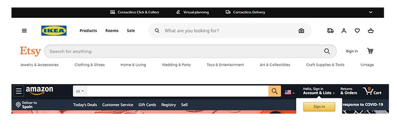
Source: Ikea.com | Etsy.com | Amazon.com
Designing the homepage content for UX
Like other web pages, think of messaging hierarchy and the F-shaped scanning pattern when designing the homepage.
This means the most important, most searched, or more profitable for the store goes at the top and minor information goes at the lower part of the page.
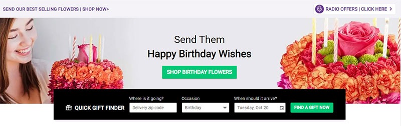
The hero header
The hero header stays above the fold and is the first thing the visitor sees. It’s got a big job. So it’s the best place to put your company’s value proposition. You can also add a link or two that guides the majority of visitors to the page that best fits their needs.
Here are some examples.
TenTree hero image with their value proposition and links to their mens and womens section

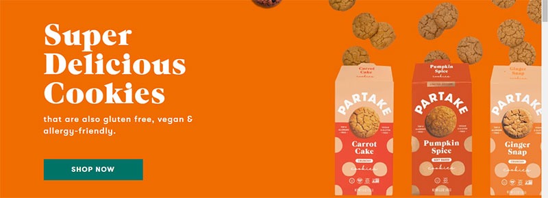
Partake foods does this with their value proposition.
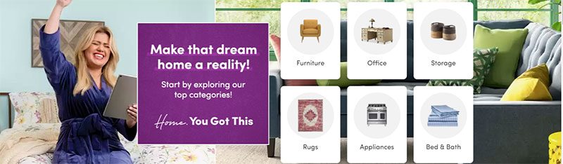
The key thing is to limit the choices. People easily go on analysis-paralysis especially on sites that they’re not that familiar with. So guide their visit by giving them only a few links to choose from. Studies show that just 2-3 choices are ideal for the hero header. This may change with bigger sites with a much bigger inventory, but it’s still important to limit the choices.
Here are some examples of bigger sites homepage hero image:
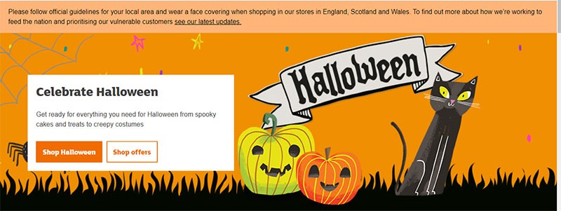
For many eCommerce sites, the hero image is not static.
Seasons change. There’s always a new offer or product. Much like a shop’s glass window, changing the display encourages new visitors to explore your site again and directs them quickly to what they may be looking for at a specific time.
You can change the hero header when:
- There’s a holiday coming
- There’s a product you want to push
- You’re having a sale
Here’s a sample of Sainsbury’s changing theirs for Halloween
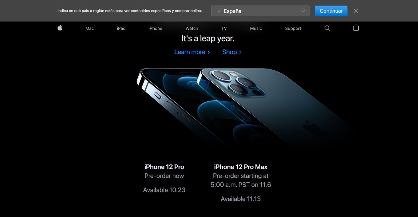
And here’s Apple pushing a new product with their hero image
Content below the hero header
Look at your analytics and figure out the buyer awareness level of most of the visitors on your homepage.
This decides how you arrange the content from the top to the bottom of the page. So for example, if you’re a new store and you get a lot of cold visitors to the homepage, consider starting early with trust signals to show customers that you’re the real deal. You can add logos of publications you’ve been featured in or 5-star reviews and testimonials.
Here’s the thing. When a new visitor lands on your page, there are often questions running through their minds:
- Does this store have what I want?
- Does this store look credible enough for me to keep exploring it?
- Does this store interest me?
As he lands on your homepage, everything on it should answer these questions. This way you eliminate any anxieties she may have and you encourage her to go deeper into the site.
Here are some ideas on what you can include on this part of the page:
- Bestselling categories not featured in the hero area
- Bigger images for new season products
- Products you want to push (and your visitors are interested in)
- Helpful content (if that’s the type of eCommerce site you’re known for)
- Social media (especially Instagram photos of people using your products)
- Social proof
- Contact/customer support link
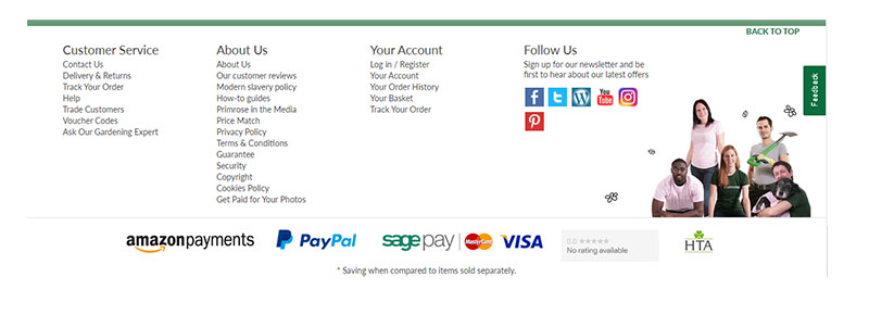
Designing the homepage footer
What should a homepage footer contain? This is your last chance to get the visitor’s attention. Not a lot of your visitors will get here. But the ones who do are usually looking for something that the body of the page does not show them.
If all the information at the top of the page does not serve this visitor, then what other things could he be looking for?
This is the question you ask yourself so you can decide what to put in the footer.
Here are some possible reasons:
- Maybe the person is a journalist who wants to get in touch with you.
- Maybe the person wants to know if you sell other products which you have not featured at the top of the page
- Maybe the person wants to see if he can follow and check you out on social media.
With these three reasons in mind, you can then design the footer. You can
- Add a link to your user-friendly site map
- Add links to your social media accounts
- Include links to your company information like the about us page, shipping info, your location, return policy, etc.
Designing the page for a repeat customer
To increase customer lifetime value for eCommerce stores, show a personalized version of the homepage to a repeat customer.
You’re not only showing that you “know” and “recognize” her but even more importantly, you’re making it very easy for her to make a purchase. And when things are easy to do online, people are more likely to do them.
Recap
Now you have some eCommerce homepage UX guidelines to help you build your store’s homepage with user experience in mind.
The most important thing to remember is that there are three main things your homepage should do:
- Send a visitor as quickly as possible to a more appropriate page
- Limit choices so as not to overwhelm the visitor
- Convince the visitor — in a few short seconds — that you run a trustworthy and credible store
If your homepage does all these three things, then many of your visitors will not bounce and will be happy to explore the other pages on your site.

Hi, I’m Kurt Philip, the founder & CEO of Convertica. I live and breathe conversion rate optimization. I hope you enjoy our findings.
We’ve worked with over 1000 businesses in the last 6 years.
Let’s jump on a quick call to see how we can help yours.
Client Case Studies


0 Comments