How to Reduce Cognitive Load
Your target customer lands on your site overwhelmed with many concerns.
He’s plagued with distractions.
A crying toddler. Hard day at work. Hangover. Slow computer. Dog demanding a walk.

Because of this, he has limited energy to spend on your site.
Psychologists call this cognitive load.
And if you want to master conversion rate optimization, it will benefit you to know all about it.
Factor it into every CRO campaign and your customers will be more receptive to your offers.
Today, you will learn about:
- What is cognitive load?
- What does cognitive load have to do with conversion rate optimization
- Conclusion: What are you waiting for?
What Is Cognitive Load?
Wikipedia defines cognitive load as the used amount of working memory resources.
I like to think of it as how much of your brain is being used at any given time.
It’s an amazing part of your mental construct that draws from what you already know based on past experiences and what you’re dealing with in the present.
It influences what you learn, how you react to situations and how you make decisions daily.
But there’s one small catch:
Our cognitive load has a limit. Every little thing you drop on it adds to the load.
The more work you give it, the more processing it has to do. If you swamp it with tasks, it slows down or clams up.
It’s like a computer. The more programs you open, the slower it becomes.
And sometimes, it’s like a circuit breaker. Give it a surge of electricity, and it shuts everything else down completely.
What does cognitive load have to do with your conversion rates?
Quick. Without using a calculator.
What’s 38747532 divided by 237.
I’m waiting….
Still waiting…
Ok. Who am I kidding? You’re not doing it, are you?

But indulge me for a moment.
What went through your head when I asked you to do the Mathematical equation?
Did you think: “Why should I do it?”, “Why bother?”, “No way I’m doing this!”?
Did you feel like it was unnecessary and a waste of time?
Hold on to that feeling.
Got it?
That feeling —
…is how visitors to your website feel when you make them do more work than necessary.
…it’s how they feel when they arrive hoping for one thing but reading something else.
…it’s how they feel when you make it difficult for them to choose something.
Why?
Because when they have to figure things out themselves, you’re adding to their cognitive load.
And what happens when you give the brain too much information for it to process?
Oh. Only a lot of things that you don’t want your customer to feel.
He gets frustrated
You may not be asking him to do a Mathematical equation. But something like a block of text without white space, images or headings adds to cognitive load.
This means he’ll struggle to scan the page. He now has to work to find what interests him on that page. This extra workload slows his brain down. And nobody’s got time for that. So he leaves as quickly as he arrives.
He postpones the decision for another time
We love having a lot of choice. But time and time again, research shows that this only stops us from picking an option.
Why? Cognitive load.
With a lot more choice, our brain has to do more mental analysis to find which option is the best. We get paralyzed and postpone the decision for another day when we’ve “given it some more thought.”
And do you think this visitor who can’t make up his mind will come back? Doubt it. He’ll probably just go to another site that makes his job easier.
The person trusts you less
A study on the effects of cognitive load on trusting behavior shows that the more cognitive load a person has, the less trusting he is.
And you know how important trust is online. When there’s trust, your customer is more willing to give you his time (and his money).
If there’s little trust, he’s less willing to do what you want him to do. So you can forget getting him to click that buy button.
So what do you do instead?
How do you reduce cognitive load so you don’t overburden your visitor’s mental processes?
Make it easy.
Think about what he needs to know when he lands on your site and give it to him.
As Steve Krug says don’t make him think. Make every page of your site intuitive so that your visitor gets it right away without even thinking about it.
What this means is this:
Once your customer starts to ask questions like:
- I wonder how long delivery takes?
- If I click this button will they charge me right away?
- Which of these buttons take me away from this page?
Then you’re adding to his cognitive load.
It’s your job to think about the possible questions and fears your customer has.
Because when you know this, you build a page that already has the answers to these questions and assurance for his fears. So he never has to wonder and think about them.
The truth of the matter is that it’s impossible to aim for zero cognitive load. But you can keep it at a level that’s tolerable.
How do you do this?
1. Make web forms a breeze by doing this
We all hate filling out forms.
Writing the same information that we’ve done so many times before feels like a sheer waste of time.
How many times have you not purchased something you liked or stopped sending an inquiry because the form looked too daunting?
Your site visitor is no different.
So make it easy for him.
Check this out:
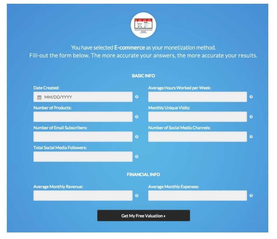
This form requires a person to recall information.
Now see the changes that we made.
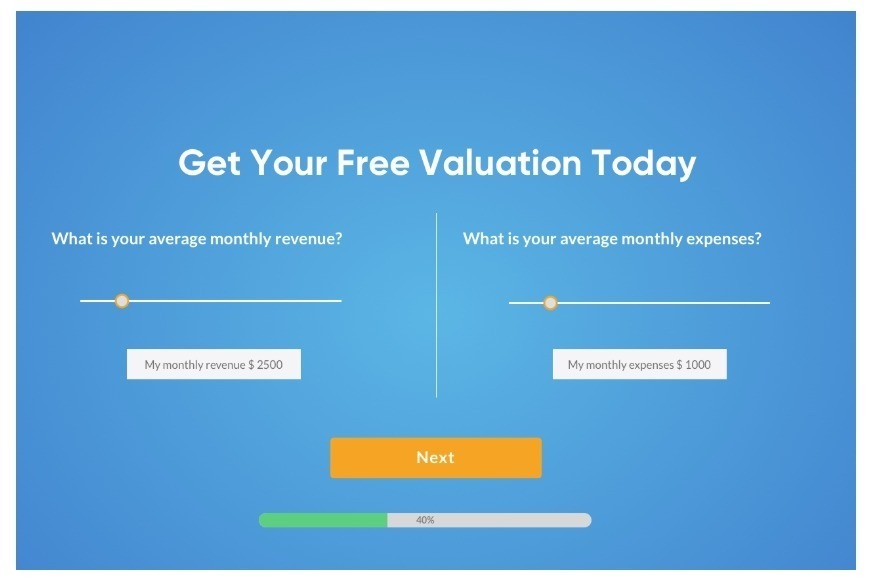
This new form lessens the cognitive load. This is easier on the brain. All he has to do is click. He doesn’t have to do the taxing task of digging through his memory to recall something. And then type it.
Do you know what else makes this form a breeze?
The sequence map.
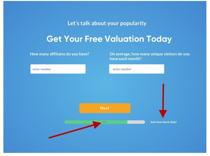
This gives the person a bird’s eye view of exactly where he is in the process. He doesn’t have to think and wonder “How much longer do I have to do this?”
Just by making these small changes was very powerful in this campaign. It was so effective that it increased conversions on Empire Flipper’s lead capture page by 40.16% in two weeks!
Pretty cool, huh?
That’s what you can expect when you factor in cognitive load when designing your website forms.
2. Take advantage of what your customer already knows and expects to see
“We must understand that our goal is not simply to give prospects more options or products. But to LEAD them to the one option that is most relevant, important and urgent to them.” – Austin McCraw –
Have you ever gone to your favorite store, gone straight to the aisle where you know the bacon is (or tofu for you vegetarians!) and found it no longer there?
You realized instantly that they’ve changed their arrangement once again.
You thought this was an in and out job. Uh uh. Not today.
So you get annoyed. You search around for a bit. You begin to get frazzled. If you really need the bacon, you might keep looking with steam coming out of your ears. If you’re in the mood to talk to somebody, you might gingerly approach a staff (customer support) for directions.
But then again.
You might also decide it’s not worth the hassle and leave.

This is what happens when you break a person’s expectation of how something is supposed to pan out.
This is what happens when you force him to learn something new to perform a task.
The fact of the matter is your customer already has a mental model of how things “should” be based on past experiences.
For example,
…he expects a holiday booking site to have a search bar for place, dates and number of people.
…he knows what a link looks like.
…he knows where to go for navigation.
And your job is simple.
Stick to things he already knows.
That’s your shortcut to making it easy for your customers.
Innovation is good. But often when what you want is a conversion, you stick to what your visitors already know.
Then they don’t have to think.
They know exactly what to do. And they’re not stuck on the page wondering,
“Hmmm… how do I buy this thing?”
You might think that’s basic marketing strategy. But even the internet’s eCommerce giant makes this mistake.
This is the page where you’re about to click pay.
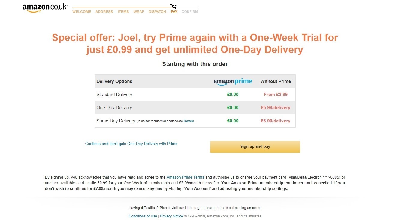
And yet, they make it difficult for the person to do that.
When my friend did this, it took him a few seconds to find the other link that takes him to the sale.
He didn’t want to subscribe to Amazon Prime.
He just wanted to pay.
And what’s your preconceived idea of what a pay button looks like?
A button!
But there’s only one button on this page and it’s not the one he wants (I know they’re doing this to push Amazon Prime subscriptions but it’s bad UX practice, methinks!)
You could almost hear his brain screaming, “I don’t want a freakin’ subscription! Where the f*@k is the buy button?”
Now, this is Amazon. A buyer might have a higher level of tolerance for it. And he might work a little longer to find that button.
But if you don’t have the same brand power, you can be certain that your visitor will leave before he finds the link that seals the deal.
My point is this:
It’s easy to forget your customer when you build your website pages.
Sometimes, we think that because we spend so much time poring over every single thing on our product pages, our customers will do the same.
That is not the case. A lot of people don’t convert because their expectations were not met. And they were left to figure things out by themselves.
As Steve Jobs used to instruct his designers every day:
“See your product through the eyes of the new customer. The one that has fears and possible frustrations and hopeful exhilaration that their new technology product could work straight away for them…So make it faster, easier and seamless for the new customer.”
Your customer already has a mental model of what the experience is going to be based on past experience.
3. Limit options already
I know you know this. I’ve said it so many times before.
But.
Why do you continue to cram your comparison tables with so many products? Why do you put a newsletter subscription on your product page? Why oh why do you insist on using sidebars on pages where your goal is to get some leads?
These are common mistakes. And they affect your conversions.
Hicks Law states, “The more stimuli (choices) users face, the longer it will take them to make a decision.”
And when it takes a long time, the person becomes less confident with his choice. So what does he do? He abandons the task.
So how can you design your page to limit choice?
Here’s how:
- When there are multiple choices on a product page, highlight the most popular one.
- Allow users to sort or filter available options
- Know the one goal of every page on your site and be intentional with the way you direct your customer to that goal
- Make a default choice in search results or web forms. For example, if 80% of users are from the US, use that as a default country when filling out forms. Or if navy blue is the most popular color, default the search results to show that shirt. As Paul Boag says, “Good defaults can reduce cognitive load on users, while not taking away the choices available to them. That is a powerful tool for overcoming choice paralysis.
4. Reduce cognitive load at the point of purchase
Want to know a Convertica SOP?
When we first work on a site, we almost always work on the part of the page where the buying decision is about to be made.
This could be the comparison table for affiliate sites.
The Add to cart section for eCommerce sites.
Or the form for lead generation.
You know why?
Because on many sites, these page elements present too much unnecessary friction for the customer.
Which means it imposes a lot of cognitive load.
Let’s say you’ve convinced the customer that yours is the right product for his needs.
Then he gets to that crucial part of the page where he’s about to sign on the dotted line, so to speak.
He’s almost there. But then he stops. And hesitates.
If you were sitting next to him you could ask him what the problem was and guide him through it.
But you can’t. For obvious reasons.
Now the burden is on your customer to figure out why he hesitated.
But here’s the thing.
He doesn’t have to hesitate.
It doesn’t have to come to that.
There are many things you can do to steer your visitor away from this land of hesitation.
There are precautions you can take. So that his questions are answered before he asks them. So that he doesn’t doubt his decision. So that he doesn’t end up being distracted by a Reddit post, breaking news or cute animal videos.

Distractions. Remember? You’re always competing with one.
So how do you get your visitor to click that buy now button and slide down the funnel to complete the purchase?
Simple.
Lessen the cognitive load to tip the odds in your favor. Minimize friction. Don’t just convince him that this is the product he needs. But also make it clear that he has to buy it now. And that your site is the right place to buy it from.
Here are some things you can do to make sure this happens.
- Add as much social proof as possible
- Make intuitive call to actions
- Add trust signals such as return guarantees, customer recommendations and company memberships
So what are you waiting for?
Now that you know all about cognitive load, I have a challenge for you.
Go to a page on your site. Preferably the one that brings in the most money.
Now go through it as if you’d never seen it before.
Imagine you’re a first-time visitor with a problem that you want solved.
You also have a lot of other things on your mind.
As you go through the page, list down the questions that pop in your head.
List down any doubts or uncomfortable feelings you may have as you scroll down the page.
What’s stopping you from clicking the buy button?
Finished?
Now redo your page to address those fears.
And when your conversions go up, come back here to tell me all about it!
=====================
Want to reread the article? Here are the quick links to each section

Hi, I’m Kurt Philip, the founder & CEO of Convertica. I live and breathe conversion rate optimization. I hope you enjoy our findings.
We’ve worked with over 1000 businesses in the last 6 years.
Let’s jump on a quick call to see how we can help yours.
Client Case Studies


0 Comments