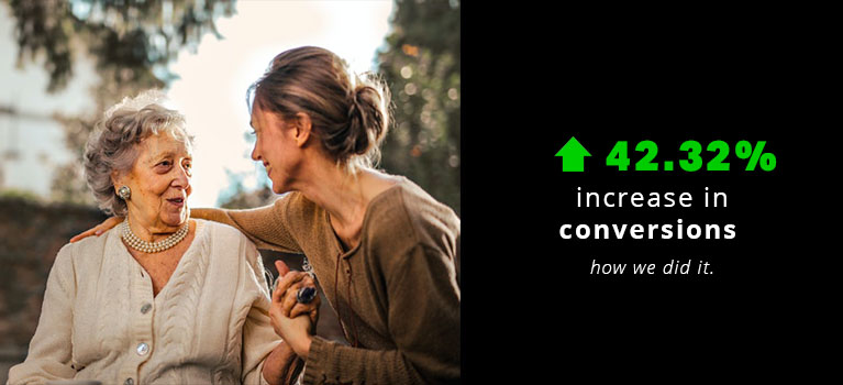
42.32% Increase for a Lead Generation Website in the Healthcare Niche
The Website:
Our latest case study features a lead generation site in the assisted living niche.
It connects family caregivers with suitable care homes or carers and provides resources for those looking into various care options.
What We Tested And Why:
For this particular test, on mobile and desktop, we added call-to-action buttons at the end of each section of content on the property pages.
This is so users would have easy access after reading their section of interest.
For desktop only, we also added a call-to-action button on the sticky bar (in-page navigation).
We used heatmaps and click maps to find the sections where users interacted most.
Based on these observations, the team hypothesized the following:
- Users read through each section of the property pages.
- On desktop, they primarily use the in-page navigation bar to browse these sections.
- There were not enough existing call-to-action buttons and they were not easily visible.
The Results:
For the combined desktop and mobile results, there was a 162.65% increase in clicked call-to-actions and a 42.32% increase in form submissions.
Our key takeaways were that to arrive at the best placement for call-to-actions, you must understand user behavior and interaction with the page.
Also, call-to-action buttons must be placed where users’ focus is so that they can easily take action as soon as they’re ready to. This is especially important on longer pages and on mobile.

Hi, I’m Kurt Philip, the founder & CEO of Convertica. I live and breathe conversion rate optimization. I hope you enjoy our findings.
We’ve worked with over 1000 businesses in the last 6 years.
Let’s jump on a quick call to see how we can help yours.
Client Case Studies


0 Comments