Case study
SaaS CRO case study: two tests that raised free trial sign-ups
This SaaS CRO case study covers two tests on the website of a software product for online marketers. The first put a slide-in call to action on the blog. The second added a section to the homepage that let visitors use some of the product's tools for free. Both raised free trial sign-ups.
SaaS CRO case study at a glance
This SaaS CRO case study reports two tests on one software site, both aimed at free trial sign-ups. A slide-in call to action on the blog raised the rate of free trial sign-ups 50.27% on desktop. A free tools section on the homepage raised free trial sign-ups 42.85% at a 96% confidence level. Neither test length was published.
| Detail | Test 1 | Test 2 |
|---|---|---|
| Client | A SaaS product in the online marketing niche (not named in the original case study) | |
| Goal | More free trial sign-ups | |
| Page changed | Blog posts | Homepage |
| What changed | A slide-in, sticky call to action with a Start FREE Trial button | A section highlighting tools visitors can use for free, on the spot |
| Devices | Desktop and mobile versions; results reported for desktop | Desktop and mobile, results combined |
| Headline result | +50.27% rate of free trial sign-ups (desktop) | +42.85% free trial sign-ups |
| Confidence published | Not stated | 96% |
| Test length published | No | No |
Who was the client?
The client was a SaaS business selling a product for online marketing. Its main conversion was the free trial: a visitor registers, goes through a checkout step and starts a trial of the service. The original case study does not name the company, so this page does not either.
Two parts of the site were working on that goal. The blog brought in readers who were not yet looking for software. The homepage met visitors who had come to look at the product but had not yet decided to try it. Each test targeted one of these groups.
What was holding free trial sign-ups back?
On this SaaS site, the path to a free trial asked visitors to go looking for it. A blog reader deep in a post had no button in view when they felt ready, and a homepage visitor was asked to commit to a trial before they had felt what the product does. The two tests answered those two gaps.
The funnel had three measurable steps: reaching the registration page, reaching the checkout page, and completing a free trial sign-up. Measuring each step, not just the last one, is what let the team read the first test properly, as the results below show.
Test 1: a slide-in call to action on the blog
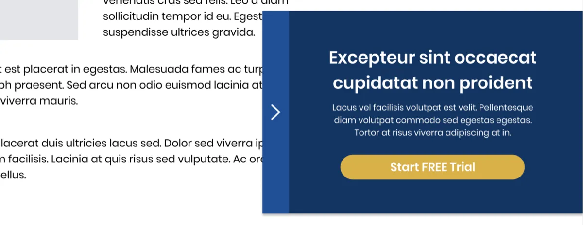
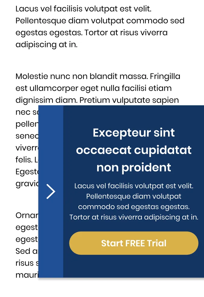
The first test added a slide-in, sticky call to action to the blog posts. The aim, in the words of the original write-up, was to give readers easy access to the call to action button wherever they are on the post. The button led to the start of a free trial.
A call to action placed at the end of a post only reaches the readers who get there. One in the sidebar scrolls away. A slide-in that stays in view means the button is there at the moment a reader decides, wherever on the page that happens. The panel had a short headline, one line of supporting copy and a Start FREE Trial button, with an arrow tab on its edge.
Test 1 results
The slide-in raised every step of the desktop funnel. The original case study reports these desktop results; it does not say how long the test ran or what confidence level it reached.
| Funnel step | Metric as reported | Change |
|---|---|---|
| 1. Registration page | People who proceeded to the registration page | +23.66% |
| 2. Checkout page | People who proceeded to the checkout page | +43.11% |
| 3. Free trial | Rate of free trial sign-ups | +50.27% |
The lift grows at each step. More readers clicked through, and the readers who clicked were more likely to finish, which suggests the slide-in brought in readers who were ready rather than curious clickers. The case study does not break the result down further, so that reading is a likely explanation, not a proven one.
No conversions were recorded on mobile. Because of the increases in the first two steps of the funnel, the team rolled the slide-in out on mobile as well as desktop. That is a reasonable call when the early steps move and the final step has too little data to read, but it is a call, not a test result, and it is worth watching after rollout.
Test 2: free tools on the homepage
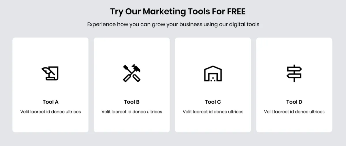
The second test added a section to the homepage that highlights the tools visitors can use for free, on the spot. The aim was to give visitors a first-hand feel of the product and so encourage them to sign up. Instead of describing what the software does, the homepage let people try part of it.
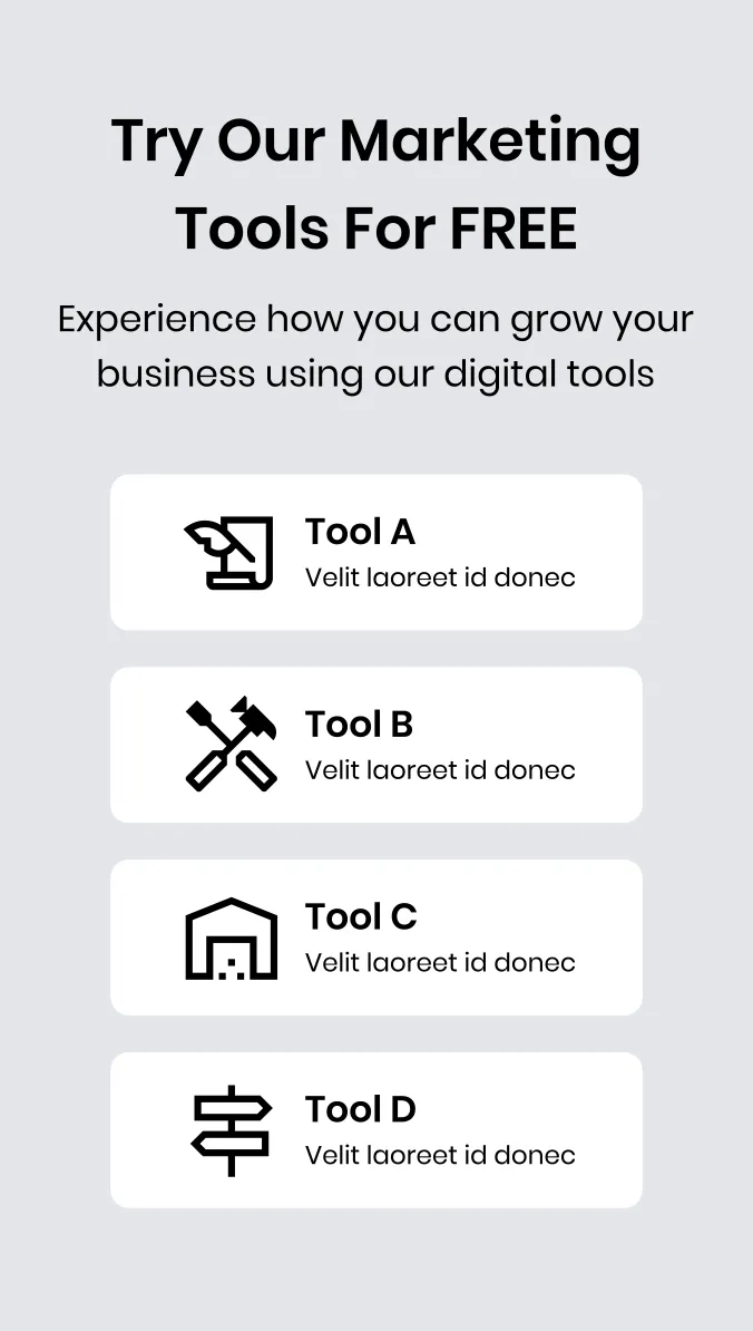
A free trial still asks for effort: registering, a checkout step, and time spent learning a new product. A tool that works straight away, with no account, answers the question a visitor has before that effort: will this be useful to me? In the published mockup the section is headed "Try Our Marketing Tools For FREE", with four tools laid out as cards on desktop and as a stacked list on mobile.
Test 2 results
The free tools section increased free trial sign-ups by 42.85% at a 96% confidence level, desktop and mobile combined. The original case study also reports increases at every step of the funnel but does not give those figures, or the length of the test.
How were the tests measured?
Both tests in this SaaS CRO case study were measured as funnel conversions: the share of visitors who reached registration, then checkout, then a completed free trial sign-up, compared with the page without the change. Test 2 reports a confidence level of 96%: a measure of how unlikely a difference that size would be if the change had no real effect.
The write-up leaves out several details a full test report would include: the testing tool, the traffic split, the number of visitors and the length of each test. That is why the figures on this page are given in tables and prose with that caveat, not as headline results with a timeframe. If you run a similar test, the A/B test sample size calculator tells you how much traffic you need before you start, and the statistical significance calculator checks the result when you finish.
Lessons from this SaaS CRO case study you can apply
The lessons from this SaaS CRO case study apply to most trial or demo funnels: put the call to action where the reader is when they decide, let people feel the product before you ask for a commitment, and read every step of the funnel, not just the last one. The second is the foot in the door idea: a small yes first makes the bigger one easier. Here is how to use each idea.
- Keep the call to action in reach on long content. A blog post is read top to bottom at different speeds. A slide-in or sticky call to action is there at whatever point a reader decides. Keep it small enough that the article stays readable. The sticky CTA case study shows the same idea on a store's mobile landing page.
- Let visitors try before they register. If part of your product can work without an account, a calculator, a checker or a generator, put it on the homepage. It shows the value faster than any description.
- Measure each step of the funnel. Test 1 only makes sense because registration and checkout visits were tracked as well as sign-ups. Without them, the mobile decision would have had nothing to go on.
- Be careful with decisions made on partial data. Rolling out on mobile because the early steps rose is defensible, but check the final conversion after rollout before you treat it as a win.
- Report the test properly. Write down the test length, the traffic, the split and the confidence level. A result without them is hard to trust and hard to repeat.
One more check applies now that did not when these tests ran: can an AI agent find and use your free trial? A slide-in built only from script can be invisible to an agent reading the page, and so can a tool that loads nothing until someone clicks. Make sure the trial link and the tools exist as plain, labeled links and buttons in the HTML. Agent readiness is one of the eight checks in Convertica's free CRO audit.
What this means for your site
If your site sells software on a free trial, ask two questions of it: when a reader is ready, is the trial button in front of them, and can a visitor feel the product before you ask them to sign up? Convertica's free CRO audit checks your page for people and for AI agents and ranks what it finds by likely impact: enter your website and email, and watch it run live. For the whole trial funnel, its metrics and how to test it, see the guide to SaaS conversion rate optimization.
For more lead generation tests, read the popup quote form case study from a home services site, the assisted living case study on call to action placement, and the Empire Flippers case study on a step-by-step valuation form.
SaaS CRO case study FAQ
What did this SaaS CRO case study test?
It tested two changes on a SaaS website in the online marketing niche. Test 1 added a slide-in, sticky call to action to the blog posts, with a button that started a free trial. Test 2 added a homepage section highlighting tools visitors could use for free, on the spot. Each was compared with the page without it.
How much did free trial sign-ups increase?
In test 1, the rate of free trial sign-ups rose 50.27% on desktop. In test 2, free trial sign-ups rose 42.85% at a 96% confidence level, desktop and mobile combined. The original case study does not say how long either test ran, so treat both figures as the result of one test each, not a trend.
Why was the slide-in call to action rolled out on mobile when mobile recorded no conversions?
The original case study says no conversions were recorded on mobile in test 1, but that the slide-in raised the first two steps of the funnel, the visits to the registration and checkout pages. On that basis the team rolled it out on mobile as well as desktop. It is a judgment call worth checking on your own data.
What is a slide-in call to action?
A slide-in call to action is a small panel that slides in from the edge of the screen while a visitor reads, and stays in view as they scroll. Unlike a full-screen popup, it leaves the article readable. In this test it carried a short headline, one line of copy and a Start FREE Trial button.
Do free tools on a homepage increase SaaS sign-ups?
They did on this site: a homepage section of tools visitors could use for free lifted free trial sign-ups 42.85% at 96% confidence. The idea is to let visitors feel the product before they commit. Whether it works for your product depends on how quickly a free tool shows its value, so test it.
Can Convertica run tests like this on my SaaS site?
Convertica starts with the free CRO audit, an app that checks your page for people and for AI agents while you watch. After it, CRO advisory, led personally by founder Kurt Philip with Convertica's CRO team, then gives you ongoing direction on what to fix and what to test while your team builds the changes. Or, with full implementation, Convertica's team builds the fixes from your audit. Both are priced after your audit.