Case study
Lead generation case study: a popup quote form vs a form on the page
This lead generation case study shows what happened when a home services website moved its quote form off the page and into a popup, opened by call to action buttons. The popup was tested against the in-page form on desktop and mobile, and successful bookings rose on both.
Lead generation case study at a glance
This lead generation case study tested a popup quote form against a quote form shown within the page, on a home services website. The popup raised the conversion rate for successful bookings 45.08% at a 97% confidence level, desktop and mobile combined. The test length was not published.
| Client | A lead generation website in the home service industry (not named in the original case study) |
|---|---|
| Conversion | A successful booking: a visitor fills in the quote form and reaches the success page |
| Control | The quote form displayed within the page |
| Variation | Call to action buttons that open the quote form in a popup |
| Devices | Desktop and mobile |
| Headline result | +45.08% conversion rate (successful bookings), desktop and mobile combined |
| Confidence | 97% |
| Test length | Not published in the original case study |
Who was the client?
The client ran a lead generation website in the home service industry. Visitors request a quote online and book the service through the same form, so the quote form is the business: every completed form is a booking. The original case study does not name the company, so this page does not either.
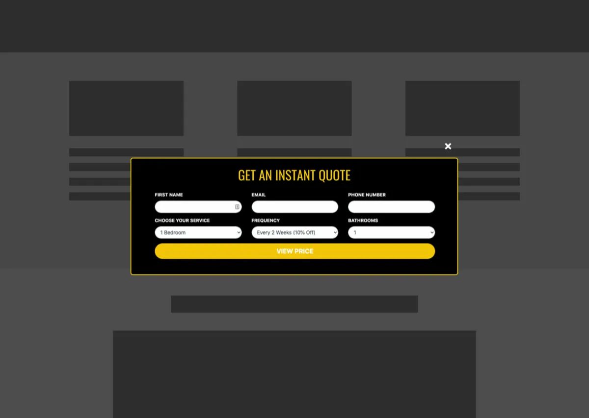
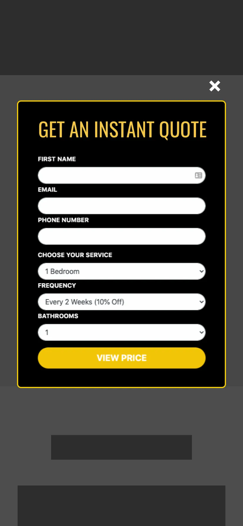
The quote form asked for six things: first name, email, phone number, the service wanted, the frequency and the number of bathrooms. That is a reasonable form for pricing a recurring home service. The question the test asked was not what the form contained, but where it should sit.
What was the problem with the in-page quote form?
The in-page quote form sat beside the page's sales message, so visitors met a block of six fields while they were still reading about the service. The team's view was that the form, shown that early and that close to the message, was overwhelming visitors who had not yet decided, and pulling attention away from the copy meant to persuade them.
A form on the page has a second limit: it is only in one place. A visitor who becomes ready further down the page, or on another page, has to scroll back or go looking for it.
What was the hypothesis?
The hypothesis was that moving the quote form into a popup would let visitors focus on the message and leave them more encouraged to go ahead. The form would appear only when a visitor clicked a call to action, so getting a quote and booking would be one click away wherever they were on the site, without the form crowding the message.
That is two ideas in one change: less on the page while the visitor reads, and a faster route to the form when they are ready. The test measured the combined effect; it cannot say which idea did more of the work.
What changed: call to action buttons that open a popup form
The variation added call to action buttons across the site that opened the quote form as a popup, headed "Get an instant quote", with a single View Price button at the end. The same six fields were kept. On desktop the popup lays them out in two rows of three; on mobile they stack in one column.
| Element | Control | Variation |
|---|---|---|
| Where the form is | Displayed within the page, near the message | In a popup, opened by a call to action button |
| When the visitor sees the fields | As soon as they reach that part of the page | Only after they click to get a quote |
| Where the visitor can start a quote | Where the form sits | Wherever there is a call to action button on the site |
| Form fields | Name, email, phone, service, frequency, bathrooms | The same six fields |
How was the popup form tested?
The popup quote form was tested against the version with the form displayed within the page, on desktop and mobile. The conversion counted was a successful booking: a visitor who used the quote form and then reached the success page. The test reached a 97% confidence level on the combined result.
The original case study does not publish the testing tool, the traffic split, the number of visitors or how long the test ran. Without the test length, the figures below are the result of one test, as reported, rather than a rate you could expect to hold over a set period. To plan a test of your own, the A/B test sample size calculator shows how many visitors you need, and the statistical significance calculator checks whether a result like this one is likely to be real.
What were the results?
The popup form increased the conversion rate for successful bookings by 45.08% at a 97% confidence level, desktop and mobile combined. Split by device, the lift was much larger on mobile than on desktop. The original case study does not say how long the test ran.
| Segment | Metric as reported | Change | Confidence |
|---|---|---|---|
| Desktop and mobile combined | Conversion rate (successful bookings) | +45.08% | 97% |
| Desktop only | People who used the quote form and reached the success page | +26.88% | Not stated |
| Mobile only | People who used the quote form and reached the success page | +67.27% | Not stated |
Two things stand out. First, the lift held on both devices, so the change did not trade one audience for another. Second, mobile gained more than twice as much as desktop. The case study does not explain why. A likely reason is space: on a phone, six stacked fields fill several screens and push the message out of view, so taking them off the page changes the mobile experience far more than the desktop one.
Lessons from this lead generation case study you can apply
The lessons from this lead generation case study apply to any site that books, quotes or captures leads through a form: let the message do its job before you show the fields, make the form reachable from anywhere, segment the result by device, and keep a popup easy to use and easy to close.
- Separate the message from the form. Visitors who are still reading are not ready for fields. Let the page make its case, and show the form when the visitor asks for it.
- Put a way to start in every place a visitor might decide. A button that opens the form can sit at the top, the middle and the end of a page, and on other pages too. An in-page form can only sit in one place.
- Read the result by device. A combined 45.08% hides a 26.88% desktop lift and a 67.27% mobile lift. If you only read the total, you would not know where the change mattered most.
- Open the popup on request, not by surprise. This popup opened when a visitor clicked a call to action. Google's guidance on intrusive interstitials and dialogs warns against popups that cover the content a visitor came for without being asked.
- Build the popup so everyone can use it. A visible close button, focus moved into the popup when it opens and back when it closes, the Escape key, and a label on every field. The same structure lets an AI agent find and fill the form.
- Test it on your own site. The opposite result is possible on a page where visitors arrive ready to book. Test the popup against your current form before you roll it out.
What this means for your site
If your leads come through a quote or booking form, look at where it sits and what a visitor sees first, on a phone as well as a desktop. Convertica's free CRO audit checks your page for people and for AI agents and ranks what it finds by likely impact: enter your website and email, and watch it run live. Read more about how a CRO audit works.
For more lead generation tests, read the Empire Flippers case study, where a valuation form was rebuilt as a step-by-step flow, the assisted living case study on call to action placement, and the SaaS CRO case study on free trial sign-ups.
Lead generation case study FAQ
What did this lead generation case study test?
It tested where a quote form should live on a home services website. The variation removed the form from the page and added call to action buttons that opened the quote form in a popup. The control showed the form within the page, near the sales message. Both versions ran on desktop and mobile.
How much did successful bookings increase?
Successful bookings rose 45.08% at a 97% confidence level, desktop and mobile combined. On desktop alone, the number of people who used the quote form and reached the success page rose 26.88%; on mobile alone it rose 67.27%. The original case study does not say how long the test ran.
Why would a popup form convert better than a form on the page?
The team's hypothesis was focus. With the form displayed beside the message, visitors faced a block of fields before they had finished reading. With the form in a popup, the page could make its case first, and the form appeared only when the visitor asked for it by clicking a button. The case study tested the result, not the reason.
Why was the lift bigger on mobile?
The original case study does not explain it. A likely reason is space: on a phone, an in-page form with six fields takes up several screens and pushes the message out of view, so moving it into a popup changes the mobile page more than the desktop page. Treat that as a reading, not a finding.
Are popups bad for SEO or accessibility?
Not when they are built well. This popup opened only when a visitor clicked a call to action button. Google's guidance warns against interstitials that cover content without being asked for. For accessibility, a popup form needs a visible close button, keyboard focus moved into it and back out, and labeled fields.
Can Convertica test my lead generation form?
Convertica starts with the free CRO audit, an app that checks your page for people and for AI agents while you watch. After it, CRO advisory, led personally by founder Kurt Philip with Convertica's CRO team, then gives you ongoing direction on what to fix and what to test while your team builds the changes. Or, with full implementation, Convertica's team builds the fixes from your audit. Both are priced after your audit.