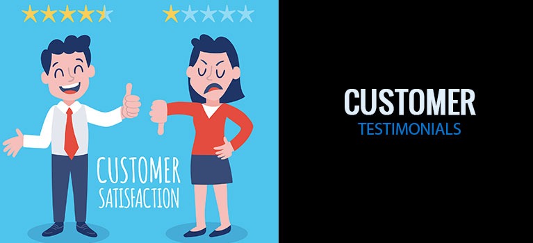
How to Use Customer Testimonials On Websites And Get Buyers to Take Action
You know what it’s like.
You go to a site to buy something. You’re interested in their offer. So you look for customer testimonials. But you can’t find them.
What happens next?
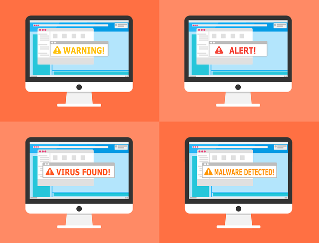
Doubt seeps into your brain. You start to wonder if there’s any truth to the site’s claim. And even though the product feels like it’s the right fit for you, you second-guess yourself. You can’t help it. You feel like you need to seek out other people’s experiences first before you can make your final decision.
Guess what?
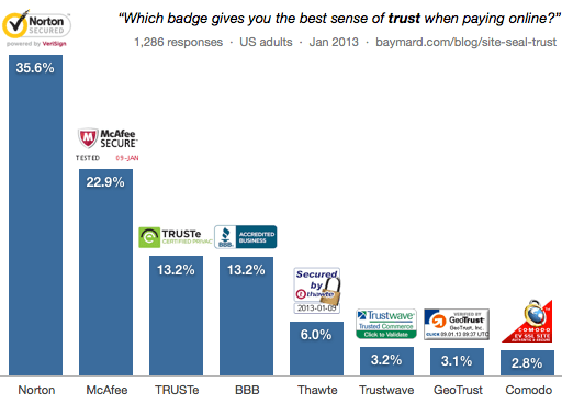
This isn’t unique to you. In a study by Trust Radius, 91% of the respondents regularly read testimonials before making a purchase. That’s because third-party reviews and testimonials give them the confidence that they’re buying the right thing.
That’s how important testimonials are on your sales pages. I know you know this. Or you wouldn’t be here.
But here’s the lesson for today.
Just because you have flour, butter and chocolate doesn’t mean you can make an awesome chocolate souffle. Similarly, just because you have testimonials on your site doesn’t mean they’re going to convince your visitors to buy. See, not all testimonials have the same degree of power. If you want to make full use of their capacity to influence decisions, then there are rules to follow. When you do this, you give your testimonials wings to fly so they can do their work.
This is exactly what this post is about. We’ll look at the characteristics of effective testimonials. I’ll show you:
- Why customer testimonials on websites are important
- Where and how to ask customers for testimonials
- What effective testimonials have in common
- Where to put customer testimonials on a website
Let’s start.
Why are Customer Testimonials on Websites Important?
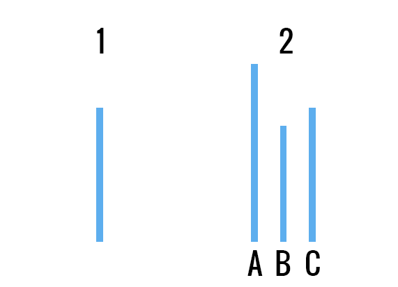
On May 6, 1954, on a cold wet day in Oxford England, Roger Bannister, broke the 4-minute barrier. Forty-six days later, the Australian runner, John Landy broke it again. Then a year after, three more runners did the same.
Here’s the catch.
Since 1886, it had been the serious runner’s dream to break that barrier. But no one managed this for over 60 years. Not until Bannister did. After which other runners started breaking it again and again. There were probably many reasons for this. But one thing’s certain. There was a mental barrier stopping runners from reaching that elusive sub-4-min time. They needed to break that mental barrier first. And all it took to break it was for them to know that another person had done it.
This is the reality of our human psychology. We tend to look to others for confirmation before we move into action. When we are uncertain, we need proof based on the experience of others.
Just like buying online.
Sure, eCommerce is commonplace. But when buying something you can’t touch. When buying a service without the face-to.face contact that the offline world allows, it all becomes uncertain. You only have the words of the seller to rely on. The seller with the ulterior motive of getting you to buy from him.
So what do we do to get rid of this uncertainty our brain is oh-so-prone to? We rely on testimonials. We get confirmation from a third-party for an unbiased analysis of the product or service.
That’s how testimonials help your business. They address the feeling of uncertainty in your customers’ minds and steer them towards making a decision quicker. Testimonials promote trust in what you sell and confidence in their decision to buy from you. Customer testimonials, when done right, can be one of your most prolific “salespersons”.
Okay. So you know you need testimonials. But you haven’t got any.
Where and how do you ask customers for testimonials?
There’s no other way to say this. The only way to get testimonials is to ask for them. As Arnold Schwarzenegger says, “If you don’t do the work, you don’t get the results.”
Your customers have their own life. Writing testimonials for your business is the last thing on their minds. It’s not their priority. It’s yours. So do something about it. You don’t have to wait for a customer to drop a testimonial for you. You can actively pursue them.

Here are three things you can do to help you get testimonials for your website now.
Strategies for getting testimonials from clients
Gather testimonials from your “hidden” vault
You may not know it. But you already have a wealth of testimonials in your possession. Where? In your customer emails. Most customers are not motivated to tell you how your product or service has changed their lives. But you’ve most likely had a client who was so happy by the results of your services, that he was moved to send you an email of appreciation and thanks.
Gather these emails and use them for testimonials. These are usually sent when the experience is new. So the words are raw and the feelings are real. Just the perfect combination you need for effective testimonials. These written-from-the-heart emails speak right to your target customers’ emotions. You can use these word for word. Or you can ask additional questions to the client for more details.
See. These are already warm customers. They’re already happy to talk about you. And many of them will be willing for you to use their names and their testimonials for marketing purposes. As long as you ask their permission nicely.
Listen to your customers
When it comes to conversion optimization, listening is one of the important skills to master. When you listen to your customers, you’ll know exactly what their needs are. This gives you valuable insights in how to better market to them.
But what you may not have been using this skill for is getting testimonials. How? Go where most of your target customers hang out. Which social media are they usually on? Are there any forums they frequent? Go there. Track any mentions of your company. Then contact the person to ask permission to use his statement as a testimonial and voila! you’ve got yourself instant content for your sales page. You can easily track mentions using tools like Mention, SocialBakers and Hootsuite.
Ask for testimonials from happy customers
Yep. By asking. You can send an email after every purchase to ask for a testimonial. But another way to do this is by knowing who your happy customers are and then asking them for a testimonial.
Here are some tips for a higher chance of them saying yes.
- Strike while the iron is hot. Ask while the experience is still new. This way, it’s easier for them to remember their exact feelings and emotions.
- Ask to interview them, if possible. You can use this for video testimonials if that’s something your customer agrees to. An interview with a customer holds so much value for your business. Not only will you have the testimonials you need but you will also know your target customers better.
- Don’t ask generic questions. Ask questions like:
-
- What benefits has the product or service had in your life?
- Why did you choose to buy from us rather than from other sites?
- How did the product or service help you?
- What was it like buying from our site?
- Be mindful of their time.
- Look after them. If they give testimonials, this means they’re happy about buying from you. If you look after them, they could become your loyal fans. And these are the type of customers you want. So take care of them.
Effective testimonials and what they have in common
When it comes to customer testimonials, businesses fill their websites with dozens or hundreds of them. These sites use mob mentality hoping that the sheer number of reviews will sway customers towards the actions of the “mob”.

But you know what’s even better?
Customer testimonials that address the common objections and anxieties that your customers have.
What do I mean? Here’s what.
Testimonials aren’t there to fill your web pages and make them look pretty. They’re there to convince your target customer to buy.
How do you do this? By gathering and displaying testimonials that specifically address your customers’ concerns. And for them to be effective, they should also have these four non-negotiable traits.
- It should be true. People have become very savvy. They can spot fake reviews from a mile away. And they are ruthless when they find a business that does this. If you deliver a good service or have great products, there’s absolutely no need to have fake reviews.
- It comes from the right person. Sure. Having hundreds of reviews from every Tom, Dick or Harry can work. But it’s not as effective as having testimonials from people your target customers respect. You see, there are degrees of importance and power when it comes to customer testimonials. For example, gamers trust the testimonial of another gamer more than they would the mom of a gamer. However, an even more powerful testimonial would be from a popular gamer the customers admire. So give priority to testimonials from known persons in your industry. Or from people your customers associate themselves with.
- It recognizes and addresses the common anxiety and objections customers have. This here is the magic ingredient in any effective testimonial. Use this to answer customer questions and lessen doubts they may have about your business. Then inject it with even more power by strategically placing it at the relevant section on your landing page. Do this and you have social proof on steroids.
- It abides with FTC rules. The FTC means well. They need to protect consumers. As they should. You also need to protect your business. So get acquainted with FTC rules and ensure the testimonials and reviews on your page follow their guidelines.
Where to put customer testimonials on a website
+ plus website testimonial design examples
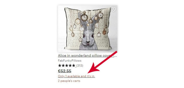
The most common place to put testimonials is on their own page. But when you only do this, you’re clipping their wings and limiting their power.
Why? There are loads of other places on your site that can benefit from customer testimonials. See. Testimonials are meant to help,
- Relieve anxiety
- Show proof
- Create buyer confidence
- Show the product benefits
So at sections on your site where a customer feels anxious, needs proof or is unsure about your product, then a testimonial strategically placed at that point does a lot of good.
Find pages on your site that stir up these feelings of insecurity in your customers. Find sections where objections and anxiety may arise. Got them? Great. Now find a testimonial that addresses these insecurities and place them near to that section. That’s how your testimonials become effective business assets.
Let’s look at a few examples to give you a better idea of what I mean.
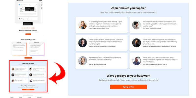
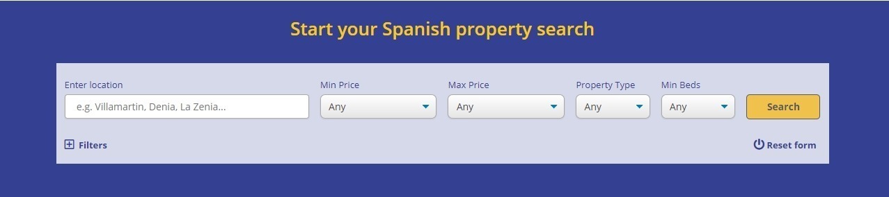
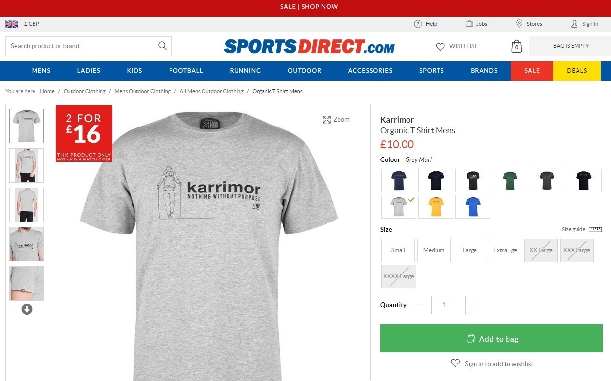
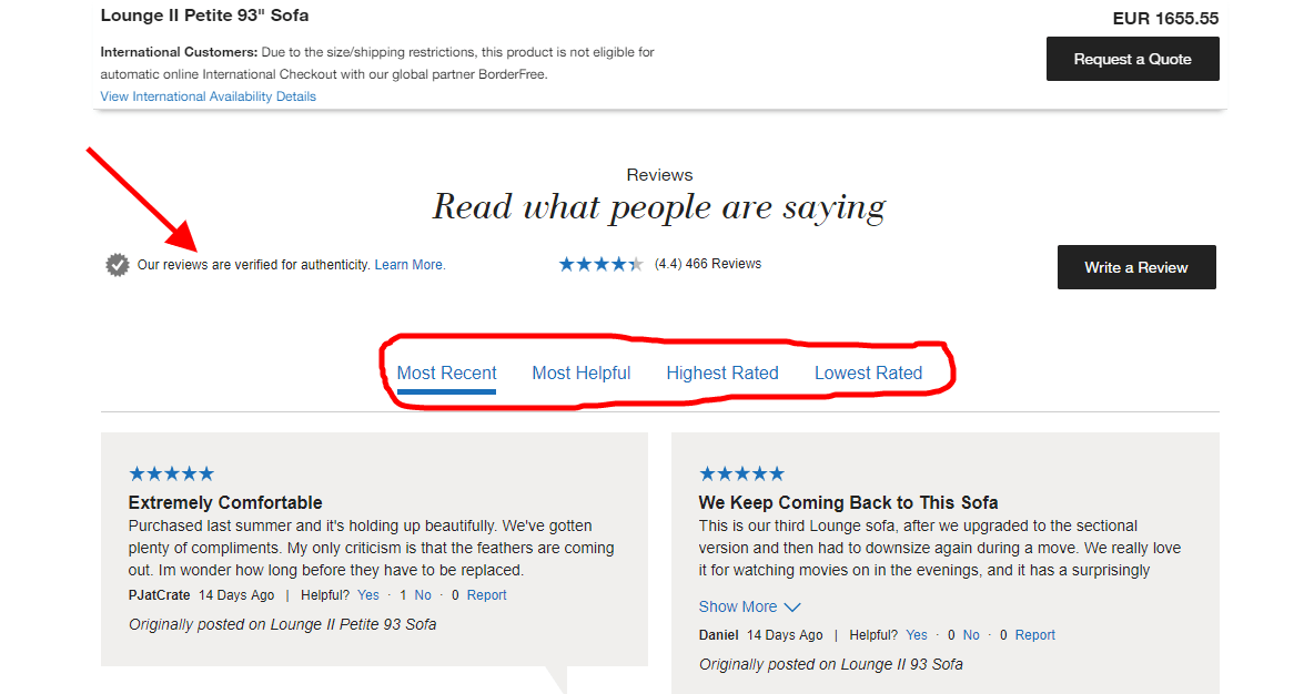
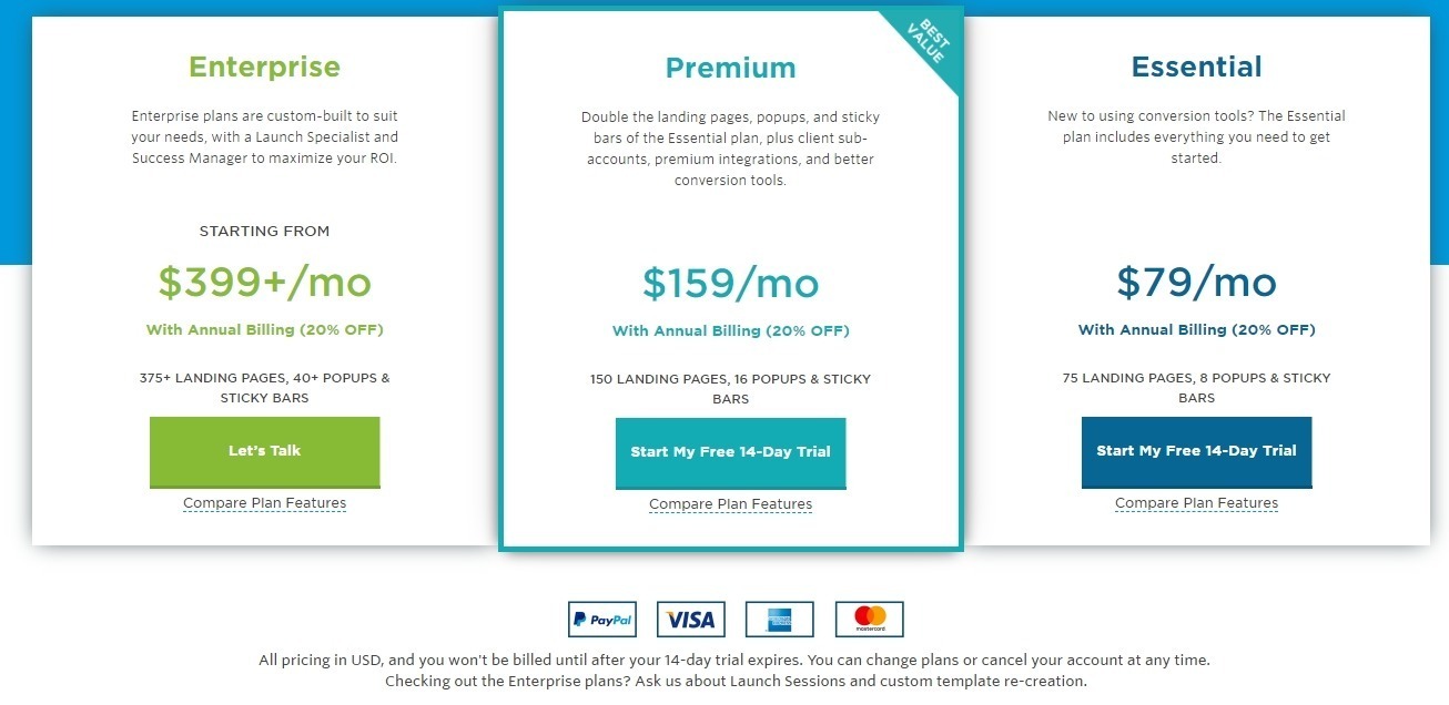
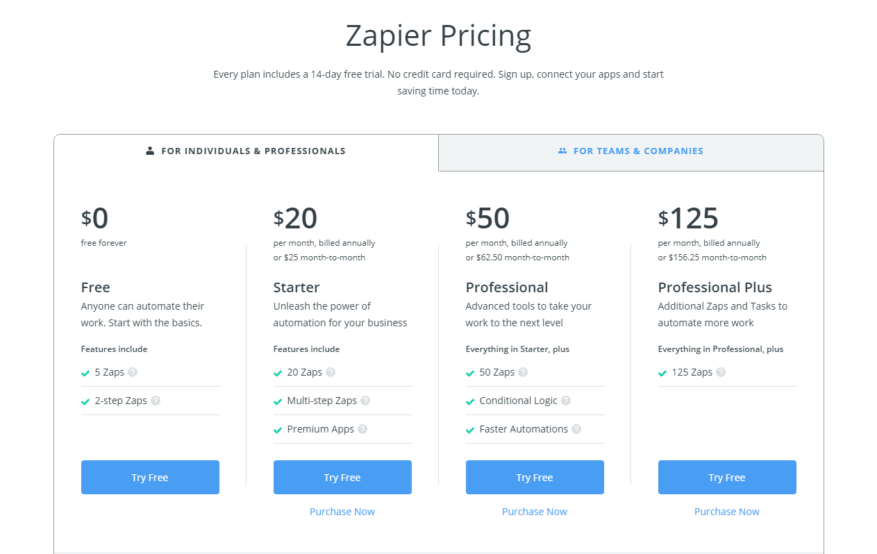
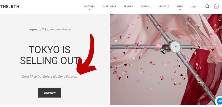
Testimonials on Zapier’s homepage
Zapier uses testimonials on their homepage. The sub-headline says, “More than 1 million people rely on Zapier to take care of their tedious tasks”. This emphasizes social proof and the power of the crowd.
But they don’t stop there. Under this are 6 relevant testimonials. I bet these testimonials were carefully chosen from the many they have. If you read them, you’ll notice that each testimonial talks about the benefits of using Zapier.
This is a way to assure customers that Zapier really does work in the wild. Take note that each testimonial not only includes a photo of the person but also their company name and their position. This is strategic. This shows that Zapier can help anyone, from professionals to founders. If using Zapier helped them, it will help you too.
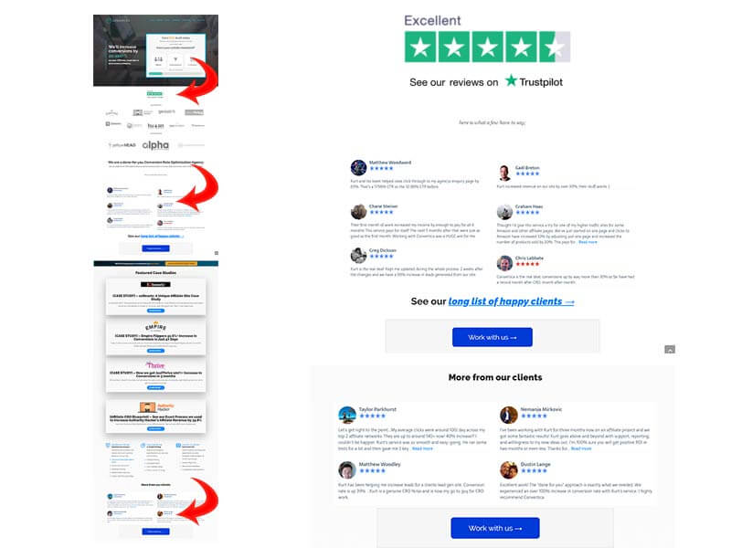
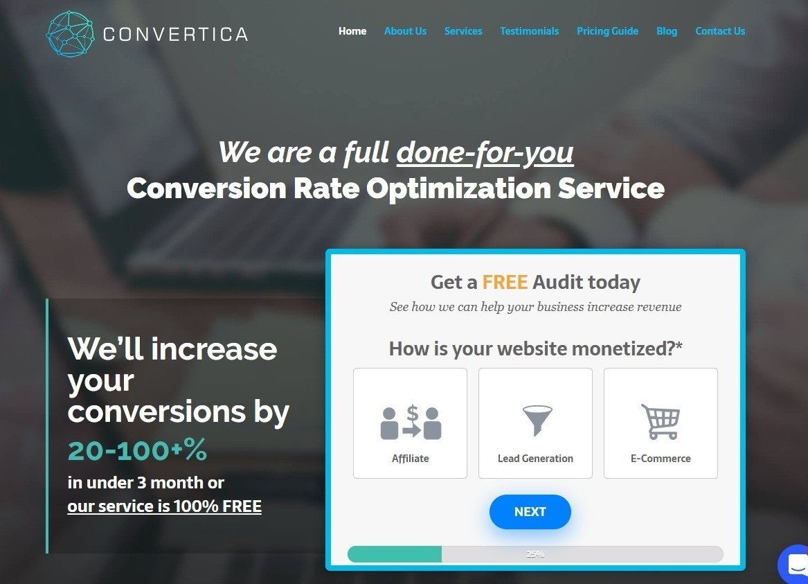
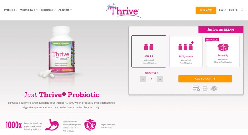
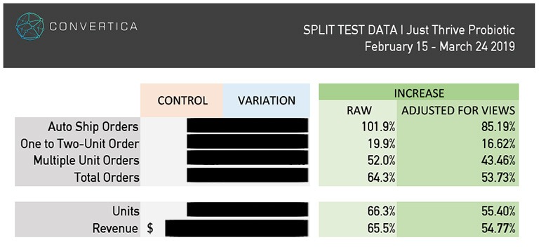
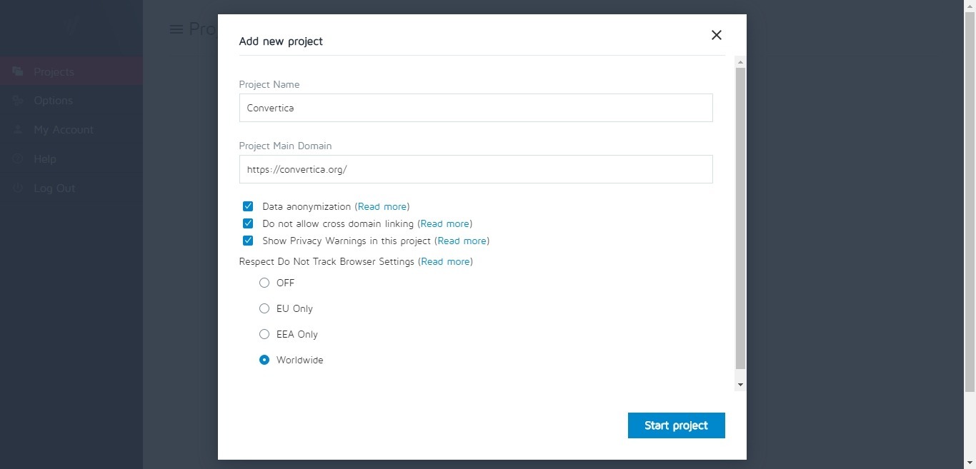
Convertica’s third-party site testimonials
At Convertica, our homepage features customer testimonials. You may notice that the testimonials are embedded from third-party sites like Trust Pilot and Facebook reviews. Our rationale is that reviews from other sites that we have no control over are more believable. But this is something you have to experiment with to find out what resonates with your audience.
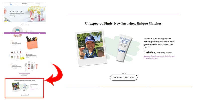
Birchbox’s Testimonials on the homepage
Birchbox’s homepage has a scrolling testimonials area. The testimonials go under the heading Unexpected Finds. New Favorites. Unique Matches. There are three different customer testimonials here that are either reviewing a product or addressing the benefits of a Birchbox subscription. Notice how each testimonial is designed. An image of the customer, an image of the product bought, and the very targeted testimonial.
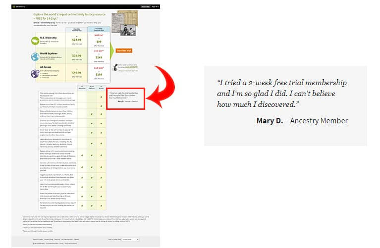
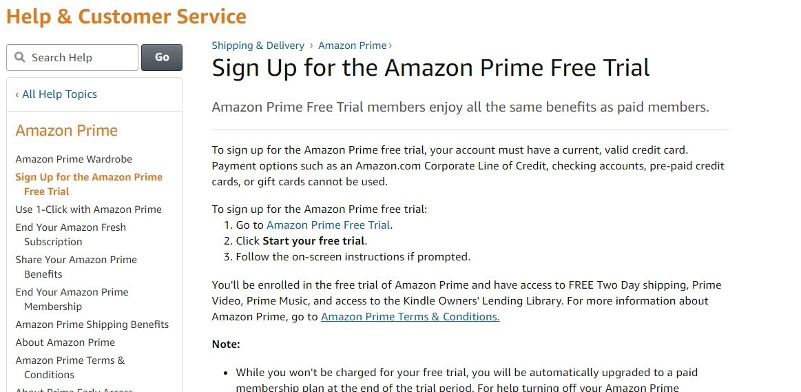
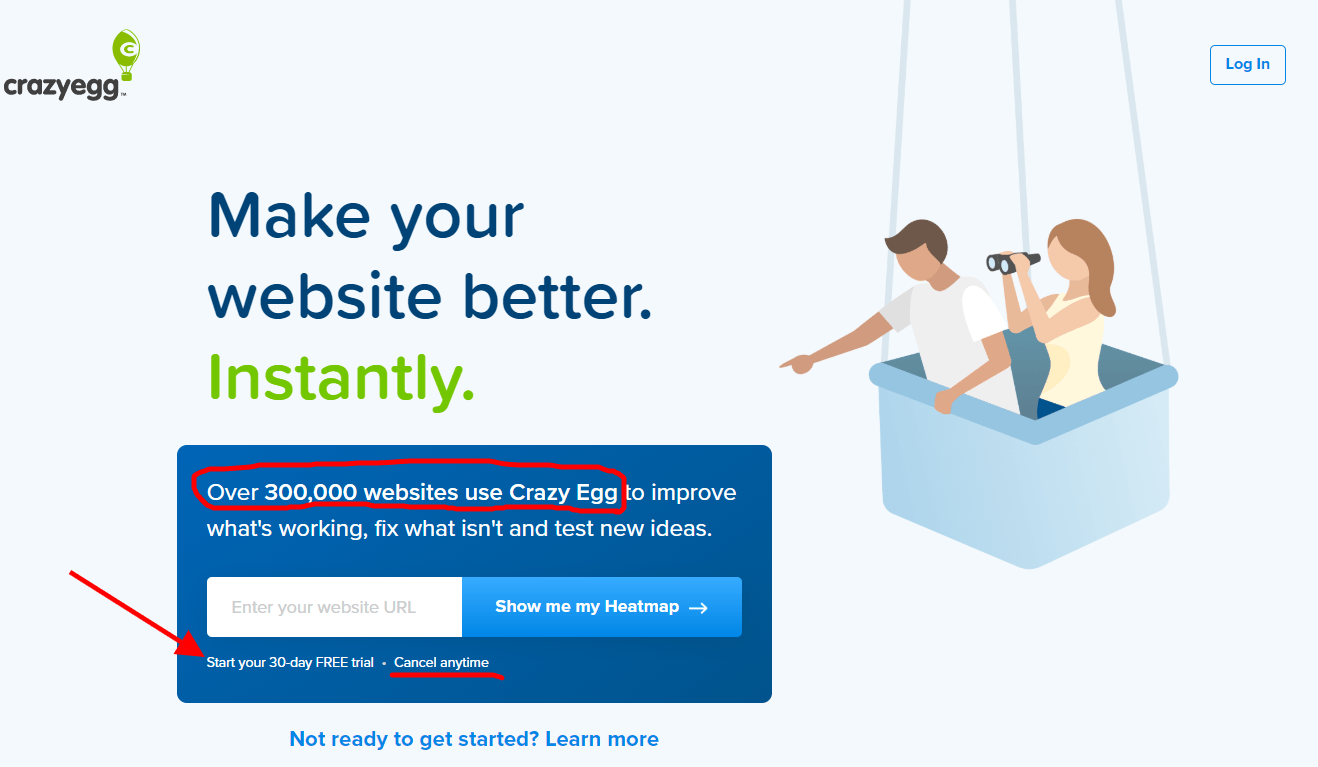
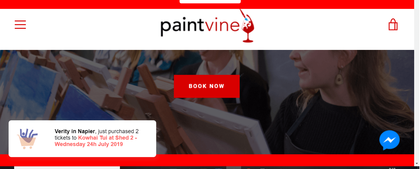
Ancestry’s Free Trial page
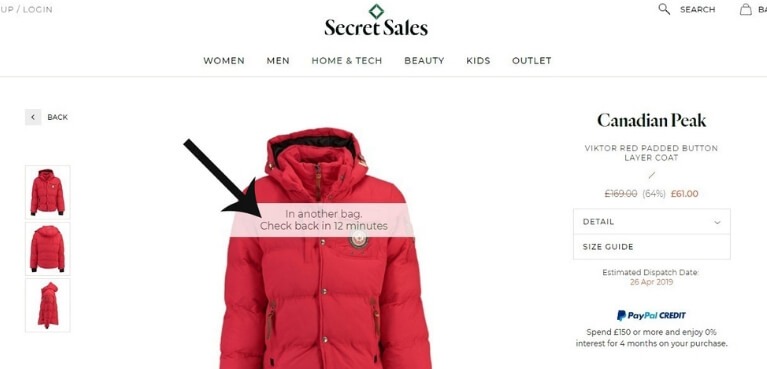
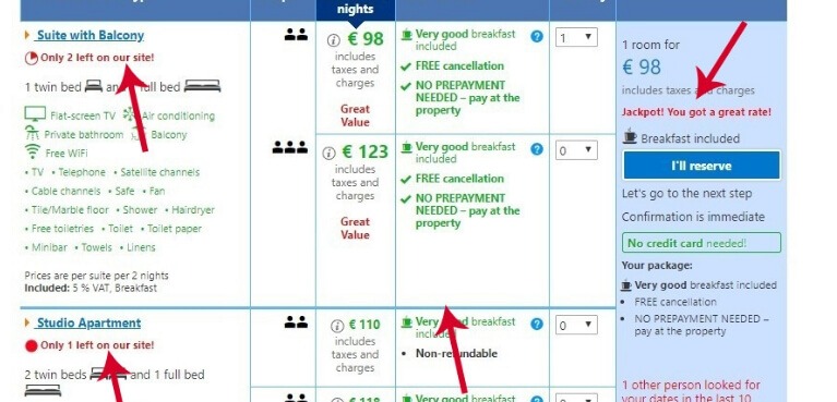
Remember what I said about putting customer testimonials near sections on your site that may cause anxiety? One of the places this happens is near a call to action button.
Here’s one example from Ancestry.com. It’s a FREE trial and you might think that someone interested will sign up without prodding. But this isn’t often the case. When a person arrives on this page, he’ll begin to have doubts and questions. “Is this worth it?” Is this legit? Isn’t filling out this form a waste of time?
So to help its customers resolve these doubts, Ancestry subtly puts a testimonial on the side. It’s like having a person on that page reassure the visitor that it’s all going to be ok. And that simple reassurance can go a long way when it comes to conversions.
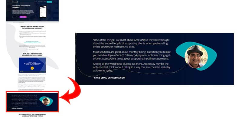
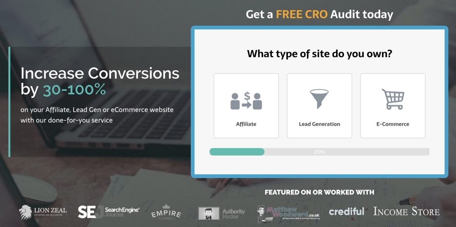
Accessally stresses its value proposition with one testimonial
Accessally’s WordPress Subscription plugin makes a point of their value proposition with one testimonial on the sales page. This testimonial stresses the selling point of this plugin – that you can set different multiple payment options unlike other plugins of this kind. This addresses the common concern that its website visitors have. And all it takes to show this benefit is one testimonial from a relevant source.
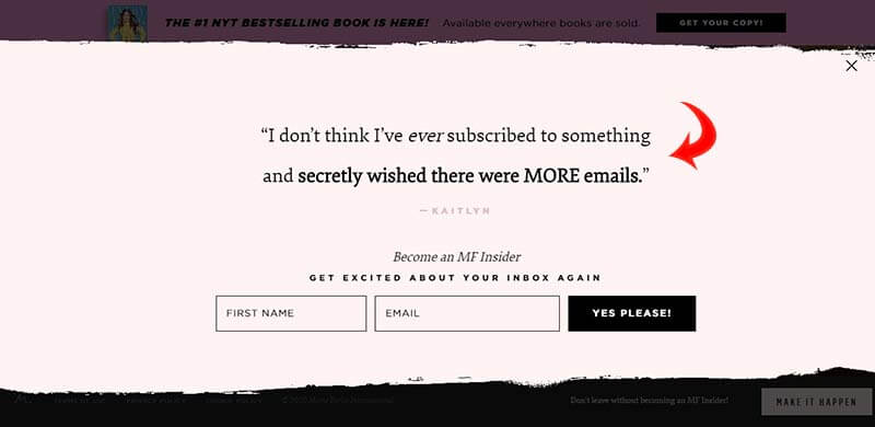
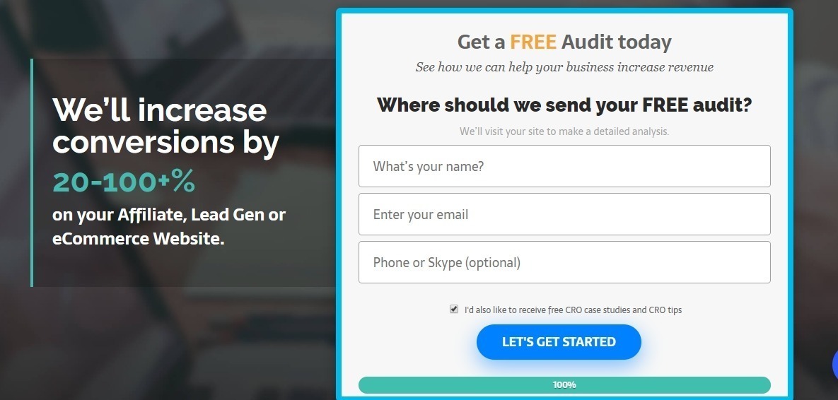
Marie Forleo’s Email newsletter sign up form
Don’t limit testimonials to product pages. You can use them to encourage visitors to sign up for your newsletter, too. The way Marie Forleo does.
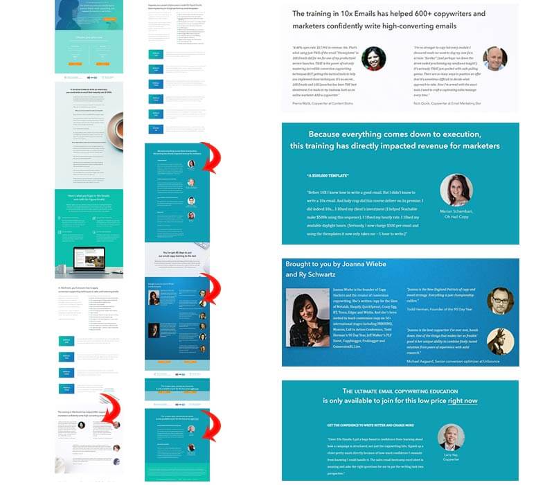
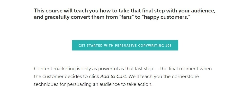
10X Emails Landing Page by Copyhackers
Copyhackers’ Joanna Wiebe does not skimp on customer testimonials. In this 19,000-pixel sales page, there are four sections full of testimonials – all addressing different pain points. The testimonials are weaved into the copy selling the benefits of the course and lessening customer anxiety. Why use your own words when your customers speak right from the gut and do it for you?
VI. FAQ
How do you use testimonials?
Use them as third-party proof to convince your website visitors that you’re the real deal. Customers tend to look to others if they have any doubts or feelings of uncertainty regarding your services. And when your claims are verified by other people who do not work for you, then they tend to believe what this third-party says.
How many testimonials to include on a website?
As many or as little as needed. If you look at the examples we have on this page, Accessally has only one testimonial on the page but it’s a testimonial that supports the product’s value proposition. On the other end of the spectrum, 10X Emails’ sales page is covered with testimonials. It’s not so much how many as to how strategic you are with them.
Where to put testimonials on a website?
Ideally in places where a customer feels some friction or anxiety. You can have one separate page for all your testimonials but there should also be relevant testimonials near the CTA button, the product pages, signup forms or the add to cart button.
So that’s all I’ve got to say for now on testimonials and reviews.
But the question is…
Are you ready to supercharge the customer testimonials on your website?
Now you know the characteristics of effective testimonials, it’s time to put what you’ve learned into action. If you already have testimonials on your site, check that every one of them addresses a pain point or emphasizes a benefit. Also, find sections on your site where a customer might have possible doubts or questions. Then put a suitable testimonial near that area.
If you don’t have any testimonials yet, then start gathering them. It takes a bit of work but with the boost it gives your website, it is well worth the while.
And as usual, if you have any questions, ask them in the comments section below or keep the discussion going at the CRO academy.

Hi, I’m Kurt Philip, the founder & CEO of Convertica. I live and breathe conversion rate optimization. I hope you enjoy our findings.
We’ve worked with over 1000 businesses in the last 6 years.
Let’s jump on a quick call to see how we can help yours.
Client Case Studies


 Daniel Cuttridge, an SEO veteran and front-end developer, is the founder of


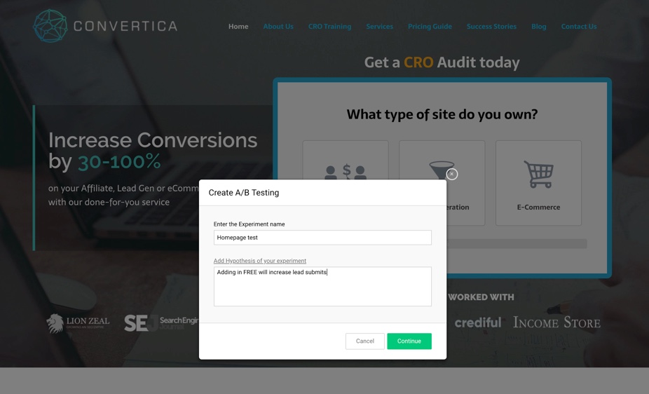
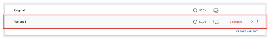
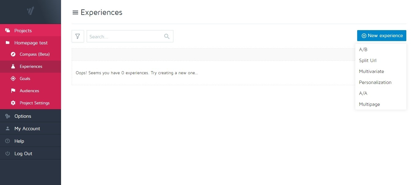
 We will also target all visitors for this test. I like how this feature is added here and the way it is laid out. It’s great for beginners to AB testing tools.
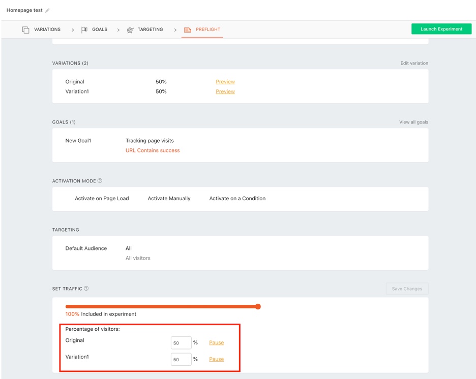

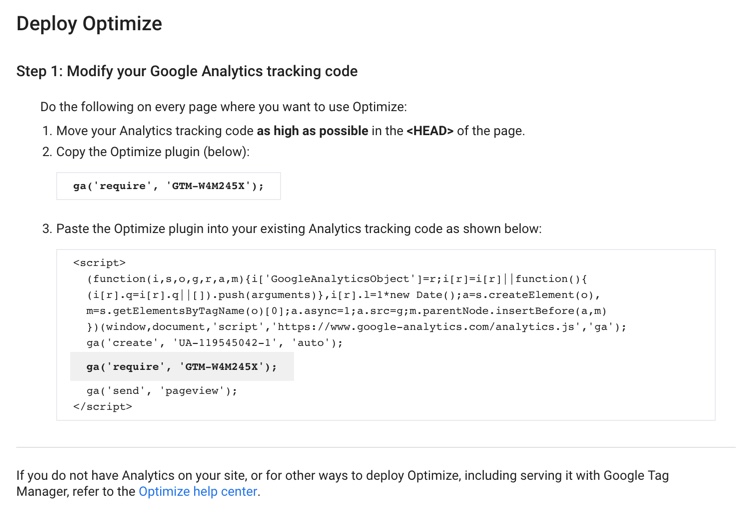
 Google Optimize
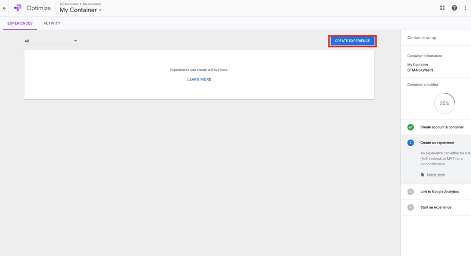 Next, you will be asked to enter some information about your campaign.
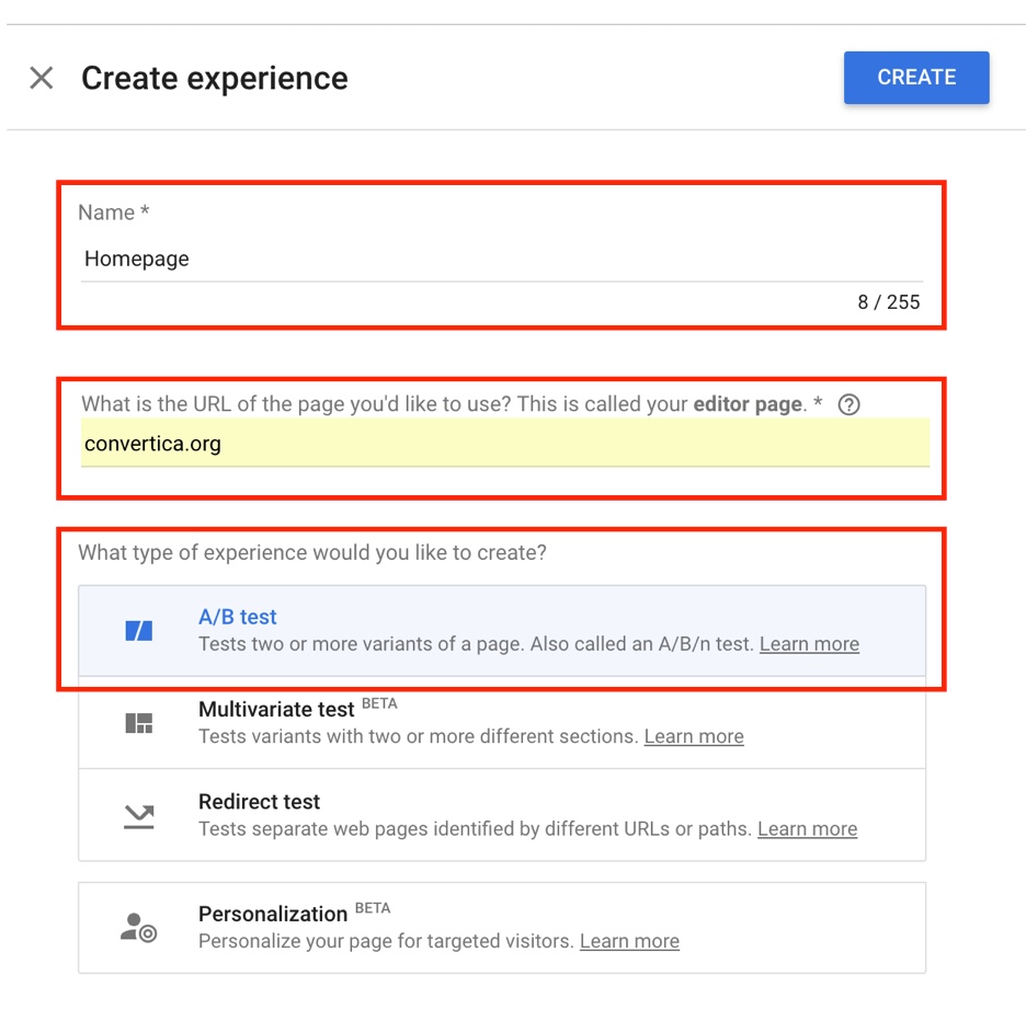 Then click create.
 As I’ve said, pretty frustrating user-interface. It took me a while to work out what I had to do after each step.
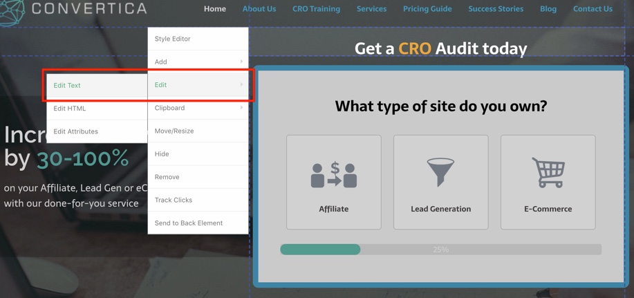
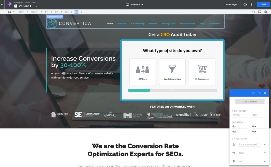 Having a programming background, I like this WYSIWYG editor. The way it overlays all the container identifiers into the editor is handy.
 Pretty straightforward.
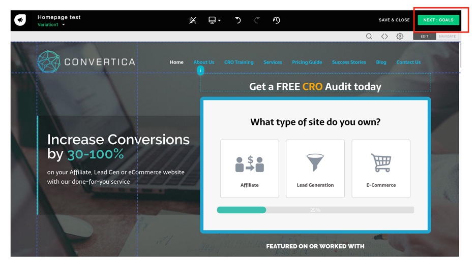
 It was simple to change. And I think, if you want to quickly get started with CRO tests, you’d love this feature. For example, if you want to make simple changes on a landing page or an eCommerce cart, this editor makes the job a breeze. You don’t have to wait for your designers to do this for you.
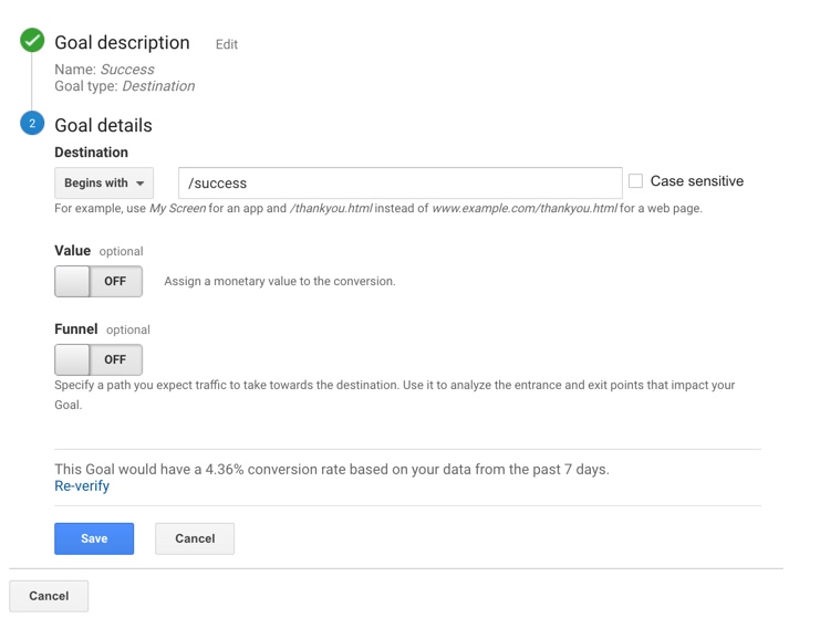
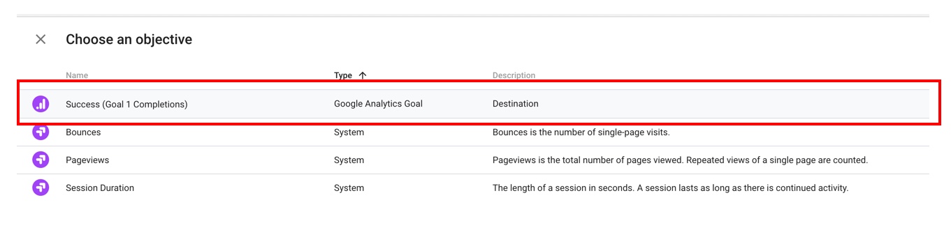


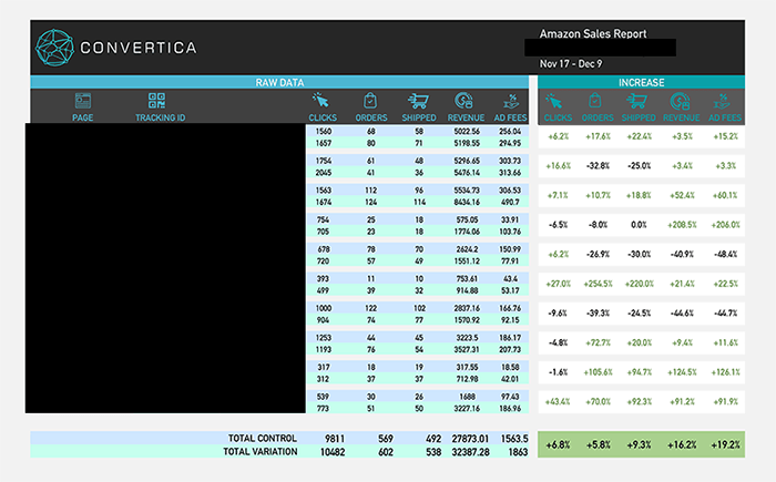
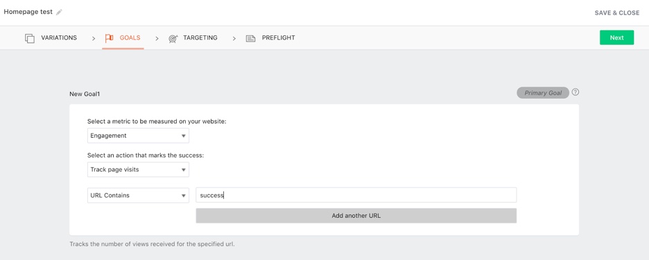
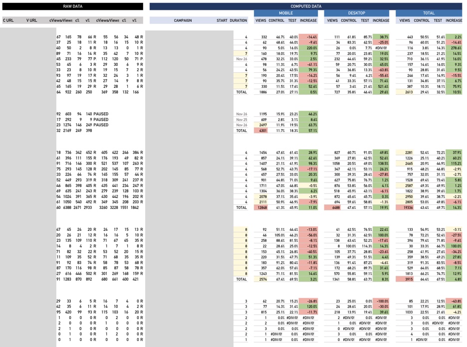 Also, with the enterprise account, we are able to pull raw data and track different goals depending on what is required for each of our clients. We’re able to deliver a 100% tailored CRO approach to each client with this flexibility.
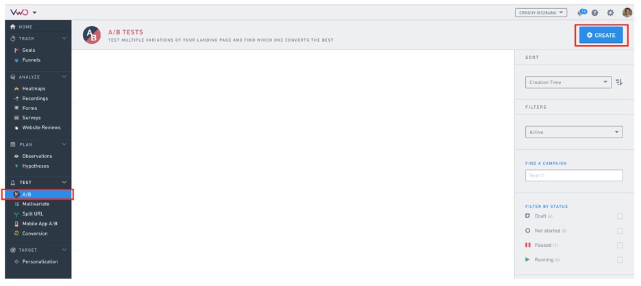 Then;
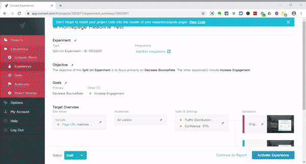
Then;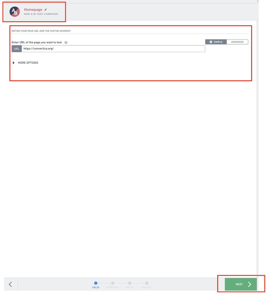 Then it will load the live editor.


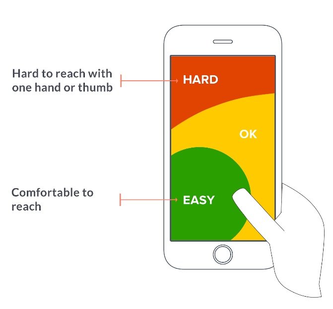 This has to be taken into consideration when designing your site.