Conversion Optimization Round-up – April 2021

Conversion Optimization Round-up – April 2021

In this month’s Round-Up we’ve got articles from VWO, Marketing Sherpa and Conversion Rate Experts covering eCommerce optimization, 3 quick Case Studies, one long-form FinTech Case Study and the Unbounce 2021 Conversion Benchmark Report. 

We hope you enjoy these as much as we did!

8 Tips for Optimizing Your eCommerce Homepage for Success

https://vwo.com/blog/8-tips-for-optimizing-your-ecommerce-homepage/

New from the VWO blog, we’ve got 8 ways you can optimize your homepage for success. When someone visits your site, you’ve only got a few seconds to show them at a glance, who you are, why they should buy from you, what you sell and how to find products. 

  1. Make sure you have optimized your homepage for search engines, as well as for users. Ensure your metadata and images are correctly optimized. And for users, having all the information they need above the fold.
  2. Include (and test) primary call to actions. 
  3. Optimize for mobile. 
  4. Build trust by displaying contact information.
  5. Provide a personalized shopping experience.
  6. Feature (and test) your best products.
  7. Display site security.
  8. Highlight sales above the fold.

VWO https://vwo.com/blog/8-tips-for-optimizing-your-ecommerce-homepage/

Purchase Intent: 3 quick case studies show how marketers increased opt-ins, leads, and ROAS by tapping into customer motivation

https://www.marketingsherpa.com/article/case-study/purchase-intent-case-studies-marketing-opt-ins-leads-ROAS-customer-motivation

This month Marketing Sherpa brings us 3 new quick case studies.

The first is a home improvement website which increased their opt-in conversions by 50%. They used Hotjar to visualize user interaction, in conjunction with Google Analytics to identify their best performing channels. They learned that there were 2 particular demographics that were engaging with the site, first time home buyers under the age of 30 and senior citizens above 65. 

With this information they were able to customize their funnels for the 2 demographics, tailoring the message for each, and subsequently improving the click-through rate from an ad landing page where they offered a lead magnet from 3% to 11%. Opt-in email conversions for the lead magnet increased by 50%.

The second case study shows how by focusing on purchase intent, a wine store increased their return on ad spend 24% above their goal. 

And lastly, an autobahn indoor speedway 10x’s their leads by leveraging an AI powered chat bot. 

Marketing Sherpa https://www.marketingsherpa.com/article/case-study/purchase-intent-case-studies-marketing-opt-ins-leads-ROAS-customer-motivation

Read through the 3 case studies in full here.

Conversion for mobile: how we helped grow a FinTech company by 470%

https://conversion-rate-experts.com/gohenry-case-study/

From Conversion Rate Experts we have a case study on how they improved conversions by 470% by adopting a mobile led approach. 

They go in depth into what aspects of mobile optimization they targeted and tested, beginning with the approach that mobile visitors are not just desktop visitors on a different device. By looking into visitor data, they determined that mobile visitors had very different intentions, likes and dislikes than their desktop counterparts.

They then tested a long form landing page, which increased sign ups 78% above the original. With this format, they had the chance to address all the objections people might have around a financial product for children. They were also able to visually get their message across and increase trust by highlighting their collaboration with Visa.

Conversion Rate Experts https://conversion-rate-experts.com/gohenry-case-study/

They also optimized Facebook ads for mobile, tested a new pricing page, homepage, and post sale page for mobile, all with generous increases in conversions. 

Read through the whole case study here.

“What’s a Good Conversion Rate for My Landing Page?” [Conversion Benchmark Report 2021]

https://unbounce.com/conversion-rate-optimization/what-is-a-good-conversion-rate-2021/

Unbounce brings us their all new Conversion Benchmark Report for 2021, which analyzes more than 33 million conversions across 44 thousand Unbounce-built landing pages.

They’ve been broken down into 16 key industries, and subcategories. You can use these benchmarks to help you determine how you’re performing against the rest of your industry, get actionable insights on changes you can make today, get data supported best practices, and help you build a culture of continuous improvement within your organization.

Author: Kurt Philip

Hi, I’m Kurt Philip, the founder & CEO of Convertica. I live and breathe conversion rate optimization. I hope you enjoy our findings.

We’ve worked with over 1000 businesses in the last 6 years.
Let’s jump on a quick call to see how we can help yours.

Book FREE CRO Call

Client Case Studies


Follow us on Youtube

42.32% Increase for a Lead Generation Website in the Healthcare Niche

42.32% Increase for a Lead Generation Website in the Healthcare Niche

The Website:

Our latest case study features a lead generation site in the assisted living niche.

It connects family caregivers with suitable care homes or carers and provides resources for those looking into various care options.


What We Tested And Why:

For this particular test, on mobile and desktop, we added call-to-action buttons at the end of each section of content on the property pages.

This is so users would have easy access after reading their section of interest.

For desktop only, we also added a call-to-action button on the sticky bar (in-page navigation).

We used heatmaps and click maps to find the sections where users interacted most.


Based on these observations, the team hypothesized the following:

  • Users read through each section of the property pages.
  • On desktop, they primarily use the in-page navigation bar to browse these sections.
  • There were not enough existing call-to-action buttons and they were not easily visible.

The Results:

For the combined desktop and mobile results, there was a 162.65% increase in clicked call-to-actions and a 42.32% increase in form submissions.

Our key takeaways were that to arrive at the best placement for call-to-actions, you must understand user behavior and interaction with the page.

Also, call-to-action buttons must be placed where users’ focus is so that they can easily take action as soon as they’re ready to. This is especially important on longer pages and on mobile.

Author: Kurt Philip

Hi, I’m Kurt Philip, the founder & CEO of Convertica. I live and breathe conversion rate optimization. I hope you enjoy our findings.

We’ve worked with over 1000 businesses in the last 6 years.
Let’s jump on a quick call to see how we can help yours.

Book FREE CRO Call

Client Case Studies


Follow us on Youtube

Conversion Optimization Round-up – March 2021

Conversion Optimization Round-up – March 2021

Today we’ve got for you all the latest articles in the CRO world. Beginning with ways virtual reality can optimize eCommerce business conversions. Moving onto formulas you can use to write great landing page headlines. Then we’ve got some expert advice on developing a hypothesis for marketing experimentation. Topping it off with 4 quick CRO case studies. 

Lets get stuck in..

4 Ways Virtual Reality Can Optimize eCommerce Business Conversions

https://vwo.com/blog/4-ways-virtual-reality-can-optimize-ecommerce-business-conversions

New on the VWO blog is an article on how virtual reality can assist in ecommerce businesses. The fast evolving technology is now being used in the healthcare and real estate industries to name a couple. 

The first step is to test whether VR (virtual reality) or AR (augmented reality) would actually work for your eCommerce business. Start by collecting data from your target audience, using surveys or polls, on what their concerns are about the ecommerce purchasing journey, and how they feel about VR/AR. You can also use analytics tools to gain insights into whether VR/AR would improve the user experience.

Once you’ve determined that VR/AR could be beneficial for your business, the article takes you through 4 ways in which it can be utilized:

  1. Testing
  2. Optimize your conversions with customer service
  3. Optimize your conversions with user experience
  4. Optimize your conversions with marketing

VWO https://vwo.com/blog/4-ways-virtual-reality-can-optimize-ecommerce-business-conversions

Check out some examples of great VR marketing campaigns on the blog.

7 Formulas for Landing Page Headlines that Practically Write Themselves (With Examples)

https://unbounce.com/landing-page-examples/formulas-for-landing-page-headlines-with-examples/

From Unbounce we have a guide on how to create effective landing page headlines. 

While there is no single right way to write a headline, there are fortunately some tried and tested formulas you can use.

First they cover the basics on what makes a good headline. 

Unbounce https://unbounce.com/landing-page-examples/formulas-for-landing-page-headlines-with-examples/

Then moving onto the 7 landing page headline formulas:

  1. The How-To Headline
  2. The Agitator
  3. The Value Prop (AKA the Promise)
  4. The Superlative
  5. The Call to Action
  6. The Special Offer
  7. The Playful Headline

To read through these formulas in depth, check out the article here.

Expert Advice on Developing a Hypothesis for Marketing Experimentation 

https://www.invespcro.com/blog/expert-advice-on-developing-a-hypothesis-for-marketing-experimentation/

This month on the Invesp blog, they share their process for crafting a marketing hypothesis, as well as tips from experts in the field.

They begin with a section covering what a hypothesis is and the format in which it must be stated. 

Next, moving onto prioritizing your issues to determine which will impact your bottom line the most. This is where hypotheses come into play. For each problem, you must create a hypothesis for it. It’s important to know that a hypothesis can be tested in many different ways as seen in the diagram below.

Invespro https://www.invespcro.com/blog/expert-advice-on-developing-a-hypothesis-for-marketing-experimentation/

Considering there are multiple ways to test a single hypothesis, one failure doesn’t necessarily mean the hypothesis is wrong. It just means the way you have implemented it could be wrong. 

Even if you do disprove a hypothesis, you will still gain valuable insights, which you can use to formulate further tests or hypotheses. 

Following on from this is the expert round-up. Check it out here

Conversion Rate Optimization: 4 quick CRO case studies to help you increase revenue, mobile conversion, and site searches

https://www.marketingsherpa.com/article/case-study/conversion-rate-optimization-4-CRO-case-studies-increase-revenue-mobile-conversion-site-searches#

Marketing Sherpa brings us 4 new case studies this month:

  1. Beginning with an insurance company that increased their conversions from 3.1% to 8% by better understanding the customers desires. 
  2. An online marketplace that nearly doubled their searches by changing their homepage subheader. 
  3. Third is an outdoor website which tripled their revenue by improving their site speed.
  4. Lastly, a lead generation company that increased their mobile conversions by 18% by putting themselves in their visitors shoes.
CRO Round-up – February 2021

CRO Round-up – February 2021

We’ve got some great articles to share with you this month. Up first is a guide to landing page optimization tactics for different sources of traffic. 

We’ve also got an A/B testing How-To for those new to conversion rate optimization. As well as a post on how to write a solid A/B testing hypothesis. 

We also dive into some consumer psychology with perceptual sets, and how to use them in marketing. And lastly, we cover retargeting and how this can be used as a powerful CRO tool.

Landing Page Optimization Tactics for Different Sources of Traffic

 https://www.invespcro.com/blog/landing-page-optimization-tactics-for-different-sources-of-traffic/

How are you currently optimizing your landing pages? Are you taking a different approach depending on where the visitor came from, for example social media, organic traffic, or a guest post? InvespCRO delves into the main intention of the visitor in the traffic sources below:

Social media:

  • Consistency is key. The colour, typography and visual design of the landing page, should match the social media ad. 
  • Landing pages should be optimized for mobile.
  • Each element on the page should notify the visitor they’ve landed at the right place, and that the offer they wanted is only a CTA click away.

Invespcro https://www.invespcro.com/blog/landing-page-optimization-tactics-for-different-sources-of-traffic/

Podcast:

  • Appearing on a podcast can be a great source of traffic. Make sure you aren’t just sending people to your homepage though. 
  • If you want to have high conversion rates from that traffic, make a customized landing page.
  • It should address the main topics covered in your podcast episode, so that it has the same “feel”.

Email Signature:

  • Sending people to your homepage is not necessarily bad here, but consider using it as an opportunity to add a more personal, bottom of the funnel touch. 

Thank You Landing Pages:

  • Your thank you page, that visitors see after filling out a form can be utilized as an opportunity to upsell.
  • Give your leads the opportunity to educate themselves and continue browsing after they convert.

Visitors Who Have Just Signed Up:

  • An effective post sign-up page should make full use of the momentum that the visitor has at that very moment.
  • Use a post sign up page or pop up to drive even more opt-ins to create a snowball effect.

How To Do A/B Testing

https://www.convertize.com/how-to-do-ab-testing/

New from Convertize is a no fuss guide to getting started with A/B testing. 

Where do I start?

  • First you need to define what your goal is
  • You’ll also need enough traffic to run reliable tests
  • User research
  • Hypothesis
  • Testing tool

Choosing the most suitable testing tool:

  • For growing businesses Convertize is recommended. 
  • For agencies VWO is the best choice. 
  • For app developers, Optimizely is the go to.

5 steps to A/B testing:

  1. Funnel analysis
  2. Creating and prioritising your hypotheses
  3. Designing your experiment
  4. Running your experiment
  5. Interpreting your result

The 3 most common mistakes: 


  1. Not prioritising the right things. Make a priority table to ensure you are testing the things with the most potential and importance.
2. Testing too many things at once. Ideally you should only be testing one thing at a time so that you know what change has resulted in an increase/decrease.

3. Stopping tests too early. Statistical significance must be reached to ensure the results are reliable. 

Check out the article here for more detailed descriptions.


How to Write a Solid A/B Test Hypothesis

https://blog.optimizely.com/2015/01/29/why-an-experiment-without-a-hypothesis-is-dead-on-arrival/

Running an experiment without a hypothesis is like heading on a road trip with no destination in mind. You will end up somewhere, but you might not gain what you wanted from the experience. 

“If you can’t state your reason for running a test, then you probably need to examine why and what you are testing.”

Brian Schmitt, Conversion Optimization Consultant, CROmetrics

A hypothesis states what is being changed, what you expect the outcome to be, and why. Then your test will either prove or disprove this. 

The 3 components of a hypothesis are: “If ____, then ____, because ____.”

  • The variable
  • The result
  • The rationale
What are the outcomes of a strong hypothesis? Whether you prove or disprove your hypothesis doesn’t necessarily matter, as either way, you will gain some knowledge from the result. Which you can use to inform your next hypothesis.

Not all hypotheses are created equal. Make sure you’re testing high impact optimizations, rather than testing for the sake of it. 

Read the full article here.

How Understanding Perceptual Sets Can Make You A Better Marketer

https://cxl.com/blog/perceptual-sets/

Why do CTA’s that look “ugly” sometimes perform better than ones that look “pretty”? Understanding perceptual sets and how they affect our behaviour can give you insights into marketing & CRO strategy.

What feeling, sensation or need does your brand provoke? The context in which your customers or clients engage with you, can unconsciously affect their behaviour. For example, if someone is shopping on your site and sees a coupon code, but they don’t have one, they are more likely to get FOMO about missing out on an offer, and abandon cart. 

Another example is if you have trigger words, such as spam present (to reassure them they won’t be spammed) could actually have the opposite effect, of making them think twice about signing up. 

The Ebbinghaus Illusion and Product Value Perception:

It can be a challenge to portray a product’s actual size in an online store. However, representing the size accurately can make or break people’s purchasing decisions, and be a huge boost to conversions. 

Take the example below:

The orange circle on the right looks bigger, but in fact, they are actually the same size. The Ebbinghaus Illusion is when things surrounded by smaller things look bigger. This also applies to e.g. how big serving sizes look when placed on a smaller plate, vs a larger plate.

If you’re selling furniture, or household items such as speakers, it pays to include a photo of how it actually looks in a real setting. Overstock is a great example of a brand that does this. 

Perception of product value:

It has been repeatedly proven that the size of a product image influences the amount people will pay for it. We naturally equate more size, with more value. 

The reverse was true for experience focused goods though. And that goes to show that these things should always be tested. 

In conclusion, humans tend to believe that they are rational, but in fact, are anything but. While understanding human behavior and psychology is a lifelong pursuit, it pays to learn the many ways in which we don’t act or behave as we should, so you can use them to your advantage.

Retargeting: An Incredibly Powerful CRO Tool

https://vwo.com/blog/retargeting-an-incredibly-powerful-cro-tool/

What is retargeting and how is it different from remarketing?

Once a visitor has browsed your site, abandoned cart, or purchased something, they are tagged with a retargeting cookie in their browser. This allows you to show relevant ads based on their activity once they leave. You can also combine retargeting, with A/B testing, for better performance and increased conversions. 

While retargeting focuses on roping prospective customers into your sales funnel predominantly through advertisements (banner and social media ads), remarketing strategies remind users to re-engage through emails or push notifications.

Retargeting isn’t “creepy”.

Studies have shown that more people actually react positively to retargeting ads, than negatively. A case study suggested that using retargeted advertisements is a very effective way to win back lost customers. 

A company called Postano, created a range of banner ads to target marketing directors in different industries. They then optimized these banner ads for maximum effectiveness. All visitors got cookied and were retargeted for 60 days. At the conclusion of their 60 day campaign, they saw a 364% increase in clickthrough conversions and a 278% increase in conversion rate (measured by requested product demos.)


Once you pull people back into the sales funnel, it’s time to focus on conversions. Retargeting customers are likely to have high buyer intent. 

Crucial retargeting concepts for CRO.

  • Observing your visitor behaviour by using tools to discover what they are actually doing on your site. On-page surveys are also a powerful tool to understand their hesitations.
  • Derive insights on what to test on your high traffic landing pages using heatmaps.
  • Create a CRO roadmap for continuous improvement.
  • Retargeting in the B2B space:
  • Use industry-targeting
  • Be mobile first
  • Use email addresses for remarketing campaigns
  • Segment your visitors in the funnel

When done well, retargeting (or remarketing) enables marketers to build a holistic and sustainable CRO ecosystem that caters to lost visitors at every stage of the funnel. 

Author: Kurt Philip

Hi, I’m Kurt Philip, the founder & CEO of Convertica. I live and breathe conversion rate optimization. I hope you enjoy our findings.

We’ve worked with over 1000 businesses in the last 6 years.
Let’s jump on a quick call to see how we can help yours.

Book FREE CRO Call

Client Case Studies


Follow us on Youtube

26.9% Increase for an eCommerce Business in the Homeware Niche.

26.9% Increase for an eCommerce Business in the Homeware Niche.

The Website:

This case study features an eCommerce business in the homeware niche.

This Shopify store features a small selection of high quality tableware.

It is a UK based site, but they ship all their products worldwide.

They work with a select few reliable sellers and ship directly from the manufacturers, to keep prices competitive.

What We Tested And Why:

For our first test for this client, we tested redirecting users to the Cart when they click the Add to Cart button on mobile and desktop. A relatively simple change but one that works well on the right type of site.

Our reasoning behind this change was that even though there was already a Buy Now button, most people are only purchasing one product per visit, so it would create less friction in the checkout process

That is an important thing to note. This test will only work well if, when you look over the data, the average items per order is one or near enough to one.

The Results:

We ran the test for 19 days, to reach 98% statistical significance

The results showed a 47.7% increase in conversion rates on mobile device users and a 71.4% increase in revenue per visitor on mobile device users.

There was no increase in conversions on desktop.

By rolling out the winner to a version of the website that only mobile users would view, the overall increase in conversions from this test was 26.9%.

This is a very simple test. It goes so show, when the right things are tested on the right areas of your website they can yield fanastic results.


Author: Kurt Philip

Hi, I’m Kurt Philip, the founder & CEO of Convertica. I live and breathe conversion rate optimization. I hope you enjoy our findings.

We’ve worked with over 1000 businesses in the last 6 years.
Let’s jump on a quick call to see how we can help yours.

Book FREE CRO Call

Client Case Studies


Follow us on Youtube

CRO Round-up – January 2021

CRO Round-up – January 2021

Here’s the round-up for the best new CRO articles for January 2021.

First up, we’re starting with a review on the state of conversion optimization in 2020. Not technically from January, but we thought it a good starting point!

Next, we’ve got a guide on CRO analytics, with examples on how you can use analytics to help with your CRO campaigns, a landing page optimization guide, and lastly, a complete guide to A/B testing (and CRO tools) for 2021.

Then we also have some ideas on how to use Hello Bar to increase conversions, as well as some ways to use email marketing for improving your eCommerce store conversions.

The 2020 State of Conversion Optimization Report

https://cxl.com/blog/2020-conversion-optimization-report/

For this report, they surveyed 399 optimizers around the world to see what the biggest issues were in the industry.

The main impact of Covid on CRO last year was how the lockdowns affected web traffic. For example, any travel related websites would have had their demand reduced almost overnight, which makes it impossible to run tests on.

Optimizers were also asked what their favourite analytics tools were, with Google Analytics far outweighing all the others, and Hotjar coming out on top for mouse tracking & heat mapping. A surprise winner for the most used testing tool was Google Optimize. Since it came out in 2017, it has quickly become the most widely used tool, possibly because it’s free and allows almost anyone to enter the testing arena.

CRO Analytics: How Analytics Help You Ace Your CRO Game (With Examples)

https://vwo.com/blog/cro-analytics-ace-your-game-examples/

To make data based decisions for your CRO campaigns, it’s essential to have an understanding of the foundations of analytics, and how it can work together with your CRO tools. 

In this guide, they cover:

  • Tracking goals: Macro and micro conversions
  • How to leverage insights from Google Analytics reports for CRO, and what the different report types are
  • The five different reports that can help you achieve your desired conversion rates
  • How to set up GA reports in your CRO tool

With the insights gained from having your goals set up properly, and analyzing the different reports, you’ll be able to make informed decisions on what to test using the data itself.

Landing Page Optimization: A Comprehensive Guide

https://instapage.com/blog/landing-page-guide/


In this guide, Instapage provides an in-depth overview of their recommended process for landing page optimization. 

To summarize:

  1. Collect data
  2. Analyze and develop a hypothesis
  3. Determine metrics for success
  4. Eliminate confounding variables
  5. Set up your test and QA
  6. Let the test run
  7. Analyze the results
  8. Continue testing

They then provide some examples of elements that can be tested on a landing page:

  • Form fields
  • Media
  • Copy
  • Page length
  • Trust indicators
  • Arrangement of elements
  • Number of elements

Go check it out!

13 Creative Hello Bar Examples Proven To Boost Conversions

https://optinmonster.com/creative-hello-bar-examples/

Sharon Hurley Hall of Optinmonster brings us some great examples of how a Hello Bar can be used to increase conversions.

This banner bar is often used to:

  • Grow your mailing list
  • Get new leads
  • Drive more sales
  • Give discounts
  • Educate visitors

She’s broken down each example by explaining its main purpose, then gone on to show how to make it using Optinmonster. A very helpful resource for anyone looking to add one of these to their website. 

Which is the best time to send eCommerce emails to your customers?

https://www.humcommerce.com/blog/ecommerce-email-timing/

Email marketing has become an essential part of the sales strategy for eCommerce stores. This is because emails enable you to connect with your customers, win their trust, and continue communication. 

According to the Humcommerce team, email marketing will:

  • Drive conversions
  • Work better than social media
  • Save you money (compared to other advertising channels)
  • Reach a wider audience
  • Use automations for increased relevance and timeliness

This guide covers the metrics you need to use to monitor the performance of your email campaigns (click-through rate, click-to open rate & open rate), as well as the best day and time to send your emails. 

According to a study by Omnisend, Thursday is the best day to send emails, followed up by Tuesday. As always, it’s essential to test what works best for you and your goals.

What is A/B Testing? The Complete Guide (2021)

https://www.convertize.com/ab-testing/

This comprehensive guide by Convertize covers all things A/B Testing for newbies. 

Starting with what exactly is A/B testing and how does it work? What is the difference between A/B testing and multivariate testing? 

They go on to provide examples of successful A/B tests in the digital marketing world, and suggestions of tests to try, including titles and subtitles, website notifications, images and web forms. 

Check out their explainer video here:

You can also check out Convertize’s list of 34 CRO tools every digital marketer needs in 2021 here.

Author: Kurt Philip

Hi, I’m Kurt Philip, the founder & CEO of Convertica. I live and breathe conversion rate optimization. I hope you enjoy our findings.

We’ve worked with over 1000 businesses in the last 6 years.
Let’s jump on a quick call to see how we can help yours.

Book FREE CRO Call

Client Case Studies


Follow us on Youtube

eCommerce Shopping Cart UX Design Tips

eCommerce Shopping Cart UX Design Tips

Every year, 4 trillion dollars are lost in eCommerce sales due to cart abandonment.

That’s a punch to the gut for eCommerce businesses. Buyers who’ve clicked the add-to-cart button are usually ready to buy. They’ve looked at a product. Loved it. Decided they want it.

And yet, for some reason or another, they balk at the shopping cart. They abandon it and never proceed to check out and pay.

What does this mean for you? It means that hidden opportunities are hiding on your cart page. Optimize them and you’ll see conversion increases very quickly.

So that’s what we’re going to talk about today. Let’s take out that sting caused by all the lost revenue from a low-converting shopping cart page. Let’s look at eCommerce shopping cart UX designs that optimize user experience.

I’ll walk you through:


What is the purpose of an online shopping cart page?

The shopping cart page is for customers to see all the products they’ve added to their cart in your online store. It includes an itemized product list and its cost and is the customers’ last stop before they check out and pay.

Think of the cart page as that moment just before you go to the cashier. If you have a shopping list, this is the time you give it a final check to make sure you’ve got everything you wanted to buy. You don’t have a credit card in hand yet. But you know that if all goes as planned, your next stop is at the cashier to pay.

As you can see, shopping cart pages are a pivotal part of conversion optimization. If the shopping cart design or the cart page is not optimized for conversions, a customer –who’s very close to giving you his money, I may add– will leave out of sheer frustration.

So how should you optimize the shopping cart page for conversions?

There are many things you can do. But for now, we’ll talk about some important shopping cart UX best practices to get you started.

What should be in an eCommerce shopping cart page for optimal user experience?

experience, feedback, survey

Based on the hundreds of tests we’ve done at Convertica, there are some elements that a shopping cart page must include. We think of these as required elements for a smooth user experience.

These elements are:

  • the option to
    • add, decrease or delete an item
  • an itemized list of products ordered. This list should include
    • the color, size, and quantity
    • a clear thumbnail image of the exact item they ordered
    • a product title linked to the product page
    • the cost of each item and the overall total cost
  • a CTA button to checkout and/or to continue shopping
  • trust signals
  • shipping details and other added costs
  • the estimated delivery time

Here are some elements which are of lesser importance but worth testing:

  • The ability to move the item to a wishlist or a save-for-later button
  • Customer testimonials
  • Upsell or down-sell options
  • an option to mail the items to themselves
  • the ability to calculate shipping fees (especially when you deliver internationally)

eCommerce Shopping Cart Page Design Optimization

(with examples of the best shopping cart UX Designs)

1. Give clear feedback when a buyer clicks the add to cart button

Imagine a person who’s never shopped online before. He clicks the add to cart button on the product page and nothing happens. I bet he’d be asking questions like:

  • Did I buy that?
  • Where did it go?
  • Did I click that button hard enough?”
  • Is it already in the cart?

See. We need feedback when shopping online. So when customers purchase an item to the cart, he’ll need to know that he’s done the right thing. That his orders are already stored in the cart. This reduces any anxiety he may have. It also builds on his confidence and trust in your system and your business —which is exactly what you want when he already has the intention to buy.

So the first thing to shopping cart page optimization is to give clear feedback when a buyer clicks the add to cart button. Show him that he has made something happen when he clicked the button.

There are many ways you can do this. You can

  • show an overlay or popover with info that the item has been added to the cart
  • and change the cart icon. Most sites do this by adding the number of items bought. Big Bonus points if the number is in a different color. And even better if the subtotal of the items is also included.

Here are some examples of how some eCommerce sites with great user experience do this.

Let’s start with one that Amazon has recently been experimenting with. Here’s what it looks like. A small popup shows on the side of the page with images of the most recent items added to the cart. It includes crisp thumbnail images that are linked to the product details page, too.


Another way you can give feedback is to alter the button’s design indicating that the product has been added. Best Buy does this by changing the button’s color and text as the item is being added to cart.


Lastly, the shopping cart icon should also change. Most eCommerce stores do this by adding the number of items added to cart. Toys R Us takes this a notch better by adding the cost of the items, too.


2. Make shipping info and other added costs clear

Online shoppers have a big issue with paid shipping. It’s at the top of the list why people abandon their carts. If you charge for shipping, you have a big psychological hurdle to overcome. As this Reddit user finds out in his eCommerce experiment, customers would rather pay more for a product than pay for shipping.

Because shipping cost affects buyer behavior a lot, address it at the cart page. Free shipping is ideal but if you must charge for it, then make it clear how much it’s going to cost them. Ideally, if there’s a big difference in shipping for different destinations, allow buyers to calculate shipping within the page.

When designing the shopping cart page for UX, here are some things to take note of:

  • If you offer free shipping, then make it clear on that page
  • Offer the option to calculate shipping fees on the page
  • If you only offer free shipping when the total purchase cost is at a specific amount, then make that clear too. Put something like, “You’re $20 dollars away from qualifying for free shipping
  • If there’s a shipping fee for each item, show the overall total

Check out how Walmart does this. Notice the message, “Want free delivery? Add $15 more”. They’re hitting two birds with one stone here. They’re overcoming the problem that people have with shipping fees and they’re also increasing average order value.


3. Allow customers to have control of the cart

Imagine you’re doing your weekly shopping at a grocery store. But there’s a catch. Once you’ve added things to your mini cart, you’re not allowed to take anything out of it. How frustrating would that be?

But that’s what you do when you don’t give customers any control of the shopping cart page designs. It disrupts their shopping experience and escalates their frustration level.

So yeah. This is the time when buyers should be given a lot of control in online stores. Here are shopping cart page UX designs to make this possible. Allow customers to:

  • add, get rid or decrease the quantity of the number of items ordered
  • change the color or size
  • add items to a wishlist, save for later, or email the list of items to themselves.
  • see a full page with all the items included.
  • go back to the product pages of each item ordered. Do this by linking the image or the item name
  • have a clear visual image of what they’ve added to cart

Crutchfield does this well. Buyers can easily remove, save or add an additional item to the cart. Notice how it even has a shipping/delivery estimator on the page.


4. Make the call to action buttons clear

The cart page’s purpose is to get the shopper to “move along” and pay. You lead him from one step to the next with a clear call to action button.

If the buyer is already happy with what he sees on the cart page, then it should also be easy for him to take the next step —which is towards the all-important page where money passes hands— the checkout page.

Make this button to checkout very clear. So clear that there’s no doubt in the buyer’s mind what to do next. We have an article just for CTA buttons, so I won’t tell you more about that here. But the important thing to bear in mind with buttons is that they have to stand out from the rest of the items on the page. You can do this by making it bigger or using a color that’s different from the rest of the colors on the page.

It’s worth testing the shopping cart button UX design. It might just increase your conversion rate. Even Amazon, which has used the same button for years, has just recently started testing a rounded button. If they regularly test, shouldn’t we all?


source


Talking of testing, here are a couple of tests you can do in your CRO campaigns which we often find positively affect conversion rates:

  1. Apart from the Checkout button, also add buttons that take the shopper to “Continue Shopping”, or to the last page they looked at.
  2. Try a sticky “Proceed to Checkout” button that’s always visible to the buyer. We see this increase conversions especially for buyers using mobile devices.

5. Show different payment methods

Not everyone wants to pay by credit card. This is especially true in some countries where buyers prefer using offsite payment processors. With insight on the types of buyers you have, ensure that you make it clear on the cart page the different payment methods available.

Show logos that your buyers are familiar with. Here are some of the ways that different eCommerce stores do this.

Build.com shows 3 different ways to pay on their cart page.


6. Make the best use of trust signals

Buyers have to trust you first before they’ll give you their money. If you’re not a household name —which is the reality for most eCommerce website— encourage customers that you’re a trustworthy and credible business.

Stats show that 60 to 80% of buyers in many eCommerce websites are first-time visitors. This means most visitors who visit your site don’t know anything about you. So you have to prove yourself to them. You do this with trust badges and signals. Here’s our complete guide on using social proof if you want to know more about trust signals.

But for now, just know that adding trust signals is one of the easiest and cheapest things you can do to increase conversions.

Have a look at the top reasons why buyers do not have confidence in eCommerce.


source


That’s a lot of fear that you can very quickly get rid of by simply adding trust signals.

Here are a couple of cart pages of two sites. Study them for some shopping cart UX design inspirations. And how they use trust signals on the page.

Build.com shows the star rating for the product.


John Lewis adds not one but three trust signals on its page:

  1. The Norton secure logo
  2. Logos of credit card companies and other payment gateways
  3. The text: BESTSELLER: 33 bought in the last 24 hours (social proof)


You now know the best practices for cart page UX designs.

But if you must remember only one thing, it’s this.

The cart page’s job is to make it easy for your customers to see the items they’ve added to cart. The keyword is easy.

Make it so easy for them that they don’t have to do a lot of thinking. Make it so easy that their journey from clicking the add to cart button all the way to checkout is smooth and not burdened with pauses of uncertainty, overwhelm, or difficulty.

Do this and you’ll have buyers who trust you and find pleasure in shopping with you. And before you know it, more people who land on your cart page will have no problem clicking the checkout button.

Author: Kurt Philip

Hi, I’m Kurt Philip, the founder & CEO of Convertica. I live and breathe conversion rate optimization. I hope you enjoy our findings.

We’ve worked with over 1000 businesses in the last 6 years.
Let’s jump on a quick call to see how we can help yours.

Book FREE CRO Call

Client Case Studies


Follow us on Youtube

eCommerce Checkout UX That Boosts Sales and Conversions ( 4 CRO Tests You Can Copy)

eCommerce Checkout UX That Boosts Sales and Conversions ( 4 CRO Tests You Can Copy)

Want some quick wins for your eCommerce store’s CRO campaigns?

Make changes to the checkout UX and you’ll see results quicker than changing any other part of your store.

Why? Because this is the bottom of the funnel. The place where customers have high motivation to buy. And when you make small changes to the page, it can mean big gains or losses. That’s why at Convertica when we start a new optimization campaign, the checkout UX and flow is one of the first things we work on.

So what is a good checkout conversion rate? The average rate is 24.4%. But if you’re looking for a benchmark for your store, you should also look at the average checkout conversion rate for each industry. For example, the cart to checkout rate in the fashion industry is 30.9%, but in the finance sector, it’s only 19.6%. (source)

Now that you have a benchmark, the next question is: how should you optimize your checkout page? Which elements should you change to increase conversions?

My high-level answer is this: Go back to the basics on optimizing user experience. That is, make the process as easy for customers as possible. Pave a smooth road for them right up to the moment they click Pay.

This is, however, easier said than done. That’s why today, we’re going to look at case studies that you can refer to next time you try to improve the UX/UI of your store’s checkout page.

eCommerce checkout UX best practices: 4 case studies you can learn from

Think of your customer at checkout as that buyer in a hurry in a brick-and-mortar store.

He’s got a couple of items in his hands. Exact cash at the ready. And he’s itching to dash out of the store as quickly as possible.

He has no time to fuss. He just wants to pay and get it all over with. That’s usually easy to do offline.

But how can you recreate this experience online? You can’t just get his money. Before you can do that, there are many things you require from him first: his name, billing & delivery addresses, credit card number —among other things.

So the question is: how can you simplify the process so that the buyer can quickly finish the transaction?

It’s not easy. But you can study the experiences of others to glean insights into what you can do to smoothen the checkout process.

Here’s what four eCommerce store owners did to optimize theirs which led to large increases in profit for their businesses.

  1. Changed the error message of declined credit cards and recouped 30% of abandonments
  2. Reduced friction at checkout and halved abandonment rate
  3. Added guest checkouts for an extra 300 million dollars
  4. Optimized checkout flow & increased conversions by 11%

Buckle up. Let’s get into the details of each of these optimization tests.

I. Baymard changed the error message of declined credit cards and decreased cart abandonment rate

Imagine this. You’re ready to pay. You add in your credit card number. And it gets declined.

There could be a whole host of reasons why. But what do you do? If you really want the item, you might try another card. But if you’re that buyer in a hurry, you’ll quickly get frustrated. Decide you don’t want the item anyway. And abandon the cart.

In this first case study, Baymard Institute salvaged 30% of the customers whose cards got declined by changing the error instructions. That’s right. Simply changing the error message inspired more people to complete the checkout process.

Here’s the thing. Declined credit cards is one of those annoying things that will plague you as an eCommerce store owner. Why? You have no control over it. The card isn’t declined just because the buyer put in the wrong number. The bank provider declined it. And they don’t tell you why. So as an eCommerce store owner, you can’t even tell the buyer why the credit card was declined in the first place.

But this Baymard Institute study shows us that you’ve got a way to appease your frustrated buyer. All you have to do is optimize the error message by telling the buyer they have another payment option.

By adding the simple sentence: “Tip: You may try another credit card or pay with paypal“, Baymard recouped 30% of sales at this stage of the checkout process.

Takeaway: Look at the message you currently use for declined credit cards in your eCommerce stores. Do you explicitly say that there is another way to pay? Also, if you don’t offer an alternative payment yet, you should consider it. This won’t only decrease cart abandonment but it will also protect your store should any problem occur with your primary payment provider.

II. Asos reduced friction at checkout and halved abandonment rate

Friction is the buyer’s psychological resistance to any given element on your website. It’s inevitable online. Your job is to reduce it as much as possible.

And nowhere is this job more needed than at checkout. That’s what Asos found out in an optimization campaign where they optimized their checkout pages by reducing different friction points. Here are some of the changes they made:

  • They enclosed the checkout process. They got rid of any distractions at checkout. They made sure that the buyer only had one thing in mind at this point. That is to finish the process and pay.
  • They showed security symbols. This boosts trust and credibility.
  • They added a progress indicator. This signals to the buyer where they are in the process and how many more steps they have to complete.
  • They provided two ways to add a billing address –manual and automatic postcode lookup. This is because they’ve found that often there are addresses that automatic lookup can’t properly find.
  • They allowed buyers to click back without losing security messages or important information. This helps in decreasing user frustration.

Takeaway: Friction is a big conversion killer. Look at your checkout page and see which elements may be stopping customers from completing the checkout process. Then implement the UX/UI changes needed to reduce friction. This is a process that needs continuous testing but as you do it, you’ll find that you understand your buyers more and with that comes an increase in conversion rates, too. Here’s our blog post on how to increase cart abandonment rate if you want to know more about how to reduce friction points in your checkout pages.

III. Jared Spool changed the checkout form of an eCommerce store he was testing for an extra 300 million dollars in revenue within a year 

This sounds like one of those clickbait headlines. But that’s exactly what happened in one of Jared Spool’s campaigns for a major eCommerce store.

What change did he make?

It was a simple change in the checkout form. The form was one that buyers filled out before they could pay. You know the one I’m talking about. The one where you’re asked to either login or register before paying. Turns out buyers have a big problem with this.

Here’s what Jared Spool says about this:

“The problem wasn’t as much about the form’s layout as it was where the form lived. Users would encounter it after they filled their shopping cart with products they wanted to purchase and pressed the Checkout button. It came before they could actually enter the information to pay for the product.”

Here’s the problem. While store owners may think that buyers don’t mind this simple and easy task, it’s actually a big friction point. See. Buyers don’t want a relationship with you. They just want to pay.

Remember what I said about the buyer in a hurry? That’s exactly what’s at play here. And asking them to login or register before they’ve even entered their payment information was stopping many of them from checking out altogether.

So what did the UX designers do? Here’s what Spool says:

“They took away the Register button. In its place, they put a Continue button with a simple message: “You do not need to create an account to make purchases on our site. Simply click Continue to proceed to checkout. To make your future purchases even faster, you can create an account during checkout.”

That simple change in the checkout flow and messaging increased the number of buyers by 45%. And for the big eCommerce store he was working with, this resulted in an extra $300,000,000 that first year.

Takeaway: Conversion rate optimization doesn’t have to be so complicated. Even small changes in your checkout process can mean big gains in your revenue. Investigate the checkout flow in your eCommerce store. Look at every single element. And figure out what things you can change that will make the buyer’s experience easier and smoother.

IV. Graph Digital optimized checkout flow and increased conversions by 11%

Optimizing the checkout page is what a lot of UX designers start when starting a CRO campaign. But another cause of friction is the checkout flow. How does your customer move from adding products to cart to completing the whole process?

For many stores, this is often a long process with lots of steps to go through. And with many forms to fill in. The more work a customer has to do, the more likely he’s not going to convert. That can only lead to low conversions.

That’s why when Graph Digital optimized Graham & Brown’s checkout pages, this was one of the elements they looked at. That’s because their initial observations amplified some glaring friction points. These were:

  1. The checkout screen was a primary barrier to paying.
  2. The checkout pages had a poor layout that was not user-friendly
  3. The form input did not validate anything until after the buyer clicked submit

Knowing these three things, they proceeded to make some changes. Their goal was to make checkout as streamlined as possible.

First, they reduced the checkout process to only one page. They cleaned up the design, used inline form validation and eliminated any element that wasn’t important. They also made it easy for buyers to move between steps. And to edit information without going through a lot of hoops.

Doing all these changes made the customer journey much easier. Remember what I said about the buyer in a hurry? That’s exactly what they did. They looked at their process and made changes to it so that the hurried buyer can swiftly go from one step to the next without any hassles. Or unnecessary work.

And by thinking about the customer, they increased checkout conversions by 11%.

Takeaway: Give your checkout page a closer look. Go through it as if you were a customer. Is there anything that slows you down or stops you from completing the process? If there’s even one element that’s making the buying experience less than optimal, then get rid of it. Or change it. Remember, customers here are so close to buying. Get out of the way and just let them buy.

V. Recap

You can’t convert all the people who add products to their cart. Some of them may have had no intention of buying in the first place. But there are cases when people who have the intent to buy, leave and abandon the cart because the checkout process is making them work too hard. These are the buyers you want to reach and keep in your ecosystem.

The good news is that there’s something you can do about it. Examine these case studies and compare them with the checkout UX in your eCommerce store. Then test them and see how that affects conversion rates.

All these tests may take time but once you find something that works, you know you’ve hit the jackpot. And whatever conversion gains you make will continue to benefit your business for many years to come.

Author: Kurt Philip

Hi, I’m Kurt Philip, the founder & CEO of Convertica. I live and breathe conversion rate optimization. I hope you enjoy our findings.

We’ve worked with over 1000 businesses in the last 6 years.
Let’s jump on a quick call to see how we can help yours.

Book FREE CRO Call

Client Case Studies


Follow us on Youtube

eCommerce Homepage Best Practices: UX/UI Tips

eCommerce Homepage Best Practices: UX/UI Tips

The homepage for eCommerce stores is not the easiest one to build for conversions.

Why? Because many of the visitors who get to it are at different stages of the customer journey. This makes it difficult to show each one of them exactly what they came to your site for.

So how do you design an eCommerce homepage with UX in mind? Like a lot of things in site optimization, it requires knowing your customers. First, know their reasons for visiting your site. Next design the page so that they know — in a few seconds of arriving — that they’re on the right website. Then quickly direct them to a page that is more in-line with their purchasing intentions.

That’s the short of it.

But we both know it’s not as easy as that, is it?

That’s what I’m writing about today. I’ll show you the best practices for eCommerce homepage UX and the things we always do in our optimization projects at Convertica. We’ll talk all about:

The Purpose of an eCommerce Homepage

An online store’s homepage has three main goals:

  1. Take customers to another page that best fits their journey in the sales funnel.
  2. Establish store credibility.
  3. Solidify brand message.

So why do you need to know these three goals? Because they dictate the design and content of your homepage.

Here’s what I mean.

Take the customer to a more appropriate page

Let’s say you’re a store in a big shopping mall. How do you tell shoppers what things you sell? You use your shop’s glass window display to attract their attention. If you’re selling only men’s shoes, that’s an easy display to make.

But what if you sell an assortment of things? How do you choose what to display in the limited area that you have?

This is the same question an eCommerce homepage designer has to answer. And you find the answer by delving into the site analytics to know the intention of the visitors who land on the page. Where do they come from? What do most of them end up buying? What’s the demographic? All this information will help you decide what to display and show on the homepage.

Establish credibility

Website visitors need to trust you first before they buy from you. They want assurance that your site is fully legit.

So whenever a new visitor enters your site, he will always have questions like these:

  • Does this site look trustworthy?
  • What do other customers say about the store and its products?
  • Is there a way to know this site is credible?

Sure you want to have these trust signals visible throughout your site. But it’s even more important on the homepage where many of your visitors will land.

Solidify brand message

Website visitors need to believe that your business is worth their time. That you’ve got what they’re looking for. Or that your values as a brand correspond with theirs.

The homepage is a great place to show this.

eCommerce Homepage UX/UI Design Best Practices

Before you make any of these changes, study your site’s analytics first. This will give you the necessary data to find out the intent of most of the visitors to your homepage. Then you can design it to fit their needs.

Assuming you’ve already done this, let’s look at how you can design each part of the homepage to optimize user experience.

It’s easy to assume that all you have to do with the header is fill it with the logo and site navigation buttons. But the reality is that you need to consider buyer behavior when designing for UX.

What does this imply? If you run a store with little inventory, designing the navigation may be straightforward. But it’s different when you sell hundreds of different items with dozens of categories. You’ll need to be able to lead visitors to the right page without overwhelming them.

The thing is web visitors don’t have the patience to spend a lot of time figuring things out. And when they feel confused or they can’t figure out how to get around your site, they’re likely to bounce off the page.

There are a lot of different things to consider with the UX/UI navigation designs. It has to include links that cover the breadth and width of your store without overwhelming the visitor. It’s so complicated that we’ve got another article just for this. Check it out if you want to know how to design the navigation for conversions.

Apart from the navigation and logo, there are other things you can add to the homepage header, too. You can add the:

  • Contact phone number and/or email
  • Value proposition boosters like
    • free shipping
    • 24/7 support
    • money-back guarantee
  • Brand boosters that align with your customer’s values like
    • being eco-friendly
    • supporting charities your customers care about

Lastly, the header is the best place to put a search bar. About 30% of website visitors will use the search bar to find what they’re looking for. So make it easy for them to do this by adding it to the site’s header. It’s not by coincidence that many of the big eCommerce stores have search bars on their headers.

Designing the homepage content for UX

Like other web pages, think of messaging hierarchy and the F-shaped scanning pattern when designing the homepage.

This means the most important, most searched, or more profitable for the store goes at the top and minor information goes at the lower part of the page.

The hero header

The hero header stays above the fold and is the first thing the visitor sees. It’s got a big job. So it’s the best place to put your company’s value proposition. You can also add a link or two that guides the majority of visitors to the page that best fits their needs.

Here are some examples.

TenTree hero image with their value proposition and links to their mens and womens section

Partake foods does this with their value proposition.

The key thing is to limit the choices. People easily go on analysis-paralysis especially on sites that they’re not that familiar with. So guide their visit by giving them only a few links to choose from. Studies show that just 2-3 choices are ideal for the hero header. This may change with bigger sites with a much bigger inventory, but it’s still important to limit the choices.

Here are some examples of bigger sites homepage hero image:


For many eCommerce sites, the hero image is not static.

Seasons change. There’s always a new offer or product. Much like a shop’s glass window, changing the display encourages new visitors to explore your site again and directs them quickly to what they may be looking for at a specific time.

You can change the hero header when:

  • There’s a holiday coming
  • There’s a product you want to push
  • You’re having a sale

Here’s a sample of Sainsbury’s changing theirs for Halloween

And here’s Apple pushing a new product with their hero image

Content below the hero header

Look at your analytics and figure out the buyer awareness level of most of the visitors on your homepage.

This decides how you arrange the content from the top to the bottom of the page. So for example, if you’re a new store and you get a lot of cold visitors to the homepage, consider starting early with trust signals to show customers that you’re the real deal. You can add logos of publications you’ve been featured in or 5-star reviews and testimonials.

Here’s the thing. When a new visitor lands on your page, there are often questions running through their minds:

  • Does this store have what I want?
  • Does this store look credible enough for me to keep exploring it?
  • Does this store interest me?

As he lands on your homepage, everything on it should answer these questions. This way you eliminate any anxieties she may have and you encourage her to go deeper into the site.

Here are some ideas on what you can include on this part of the page:

  • Bestselling categories not featured in the hero area
  • Bigger images for new season products
  • Products you want to push (and your visitors are interested in)
  • Helpful content (if that’s the type of eCommerce site you’re known for)
  • Social media (especially Instagram photos of people using your products)
  • Social proof
  • Contact/customer support link

What should a homepage footer contain? This is your last chance to get the visitor’s attention. Not a lot of your visitors will get here. But the ones who do are usually looking for something that the body of the page does not show them.

If all the information at the top of the page does not serve this visitor, then what other things could he be looking for?

This is the question you ask yourself so you can decide what to put in the footer.

Here are some possible reasons:

  1. Maybe the person is a journalist who wants to get in touch with you.
  2. Maybe the person wants to know if you sell other products which you have not featured at the top of the page
  3. Maybe the person wants to see if he can follow and check you out on social media.

With these three reasons in mind, you can then design the footer. You can

  • Add a link to your user-friendly site map
  • Add links to your social media accounts
  • Include links to your company information like the about us page, shipping info, your location, return policy, etc.

Hortology - ecommerce footer UX

Designing the page for a repeat customer

To increase customer lifetime value for eCommerce stores, show a personalized version of the homepage to a repeat customer.

You’re not only showing that you “know” and “recognize” her but even more importantly, you’re making it very easy for her to make a purchase. And when things are easy to do online, people are more likely to do them.

Recap

Now you have some eCommerce homepage UX guidelines to help you build your store’s homepage with user experience in mind.

The most important thing to remember is that there are three main things your homepage should do:

  • Send a visitor as quickly as possible to a more appropriate page
  • Limit choices so as not to overwhelm the visitor
  • Convince the visitor — in a few short seconds — that you run a trustworthy and credible store

If your homepage does all these three things, then many of your visitors will not bounce and will be happy to explore the other pages on your site.

Author: Kurt Philip

Hi, I’m Kurt Philip, the founder & CEO of Convertica. I live and breathe conversion rate optimization. I hope you enjoy our findings.

We’ve worked with over 1000 businesses in the last 6 years.
Let’s jump on a quick call to see how we can help yours.

Book FREE CRO Call

Client Case Studies


Follow us on Youtube

Effective Bottom Funnel Marketing Tactics

Effective Bottom Funnel Marketing Tactics

Do you want to know a quick way to increase conversions?

Go and optimize the bottom of your sales funnel.

Why? Because potential customers who get to this stage are on the verge of buying. And yet, they can’t quite make the leap. Figure out what the resistance is and more of them will convert.

This is the low-hanging fruit of CRO. The place where we can find quick wins.

And today, I’m going to give you the lowdown on bottom of funnel marketing. So that you can shred to bits the resistance that’s stopping BoFu potential customers from buying.

Funnel Marketing Tactics:

That’s a lot to cover. So let’s start.

tiktok, social media, social

Who are the people in the lower part of the marketing funnel?

The lower funnel is the peak of all your marketing efforts.

People here know about you.

There are customer stories circulating.

They’ve had some form of interaction with your brand.

They may have read one or more of your blog posts, see your social media posts, or consumed one of your lead offers.

They’re very warm leads. Hot as a potato fresh out of the oven.

But there’s a catch. 

They’re also as hot as a potato in someone else’s marketing funnels — that of your competitors.

They’re on the verge of buying. But they’re not sure who to buy from or when to buy. They’re waiting for that perfect moment or the right company to give their money to.

They also want to make the right choice. They don’t want to be made to look like a fool and regret the decision. They’re looking for the assurance that they’re going to get the right product from the right company.

That’s your challenge. This means your marketing funnel tactics should address their common fears and solidify their belief in your brand.

accountant, counting, calculation

Bottom of funnel marketing tactics that work

Your goal for the bottom of funnel marketing is to convince BoFu leads of the credibility of your business and the quality of your products or services.

Think of it as the final tribal council in that reality show Survivor. You’ve got to prove you’re worthy of the prize.


How do you do this?

What bottom of funnel marketing tactics work to assure leads that it’s worth handing you their money?

Here’s what you do:

  • Build up their confidence in your product or service

  • Strengthen their trust in your company

  • Reduce their doubts and anxieties

Make the path to a “yes” as easy and as frictionless as possible and you’ll see conversions go up.

I know. I know. Easier said than done.

Your competition is also fighting for that coveted prize. That’s why you need a low funnel marketing strategy that is effective at nudging BoFu customers to choose you instead of one of your competitors.

digital marketing, seo, google

You do this by building marketing funnel content (BoFu) and offers that make a “yes” to your offer the obvious choice

Marketing funnel content is your chance to put your company on a pedestal. Sure. You still have to appeal to the emotional part of decision-making. But this time, you don’t have to be gun-shy about “bragging” about your products and the merits of your business.

Here are some of the types of content that do well in this stage of the marketing funnel:

1. Have different content for the common keywords people use in search

Customers use different keywords depending on where they are in the marketing funnel.

For the bottom of the funnel, people use words like:

  • discount

  • sales

  • coupon

  • buy

  • compare

  • reviews

  • testimonials

  • brand x vs. brand y

Write different landing pages for each of these keywords.

The more pages you have, the better. It makes your brand more visible in the search engines. The more customers see your site, the more top of mind you are when they finally make the buying decision.

books, library, room

2. Provide material that educates leads about your product

It’s not easy to buy products or services online. It’s not like being in a supermarket where customers have a visual and tactile experience to gauge if the product is what they really want.

So the burden is on you to recreate that experience for them. There are many ways you can do this online depending on what you’re selling.

Here are some things you can add to your marketing channels:

  1. Show a video walkthrough of the product

  2. Offer limited trial accounts

  3. Conduct webinars to show the most popular key features of the product

  4. Have Facebook or YouTube lives answering FAQ’s

Educating BoFu customers about the product and the brand accomplishes two things. First, it puts a face to the company. This increases trust which is highly valued at this critical stage of the funnel. Secondly, it reduces buyer anxiety and boosts confidence in your brand.

So how do you know what your buyers want to know?

One of the best places to look for common fears and doubts are your customer support tickets. Take the time to go through them and you’ll see a window to the hearts and minds of BoFu leads. Once you have this inside information, you’ll know exactly what type of content to build to address these concerns.

graph, diagram, growth

3. Have different case studies that cater to different segments of your market

Case studies are effective content for bottom of the funnel marketing. They give customers confidence in your product. Remember that they don’t want to look foolish. When there’s proof that what you sell has worked for someone else, it reassures them that fools they will not be when they hand you their money.

Here are two things to consider when producing case studies for your company

Have different content for every segment in your audience 

For example in Convertica, we have three different case studies: one for affiliate sites, another for lead generation companies and the third one for eCommerce stores.

There’s a reason for this. The more similar a case study is to the niche you’re targeting, the more persuasive the content is.

follow us, facebook, google plus

Make the bottom of funnel content digestible and easy to share.

More than one person may approve the purchase of your product. So make case studies easy to share between them. For example, you can have them in slide decks or you can provide easy comparison charts in a PDF file. The quicker the information is shared between many decision-makers, the easier it is for them to say “yes” to what you’re selling, too.

4. Make your bottom of funnel content stand out from the competition

Bottom of funnel marketing is not the time to be timid about selling.

This is not the time to be vanilla. At this stage, you’re being compared against others in your industry. You’ve got to stand out so prospective customers notice you.

How do you do this? Emphasize your unique selling position. Sell what makes you different and better than others. Elevate the value that you offer in their lives that the competition can not provide.

5. Make your bottom of funnel marketing double down on the persuasion tactics


While a lot of content at the top of the funnel focuses on educating the prospect about their problems, bottom of funnel marketing content is all about making the hard-sell.

Make your product or service so tantalizing that potential buyers can’t help but gravitate toward it. And one of the most effective ways to do this is by using persuasion techniques that give them a good reason to make the leap and buy.

Here are some that you can use. We’ve covered these before in the blog. So click the link if you want to know more

experience, feedback, survey

6. Don’t forget the user experience for your bottom of funnel marketing

Sometimes, you get so focused on providing persuasive content that you forget how important user experience is at this point.

By this, I mean making sure that your sales or product pages are designed in a way that makes it easy for website visitors to buy.

Just because a customer has decided to buy from you doesn’t mean he’ll definitely give you the money. It’s not too uncommon for a buyer with a credit card in hand ready to buy to abandon the cart because the page is too confusing, overwhelming or frustrating.

This is, after all, the internet. And a web page that doesn’t make it easy for customers to buy will often lose to the competitor who does it well.

review, opinion, feedback

Bottom of Funnel Marketing Metrics: How do you know it’s working?

You’ve got a lot of lower funnel marketing content already. How do you know if your content marketing is working?

I’d say if the conversion rate is going up month after month and your revenue reflects that, then you’re doing a great job. It’s also worth tracking the following funnel marketing metrics to discover what to improve in your marketing:

Are these bottom of the funnel metrics going up?

  • Total purchases & free trials

    Customers demonstrate their confidence in an eCommerce business by investing through total purchases. This dynamic metric helps measure the v performance and growth of a platform or website, providing insights into customer habits over time to benchmark against industry standards and competitors alike.

  • Earnings per lead

    Earnings per lead (EPL) is a powerful tool enabling businesses reliant on lead generation to unlock insights from their sales process. By effectively tracking and analyzing the return generated for each potential customer acquired, it’s possible to optimize marketing campaigns, plan budget allocation more accurately and make informed decisions based on data-driven evidence. This makes EPL especially beneficial in sectors such as B2B, consulting, or financial services.

  • Trial sign-ups or demo requests

    Requesting a trial or demo of a product, service, or software is an integral part in the purchase decision-making process for many industries. Tracking sign-ups allows businesses to measure customer interest and demand as well as gauge their marketing efforts. It can also identify valuable leads that have the potential to convert into paying customers down the line.

  • Return on investment

    ROI is an essential financial metric that allows investors to compare the efficiency of their investments, while also providing a measure for evaluating marketing campaigns and other business ventures. It works by taking into account both gains/losses from an investment expressed as a ratio or percentage relative to cost. For instance, if an ROI stands at 20%, it means each dollar invested generated back twenty cents in profit – making this invaluable data when deciding where best to put one’s capital!

dial icon, speedometer, metric

Are these bottom of the funnel metrics going down?

  • Cart abandonment

    Cart abandonment is a significant challenge for e-commerce businesses, having the potential to significantly impact their sales and revenue. The phenomenon occurs when customers add items to an online shopping cart but fail to complete the purchase – either due changed mind or unexpected costs during checkout being possible causes. Cart abandonment can be measured as the percentage of abandoned carts divided by total initiated checkouts. To combat this issue, retailers may consider offering discounts/incentives along with streamlining payment processes and displaying trust signals throughout their checkout process in order to increase customer conversions on-site.

  • Cost per lead

    Calculated by dividing the total cost of a marketing campaign or initiative by the number of leads it generates, Cost per Lead (CPL) is an invaluable metric for businesses that require lead generation to remain competitive. For example, if $1,000 were spent on one campaign and 100 leads yielded from it then CPL would be $10. Through diligent comparison between different campaigns’ CPLs companies are able to identify which tactics prove most effective in generating potential customers at minimal expense – allowing finite resources to be allocated with precision towards maximizing revenue growth opportunity.

conclusion, reason, final

Recap

You now have the information you need to optimize the bottom of the funnel.

As you can see, it’s an exciting part of the sales team pipeline. Customers are in the decision phase of the customer journey and are ready to convert. But it’s also a sensitive stage of the funnel. People have already narrowed down their choices to you and maybe a couple of your competitors. And it’s now up to you to do a better job than your competitors at convincing them.

You do it better than them, you get the sale. You don’t, you lose it. Simple as that.

But with the knowledge that you have now, you’re already one step ahead of the competition.

All you have to do is do the work.

Author: Kurt Philip

Hi, I’m Kurt Philip, the founder & CEO of Convertica. I live and breathe conversion rate optimization. I hope you enjoy our findings.

We’ve worked with over 1000 businesses in the last 6 years.
Let’s jump on a quick call to see how we can help yours.

Book FREE CRO Call

Client Case Studies


Follow us on Youtube

Track These 5 Conversion Funnel Metrics To Identify Areas for Growth

Track These 5 Conversion Funnel Metrics To Identify Areas for Growth

You’ve spent many hours building a sophisticated sales funnel.

Now it’s time to analyze the conversion funnel metrics to figure out if it’s working to meet your business goals. There’s only one problem. There are so many metrics you have to keep track of that you’re getting overwhelmed.

So how about we make it easy by focusing on only 5 conversion funnel metrics that directly impact your bottom-line?

Track the data these 5 metrics provide to find out where funnel leaks are and to decide what to focus on to meet your sales goals.

These 5 metrics are:

  1. Sales conversion
  2. Desktop vs. mobile conversions
  3. Sales velocity
  4. Visits by source
  5. Cost per acquisition

1. Sales Conversion Metric

Imagine meeting a friend who looks pale and disorientated. Your immediate thought is most likely that there’s something wrong.

That’s what it’s like when you look at the sales conversion metric. You see the numbers and you immediately get an idea of the state of things. It tells you how many of the leads that enter your funnel have turned into paying customers.

Here’s the formula to measure sales conversion:

sales conversion rate = (number of sales / total number of visitors ) * 100

Track the sales conversion metric every month instead of waiting until the end of the year. This way, you can immediately see any dips or rises in sales. Check its trajectory every month and you get an overall idea of your funnel’s health.

Apart from the overall sales conversion metric, also keep track of the conversion rate for each stage of the funnel. This means gathering data on how many of the leads turn into qualified leads and then into paying customers.

Doing this allows you to see where the possible bottlenecks are. This then gives you actionable insights to optimize your sales pipeline.

2. Desktop vs. Mobile Conversion

There’s a good reason why mobile conversion is not at the same level as that of desktop devices. User intent is different. Desktop users are more often in the buying state of mind than are mobile users.

But just because most mobile users aren’t ready to buy doesn’t mean you shouldn’t optimize your site for them. A good percentage of these users will convert if you lessen friction points and give them enough motivation to buy.

So here’s what you do.

Go to Google Analytics and compare the desktop vs. mobile conversion in your funnel. You’ll likely find that visitors on mobile devices do not convert as much as the visitors who visit your site through their desktop devices.

But here’s where this becomes useful to your business. Study the journey that your mobile users take from the top of the funnel to the bottom of the funnel. Where do most of them drop off?

When you have this data, you can then make educated guesses on possible reasons why mobile users are leaving without converting. This will help you identify the direction of your next optimization tests.

This was what we did when we worked on Matthew Woodward’s agency which led to mobile conversion increases as high as 48%.

mobile conversion rates

Are you excited yet? Great. Here’s a video on where to find the data for mobile conversions on Google analytics and what you need to look out for.

3. Sales Velocity

It’s easy to get confused by the word sales velocity. You’d think it’s going to show you the speed at which a lead turns into a sale. Yet sales velocity is expressed in terms of dollars. Not speed.

Let me explain.

Here’s the formula to calculate sales velocity:

Sales velocity = (number of opportunities * Average Deal Size ($)* Conversion Rate) / Sales Cycle Length

And here’s an example of that equation using real numbers.

Source

The sales velocity is $68/day. This doesn’t mean a lot by itself. But when you compare it to your sales goals, it will begin to make sense.

This is how Josh Bean from GetBase explains this:

According to the equation, your personal sales velocity is $68 per day. That means you have a sales velocity of $2,112 per month. If one of your sales goals is to close $8,000 worth of deals by the end of the quarter, you’re going to fall about $1,600 short at your current sales velocity.”

This means that you’ll need to make your sales velocity move quicker (or go higher if you’re looking at it in dollar numbers), to meet your sales goals.

Here’s how you do that. If you look at the formula again, there are 4 other metrics to identify first to find the velocity rate: number of opportunities, deal size, win rate and sales cycle length.

Mathematics tells us that if you change any one of these metrics on the other side of the equation, the answer also changes. So how do you increase the velocity rate so you’ll reach the quarterly sales goal? Just change at least one of these four metrics.

Andrew Nguyen says in Bizible, sales velocity is a useful metric because it captures trending information around time and money, two basic but fundamental measures of performance. Perhaps you can generate business faster by decreasing the sales cycle. Or maybe generate more business by maintaining a good win-rate and short sales cycle.

As you can see, sales velocity is vital to understanding the health of your conversion funnel right now. And more importantly, what immediate actions to take to reach your business goals.

4. Visits by Source

The quality of a site’s traffic affects its conversion rate. A website can have lots of visitors. But if most of them are not interested in what the site is selling, then you can’t expect them to convert.

This is why knowing your site’s traffic sources and how each traffic performs in your sales pipeline is another conversion funnel metric worth tracking.

Here’s Jesper Åström showing where you can find this on Google Analytics and how you can use this information for website optimization.

Here’s what I suggest you do.

Look at the data for each source of traffic and analyze how each of them converts. Then refine that data further by finding out at which stage of the funnel most of them drop off.

As you do this, you may find that visitors from different traffic sources have different conversion rates. Once you know this, you have some decisions to make such as:

  1. Should you spend more time optimizing your site for the source of traffic that already converts well?
  2. Is it worth optimizing your site for the visitors from an underperforming traffic source?
  3. If visitors from one traffic source drops off in specific pages on your site, why do you think this is? What can you improve so they keep moving down the funnel?

As you go through this analysis, also consider the nature of the people from specific traffic sources. For example, traffic from a search engine tends to convert better when your site has a page that addresses their search query well. On the other hand, social media traffic is more exploratory and may not convert as well as search traffic.

I guess what I’m saying is this: sometimes, it’s them, not you. 😉

5. Cost Per Acquisition

If you want to make sure you’re making more money than what you’re spending on customer acquisition, then keep track of the cost per acquisition (CPA) metric.

Here’s the formula to measure CPA:

CPA = total spend / total number of sales

This is easy to figure out when you know exactly the cost of a campaign like when using Google or Facebook ads.

However, the total spend on marketing channels like social media and SEO is not easy to track. There are ways you can do it, but it’s not 100% accurate. It’s still worth doing it though. The data can help you decide whether or not it’s worth your time investing in these traffic sources.

If you want to learn more about how to do this, here are a few resources that will set you on the right path:

Recap

Apart from these 5 metrics, there are many other conversion funnel metrics you can track. But these should give you enough data to see how effective your funnel is and what to focus on to improve conversions.

Here are the five metrics again:

    1. Sales conversion
    2. Desktop vs. mobile conversions
    3. Sales velocity
    4. Visits by source
    5. Cost per acquisition
Author: Kurt Philip

Hi, I’m Kurt Philip, the founder & CEO of Convertica. I live and breathe conversion rate optimization. I hope you enjoy our findings.

We’ve worked with over 1000 businesses in the last 6 years.
Let’s jump on a quick call to see how we can help yours.

Book FREE CRO Call

Client Case Studies


Follow us on Youtube

How to Reduce Form Abandonment the Right Way

How to Reduce Form Abandonment the Right Way

Web forms are money.

Few elements on your site are as close to a conversion as an online form is. When a customer completes a form, this usually means money isn’t far behind.

What do I mean?

When visitors sign-up for your newsletter, the know-like-trust journey starts. When they trust you, they’re more likely to buy from you.

How about lead generation forms? They give you warm leads. Warm leads eventually lead to a purchase.

Cart checkout forms? Also money in your pocket.

So I guess it’s safe for me to say that web forms are the lifeline of your business. When properly optimized, they can lead to high conversions and more revenue.

That’s why I’ve been talking about how to optimize web forms in the past month. This is your 80/20. It’s a low-hanging fruit that gives a big return.

I’ve written about :

But today, let’s talk about why visitors fill out a web form but leave without finishing it.

We’ll discuss

  • Form abandonment rates and common reasons why people drop off and
  • How to reduce form abandonment

Online Form Abandonment Rates And Why People Drop Off

According to WPforms, 67% of website visitors will abandon a form.

It’s a prevalent problem that websites regularly grapple with.

But why do people abandon forms?

The Manifest gives us this graph showing the top four reasons for form abandonment. These are:

  1. Security concerns
  2. Form lengths
  3. Advertisements or upselling; and
  4. Unnecessary questions

As you can see, these are all things you can fix. And if you follow our instructions for form design best practices and building multi-step forms, you’ll already be a step ahead of your competitors.

Why people abandon forms statistics

Something to bear in mind on form abandonment statistics

As always, whenever we talk about benchmarks and statistics in this blog, it comes with a caveat.

Don’t obsess about it.

What matters is that you have a strategy in place to continuously improve your website’s form abandonment rate.

Here are some tips on how to do this.

How to Reduce Form Abandonment

Before you follow the steps in this tutorial, optimize your online forms first.

You can do all the recommendations in this article. But if you have a form that does not follow basic form optimization practices, then you’re going to have a difficult time making these strategies work.

Agreed? Great. Let’s start.

1.  Improve the Copy

A Stanford University study shows that confusing copy makes customers wonder if you’re a fly-by-night business.

This means if you want your website visitors to take you seriously and to trust you, then you need web copy that is clear and easy to understand. This holds true for every page on your site from the homepage to the product pages. And even more so in your web forms where the visitor changes from being a passive reader into an engaged prospect.

You see, as a customer interacts with your form. It doesn’t only tell her what each form field requires. More importantly, it shows her the value she’s going to get from finishing the form.

And yet, copy is one of the last things that people think about, if at all, when designing forms.

Just look at the reasons why people abandon forms. Over 29% drop off because of security concerns. But you can easily take the edge off their fears with a few words of reassurance in your copy.

So put your copy to work and convince prospects that filling out the form is worth it and that it’s safe to do so.

Do this by:

  1. Making it clear what they’re signing up for.
  2. Lessening their security fears by demonstrating their private information is safe.
  3. Highlighting the value they’ll get from finishing the form.

2. Track the form

If you want to know why your visitors are leaving, you first have to look at their behavior and see which part of the form triggers them into leaving.

Luckily, there is a lot of form tracking software that can help you with this.

These types of software tell you at which part of the form people tend to leave. Do they leave at the point where you ask for their phone number? Do they fill out all the form fields but not click the CTA button?

Sure. Form tracking software isn’t going to tell you exactly why people leave. But the knowledge you glean should give you a clear idea of where to focus your form optimization efforts moving forwards. Could you make your copy clearer? Are you asking too much too soon? You can then use these insights to conduct a data-based CRO test.

3. A/B test the forms’ performance

There’s no easy way around this.

When you have data on the possible friction points in your online forms, then it’s time to A/B test it.

This is the only way to see if the changes you make lead to any difference in the form’s conversion rate.

Use one of these A/B testing tools or heat mapping software to implement this. You can also get in touch with our team to see how we can work together to improve conversion rates on your site.

4. Send retargeting emails or start a retargeting ad campaign

If you’re not using retargeting ads yet, then you’re leaving a lot of money on the table.

Why? Over 26% of people who see a retargeting ad will click it and return to the site. So when you don’t use it to entice people back, you’re missing the opportunity to convert that warm customer.

Statistics retargeting

Retargeting requires a different tutorial, but here are some things to remember when retargeting visitors who abandoned a form

  1. Use both email retargeting and ad retargeting
  2. Personalization works the best. The more personalized the retargeting ad is the better it converts. For example, if you’re retargeting someone who abandoned a checkout form, then you can retarget using images of the items he intended to buy.
  3. study shows that retargeting emails sent within one hour converts at 20.3%. But if sent after 24+ hours, this drops down to 12.2%. So if you want to increase the chance of them returning to your site, send the first retargeting email/ad within the first hour of abandonment.
  4. To encourage conversions, sweeten the deal by adding additional incentives like a discount if they checkout in the next 2 hours, for example.

To do retargeting ads, you can use one of the following services

5. Save abandoned form data for when the customer comes back

Imagine you just abandoned a cart. Then after a day or two, you decide to go back to the site to finish your purchase.

You go to the cart and the items you previously added are still there. What’s more, the unfinished form still has all your information in it.

Doesn’t this make your life easier? And won’t you be more motivated to complete the purchase?

This is exactly what you want returning customers to experience.

Many plugins or apps can add this site capability. The software allows for a way to have the user’s computer remember the data. It means the data isn’t sent to your server but only saved on the visitor’s browser – which is what you need to comply with privacy laws.

Here is a list of software to get you started:

Recap:

Website visitors abandon online forms all the time.

The big question for you is why. The person already started the process. She already had the motivation. But then something made her stop in the middle of the process.

If you find out the possible reasons why then you can decrease form abandonment. Then you can get more people to take the action you want them to take on the page.

Once you know the potential reasons why customers drop off, change the form to encourage more conversions. And as always, test all the changes you make. Learn from it and use it to increase conversions.

——

This concludes our series on how to optimize web forms.

Now you’ve got everything you need to build forms that are optimized for conversions. Once again, here are the links to the articles:


Author: Kurt Philip

Hi, I’m Kurt Philip, the founder & CEO of Convertica. I live and breathe conversion rate optimization. I hope you enjoy our findings.

We’ve worked with over 1000 businesses in the last 6 years.
Let’s jump on a quick call to see how we can help yours.

Book FREE CRO Call

Client Case Studies


Follow us on Youtube

How to Build Multi-Step Forms to Increase Conversion Rates

How to Build Multi-Step Forms to Increase Conversion Rates

Are you unsure of what to test first to increase conversions?

Don’t be.

Start with a page that has the promise of big gains but only needs a few little tweaks.

This includes

  • Optimizing the value proposition of the landing page
  • Adding testimonials on product pages, or
  • Displaying trust signals at the point of purchase

But one of my favorite places to start is optimizing a web form. Doing this almost always leads to an increase in conversions.

There are many things you can change on web forms that affect how people perceive them. But here’s what I suggest you do. Convert your one-page forms into a multi step form.

And you’ll most likely see an uptick in visitors completing the form.

We’ve done this so many times we know it works. For example, when we did this to Empire Flippers’ valuation form, their leads increased by 51.6% in only a few weeks (read the case study here).

Do you want to know exactly how to do this?

Buckle your seatbelts.

Today we’re going to talk about how to build a multi-step form.

The Benefits of Multi-Step forms

You’ve read a lot of tactics, hacks and strategies to increase conversions.

But if there’s one overarching theme in all these best practices, it is this: Make your pages easy for every person who lands on that page.


Satisfied customer after filling new forms.

That is it.

Easy to Read

Make it easy for him to read the page. Make it easy for him to know what you offer. Make it easy for him to take the action you want him to take.

When something is easy to understand, people give it more attention. And when something is easy to do, people tend to agree more to do it.

That’s why multi-step forms are so effective. They make it easy for a person to understand and fill out the form. It minimizes the “hostility” attached to forms by making them pain-free.

So let’s have a look at what happens to your visitors’ psychology when you change one-page forms to multi-step forms.

It reduces friction

It’s about focus. Doing (or thinking of) too many things at the same time bears too much load on the brain. Our brain is a powerhouse. But it’s not too keen on spending too much of its resources at any given time. If there’s something less demanding, that’s where the brain likes to hang out.

And guess what? Filling out forms, especially during the form-filling process, is not easy for most people. Give a person a form with lots of details to fill out and the thought alone of doing it can be overwhelming. Too many questions, too much recall necessary, and the process itself can seem like too much work.

But when you split the questions into multiple pages, each page focusing on only one category, then the brain focuses on only one task at a time. It then gets the impression that it’s easy to finish the task. It may seem counterintuitive at first. Won’t many pages give the feeling that a lot of work is involved?

You’d think. But based on our tests, forcing a person to think of only one thing or category at a time, reduces friction and does wonders in getting him to finish the task.

Multi-step forms are mobile-friendly

A user holding his mobile phone.

Don’t you hate it when you’re on mobile and you get to a page with a long form that has a lot of fields to fill out, like your own multi-step form or a contact form? With that small device and the even smaller keyboard, the task can quickly get daunting.

But when you break the form into multiple steps, it becomes less overwhelming. And when you add in some multi-step UX principles as well, the task is easier, too.

Small asks lead to big gains for multi step forms

It’s easier for a person to agree to a small ask, particularly when it comes to form filling. By asking relevant questions, you can boost the conversation and make the task seem less overwhelming. A simple question can make sense, just like a small ask from a friend. This approach can lead to more leads and more visitors to your website. 😊

problem, solution, help

But here’s another situation.

What if a few days after the 1-hour babysitting, your friend asks you to look after the child again for a couple of hours? Then the next week the whole afternoon? When it plays out like this, you’ve had the chance to get used to the task. And also, you’ll start to think, “I’ve done a couple of hours before, a few more hours is not much of a chore. Besides, the child’s quite fun to be around!”

The same thing happens when you use multi step forms. Each page has a little ask, which is a small request for information or action. The little ask doesn’t cause too much anxiety to the brain. And each step slowly gets the person invested in the task. This can boost conversion and create an account by simply clicking the submit button or adding a credit card number. It’s not as much of a burden. And she becomes more likely to agree to it. That’s one of the reasons why multi-step forms have a higher completion rate and can boost conversion rates.

Best practices for building multi step forms

By now, I hope I’ve convinced you enough of the benefits of breaking one form into many pages. Now it’s time to do the work.

Let’s look at how you can design multiple step forms to maximize conversions.

1. Consider “gamifying” the multi step form

When I say gamifying, I mean eliminating as much as possible any use of the keyboard.

So if the visitor is on a desktop, he uses the mouse to click from a list of options. Or if he’s on mobile, he can just easily tap a button.

One great example is this.


lead generation form design

There’s no need to use the keyboard with the above example. Just choose the best answer and click.

Gamifying may also involve using elements of game design, such as rewards, progress tracking, and competition, to make the form more interactive and enjoyable.

2. Make as many pages as possible to lessen distraction

The main purpose of multi step forms is to have the user focus on one task at a time. It doesn’t necessarily mean asking only one question on each page. You can include a few questions as long as they belong to one category.

Here are some of the many multi-step form examples that are used across various industries and websites: E-commerce Checkout Forms, Job Application Forms, Event Registration Forms, Survey Forms, and Lead Generation Forms.

Let’s say you’re an eCommerce store and you’re designing a multi-step form for the checkout page.

The first page could ask only for important contact details like name and email. Then the next page might be for the delivery address. Then another page for payment details. Each of these pages might have a few different fields, but since they all belong in one category, it’s no burden to the brain.

3. Use a progress bar on your multi step form

progress bar in online form

Have you ever tried doing an online quiz and the questions just kept on coming? And there’s no way to know how many questions are left? There’s a point when you start to wonder if you’ll ever finish the form. When you don’t know how many more steps you need to do, your mind wanders off and starts thinking of other things.

I’ve wasted too much time on this already, maybe I should just stop now and ditch this, ” or

I’ve spent quite a lot of time on this, maybe I should just keep going. I’ve already wasted a lot of time on it anyway” or

“How many more questions do I have to answer? I’m getting bored of this.”


Users complaining about the take-too-long process.

You know what’s happening here? Your brain has left the task at hand and got lost in another task. That of worrying and wondering. And when your brain becomes too caught up in this, you will most like get frustrated and leave. This uncertainty fazes a lot of people and clicking the back button becomes the easier option.

But put a progress bar and all that mindless wandering disappears. You now know exactly how many steps there are left, so you can put your undivided attention into the form. A positive experience is crucial when it comes to form filling, a progress bar can help to make the process feel less time-consuming and increase the chances of user conversion. That’s the kind of attention you want while a customer is filling out a lead gen or a checkout form. A progress bar can also help to keep the user engaged and motivated to complete the form, which can lead to more leads and a higher conversion rate.

4. Follow all principles of the optimization of regular online forms

Just because you have a multi-step form doesn’t mean you ditch the best practices for building online forms.

web forms filling process

I’ve written about form optimization here. So if you haven’t read that yet, go there after you finish this one. At any rate, here are the important points you need to know.

  1. Ask only for the things you really need. Only ask questions that are necessary for the task at hand. This will make the form seem less overwhelming and easier to complete.
  2. Make use of white space. This creates a sense of visual hierarchy and draws attention to specific elements.
  3. Clearly state which is the required fields. Use plain language to avoid confusion.
  4. Make the CTA button stand out for website visitors.
  5. Spend time on the copy.
  6. Add social proof.
  7. Test the forms.

5. Provide validation and proper error message on your multi step forms

Prompt error on contact forms.

Provide real-time validation, and error messages and help the user to correct their mistake, this will make the user feel more in control of the process.

6. Add a summary form in the form-filling process

For the last page of a multi-step form, it’s good practice to add a summary of all the answers.

A summary form can help to make the multi-step filling process less daunting, by providing a clear overview of the information that has been entered and helping the user to identify any mistakes or missing information before submitting the form. This gives the visitor one last chance to make sure he filled out all the forms correctly.

Users and customers checking the happy checkbox.

Ideally, also make it easy to edit any part of the form during this last step.

Build you Multi Step Forms with WordPress Plugins

There is a lot of software that makes building a multi-step form easy even for non-techy people. I won’t show you all of them. However, I know that a lot of you use WordPress, so I’ll show you three plugins that can help you build multiple-step forms.

Here are multi steps form examples.

All of these plugins have free versions with limited functions. For a more advanced form, that looks better and includes important optimization elements like a progress bar, check out their paid versions.

1. Multi Step From by Mondula GmbH

With its drag-and-drop form builder, Mondula GmbH’s builder is the best free option on this list. I also like that it’s already compatible with Gutenberg. The forms look beautiful out of the box but you can also customer it with a little bit of CSS.

2. Contact Form 7 Multi-step form

Contact form 7 (cf7) has a free multi-step form plugin. And if you just want to test how multi-forms work, it’s a good place to start. However, it’s not the most user-friendly plugin, and building the form can take a lot of time. If you have a web form with a lot of form fields, then you’ll have to use the pro version.

3. Formidable Forms

Formidable makes it very easy to build multiple-page forms. If you have a complicated form, Formidable is a good choice. Apart from its intuitive drag-and-drop builder, it’s also full of features not just for a contact form but also for other forms your website might need like surveys, quizzes, or checkout forms. This costs more than the other two plugins above.

Takeaways

There are a lot of things you can test on your website to boost conversion rate optimization. But web form optimization, specifically lead capture forms, is one of the things I’ve seen that almost always gives quick and high returns.

By making it easier to fill out, making it user-friendly, and dividing long forms into multiple pages, you can increase the chances of qualified leads.

Test this on your site today. Pick one form that gets a lot of traffic. Grab a WordPress plugin and change the form into multiple pages.

Then sit back and watch the conversions go up.

Want to reread the article? Here are the quick links:

Author: Kurt Philip

Hi, I’m Kurt Philip, the founder & CEO of Convertica. I live and breathe conversion rate optimization. I hope you enjoy our findings.

We’ve worked with over 1000 businesses in the last 6 years.
Let’s jump on a quick call to see how we can help yours.

Book FREE CRO Call

Client Case Studies


Follow us on Youtube

eCommerce Navigation Best Practices

eCommerce Navigation Best Practices

Imagine going into a store for the first time. You enter a big building where you see dozens of aisles full of products from all over the world.

Here’s your dilemma. You’re in a hurry and you only want almond flour. What do you do? Do you frantically walk up and down the aisles to look for the most likely place where it might be displayed? Is it in the baking goods section? Or the healthy food aisle, perhaps?


Your website visitors go through the same dilemma. They want something but they have to figure out where it is on your site. The only difference is that they can’t walk up and down the aisles to find that bloody almond flour.

This is when your website navigation becomes the hero. It’s the online assistant that guides shoppers to the page they’re looking for in the quickest way possible.

When your site has a navigational structure that’s optimized for user experience, you get happy customers: customers who stay on your site, who discover the items in your store and who buy your products with a broad range of categories.

It’s that simple.

The bottomline is this. If you want to increase conversions, one of the things to test is your website navigation. That’s what we’re going to do today. Let’s have a look at some top eCommerce navigation examples and see where your website stands.

We’ve got a lot to cover, so let’s get this going.

Important considerations when designing site navigation

A wise woodsman once said that if you want to cut down a tree in five minutes, you must spend the first three sharpening your ax. In the same vein, if you want a navigation menu that does its job well, you’ll need to spend time carefully designing it.

So before we dive into the specifics, let’s first talk about the basic foundation of a user-friendly navigation menu.

Get the categories right

It should never take a long time for a customer to figure out whether you sell a product or not.  Your products on your product pages must be accessible and easy to find.

But what do you do when there are hundreds or thousands of items in your catalog? How do you make it easy for customers to find the needle in the haystack, so to speak?

Luckily for you, people’s brains love broad categories. We love to put everything in groups for easy comprehension. Figure out the category that people correlate items to. And you’ve got yourself the backbone for your website’s navigation menu.

You probably already have an idea of which categories the items in your store belong to. But first, like any good conversion optimizer, have a look at your site’s analytics to see the navigation path people take so you have a better idea of the best category to peg a product in.

Another thing you can do is to spy on your competitors.

See. People’s perceptions depend a lot on past experiences. And like it or not, your customers will have visited a lot of other sites before finding yours. Capitalize on this by studying the navigation structure of your top competitors.

You’re not doing this to copy exactly what they do. You’re researching to have an idea of their navigation styles, how they name categories, and where their products are grouped. Find the similarities and let this guide you when you design your site navigation.

Limit the number of levels in your site hierarchy

Go only three to four levels deep in your site category hierarchy. This makes all pages easy to access and lessens buyer confusion when navigating your site.

Make labels intuitive

Labels affect usability too.

The consensus is this:

Use short labels. If you can use only one word so much the better.

Have clear descriptive labels.

The best way to optimize the main navigation bar

For many sites, the main navigation bar is on the header of each page. It’s the compass shoppers use to find what they want to purchase.

There’s only one problem. There’s very limited real estate in this area. There are only so many category links you can put on the top bar.

This is easy for small eCommerce sites. But stores with thousands of products will have to decide which categories to include.

If you have this problem, below are two guidelines to keep in mind for improved user experience.

1. Limit the numbers of links on the menu bar

If you spend any amount of time reading expert recommendations for the ideal number of links on the menu bar, you’ll find seven to be the lucky number. This means using seven parent categories in the top bar navigation.

I don’t know who first recommended this number. But it is something you’ll have to test on your site. The important thing to know is the reason why you limit the links. This is because too many buttons confuse shoppers. Which leads to frustration. Then abandonment. So by limiting the number of buttons, you make it easier for them to find an item.

The number of navigation links that’s ideal for your audience is one that needs testing. Let’s look at how a couple of sites do this.

The Sock Drawer follows this religiously with seven categories on the top bar.


Sock Drawer navigation categories

But Barnes and Noble, which carries a lot of products, has 13 on theirs.


Barnes and Noble Header Menu

So what’s best for your site? No one knows. You’ll have to test it.

2. Use drop-down menus the right way

You’ve chosen the parent categories for the top navigation bar. What do you do with the subcategories?

Big eCommerce sites solve this problem by using mega menus. These are a type of dropdowns that display all the subcategories visible at once. This means that when a user hovers, clicks or taps a parent category, all the subcategories are displayed on the drop-down. No scrolling, extra taps or clicks needed.

Below are two images showing the difference between a regular drop-down menu and a mega menu.

Here’s an example of a regular drop-down menu from the Doodle Collection. Not all subcategories are displayed.


Doodle Collection Subcategories

And here’s an example of a mega-drop down menu from Not On The High Street. A mouse hover on the parent category drops down a window that shows all the subcategories at once.


Mega drop-down example

Using the homepage for site navigation: best practices

Apart from the top bar navigation, shoppers also use the homepage to find their bearings. So consider your homepage a navigational tool, too.

The good thing is that you’ve got a bit more real estate to work with. But this doesn’t mean you can display just anything and everything on it. Too much information can be overwhelming. And overwhelm is the enemy of eCommerce sites.

So what do you do instead? Display only the categories or products that the majority of your shoppers are interested in.

For example, you can display

  • Ongoing sales
  • The most popular products
  • A list of the main categories
  • Recently viewed items

Also, include a diverse selection of products on the page. This gives shoppers a bird’s eye view of the breadth of your store.

See these principles in action. Have a look at the three examples below.

Wayfair

Wayfair features a lot of products on its homepage. Perhaps this is for SEO purposes. Nonetheless, you’ll notice that the top of the fold features the July 4th clearance with navigation links to popular categories: Furniture, Decor and Outdoor. But they don’t stop there. Just below that are links to all the parent categories. Pretty clever.

Photobox

Photobox sells a lot of different products you can customize. But they feature their main product, photo books, on top of the homepage. Scroll a little lower and you’ll notice that they’ve also got quick navigation links to customized masks. So that must be a popular product this month considering the current state of things. The rest of the page also features some popular multiple parent categories.


Photobox homepage

Asos

Asos goes for minimalism by pointing to two top categories: men or women. I like this. And a lot of fashion stores should probably follow this, too. It makes that first decision very easy for the visitor. If you go to the Asos homepage with the intent of buying, you’re bound to click one of these links. Once you click it, you then arrive at another page where most of the products are more tailored to your needs. Like going to a specific floor in a store that sells the products you came there for.

Designing the Category page for easy navigation to subcategories

Treat the category page as a mini-homepage. The same principles apply here. Except this time, you display the subcategories.

Here’s a Spanish site that does this well. Even if you don’t speak the language, this particular category page gives you a clear idea of the types of products they have for this category. On the top of the fold are the three top selling plant categories: Interior plants, Bonsais and Airplants.

If you scroll down, you’ll also see all 16 subcategories of the plants they sell. That’s a lot of links but they’ve designed it so well, that you don’t get overwhelmed. If you go to this site to buy a plant, it’s easy to find your way around and get the plant you want to buy.

As an eCommerce store, that’s exactly what you want your shoppers to experience.


Designing Category Page for subcategories

How to use the product page for site navigation

You may not think of the product page as a place for navigation optimization. But it is.

Your focus, however, is different. This time, the main purpose of the navigation is to increase average order value or to get the visitor to keep looking for a product to buy. You see, the visitor is very close to buying something. So it’s best to limit his/her choices.

Here’s how you can do this.

  • Add links to product alternatives. This could include the same product from a different brand, a cheaper version, or the bestselling item of its type
  • Include a comparison table to similar products
  • Give recommendations for product accessories.

I suggest having a look at Amazon as it does this so well. For example, this product page for adhesive bandages has links to:

Similar item to consider


Product page - similar items

Frequently bought together items


Product page - brought together

A comparison table


Product page-comparison table

How to optimize the search bar for easy website navigation

If you’re still wondering whether internal search boxes are useful or not, stop. The verdict is out. We use both the search bar and navigation links when searching for a product in an eCommerce store. And if you cater to a younger demographic, 50% of them will go straight to your search bar to find their way around your site.

Here’s the thing. We’re a little spoiled when it comes to search bars. We’re used to internet giants like Google or Amazon who do a good job of assisting us with our searches. So we expect nothing less from other e-commerce sites we visit.

What does this mean for you?

It means that you should treat your eCommerce store’s search function with the same reverence. This means making your site’s internal search bar more intuitive and helpful with what customers are looking for.

Here are some things you can start doing now:

Use the autocomplete feature the way Waterstones does it.


Autocomplete feature

Make it possible to search not only for product names but also for things like the product’s theme (spring jacket), product ‘s type (multi-function jacket) or a problem (drafty window). See how Build.com does this.


Build.com search

Know which different ways people refer to a product and offer the same results whatever search words they use. Notice how Office Depot shows the same results whether you search for hp 26a toner or just 26a.


Different search term

search term: hp 26a toner


Search term: 26a

Lastly, autocorrect spellings whenever possible as Amazon does:


Amazon Search Autocorrect

Building mobile-friendly navigation menus

As soon as a person searches the internet using a mobile phone, his psychology changes. He becomes a bit more demanding. He has less tolerance for sites that aren’t user-friendly. And he doesn’t want to waste his time on an e-commerce website searching for a product. It is critical in supporting explorative product browsing.

What this means is that your navigation carries an even bigger responsibility in making sure your customer finds the product that you sell. This also means that site navigation should be simpler and easier to access than on desktop.

You know where I’m going with this, right?

You’ve got an itty-bitty space on mobile. This makes designing navigation menus for big eCommerce stores a challenge. I admit it’s not straightforward . But there are ways around it. Here are some best practices for building mobile-friendly navigation menus.

  • Use a hamburger icon to indicate navigation. Even better, use the word Menu with it
  • Test different places to put the navigation menu such as the top bar, the bottom of the window, or as a sticky.
  • Make it easy to tap, click and scan links.
  • Add a search box that’s always visible.
  • Put the most popular product categories at the top and within easy access.

Recap

As you can see, an optimized website navigation structure leads to a good buying experience. It encourages customers to stay on your site, increases the average order value and improves conversions.

It takes careful planning to make a user-friendly navigational structure. But it’s a task that’s well worth it.

Here are the quick links to the sections of the article if you want to read it again.


Author: Kurt Philip

Hi, I’m Kurt Philip, the founder & CEO of Convertica. I live and breathe conversion rate optimization. I hope you enjoy our findings.

We’ve worked with over 1000 businesses in the last 6 years.
Let’s jump on a quick call to see how we can help yours.

Book FREE CRO Call

Client Case Studies


Follow us on Youtube

How to Build Trust With Customers Online

How to Build Trust With Customers Online

Give a free offer to get more leads…

Be active on social media…

Send nurturing emails to get leads closer to the sale…

You’ve got to admit it. We are regularly bombarded with all these marketing tactics on how to get more people into our sales pipeline.

Some of them are long complicated processes that create more confusion than clarity. But you know what we’re really trying to accomplish here? We’re building trust.

Something that we naturally do in our daily lives. So we should all be experts at it, right?

But, no!

We’re so used to face-to-face interaction that selling online can be a challenge. I don’t blame you. Building trust online is a difficult world to navigate.

But if you want loyal customers who not only buy from you but tell others about you, too. Then you have to get their trust.

Whether you own an ecommerce store, a lead generation site or an affiliate niche site, trust is essential in making sales and increasing conversions.

And that’s what I’m going to talk about today. We’ll look at:

How to build trust and loyalty online: What you need to know

The internet is a low-trust environment. People think of it as a place where scammers and unreliable businesses can easily set-up shop. Every business is guilty until proven otherwise. For this reason, when you run an online business, you’re fighting an uphill battle trying to earn your target customers’ trust. You’ll have to fight tooth and nail in order for them to lower their defenses.

Think about it. Imagine you’ve never heard of a brand or a website before. Do you go into the site eager to buy from them? No, you don’t. Instead, you enter with caution and with your guard up.

As soon as you land on a website, you immediately make mental calculations if you can trust it or not. Questions fire-up in quick successions:

  • Who are the people in this company? And can I trust them?
  • Are there any signs that show they won’t rip me off?
  • Are their claims believable?

When the answer to these questions do not meet your trust requirements, you leave without a second thought-

So here’s the thing.

If you run a business online, the burden of proof is on you. It’s up to you to prove that you’re a credible and trustworthy business.

That’s the big work and hurdle you have to overcome.

Steps to gaining customer trust and confidence

Trust doesn’t build overnight. Not in real life. Even more so online. But there’s a strategic way to get there.

And this involves the know-like-trust factor. That is, people have to know you first before they’ll like you. When they like you, then trust can begin to develop.

You can put this into practice in three areas of your online marketing strategy:

  1. On your website
  2. On other people’s websites
  3. Throughout the customer journey

How to build trust on your website

The easiest place to build trust is on your website. You’re in control of it. You can easily tweak it to see which elements your customers value more to develop trust.

However, based on what I’ve seen, a lot of businesses fail to maximize the power of their websites when working on building trust. I don’t think it’s for lack of trying. It’s probably because a lot of advice online is still stuck on Internet 1.0, stating that just having a site with lots of visitors is enough for a business to thrive online.

But the internet has moved on. People have become savvier. Competition is high. And trust is low. To rise above the competition, a website needs to have UX/UI in place and a dose of behavioral psychology in practice.

With that said, here’s your crash course on how to build a website that people trust and are eager to buy from the Internet 2.0 way.

1. Website Aesthetics still counts

A beautiful-looking site alone doesn’t cut it. But this doesn’t mean it doesn’t matter.

It is still a prerequisite to building trust in your website online.

A beautiful and professional looking site triggers the halo effect cognitive bias. This is “the idea that what is beautiful is good. In other words, if we find someone physically attractive, we make other positive judgments on their character, unconsciously perceiving them as intelligent, trustworthy, kind, responsible, and successful…”

When something is beautiful, our brain makes a cognitive shortcut and assigns positive attributes to it.

But don’t focus only on eye-candy. Every design element on your site needs to be strategic. It has to make your customers’ experience on your site a flawless and easy one.

“What has this got to do with trust,” you ask.

Here’s what:

People only have limited bandwidth when they’re on your site. Make it difficult for them to find what they want and they will leave. Or worse, question your credibility. It’s not just how it looks that matters. The navigation, layout and content also affect trust.

Improve the user experience on your site and you’ll find that people stay for longer. The more they stay, the more exposure they have to your company. The more exposure, the more they like you. And when they like you, the trust will soon follow.

Let’s assume you already have a good-looking site. But does it also follow UX/UI principles so that customers stay on your site for longer? Here are some questions that you can ask to see if it does.

  • Does the website make good use of white space?
  • Does it have a strong visual hierarchy?
  • Does it have directional cues that guide a person to the goal of the page?
  • Is it easy to find other pages on the site?
  • Will a visitor know in the first few seconds what the site is about, what he can do there and how to do it?

2. Develop connection using the about us page

You’ve seen the statistics. Most visitors on your site will read your about us page. A study by Ko marketing [PDF] showed that over 52% of visitors read it on any website they visit.

That makes sense.

If you’re trying to decide whether to buy from a business or not, you would like to know who you’re buying from, right? And the about page is the quickest place to know more about the company.

So what does an about page that builds trust look like?

According to the NN Group, the about Us page is where you tell your story, but you tell it succinctly.

Your potential customers are busy. They’ve got a dozen other tabs open. And when they click that link to the about us page, what they want is a quick look so they can form an opinion about your business. And decide if you’re trustworthy or not. They don’t want to spend much time reading about every little thing your company does. So make it short, easily scannable and easy-to-read.

Here are some ideas of things to include on your about page that people like to see:

  • What your company stands for
  • How you help your customers
  • How you’re different from your competitors aka your value proposition
  • How you support the community
  • What proof you have to support your claims like customer reviews, mentions in the media, important certifications, etc.

Here’s an example from Zendesk. It succinctly gives an idea of what they do (how they help customers)…


…how big their company is (proof)

and the social causes they support.

All written in a fun way.

It’s so short the whole page is less than 400 words long. And yet you get a good idea about the company with only a few hundred words.

3. Make it easy to get in touch with you

The contact page is another oft-visited page on your website. People want to know where you’re based and how to contact you. This way, they know where they can send Liam Neeson in case you fall short on your promise. Just kidding.

In all seriousness, it’s part of the process your visitors take to assess your credibility. They want to make sure you’re not some fly-by-night company that disappears as soon as they send their money.

This means that on your contact information you should include all the different ways they can get in touch with you. This includes your:

  • Physical address
  • Email address
  • Phone number
  • Social media channels
  • Live chat
  • Customer support details

4. Convince using third-party proof

People are more likely to believe what other people say about you than what you say about yourself.

When visitors don’t know much about you, they tend to look to what other people say to verify your claims.

You can use reviews or testimonials not only on product pages or the offers page. Have reviews and testimonials visible throughout your site. The regular appearance of positive reviews about your company or products helps etch the validity of your claims into your potential customers’ minds.

Note: I’ve written about social proof before and how you can use it on your site to increase conversions. If you want to dive deep into it, I suggest you read that as well as another article on how to use customer testimonials on your website to get buyers to take action.

5. Lessen friction and customer anxiety using trust elements

Lastly, use trust elements that show your credibility. These include:

  • Trust badges
  • Logos from other well-known established companies
  • Media mentions
  • SSL certificates
  • Anti-malware logos

Even more importantly, trust elements include being honest and upfront with your customers about what you can or can’t deliver.

This means:

  1. Being clear with shipping fees or any other additional fees. For a lot of eCommerce sites, unclear shipping information is one of the top reasons why people don’t check out.
  2. Including a guarantee. This is a great way to skyrocket trust at this juncture of the customer journey. They’ve decided you are the best option. The next thing they want to know is that there is some kind of guarantee in place in case you don’t deliver on your promise. This takes the risk away from them.
  3. Having basic trust signals in places like your privacy policy, terms and disclaimers.

How to build trust using third-party Websites

Your own website is a great place to build trust. But a first-time visitor will always ask:

“So what?”

Without knowing you, they’ll err on the side of caution. They know you run the site. You can write whatever the heck you want, whether it’s true or not.

So what do they do?

They check you out on other sites that you don’t control. And they spy on your interactions with other customers on social media sites.

This gives them a more unbiased picture of your business. Here’s what you can do to help customers know more about you on these third-party websites.

1. Be present on review sites

Look at review sites as your marketing partner.

Sure. Some of these sites have been embroiled in some form of review biases and scandals. But nonetheless, they help in getting potential customers know more about you.

So what do you do?

Think of them as another marketing outlet. Be present. Respond to reviewers or answer any questions people have.

When you get positive reviews, respond if possible.

But what if you get a negative review? What do you do then?

First of all, a negative review doesn’t mean it’s the end of your business.

Customers are not stupid. They know that negative reviews are inevitable. Most customers will not base their trust in you on only one or two negative reviews.

As long as you have more positive reviews and the negative review doesn’t look like it’s a recurring problem, you should not worry too much about it.

Of course, it’s never easy to read a negative comment about yourself or about your company. Here’s my take on this. If the negative review has some element of truth in it, then apologize. Answer it with tact and respect, explaining your side of the story.

If it is completely fabricated, then many review sites will have ways for you to respond to it. Use these channels whenever possible

If you want to know more about how to deal with negative reviews, start with this Search Engine Journal article.

2. Leverage the power of social media

You don’t have to be on all the social media sites. If you only have the resources to be active on one site, then make the best of your presence there.

Think of it as a way to reach more people. To get the attention of potential customers and bring them into your circle of influence. The more you become active on social media, the more attention you get. Attention leads to trust.

So what should you post on Social Media to develop trust in your brand? I suggest posting different things like:

  • Company news
  • Behind-the-scenes product development
  • Feature the people who work in your company in a relatable and fun way
  • Quick tips and tutorials to promote expertise
  • Customer testimonials and reviews

Just with these 5 topics, no matter how small your company is, you will have more than enough content for social media.

Look. If Anthony Hopkins is on the TikTok train, you have no excuse not to get active on Social Media.

How customer service helps build customer trust and loyalty

You can have a trustworthy-looking website littered with trust signals. You can have a great social media profile. But at the end of the day, what solidifies trust and builds loyal customers is the way you treat people. It all boils down to building relationships. Being true to your word. And giving your customers the product, offer or experience you promised them.

Stray away from this and all your efforts to build trust will have been for nothing.

“Trust takes years to build. Seconds to break. And forever to repair.” – Dhar Mann –

Good customer service means not only looking after the people who have bought from you. But also looking after people who haven’t given you a cent.

Why? Because your customers are always watching. And for them to trust you, they’ll have to see you as someone who looks after his flock. As someone who is on their side no matter what. Whether they give you money or not.

Here are some questions that customers often want to know about a business’s customer support.

  1. What’s your after-sales like? Do you continue to look after people who’ve already given you their money or do you just leave them to their own devices after they’ve come across a problem?
  2. What’s your sales process like? Do you just sell or do you give more than you take?
  3. Are you involved in any social cause?
  4. Do you help people who come across your site or your social media accounts without expecting anything in return?

The answers to these questions influence the customers’ perception of you. Get these right and your credibility will go up a notch. Customers will lower their defenses and give you their trust.

Recap:

As you can see, building trust and loyalty with customers online is a long process. Sure you can start with having a trustworthy looking website. But to sustain that trust. To get people to keep coming back. To get people to recommend you to their friends, you’ll need to regularly work on it.

  • Do it with a trustworthy-looking website that shows your credibility and authority
  • Do it by interacting like a human on social media, not like a faceless company
  • Do it by looking after your customers, by helping visitors to your site, and basically just being nice to people whether you’re compensated for it or not.

Have all these three things in place, and you’ll have customers who trust your brand, buy your offers, and recommend you to others.

Author: Kurt Philip

Hi, I’m Kurt Philip, the founder & CEO of Convertica. I live and breathe conversion rate optimization. I hope you enjoy our findings.

We’ve worked with over 1000 businesses in the last 6 years.
Let’s jump on a quick call to see how we can help yours.

Book FREE CRO Call

Client Case Studies


Follow us on Youtube

How to Increase Cart Conversion Rates

How to Increase Cart Conversion Rates

It’s frustrating and mind-boggling.

You look at your analytics. And you find that more than half of the people who add items to the cart abandon it.

It’s safe to assume that most of them didn’t accidentally add the items. They read the product pages, liked what they saw and then clicked the buy button.

Doing all that requires some form of commitment. At the very least, they’ve spent some of their precious time on your site. And have become emotionally attached to the products.

By all accounts, they should be engaged, customers. They should have a credit card in hand itching to give you their money.

But no.

Your analytics say otherwise.

Your precious shoppers leave items in their online shopping cart. They click the back button or the X on the browser window and off they disappear into the internet universe.

“What in the world is going on?” You ask. “Why do they leave the cart and not check out?”

Today, we’ll have a look at this. We’ll delve into the Psychology of cart abandonment and explore some strategies to reduce it. We’ll look at:

  • why cart abandonment optimization is a great place to start CRO
  • what factors cause buyers to leave during the checkout process
  • how to increase cart conversion rate

Shopping Cart Optimization and Conversion Quick Wins

If you love easy wins as much as I do, you’ll love optimizing the checkout process. Small changes can lead to great results in the shortest possible time.

Why is this so?

The customer is ready to take the plunge. He’s at the bottom of the sales funnel. All he needs is a little nudge, an incentive or a bit of reassurance to complete the sale. You only have to find out what it is that pushes him to leave your site at this point in the buyer’s journey. Once you’re privy to this information, you can easily make changes to your site. And voila! Cart conversions go up.

But we all know this is easier said than done.

How do you know what’s stopping him?

Let’s find out.

Why do online shoppers abandon carts without completing the purchase

Here’s the not-so-good news.

More than 80% of customers who add products to the shopping cart fall through the cracks.

This means that for every 100 people, only about 20 of them finish the transaction.

That’s the bad news.

But wait a sec. Let’s look at the silver lining.

This means that there are 84 ready-to-buy customers. You have more chance of converting them than the cold traffic that lands on your site. Convert a bunch of them and you’ll see revenue go up quickly.

So the big question is:

“What’s stopping them?”

For this, we refer to Sales Cycle’s abandonment survey. In the study, Sales Cycle asked buyers the reasons why they leave a cart without checking out. Here’s the list

  • Just looking (34%)
  • Shipping costs and options (23%)
  • To compare prices (18%)
  • To buy in-store (15%)
  • Lack of payment options (6%)
  • Technical issues (4%)

salescycle

source:

From looking at this list, we now have a better idea of where to start our initial shopping cart conversion rate optimization.

This is a great insight into the minds of customers when they buy online. Furthermore, Baymard also conducted a study on checkout abandonment and this gives us even more understanding into why customers leave.

Here’s what they found out.

  • Extra costs too high (shipping, tax, fees) (50%)
  • The site wanted me to create an account (28%)
  • Too long/complicated checkout process (21%)
  • I couldn’t see/calculate total order cost up-front (18%)
  • I didn’t trust the site with my credit card information (17%)
  • Website had errors/crashed (13%)
  • Returns policy wasn’t satisfactory (10%)
  • There weren’t enough payment methods (6%)
  • The credit card was declined (4%)

Baymard Checkout surveySource:

So here we can see an even more detailed picture of the specific factors for people leaving.

As you can see, these are things that are within your control. So to start optimizing the checkout process, what you really need to do is take down or lower these hurdles.

Now we’re getting somewhere.

How to increase cart conversion rate: Cart Abandonment Solutions That Work

Looking at the list above, you can see that there are four categories to look into if you want to increase cart conversion rate.

You’ll need to:

  • Reduce shipping fees
  • Address the buyer psychology
  • Make the checkout process as easy as possible
  • Fix any technical glitches

1. Reduce Shipping Fees

Shipping fees are the main reason why people don’t check out. So this deserves full attention. A lot of eCommerce shops realise that whenever they offer free shipping, cart conversion rates go up.

So if you can, offer it for free. The best way to do this is to add in the cost of the shipping into the product price. It’s effectively the same thing. But this little change massively affects how a buyer perceives your offer.

Now sometimes, it may not be cost-effective for you to do this. What do you do then?

Here’s my take on it: If you must charge for shipping, be clear how much it is from the get-go.

People are not necessarily against paying shipping fees. It’s the complexity of finding out how much it costs that annoys them. Most buyers know that sometimes they have to pay for shipping when buying online. And what’s more, they already have an idea of how much it will cost them based on past shopping behavior.

So one of the first things they’ll look for is how much the extra fees are. If this is too difficult to find on the page, then they will probably add the item to the cart to find out.

Remember that they already have an idea of roughly how much the shipping costs. If your store charges them a fee that’s higher than other stores (based on past experience), then they will abandon the cart.

My suggestion is this. Don’t overcharge on shipping fees. Keep it to the minimum. Also, don’t hide it. Put it right there on the product page. Be upfront about it.

2. Address the Buyer Psychology

Whenever a person buys online, anxieties prop up. We always have questions like:

  1. Can I trust this company?
  2. How long will it take for this product to arrive?
  3. Is this product as good as I picture in my head?

To mention just a few.

As the seller, it’s your job to ease these fears. Since you’re not there to physically respond to their questions, you can preempt them and have the answers right on your site. Some of these things we’ve discussed on this blog

3. Make the checkout process easy

When you’re in a store, buying is easy. When you have all the things that you like in your cart, you just go to the cashier and pay.

Yet this isn’t our shopping habit when we buy online. We have time on our hands. We can compare prices. We can leave any time we want.

As an eCommerce store owner, you’ve got a lot of things working against you. So you have to make the process as easy as possible for your customers.

It sounds like common sense. And yet, it’s surprising how we make it so difficult for a buyer to make a purchase.

We ask way too much unnecessary information. We make checking-out a long-drawn-out process.

Imagine what our online buying process would be like offline. Actually, you don’t have to imagine. Here’s a BBC skit that perfectly illustrates it.

But seriously. The customer is ready. Making checkout so unnecessarily tedious only squashes the transaction.

The thing to remember is this:

Ask for as little information as possible.

Let me show you how Asos does this so well.

Here’s what their cart page looks like.

Asos Cart

Everything on this cart is well-optimized to get a person to checkout. Notice the following:

  1. Adds a sense of urgency by holding the item for only 60 seconds
  2. Save for later button (for buyers who can’t finish the transaction right now or are only “window shopping”)
  3. Has very clear information on shipping and returns
  4. Has trust signals
  5. Makes it easy to see what to do next

Notice that on this page, you don’t have to add any personal information yet. All you have to do is click that checkout button – a micro-conversion which can mean a big change in the buyer’s psychology.

As soon as he clicks it, he invests his time in the checkout process. And as the foot-in-the-door technique shows, we’re more likely to agree to a bigger request after a small one.

But the ease of buying doesn’t stop here for Asos. When you click checkout, you can sign in if you’re registered. If you don’t have an account with them, there’s the option of a one-click registration using Facebook, Google or Twitter.

And what if you don’t want to register?

No problem. You can just check another button to be taken straight to the checkout page.

These three different ways to check out consider different buyers at this point. What makes it even more impressive is the way they make it easy to get to checkout even for people who are not registered in their system.

Here’s what it looks like. Study it. I bet they have done a lot of conversion tests on this.

Checkout

Notice how each step is very clear. The design helps direct the buyer to the next step without being intrusive or demanding.

Notice how each succeeding step is grayed-out.

This focuses the buyer on one step/action at a time. That’s pretty clever. It lessens the cognitive load and gives the viewer the “permission” not to think about anything else.

In this case, the buyer only has to add an email address.

For Asos, I think that’s the minimum amount of information they need to make sure they can still get in touch with you should you bail at this point. You can’t, however, proceed to the other steps without adding your email. And here’s the thing. The email address offers the least resistance when it comes to giving personal information on an eCommerce store.

Once you add your email address, you are then prompted to add in your delivery address. And check this. You don’t even have to type in your full address. They have an automatic system that gives address suggestions just from writing one word. Believe it or not, most people don’t use auto form fillers. And they also hate writing down their address every time they buy something online.

So there you have it. An example of a very slick checkout process.

If you’re in eCommerce and you have cart abandonment problems, then I suggest looking at the Asos process and see if there is anything there that you can test on your own site.

4. Fix any Technical Hiccups

Strangeloop recently conducted a study to examine the impact of site speed on finishing a 5-step online transaction. They had two different sites with exactly the same content. The only difference was that one of the sites was given a 2-second delay.

Here’s what happened:

In the control, all respondents finished the transaction. However, for the site with the 2-second delay, this dropped to 60% conversions.

You may think that if a person is motivated enough, he will live with slow site speed. But as we can see from this experiment, there’s a good percentage of your customers who don’t. The good news is that this is something you can easily correct.

Learn the art and science of getting your customers back

No matter what you do. No matter how slick and well-thought-out your checkout process is, there will be buyers who abandon the cart for one reason or another.

But all is not lost.

You can still get them back. Here are different ways you can do that:

Set up an exit-intent pop-up

Many people say they hate pop-ups. But the truth to the matter is they work. An exit-intent popup delivered at just the right time can make a person reconsider leaving. To make this work, have a pop-up that offers an incentive or fires-up a sense of urgency. The incentive can be a discount, waived shipping fee or a gift card for his next purchase.

Find out the possible reasons why your buyers are leaving, then you can easily test different pop-ups to entice most of them back.

If you don’t want to use an incentive, try adding a sense of urgency. Here’s how Bookings.com does it.

Bookings urgency

Get them back as they surf the web

Unless the person who abandoned the cart follows your brand or is really interested in your products, he will likely not come back to finish the transaction.

So you need to follow-up by using retargeting ads. If you don’t have a pixel on your site yet, it’s time to get started. In fact, retargeting has been found to have the highest ROI and highest lifts of all the targeting strategies.

Remind them with cart abandonment emails

For many eCommerce sites, you can easily ask for a customer’s email address during the checkout process without causing too much friction.

If you have their email address (and providing you follow all GDPR guidelines), then entice them back with cart abandonment emails.

Cart abandonment emails work well when timed right. There are many ways to do this.

I recommend sending three emails. Send the first one about an hour after abandonment, the second one a day after and the third one, three days after.

More than 3 can just be plain annoying and may even drive the person away.

Wrapping it up

I have shown you the reasons why buyers abandon shopping carts and what you can do to lessen the frequency of this happening.

Test the strategies above to increase cart conversion rates. Not only will you know more about your customers’ motivations. But you will also be improving your site’s checkout process and increasing your revenue.

But as always, remember that you can’t just copy and paste these best practices. First understand why your customers are leaving. Understand their psychology and know what elements on your page stop them from buying.

When you understand this, then making changes to your checkout process to increase conversions becomes an easy task for your team.

Author: Kurt Philip

Hi, I’m Kurt Philip, the founder & CEO of Convertica. I live and breathe conversion rate optimization. I hope you enjoy our findings.

We’ve worked with over 1000 businesses in the last 6 years.
Let’s jump on a quick call to see how we can help yours.

Book FREE CRO Call

Client Case Studies


Follow us on Youtube

How to Check Conversion Rates in Google Analytics for Beginners

How to Check Conversion Rates in Google Analytics for Beginners

Over 50 million websites use Google Analytics (GA). But for many, it’s like a gym membership that hasn’t been used for months.

You see, it’s one of those things you’re told to get when you first build your site. But they forget to tell you about the fine print. They forget to say that the out-of-the-box installation is very basic. That if you want to use the tool to its full power, you must customize it.

But many of us don’t know this. So we install it and go about our merry way.

We have in our hands all that potential and yet we are oblivious to it.

You know, like that Harry Potter kid before he realized he was a wizard.

Yeah. The power of Google Analytics lies in its customization. And the only way you can do this is to go in, wrestle it, and customize it to fit your business.

And then. Only then will it have the wings it needs to properly analyze your traffic.

But why don’t many businesses do this? Because there’s a bit of a learning curve to it. And looking at all the numbers can be daunting. You can’t just go in and intuitively know what to do. So people shelve it and forget to touch it again.

Today, let’s change this. Let’s get you a little bit more adept at Google Analytics by learning how to track your site’s conversion rates. This will help you not only in discovering how many visitors visit your site but more importantly, learning how many of them become engaged visitors and eager buyers.

What You Must Do First

Before you can command Google Analytics to work at full throttle, it needs to know your business first. You’ll need to tell it which metrics are important to you. This means specifying what your goals are.

If you don’t do this, then GA will have no idea what a conversion means to your business. When you don’t specify and tell it what to measure, it won’t have any idea what to do. When there are no goals, there are no conversion rates to speak of.

So what are your site’s goals?

Before you go in and configure Google Analytics, first identify and list down the metrics you want to track. These vary depending on the nature of your business.

For example,

  • an eCommerce site would like to track sales,
  • a lead generation site would like to track form submissions, and
  • an affiliate site would like to track clicks to Amazon

Once you know what you want to track (and you might want to track more than one metric), it’s time to go into the GA dashboard to set up goals.

Let’s set up your Google Analytics goals

At this point, you should already have a list of metrics that are important to your business. These metrics will be the basis of the goals that you tell analytics to track.

Setting up your first goal

Here’s how to set up your first goal.

Log in to Google Analytics

Then click the cog icon at the bottom left corner to go to your admin settings.

On the far right column, click Goals. Then New Goal. This takes you to the page where you can list and configure a goal.

There are three steps to every goal you make: Goal setup, Goal Description and Goal Details.

Google Analytics setup 1Source

Goal Setup

For goal setup, you can either use a pre-made template or custom setting. Let’s choose the template. Quick and easy.

Goal Setup GA

Goal Description

Next, set up a goal description.

First, give the goal a name. Make this short but clear so that you or another person will immediately recognize what it is even years down the road.

Second, choose the type of goal you’re measuring. There are four types to choose from: Destination, Duration, Pages/screens per sessions and Event.

For most businesses, each metric you want to track will fit one of these goals. Here are some examples:

The Destination goal measures every visit to a URL on your page. This is handy if you want to track, for example, the conversion rate of a lead generation form. That’s because every time a person submits a form on any page on the site, there’s a common URL they end up in. This is usually the thank you page. So you know that when a person reaches that page, he has submitted a form.

Note: Google Analytics has a more advanced feature for large eCommerce sites. But for small sites, you can also use the destination goal for tracking purchases.

The Duration goal measures how long visitors stay on your site per session. This goal usually gives you an idea of visitor engagement by measuring how long they stay on your site. That’s because generally, you can say that a person who stayed on your site for 5 minutes is more engaged than one who stayed for only 30 seconds. It’s a number you set by yourself. So, for example, you can state that if a visitor stays on your site for at least 3 minutes, then he is an engaged visitor and is then counted as a conversion.

The pages or screens per visit. Is exactly what it sounds. It’s how many pages a person visits before he leaves your site. Another measure of engagement.

Lastly, there’s the event goal. This is more advanced. And one we can have another blog post on if you’re interested (Get in touch on the Facebook group). This is triggered when a visitor performs a specific action that you set like watching a video, clicking a button, or sharing on social media.

Here’s a handy-dandy table by Google Analytics Support to help you remember what each of the goal types are:

Goal Types

Moving on with the setup, it’s time to choose the goal that fits the metric the most. For this example, I’m going to use Destination.

Goal description

Goal Details

Next, click Continue to go to the third step which is the goal details. With this setup, this means picking a URL that indicates success or a conversion. For this lead sign up form, when a visitor arrives at a “thank you page,” it means that they have submitted their email (i.e a conversion). So I write /thanks.html which is the URL of the page.

There’s also the option to set monetary value and a funnel. The value is a monetary value you assign to conversion, in this case, a sign-up lead. The funnel is the different pages a visitor visits before he converts. These two are optional. I choose not to use them for now.

To verify if you’ve set this goal properly, click the verify link at the bottom.

Verify

Where to find conversion rates in Google Analytics

You’ve set up your goals. Now comes the exciting part. Finding out the conversion rates.

But before that, you’ll need to wait a few days. This isn’t retroactive. So you’ll need to wait until the numbers populate. Give Google Analytics a few days to see some data.

Here’s where you can find the conversion rates data once the data is available.

  1. Login to Google Analytics
  2. On the right menu, click Conversions>Goals>Overview
  3. This will give you a bird’s eye view of the conversion rate of your goals. The page defaults to the average conversion of all the goals. If you have more than one goal, you can also choose to see the conversion rates for each specific goal.
  4. There is also other important information in this section that can help you analyze your traffic and conversions.
    1. Goal URL: The URL where visitors converted. Helpful if you want to know which pages on your site tend to convert more.
    2. Reverse Goal paths: This shows the steps a visitor took before the conversion. Useful for seeing which are the most significant pages that result in a conversion. Like the funnel
    3. Funnel visualisation: You’ll see data here if you did an initial Funnel set up of the goal

Next Steps

That’s your basic setup for measuring your site’s conversion rate in Google Analytics. The key word here is basic. There are many more powerful things that Google Analytics can do. This simply gives you an overview so you can start measuring conversions on your site right away.

If you have a specific need and want to know how to set up conversion tracking like clicks to Amazon links, an eCommerce store set up or how to use the Google Tag manager, comment below or send me a message on the Facebook group, and I’ll cover it in more detail in another post.

Author: Kurt Philip

Hi, I’m Kurt Philip, the founder & CEO of Convertica. I live and breathe conversion rate optimization. I hope you enjoy our findings.

We’ve worked with over 1000 businesses in the last 6 years.
Let’s jump on a quick call to see how we can help yours.

Book FREE CRO Call

Client Case Studies


Follow us on Youtube

Benefits of Customer Retention Optimization (+ Tips for Retaining Customers Online)

Benefits of Customer Retention Optimization (+ Tips for Retaining Customers Online)

Let’s assume your business only depends on sales from new customers.

So what do you do? You work hard to bring traffic to your site. You spend money to get all the cold leads coming. Again. And again.

Once they buy something, you forget all about them. You move on to finding more cold customers.

A lot of businesses online survive on this model. But it’s like running against the wind. Eventually, you’ll run out of steam because it never ever gets easier.

Now let’s look at it another way. Here’s what you could do instead. 

Right after that first sale, you look after the customer. You make sure he has a positive experience.

In short, you make him happy.

What do you think will happen next time he needs something that you sell? He’ll think of you first. And he’ll buy from you without any hesitation.

That’s what happens when you work on customer retention.

But what does this have to do with how you run your business?

Let me put it this way:

Getting the first sale (customer acquisition) is an indispensable part of the sales funnel. But it’s not the end. It’s the start of a relationship.

You and your team have worked hard to get the first sale. So when a prospect finally says “yes” to you, it’s only logical that you treat that transaction with a high level of respect.

How? You look after that person. Regard that sale not as the end of the funnel but the start of a long-lasting relationship.

Makes sense, right?

And yet many companies overlook this part of the customer experience.

Just look at the sales funnel that many of us preach. Where does it stop? When the sale happens. What happens after that? Do you put a sudden halt to the connection that you’ve worked so hard to get?

Isn’t it more logical to keep working on it, cementing the bond and growing the trust?

Am I right or am I right?

This is what you call customer retention optimization. It means you focus on keeping customers within your ecosystem so that they become repeat buyers.

You’re probably thinking that it’s not your priority. That you’re quite good at acquiring traffic and you’d like to focus your energy on that.

Here’s what I say.

The benefits of customer retention optimization are so many that you can’t ignore it. Your business will grow quicker online if you make it part of your marketing strategy.

That’s what we’re going to talk about today. Let’s talk about the importance of customer retention in online commerce.

Short on time? Here are the quick links:

The Importance of Customer Retention Optimization

Here are six reasons why retaining customers is a great business strategy.

Paves the way for customer loyalty

Do you remember the first time you saw the Dollar Shave Club advertisement? When it went viral, it got over 12,000 orders in the first 48 hours. But the company’s story doesn’t stop there. Sure. They’re great at customer acquisition. But they also know the importance of customer loyalty. They know that it is a key factor to growth. They know this so well that their 1.5 million subscriber base has steady positive opinions of the company. 

But customer loyalty doesn’t happen overnight. As Jeffrey Gitomer says, “You don’t earn loyalty in a day. You earn loyalty day-by-day.” It only happens when a customer is happy and has had a positive buying experience.

And what is so important about it?

Customer loyalty brings you repeat customers. And if you want to thrive online, you want repeat buyers. This is how you get Apple diehards who queue up outside a store. Or Amazon customers who think of the company first before going to other shops. That’s what customer loyalty does.

So work on making your customers feel valued. Let them know they’ve made the right decision to trust your business.

Gives your brand a wider reach

Nielsen research study shows that 83% of respondents in 60 countries trust recommendations from friends and family. But customers don’t recommend you just because you have a sharing button on your page. They only recommend when they’ve had a good experience with you.

Airbnb understands this well. Customer referrals are the backbone of their business. It’s how they increased their number of guest arrivals from 21,000 in 2009 to 80,000,000 in 2016.

Why? Because social proof is a powerful motivator. When your customers are pleased with your service, they become advocates of your brand. You know what this means? That you have another advertising department in your company. An advertising department that can move customers down your funnel quicker than any of your in-house staff could.

As you can see, it’s not something to take lightly. If you want business growth, then having loyal customers who are also your advocates is a fast way to get there. Work on customer retention and you’ll build this precious fanbase.

Gives a better ROI

A research study by the Harvard business school showed that increasing customer retention rates by only 5% can increase profits by 25% to 95%.

Here’s what Reichheld  & Schefter say:

At the beginning of a relationship, the outlays needed to acquire a customer are often considerably higher in e-commerce… In apparel e-tailing, for example, new customers cost 20% to 40% more… That means that the losses in the early stages of relationships are larger. In future years, though, profit growth accelerates at an even faster rate. What’s more. These customers tend to spend more over time. The longer they are with you, the more they spend on your products and services.

It costs money for businesses to get new customers. So why stop with one sale? Focus on retaining these current customers. They won’t only keep buying from you, they tend to spend more money on your business, too.

Helps you understand customers better

The smell of freshly mowed grass. It takes us back to many memorable summers. But did you know that this is the smell of a chemical that plants emit to warn other plants in the area?

The signal helps plants in the vicinity to prepare for an “attack”. One plant’s “feedback” becomes another plant’s impetus to protect itself.

If feedback is important for plants to thrive, it’s even more important for you as a business. And where do you get feedback? From customers.

But the problem is that new customers rarely volunteer to give their opinions (unless they have a very negative experience). So you’ll have to seek it. And do you know who is more likely to give you feedback? Repeat customers.

They’re already invested in you. They know you. They trust you. So you only have to nudge them a little.

And what’s so important about feedback? It’s a wealth of information showing you what matters most to the people you serve. It’s valuable data you can never get just from plucking it out of your team’s heads. It’s raw, real and true to their needs. It tells you what they need. How best to attract them. What products or services to put in front of them.

When you have this information, you can easily serve and support your customers so that they are more likely to keep buying your services or products.

Repeat customers spend more

Can you remember the first time you prepared to jump into a pool? Do you remember the panic in your body? Legs shaking. Heart beating. Brain screaming. Then you made a half-hearted jump. It wasn’t too bad, you found out. So you tried it again. And again. And again. And the more you tried, the more joy and excitement replaced the fear.

A website visitor’s first purchase from you is much like this. It’s coupled with fear, inhibitions and uncertainties. And often, to get them to make that leap requires a lot of resources from you — a lot of coaxing, reassurance and money.

But once they make that first purchase. Their initial fear lessens. If they have a good experience, they might buy again. The more they buy from you, the more familiar they become with your brand. Until a time arrives when it becomes second nature for them to think of you whenever they need a product you sell. That’s because you’ve established trust. And they don’t have to go through the big fear that comes with buying from an online store for the first time.

Don’t believe me?

Forget about your customers for one moment. and think of your own buying habits. Don’t you buy the same brand? Or from the same online store? Or regularly read the same blogs?

Your customers are no different. Nurture them after that first purchase. Build a relationship with them and it becomes easier for them to say yes to all your other offers.

It’s low hanging fruit that will drive you more sales

I’m not saying that you should put customer acquisition on the sidelines. What I’m saying is that we should never underestimate the value of customer retention. I come from an SEO background and I see a lot of my peers focus too much on acquiring sales through traffic. Yet they’re unaware that they’re already sitting on a gold mine because of the current customers they have.

Let me explain this further.

Let’s say you have a well-targeted new visitor to your website. You know what the typical conversion rate is for eCommerce sites? Five to twenty percent! But do you know what the conversion is for recurring customers? Sixty to seventy percent!

You can convert new customers all you want. If you have a great conversion funnel and strategy, you will. But looking at these statistics, the smart thing to do is not only to work on customer acquisition but also to promote customer loyalty through customer retention optimization.

Where do you start and how do you improve customer retention?

So you’re all hyped-up. You’re now convinced of the benefits of customer retention. And you’re ready to build a strategy to retain customers online. But how do you do it?

That’s a whole new post. But in a nutshell, it has a lot to do with improving your relationship with your customers. It’s like cultivating a friendship. It takes time. It requires regularly checking in. It means engaging them when they’re on your site and even when they’re not.

Here are some things you can incorporate in your strategy:

  1. Don’t just get feedback right after the purchase. Regularly ask customers what they think about your products after using it for a week or two (and even more). And don’t just leave the answers in a Google sheet. Use this feedback to improve customer retention.
  2. Be willing to invest in activities that are not scalable but make your customers feel valued.
  3. Focus on keeping your existing customers feel that they’re part of your community.
  4. Engage with customers even when they’re not on your site. For instance, on social media.
  5. Have a robust and active email communication strategy. Regularly get in touch with them so that even when they’re not looking for something specific, they’re still aware of your business.
  6. Invite them to take part in a company project or event if possible.
  7. Focus on training your customer service team. They’re the face of your company when dealing with existing customers. And they play a vital role in making customers feel happy and valued.

Let’s Recap

If you want exponential growth in your business, give equal attention to both customer acquisition and customer retention. You’ve already completed the difficult task of the first sale. So getting them to buy from you again becomes easier. But that’s not the only benefit of customer retention. It also

  • Paves the way for customer loyalty
  • Gives your brand a wider reach
  • Gives better ROI
  • Helps you understand customers better
  • Repeat customers spend more money
  • Low-hanging fruit for more revenue
Author: Kurt Philip

Hi, I’m Kurt Philip, the founder & CEO of Convertica. I live and breathe conversion rate optimization. I hope you enjoy our findings.

We’ve worked with over 1000 businesses in the last 6 years.
Let’s jump on a quick call to see how we can help yours.

Book FREE CRO Call

Client Case Studies


Follow us on Youtube

How to Increase Website Engagement

How to Increase Website Engagement

Here’s something I see far too often.

In this age of big data, many marketers seem to get hung up on numbers.

Rightly so.

But in the process, they often overlook the beating heart that pumps these numbers.


What am I getting at?

Let’s look at website engagement, for example. Often, when a website has engagement problems, marketers exhaust all their attention on optimizing engagement metrics:

Increase social media shares. Decrease the bounce rate. Sign up more subscribers.

These are valid demands. But here’s the thing. Website engagement is the result of the quality of the relationship you have with your website visitors. When they feel valued at every point of the customer journey, then engagement goes up. When they don’t, they won’t engage.

So instead of obsessing about the numbers, you should be asking,

How can we improve the quality of our relationship with our audience?”

When you shift your mindset to this, the numbers will eventually follow.

That’s why today, I would like to talk about how you can improve customer relationships because this is the best way to increase website engagement.

Ready? Let’s dive in.

==============

polar bear, zoo, captivity

But first, what is website engagement and why is it important?

In simple terms, website engagement (or user engagement) is how long a person stays on your site and interacts with it. 

The metrics to measure it include;

Time on page

Understanding how users interact with your website is key to creating a user experience that encourages website engagement. Time on page can give you insight into the level of interest individuals have when viewing content, helping web developers develop targeted strategies for enhancing their web page’s design and content.

Number of pages visited

Measuring page visits within a website’s google analytics can provide valuable insight into user engagement and the success of particular pages.

Web page owners can use this metric to identify which elements are connecting with visitors, as well as pinpoint areas where users may lack interest or be dropping off quickly.

Understanding what drives interaction not only enhances overall performance but also offers opportunities for further optimization in order to maximize audience reach and satisfaction.

Bounce rate

When visitors land on your web page it can reveal a lot. Our metric of bounce rate measures the percentage of visitors who take one glance and disappear or those that stick around for further website engagement, providing invaluable insights into customer engagement and retention rates.

A low bounce rate demonstrates an invigorating user journey while higher figures suggest opportunities for improvement in content discovery or overall site navigation experience.

Depth of scroll rate

How is user engagement with the content on your web page?

What can be done to encourage further exploration of a webpage and drive user engagement?

The answer lies in scroll rate – an essential metric that provides valuable insight into how effectively designed the page is, represented as a percentage based on how far down the website visitors have scrolled.

Understanding this KPI allows for more informed decisions about web design that strengthen user experience.

Repeat visits

Repeat visits are a valuable metric to measure user engagement and interest in websites.

As they suggest that users derive value from the website’s content or services, marketers should pay attention to them as an indicator of potential return customers in the future.

Analytics tools can help identify repeat visitors, providing invaluable insights into people’s behavior when interacting with your site.

But why is user engagement important? And why should you care about it?

According to a Gallup study, highly engaged users tend to spend more than those who aren’t. So if you want your business to grow, then you want engaged users.

This is easy in a store where a salesperson can talk to a customer at any time. But doing this online can be a challenge. How do you engage users who are behind a computer screen?

Let’s find out how.

business, idea, strategy

Website Engagement Ideas

Like a lot of things, your goal dictates your actions. And when it comes to user engagement, your business goal guides your strategy. Without it, you’d be shooting in the dark not knowing if you’re successful or not. As Bill Copeland says,

The trouble with not having a goal is that you can spend your life running up and down the field and never score.

So before you work on increasing website engagement, define your goals first.


User engagement is closely tied to business goals

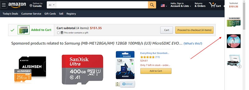
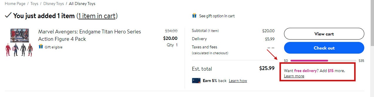
For example, an eCommerce site’s goal is to make more sales. Considering this, your strategy may zero in on taking visitors closer to the add to cart button. How do you do this?

Try to Improve the content on product pages or make customer support better with a live chat feature.

These measures will encourage visitors to stay longer which may result in more sales.

On the other hand, a lead generation site’s goal is to get visitors to fill out a lead gen form. So your marketing strategy may focus on priming your audience so that they convert to leads.

How?

You could build up your blog content to position yourself as a thought leader in your industry.

This boosts trust – an important ingredient in cultivating good customer relationships.

As you can see, it’s different for every business. So it’s important to review your goals so you can take the proper steps.

Once you know your goals, it’s time to start doing the work.

Let’s categorize it into three steps:

  1. Know your users’ motivations.
  2. Design your website to sustain attention
  3. Continuously get client feedback

inspiration, motivation, life

Firstly, know the motivation of your site visitors

You may have awesome websites selling awesome products, but if the visitor has no interest in what you’re selling, it’s all moot.

This may sound so basic that every marketing person should know it. But you’ll be surprised how many business owners fail to really understand what their audience wants.

See. This requires putting yourself in someone else’s shoes. That’s not always an easy thing to do especially when you’re emotionally invested in your product, content or website.

When you don’t take time to know their motivations, you end up giving them information or content they have no interest in. When they’re not interested, they won’t interact with you. As they say, you can lead a horse to water but you can’t make it drink.

On the other hand, if your web pages are exactly what they came looking for, they will only need a little nudge to engage.

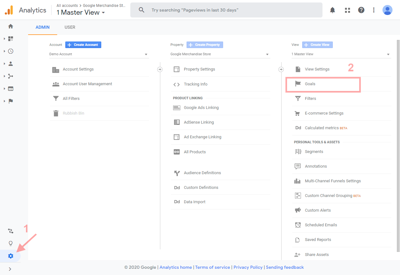
But the question is how do you find out their motivations? How do you understand user intent? Well, it’s time to put your trusty site google analytics to work. Look at the data for insights on customer behavior. There are many metrics you can study for this, but here’s one of the easiest things you can do right now.

  1. Go to Google analytics and find the keywords that people use in search. These words are a window to their intentions. Then make sure that the content matches the intent. 
  2. Sometimes, you might find that visitors to one page have different motivations. If this is the case, look into segmenting your visitors. Then personalize the content for each visitor. This is especially important if you’re optimizing products or landing pages.

megaphone, speaker, speak

Secondly, sustain the attention of your potential customers

Once a visitor lands on your site, the initial motivation is not enough. Now you need to hold that attention to keep visitors on the page.

This stage is important.

If a visitor doesn’t stick around long enough, there’s no relationship, to begin with.

Luckily, there are many things you can do to sustain interest.

finger, feedback, report back

1. Double down on your value proposition for your site visitors

Your audience needs a valid reason to buy from you and not from your competition.

That’s where your value proposition comes in.

What makes you different?

Make that clear on your site pages to give them a compelling reason to stay and find out about your offer.

To discover more about perceived value, here’s our Perceived Value 101 guide.

2. Speed up your website for better website user engagement


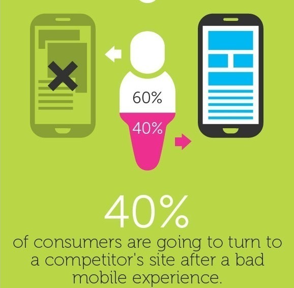
Your customers are an impatient lot. A slow loading site is not one they respond very well to. In a study by Forrester Consulting, they found that 47% of surveyed consumers expect a site to load in 2 seconds. If it goes up to 4, they abandon the site.

So before you even consider putting your user engagement & marketing strategy into action, speed up your website first.

It’s a waste of time and money to optimize for anything else when people who arrive bounce right off to another site.

superhero, girl, speed

Here are a few ways to speed up your website and get page load time down:

Website loading time is more than a mere inconvenience – it has far-reaching implications for user engagement and conversion. To make sure your website keeps up with the times, try these tricks to keep things running fast!

Keep your website running quickly and efficiently by compressing images or using a plugin like Smush to limit the file size. This is an easy optimization that can have major increases in website engagement.

Enhance website speed and performance by making use of a Content Delivery Network (CDN). This ensures files are distributed across multiple servers around the world, minimizing latency and ensuring faster loading times.

Optimize page load speeds further with fewer HTTP requests as well minifying & combining files for simplified yet effective processing cycles. Enhance user engagement via caching plugins that store copies of webpages on their browser to ensure speedy access!

To give your website engagement metrics a boost, consider optimizing the code on it for maximum efficiency. Keeping an eye out for any unnecessary clutter and ensuring the tidy organization can help reduce processing time used by browsers to read through multiple lines of coding data.

For optimal results, upgrade the hosting plan you use or switch up providers entirely – this will no doubt make a significant difference in overall webpage speed.

Take advantage of available tools such as Google’s PageSpeed Insights or GTmetrix which provide monitoring capabilities so that you may analyze loading times and pinpoint areas ripe for website engagement improvement over time.

Keep all these measures in mind when hunting down those pesky milliseconds.

Tip: If your site runs on WordPress, here’s a Facebook group that has all the instructions you need to speed it up.

web design, user interface, website

3. Optimize the user experience to increase engagement

User experience is not just a buzzword. It’s critical to the success of your site.

A site designed with user engagement in mind is like an outstanding AirBnB experience. It’s got everything you need and feels just like home.

When web pages are clear and navigation is easy to follow, it draws people in and lessens the cognitive load.

When your visitors are in this state of mind, it’s easier to steer them toward the goal of the page. Happy website visitors are more inclined to engage with you.

phone, samsung, samsung galaxy

4. Make use of different visual media to increase engagement

People respond differently to different types of content.

Some people learn better by reading while others prefer audio or videos.

Having these different options on your site ensures that you get the user engagement of more visitors.

It’s not always easy or quick to include a lot of different types of content on one page. But many tools can help you repurpose your content into different formats.

Here are some;

  • Repurpose – Automated tool for repurposing content.
  • Canva – Make infographics for free
  • Doodly – Turn content into whiteboard doodle videos

balloon, comic, popart

5. Give visitors the tools to engage with you

Your website shouldn’t be a one-way street.

Instead, it should be a two-way conversation between you and your users. For this to happen, you’ll need tools in place to get customer feedback.

As Paul Greenberg of 56 group says,

“... provide the customer with channels and capabilities to reach you or to be involved in some way… the reality is engagement is proactive. And it’s typically the customer who’s decided to engage. What you’re providing them is products, services and tools and… consumable experiences that make them want to interact with you.”


When visitors feel that you listen to their concerns, they become emotionally invested in you. By giving them control on how and when to contact you, you create google environment of trust.

So how do you turn your site into a place for active conversations? The comment section is a great place to start. But you can take this even further through

  • Surveys
  • Live chats
  • Chatbots; or
  • Live customer support

business, the next step, next

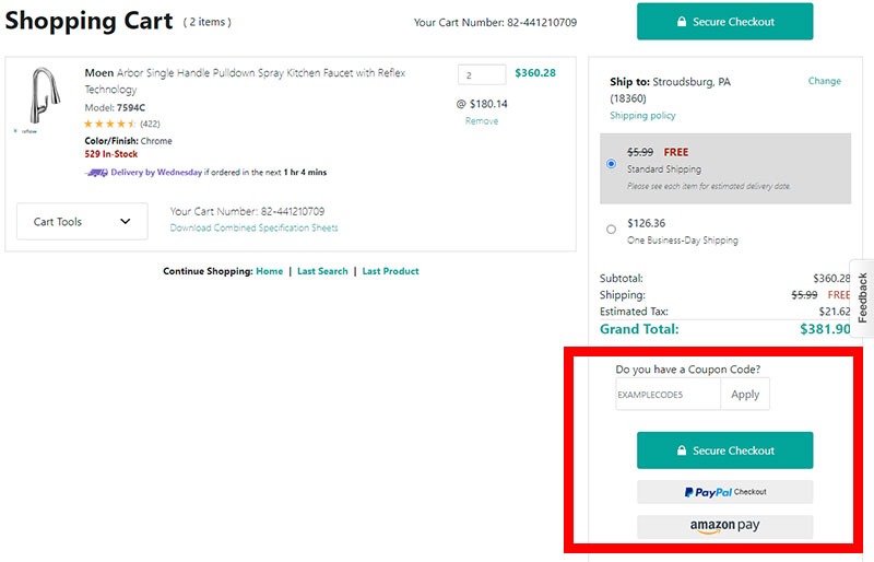
6. Make it easy for visitors to take the next step

Guide website visitors as they navigate your site. This isn’t only about having intuitive navigation. This is about having all web elements, from the images to the content, built in a way that takes the reader closer to a conversion.

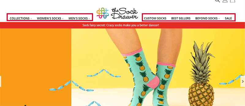
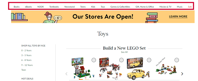
Let’s put it this way. When you enter a store for the first time, you can either ask a sales clerk where something is or you look at the signs on each aisle.

There’s always a marker or a person to ask that makes shopping easy. And that’s the same thing a visitor expects from a website. He wants to navigate it with ease. So if you want him to engage, then you’ve got to fulfill that expectation first.

It’s surprising how a lot of websites don’t do this. Call-to-action (CTA) buttons are hidden or non-existent. There’s very minimal text to help readers understand the offers. Or there are no directional cues to guide visitor behavior. You may think you’re being too “salesy” when you call the shots on visitor behavior. But the truth is, when you don’t do this, visitors are left confused. And most confused people on a website, leave.

Don’t be that company. Make it a point to help your customers understand exactly what you want them to do and what to do next. Don’t be scared to direct them down the path leading to the next stage of the funnel.

How? Do these things:

  • Add related articles at the end of a blog post

Keep readers engaged by including related articles at the end of your blog posts.

Plugins like WordPress’s Related Post plugin can be used to automatically display content, or you may manually include links.

Additionally, Content discovery platforms such as Outbrain and Zemanta offer widgets that can be used as a website engagement tool.

If you have an extensive library of content, using an API to provide dynamic related article suggestions on your website could be the perfect solution. With a selection of APIs available for different purposes, it’s easy to find one that meets all your requirements.

  • Strategically interlink products or content

Maximize your website’s visibility, website engagement and interconnectivity by strategically cross-linking related products or content.

Utilizing internal linking to other pages on the same site will also help visitors easily access important information about products or services of interest.

Linking to external sites that are related to your products or content is a great way of boosting the website engagement metrics, credibility and authority of your website.

In addition, you can attract referral traffic from these websites by carefully selecting appropriate anchor text keywords in the hyperlinks which should be relevant to what’s being linked.

Contextual linking also enhances visibility for certain pages while providing users with an improved experience at the same time.

To ensure your linking strategy is successful, it’s beneficial to track click-through rates, conversion rates, and bounce rates of the pages you link to.

It’s important not only for quantity but also quality; be sure that all links go towards high-value and relevant sources.

Lastly, build an effective long-term website engagement strategy


Customer website engagement is a by-product of happy customers who feel valued and appreciated. Most of the time, this doesn’t happen on the first visit. There need to be many different points of contact before a website reader feels free to engage with you.

Here are a few things you can do to get this underway.

  1. Nurture the relationship through email: Engage your customers through email marketing. Regularly sending them emails keeps them aware of your brand. Don’t just bombard them with your offers though. Instead, use email to regularly involve them in your business. So in return, they will feel like they’re a part of it. And people who feel that they’re a part of a business are more likely to engage. 
  2. Segment your website visitors: Many software tools help you segment visitors. This way you can give them a personalized experience as they explore your site. Why? All visitors have different needs. A first-time visitor needs more coaxing than one who devours every piece of content you put out there. And the best way to get them to engage is to personalize the content to their needs. 
  3. Regularly keep in touch with your customer base. Apart from email, there’s also social media. If you don’t have time to use all of them, then my advice is to find out which platform most of your visitors gather and start there. It’s a great way to keep your business constantly in your customers’ minds.

And that’s it!

Now, it’s all down to you…

It’s time to apply all the information here for a higher website engagement rate on your site. Just remember that it’s not all about the numbers. Make your readers feel valued and involve them in your community. Know their intent every time they visit your site so you can give them what they want. Design every page so that it’s easy for them to navigate it. Finally, have a long term marketing strategy that engages them at every point of the buyers’ journey.

This is how you make your customers feel like they’re part of your “tribe.” It’s a lot of work, but it’s all worth it.

Author: Kurt Philip

Hi, I’m Kurt Philip, the founder & CEO of Convertica. I live and breathe conversion rate optimization. I hope you enjoy our findings.

We’ve worked with over 1000 businesses in the last 6 years.
Let’s jump on a quick call to see how we can help yours.

Book FREE CRO Call

Client Case Studies


Follow us on Youtube

Form Design Best Practices For the Best Sign-up Forms that Convert

Form Design Best Practices For the Best Sign-up Forms that Convert

It’s a scenario we’ve all had to deal with far too many times.

You stand in a long queue for a long time in front of an office window. Then when your turn comes, the person in charge hands you a piece of paper. And with a dull and monotonous voice says, “Fill out this form. Next!”

As you look at it, you see all the blank lines you have to fill. And all the joy gets sucked out of you. No wonder many of us have an aversion to filling out forms.


I’ll tell you what though. Forms are indispensable in online commerce. From generating leads to selling to getting newsletter subscriptions, you will have to show your target visitors a form at some point.

The reality is it’s a delicate situation. You know that people inherently hate forms. And yet the person who’s about to answer it is on the edge of converting. This person has already made up his mind to engage with you. You’d think that because the motivation is there, the form is the least of his worries.

But that’s not the case. The form’s appearance intimidates your customers. And even though they’re motivated to interact with your site, it still gives them the same visceral response that standing in a queue in front of an office window induces.

That’s why testing sign-up forms on your website is one of the first tests to do especially during the early stages of your conversion rate optimization campaigns. From our many tests in Convertica, optimizing forms are one of the easiest things you can change that offer big returns. (Click here to see how we increased Empire Flippers’ conversion rates by 51.6% just by working on their valuation form)

And yet not many businesses spend that much time optimizing it.

But not you. Today, let’s talk about form design best practices. Let’s discuss all the little tweaks you can do to build the best sign up forms that convert

Form Design Best Practices For the Best Web Forms

1. Make forms short and easy to fill out

As soon as a customer sees a form, a lot of questions arise. “What personal information do I have to give up? What will I get in return? What’s in it for me? Is it worth filling out this form? How long will this take?

They’ll then scan the form to find the answers to these questions. If the pros outweigh the cons, they proceed to start and fill it in. Because of this quick evaluation that people often do, first impressions matter.

So what do you do to give your online form a fighting chance?

Make the forms short and easy to answer. Long forms generally overwhelm people. A study by Marketing Experiments showed that every field you take away from a form increases conversions. In this study, they tested three different form variations with five, seven and nine form fields. The results of the study showed that the shorter the form, the higher the conversion. The one with 5 fields converted at 13.4% while the long-form converted at 10%.

So let this be one of the first things to consider when you design a form. This leads us to the next form design best practice…

2. Include only the things you need

Which data do you really need to reach the form’s one goal? And I mean only the absolutely necessary information you need. Be ruthless. Got that? Then only ask for that information.

Your goal once a target customer is already eyeing up the form is to get him to click the call to action button as quickly as possible. More form fields will only delay his journey. So be frugal with the information you ask from him. Other information can wait another day.

When deciding which fields to include, be aware that people tend to guard some information more than others. Giving up certain personal details triggers more anxiety. We’re only willing to give them up when we feel that the value we get is proportionate to the information we give.

Here’s an illustration from Marketing Experiments showing a few of the forms fields we often use. And the level at which each piece of requested information triggers people’s anxiety.


source

Study the image. You can see for example, that asking for someone’s phone number makes people more uneasy than asking for their email address. With this insight, you can do one of two things.

You can either

  • Not ask for phone numbers
  • If you really need it, let them know why

3. Arrange form fields in one column

One of the surefire ways to increase conversions is to ensure that you’re in control of the path your visitors take. Having multi-column layouts takes away that control from you.

How so?

A study by Baymard.com shows that users interpret multi-column forms in different ways. Edward Scott says,

“…some users may look at a multi-column form and think they only have to fill out one column. Some may view the columns and think there is a sequence they must follow, while others may assume there’s a different sequence entirely.”

This poses a problem for you. When different users interpret it in different ways, you are no longer in control of the conversion path. Stick to a single-column form so your customers better understand what you want them to do.

However, here’s another thing that the Baymard study found:

There are form fields that you can put together in multiple-column forms but will not confuse the user such as

  • credit card details
  • Name fields and
  • City, state and zip code fields.

Just like what you see in the form below.


Baymard multiple columns

source

4. Make use of white space

Perception plays a big role in form design. You know your customers already have a pre-existing repulsion to forms. Without even realizing it, their brain’s immediate response when they see a form is, “Do I have to do this?”

And just as quickly, they make a mental calculation of the form’s ease of use. Their brains also decide how to quickly and easily finish the form.

That’s why from the onset, give your customer no reason to conclude that the form is going to be a pain. And how do you help him arrive at this conclusion? One of the easiest things you have in your design toolbox is the use of white space.

This may seem so trivial.

But this small visual change affects what a person feels about your form.

When elements in a form have very little white space, it looks too busy and overwhelming. It makes a person feel like there’s so much that needs to be done. It also makes the brain’s job of scanning the form a difficult one.

As Jan Tschichold said, “White space is to be regarded as an active element, not a passive background.”

5. Handle errors with grace for the best sign up forms

Imagine that at the end of every day, you’re not allowed to sleep unless you’ve correctly done everything you were supposed to do that day. Now imagine that you will only know if you’ve made any mistakes just when you’re about to sleep.

Ding. Ding.Ding. An alarm bell rings as you’re getting ready to go to bed. “You’ve made five errors today. Go back and do them again.” It won’t even tell you which one you got wrong. Imagine the frustration! The anger! The tantrum that will follow.

But that’s exactly what you do to customers when they answer a whole form and a message in red pops up when they click the submit button.

We can’t process the form. You’ve made 5 errors, stupid!”

Okay. Maybe you don’t write the stupid bit. But that’s how the user feels. He feels like after all the work, he’s not getting close to finishing it. Or he’ll feel you’re the stupid one. And he will raise his hands in frustration and forego finishing the form.

Now imagine a different situation. Imagine that as you go about your daily activity, someone gently taps you on the shoulder whenever you make a mistake. And then, he tells you exactly how to fix it.

Isn’t that better? You wouldn’t be as irked by it and you’d be a much happier person at the end of the day.


When it comes to online forms, this is called inline validation. That is, you immediately show the error message right after it is carried out. This allows the person to correct it right away. And displaying validation errors is a user-friendly way to show your customers any errors they make.

But let’s not stop there. The timing of when you put an error also plays a big part in your users’ frustration level.

Alistapart did a study to see how validation errors affect form completion. In the study, the control showed the error/s only after the user had answered all the questions. For the variations, there were five. Each variation showed a different method of inline validation. Watch the YouTube video below to see the placements of the error messages in each variation.

The study concluded that when the errors were validated inline after answering each question, they saw a 22% increase in success rates. But that’s not all. Doing it this way, errors lessened, completion time decreased and customer satisfaction went up.

6. Clearly state required fields

My gut reaction to an optional active input field prominent is to exclude them. We know that a shorter form structure generally convert more than longer ones. So why bother asking for information that’s optional at this time? If you really don’t need it now, then get rid of it.

However, if you must include optional information, then clearly label the required fields. And how do you do this to maximize user experience? Use an asterisk before the label, preferably in red. ch

7. Make the CTA button stand out

I guess it’s safe to say that when it comes to optimizing form designs, the call to action button gets all the attention. Many CRO case studies have been devoted to optimizing it. That’s because the customer who gets to this part of the form is very close to converting. All it takes is a click.

And yet this small action — the click, comes with a lot of burdens. It triggers a lot of doubts and questions to the user. “What happens when I click this button?” “Where will this button lead me?” “Do I have to do more things after I click this?

That’s a lot for the CTA button to be responsible for. That’s why CRO specialists devote a lot of time to it. It’s got a big responsibility at a crucial point in the transaction.

The good news is that because of the many CTA button case studies, there’s a lot of data that you can base conversion experiments on.

But for this article, here are some of the most important things to bear in mind.

  1. Make it stand out from the background.
  2. Work on the call to action text. Don’t just write submit. Make the words on the button match what’s going to happen after the person clicks it. Words like Add to Cart, Download my PDF, Audit my site, Subscribe are all descriptive words that signal to a person what’s going to happen when he clicks the button. For more on CTA buttons, see our post on this topic

8. Spend time on the copy

Imagine you’re in an office filling out a form. Then by sheer luck, the person at the desk offers to help. He nicely asks you how you’re doing and if there’s anything he could help you with.

When this happens, the experience of filling out the form is no longer as painful as it usually is.

Online, you don’t get this type of interaction. Forms are often cold elements on a screen, leaving you to work it all out yourself.

But they don’t have to be. You can make a web form warmer, more responsive and more conversational by using the power of words.

The copy acts like that friendly person in the office. It reminds the user of the value of what he’s getting. It helps lighten his mental load. It helps him understand the form. It gently nudges him when he’s made a mistake.

From the headline to the text in the CTA button, the words you use and how you say them play a pivotal part in convincing the customer to finish the form. You want him to think, “After I do this, I’m going to get something that will benefit me. So I’m going to finish this form.”

This was what MECLABS did in their study on web form design.

They made two variations against the control. Variation A had 14 fields while variation B had 9. When they did the test, variation A (the longer form) converted at 115% more than the control while variation B (the shorter one) converted at 89%. When they further studied why the longer form performed better, they concluded that it was the copy that made the difference.


Optional fields in forms

source

That’s because it was like a conversation between the company and the person filling out the form. The copy made it clear why the questions were important for the user’s future interactions with the business. In short, they made the value of each field clear to the user. He knew that they were not asking for information that only benefits the company. But it’s information that benefits the user as well.

And you know what’s even more impressive about this test? Every single person who answered the form filled out all the optional form fields. Every. Single. One. That’s because they knew that even though the input fields were optional, it would make their interaction with the company easier later on. This change in knowledge amplified by the copy made all the difference.

9. Add social proof

Third-party proof can go a long way in making a person see the value of what he’s signing up for. If someone else vouches for you, then the person who’s filling out the form gets a boost in confidence that he’s doing the right thing. If other people are happy with your offers, products or services, then he’s likely going to be pleased with them, too.

10. Design a separate form for mobile devices

Ideally, web forms should have a mobile-first design. However, I know that many websites don’t do this. But if most of your visitors visit the site using a small screen, then it’s in your best interest that web forms render well in mobile devices.

Why?

Mobile users have different psychology to people who access the internet using desktop devices. They have smaller screens, less freedom for keyboard controls and are usually on the move. Because using the keyboard on mobile can be challenging, then users have a lot less patience in finishing the forms. If desktop users want easy-to-use forms, mobile users require it even more.


Mobile optimization forms

source

11. Consider using “gamification” on web forms

We use this on Convertica’s site and it works wonders. We also applied the same concept on Empire Flippers’ valuation tool and increased conversions by 51.67%.

The rationale is simple. “Gamification” makes it easy for a user to answer forms online. Most of the time, he doesn’t have to use a keyboard. All he needs is a click of his mouse to answer most of the questions. Designing forms this way keeps typing on a keyboard to a minimum. All they have to do is click.

Click. Next step. Click. Next step. Click. Next step.


gamification

Do it like the above and you make your visitors’ lives easier. And this almost always increases form conversion rates.

Another important element of this type of form is that it puts you in control of what the person does next. And as I’ve said many times before, when you limit the activities of your users to the path you want them to take, conversions increase.

Lastly, look at how mobile-friendly it is. I have yet to see a form that does not benefit from being designed this way.

Give it a try. You’ll never look back.

12. Consider using form builders

Here’s the good news. If you aren’t a web developer or you want to build forms quicker, then a form builder software will make your job a breeze.

Many of them have a very short learning curve, so you could have a well-optimized form that follows best practices by tomorrow without learning how to code.

Some of the best form builders we’ve seen are:

13. Test the forms

And last but not the least. Test your checkout form. At the end of the day, all that I’ve listed here are best practices and you will never know how your new form design performs until you’ve tested it.

A form analytics software will tell you things like

  • Which fields people always make errors on
  • Which fields take a user a long time to answer
  • Which parts customers decide to abandon the at

These insights give a wealth of knowledge to help you improve your form design for better conversions. Check out Zuko or Clicktale for this. Only feedback can prove that your forms are effective.

Conclusion

It all boils down to this. Your website visitors hate filling out forms. It’s your job to enlighten them so they see the value of answering them and clicking the add to cart button. Follow the form conversion best practices I’ve laid out above, and you’ll see that the form completion on your site increases. I challenge you to make it happen. Then tell me all about it in the comments section.

Author: Kurt Philip

Hi, I’m Kurt Philip, the founder & CEO of Convertica. I live and breathe conversion rate optimization. I hope you enjoy our findings.

We’ve worked with over 1000 businesses in the last 6 years.
Let’s jump on a quick call to see how we can help yours.

Book FREE CRO Call

Client Case Studies


Follow us on Youtube