The 16 conversion rate optimization strategies below fall into six groups: find the real problem, make the message clear, build trust, remove friction, strengthen the offer, and run a testing program that compounds. Each one says what it fixes, how to apply it and how to test it.
-
Find the real problem first
Start from the funnel step that leaks most
Fixes: effort spent on pages that do not matter. Rank pages and steps by traffic multiplied by drop-off, and work from the top. A small gain on a step everyone passes through beats a big gain on a page few people see. Test it by tracking the step's completion rate before and after each change.
-
Ask visitors what stopped them
Fixes: guessing. A one-question poll on an exit-heavy page ("What is stopping you from buying today?") or a short survey after purchase ("What nearly stopped you?") gives you objections in the customer's own words. Repeated answers become hypotheses, and the exact words often become better copy.
-
Watch recordings at the weak step
Fixes: problems analytics cannot show. Session recordings reveal rage clicks on things that are not links, fields people fill in twice, and visitors scrolling up and down hunting for a price or a delivery date. Watch recordings of people who left, not only those who converted.
-
Make the message clear
Answer what, who and what next on the first screen
Fixes: visitors who leave because they cannot tell whether they are in the right place. The first screen should say what you offer, who it is for and what to do next, in words your customers use. Test it by trying a clearer headline and subheading against the current one. The free value proposition template drafts the clearer version from who the offer is for and what they get.
-
Match the page to the ad or search that brought people
Fixes: broken promises. If the ad says "free shipping on running shoes", the landing page should show running shoes and free shipping, not the homepage. Message match matters most on paid traffic. See landing page optimization.
-
Give each page one main call to action
Fixes: choice overload. When several buttons have equal weight, none stands out. Make one action primary, make secondary ones visibly secondary, and repeat the main action down long pages. Button wording that says what happens next ("Get my free quote") usually reads better than a generic "Submit". More in the guide to call to action buttons.
-
Build trust where the decision happens
Put proof next to the decision
Fixes: doubt at the moment of commitment. Reviews, ratings, guarantees, returns terms and security information work best beside the button or form, not in the footer. Use specific, real proof: a named customer quote beats a vague claim. See the guide to trust badges.
-
Use scarcity and urgency only when they are true
Fixes: procrastination. Real limits, such as genuine low stock, a sale that really ends or limited places, give people a reason to act now. Fake countdown timers that reset on reload do the opposite once noticed, and can cost returning customers. More on scarcity marketing.
-
Remove friction
Cut form fields, or split long forms into steps
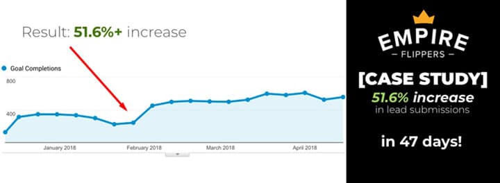
Fixes: form abandonment. Remove every field you do not need now. Where you need a lot of information, a multi-step form that starts with easy questions can work better than one long page. In Convertica's Empire Flippers test, a valuation tool rebuilt as a step-by-step submission process lifted valuation tool submissions by 51.6% in 47 days (split-URL test, then rollout). See multi-step forms and how to reduce form abandonment.
-
Remove surprises from the cart and checkout
Fixes: last-step abandonment. Show shipping costs and delivery times before checkout, offer guest checkout, list accepted payment methods early, and keep error messages specific. In Baymard Institute's survey of US shoppers (2025), 40% of those who abandoned for a reason other than "just browsing" cited extra costs such as shipping, tax and fees. More sourced figures are in the CRO statistics and the guides to checkout optimization and shopping cart optimization.
-
Make pages fast and easy on a phone
Fixes: mobile drop-off. Test your key pages on a real phone on mobile data. Look for slow loading, layouts that jump, small tap targets, pop-ups that cover the page and buttons out of thumb reach. If mobile converts far below desktop on the same traffic, start here. See mobile conversion optimization.
-
Reduce the thinking a page asks for
Fixes: overwhelmed visitors. Fewer choices, clear defaults, plain words, scannable sections and familiar layouts all lower the effort a decision takes. See how to reduce cognitive load.
-
Strengthen the offer
Show people what they get, at the point they look for it
Fixes: visitors who want to buy but cannot see how. In Convertica's dScryb test, adding calls to action and access levels to a membership store's search results lifted paid membership sign-ups by 49.4% in a 17-day A/B test at 98% confidence. The fix put the next step where buyers already were.
-
Make pricing easy to understand and compare
Fixes: hesitation on the pricing page. Few plans, clear differences, a recommended option, the total cost including fees, and answers to billing questions beside the plans. Defaults matter: making the option most customers want the preselected one can change what they choose. See pricing pages that convert.
-
Run a program that compounds
Test in sequence and build on each winner
Fixes: one-off wins that stop there. Test the next change against the last winner, not the old original. In Convertica's JustThrive work, a second split test ran against the first winning product page, and revenue rose 101.82% cumulatively across the two sequential tests, run from 7 December to 24 March. See Convertica's complete A/B testing guide.
-
Make your pages readable for AI agents
Fixes: a new kind of visitor that cannot use your page. AI search and some AI assistants read your page's HTML, not the rendered design. Put prices, product details and policies in the page text, add accurate structured data, and allow the AI crawlers you want. This is new, and nobody has long-run data on it yet; treat it like any other CRO change and measure it.