Conversion Optimization Round-up – May 2022

Conversion Optimization Round-up – May 2022

This month’s round-up is one not to be missed. We have chosen some great articles from those we have come to trust.

Together we will explore 5 new rules of landing page testing from the ever-popular Unbounce. Guess The Test stumped me this month when they asked what filter order won. You will enjoy the article from The Marketing Sherpa; three case studies are examined, including one from Coors Light and how they got 8 million impressions by partnering with a popular podcast. And last but not least, VWO talks about SEO testing.

You’re Doing Landing Page Testing Wrong: These Are The 5 Rules To Do It Right

https://unbounce.com/landing-pages/landing-page-testing/

Unbounce has prepared a great article all about landing pages and the power they can hold. This article talks about what happens when landing page testing goes wrong. Also, some of the agency powers to focus on, such as prioritizing a small group of low-effort tests.

However, the main focus of this article is the 5 new rules of landing page testing. We particularly liked rule 2- focus aggressively on how the offer is presented. This rule shares that more often, you won’t need to change your offer or goals; however, you need to find a way to create more motivation by creating compelling copy.

Unbounce

Below is a list of the 5 rules for you to explore:

  1. Traffic conversion intent must follow call-to-action (CTA) intent.
  2. Focus aggressively on the offer itself.
  3. Use the Breadcrumb Technique on your forms.
  4. Don’t stop at the “Thank You” page.
  5. Go all-in on Smart Traffic.

Which Filter Order Won? “Best Result” Placed First or Last?

https://guessthetest.com/test/which-filter-order-won-best-result-placed-first-or-last/

We got this one wrong- how did you do? From the poll, many more of us got it wrong than right. This experiment from Guess the Test tested whether placing the “Best Results” option in the filter menu was best placed first or last.

It turns out that when it came to Dell, the popular computer company’s “deals” webpage, customers were more inclined to engage when viewing Price: Low to High first.

For this test, the filter menu categories were ordered as follows:

Guess The Test

With version B being the clear winner, it is safe to say- the results may not always be as they seem. Keep in mind that small changes can make a huge difference. Something as simple as testing the side filter could net you large returns.

This is a great article to remind us always to be testing, and nothing is too minor to test.

Customer Engagement: Marketing case studies from Coors Light, a professional soccer team & a private jet charter

https://www.marketingsherpa.com/article/case-study/customer-engagement

As always, we can count on The Marketing Sherpa to present us with case studies that make us stop and take notice. This month is no different.

The first case study shares how a private jet charter company got 17% more interest after adding a catchy opening paragraph to its homepage. Case study #2 is about Valencia’s football club and how they gained 5808 new newsletter subscribers by gathering zero and first-party data collection. Moving forward, we will see a lot more companies move from third-party data (i.e., tracking cookies) to zero and first-party information. This information is intentionally provided by the customer, allowing for more genuine and honest relationships.

And the final case study is brought to you by Coors Light. We learned by partnering with a popular podcast and being a presenting sponsor of the Pardon My Take’s 5th annual Grit Week, Coors Light had some massive results.

“Authentic endorsement is the key to all podcast partnerships,” said Lisa Jacobs, VP of Media.

Below is an example of a CRO (conversion rate optimization) loop used in all tests Linear uses.

Marketing Sherpa

Here are the results of this campaign.

  • 23 million minutes of Grit Week content were watched
  • The brand received 8 million new impressions
  • Over 166,000 engagements

As always The Marketing Sherpa has delivered some great stuff!

Why You Should Test Your SEO Ideas Before You Ship Them

https://vwo.com/blog/why-you-should-test-your-seo-ideas-before-you-ship-them/

According to VWO, your conversion rate optimization (CRO) strategy needs two areas to run well. Search engine optimization (SEO) and A/B testing.

SEO has evolved into its own world, and Google keeps changing its algorithm, making SEO something to be constantly tested. By routinely optimizing your landing pages to improve the user experience (UX), Google is signaled. Resulting in Google incentivizing you with a higher ranking.

VWO

One of the top factors for ranking is user intent. Although hard to predict your visitors’ behaviors, there is good news. It is possible to run A/B testing without impacting your SEO negatively. And on top of it, Google encourages you to A/B test your SEO changes.

Googlebot then crawls these changes to help Google learn the new information and better rank you.

Be sure to read through this entire article for information not to be missed.

In Summary

Did you know that 61% of companies test their landing pages up to five times per month! Where do you stand when it comes to testing?

We hope this month’s round-up offered you some insight into what steps you should take to move forward.

Let us close with a quote we love:

“I don’t care much for Best Practice — I care about conversions. That’s why I test”

 – Michael Aagaard

Are you interested in a free conversion optimization audit?

Submit your site and let us send you a list of custom optimizations just for you!

Claim your Free Audit Here.

Author: Kurt Philip

Hi, I’m Kurt Philip, the founder & CEO of Convertica. I live and breathe conversion rate optimization. I hope you enjoy our findings.

We’ve worked with over 1000 businesses in the last 6 years.
Let’s jump on a quick call to see how we can help yours.

Book FREE CRO Call

Client Case Studies


Follow us on Youtube

Affiliate Case Study – 43.1% Increase in Revenue Per Visitor

Affiliate Case Study – 43.1% Increase in Revenue Per Visitor

The Website:

This website is an Amazon affiliate site in the home heating and cooling niche. 

What We Tested And Why:

For this test we added a product rating above the call-to-action buttons on the comparison tables of the review pages. By giving visitors that bit of extra information, we thought it would help people to make an informed decision on which product to purchase and encourage them to buy. 

We also added a sticky anchor button which appeared at the bottom of the page once you scrolled down further than the comparison table section. This button would return users back up to the section. By adding this, we thought it would allow users to quickly return and click through to buy the product, once they had read the full reviews further down the page and made a decision.

The Test Details:

The desktop version of the product rating is shown below:

The mobile version of the product rating is shown below:
The desktop version of the sticky anchor is shown below:
The mobile version of the sticky anchor is shown below:

The Test Results:

We saw an overall increase in clicks per visitor of 6.5%, a 67.7% increase in orders per visitor and a 43.1% increase in revenue per visitor. 

For all the data of the pages we tested combined, we reached a 99% confidence level. 

The heatmaps also confirm that the product rating helped in increasing engagement in the comparison table section. 

Are you ready to increase your conversion rate on your own website?

Why not claim our free CRO audit that can increase your conversions anywhere from 20-100+%? 

Answer a few questions and we’ll send over the personalized audit by email!

Author: Kurt Philip

Hi, I’m Kurt Philip, the founder & CEO of Convertica. I live and breathe conversion rate optimization. I hope you enjoy our findings.

We’ve worked with over 1000 businesses in the last 6 years.
Let’s jump on a quick call to see how we can help yours.

Book FREE CRO Call

Client Case Studies


Follow us on Youtube

eCommerce Case Study – 12.7% Increase in Revenue

eCommerce Case Study – 12.7% Increase in Revenue

The Website:

This is a cro case study for an Australian owned and managed business called Factory to Home, which sells quality furniture and homeware to Australians. They realised there was a gap in the market for buying home goods at an affordable price with quick and reliable delivery. 

They established relationships directly with suppliers which allowed them to secure low pricing for their customers. They also made sure to use reliable couriers to ensure a seamless delivery. Lastly, they employed a great team of customer support staff which all amounted to an overall smooth customer experience.

They now have warehouses located all over the country, and are able to ship most items within 1 working day. They provide full transparency around their supply chain and have created a win-win scenario for both customers and suppliers.

Test Details & Background:

For this test we added shipping, warranty, and payment information on the product pages, while also popping open the details when the links are clicked so that users can get answers for their FAQs without leaving the product pages.

By doing this we are reducing the steps to checking out and creating a streamlined experience. It is often at the checkout stage that people’s fears about buying online come into play. By addressing them at the point that they are adding the product to cart, they can move forward with the purchase, by getting all the answers then and there, without leaving the page. 

The Test Details:

We added the FAQ pop-up section at the bottom of the product page below the product description. 

The desktop version is shown below:

The mobile version is shown below:

Once users clicked any of the FAQ links, a pop-up appears on screen as below:

The Test Results:

The following results are for desktop and mobile combined. 

We saw an 18.1% increase in the rate of order completion and 12.7% increase in revenue per visitor.

Our changes on desktop reached statistical significance with a 96% confidence level. Our results on mobile didn’t reach statistical significance, but we rolled out the results on mobile as we saw no negative impact. 

Are you ready to increase your conversion rate on your own website?

Why not claim our free CRO audit that can increase your conversions anywhere from 20-100+%? 

Answer a few questions and we’ll send over the personalized audit by email!

Author: Kurt Philip

Hi, I’m Kurt Philip, the founder & CEO of Convertica. I live and breathe conversion rate optimization. I hope you enjoy our findings.

We’ve worked with over 1000 businesses in the last 6 years.
Let’s jump on a quick call to see how we can help yours.

Book FREE CRO Call

Client Case Studies


Follow us on Youtube

Conversion Optimization Round-up – March 2022

Conversion Optimization Round-up – March 2022

This month we are talking about customer perception, how to optimize your landing and checkout page, and what your potential customers are really looking for.

Did you know that most companies spend about $1 on conversion rate optimization for every $92 spent on customer acquisition! Yes, I’m shaking my head also- that’s crazy. However, the top converting companies spend over 5% of their budget on conversion rate optimization. Ask yourself where do you stand?

Today let’s look at a few great articles from those sites we have come to trust, beginning with Guess the Test asking us what’s more important, time or Money? The Marketing Sherpa shares 3 great case studies, one asking if a contact form on the homepage is beneficial or not. We look at 11 usability tools for landing page performance from Linear Design. And finally, we learn about optimizing your landing page checkout with 5 useful tips from Unbounce.

Time or Money? Which offer converts better?

https://guessthetest.com/test/time-or-money-which-offer-converts-better/

Guess the Test shares a great test with us. This one has a few flaws. We find the flawed studies just as good to evaluate as the well-done tests. When we review these, we can learn what not to do.

This test is brought to you by a phone company connecting families and friends to those in India. The test aimed around the call to action button with one reading the number of bonus minutes (241) over free credit ($3). Which one do you think faired best?

Guess The Test

Regardless of the outcome, this test was flawed. During the total time of this test, 19,000 PhoneIndia subscribers received emails. 50% of those emails were sent with 25% describing an extra 241 minutes, and the other 25% reading a free $3 credit. The remaining 50% were then sent to the winning call to action button. In turn, this left us without clear results. Traffic needs to be equally allocated and no changes should be made throughout the entire study.

This article also goes on to discuss the “Rule of 100”. In Johan Berger’s book Contagious, he goes into depth saying products should be priced to influence perception, so buyers feel they’re getting the best deal possible. Learn more about this rule and how to ensure you are running precise tests.

Pull The Customer Forward: 3 quick marketing case studies

https://www.marketingsherpa.com/article/case-study/pull-customer

Ever wish you could tell a customer what to do and they’d actually listen? Yea, we make that same wish all the time. However, that’s not the case. We have to spark ideas and help guide them to where we want them. With a little practice, this process can be achieved.

Take the study done by Century Law Group an injury lawyer firm, they tested two landing page options, one with a number and form to fill out and one with just a number. This result surprised us. The landing page using the form as a clear call to action was the ultimate winner with conversions 53.2% better.

Marketing Sherpa

The reason behind this is those needing the services of a personal injury lawyer have enough on their minds. They need clear direction on where to go to get the help needed. If you’re in a similar industry where emotions run high, be sure to test your landing page using the form method.

Read this complete article for two other interesting case studies from the Marketing Sherpa.

11 Usability Testing Tools to Improve Landing Page Performance

https://lineardesign.com/blog/usability-testing-tools/

We love this quote from Dana Chisnell Want your users to fall in love with your designs? Fall in love with your users.” This couldn’t be truer. The more you know about your customers and potential customers the more you can generate a page they will use. And in turn a product or service they will buy.

They say the most common user action on a website is to flee it. Liner Design looks at 11 usability testing tools to help improve your landing page. 

Before you dive into this article to find what usability testing tool will work best for you, there are a few things you need to know. Beginning with asking yourself what you want out of it?

The platform you use is dependent on the test you design. Here are a few things to determine.

  1. Narrowing your research questions and your hypothesis
  2. What type of data do you need to collect?

These answers will help you decide what usability testing method you should use.

Below is an example of a CRO (conversion rate optimization) loop used in all tests Linear uses.

Linear Design

Optimize Your Landing Page Checkout Process with These 5 Tips

https://unbounce.com/conversion-rate-optimization/checkout-process/

This article is all about A/B testing (aka: controlled experimentation). Andrew Hon from Medium shares with you a talk he gave to product managers from around the world. He explains the vital reasons why A/B testing is necessary for the growth of your company.

Three main points:

  1. A/B testing is a simple idea that can be simple to apply
  2. Useful for more than incremental optimization — A/B tests can yield deep insight
  3. Fail Fast and Just Test It — A/B tests have the highest ROI of any data activity

Andrew worked for both Disney and Tinder building the A/B test to improve usability and overall growth of the companies. This article takes examples from both. Including, this test from tinder determining what iconography to use.

Unbounce

Make sure to include options to register using an existing Facebook or Google account. This easy sign-up option will add to the number of potential customers willing to sign-up.

This article is loaded with some great stuff you need to know today.

In Summary

We want to close with this great quote from Bryan Eisenberg.

“Trying to increase sales simply by driving more traffic to a website with a poor customer conversion rate is like trying to keep a leaky bucket full by adding more water instead of plugging the holes.”

You need to understand what your customers need, and you must deliver. Traffic doesn’t mean conversions. 

See you next month!

Are you interested in a free conversion optimization audit?

Submit your site and let us send you a list of custom optimizations just for you!

Claim your Free Audit Here.

Author: Kurt Philip

Hi, I’m Kurt Philip, the founder & CEO of Convertica. I live and breathe conversion rate optimization. I hope you enjoy our findings.

We’ve worked with over 1000 businesses in the last 6 years.
Let’s jump on a quick call to see how we can help yours.

Book FREE CRO Call

Client Case Studies


Follow us on Youtube

Affiliate Case Study – 10x Increase in Sales

Affiliate Case Study – 10x Increase in Sales

Today we’re bringing you part 2 of our Affiliate Case Study

The Website:

This website is in the adult niche and reviews products that are sold on various eCommerce stores. 

Test Details & Background:

For this test we added an in-house designed exit popup and sticky footer which contained a call-to-action button to compel users to click through to see the top product. 

By clicking the button they would be redirected to view the product on the store product page. 

Below is the mockup of the exit popup on desktop:

Below is a mockup of the exit popup on mobile:

Below is a mockup of the sticky footer on desktop:

Below is a mockup of the sticky footer on mobile:

The Results:

The tests ran for 3 weeks, to reach a 99% confidence level.

7 out of the 10 pages we tested had an increase in clicks, with the overall increase for the 10 pages being 29.6%.

6 out of the 10 pages had an increase in orders, and increase in revenue. 

The overall increase in sales per visitor was over 10x the original and the increase in revenue per visitor was over 50x.

On mobile specifically, having long sales copy with infrequent call to actions can drastically hinder conversion, as in this example. By always having a call to action floating at the bottom of the mobile device screen, just above the user’s thumb, the user can quickly click it without having to navigate around your site to look for a call to action. 

Think about it like this, once they are reading through your sales copy and subconsciously say “Yes, this is for me”, you want to have that call to action right there for them to click when they are ready to buy.

Although very simple, conversion tactics like these are some of the best performing for many of our clients.

Are you ready to increase your conversion rate on your own website?

Why not claim our free CRO audit that can increase your conversions anywhere from 20-100+%? 

Answer a few questions and we’ll send over the personalized audit by email!

Author: Kurt Philip

Hi, I’m Kurt Philip, the founder & CEO of Convertica. I live and breathe conversion rate optimization. I hope you enjoy our findings.

We’ve worked with over 1000 businesses in the last 6 years.
Let’s jump on a quick call to see how we can help yours.

Book FREE CRO Call

Client Case Studies


Follow us on Youtube

Conversion Optimization Round-up – February 2022

Conversion Optimization Round-up – February 2022

In this month’s Round-up we bring you valuable information regarding A/B testing and how, when, and where to use it.

Today you will learn from Guess the Test about using the top display banner or notVWO looks at the widely successful Bear Mattress, and how they are improving revenue. Marketing Sherpa shares three-speed to value marketing case studies featuring A/B testing. And finally, Medium offers us a wealth of knowledge all about- you guessed it, A/B testing.

The articles we have set forth today will explain why A/B testing is so vital for the success of your business. As Chris Grosser says, “Opportunities don’t happen. You create them.”  So, sit back and get inspired.

With or Without the Top Product Display Banner

https://guessthetest.com/test/with-or-without-the-top-product-display-banner/

A/B testing is what Guess the Test is all about, and this month is no different. The company used for this month’s test was a guitar company named SweetWater. The KPI (Key Performance Indicator) was engagement measured by unique views of guitar product detail pages, Average Order Value (AOV), and purchases of guitars.

Version A used a top-placed display banner above the featured item, and version B did not. Which one do you think came out above? Yup, you are right – version A was the clear winner. The study ran for one month and saw over 2.2 million sessions. The traffic from these visits was split evenly 50/50.

Guess The Test

Compared to the version without the top banner, including it led to:

  • 118% conversion lift in unique views of guitar product detail pages 
  • 5.72% increase in Average Order Value (AOV)
  • 6.64% rise in purchases containing a guitar

Time To Value: 3 Speed-To-Value Marketing Case Studies

https://www.marketingsherpa.com/article/case-study/time-to-value

We love sharing the case studies from the Marketing Sherpa. Today is all about rapidly getting the attention of your potential customers and providing them the value they require before they help send your bounce rate soaring.

The first case study brings you to Talkspace, an online couple’s therapy that used an A/B test to determine if shortening an end-of-quiz animation would increase conversions. Well, it did, by a staggering 60%. By getting out of the customer’s way, Talkspace brought the information the customers needed faster, in turn generating more returns.

Marketing Sherpa

Version A tested an animation for signup at 8 seconds, version B shortened this process to 4 seconds. Results showed version B outscored version A by 60%. In addition to testing different video lengths, you should test different video locations and run testing on the checkout flow.

How Bear Mattress Leveraged Cross-Sell Opportunities with VWO and Increased Revenue By 16% – Success Story

https://vwo.com/success-stories/bear-mattress/

We love to share success stories with you, especially when we see huge numbers like these. Founded in 2014, this mattress company with a vision to change the way we sleep, aspired to some massive goals. And with continued testing and adjusting, they are getting there.

The goal of their latest test was to aim at increasing revenue by focusing on optimizing the cross-sell flow on the mattress product detail pages of the website.

They determined using VWO Insights that:

  1. There wasn’t much visitor interaction within the frequently bought with mattress section. Which consists of the cross-sell product listings.
  2. Overall clicks on cross-sell products were fewer compared to the other elements of the page.
  3. Images weren’t showing with items present in the ‘frequently bought with mattress’ section of the page, which was impacting the engagement.
  4. The copy was not customer-centric but product-centric. It did not pique interest or give enough reasons to customers to consider buying the product.

VWO

Overall, the variation outperformed the control with a 24.18% uplift in successful purchases and a 16.21% increase in revenue. Take a look and see how you can implement a test like this for your website.

A/B Testing for Product Managers

https://medium.com/@andrewhon_95925/a-b-testing-for-product-managers-267ef1853483

This article is all about A/B testing (aka: controlled experimentation). Andrew Hon from Medium shares with you a talk he gave to product managers from around the world. He explains the vital reasons why A/B testing is necessary for the growth of your company.

Three main points:

  1. A/B testing is a simple idea that can be simple to apply
  2. Useful for more than incremental optimization — A/B tests can yield deep insight
  3. Fail Fast and Just Test It — A/B tests have the highest ROI of any data activity

Andrew worked for both Disney and Tinder building the A/B test to improve usability and overall growth of the companies. This article takes examples from both. Including, this test from tinder determining what iconography to use.

Medium

This article also discusses some critical testing from the widely successful SpaceX. Don’t miss this great article from Medium.

In Summary

As a takeaway- a collection of quotes from the ones who have gotten it right!

Jeff Bezos, Amazon: “Our success at Amazon is a function of how many experiments we do per year, per month, per week, per day.”

Google: “… Experimentation is practically a mantra; we evaluate almost every change that potentially affects what our users experience.”

Netflix: “… Every product change Netflix considers goes through a rigorous A/B testing process before becoming the default user experience.”

We hope this sparked some ideas for you. Remember, if we are not testing and improving, we are not growing. What areas of your site could use a re-vamp?

See you next month!

Are you interested in a free conversion optimization audit?

Submit your site and let us send you a list of custom optimizations just for you!

Claim your Free Audit Here.

Author: Kurt Philip

Hi, I’m Kurt Philip, the founder & CEO of Convertica. I live and breathe conversion rate optimization. I hope you enjoy our findings.

We’ve worked with over 1000 businesses in the last 6 years.
Let’s jump on a quick call to see how we can help yours.

Book FREE CRO Call

Client Case Studies


Follow us on Youtube

Top 7 Conversion Rate Optimization Trends for 2022

Top 7 Conversion Rate Optimization Trends for 2022

Did you know that since the start of the pandemic, e-commerce businesses rose by a whopping 17.9%? 

How did you fare last year? 

As the new year falls upon us, it is time to take a serious look at our goals for the coming year. No, we are not saying to make a resolution list- we all know these don’t work. We are talking about asking yourself honestly, where do I want to be at the end of the year? What do I want my business to look like? And how do I get there?

By the time you get to the end of this article, we are confident you will have more concrete answers to these questions.


1. Understanding Your Audience

Understanding your audience can be the difference between someone who visits your site and a customer who helps yield results. That’s why you are here, right? 

As we move into 2022, more and more people want to be heard – gone are the days of a generic site geared to everyone. You need to stand out.

Let me explain. 

I know it may sound creepy but track your customer’s interests. Learn their behaviors, find out what social media platforms they use, what blogs they read, what grabs their attention? With this knowledge, you can run specifically targeted ads. Not only does this help minimize the amount you spend on ads but will almost guarantee you are maximizing the revenue from those ads. 

Another keyway to understand your clientele is to send out surveys. I know what you are thinking, who does those things anyway? Your current customers are likely willing to help. If they know it’s all to better serve them, they might jump at the chance to help. This, coupled with any online feedback you already get from existing customers is a great place to start. 


Pixabay

Remember, if you don’t ask, the answer will always be no. 

Let’s look at a few more tips to help you better understand your audience and gain more conversions.

Tips to help understand your audience

  • Communicate with them – ask them what they want and listen.
  • Use social media networks to learn what interests them.
  • Show them who is working behind the screen – let them get to know you and your team.
  • Be approachable.
  • Use online tools such as Audience Analytics and chatbots.
  • Learn your demographic.

2. Minimizing Website Load Times

You know it, I know it, we all know it – waiting for a website to load is a sure-fire way to get someone to exit your site and move on. We live in a world of instant gratification. Nobody wants to wait for a slow webpage. 

Crazy Egg

It doesn’t take much to get a user to abandon your site. If you have a delay of even 100 milliseconds, that could send your potential user to your competitor. On average this small delay could result in a 7% decrease in conversions. 

Did you know if a smartphone user must wait close to 3 seconds for a webpage to load, you have a 53% chance they leave your site? Those are huge numbers!  

Let’s break down what a 1-second delay in upload time can mean.

  • 11% fewer page views
  • 7% decrease in conversions
  • 16% decrease in customer satisfaction
  • 47% of potential customers believe a page should load in less than 2 seconds.
  • 79% of customers said they would not return to a slow site – ever! 

If the potential customer won’t stay to see what you have to offer, everything else you have done or will do means nothing. 

Ways to improve website loading time.

  • Reduce the file size of your images and videos. 
  • Use JPG when possible. 
  • Optimize your design for mobile users
  • Reduce your redirects
  • Cache your webpages

3. Optimize Your Design for Mobile Users

We mentioned this above as a way to improve the speed of your site, but this deserves a deeper dive. Historically, desktop users convert to more sales because desktop users are more often in the buying state of mind than mobile users. This, however, is starting to balance out a bit more.

Today, everyone has a smartphone. Anyone can access your website from anywhere in the world. Experts predict that as we move forward, mobile users will be just as important as desktop users if not more so. Similar to the home phone – desktops are now seen in fewer and fewer homes. Don’t miss out on the top trend of 2022.

Since 2016 Accelerated Mobile Pages (AMP) have been integrated into Google’s mobile search results. What does this mean to you? When you implement AMP you will be included in Google’s SERPs search results as well as most paid results. This simple step could mean huge results for your e-commerce business.  

Another key area to look at is Adobe Flash. Back in the day, it was all the rave. However, today it doesn’t serve much purpose but slows you down. Ditch the animation, ditch the overly busy. Try to stick to a simple, clean design your users will appreciate. Help them stay on track and not get distracted from the real reason they are on your page – to solve a problem. 

Top ways to optimize for mobile users:

  • Test, test, and re-test
  • Pick a responsive web design
  • Speed is vital to your success
  • Use AMP in your webpages
  • Compress images

4. Building Trust Through Transparency

Conversions are largely influenced by trust. The best way to build trust is to be transparent. Consumers are demanding that we use transparency in design. Ask yourself – do I have a website I would trust?

Let’s dive into what that means and how to implement this in your website and overall business.

One of the key factors to build trust through transparency is to be as upfront as possible. Don’t try to fool people- now is the time for honesty. 

  • Always invest in secure systems
  • Informed data usage is vital
  • Always be upfront about pricing – try to avoid any hidden costs


Your users should know what your app will have access to. (What information are you obtaining from them – be clear) If they understand that the collection of data is for a better user experience, they will be more inclined to offer it to you.

Once you build trust, it will help with conversions and retention. We need those customers to come back, and they will if they trust you. 


5. Using True Social Proofs

Using true social proofs is what will set you apart this year. More and more companies are moving towards this way of gaining trust with customers. True social proofs may be the most important trend of 2022.

We must move past the generic photo claiming this product is great. Everyone thinks their product is great. Your customers are smarter than you think. We as humans tend to trust what our peers say more than the head of a business. I bet you have some loyal customers who would be thrilled to be a part of your success. It doesn’t hurt to ask- right?

Did you know a study done by WordPress states 82% of potential customers are more likely to trust a company that uses real people in their marketing campaigns and ads? 

How to use social proofs in your business:

  • Use real-life customers, their pictures, and their words.
  • Ask them directly to share your company or product on their social media sites. (You can offer those who help a discount- however, most people want to help without the payback)
  • Contact an internet influencer who knows or works with your target audience and ask for help – you may be surprised how easy this one is.

Here is a popular example.

Swedish watch company Daniel Wellington is known for using influencers on Instagram to promote their watches. Year after year they see their conversions grow.


Coredna

6. User Experience (UX)

This should go without saying, but, if a user isn’t having a good experience, they are quick to exit your site and move on. If that potential customer doesn’t stick around, it’s hard to convert them into a sale. That is why in 2022 it’s imperative to put the user experience first and foremost. Even Google says having a great UX score will lead to a better ranking, and in turn, lead to more conversions. 

You need your customers to find your content useful, your product valuable, and your site credible. Your website should be easy to navigate and the information easily accessible. If you can tick all these boxes, you will be one step closer to a conversion

iservice

Keeping with the customer’s experience and needs being at the forefront of everything you do, ask yourself what is it that gets you to vacate a site? One of the top reasons people leave a site is too many pop-ups, and videos that play on repeat. Ditch these as soon as you can.

Keyways to improve the User Experience (UX)

  • Make your content interesting. Find a link between the company and the customer. Using a brand story will help achieve this.
  • Don’t be annoying. Skip the extra fluff – you don’t need it. 
  • Be direct and keep it clean and transparent – don’t try to hide anything. Be as honest as you can. It will yield results.
  • Speed is huge – nobody has time for your webpage to load.
  • Make it easy to ask for assistance – use the chatbot. This is another trend most sites are now using in 2022

7. Simplify Your Checkout Page

Congratulations, you got your customer to the checkout page, you have almost hit the goal line. However, 60%-80% of potential customers leave your site at this point, never to return. It’s a sad fact, but true. 

Do you know what your abandonment rate is?  

One of the leading causes of high abandonment rates is a busy and difficult checkout page. On average, a potential customer stays on your page for 15 seconds. That is not a lot of time. In those 15 seconds, you must make sure your point gets across, that trust is built, and you are providing the product or service you promised. 

The online user is impatient and nervous to give out too much information. That is why we suggest ditching the mandatory account setup and instead opt for a guest option as well.

Pixabay

Keys ways to simplify your landing page:

  • Make it easy. Easy to get to payment, easy to add or remove items from the cart, easy to ask questions. 
  • Keep it simple – your checkout page should only contain four items – 1. Checkout 2. Delivery Details 3. Payment Details 4. Confirmation
  • Include a visual indicator of the checkout process. When the customer knows what to expect, they are more inclined to continue the process until the end of the indicator. As a new company, we suggest keeping your checkout process to a maximum of 4 steps – more than that, and you could lose so close to the finish line. 

Above all else test, test, and test again. Make sure to perform an A/B test for the different layouts and designs. Knowing your audience will help with this checkout process.

In Summary

We are all here for conversions, right? Using these 7 top trends of 2022 is sure to put you ahead of your competition. The main takeaway from this article is how our customers feel about using our site – everything goes back to the User Experience

As you implement some of these trends into your website, we encourage you to keep testing, trying new things, and continuously be learning. 

By optimizing for customer success, you’re more than likely optimizing for growth.

– Alex Turnbull

Are you interested in a free conversion optimization audit?

Submit your site and let us send you a list of custom optimizations just for you!

Claim your Free Audit Here.


Author: Kurt Philip

Hi, I’m Kurt Philip, the founder & CEO of Convertica. I live and breathe conversion rate optimization. I hope you enjoy our findings.

We’ve worked with over 1000 businesses in the last 6 years.
Let’s jump on a quick call to see how we can help yours.

Book FREE CRO Call

Client Case Studies


Follow us on Youtube

Affiliate Case Study – 35.4% Increase In Sales Per Visitor

Affiliate Case Study – 35.4% Increase In Sales Per Visitor

In our latest conversion optimization case study, we’ll share with you an affiliate website where we placed “Our Top 3 Picks” in a vertical table for increased conversions. 

The Website:

This website is in the adult niche and reviews products that are sold on Amazon.

Test Details & Background:

This test was a desktop only test, where the control was an “At A Glance” section, which listed the top 5 picks as shown below:

And the variation was “Our Top 3 Picks” shown in a vertical table, as below:

The top 3 vertical tables are designed to increase the buying intent of visitors and help them in their decision to make a purchase. 

The sales data showed an increase in sales. The heatmaps also confirm that there were better engagements in the top 3 vertical tables when compared to the “At A Glance” section.

Even though the overall click data did not increase, the sales conversions increased because visitors were more educated about the product before they clicked.

The tests ran for 11 weeks to reach a 97% confidence level. 

This test was a follow on from a mobile and desktop test where we tested “At A Glance” vs “Our Top 3 Picks” and the “At A Glance” section performed better on mobile, whereas the “Our Top 3 Picks” table performed better on desktop. 

The Results:

We saw an overall increase of 35.4% in sales per visitor.

Our key takeaway was that the vertical tables increased the buyer intent of the visitors by educating them, then and there, on their purchasing decision where space allowed (desktop only).

Are you ready to increase your conversion rate on your own website?

Why not claim our free CRO audit that can increase your conversions anywhere from 20-100+%? 

Answer a few questions and we’ll send over the personalized audit by email!

Author: Kurt Philip

Hi, I’m Kurt Philip, the founder & CEO of Convertica. I live and breathe conversion rate optimization. I hope you enjoy our findings.

We’ve worked with over 1000 businesses in the last 6 years.
Let’s jump on a quick call to see how we can help yours.

Book FREE CRO Call

Client Case Studies


Follow us on Youtube

Conversion Optimization Round-up – January 2022

Conversion Optimization Round-up – January 2022

https://convertica.org/statistical-significance-calculator/Gone are the days of the generic site- you need to stand out. Before we begin, ask yourself, what makes my website stand out from my competitors? If you don’t have a clear answer to this question, maybe, it’s time to take action.

Our goal is to help you generate more revenue, gain more conversions, and stand out from the pack. We do this using tried and tested conversion techniques. 

This month is no different. Today, you will learn from Crazy Egg about 15 high-converting lead magnet examples and design ideas. The ever-popular Guess the Test asks us what homepage design decreases bounce rates. Unbounce helps us learn from our mistakes from 2021 and use them to improve in 2022, and finally, Marketing Examined shares with us 9 copywriting tips to improve your conversions.

Let’s dive in.

15 High-Converting Lead Magnet Examples and Design Ideas

https://www.crazyegg.com/blog/lead-magnet/

Before we continue, let’s answer what a lead magnet is and why you need to use them. A lead magnet is a marketing term for a free item or service that you give away to gather your contacts information.

When you produce a high-converting lead magnet, it’s extremely hard for your target audience to say no. The more you test and hone in on what works, the more you will generate highly qualified leads. That’s the goal, right?

Here are a few of the top converting lead magnets for you to try.

  • The E-book. This lead magnet is one of the more successful lead magnets you can use.
  • Mini-Courses. This online education industry is a $275 billion industry- not to be missed. Even weekly emails with a video link will get you the conversions you need.
  • Checklists. These simple lists are a tried and tested way to produce a high converting lead magnet.
  • In 2022 Podcasts are HUGE! Podcast listeners have grown by 29.5% in 3 years.
  • Calculators. Calculators require a bit of coding, but the benefits are massive. VWO created a simple calculator that allows visitors to determine whether their A/B tests have achieved statistical significance.

Here’s an example:


Crazy Egg

These are just a few of the fantastic ideas coming from Crazy Egg this month – don’t miss out on this great article.

The Biggest Marketing Lessons of 2021 (And How to Use Em’ in 2022)

https://unbounce.com/marketing-ai/biggest-marketing-lessons-2021-to-use-in-2022/

Unbounce has done it again, offering us gold in an article. This not-to-be-missed article offers you insight into where you might have gone wrong in 2021 and help you use that to push ahead in 2022.

According to Twilio, COVID-19 accelerated companies’ digital communications strategies by six years. This means heaps of new competition and in turn, means the need to stand out is at an all-time high. 

So, what is one of the biggest mistakes of 2021 that you might be guilty of? Not using AI. According to researchers, the use of AI soared between 2018 and 2020, jumping from 29% to a staggering 84%. If you’re not using it, your competitors are. 

Pixabay

Netflix’s use of AI is a great example to mention. In 2017 Netflix saved $1 billion in revenue to their competitors by using AI to personalize recommendations for its users. Helping them remain leaders in this industry year after year. 

This article list 6 other lessons for us to learn from. Always a great read from Unbounce.

What Homepage Re-Design Decreases Bounce Rate?

https://guessthetest.com/test/which-homepage-redesign-decreased-bounce-rates/

Bounce Rate is defined as the percentage of visitors who view your site and then leave rather than continuing to other pages within the same site.

Guess the Test asks us what re-design decreases bounce rates? 

  • Version A – Homepage design with a series of product categories
  • Version B – Homepage design with a dropdown menu selector 

What option do you think decreases the bounce rate by 7%? Yup, you are right- version B has users more inclined to use the dropdown menu selector and continue onto the next page. 

Guess The Test

In an attempt to create a clear and prominent Call To Action (CTA), the re-designed version stripped away all potentially distracting elements and displayed only the dropdown menu selector.

Just another example of why it’s imperative to always be testing. 

9 Copywriting Tips to Improve Your Conversion Rate

https://www.marketingexamined.com/blog/copywriting-tips-to-improve-conversion-rate

The Marketing Examined explores 9 great tips to improve your conversions. Taken from the head honcho Amazon, these tips will help you stand out, and remember that is what 2022 is all about- standing out above the rest. 

Here are a few of the great tips brought to you by Marketing Examined.


  • Eliminate weasel words -such as half, most, a small percentage. Instead, use statistics. 
  • Avoid adverbs in your writing – they are for lazy writers. You are showcasing your product- be BOLD, be CONFIDENT.
  • Be objective. Subjective writing lacks in facts and data. Want to stand out? Write knowledgeable sentences.

Marking Examined

Overall keep it simple and precise. In today’s busy world, we don’t have time for fluff. 

In Summary

Standing out from your competitors is what 2022 is all about. What steps are you going to take this month to improve conversions? Let us know- we would love to hear from you.

Those who are not growing will get left in the dust- don’t let that be you.

Until next month.

Are you interested in a free conversion optimization audit?

Submit your site and let us send you a list of custom optimizations just for you!

Claim your Free Audit Here.

Author: Kurt Philip

Hi, I’m Kurt Philip, the founder & CEO of Convertica. I live and breathe conversion rate optimization. I hope you enjoy our findings.

We’ve worked with over 1000 businesses in the last 6 years.
Let’s jump on a quick call to see how we can help yours.

Book FREE CRO Call

Client Case Studies


Follow us on Youtube

Conversion Optimization Round-up – September 2021

Conversion Optimization Round-up – September 2021

This month we have a phenomenal lineup for you. You will not want to miss the stellar information some of our favourite websites are dishing out. Do you want more conversions? Don’t worry, we have your back. Today, let’s dive in and see what some of the best companies out there are doing.

We are sharing an article from the Marketing Sherpa, who offer us a look into three great case studies making positive change in your customer’s lives. Widerfunnel discusses the debate of the ROI of experimentation and conversion rate optimization (CRO). Then we will look at some of the best practices for your homepage. Next, let’s dive into what the heck “gamification” really is. And finally, want to get a better pay-per-click rate (PPC)? unBounce shares how to optimize your landing page.

Let’s not waste any time, let us break it down for you.

Make a Positive Change in Your Customers Lives – Best Marketing Practices

https://www.marketingsherpa.com/article/case-study/positive-change-marketing-case-studies

The Marketing Sherpa takes us along for three in-depth case studies from businesses that are making waves. From a cupcake maker who increased triggered email revenue by a whopping 70%! Too many businesses take your money and then forget about you. This case study highlights how a few steps in the customer’s direction can heed a lot more repeat sales for your future. This article also showcases a bridal shop with 30% more sales after getting a better view of their target customers. And the final case study shares how an online photo ID service got over a thousand people to try their service, almost overnight.

Over the years, we have come to trust The Marketing Sherpa and their ability to put together some great case studies that make us open our eyes and want to do better.

MarketingSherpa (https://www.marketingsherpa.com/)

The ROI of Experimentation and Conversion Rate Optimization (CRO)

https://www.widerfunnel.com/blog/the-roi-of-experimentation-and-conversion-rate-optimization-cro/

This may very well be the debate of our time. Is testing effectiveWiderfunnel dives deep into this age-old debate. Companies like Microsoft and Spotify, to name a few, strongly believe that testing is an effective way to innovate and develop a product your customers want. Some say if you are not innovating and growing, you are already a fish dead in the water. This article will discuss common objections with real-world applications and provide you with some great formulas to see just where you stand.

They teach you how to calculate the ROI of your CRO program. Learn about Velocity, Quality, Impact, and Cost. Widerfunnel takes you along for a very informative ride. Hop on.

Widerfunnel (https://www.widerfunnel.com/)

eCommerce Homepage Best Practices- 7 Tips to Boost User Experience

https://vwo.com/blog/7-ecommerce-homepage-best-practices/

You don’t want to get left behind, do you? Your user experience (UX) determines how people feel when they visit your website, engage with your brand and customer support.  UX is one of the most critical aspects of your eCommerce business. As the owner, it’s your job to make sure this experience is the best it can be. This article from VWO teaches us some of the best homepage practices to set you above the rest.  Let’s highlight a couple of these top tips, starting with one of the best.

It’s no surprise having a great mobile application is key. Although not always possible, it’s highly recommended to design your website for mobile-first. This article goes into depth why this is so vital. VWO says there are 7.1 billion mobile users worldwide, users who shop, pay bills, and do pretty much everything on their mobile devices. It’s projected this number will rise significantly in the future. So, where do you stand when it comes to your mobile platform?

VWO (https://www.vwo.com)

Some of the other tips to look forward to include optimizing load speed, maximizing space above the fold and streamlining your checkout process, to name a few. You are not going to want to miss this insightful article from VWO.

Using Gamification for MORE Customer Engagement

https://optinmonster.com/gamification-customer-engagement/

If Optinmonster told you there was a strategy that would immediately hook your site visitors and increase the odds they’d subscribe to your site, would you want to know how? That’s what we thought you would say.

Take a deep dive into what gamification is and just how vital it is to the success of your business. Want to improve your user experience (UX)? Gamification is not only a way to make more conversions and gain more sales, but it also makes your eCommerce business fun, a place people want to spend some time.

This article will also dive deep into three expert tips on how to use gamification such as:

  1. Add a Spin-to-Win Wheel
  2. Run an Online Contest
  3. Build a Customer Loyalty App

Optinmonster (https://optinmonster.com/)

How to Optimize Your Landing Page for Better PPC

https://unbounce.com/ppc/optimize-your-landing-page-for-ppc/

One of the most competitive games out there right now is the Pay-Per-Click (PPC) game. As most of us know, PPC is a digital advertising method where you pay for visits to your site through ads, as opposed to earning them organically.

This article from Unbounce has a goldmine of useful information to help maximize your (ROAS) Return on Ad Spend and help create a strategy that will work best for you and your eCommerce business. Breaking down 4 of the top questions asked by their readers, such as: How do paid ads work, anyway? And why your PPC Ad needs a dedicated landing page. They also share with us a step-by-step guide to optimizing your post-click strategy. This is one of those great articles not to miss.

Summary

As you see, this month’s lineup is not to be missed. From learning about gamification, to getting a lesson in best practices for your homepage, this month’s round-up has it all. What steps can you take this month to improve your business?

Success is often a result of many small steps in the right direction.

Until next month.

And as always, we are here to look at your website, to see where you could optimize for increased conversions.

Claim our Free Audit Here.

Author: Kurt Philip

Hi, I’m Kurt Philip, the founder & CEO of Convertica. I live and breathe conversion rate optimization. I hope you enjoy our findings.

We’ve worked with over 1000 businesses in the last 6 years.
Let’s jump on a quick call to see how we can help yours.

Book FREE CRO Call

Client Case Studies


Follow us on Youtube

How to Boost Your Amazon Conversion Rate – Proven CRO Tips and Examples

How to Boost Your Amazon Conversion Rate – Proven CRO Tips and Examples

Getting your products listed on Amazon is the first step.

Then, boosting your conversion rate is what comes next.

Because, unfortunately, if you build it – they will probably not come.

It’s harder than ever to attract potential eyeballs to your product.

On Amazon alone, there are well over 353+ million products listed. And while you can niche down to a specific, smaller audience, it can still be hard to convert a cold visitor to a customer from your Amazon listing.

They might be looking for product information that’s not visible in your listing. Or they’re not even finding your product listing organically because it’s not SEO-optimized.

Now, you probably already know the importance of a high conversion rate and how you could be getting a higher ROI on your sales and paid ads.

So, instead, we’ll just be focusing on practical ways to boost your Amazon product conversion rate. We’ll be taking a look at examples and other practical how-to you need to keep in mind.

Here’s what we’ll cover:

  • How to Find and Track Your Amazon Conversion Rate
  • Amazon Product Headline: Boost Your Clickthrough-Rate
  • Amazon SEO: Ranking Highly for Amazon Searches
  • Highlighting Your Product’s Benefits
  • Designing a Product Pricing That Converts
  • Consider Promoting Your Amazon Products With PPC

Ready?

Let’s begin!

How to Find and Track Your Amazon Conversion Rate

First, to get a baseline of your business, it’s a good idea to start with your current conversion rate.

Then, you can compare it to your niche benchmark or start running A/B tests to see how it’ll increase (or decrease).

Either way, the only way to know for certain what’s working and what isn’t within your CRO is through data.

Now, finding your Amazon conversion rate is a bit different from calculating your eCommerce conversion rate

But because you’re managing your products and handling your info natively through Amazon, it’s actually easier to check your product’s conversion rate.

Here’s where to find that info:

  1. Open your main Amazon menu and go to Reports.
  2. Click Business Reports.
  3. Under Business Reports, click on Detailed Page Sales and Traffic by Parent Item under By ASIN category.
  4. Next, write down your Total Order Items number for the product you’re interested in, and divide that by the number of your Sessions, including those who left and returned.

In other words, the formula to calculate your Amazon product conversion rate is:

Conversion Rate = (Total Orders)/(Total Product Listing Sessions)

amazon conversion rate data

Average Amazon product conversion rate

Now that you have your Amazon product conversion rate, you’re probably wondering what to do with that number, right?

Is it good? Bad? Can it be improved?

Well, according to AdBadger, the average conversion rate on Amazon is around 9.55%.

But it’s important to put this in context. Because, conversion rate, like all other metrics, is widely different in each niche.

For example, more expensive products on Amazon ($100+) will typically have a lower conversion rate as customers like to shop around and compare products first. Meanwhile, cheaper products on Amazon might have a higher conversion rate if people can instantly find what they’re looking for.

But it’s also important to take into consideration your bigger eCommerce website and general brand.

Consider applying some of the conversion rate optimization strategies to your website too.

Now, let’s take a look at some other ways you can boost your Amazon conversion rate.

1. Amazon Product Headline: Boost Your Click Through-Rate

When optimizing your Amazon product listing, it’s best to start with your headline. As that’s the main thing that drives clicks. 

We’ve covered this briefly in our landing page best practices, but it’s the same idea here.

An effective headline captures a visitor’s attention and entices them to click on your Amazon product.

Hint: If you’re out of headline ideas, consider looking up and starting with some headline templates. You’ll find a lot of them online.

Another thing you might have noticed is that no one on Amazon writes just the product name in the headline and calls it a day.

If you’ve ever looked up anything on the site, you’ll know that people go out of their way to include as much information and relevant keywords in the headline as possible.

amazon product headline keywords

Though this might look like keyword stuffing, this tactic definitely works. 

Because, people looking up general products on Amazon (e.g. iPhone case, skincare moisturizer, etc.), are probably looking for something more specific.

It could be a waterproof phone case or an SPF moisturizer

Then, this could be the main thing that drives clicks from the general Amazon search result page to your product description page.

And that brings us to the next step of optimizing your Amazon conversion rate.

2. Amazon SEO: Ranking Highly for Amazon Searches

So, Amazon SEO can be a bit complicated and time-consuming process. So, we’ll try to summarize it briefly.

Just like on Google, buyers on Amazon start their buyer’s journey by entering a relevant keyword to find what they’re looking for. And just like on Google, users mainly click on the first few results and rarely click on anything beyond the second, third, or any further pages.

This means that if you’re selling on Amazon, your rankings are one of the most important steps in boosting your conversion rate.

The higher you rank – the more you sell.

Now, the most important part of the equation:

How DO you boost your Amazon product SEO?

Well, long story short, Amazon has to determine the purchase likelihood not just for every product, but for every combination of product and search query.

Sounds confusing?

To put it into simpler terms, Amazon follows a two-step process for their SEO.

amazon ranking seo

Source: Sellics

So, to optimize your product listing for higher rankings, you need to watch out for:

  • Content – Copywriting (title, bullet points, description), images, enhanced content, etc.
  • Keywords– Based on product research and other keywords people look up in order to find your product.
  • Maintenance – Reviewing and tracking your Amazon conversion rate, price management, external traffic, shipping & FBA, inventory management, and more.

So, to recap this step:

Amazon SEO = optimized product listing description = more visibility = more sales.

Be sure to check out our guide to user-experience for CRO and SEO for more information and practical steps you can apply to your Amazon listing SEO too.

3. Highlighting Your Product’s Benefits

Another simple Amazon conversion hack is to focus on your product’s benefits.

If you want shoppers to buy your products, then you need to show how your product benefits them.

Obvious, right?

Meanwhile, most people get caught up on focusing on product features, instead of the benefits.

Ideally, you’d like to include both in your Amazon product description.

Features to qualify buyers so people know what they’re buying (e.g. “25 Feet HDMI cable.”).

Benefits to convince them they need this product and give them the extra nudge to make the purchase (“can reach across most rooms, ideal for events.”).

You need to demonstrate how your product can help shoppers.

To get started with that consider these questions:

  1. What problems do your shoppers have?
  2. How does your product resolve that problem?
  3. What makes your product a better solution than your competitor’s?

Then, consider some of our proven conversion rate optimization strategies too. Things like scarcity, social proof, and trust badges can also help greatly with boosting sales from your Amazon products.

4. Designing a Product Pricing That Converts

Your pricing is an important part of your product conversion strategy.

Too low and potential customers might have some doubts.

Too high and people might click off to find cheaper competitors.

It’s like asking if $150 is cheap or expensive?

The answer?

“Well, it depends on the product.”

Then, your brain might come up with a comparable product as a price anchor.

It turns out you can plant this anchor in your customer’s brain too.

To find the sweet spot for your product’s pricing that boosts your conversion rate, consider some proven pricing page strategies that convert, such as:

  • Using a 3-tiered pricing strategy.
  • Highlighting a preferred pricing option.
  • Continue making A/B tests in your pricing to boost your conversions.
  • Interviewing your customers and ask how much they’d be willing to pay for your product. Consider doing competitive research too.
  • Reduce anxiety and add trust signals to get more people to buy.

5. Consider Promoting Your Amazon Products With PPC

Finally, promoting your Amazon products via ads and PPC is another technique for boosting your conversion rate.

With PPC, you can create ads for your products and brand. You can also maximize your real estate in search results, as paid ads appear at the top of search results.

So, this should be the final step of your conversion rate optimization journey, once you’re done optimizing your product description, writing clear benefits, and adding high-quality pictures.

Amazon offers a few advertising options:

  • Sponsored brands – To advertise 3 products and appear at the top of search results.
  • Sponsored product ads – To advertise one product and appear above organic search results. 
  • Product display ads – To advertise one product and appear on product detail pages.

The main advantage of PPC is that you only pay per click. You don’t pay for impressions or when a shopper sees your ad. This feature can help maximize your ad spend and boost your ROI too.

Conclusion

So, to recap, let’s go over some of the top questions when it comes to Amazon conversion rate optimization.

  • What is a good Amazon conversion rate?

On average, a good conversion rate is around 9.55-15%. This, however, doesn’t take into consideration any additional factors which might make your conversion rate acceptable or not. Additionally, the conversion rate differs from industry to industry. So, your conversion rate should be analyzed within the proper context.

  •  How do I increase my Amazon conversion rate?

To optimize Amazon product listings as well as improve your conversion rate, you can:

  1. Optimize your product headline for a higher clickthrough rate.
  2. Write thorough product descriptions, content, keywords, and do regular SEO maintenance to see what’s working.
  3. Highlight your product’s benefits in your bullet points through clever copywriting.
  4. Design a product pricing system that makes sense for your customers and offer them a few options when making a purchase.
  5. Consider promoting your products with Amazon PPC ads so you get more real estate when listing your products.
  • How do I find my Amazon conversion rate?

To find your Amazon conversion rate, you can:

  1. Open your main Amazon menu and go to Reports.
  2. Click Business Reports. Under Business Reports, click on Detailed Page Sales and Traffic by Parent Item under By ASIN category.
  3. Next, write down your Total Order Items number for the product you’re interested in, and divide that by the number of your Sessions, including those who left and returned.

In other words, the formula to calculate your Amazon product conversion rate is:

Conversion Rate = (Total Orders)/(Total Product Listing Sessions)

But it’s important not to lose track of your own eCommerce website conversion rate.

Get started on your CRO journey today!

Author: Kurt Philip

Hi, I’m Kurt Philip, the founder & CEO of Convertica. I live and breathe conversion rate optimization. I hope you enjoy our findings.

We’ve worked with over 1000 businesses in the last 6 years.
Let’s jump on a quick call to see how we can help yours.

Book FREE CRO Call

Client Case Studies


Follow us on Youtube

eCommerce Case Study – 49.4% Increase in Paid Membership Sign-ups

eCommerce Case Study – 49.4% Increase in Paid Membership Sign-ups

The Website:

Today’s conversion optimization case study is for a unique Membership eCommerce store called dScryb, where you can purchase boxed text called “scenes”, which describe various characters, places, spells, and other observations within the fantasy worlds of Role Playing Games. 

These assist players in bringing scenes to life, with the descriptions written by award-winning writers who have carefully crafted each high quality text. Scenes are organised into collections with similar elements. 

dScryb currently offers a selection of free scenes available to everyone, with the ability to purchase and subscribe to particular collections, or the option of becoming a Hero subscriber in which you have access to everything. 

What We Tested And Why:

For this test, we wanted to see whether we could improve the rate of paid membership sign-ups by adding call-to-action buttons in the search results. 

dScryb has a widely used search feature, where users can enter a subject and be shown any related scene listings below. 

The Control version had the following factors as potential conversion barriers:

  • The search results had no clear call-to-action buttons. Users needed to click the listing title as the next step. 
  • The listings didn’t state whether a search result was free or accessible, depending on the visitor’s membership level.
  • When a user clicked an item that was restricted to them (either they have not yet signed up for an account, or they needed to upgrade to a higher tiered account), they would be shown an error notification asking them to go to the store page so they could sign up or upgrade their account.

The Control version is shown below:

The error notification for restricted content is shown below:

Our Test Variant included the following changes:

  • Each search result had a clear call-to-action button.
  • The call-to-action button indicated what actions a user could take based on their account level (i.e. Show Full Test or Unlock Access)
  • Since the available action was already stated in the search result, the error message was no longer necessary and was removed. Users were redirected straight to the store page. 

The Test Variant is shown below:

The Test Details:

This test was run on desktop and mobile using VWO (our preferred testing software), with traffic split equally between the control and the variant. 

During the test period there were 20,000 visitors to the website.

The test was run for 17 days and reached a 98% confidence level. 

The Test Results:

The following results are for desktop and mobile combined.

We saw a 24% increase in call-to-action clicks from the search results page. 

With an impressive 49.4% increase in paid membership sign-ups

This translated to a 23.8% increase in revenue per visitor

Are you ready to increase your conversion rate on your own website?

Why not claim our free CRO audit that can increase your conversions anywhere from 20-100+%? 

Answer a few questions and we’ll send over the personalized audit by email!

Author: Kurt Philip

Hi, I’m Kurt Philip, the founder & CEO of Convertica. I live and breathe conversion rate optimization. I hope you enjoy our findings.

We’ve worked with over 1000 businesses in the last 6 years.
Let’s jump on a quick call to see how we can help yours.

Book FREE CRO Call

Client Case Studies


Follow us on Youtube

Improve Your Conversion Rate Optimization With This CRO Checklist

Improve Your Conversion Rate Optimization With This CRO Checklist

Doing conversion rate optimization and not sure where to start?

Or maybe you’re just looking for a practical list of conversion elements to test on your landing page?

Hopefully, our conversion rate optimization checklist can help you out.

One common school of thought in the world of conversion rate optimization is that the more things you can identify to A/B test on your site – the better.

At the same time, you should be identifying elements to test that make a difference and can bump up the conversion rate considerably. Instead of making small, minor changes (like a different hue color of a button), one-by-one that can only improve your CR ever so slightly.

Across industries, the average landing page conversion rate is around 2.35%. Yet, the top 25% are converting at 5.31% or higher. Ideally, you want to break into the top 10% – where the conversion rate can go as high as up to 11.45%+.

landing page cro statistics

If you need more concrete information and a benchmark, consider looking into the average conversion rate for your industry.

And as you might have guessed – the only way to get there is through constant CRO tests and refining your offer until you struck gold.

Now, yes, it’s true. There are a lot of factors and elements you need to take into account when doing conversion rate optimization. 

But hopefully, this checklist can save you a lot of trouble by providing a super actionable approach to CRO. Here’s what we’ll cover:

  • General Landing Page Optimization Checklist
  • SaaS Conversion Rate Optimization Checklist
  • eCommerce Optimization Checklist
  • Conversion Rate Optimization Audit

Feel free to jump ahead to your industry section if you’re looking for something more specific

General Landing Page Optimization Checklist

First things first – let’s take a look at some best practices for general landing page conversion rate optimization.

Most landing page layouts use the following structure:

  • A main headline and a supporting headline (hero section).
  • Strong offer or unique selling proposition (USP).
  • The benefits of what you’re offering.
  • Image, video, or GIFs showing the context of use or live examples).
  • Lead magnet.
  • Social proof.
  • Reinforcing statement.
  • Final CTA.

Obviously, some of these elements are optional. So, you shouldn’t try and cram your landing page with as much information as possible.

Here’s our take on the hero section while clearly illustrating the benefits of working with us.

convertica hero section landing page

Here’s a practical checklist for landing page optimization, as to what your landing page should include:

  • A clean website design that follows the best user-experience practices.
  • Uses a catchy headline and A/B test meaningful elements.
  • Uses social proof (e.g. featured on certain websites or past client reviews).
  • Elaborates on your services and benefits of working with you.
  • Shows past experience and results.
  • Multiple CTAs.
  • Case studies and live examples of your work.
  • More detailed overview of your services and examples.
  • SEO optimized.
  • Valuable lead magnet that captures a prospect’s email and stops them from leaving.
  • Elements are spread out and not cluttered (from a UX best practice perspective).
  • Your landing page passes the 5 second test (consider heatmaps too).
  • Your landing page uses whitespace and blank-space around focus elements.
  • No unnecessary links.
  • Easy to follow through with final CTA.

Check out some of our other general conversion rate optimization strategies for more info on best practices and other things you should keep in mind.

Consider doing a full page audit of your landing page with the above in mind too. More on this later. 

Now, let’s take a look at some other CRO best practices for other industries.

SaaS Conversion Rate Optimization Checklist

A lot of SaaS conversion rate optimization comes down to knowing your target audience and having a strong, irresistible offer

Arguably, there are more CRO elements in a SaaS landing page than other industries. From design choices, pricing models, checkout process, freemium plan vs. upsells, and so much more.

Basecamp, in particular, has often been applauded for having a strong SaaS landing page.

basecamp saas landing page cro

Here’s a checklist that takes into consideration most proven SaaS elements in your layout:

  • Header – Explain what the product does with a clear CTA. Brief description and preview to show the SaaS tool in use.
  • Initial social proof – Logos of companies using your product and/or some stats that make a difference.
  • The problem – Explain the problem, common pain points of your audience, and how you solve it. 
  • How it works and solution – What’s the solution to the product you mentioned, explain how it works, give a brief overview and a few steps of the process.
  • Reinforcing the benefits – What’s unique about the product, benefits, and other features your competitors don’t have.
  • More social proof – Consider testimonials or direct quotes here of how your product made a difference (e.g. increased productivity, sales, etc.).
  • Final and/or alternative CTA – Can be a link to your demo, article, lead magnet, or anything that can convert your target audience long term.

Need more info on SaaS landing pages and how to increase your sales conversion rate?

Check out Pedro Cortes’ landing page breakdowns for more practical CRO examples in the SaaS industry.

eCommerce Optimization Checklist

Same with eCommerce, there’s a lot that can go into your website audit checklist.

Especially considering your eCommerce SEO, product pages, checkout process, and so on.

Depending on your time and budget, you can probably test up to 100+ CRO elements on your landing page alone. From your homepage UX to different copywriting elements.

But for the sake of brevity, let’s take a look at a checklist for the main elements on your landing page:

  • Establish credibility. Does your site look trustworthy? What do other customers say? Is there a way to know the site is legit? (i.e. not dropship-y).
  • Solidify brand message. Visitors need to know your business is worth their time and that you’ve got what they’re looking for.
  • Follow the best UX/UI practices.
  • Include the essential elements that remove any objections and doubts. E.g. free shipping, money back guarantee, safe payment, brand boosters, etc.
  • Strong offer, email promotion, and lead magnet for first-time visitors. Consider exit-intent popups too.
  • Seasonal promotions if applicable.
  • AfterPay (to split your payments) and different payment options.
  • Different security badges and trust signals.
  • Perfected CTA (see 15+ CTA examples).
  • Improve and test higher-quality product images on your landing page.
  • Test font-size, line-height, lifestyle vs. product images.
  • Optimized and improved page load speed.
  • Best eCommerce navigation practices.

There’s a lot that goes into eCommerce conversion rate optimization. Check out our case study to see how we achieved a 100%+ increase in conversion in 3 months for a supplement website for more info on what goes on behind the scenes.

Conversion Rate Optimization Audit

Hope you found the above checklists helpful!

Now, to recap:

  • What is a conversion audit?

A conversion audit (or CRO audit) is a 360-assessment of your website to improve your conversion rate. It’s like looking at each element of your website with a magnifying glass to see what can be improved so you start getting more leads from your traffic. Usually, a conversion audit focuses on the end-to-end customer experience while also looking at the website’s analytics to find what can be improved.

  • How do you do a CRO audit?

When doing a CRO audit, our process is usually as follows:

  1. Set goals and objectives.
  2. Focus on which pages to optimize based on importance and priority (e.g. homepage, product page, email opt-in, etc.).
  3. Do customer analysis (the who, what, where, and when.). Use heat maps and do customer surveys or interviews to analyze the target audience.
  4. Evaluate the landing page layout and design and see what can be improved.
  5. Collect data from the analysis, start making CRO changes, and track results of the experiment. Based on that, make a decision on what to change or A/B test.
  • What is the conversion rate optimization formula?

To calculate your conversion rate optimization percentage, all you have to do is divide the number of conversions on your site by the total number of visitors. Then, multiply that number by 100. In other words:

Conversion rate = (conversion/total visitors) * 100

Now, you should have a much better understanding of what goes behind a conversion rate audit and hopefully, the above optimization checklists can help you get started.

Alternatively, why not take the load off your shoulders and let us handle the CRO part of your business?

To get started, you can just claim a free, custom CRO audit with no strings attached to learn how your website conversion rate can be increased and what you can do to start getting more leads from your traffic.

See you soon!

Author: Kurt Philip

Hi, I’m Kurt Philip, the founder & CEO of Convertica. I live and breathe conversion rate optimization. I hope you enjoy our findings.

We’ve worked with over 1000 businesses in the last 6 years.
Let’s jump on a quick call to see how we can help yours.

Book FREE CRO Call

Client Case Studies


Follow us on Youtube

Conversion Optimization Round-up – August 2021

Conversion Optimization Round-up – August 2021

Would you want to know if I told you there was a way to get more conversions, attract more customers, and put more money in your pocket? That’s what we thought you would say. Today, we will break down some amazing articles from some of the most reputable companies in the market, companies making the right moves, the moves that make waves.

We will share some tips for writing a good product description to get consumers to notice you. What mistakes are you still making on your landing page? We have that list for you. Next, we want you to check out the ultimate handbook on writing the perfect call-to-action from VWO; let’s start maximizing your website conversions. Furthermore, Guess the Test shares with us their experiment if you should use a padlock or not. And finally, Widerfunnel gives you six factors to increase your conversion rate. Yes, we agree this is quite the lineup. Let’s get those conversion rates up! That’s the goal, right?

Tips for Writing a Good Product Description for eCommerce Websites

https://www.invespcro.com/blog/good-product-description-for-ecommerce-websites/

Invesp has compiled tips for writing a good product description for your eCommerce websites. Knowing the amount of effort and time you put into your business, it must be frustrating when you do not see that effort translated into the conversions you want. There could be many reasons, but the one Invesp has noticed recently is your description to the consumers. Does the description you currently have entice them?

This article will also ask you some good questions to consider. Does your description include these essential details such as:

  • Price,
  • Shipping costs,
  • Product availability,
  • Product specifications (e.g., color, size)
  • Product features etc.

This article will also help you determine the right keywords to use by asking about keyword difficulty, search volume, and related terms. Knowing your audience is key to determining how to describe your eCommerce website in a description that grabs hold of your consumers.

According to Julia McCoy:

“The whole point of search is to help users find exactly what they’re looking for. If your product descriptions align with this goal, you’re going to please Google and rank well. “

This article is filled with useful tips such as enticing with storytelling, using both features and benefits and writing a scannable copy. These are just some of the tips to start implementing today. This article is not to miss.

Invespcro (https://www.invespcro.com/)

The Top Landing Page Mistakes You’re Still Making in 2021 (and How to Fix ‘Em)

https://unbounce.com/landing-pages/top-landing-page-mistakes-2021/

Do you feel you’re listening to all the advice, making necessary changes, and following what the pros are doing, yet still don’t have the conversions you want?  It could be possible you are making some critical mistakes. The latest article from Unbounce is here to lay out some of the top mistakes eCommerce websites are making and how to find the right balance for you and your company.

We won’t dive into them all here, but some of these critical mistakes include driving all your traffic to one generic landing page. Does this sound like you? Ever heard the saying, “Don’t put all your eggs in one basket?” This is what you are doing when you only have one generic landing page. Not everyone is the same; you need to tailor different landing pages to appeal to different users. According to HubSpot research, companies with 31-40 landing pages get seven times as many leads as companies with only 1-5 different pages. We know that seems like a lot but remember, small steps in the right direction will eventually get you there.

Another huge mistake eCommerce businesses make is to try to close on cold audiences. You need to pre-heat the oven before you can stick the turkey in. One huge mistake Unbounce found was too many landing pages are designed as tools for closing the deal. The goal of your landing page when reaching out to new consumers should be to familiarize them with your brand. Don’t be the company that scares them away before they even get a chance to know you.

Here is an example from Industrial Strength Marketing. They offer you a chance to get to know them by offering you free knowledge in the form of an ebook. This is a great way to get your foot in the door and not have your new visitor run for the hills.

Unbounce (https://unbounce.com/)

The Ultimate Handbook on Writing the Perfect Call-To-Action

https://vwo.com/blog/the-ultimate-handbook-on-writing-the-perfect-call-to-action/

Too many marketing teams neglect the CTA’s (call-to-action) across their platforms. VWO shares that more than 70% of small business websites lack a CTA on their homepage, and of those companies that do, many don’t know how to formulate them properly. That’s what this handbook is all about—teaching you how to utilize CTAs to promote more conversions. That’s what it’s all about, right?

This article explains the different types of CTA’s and where to use them, as well as teaches you six ways to write a persuasive CTA. (For an in-depth explanation, see VWO’s article in full)

  1. Using action words in the copy is a must
  2. Stir up those emotions
  3. Creativity is key
  4. Take your audience to the land of promises
  5. Play with colours and choose the best size
  6. Appeal to their FOMO

Did you know colour is one of the biggest overlooked factors when designing your CTA’s? According to a study by Emma, 85% of people purchase a specific product or service based on colour.

VWO (https://www.vwo.com/)

Is it not time to stand out from the crowd and get more conversions?

Guess the Test – With or without the padlock icon?

https://guessthetest.com/test/with-or-without-the-padlock-icon/?referrer=A

Once again, Guess the Test is providing us with the results from their in-depth testing. This time, should you include the padlock icon or not?  Now, we don’t want to give away the results, but let’s just say your guess on the experiment’s outcome is probably right.

The padlock icon is an easily understood, relatable image we have come to trust. It’s confidence-boosting; it gives us a sense of security knowing we are in good hands. Giving your consumers reassurance is one of the easiest ways to make conversions.

GuessTheTest (https://guessthetest.com)

Take a look and see the results from another in-depth test from Guess the Test to see just why this icon is so important.


Use These Six Factors to Increase Your Conversion Rate – The LIFT™ Model

https://www.widerfunnel.com/blog/the-six-landing-page-conversion-rate-factors/

Using LIFT™, a Landing Page Influence Function for Tests is an optimization framework developed for WiderFunnel to analyze conversion pages and develop test hypotheses; you will be able to increase your conversion rate by simply following this article.

Widerfunnel (https://www.widerfunnel.com/)

These are the six factors to use to increase your conversions rates.

  1. Value Proposition
  2. Relevance
  3. Clarity
  4. Anxiety
  5. Distraction
  6. Urgency

Widerfunnel recently began working with Rudder.com, a free personal financial management service, and used the LIFT™ method to evaluate their homepage. This article goes into detail about the 18 factors identified as priorities for testing. Does your landing page have some of these same errors? If so, they explain how to fix them easily so you can start having a better conversion rate today.

This new LIFT™ model is proven to deliver results to everyone, don’t miss out.

This month we sure have given you lots to look over and consider. What small or large steps are you taking this month to get more conversions?

Author: Kurt Philip

Hi, I’m Kurt Philip, the founder & CEO of Convertica. I live and breathe conversion rate optimization. I hope you enjoy our findings.

We’ve worked with over 1000 businesses in the last 6 years.
Let’s jump on a quick call to see how we can help yours.

Book FREE CRO Call

Client Case Studies


Follow us on Youtube

Calculate Your eCommerce Conversion Rate Formula Included!

Calculate Your eCommerce Conversion Rate Formula Included!


Wondering how to calculate conversion rate for your eCommerce website?

Here is the basic conversion rate formula;

Your conversion rate is the number of conversions divided by the total number of visitors to your site. Then, multiplied by 100.

Conversion Rate Formula: Conversion rate = (conversion/total visitors) * 100

So, for example, let’s say your eCommerce site is getting 1,000 visitors in a month, and from that number, 50 total number of conversions (or sales). This means your conversion rate is 50 divided by 1,000 and then multiplied by 100. So, it’s 5%.

Generally speaking, the higher your average conversion rates – the better. Because you’re getting more bang for your buck per traffic.

Through a Conversion rate optimization audit, you could even bump up your conversion rates from 5% to 7% (as an example). This may not seem like a high increase, but you’d be getting on average 70 conversions instead of 50 per month from the same amount of traffic.

A higher conversion rate leads to exponential growth and can really increase your revenue for your eCommerce business or your general marketing funnel over time.

And the best part is you can launch a successful conversion rate optimization audit one time and reap the rewards of having higher conversion rates for years to come.

But we’re getting off track here.

If you’re wondering how to calculate your eCommerce conversion rate formula – it’s not as simple as just dividing your conversion rates by your visitors.

There are a few other conversion rate optimization audit concepts and strategies you need to know about so you know what you’re looking at within your data and how to boost your rate.

Conversion Rate Topics:

  • How to Track and Calculate Your eCommerce Conversion Rates
  • What Is a Good eCommerce Conversion Rate
  • 3 Essential Tips to Increase Your eCommerce Conversion Rates (From Proven Conversion rate optimization Principles)

So, let’s take a look at some other ways you can increase the conversion rate measures for your eCommerce store, optimize your eCommerce checkout process and other concepts you need to know about.

analysis, analytics, business

How to Track and Calculate Your eCommerce Conversion Rate


goal-types-analytics

Tracking your conversion rate allows you to measure the performance of your top web pages and apps.

For eCommerce, for example, it would be nice to know which of your pages are converting the most, where your visitors are going from your landing page, and what you can do to improve other product pages.

It goes without saying that knowing what works and what doesn’t is extremely important in any business. Ideally, it should be backed up by data and not guesswork or assuming a landing page converts just because it looks good.

You’ll also want to know what’s performing better when you make changes and what’s worse.

This is the basis of A/B testing.

Now, you know how to calculate the conversion rate – but how do you actually TRACK it or find that much-needed data?

Let’s take a look.

How to track your eCommerce conversion rate with Google Analytics

  1. Log into Analytics.
  2. Click the cog icon at the bottom left corner and go to your admin settings.
  3. On the right, click Goals, where you’ll configure a new goal to track.


-analytics-setup

4. For goal setup, you can use a custom one or follow a pre-made template.


analytics-template

5. Next, you’ll want to set up a goal description.

Give the goal a name and select the type of goal you want to track (examples above):

  • The Destination goal – Measures every visit to an URL on your page.
  • The Duration goal – How long visitors stay on your site per session.
  • The pages or screens per visit – How many pages a person visits before leaving your site. Another measure of engagement.
  • The Event goal – When a visitor performs a specific desired action that you set like watching a video, clicking a button, sharing a post, etc.


 analytic goal templates

Next, click continue and go to the third step, which is the conversion goal details. This is your desired action.

With this setup, you pick a URL that indicates success or conversion.

For example, when a visitor arrives at a “thank you page” on your website, this means they’ve submitted their email (converted through an opt-in form). So, you can write /thanks.html as the URL of the page to track conversions.

Finally, once you’ve set up your conversion goals, here’s where you can find the conversion rate for your eCommerce store in Analytics:

  1. Click Conversions>Goals>Overview.
  2. Here, you’ll see the conversion rate for your different goals.
  3. The page defaults to the average conversion of all goals. So, if you have more than one goal, you can choose to see that specific conversion rate, depending on the goal.

You can also see other important information in this section of Analytics, such as:

  • Goal URL – The URL where your visitors converted. E.g. email opt-in.
  • Reverse Goal Paths – The steps your visitors took before converting. E.g. to see which pages result in conversions the most.
  • Funnel Visualization – Data visualized if you did an initial funnel set up of your goal.

There are plenty of online eCommerce conversion rate calculator tools out there. But they calculate your rate based on the data you input from Analytics.

So, it’s always better to check your conversion rate through Analytics, as it’ll be more accurate too.

Depending on the platform or what you’re tracking though, most media buying channels will have their own conversion metrics and other info you can track on their respective sites.

Such as:

  • Google Ads and PPC.
  • Analytics.
  • Facebook ads.
  • Twitter ads.
  • Pinterest or Snapchat ads.
  • And many more.

Now that you know how to calculate and track the conversion rate for your eCommerce store, here’s what you can do with that info.

ecommerce, shopping, credit card

What Is a Good eCommerce Conversion Rate

As you might have guessed, a good eCommerce conversion rate varies from industry to industry. It also depends on a ton of varying things – like where the traffic is coming from, what you’re selling, your ads, etc.

With that said, the average conversion rate for eCommerce is around 1%-2%, according to Growcode, 2021.

Which sounds low, right?

But this is just the average. It’s interesting because computer software and video game eCommerce stores have an average conversion rate of a whopping 61% in the 90th percentile. While the mean is 19.5%


average ecommerce industry conversion rate statistics

Source: MarketingSherpa

So, either way, you should be aiming for more than the average 2%+ conversion rate, at the very least.

Which is more than possible.

How do you do that?

There are a number of ways to increase your eCommerce conversion rate.

Let’s take a look at a few eComm tips we’ve learned from experience.

store, online, ecommerce

3 Essential Tips to Increase Your eCommerce Conversion Rate (From Proven CRO Principles)

eCommerce conversion rate is simple on paper.

When a person visits your online store, they want to know what they’re getting into.

And it’s your job to remove any technological or other kinds of challenges between them and buying your products from you.

A lot of this comes down to knowing the right customers and doing a lot of CRO tests.

1. Make your eCommerce store understandable at a glance

According to UX-based research, most people stay on websites for under 10 seconds (realistically 4-5).

To gain several minutes of their attention, you must clearly communicate your value proposition in seconds.

At a glance, your website visitors need to know:

  • They’re in the right place.
  • That you’re selling the right products they’re looking for.

Your goal is to illustrate this with smart copywriting and web design. Though, of course, this will also depend on your customer’s buyer’s stage and where the traffic is coming from.


conversion rate optimization buyer stages

Source: HubSpot

If a customer is on the awareness stage, then you should be seeking to educate them – instead of bombarding them with eCommerce discounts or other FOMO and scarcity tactics.

They’re not interested in buying just yet.

2. Reduce friction and anxiety

To add to the above, online shopping comes with a lot of doubts, fears, and insecurities.

People trust bigger eCommerce brands from word-of-mouth and social proof in digital marketing efforts.

But do they know about your own brand? How can you get people to trust your brand if they know nothing about you?

A few ways, actually:

  • You can use third-party social proof conversions.
  • You can display essential customer support information and trust badges to show everything is safe and sound to purchase from your landing pages.
  • Optimize and test your Add to Cart button. Your shopping cart web page should be optimized for user experience and ease of access.

ecommerce, application, buy

3. Optimize the checkout process so it’s easy for customers to give you money

Or in other words – make it easy as possible for potential clients to part with their money.

Sounds obvious, right?

But you’d be surprised at the many eCommerce checkout processes that make the customer jump through hoops just to give the online store their money.

The checkout process can be the most stressful part of the online shopping experience. Your job is to make it as easy and smooth as possible for them.

After all, parting with your money isn’t necessarily easy or fun.

Look at things from their perspective. They’re ready to buy from you, only to find out they have to:

  1. Register on your site first.
  2. Fill out a long web form with all their contact info.
  3. Then they find out you don’t accept their preferred payment method.
  4. Shipping’s going to take weeks and total product costs extra.

Obviously, they’ll have clicked off at this point.

Just to show the severity of this problem – the average documented online shopping cart abandonment rate is 69.80% (source).

Here are the top reasons for top checkout abandonments.


ecommerce reason for abandonment during checkout

Source: Baymard

Looking for more tips on how to increase your eCommerce conversion rate?

Check out our eCommerce conversion optimization case study which is also full of practical tips and step-by-steps.

After 3 months, we achieved a 100%+ increase in conversions for a health-based eCommerce company and share all the variations and live examples of what went behind that change in the article.

Conclusion

So, to recap:

  • How do you calculate the conversion rate formula

To calculate your conversion rate formula, divide the number of conversions by the total number of website visitors on your page. Then, multiply by 100.

That is to say, Conversion rate = (conversion/total visitors) * 100. For example, if 100 people visited your eCommerce store and 10 of them converted, your conversion rate would be 10%.

That is the simplest way to calculate conversion rate.

  • What is a typical campaign conversion rate for eCommerce?

The average conversion rate for eCommerce stores is around 1%-2%. For most online store industries, this rate falls between the 10th to 25th percentile. So, through a proper CRO audit, you should be aiming for a conversion rate of well over 2%.

  • How does Analytics calculate conversion rate?

According to Google, they calculate conversion rate by dividing the number of conversions by the number of total ad interactions that can be tracked to a conversion during the same time period. The goal conversion rate is calculated as the number of goal conversions divided by the number of sessions, times 100.

Ready to increase your own eCommerce conversion rate?

Why not claim our free CRO audit that can increase your conversions anywhere from 20-100+%?

Answer a few questions and we’ll send over the personalized audit by email!

See you soon!


Author: Kurt Philip

Hi, I’m Kurt Philip, the founder & CEO of Convertica. I live and breathe conversion rate optimization. I hope you enjoy our findings.

We’ve worked with over 1000 businesses in the last 6 years.
Let’s jump on a quick call to see how we can help yours.

Book FREE CRO Call

Client Case Studies


Follow us on Youtube

5 Conversion Rate Optimization Strategies for 2023 and Beyond (With Examples)

5 Conversion Rate Optimization Strategies for 2023 and Beyond (With Examples)

If you’re researching a conversion rate optimization strategy, you might have noticed that it can be quite easy to get overwhelmed. Doing CRO on your own can be intimidating, especially if you’re starting from scratch.

There are many strategies, best practices, and marketing steps you need to keep in mind. To put it shortly – if you want to quickly increase your conversions, you need to focus on the bottom of your sales funnel.

There, you’ll find a ton of potential customers who are on the verge of buying from you. But they just need the final push that tells them “it’s ok” and that they can trust you.

This is the low-hanging fruit of conversion rate optimization and the place where you can find quick wins.

But in today’s world, technology is constantly evolving and changing the way people interact with businesses, CRO should be seen as an essential part of your digital marketing strategy.

This article will look at some of the strategies that will be essential to success in CRO for 2023 and beyond.

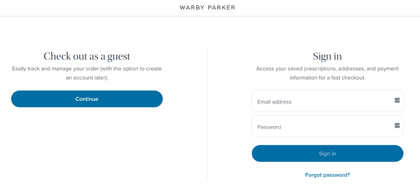
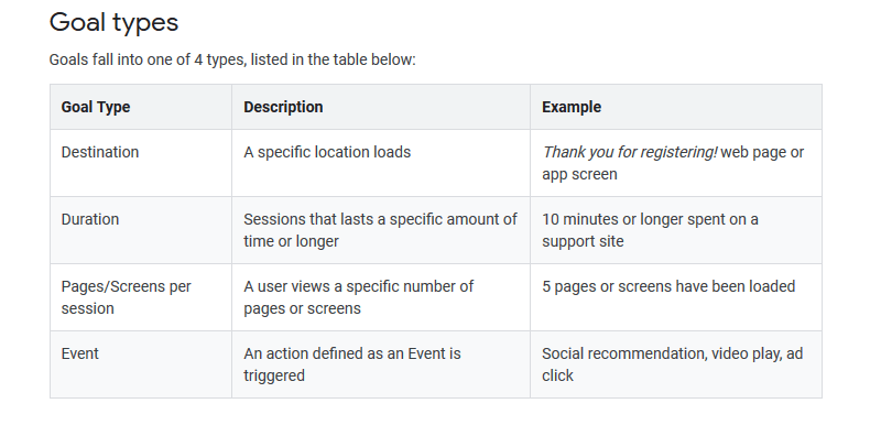
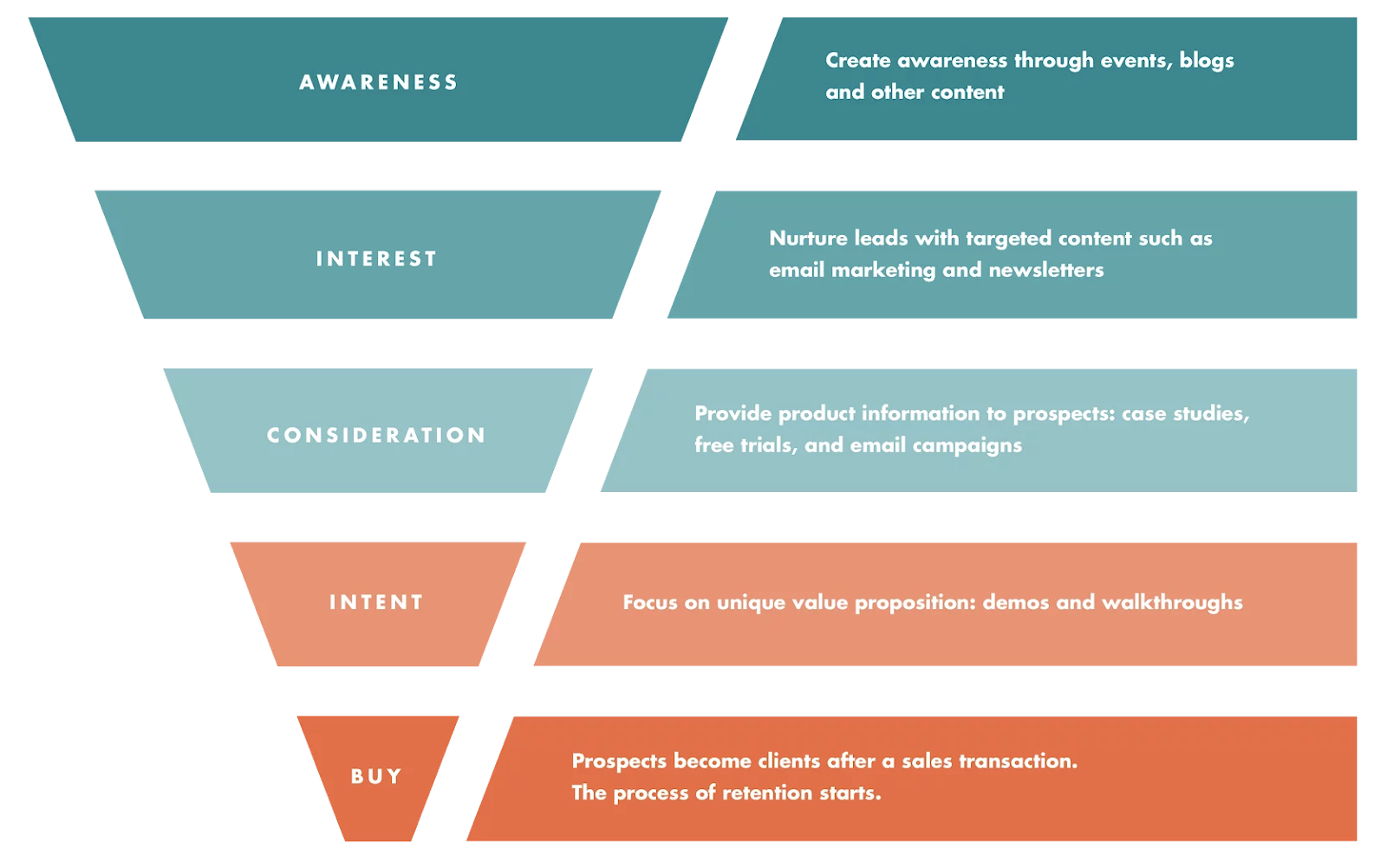
What is a Conversion Rate?

Conversion rate is a measure that helps business owners understand the percentage of people who visit their website or online store and complete an intended goal such as buying a product, signing up for a newsletter or taking some other action.

Conversion rates are an important metric for measuring the success of digital marketing campaigns and website optimization efforts.

In order to increase conversion rate, business owners need to have a comprehensive understanding of their target audience and their behaviors.

To achieve this, they must use conversion rate optimization (CRO) strategies that create an effective user experience and guide visitors through the customer journey towards taking action.

CRO strategies for 2023 and beyond should focus on creating a seamless customer journey, providing personalized experiences, optimizing mobile experiences, leveraging AI technology, and delivering better content.

Ideal Conversion Rate

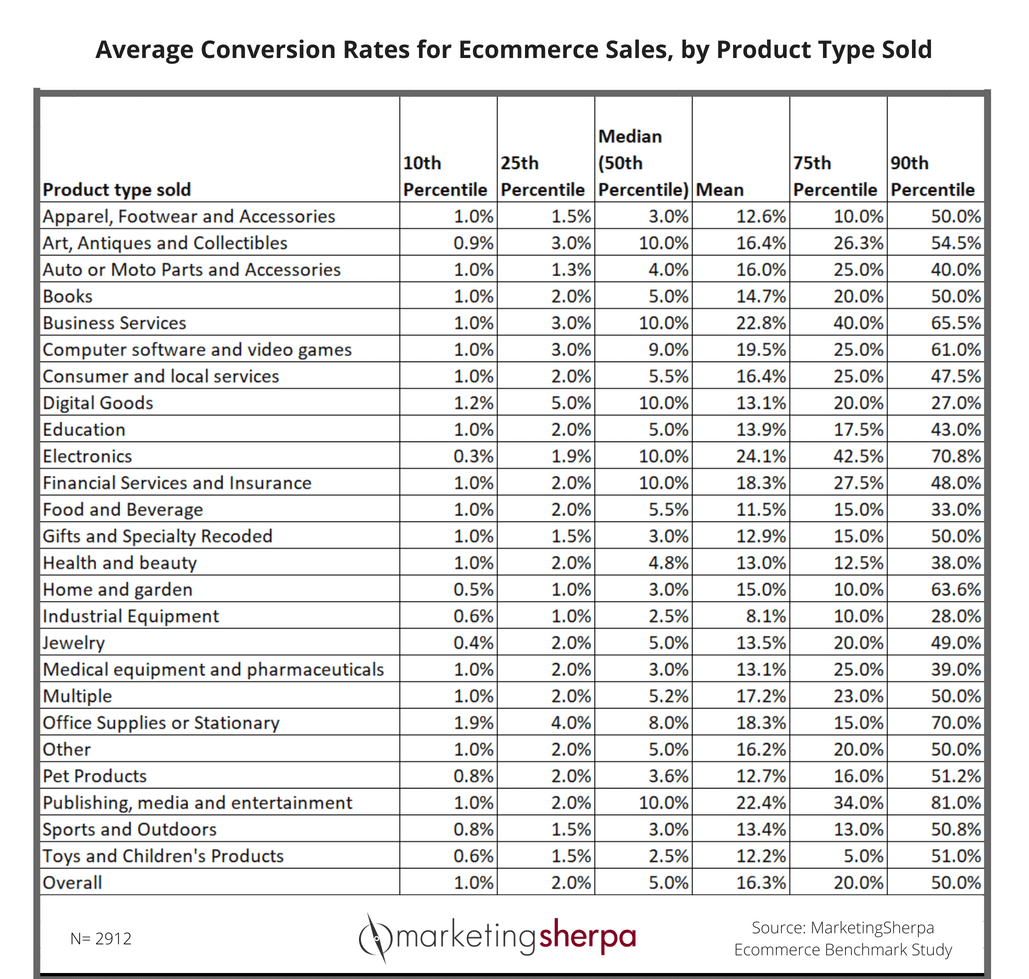
There is no single answer to this question as conversion rate can vary significantly depending on the industry and your customer base. Generally, a good conversion rate will be higher than 3%, although some industries may have much higher or lower conversion rate.

It’s important to keep track of your website’s performance over time by monitoring key metrics within the conversion funnel such as page views, average time spent on a page, and bounce rate to get an understanding of your conversion marketing strategy.

Measuring Your conversion rate optimization

Calculating your website’s conversion rate is fairly straightforward. All you need to do is take the number of site visitors who completed a desired action (such as buying a product or signing up for a newsletter) and divide it by the total number of site visitors to your website. The result is your conversion rate, which will typically be expressed as a percentage.

For example, if you had 100 visitors to your website and 10 of them completed the desired action, your conversion rate would be 10%.

This is also what we’ll be focusing on today. In this action-packed and practical article on conversion optimization strategies and examples:

5 ways to boost your conversion rate:

  • Using Scarcity to Improve Conversion Rates On Cold Traffic

  • Multi-step Forms to Decrease Bounce Rate and Boost Engagement

  • Developing Trust And Educating Your Leads Through Social Proof

  • Trust Badges And Other Authoritative Signals to Reduce Friction and Boost Conversions Rate

  • All-Inclusive CRO Audits That Cover Your Whole Site.

To improve this rate over time, you can use the strategies outlined above such as optimizing for mobile, personalizing content and leveraging social proof. Over time, these efforts will help you to increase the conversion rate of your website and maximize the ROI of your digital marketing campaigns.

Ultimately, having a high conversion rate is key to driving revenue for any business. By utilizing the strategies outlined above, you can optimize your website performance in 2023 and beyond and ensure that you are building a successful online presence.

Ready?

Let’s dive right in.

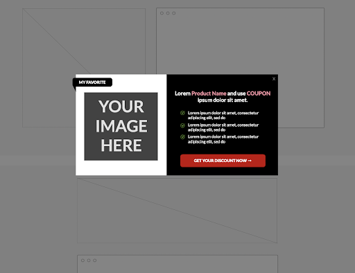
1. Using Scarcity to Improve your Conversion Rate On Cold Traffic

email cro

Source: AppSumo 

Scarcity is a proven marketing tactic that also can drastically boost conversions rate.

You see it everywhere:

  • In eCommerce with countdown timers telling you there’s only one stock left on the page.

  • Marketing consulting experts telling you they only have time for 1 more client.

  • Auction sites alerting you to bid now before someone else does so.

It’s a proven conversion rate optimization strategy that can be best explained as “a product becomes more attractive when their perceived availability is limited.”

Using scarcity is like a quick nudge to potential customers who are on the fence about buying from you.

They have a limited attention span (as do most people browsing the internet) and they need a reason to care.

Show them a tempting offer with a time limit next to it and you’ll get their attention real quick.

There are a few different ways you can implement scarcity as part of your conversion rate optimization strategy.

A lot of it comes down to the right mix of words (copywriting) and/or web elements (widgets, plug-ins, custom code, etc.).

Let’s take a look at some examples of scarcity in Conversion rate optimization (CRO).

Words for time scarcity:

  • Deal ends today.

  • Only 12 hours left.

  • Price goes up in 1 day.

  • Offer expires today.

Words for stock scarcity:

  • First 50 people get a free coaching call.

  • Nearly sold out. 

  • Limited edition. 

  • Only available to members. 

  • Get them while they last.

Words that imply exclusivity:

  • Members only.

  • Login required.

  • Class full.

  • Membership now closed.

  • Exclusive offers inside.

  • Get it before everybody else.

  • Rush my order (for Prime members only)

  • And more.

Some eCommerce stores go as far as using fake timers and countdowns to inspire urgency and get people to buy faster. 

Now, the ethics of fake scarcity is a topic for a different time.

But that just goes to show how effective scarcity is when it comes to conversion rate optimization.

Need more live examples and different ways you can use scarcity to boost your conversion rate?

Check out our full list of biggest brands using scarcity marketing and how you can implement this strategy in your own site. 

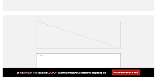
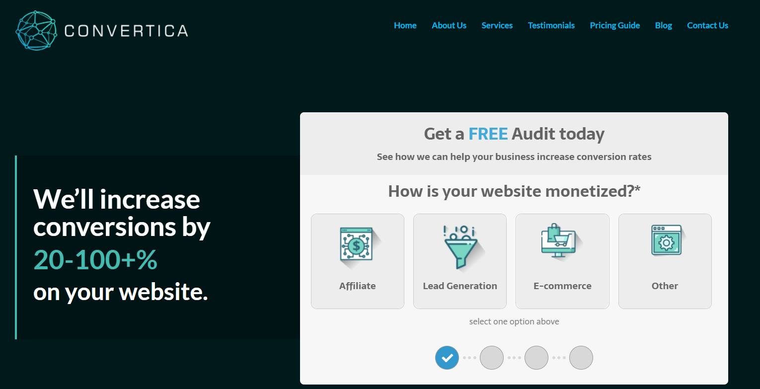
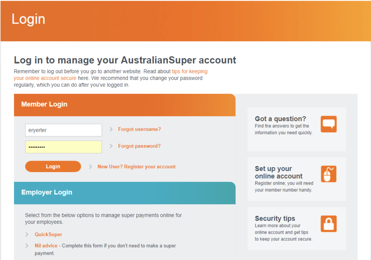
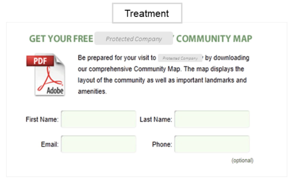
2. Multi-step Forms to Decrease Bounce Rate and Boost Engagement

cro-webform

Source: Convertica 

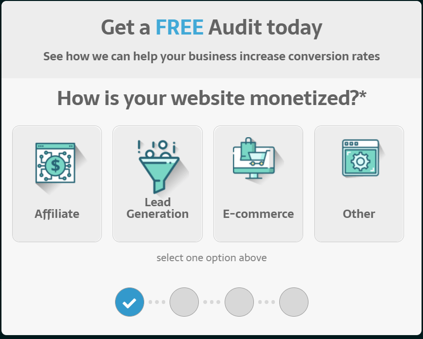
Want to increase the conversion rate on your Shopify website and start converting more qualified leads?

Consider using multi-step forms to make your site visitors stay longer on your website and keep them engaged

With high-quality and well-designed web forms, your potential paying customers learn more about you, develop trust, and be more likely to continue to your final CTA.

There’s a lot that goes behind boosting your conversion rate. But to very generally break it down, you need to:

  1. Keep your first-time website visitors.

    Let them stay on your page and convince them it’s relevant to them through your design and copywriting.

  2. Educate them.

    Educate your visitors with your offer and target their pain points (copywriting, your offer, your positioning, etc.).

  3. Qualify your leads.

    Not everyone who lands on your landing page will be a relevant lead. Being able to qualify qualified leads will save you a lot of time in the long run (copywriting, your offer/pitch, and ideally, a multi-step form).

Multi-step forms are ideal for boosting your conversion rate and qualifying your leads.

How do these forms work?

The best way to learn is through an example.

Check out the form on the Convertica homepage to learn the steps it goes through. It’s interactive and designed to keep leads on the site longer.

The questions it asks include:

  1. How is your website monetized?

  2. How many monthly unique visitors do you have?

  3. What’s the link to your website?

  4. Where should we send your FREE audit? (contact information).

Here’s why this works so well for CRO:

  • Engaging design elements that lets the prospect know how many steps are left.

  • Branded design that fits with the rest of the site well.

  • Specific questions and asks for the right information (ends with opt-in info).

Thankfully, there are many form builder tools out there you can use to create a lead-generation specific web form.

And if you’re looking for general web page optimization best practices, be sure to check out our full guide to multi-step forms for more info and the step-by-steps.

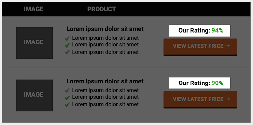
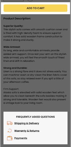
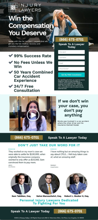
3. Developing Trust And Educating Your Leads Through Social Proof

social-proof-conversion

Source: Intercom

Trust is one of the most powerful tools in your conversion rate optimization arsenal.

Building trust is hard nowadays because your leads probably have a thousand other tabs open and don’t have a huge attention span to begin with.

You need to educate them quickly as to why you’re trustworthy to do business with and why your offer is relevant

Some other ways you can leverage trust include:

  • Being present on review sites (Capterra, Trustpilot, G2, etc.).

  • Strong web presence and social media.

  • Strong branding and marketing on your website (e.g. strong “about us” page that shows you’re an actual person).

  • Social proof – quotes and testimonials from past clients or paying customers.

Zendesk is great at building trust and using social proof that’s digestible at a glance.

zendesk social proof landing page

There’s a lot you can learn from their marketing too. Including how to leverage your lead generation strategy, content strategy, PR marketing, pricing, SEO, and more.

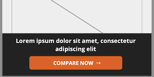
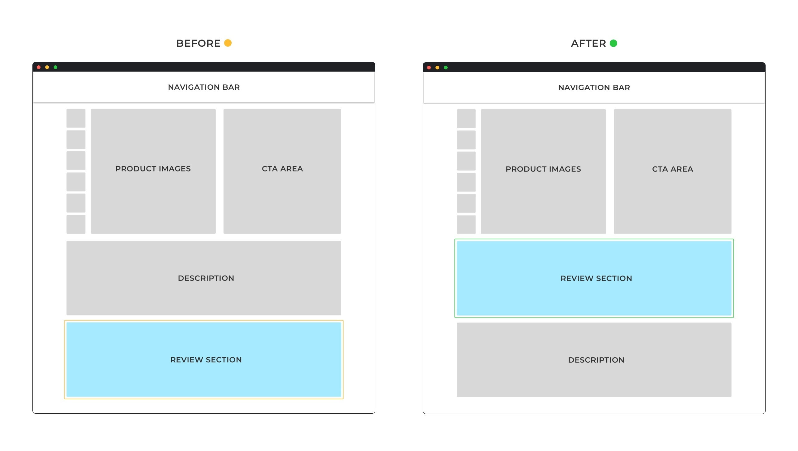
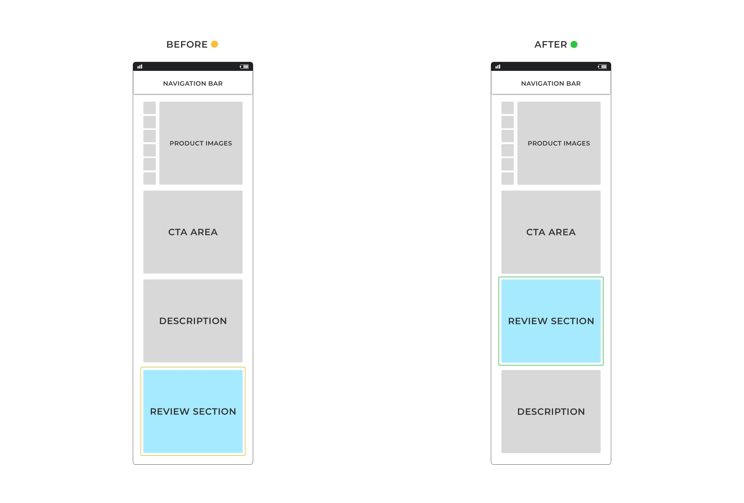
4. Trust Badges And Other Authoritative Signals to Reduce Friction and Boost Site’s Conversion Rate
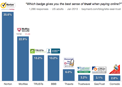
trust badge examples statistics

Source: Baymard

This ties in directly with the above.

Another great way to increase your trust is through trust badges, online certifications, social proof, and more.

For example, in an eCommerce conversion rate A/B test, Goinflow found that including the McAfee seal on an electronic website boosted the conversion rate. In a test of over 3 days, their revenue was measured as following:

  • No badge: $112,286

  • Norton Secured: $112,538

  • McAfee Secure: $126,769

The McAfee badge returned the highest life rate of 15.7% with a 97% confidence score.

The best part is that adding the McAfee badge to your website is a very quick and easy process, free for your first 500 visitors/month

That’s an easy way to suddenly jump your conversion rate.

Looking for other easy conversion rate increasing strategies? 

Look into your target audience and what they consider a business to be trust-worthy.

Or check out our full guide to trust badges for more info on this conversion strategy partners.

 5. All-Inclusive CRO Audits That Cover Your Whole Site

cro data based on device

Source: NeilPatel

Okay, this might sound obvious but…

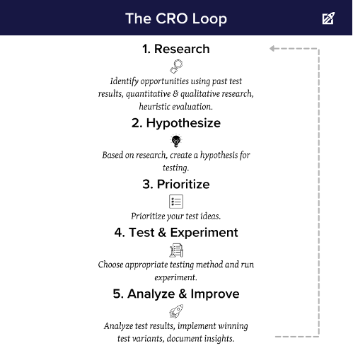
If you’re looking for an all-inclusive website analysis of your average conversion rate and other website elements – a CRO audit is the best way to go about this.

Essentially, a CRO audit is research and data-based assessment of the state of your website. 

It’s like looking at your website with a magnifying glass to identify each link and element of your website to find bottlenecks that stop people from converting.

What’s included in a CRO audit?

Depends on a lot of things. But our process usually includes:

  • Setting goals and hypotheses.

  • Identifying which pages to optimize.

  • Doing a thorough customer analysis (who, what, where, and when of your site visitors. Heatmaps, Google Analytics, etc.).

  • Website analysis: Evaluating your landing page layout, design, and copywriting.

  • Collecting data from analysis and A/B tests.

  • Applying changes, checklist, and implementing the conversion rate optimization plan accordingly.

Obviously, there is no one-size-fits-all approach to CRO audits. Everything depends on the specific website, goals, and data.

Once all the audit checks are applied, you should come out of the CRO audit converting more traffic into leads.

Think of it as a one-time investment.

Once you make the changes, your website will be in better condition and start getting more leads per existing traffic.

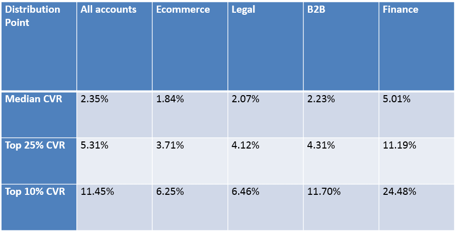
Across industries, the average landing page conversion rate is around 2.35% (source). After a strong CRO audit, you could be getting 5.31% or higher (which is the top 25% of landing pages – not too unrealistic).

Not bad, right?

Benefits of Conversion Rate Optimization (CRO)

Good conversion rates will vary depending on the industry and type of business, but typically a conversion rate of 2-3% is considered good. To calculate your website’s conversion rate, divide the total number of conversions by the total number of visitors.

The benefits of CRO are vast and can help businesses and sales team achieve their online goals faster. Not only will your website be more attractive to visitors, but it will also have better search engine optimization rankings and higher conversion rates. In addition, CRO can help you increase customer loyalty, target potential customers more effectively and ultimately maximize revenue.

By effectively utilizing CRO strategies, businesses can create a better customer experience and optimize their website performance. Ultimately, this will lead to increased conversion rates and higher ROI on digital marketing efforts.

Where to Maximize Your CRO Strategy?

Once you have identified the key conversion marketing tactics that are appropriate for your business, you can begin to identify which areas of your website should be targeted with these tactics.

Homepage

The homepage is often the first page a visitor will see and therefore it is important to optimize this page to increase conversions. Make sure that your content, visuals and calls-to-action are all tailored towards the target audience.

Landing Pages

Landing pages should be optimized for specific goals of each sales team such as downloading a whitepaper or signing up for a newsletter. Be sure to include relevant visuals, content and CTAs on the page in order to maximize and increase conversions.
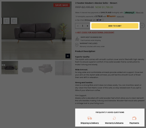
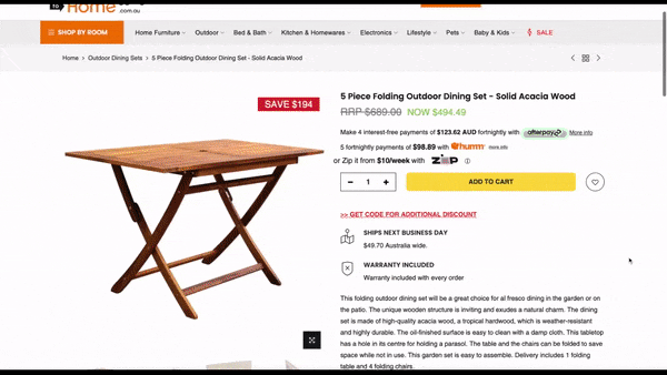
Product Pages

Product pages should be optimized with images, videos, customer reviews, descriptions and more. These elements can help shoppers get the information they need in order to make an informed purchase decision.

Checkout Pages

The checkout page should be optimized with simple navigation and a one-click purchase option. Additionally, it’s important to include trust signals such as customer reviews and secure payment logos.

Pricing Page

The pricing page should be optimized to make sure that customers can easily find the information they need to make a purchase decision. Additionally, having different pricing options can help capture more sales and increase conversion rates.

Blog

Blog posts can be optimized to increase conversions by including relevant calls to action at the end of each post. Additionally, leveraging content upgrades can help capture all your incoming leads and drive more conversions.

Conversion Marketing: From Site Visitors to Paying Customers

Conversion marketing is all about understanding the needs of potential customers and leveraging tactics to turn them into paying customers. Implementing a CRO audit can help your business optimize its website, improve customer experience and boost conversions. So, don’t wait any longer – start optimizing today!

Remember, conversion rate optimization is an ongoing process and there’s always room for improvement. It’s important to monitor your website analytics regularly and make small changes as needed in order to maximize the potential of your website. With the right strategy in place, you can drive more revenue and grow your business.

The key is to stay up-to-date with the latest trends in CRO and be sure to keep testing different tactics. With patience, practice and a customer-focused approach, you will see an increase in conversions and ROI on your digital marketing efforts.

Final Thoughts

So, to recap, let’s go over some of the top conversion rate optimization questions:

  • What is CRO strategy?

A conversion rate optimization (CRO) strategy is the science and art of increasing the percentage of your website visitors who take desired action. Be it buying a product, signing up for your services, opting into your newsletter, or submitting a form. Conversion marketing aims to transform more of your website visitor traffic into real business results and get you more leads from the same traffic.

  • What are the best practices for optimizing your conversion path?

There are a lot of best practices and strategies you can follow to optimize your conversion path and website. To start with, you can use the proven strategies we’ve covered above:

  1. Using scarcity to improve conversion rates on cold traffic.

  2. Multi-step forms to decrease the bounce rate and boost engagement.

  3. Developing trust and educating your leads through social proof.

  4. Trust badges and other authoritative signals to reduce friction and boost conversion rate.

  5. All-inclusive CRO audits that cover your whole site.

  • What is the conversion rate optimization formula?

To calculate your conversion rate, divide the number of conversions you’re getting in a specific time frame by the total number of people who visited your site or landing page. Then, multiply it by 100%. For example, if your site had 10,000 visitors and 1,000 conversions in the last 30 days, your conversion rate is 10%!

Now, are you ready to boost your conversion rate and start getting more leads per traffic?

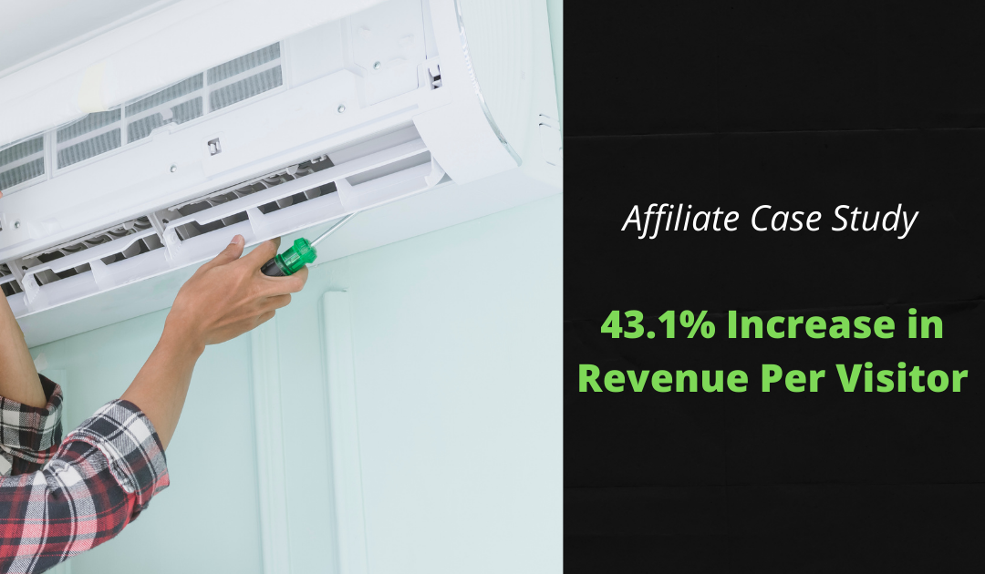
Claim your free website audit today to see how we can help your business increase the conversion process. We’ve increased website conversions anywhere from 20-100%+ across different niches from affiliates, eCommerce, SaaS, local businesses, and more.

FAQs

How do I track my conversion rate?

To track your website’s conversion rate, you need to use analytics tools like Google Analytics or Hotjar. These tools will provide you with data about the number of visitors who have visited your site, as well as the number of conversions (or desired actions) taken by those visitors.

What is an example of conversion in marketing?

Conversion in marketing is when a website visitor takes a desired action such as signing up for an email list, downloading a guide/ebook, or buying a product.

What is the Purpose of Conversion Marketing Tactics?

The purpose of conversion marketing tactics is to increase the percentage of website visitors who take the desired action. This can be anything from buying a product or service, signing up for a newsletter, or submitting a form. By optimizing your website and leveraging effective CRO strategies, you can get more leads per traffic and maximize your conversions.


Author: Kurt Philip

Hi, I’m Kurt Philip, the founder & CEO of Convertica. I live and breathe conversion rate optimization. I hope you enjoy our findings.

We’ve worked with over 1000 businesses in the last 6 years.
Let’s jump on a quick call to see how we can help yours.

Book FREE CRO Call

Client Case Studies


Follow us on Youtube

Conversion Optimization Round-up – July 2021

Conversion Optimization Round-up – July 2021

Who doesn’t want more conversions? However, where does one start with the ever-changing methods and resources available? Let us help you out with some top picks of the latest articles in Conversion Rate Optimization.

This Round-Up will explore how to calculate conversion rates and their application across different channels and customer journeys. You’ll also learn how to attract customers and keep them coming back. Next, we will explore what critical mistakes to avoid when doing your A/B testing. Then we bring you along for an experiment on what works better, the link or the button? And finally, we dive into conversion intelligence and let you in on some important insights.

Conversion Rate Formulas to Accurately Calculate Growth

https://cxl.com/blog/conversion-rate-formula/

Take a deep dive into how to calculate your growth. What’s working for you, and what needs to be revamped and revisited. 

Conversion rate formula is key to understanding your marketing insights. It’s the best method to find out what your next steps should be.

The method for calculating conversion rates varies depending on a lot of criteria. CXL details a few of the best formulas to use to see where you stand. However, using the basics, you can calculate the conversion rate with the following formula:

Number of Conversions / Number of Visitors * 100 = Conversion Rate

In addition, you need to keep in mind the item you are selling. A 5% conversion rate on large ticket items is comparable to a %15 conversion rate on smaller ticketed items. Remember, context matters here.

You are also going to learn how to calculate and collect accurate data:

  • How many clicks are we generating?
  • What’s the click-through rate?
  • What’s our CPC?
  • What’s our CPA?

If you are looking at how to leverage and calculate your conversion rates to drive your optimization efforts, this is the article you need to read.

CXL (https://cxl.com/blog/conversion-rate-formula/)

Attracting the Customer’s Attention

 https://www.marketingsherpa.com/article/case-study/brand-refresh-AB-tests-PPC-landing-pages-XR-immersive-experience

When the Marketing Sherpa puts together case studies, you pay attention. They know what they are talking about. If you cannot grab the customers’ attention, how amazing your product is doesn’t matter.

Find out what it takes to attract the ever-fleeting attention of your new and old customers. Remember, as we move forward, the most important element of an effective advertisement is its ability to capture attention.

Here three case studies are offered that will certainly help you generate more attention, which in turn generates more money in your pocket.

  •   Bumble Bee Seafoods attains its first profitable year in five years by rebranding.
  •   Roommate finder app increases conversion by 10% in the A/B test by adding value proposition information.
  •   Tennessee Titans reach 2.2 million people on Twitter using an XR immersive experience.

In addition, the Marketing Sherpa explains this fundamental ability in a fun, attention-grabbing way.

MarketingSherpa (https://www.marketingsherpa.com)

The Pitfalls of DIY A/B Testing

https://www.widerfunnel.com/blog/the-pitfalls-of-diy-a-b-testing/

WiderFunnel takes you in on an in-depth ride into the best practices when doing A/B testing. A/B testing results have helped inform many crucial business decisions. However, A/B tests are only as helpful as the accurate information and skill of the tester. Due to this, A/B testing can be frustrating and sometimes can even produce unreliable results.

Reading through this article will help break down what you must avoid. What you need to include and how to use this testing to improve traffic and sales. They help explain what you need to plan your optimization road map, avoid too many testing elements, and finally, how to avoid calculating using unbalanced traffic.

Furthermore, following these steps will help you filter through ideas that are not based on insights that lead to fruitless and repetitive testing, which is wasteful, risky, and less impactful.

GuessTheTest (https://guessthetest.com)

We get asked all the time, what converts better on your webpage and articles: The link or the button?

With this case study from Guess the Test you can see exactly how their button contributed to a 32.37% increase in logins.

Use this as an idea for your own test. Keep in mind to generate accurate numbers and execute this like a true experiment. Keep constants, record accurate data, and be prepared to change what isn’t working.

So, following these steps will put you in the right direction. And settle once and for all what’s better for your business? Link or button?

Conversion Intelligence—The New Era of Marketing

 https://unbounce.com/marketing-ai/conversion-intelligence-the-new-era-of-marketing/

Unbounce (https://unbounce.com)

We will be the first to agree with you, change is hard. It can sometimes feel overwhelming and frustrating. Unbounce is a leader in trying new marketing methods, and they are sharing some of their key finds. They recommend capitalizing on new trends and not missing out on the new way of streamlined marketing.

When a group of marketers was asked if they could have more of one thing, what would it be? 50% said more conversions. It’s no secret conversions lead to more sales, and more sales lead to more money in your pocket. That’s why we are all here, right?

In today’s world, we need to combine the increasingly used artificial intelligence with marketing intelligence. And combined, we get conversion intelligence that works best for you in today’s market. This world is moving fast. The advances to how we market are changing at rates never seen before. Covid has changed the way businesses operate. In addition, we learn what is involved in getting those customers through the door, so to speak, and keep them coming back. 

We hope this Round-Up helps you put into perspective exactly what needs to be done to help improve conversions and build a stronger, healthier business.

Author: Kurt Philip

Hi, I’m Kurt Philip, the founder & CEO of Convertica. I live and breathe conversion rate optimization. I hope you enjoy our findings.

We’ve worked with over 1000 businesses in the last 6 years.
Let’s jump on a quick call to see how we can help yours.

Book FREE CRO Call

Client Case Studies


Follow us on Youtube

Conversion Optimization Round-up – June 2021

Conversion Optimization Round-up – June 2021

Today we’ve got for you, a rich pool of helpful resources wherever you are on your CRO journey—beginner, intermediate or expert. 

First, we have an article from GuessTheTest that will surely give you a good idea for grabbing and sustaining your reader’s attention. Next, we have Google’s 2021 update and why delivering top-notch content is always crucial. 

Third, you can learn some valuable strategies from the 4 case studies we included. Then, we will give you more ways to love Google Optimize. Finally, we have a guide on Conversion Funnels, and why understanding them will help you lead consumers through the buying journey.

Result: Which AI-generated headline won?

https://guessthetest.com/test/which-ai-generated-headline-won/?referrer=A 

With thousands of things constantly grabbing people’s attention, how do you compete with human’s ever shortening attention span? This experiment by GuessTheTest is designed to capture and hook the reader’s attention. 

The goal was to ascertain which AI-created copy combination of the 5 versions would prompt users to click on the Call-To-Action (CTA) button leading to the LottieFiles tool. For your info, LottieFiles is a design and development tool that provides everything needed to create, edit, display, and share Lottie, an open-source animation file format.

The results reveal that high-converting headline copy needs to be crisp, clear, and easily scannable. In addition, a longer and more detailed copy is better at later stages in the funnel to support the user’s decision making.

Guess the Test (https://guessthetest.com/)

Google’s Page Experience Update 2021: Prioritize UX Optimization for Success

https://vwo.com/blog/googles-page-experience-update-2021-prioritize-ux-optimization-for-success/

VWO talks about Google’s update in prioritizing websites that serve an excellent page experience to their users over others. This paves the way for small brands to rank high and have higher conversions as long as they deliver relevant, helpful content and a delightful user experience. 

Another key point that VWO noted is to put a premium on listening to and understanding your customers, giving them what they are looking for. Then, of course, to constantly experiment, evolve, and explore.

Apart from that, there are other high-impact changes that you can explore, such as optimizing your content, speed, SEO, UX, and security. Remember that in determining page rankings, content will always be crucial. Make sure to top it up with alt text descriptions and SEO-optimized keywords. Don’t forget your website’s speed and reduce 4xx errors. With UX, let’s talk about well-designed and correctly positioned call-to-actions as well as ensuring your website is mobile-ready. Finally, ensure safe browsing. The user’s personal information should not be at risk.

VWO (https://vwo.com/

Lead Generation: 4 quick case studies about web forms, local keywords, referral campaigns, and virtual business cards

https://www.marketingsherpa.com/article/case-study/lead-generation-case-studies-web-forms-local-keywords-referral-campaigns-virtual-business-cards

The first case study highlights that tweaking a single, important content section in a web form generated a 326% increase in leads. They also emphasized clarity, imminence, time to value, and value translation in influencing the results.

Marketing Sherpa (https://www.marketingsherpa.com/)

Case 2 talks about exploring numerous untapped, local-based keywords with extremely low competition. They also created hundreds of pages with relevant content using a bulk page generator. This resulted in an increase of 37% in email opt-ins and 10% on the front-end, and 28% on the back-end in affiliate commissions. 

Case 3 shows how a team devised a referral strategy called a ‘coffee campaign’ on LinkedIn to promote a product on its launch day. First, they tagged a few prominent people in the Managed Service Provider industry, telling them to tag an MSP buddy in the comments section of the launch post to get a $10 coffee voucher. Then, the team proactively DMed the coffee vouchers as soon as people got tagged. This enticed people to enjoy and participate in the online event.

Lastly, case 4 is about how a real estate company took inspiration from the ban of shaking hands and passing along a physical business card due to the pandemic. Instead, the team experimented with contactless, virtual business cards that generated 103,500 new leads. 

Invespro (https://www.invespcro.com/)

This article talks about (as the title suggests) the good, the bad, and the ugly sides of Google Optimize. Although not a perfect tool, you can start with conversion optimization without breaking the bank. If you are a small business owner, this is the tool for you. It is accessible, user-friendly, easy to set up, and offers many testing options. In addition, it will enable seamless integration with other Google tools and products. How convenient is that?

On the flip side, there’s a limitation to the number of simultaneous experiments you can initiate for the free version. If you need customer support, there is no option unless you upgrade to Optimize 360. 

Moving forward to the ugly side, it does not have an image upload feature, which requires you to use a third-party tool. Another thing is, there is also no segmentation for your A/B testing. You may also experience page flickering, which may cause trust issues for your visitors. Plus, no scroll maps and heatmaps for your in-depth analysis.

Your Step-by-Step Guide to A/B Testing with Google Optimize

https://www.crazyegg.com/blog/ab-testing-google-analytics/  

Crazy Egg https://www.crazyegg.com/

If you are new to A/B testing and want a more in-depth guide to Google Optimize, this article walks you through this free tool. It explains how A/B testing plays a crucial role in your conversions and sales generation. It also shows you more ways to love Google Optimize. It is user-friendly and an ideal tool for learning the basics and building the foundations of conducting A/B testing.

Why Your Marketing Strategy Needs a Conversion Funnel (and How It Works)

https://unbounce.com/campaign-strategy/conversion-funnel/

Unbounce (https://unbounce.com

Unbounce talks about Conversion Funnels and emphasizes that a “well-constructed conversion funnel attracts prospects, nurtures qualified leads, and then converts them into paying customers.”

You will be introduced to the top of the funnel (TOFU). This is where the blog post, articles, ads, and landing pages become handy. Each buyer starts at this spot, actively seeking solutions to their problem. You offer a solution to their problem by offering valuable content.

Next comes the middle of funnel (MOFU). This is the stage where both of you and your prospect get to know each other. They are gathering more information about the solutions you offer, and you also gather information to provide tailor-fit solutions. This is also where you “reinforce trust, nurture leads, and monitor purchase intent.” 

Finally, the bottom of funnel (BOFU). This is the part where you are more optimistic that your prospect may decide to purchase your product or services. Unbounce shares that this is when you need to apply “some sense of urgency” through your emails, offers, and ads.

Author: Kurt Philip

Hi, I’m Kurt Philip, the founder & CEO of Convertica. I live and breathe conversion rate optimization. I hope you enjoy our findings.

We’ve worked with over 1000 businesses in the last 6 years.
Let’s jump on a quick call to see how we can help yours.

Book FREE CRO Call

Client Case Studies


Follow us on Youtube

eCommerce Case Study – See How We Got a 42.38% Conversion Rate Increase

eCommerce Case Study – See How We Got a 42.38% Conversion Rate Increase

In our latest eCommerce case study, we’ll show you how we repositioned the reviews section on two sites for increased conversions.

The Websites:

The first website is a niche bedding store based in the USA. They sell premium bedding designed in the states. 

The second website is a jewellery store, specialising in beaded bracelets. They are based in the USA but ship their products worldwide. 

Test Details & Background:

We repositioned the reviews section on the product pages so that it appeared earlier on the page and was more readily visible to customers. Beforehand, the customer reviews were at the very bottom of the page. 

We placed the reviews before the recommended/suggested products, and by doing so we hoped to increase trust with shoppers. 

We tested the changes on mobile and desktop on both sites.

We ran the tests for 2 weeks to reach a 98% confidence level. 

Traffic allocation was set to 50/50.

Test Set-up:

The version with the review section higher up the page looked like this on Desktop:

Desktop mockups

Mobile:

Mobile mockup

We placed the reviews just under the product, just below the fold and above the product comparison and detailed description/features.

The Results:

The repositioned reviews section won on both sites, but only on mobile on one, and only on desktop on the other. 

The bedding store saw increases in conversions (order per visitor) on mobile only, with an overall 42.38% increase in orders.

We saw conversion increases in all the different steps of the funnel (users proceed to the cart page, users proceed to the checkout page, and users complete their purchase).

The revenue results (revenue per visitor) were consistent with our funnel results where we saw increases in all steps of the funnel on mobile.

For the jewellery store, interestingly they only saw increases in conversions (order per visitor) on desktop, with a 20.34% increase in completed orders. 

We also saw increased conversions in all steps of the funnel on desktop (users add to cart, users checkout, users are redirected to thank you page).

The revenue results (revenue per visitor) were consistent with our funnel results where we saw increases in all steps of the funnel on desktop.

By rolling out the winner only on desktop, the total impact would be a 2.9% increase in the rate of order completion and 2.2% increase in revenue per visitor.

Key Takeaways:

  • For this test to work for your website, you will need to have good reviews first.
  • A/B testing this change first is important, as we have shown, one saw increases on mobile and the other on desktop.
Author: Kurt Philip

Hi, I’m Kurt Philip, the founder & CEO of Convertica. I live and breathe conversion rate optimization. I hope you enjoy our findings.

We’ve worked with over 1000 businesses in the last 6 years.
Let’s jump on a quick call to see how we can help yours.

Book FREE CRO Call

Client Case Studies


Follow us on Youtube

Conversion Optimization Round-up – May 2021

Conversion Optimization Round-up – May 2021

This month we’re sharing some great new articles that will help you grow your online business and increase your conversion rates.

First off, we thought you should know about the most common conversion killers that are likely hurting your profits. Then, the importance of communicating your value proposition correctly.

Moving on to conducting experiments to achieve product evolution. You’ll also learn about powerful A/B testing solutions for your e-commerce store. Finally, implementing a bold guarantee to increase sales.

We hope you enjoy these helpful reads!

Conversion Killers: The Definitive Guide

https://conversion-rate-experts.com/conversion-killers/

This article series is brimming with great reads, resources, and examples to increase your website’s conversions. First, the series introduces you to the most common conversion killers and how to spot and overcome them.

One of the emphases in this guide is the importance of learning to write clearly. Using jargon and stuffing your content with hard-to-read sentences will only be a disservice to readers.

Conversion Rate Experts https://conversion-rate-experts.com/conversion-killers/

It’s a given that visitors won’t convert if they don’t understand and trust you or your products. Our job here is to ensure that we can deliver what our visitors desire, including the information they need.

As you read through the series, you’ll learn to organize your copy so that visitors can effortlessly see what they need. This includes fixing your headings by turning them into “teasers” or “spoilers”.

There are also helpful techniques to better deal with competition and outsmart your competitors in this ultra-competitive market.

Your 2021 Guide to Creating (and Optimizing) a Value Proposition

https://unbounce.com/copywriting/value-proposition/

Unbounce talks about value propositions and why they should clearly impart what your brand can offer and its overall value to your audiences. 

If you’re wondering how you can create your own value propositions, you can start by understanding the three main parts:

  1. Your solution to your customers’ problem
  2. The specific benefits you offer
  3. The strengths that set you apart from your competition

Unbounce https://unbounce.com/copywriting/value-proposition/

In addition, they further explain why and how these three elements can help your landing pages stand out. They provide samples of landing pages from specific industries like software as a service (SaaS), e-commerce, and professional services. Finally, Unbounce emphasizes that value propositions should “offer clear-cut benefits convincing the audience to choose you.”

How Experiments Guide Growth at Thumbtack

https://medium.com/thumbtack-engineering/how-experiments-guide-growth-at-thumbtack-31ef32b564f1

Alpesh Gaglani, Director of Engineering at Thumbtack, shared how they conduct experiments to guide product development and the complexity innate in running these experiments. Thumbtack is a local services marketplace where customers find and hire skilled professionals.

He mentioned how engagement can be increased by enabling customers to refine their search or filter keywords based on specific criteria. For example, a customer wants to hire a birthday party caterer specializing in preparing food with dietary restrictions or an appliance installer specializing in repairs or installation of a particular brand.

Through this, customers yield quick results and help customers find the right professionals who can do the job for them.


Medium https://medium.com/thumbtack-engineering/how-experiments-guide-growth-at-thumbtack-31ef32b564f1

Having a good experimentation structure paves the way to data-driven decisions and creating products or services appropriate to the market demand.

Finally, he also emphasized the importance of cultivating an amazing culture that rewards success and seeing failures as an avenue of learning. This allows them to super-charge their growth.

Powerful A/B Testing Solutions for Your eCommerce Store

https://vwo.com/blog/top-4-methods-for-finding-test-ideas-for-your-ecommerce-store/


VWO https://vwo.com/blog

VWO walks you through a better approach in A/B testing that will increase your chances of getting meaningful, positive results. In addition, this article points out Google Analytics’ role in telling you where to focus your efforts, thanks to its Funnel Visualization Report. 

Although it tells you which part of the funnel is the weakest link, it does not reveal why it is not working.

Hence, the need to employ tools like:

  1. Surveys and polls
  2. User testing
  3. Competitors and other big eCommerce stores
  4. Customer service logs

These methods can generate significant insights and valuable results that help improve metrics and develop solutions to the problem.

How to do Guarantees Right. And How we Grew a Business by 49% by Adding a Guarantee.

https://conversion-rate-experts.com/guarantees/

This article from the Conversion Rate Experts talks about when and why guarantees work.

A guarantee helps customers feel at ease as it reduces the risk for them if the company does not deliver what it claims.

Guarantee example

Conversion Rate Experts https://conversion-rate-experts.com/guarantees/

This is evident when they implemented a bold guarantee for Geeks2U— to augment the already-great service offered. Just by adding a guarantee on the page, the initial test generated 11% more orders, which increased to 21% when a more specific and prominent version was used. 

Then another experiment with a new variation using a single, powerful sentence, supported with a simple visual, resulted in 24% more conversions. These tests garnered them an overall improvement of 49% over the original “guarantee-less” page. 

In addition, they also pointed out the use of positive terms to deliver a positive promise like “We guarantee that you’ll love our service.” Instead of “If you dislike our service….” 

If you are curious about crafting a guarantee, a 9-step checklist for implementing a bold yet safe guarantee is also discussed in the article.

Author: Kurt Philip

Hi, I’m Kurt Philip, the founder & CEO of Convertica. I live and breathe conversion rate optimization. I hope you enjoy our findings.

We’ve worked with over 1000 businesses in the last 6 years.
Let’s jump on a quick call to see how we can help yours.

Book FREE CRO Call

Client Case Studies


Follow us on Youtube