Top 7 Conversion Rate Optimization Trends for 2022
Did you know that since the start of the pandemic, e-commerce businesses rose by a whopping 17.9%?
How did you fare last year?
As the new year falls upon us, it is time to take a serious look at our goals for the coming year. No, we are not saying to make a resolution list- we all know these don’t work. We are talking about asking yourself honestly, where do I want to be at the end of the year? What do I want my business to look like? And how do I get there?
By the time you get to the end of this article, we are confident you will have more concrete answers to these questions.
1. Understanding Your Audience
Understanding your audience can be the difference between someone who visits your site and a customer who helps yield results. That’s why you are here, right?
As we move into 2022, more and more people want to be heard – gone are the days of a generic site geared to everyone. You need to stand out.
Let me explain.
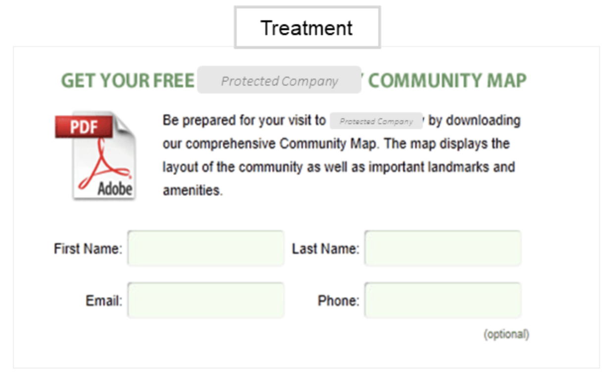
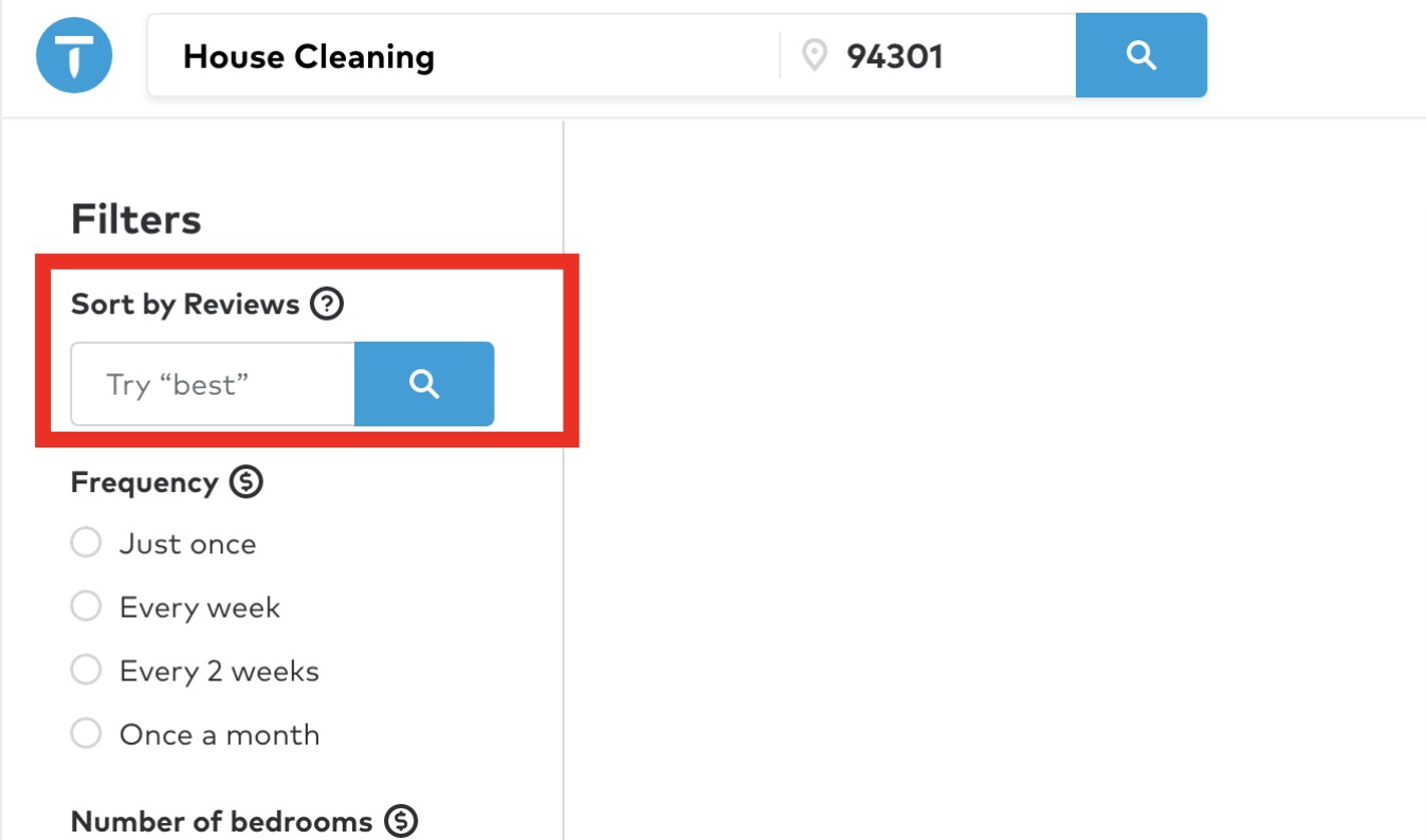
I know it may sound creepy but track your customer’s interests. Learn their behaviors, find out what social media platforms they use, what blogs they read, what grabs their attention? With this knowledge, you can run specifically targeted ads. Not only does this help minimize the amount you spend on ads but will almost guarantee you are maximizing the revenue from those ads.
Another keyway to understand your clientele is to send out surveys. I know what you are thinking, who does those things anyway? Your current customers are likely willing to help. If they know it’s all to better serve them, they might jump at the chance to help. This, coupled with any online feedback you already get from existing customers is a great place to start.

Remember, if you don’t ask, the answer will always be no.
Let’s look at a few more tips to help you better understand your audience and gain more conversions.
Tips to help understand your audience
- Communicate with them – ask them what they want and listen.
- Use social media networks to learn what interests them.
- Show them who is working behind the screen – let them get to know you and your team.
- Be approachable.
- Use online tools such as Audience Analytics and chatbots.
- Learn your demographic.
2. Minimizing Website Load Times
You know it, I know it, we all know it – waiting for a website to load is a sure-fire way to get someone to exit your site and move on. We live in a world of instant gratification. Nobody wants to wait for a slow webpage.
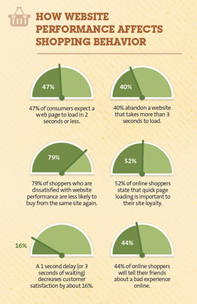
It doesn’t take much to get a user to abandon your site. If you have a delay of even 100 milliseconds, that could send your potential user to your competitor. On average this small delay could result in a 7% decrease in conversions.
Did you know if a smartphone user must wait close to 3 seconds for a webpage to load, you have a 53% chance they leave your site? Those are huge numbers!
Let’s break down what a 1-second delay in upload time can mean.
- 11% fewer page views
- 7% decrease in conversions
- 16% decrease in customer satisfaction
- 47% of potential customers believe a page should load in less than 2 seconds.
- 79% of customers said they would not return to a slow site – ever!
If the potential customer won’t stay to see what you have to offer, everything else you have done or will do means nothing.
Ways to improve website loading time.
- Reduce the file size of your images and videos.
- Use JPG when possible.
- Optimize your design for mobile users
- Reduce your redirects
- Cache your webpages
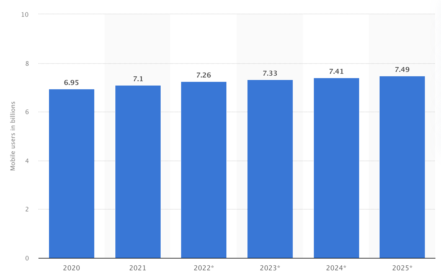
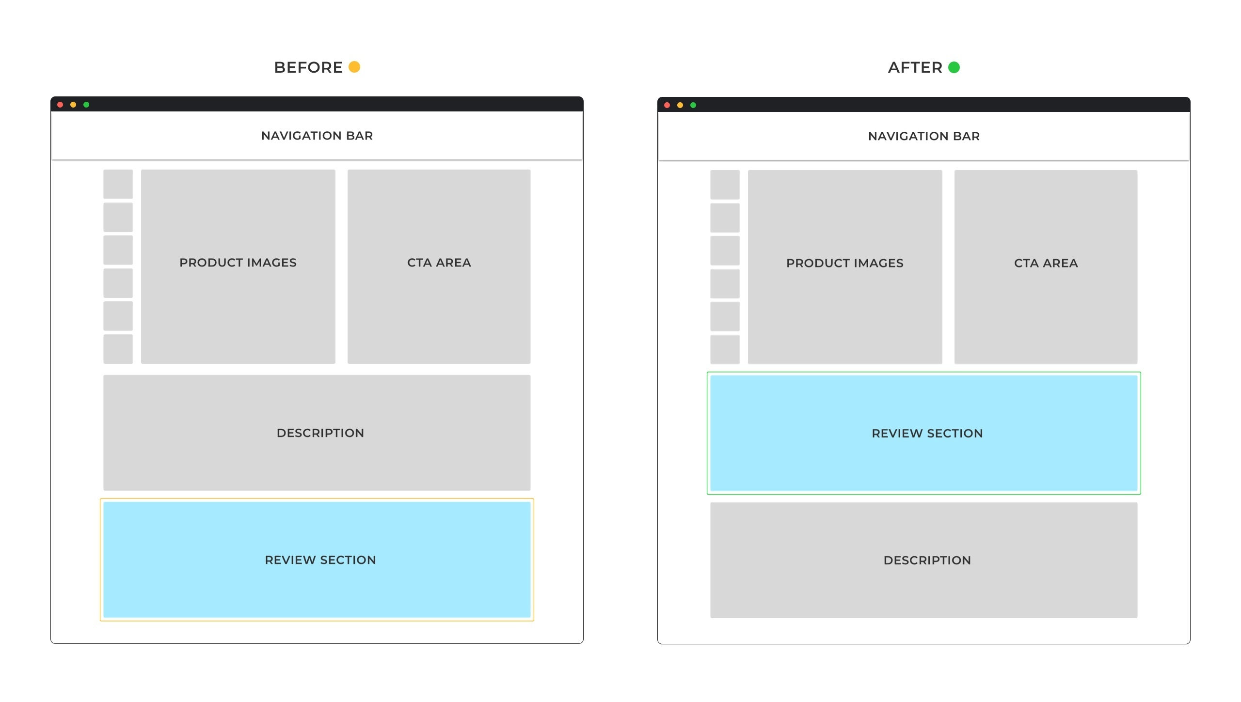
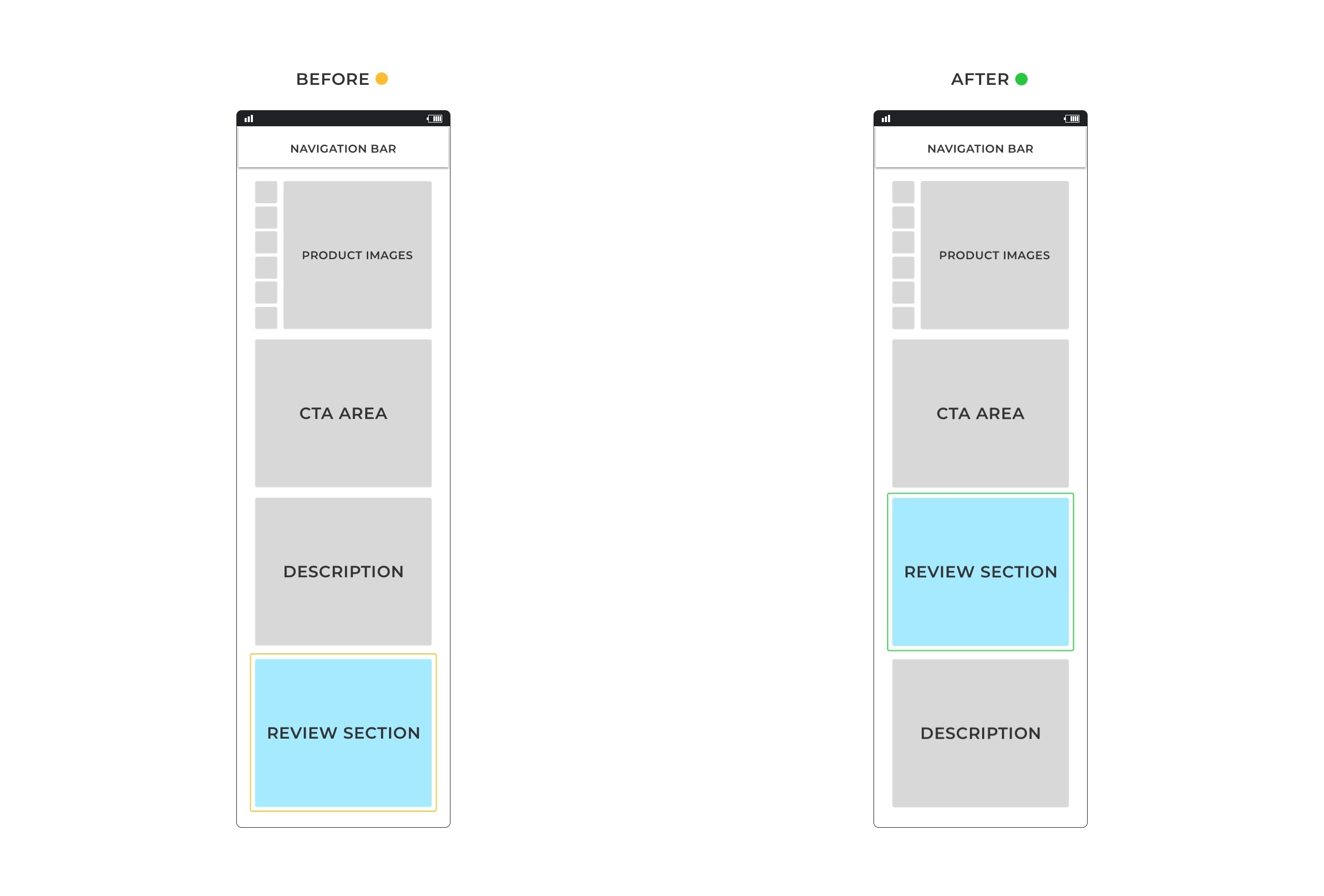
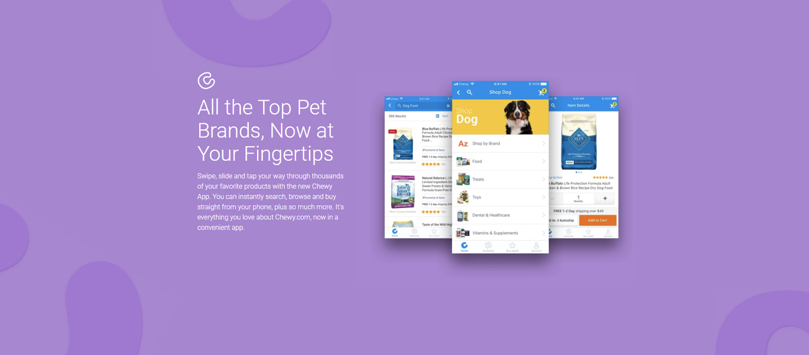
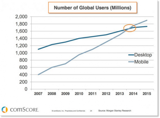
3. Optimize Your Design for Mobile Users
We mentioned this above as a way to improve the speed of your site, but this deserves a deeper dive. Historically, desktop users convert to more sales because desktop users are more often in the buying state of mind than mobile users. This, however, is starting to balance out a bit more.
Today, everyone has a smartphone. Anyone can access your website from anywhere in the world. Experts predict that as we move forward, mobile users will be just as important as desktop users if not more so. Similar to the home phone – desktops are now seen in fewer and fewer homes. Don’t miss out on the top trend of 2022.
Another key area to look at is Adobe Flash. Back in the day, it was all the rave. However, today it doesn’t serve much purpose but slows you down. Ditch the animation, ditch the overly busy. Try to stick to a simple, clean design your users will appreciate. Help them stay on track and not get distracted from the real reason they are on your page – to solve a problem.
Top ways to optimize for mobile users:
- Test, test, and re-test
- Pick a responsive web design
- Speed is vital to your success
- Use AMP in your webpages
- Compress images
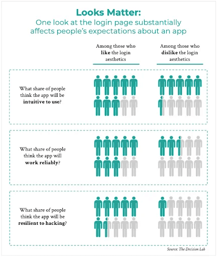
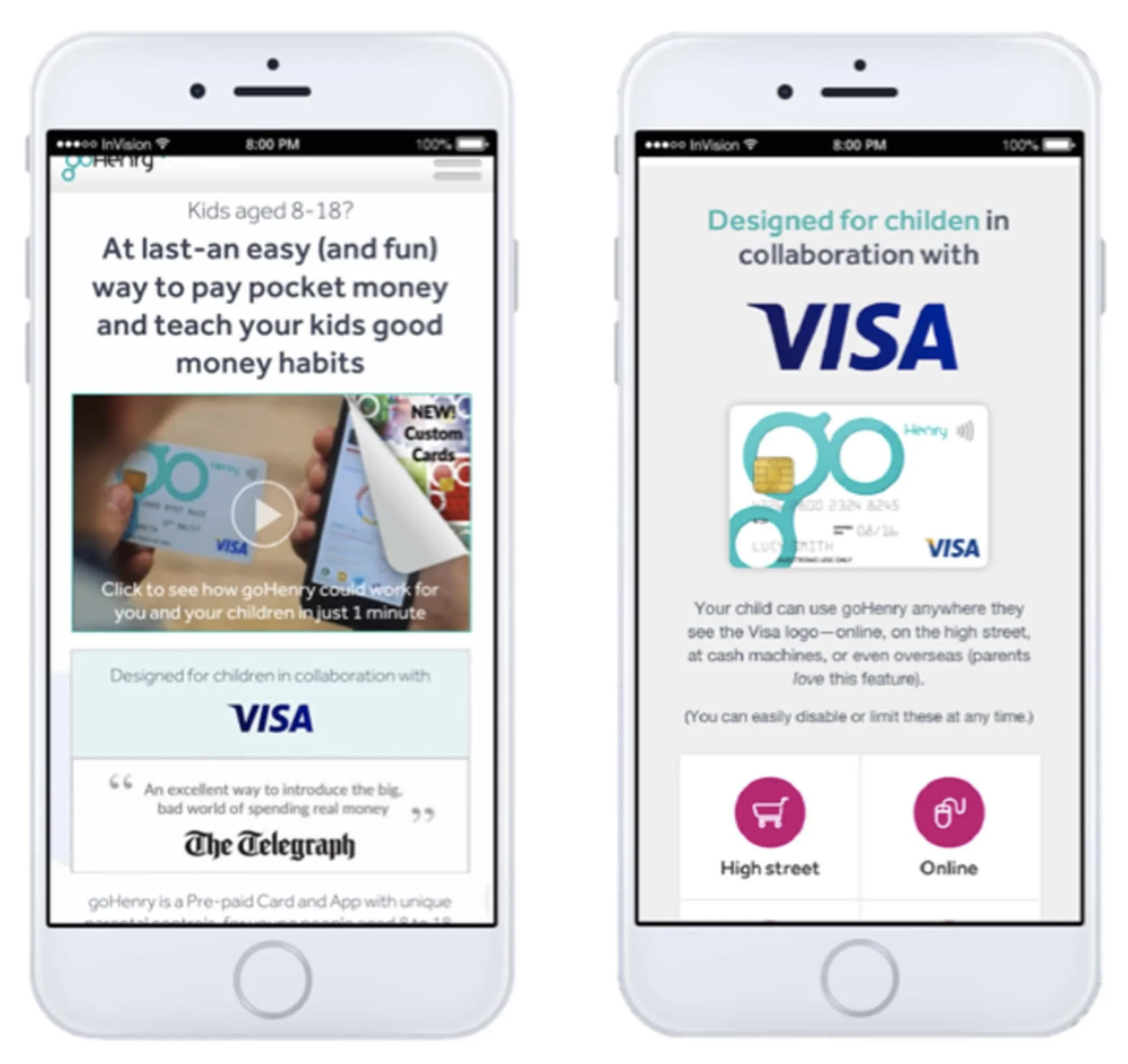
4. Building Trust Through Transparency
Conversions are largely influenced by trust. The best way to build trust is to be transparent. Consumers are demanding that we use transparency in design. Ask yourself – do I have a website I would trust?
Let’s dive into what that means and how to implement this in your website and overall business.
One of the key factors to build trust through transparency is to be as upfront as possible. Don’t try to fool people- now is the time for honesty.
- Always invest in secure systems
- Informed data usage is vital
- Always be upfront about pricing – try to avoid any hidden costs

Your users should know what your app will have access to. (What information are you obtaining from them – be clear) If they understand that the collection of data is for a better user experience, they will be more inclined to offer it to you.
Once you build trust, it will help with conversions and retention. We need those customers to come back, and they will if they trust you.
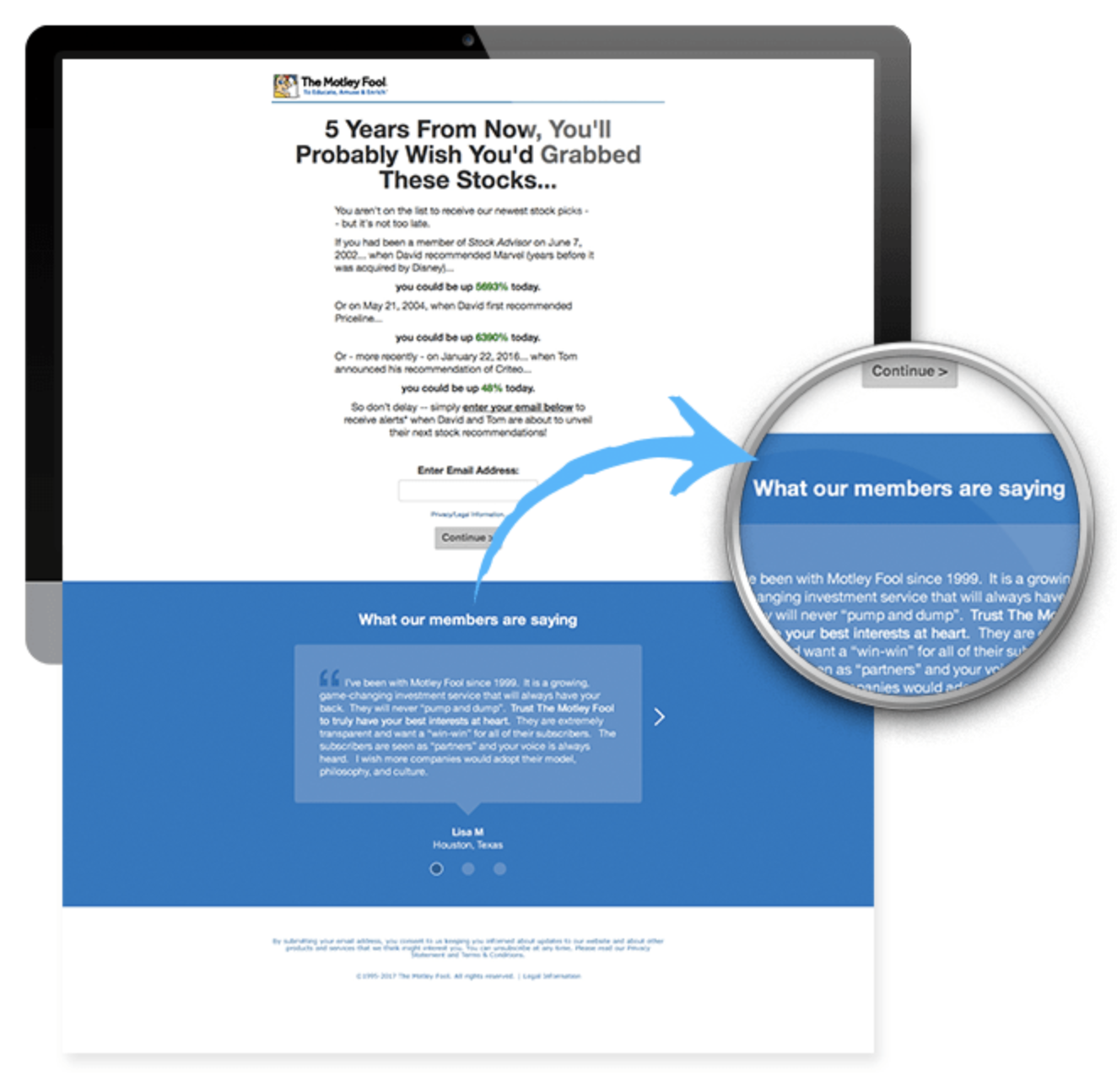
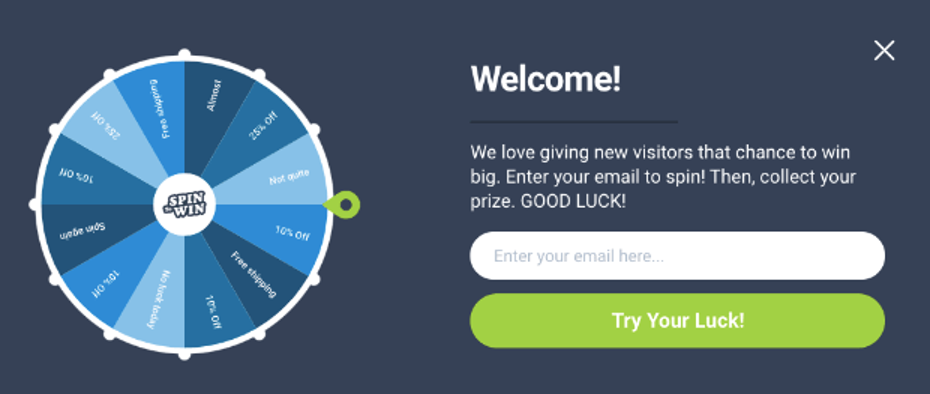
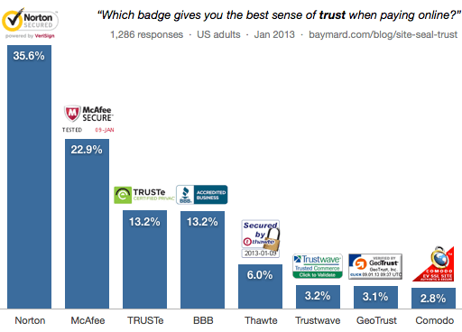
5. Using True Social Proofs
Using true social proofs is what will set you apart this year. More and more companies are moving towards this way of gaining trust with customers. True social proofs may be the most important trend of 2022.
We must move past the generic photo claiming this product is great. Everyone thinks their product is great. Your customers are smarter than you think. We as humans tend to trust what our peers say more than the head of a business. I bet you have some loyal customers who would be thrilled to be a part of your success. It doesn’t hurt to ask- right?
Did you know a study done by WordPress states 82% of potential customers are more likely to trust a company that uses real people in their marketing campaigns and ads?
How to use social proofs in your business:
- Use real-life customers, their pictures, and their words.
- Ask them directly to share your company or product on their social media sites. (You can offer those who help a discount- however, most people want to help without the payback)
- Contact an internet influencer who knows or works with your target audience and ask for help – you may be surprised how easy this one is.
Here is a popular example.
Swedish watch company Daniel Wellington is known for using influencers on Instagram to promote their watches. Year after year they see their conversions grow.

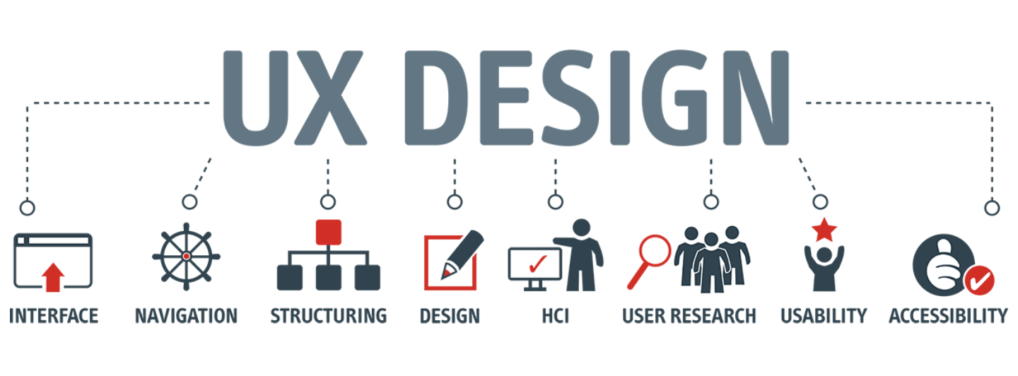
6. User Experience (UX)
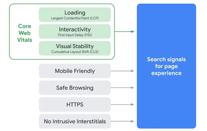
This should go without saying, but, if a user isn’t having a good experience, they are quick to exit your site and move on. If that potential customer doesn’t stick around, it’s hard to convert them into a sale. That is why in 2022 it’s imperative to put the user experience first and foremost. Even Google says having a great UX score will lead to a better ranking, and in turn, lead to more conversions.
You need your customers to find your content useful, your product valuable, and your site credible. Your website should be easy to navigate and the information easily accessible. If you can tick all these boxes, you will be one step closer to a conversion
Keeping with the customer’s experience and needs being at the forefront of everything you do, ask yourself what is it that gets you to vacate a site? One of the top reasons people leave a site is too many pop-ups, and videos that play on repeat. Ditch these as soon as you can.
Keyways to improve the User Experience (UX)
- Make your content interesting. Find a link between the company and the customer. Using a brand story will help achieve this.
- Don’t be annoying. Skip the extra fluff – you don’t need it.
- Be direct and keep it clean and transparent – don’t try to hide anything. Be as honest as you can. It will yield results.
- Speed is huge – nobody has time for your webpage to load.
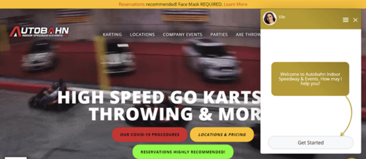
- Make it easy to ask for assistance – use the chatbot. This is another trend most sites are now using in 2022
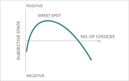
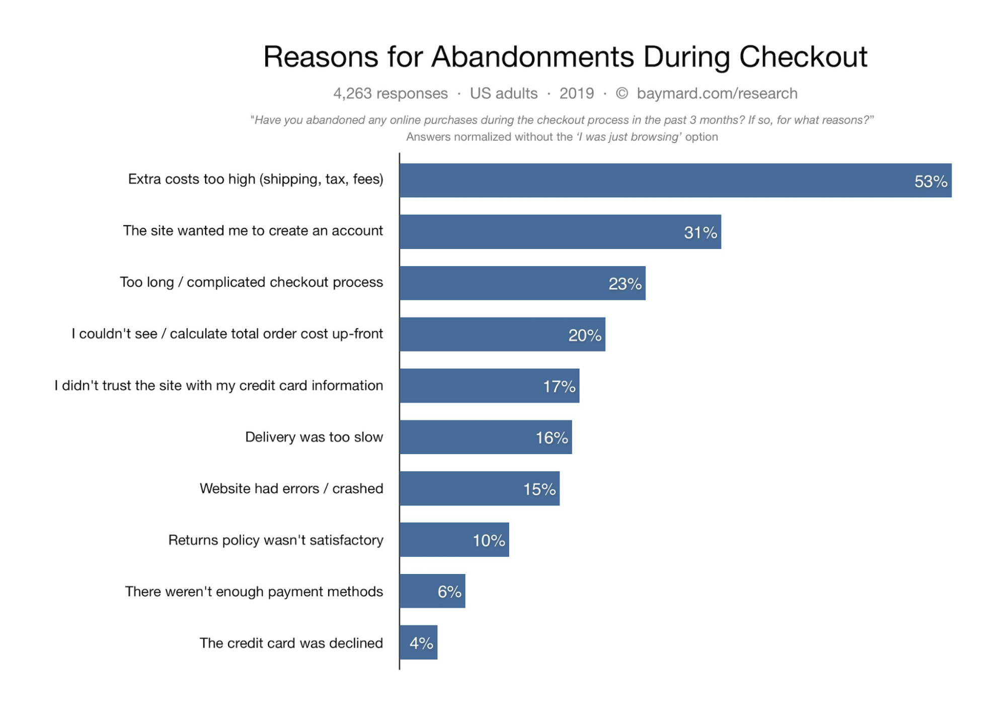
7. Simplify Your Checkout Page
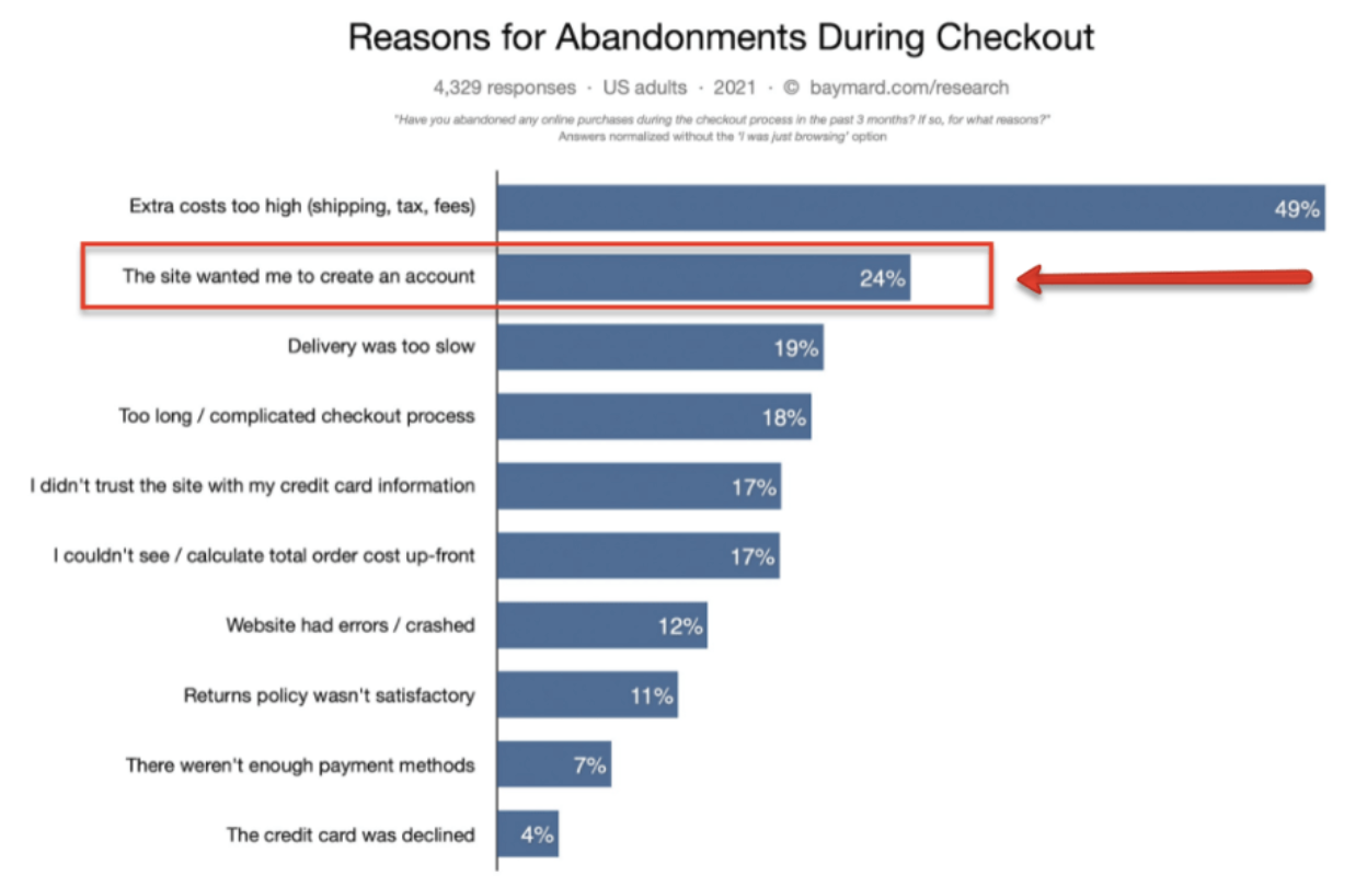
Congratulations, you got your customer to the checkout page, you have almost hit the goal line. However, 60%-80% of potential customers leave your site at this point, never to return. It’s a sad fact, but true.
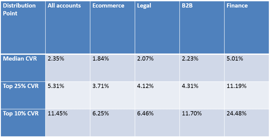
Do you know what your abandonment rate is?
One of the leading causes of high abandonment rates is a busy and difficult checkout page. On average, a potential customer stays on your page for 15 seconds. That is not a lot of time. In those 15 seconds, you must make sure your point gets across, that trust is built, and you are providing the product or service you promised.
The online user is impatient and nervous to give out too much information. That is why we suggest ditching the mandatory account setup and instead opt for a guest option as well.

Keys ways to simplify your landing page:
- Make it easy. Easy to get to payment, easy to add or remove items from the cart, easy to ask questions.
- Keep it simple – your checkout page should only contain four items – 1. Checkout 2. Delivery Details 3. Payment Details 4. Confirmation
- Include a visual indicator of the checkout process. When the customer knows what to expect, they are more inclined to continue the process until the end of the indicator. As a new company, we suggest keeping your checkout process to a maximum of 4 steps – more than that, and you could lose so close to the finish line.
Above all else test, test, and test again. Make sure to perform an A/B test for the different layouts and designs. Knowing your audience will help with this checkout process.
In Summary
We are all here for conversions, right? Using these 7 top trends of 2022 is sure to put you ahead of your competition. The main takeaway from this article is how our customers feel about using our site – everything goes back to the User Experience.
As you implement some of these trends into your website, we encourage you to keep testing, trying new things, and continuously be learning.
By optimizing for customer success, you’re more than likely optimizing for growth.
– Alex Turnbull
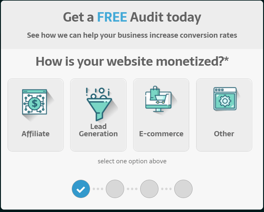
Are you interested in a free conversion optimization audit?
Submit your site and let us send you a list of custom optimizations just for you!
Claim your Free Audit Here.

Hi, I’m Kurt Philip, the founder & CEO of Convertica. I live and breathe conversion rate optimization. I hope you enjoy our findings.
We’ve worked with over 1000 businesses in the last 6 years.
Let’s jump on a quick call to see how we can help yours.
Client Case Studies